We use essential cookies to make Venngage work. By clicking “Accept All Cookies”, you agree to the storing of cookies on your
device to enhance site navigation, analyze site usage, and assist in our marketing efforts.
Manage Cookies
Cookies and similar technologies collect certain information about how you’re using our website. Some of them are essential, and
without them you wouldn’t be able to use Venngage. But others are optional, and you get to choose whether we use them or not.
These cookies are always on, as they’re essential for making Venngage work, and making it safe. Without these cookies, services you’ve asked for can’t be provided.
Show cookie providers
Venngage
Amazon
Google Login
Intercom
Functionality Cookies
These cookies help us provide enhanced functionality and personalisation, and remember your settings. They may be set by us or by third party providers.
Show cookie providers
Venngage
Chameleon
Intercom
Algolia
Performance Cookies
These cookies help us analyze how many people are using Venngage, where they come from and how they're using it.
If you opt out of these cookies, we can’t get feedback to make Venngage better for you and all our users.
Show cookie providers
Venngage
Mixpanel
Intercom
Google Analytics
Hotjar
Targeting Cookies
These cookies are set by our advertising partners to track your activity and show you relevant Venngage ads on other sites as you browse the internet.
When designing communication material, it’s easy to forget not everybody processes information in the same way.
That’s because people have different accessibility requirements.
Disabilities like autism, color blindness, dyslexia, visual impairments, and more mean people experience content differently.
Good communication depends on your ability to present information that is understood widely.
This means you need a design tool that prioritizes accessibility.
And there’s no better solution than Venngage’s Accessible Design Tool. We’re the only tool with accessibility features baked in to let you create designs that are inclusive and accessible.
Note: If you want to create accessible designs fast, you can also customize our accessible templates which cover many content types from reports, presentations, infographics, and more.
Some of our accessible templates are free and some require a small monthly fee. Sign-up is always free, as is access to Venngage’s drag-and-drop editor.
What is accessible design?
Accessible design is a process in which designers minimize barriers to allow people with visual impairments or other disabilities to understand and consume content equally.
How you achieve this varies depending on the type of accessible document being created.
Fortunately, there is a set of guidelines you can follow to ensure accessibility.
The World Wide Web Consortium (W3C) developed the Web Content Accessibility Guidelines or WCAG 2.2 to ensure all forms of digital content are accessible.
WCAG 2.2 breaks accessible design into POUR principles or perceivable, operable, understandable, and robust.
I’ll provide a simple overview of POUR principles in this article.
(Note: Accessible design is a close cousin of inclusive design. The main difference between them is that inclusive design is more of a mindset while accessible design has a set of guidelines).
When creating for accessibility, most of your focus will be on colors, images, text, fonts, and visual hierarchy, but there are non-visual factors to keep in mind as well.
I’ve split this post into visual and non-visual accessibility design tips.
Why accessibility matters
Accessibility matters because it gives people with disabilities equal access to information and equal opportunity to participate in society.
Around 1.3 billion people live with some form of disability, whether permanent like autism or color blindness or temporary as a result of aging or a broken hand or arm.
Failure to create accessible content also goes against the principles of inclusivity fundamental to a just and equitable society.
Besides social and moral obligations, many countries require digital content to be made accessible.
In the EU, there’s Directive (EU) 2016/2102 and in Canada, there is the Accessible Canada Act.
Accessibility also matters from a business perspective.
Companies that fail to create accessible content risk losing potential customers because they can not navigate or access content that may sway purchase decisions.
Visual impairment covers any type of vision loss ranging from partial to full blindness.
The most common types of vision impairments include:
Loss of central vision
Loss of peripheral (side) vision
Blurred vision
Generalized haze
Extreme light sensitivity
Night blindness
Color blindness
Among these, color blindness is particularly significant and affects 350 million people globally.
Fun fact: Most color-blind people can actually see color, but just not in the way others can.
There are three main types of color blindness:
Red/Green color blindness
Blue/Yellow color blindness
Complete color blindness
Want to know how your design looks to people with different visual capabilities? Check out our Color Blindness Simulator to test your design for free!
It’ll help you create accessible designs your entire audience can appreciate.
Text
When creating accessible designs for people with visual impairments, make sure to use a large text size like in this poster example:
Large text size makes content easier to read and prevents characters from blending together, making it easy to consume for people with different vision capabilities.
A text size of 16 pixels is generally recommended to ensure legibility.
Fonts
Fonts are also crucial in accessible design since they impact readability and comprehension.
Accessible fonts are particularly beneficial for people with dyslexia, a learning disability that affects the part of the brain that processes language and impacts how a person reads and understands written material.
For people with dyslexia, written words can be hard to understand and comprehend.
One way to achieve good color contrast is to use a lighter color for your background and a darker color for your text.
Learn more about color relationships:
Let’s look at an example.
The black text on a white background below helps achieve high color contrast, but when it’s made yellow, the contrast level becomes low.
WCAG 2.2 recommends the following color contrast ratios to achieve an AA compliance rating:
Body text: 4:5:1
Large text: 3:1
Note: WCAG defines accessibility compliance with several ratings (A, AA, and AAA). An A rating means your design meets basic accessibility standards, but aiming for an AA rating is recommended.
Here’s a recap of how you can ensure adequate contrast in designs:
Use dark colors on a light background, or light colors on a dark background
Use solid patterns in the background, to make any elements layered over it more visible
Venngage’s Color contrast checker tells you whether users with visual impairments or other disabilities can see and interpret elements in your design.
To use our Color contrast checker, click on the “Color” menu at the top of the editor after selecting an element.
At the bottom of the “Color” menu panel, a “Contrast Ratio” display will appear to give you a score and tell you the level of compliance.
A red “X” appears when an element (“Graphics”, “Normal text”, or “Header”) doesn’t meet accessibility requirements, and a green checkmark if it does.
Icons
Accessible icons are a designer’s best friend.
Without taking up much space, they help draw attention to important parts of a design where text may not work.
But to make sure they’re accessible, focus on using simple icons that are clearly visible.
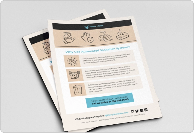
For example, in this work-from-home infographic, not only are icons large but also achieve high contrast against the background.
While standalone icons are great, you can also use them to reinforce text messaging.
Placing icons and symbols next to text is a great way to make text easier to understand for people living with disabilities like dyslexia.
Here are some common icons and symbols you can use and their meanings:
When adding an icon to your design, pay close attention to how they add to your design. Are they just decorative tools to add visual appeal, or do they also communicate vital information?
Your answer will determine whether to set alt text.
A decorative icon that does not add information or does not confer an action a user can take does not require alt text descriptions.
For example, a small decorative star in the body background does not need alt text descriptions.
But you do need to add alt text when an icon provides information visually. For example, an email icon that can be clicked or a magnifying glass representing the search function.
In these cases, you could write a simple alt text like “email us” or “magnifying glass icon representing the search function.”
Here are the key takeaways to make your icons accessible:
Make icons large and clearly visible
Set alt text to icons that communicate information or an action
Visual hierarchy is another key element of accessible design, especially for a neurodiverse audience or people who experience the world in a different way.
Some examples of neurodiversity include:
Dyspraxia
Dyslexia
Attention deficit hyperactivity disorder (ADHD)
Dyscalculia
Autistic spectrum
Tourette syndrome
Making designs accessible for neurodiverse audiences requires an understanding of their needs.
Generally, people with neurodiverse needs benefit from designs that help them understand the relationships between different elements.
Here are some tips to ensure visual hierarchy:
Use short simple sentences
Make use of headings, subheadings, and bulleted lists
Use icons and photos to reinforce concepts
Minimize distractions with simple backgrounds
Make your text large and avoid clutter
And here’s what you should avoid:
Walls of text
Bright contrasting colors
Complex or cluttered layout
Distracting backgrounds
Small fonts
Clear structural organization is key to visual hierarchy and accessible designs.
Make sure to use headings to break down information into logical sections, similar to how a roadmap helps you navigate through something that may be unfamiliar.
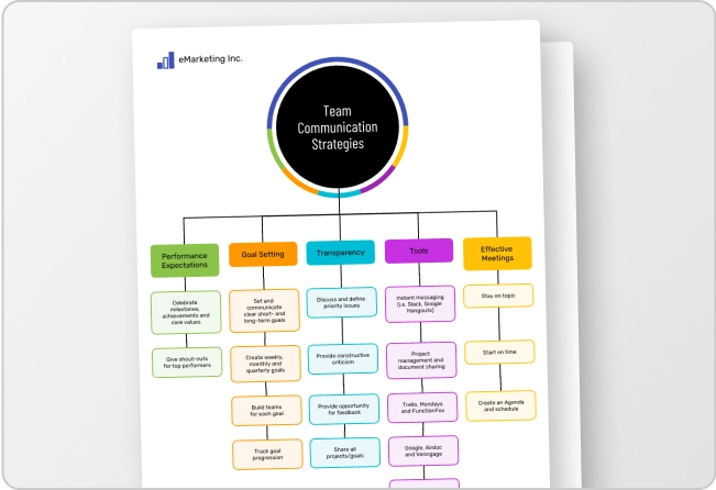
In this accessible brochure, headings and sub-headings help guide users to different sections.
An infographic is also a great way to simplify complex information for a neurodiverse audience since you can separate information and use icons to illustrate important points.
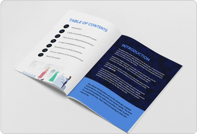
If you want to create an accessible report, white paper or pamphlet for people a neurodiverse audience, you can implement a consistent layout of columns and short paragraphs like in this example.
Interactive elements
Interactive elements are items that people can click, tap, or interact with to perform actions or navigate through content.
Think links, buttons, or audio and video buttons.
In an accessible design, interactive elements should be distinct from static content.
You can achieve this by providing visual cues such as using different colors, shapes, or visual effects like underlines to indicate interactivity.
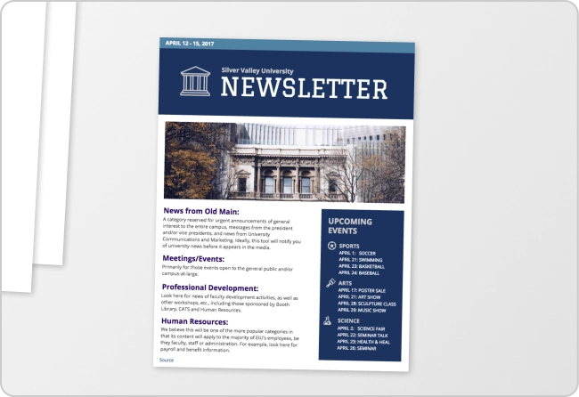
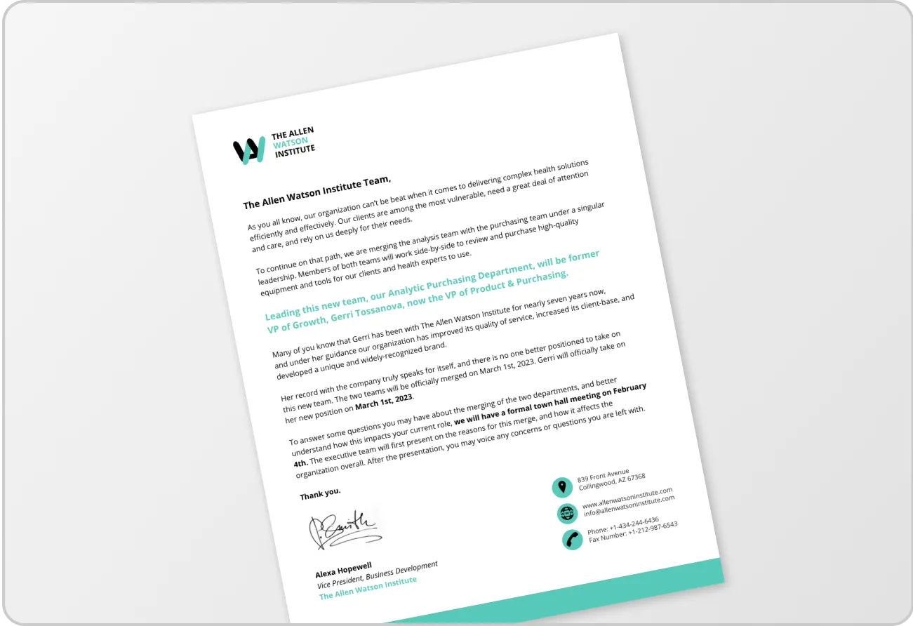
For example, in this accessible newsletter, the CTA buttons use a different font color and are surrounded by a button shape to make them clearly stand out from other text.
You should also label interactive content to ensure assistive technology gives accurate context to users.
For example, labeling a button as a link to a sign-up form enables users of assistive technology to understand an element in case they cannot comprehend it by visual cues alone.
This nudges people to perform the actions they wish, from navigating to a link, submitting a form, or playing multimedia content.
Non-visual accessibility design tips
I’ve already covered one major aspect of accessible design which focuses on the visuals.
In this section, I’ll shift focus to non-visual accessibility.
This is equally important if you want digital content to be understood by people who have motor disabilities or cognitive impairments.
Keyboard navigation
Keyboard accessibility is another core principle of accessible design.
People with motor conditions or even a temporary arm injury might not be able to use a mouse and instead rely on a keyboard to navigate a document.
Note: Even people with visual impairments might use keyboard navigation to browse a digital document.
Here are some keys users with disabilities might use to help with navigation:
Tab Key: By pressing “Tab”, users can move through elements in the order they appear
Shift + Tab: This combination allows users to move backwards in case they skip past something
Arrow Keys: Facilitate movement within elements
Enter Key: Helps activate an interactive element similar to a mouse-click
Space bar: Can be used to activate certain elements
Want to learn more keyboard navigation keys that help users navigate through designs created in Venngage? Read this post:
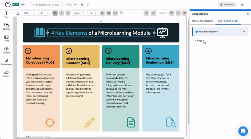
Keyboard navigation follows a logical sequence, unlike visual navigation which allows people to skip elements.
This means you need to set the correct reading order in your designs so that when users tab through, content appears in the order it is intended to be consumed.
Screen readers read out the content of a document according to the reading order.
For example, if you see this design visually, you’ll understand this is how the creator intended for content to be consumed.
To ensure a similar experience for people using keyboard navigation or screen readers, you’ll have to program this information in.
This is not possible with any design software except Venngage.
Venngage lets you set the right reading order in designs in a few clicks without having to leave the platform.
Text-to-speech compatibility
Text-to-speech refers to converting written text into spoken language.
This technology allows people who cannot read text to access and understand digital information.
Therefore, to make your designs accessible, you’ll want to make sure your digital documents are compatible with AI text-to-speech technology.
Design tools should let you explicitly convey the context of every type of element in your document from icons, images, and charts, to text.
Images are a powerful way to convey information, ideas, emotions, and concepts because of our brain’s ability to process visual stimuli quickly and effectively.
Imagine your favorite movie poster and then think of it without the visual. Would it still make sense?
This is why it’s important to provide text descriptions of images in your design.
Users who rely on assistive technology such as screen readers to consume content need designers to set image alt text. Otherwise, a screen reader will skip images in a design.
What is image alt text?
It’s a brief description of an image’s content and purpose.
For example, let’s say you include this image in your design. How would you describe it to someone who can’t see it?
It depends on the context but on a website for a dairy product company, you might describe it as “a bowl of dip made with fresh, locally sourced organic dairy yogurt, appears on a table next to a slice of brown bread”.
Now when a screen reader arrives at the image, it’ll read this description out loud to the user.
Note: You only need to set alt text when an image communicates information. If it’s used for decorative purposes or does not add to the user experience, you don’t need to provide alt text.
Writing great alt text isn’t difficult.
The general rule is to be concise and provide accurate context.
But it doesn’t always work that way. For example, if you have a chart or diagram with complex data in your design, you might need to set a long alt text to ensure a reader understands the visual.
For example, let’s say you have this flowchart in a presentation. How would you set the alt text to make it accessible?
You might write it out completely like this:
“Flowchart titled ‘Should You Rent or Buy?’ The starting box contains the question ‘Are you planning to stay for more than 5 years?’, with two subsequent boxes: ‘Are you are a financially stable position?’ and ‘Can your budget handle mortgage, taxes, maintenance and other costs?’ Possible answers to all questions are either ‘yes’ and ‘no’; all flows end in a box either marked ‘Rent’ or ‘Buy’. Flows ending in ‘Rent’: 1. Are you planning to stay for more than 5 years? Yes; Are you at a financially stable position? No. 2. Are you planning to stay for more than 5 years? No; Can your budget handle mortgage, etc.? No. 3. Are you planning to stay for more than 5 years? Yes; Are you at a financially stable position? Yes; Can your budget handle mortgage, etc.? No. Flows ending in ‘Buy’: 1. Are you planning to stay for more than 5 years? Yes; Are you at a financially stable position? Yes; Can your budget handle mortgage, etc.? Yes. 2. Are you planning to stay for more than 5 years? No; Can your budget handle mortgage, etc.? Yes.”
Want more information on image alt text? Check out these resources:
Now that you understand the different types of accessibility needs, it’s time to put accessible design into practice.
If your department or organization doesn’t have the budget for a designer, using a pre-made accessible template can be a quick and easy way to create professional-looking designs.
Graphs are often used in reports or presentations to give detailed insights into your data.
But graphs often don’t take accessibility into account. Using colors that are too similar, or not labelling data can mean your data isn’t accessible.
Make your graphs accessible with color
When using a graph template, like this pie chart example below, make sure you are using shades and contrasting colors to differentiate data.
Show differences with shades in your accessible charts
Using shades of colors is also effective in bar charts to show different genres or topics. In this accessible chart example, the box office sales have been arranged according to genre.
The chart is also well-spaced and easy to understand.
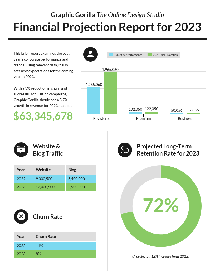
Label charts thoroughly
Labelling your charts is the easiest way to make them more accessible.
If your value range is quite large, adding details to each point on your line graph is especially helpful.
In the line chart template below, a note has also been added to confirm overall decrease which helps aid comprehension of the chart.
It’s crucial you design accessible presentations so that everybody understands the information.
Besides meetings, presentations are also used during employee onboarding to communicate important information about company culture, and being an inclusive employer begins with accessibility.
Create a presentation with simple colors
In the pitch deck example above, a simple color palette is used and the contrast between pink and black is suitable for most people with color blindness.
The fonts are also large and easy to read, and important information has been highlighted using bold or different colors.
Create an ‘Agenda’ slide to make your presentations accessible
In the remote team meeting presentation below, the agenda has been set out at the start of the meeting. This is especially useful for accessibility when remote working, as it makes sure everybody knows what to expect straight away.
Illustrate presentations with icons for accessibility
Another way to make presentations more accessible is to use icons throughout the design.
An icon can help provide context for information and can help you create engaging slides.
Following the rules I’ve covered in this post such as using contrasting colors, simple fonts, and icons, you can easily create engaging and accessible infographics.
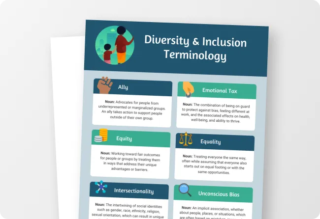
Use icons to make infographics accessible
In the accessible infographic above, icons help readers categorize results visually without having to read the text.
Also, each section is clearly labelled and the infographic is well-spaced out and easy to understand.
Use boxes to separate information in your infographic
In the infographic below, icons and boxes are used to help differentiate the information.
Also, the colors used are simple and make the design easy to read.
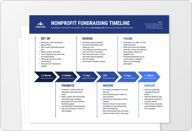
Use a timeline infographic to communicate processes
Timeline infographics are especially good for creating consistent layouts and flows.
In this accessible infographic example, the timeline follows a “zig zag” pattern to progress week to week. The use of lines that connect icons makes it very easy to follow.
Want to learn more about creating effective infographics?Check out our video!
Accessible reports
Reports are often dense documents that contain a lot of important information.
Making sure that your readers can understand and digest points in a report easily is important for accessibility.
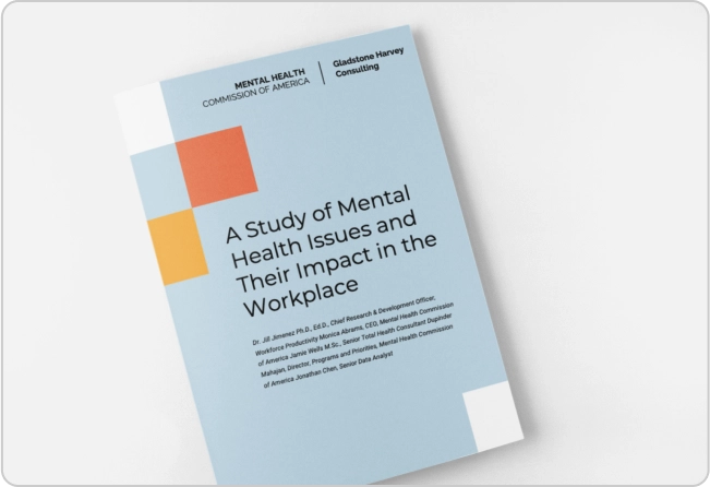
Create an executive summary in your reports
One method to make accessible reports is to include an infographic summary.
An executive summary presented as a one-page infographic at the beginning of a report should highlight the key data points.
If you’re an organization that produces annual or quarterly reports, you can create an interesting and accessible report template that you can reuse again and again.
Use Icons in your annual reports for accessibility
The annual report summary template below makes good use of icons and graphs.
The font is also simple to understand and the important information is highlighted in a separate “year at a glance” box.
Common visual accessibility mistakes
When getting started with accessible design, there’s a lot of information to take in.
How should you present the information to make it easy to understand to people with different cognitive or vision abilities? What about the color scheme and contrast?
There are a lot of decisions to be made.
And it can lead to analysis paralysis.
That’s why I’ve listed some common visual accessibility mistakes that most designers make.
Use this checklist to help you run accessibility audits or avoid visual accessibility mistakes most designers make when creating digital content.
Here are the visual accessibility mistakes you should avoid:
Using serif or other hard-to-read fonts
Small text sizes
Creating complicated or patterned backgrounds
Using too many colors
Not ensuring enough color contrast between elements
Visual accessibility tools and resources
Creating an accessible design is not an art, but a science.
Ideally, you want to ensure a design is accessible before you share it, not after. Otherwise, you’ll end up wasting time and money remediating digital documents.
Here’s how most people approach accessible design today:
1. Evaluation
First, a standalone software is used to run manual checks to figure out whether elements such as images without alt text, color contrast, text size, etc meet accessibility standards.
2. Remediation
Once a design fails, the remediation process or fixing inaccessible elements begins.
3. Validation
Once remediation is complete, the document is re-evaluated to ensure all accessibility barriers have been removed.
This can be a very time-consuming and frustrating process.
And it costs a lot of money.
A much better method is to use graphic design software like Venngage that helps you design with accessibility in mind.
Our color palette generator lets you easily discover beautiful combinations that adhere to WCAG guidelines.
And our color contrast simulator lets you check the contrast ratio of text/images and background colors.
So whether you’re designing an infographic, report, presentation, newsletter, or more with Venngage, you’ll get built-in tools that help make it accessible without having to leave the platform.
Let’s see it in action to get a better understanding!
Frequently Asked Questions
What are some common types of disabilities that need to be considered in accessible design?
Some common types of disabilities that will benefit from accessible design include visual impairments, color blindness, motor disabilities, hearing impairments, cognitive impairments, and more. Each of these types of disabilities requires specific design considerations to ensure that the content is usable by individuals with diverse needs.
How can I choose the right color palette for accessible design?
When selecting a color palette for accessible design, your best bet is to use a tool like Venngage’s Color palette generator or Color contrast checker to ensure your color choices meet accessibility standards. Both are free!
Can I use templates to create accessible designs?
Yes, accessible design templates can be a convenient way to ensure your content follows accessibility best practices. Venngage’s accessible templates library is a great source to find designs that cater to various content needs.
In Summary: Accessibility is not just a nice-to-have feature but a fundamental necessity that ensures everyone can access and comprehend information
People with varying accessibility needs, from visual impairments to cognitive differences, deserve the same opportunity to consume content.
To create a more inclusive digital landscape, we all need to play our part in prioritizing accessibility.
And how you achieve that depends on you.
You can either waste time and resources making your designs accessible manually.
Or you can use Venngage to create accessible designs from start to finish without having to worry about testing.


![How to Create Accessible Designs [Tips + Examples] - blog header image](https://venngage-wordpress.s3.amazonaws.com/uploads/2024/10/How-to-Create-Accessible-Designs-2.png)