


WCAG Color Contrast Checker
Check the contrast ratio of text/image and background colors and follow Web Content Accessibility Guidelines (WCAG) with ease.
Calculate foreground-and-background contrast ratio in seconds
Make sure your foreground design has sufficient contrast against the background, whether it’s normal text, large text or graphics.
It’s easy as 1, 2, and... that’s it! Calculate your contrast ratios in two simple steps:

Input your colors
Enter the foreground and background colors using their HEX codes. If necessary, adjust the colors using the lightness slider.

View your results
That’s it! Your contrast ratio is ready in seconds. You’ll know if you pass the WCAG whether you’re checking text or non-text content.
Examples of accessible designs with the right contrast ratio
Different WCAG-compliant designs for your inspiration. Create your own accessible design and check it with the color contrast analyzer with just a click.


What is WCAG?
WCAG stands for Web Content Accessibility Guidelines, which cover a wide range of recommendations for making web content more accessible.
WCAG 2.1 specifies — on the use of colors — that color isn’t used as the only visual means of converting information, and that the visual presentation of text and images of text has a contrast ratio of at least 4.5:1.
What is contrast, exactly?
Contrast is the brightness or vibrancy of a color or element when compared to another element. For example, black text on a white background is high contrast. On the other hand, yellow text on a white background is low contrast.
Color contrast requirements are part of WCAG Level AA and AAA.


What’s the difference between WCAG Level AA and AAA?
The WCAG has three levels of conformance: A, AA and AAA — A being the easiest level to meet and AAA being the hardest.
Most websites aim to meet Level AA, which is the middle level of compliance that works with most assistive technologies. Level AAA is the gold standard level for accessibility compliance and is often used by government sites.
When discussing creating accessible designs or websites, we often mean trying to satisfy WCAG criteria at Level AA
Color contrast requirements are part of Level AA and AAA. Specifically:

WCAG Level AA for text requires a contrast ratio of at least 4.5:1 for normal text and 3.1 for large text.

WCAG Level AA for non-text requires a contrast ratio of at least 3:1 for graphics and user interface components (e.g. form input borders).

WCAG Level AAA for text requires a contrast ratio of at least 7:1 for normal text and 4.5:1 for large text.
Why should you pay attention to contrast?
Contrast is key to helping your audience see and understand your design. Elements with low contrast are hard to see, even for those without visual impairments.
If your designs aren’t legible, you’ll have a hard time connecting with your audience. What’s worse, if your designs are inaccessible, you may even alienate your audience — both those with visual impairments and those conscious of accessible needs.
In other words, designing for accessibility benefits your entire audience. You can make sure your designs are accessible by:
What is an accessible color palette?
Understand how color theory and contrast contribute to creating inclusive communications.
An accessible color palette ensures readers with visual impairments and disabilities can see and understand your design. Accessible color palettes are WCAG compliant — which means they follow proper accessibility guidelines when it comes to contrast.


Did you know…
- At least 2.2 billion people worldwide have a vision impairment (WHO)
- Around 1 in 12 men and 1 in 200 women have color vision deficiency (NCBI)
- Most people with color blindness have trouble with reds and greens (CBA). Use our color blind simulator to check how your design really looks to this audience.

How to create an accessible color palette
In a typical design process, you might have a color palette ready, put together a visual and then check it for accessibility. This is where Venngage’s free accessibility color checker comes in.
But you can also flip this process around and save yourself some time and effort by starting with generating an accessible color palette.
With Venngage’s free accessible color palette generator, you can create WCAG-compliant color palettes in seconds.
GENERATE ACCESSIBLE PALETTESCreate a design and test it out with Venngage’s free WCAG contrast checker
Finished a design or just wanted to test out a color combination? Make sure your design is accessible by double checking it with Venngage’s free color contrast checker.
Have a Venngage account? You can use test your design for contrast right within the Venngage editor!
Simply sign up for a free Venngage account, pick an accessible template and start customizing with our accessible editor. Yes, it’s as simple as that.

FAQ
How do you calculate a contrast ratio?
Contrast ratios can range from 1 (1:1) to 21 (21:1). You can use this formula to calculate the ratio:
(L1 + 0.05) / (L2 + 0.05)
In which:
- L1 is the relative luminance of the lighter color
- L2 is the relative luminance of the darker color
Relative luminance refers to the relative brightness of a color, ranging from 0 for darkest black and 1 for lightest white. There are formulas you can use to calculate the relative luminance of a color, but they can be complicated and time-consuming.
Instead of using multiple formulas to calculate a contrast ratio, you can just use a contrast ratio checker like Venngage’s to ensure your design is WCAG-compliant.
Are the WCAG guidelines legally enforceable?
While the WCAG isn’t a legal document, section 508 is a law that requires American federal agencies and their contractors to comply with WCAG 2.0 AA standards.
For private companies, it’s even more complicated.
The American Disability Act (ADA) — which organizations with more than 15 employees are subject to — requires places of public accommodation be accessible, and many regions now consider businesses’ websites an extension of that.
In 2019, more than 10,000 lawsuits were filed for violating the ADA, and 20% of those involved website and mobile app design. None of those would have occurred had they followed WCAG AA guidelines.
What colors contrast well together?
Contrary to popular belief, complementary colors (colors that sit opposite each other on the color wheel) don’t always contrast well. They can catch your eye, sure, but they often fail the WCAG contrast ratio test.
To guarantee a good contrast ratio, pay attention to how bright a color is — the ratio is calculated using a color’s relative luminance after all. As a rule of thumb, you’ll want to pair dark colored text with a light background or light colored text with a dark background.
To be absolutely sure that your colors conform to WCAG’s contrast criteria, use a color contrast analyzer.
What is the color wheel?
The color wheel includes primary colors (red, yellow, blue), secondary colors (orange, green, and purple), and tertiary colors (vermillion, amber, chartreuse, teal, violet, and magenta).
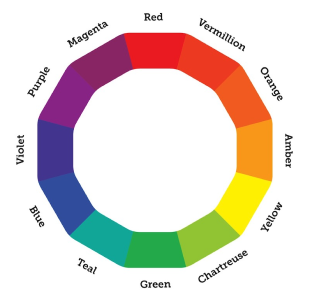
The color wheel is a very useful tool to help us understand color relationships, which are indispensable for visual communication.
What are basic color relationships?
There are six classic color relationships based on the color wheel:
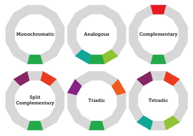
To be more specific:
- Monochromatic: A monochromatic color scheme consists of a single color (or multiple variants of that color).
- Analogous: Analogous colors are side-by-side on the color wheel.
- Complementary: Complementary colors are across from each other on the color wheel.
- Split-complementary: A split-complementary color scheme is a variant of the complementary color scheme, with one base color and two secondary colors adjacent to its complementary color.
- Triadic: A triadic color scheme features three equidistant colors.
- Tetradic: A tetradic color scheme features two pairs of complementary colors.
Why is color accessibility important?
Designing with accessible colors is important because it ensures people with visual impairments can understand your content. It removes barriers and provides an equal opportunity for everyone — regardless of circumstances — to engage with your designs.
How do you choose accessible colors?
There are a few factors to keep in mind when choosing accessible colors. First and foremost, consider contrast. You’ll want to choose colors that provide maximum contrast. The best example of this is black text on a white background — or in this case, white text on a dark green background.
You’ll also want to keep in mind that about 360 million (and counting!) people worldwide have color vision deficiency (color blindness). The most common form of color vision deficiency is red/green, but blue/yellow can also occur. You can still combine these colors in a palette, but you should try and avoid superimposing them. Some color combinations you should avoid include:
- Red & green
- Blue & purple
- Green & brown
- Blue & yellow
How do you know if a color is accessible?
To determine if a color is accessible, you can check its contrast ratio against the colors you’re pairing it with. There are several free online tools that can help you do this. Alternatively, if you want to make sure the colors you choose will be accessible, try using our color palette generator.
What colors are good for the visually impaired?
This may vary depending on the type of visual impairment. But in general, bright colors are easier to see than pastels. For example, a bold red may be easier to see than a light pink. Remember though: red may stand out, but if you pair it with a green, someone with color blindness may still struggle to understand your design.
So, rather than saying “this or that” color is good for the visually impaired, it’s best to take a holistic approach and think about how the colors in a palette combine — both in terms of contrast and color blindness.