


Color Blind Simulator

Break down visual barriers with Venngage’s free color blind checker
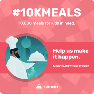
Try different filters on our sample template or add a website link below.


How you can use Venngage’s Color Blind Simulator
If you don’t suffer from color blindness, it can be difficult to imagine what color-blind people actually see. Venngage’s Free Color Blind Simulator helps you breach that gap.
Just finished a design or website and want to check for accessibility? Add the link to the color vision simulator and try out the different filters there. Or if you just want to test out the tool — there’s always a sample template ready for you.
Venngage’s free color blind checker tool lets you experience what it’s like to have red/green, blue/yellow, or complete color blindness. To help you create accessible designs, we’ve also added two other vision problem filters — cataracts and low vision.
CHECK MY DESIGN
What is color blindness?
Color blindness — or color vision deficiency (CVD) — makes it hard for people to distinguish between different colors. About 1 in 12 men and 1 in 200 women have color vision deficiency.
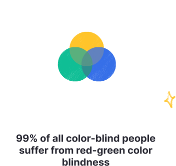
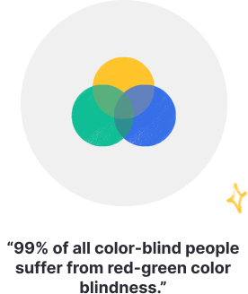
Unlike what the condition’s name suggests, it’s not very common to get completely color blind — that is, unable to see colors at all. The most common type of color blindness is red-green — 99% of all color-blind people suffer from red-green color blindness.

What are the different types of color blindness?
There are seven official diagnoses of color blindness: four in the red-green category, two in blue-yellow, and one describing the vision completely lacking in color.


Red-green color blindness
- Protanopia (aka red-blind) and Deuteranopia (green-blind): individuals can’t distinguish between red and green
- Protanomaly (aka red-weak): individuals can see some shades of red
- Deuteranomaly (aka green-weak): individuals can see some shades of green

Blue-color color blindness
- Tritanopia (aka blue-blind): individuals can’t distinguish between blue and green, purple and red, yellow and pink
- Tritanomaly (aka blue-weak): individuals can see some shades of blue and yellow

Complete color blindness
- Individuals with this condition see no color at all — their world exists in black and white
- Occurs in one out of 33,000 people
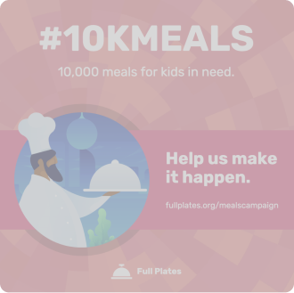
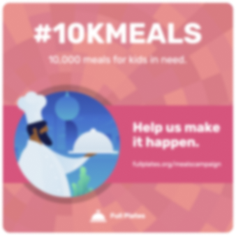
Venngage’s Color Blind Simulator can show you how people see when having one of the main four types of color blindness (complete color blindness, red-blind, green-blind, blue-blind). We also offer two other filters — cataracts and low vision.

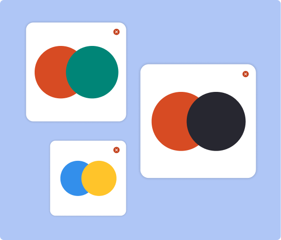
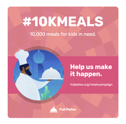
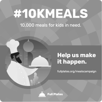
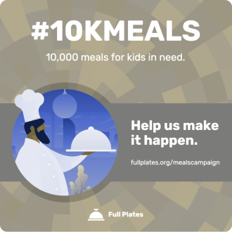
View your designs the way your audience does
Over 360 million people experience a type of color blindness. Leave no audience member behind by combining colors consciously.
Ever wonder how visually impaired people will view your design? A like the one on the right can look like this to people with color vision deficiency (see below):
Keep your designs accessible with a color blind friendly palette
Keep your designs accessible
If your design is inaccessible, you may alienate your audience — both those with visual impairments and those conscious of accessible needs.
A color blind friendly palette takes into consideration how people with this visual impairment perceive color combinations.
Using a color blind friendly palette doesn’t mean you need to strip all colors from your designs. It just means being conscious of how combining certain colors may affect your audience’s ability to between them.
For instance, a blue and orange palette is a common color blind choice. On the other hand, a red and green palette could be confusing for someone with color blindness.
Examples of color blind friendly palettes
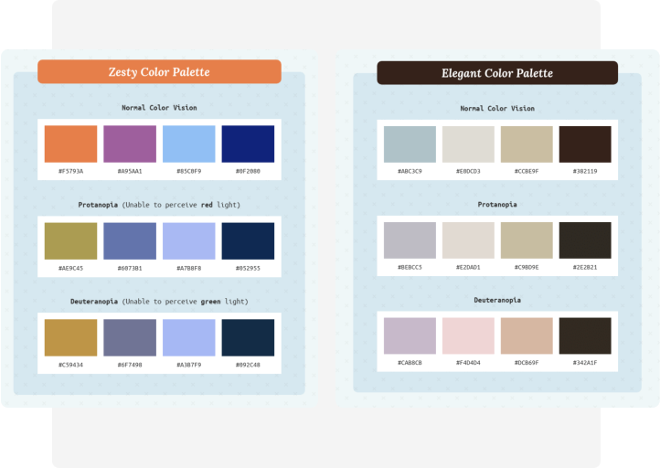
Make sure your design is color conscious and inclusive using these accessible color palettes.
Connect with your audience using accessible, color blind friendly palettes
Create inclusive communications with these simple tips.

-
Plan out color schemes beforehand
With one of our color blind friendly palettes above. Or use Venngage’s Accessible Color Palette Generator to create inclusive color pairings in seconds — for free.
-
Avoid certain color combinations
These combinations can make your design inaccessible to color blind people:
red & green, blue & purple, green & brown, blue & yellow.- red & green
- blue & purple
- green & brown
- blue & yellow
-
Use highly contrasting colors
Contrast isn’t an issue for most people with color blindness. You can darken and lighten your colors, play with different hues or levels of brightness to make the contrast more pronounced.
Make sure your design complies with the WCAG 2.1, which specifies the contrast ratio for body text should be at least 4.5:1.
-
Use patterns and textures
Patterns and textures are a great way to incorporate visual elements into your design without relying on color.
-
Use symbols
Likewise, symbols and icons can make your designs more accessible since they can visually punctuate a message without the use of color.
Create an accessible design and test it out with Venngage’s free color blind simulator
Make your design inclusive of all audience members by using a color-blind friendly palette and double check it with Venngage’s free color vision checker.
Have a Venngage account? You can use the vision simulator and test your design for accessibility right after you finish it — right on the Venngage editor!
Simply sign up for a free Venngage account, pick an accessible template and start customizing with our accessible editor. Yes, it’s as simple as that.
FAQ
What colors are good for the visually impaired?
As most color blind people have trouble telling the difference between reds and greens — you can avoid this color combination to make sure your design is more color-blind friendly. Instead, try using two basic hues — blue and red, for example — and make color-blind friendly palettes out of them.
What does being color blind feel like?
A color blind person may have trouble seeing:
- The difference between colors — most commonly, red vs. green
- How bright colors are
- Different shades of colors
If these symptoms are mild, you might not even notice them and not realize you may have color blindness.
How do I check if I have color blindness?
One way to check if you have color blindness is to use a color blind simulator like Venngage’s, which shows you what the design looks like for people with regular vision vs. those with visual impairments.
For more precise results, you can try a color blind vision test, which often makes numbers or shapes out of dots that have a different color from the dots surrounding them.
Can you be slightly color blind?
You can be totally color blind (complete color blindness) or partially color blind (inability to distinguish between certain colors). Complete color blindness is not common and is found in 1 out of 33,000 people.
The most common form of color blindness is the inability to tell the difference between reds and greens. Often, a person with a red-green color deficiency can still detect certain shades of each or both colors.
What is WCAG?
WCAG stands for Web Content Accessibility Guidelines, which cover a wide range of recommendations for making web content more accessible.
WCAG 2.1 specifies — on the use of colors — that color isn’t used as the only visual means of converting information, and that the visual presentation of text and images of text has a contrast ratio of at least 4.5:1.
Is a color blind friendly palette the same as an accessible color palette?
There’s a distinction between a color blind friendly palette and an accessible color palette. A color blind friendly palette may simply refer to color choices that take into account this condition. For example, choosing blues and reds instead of blues and yellows. But an accessible color palette takes the full range of visual impairments into account.
So, beyond thinking about how someone with color blindness will see certain combinations, an accessible palette also considers how someone with blurred vision, glaucoma or cataracts will perceive colors.
An accessible color palette will adhere to all WCAG 2.1 guidelines, including contrast ratio requirements. To see what this type of palette looks like, give our accessible color generator tool a try here.