


Newsletters are powerful communication tools and a core part of email marketing.
They provide companies a way to build and nurture relationships with loyal followers or customers.
Every business should have a newsletter.
But what happens when you send a newsletter that excludes subscribers with disabilities?
It’ll lead to frustration, disappointment, and create a negative perception of your brand.
The solution? Accessible newsletters!
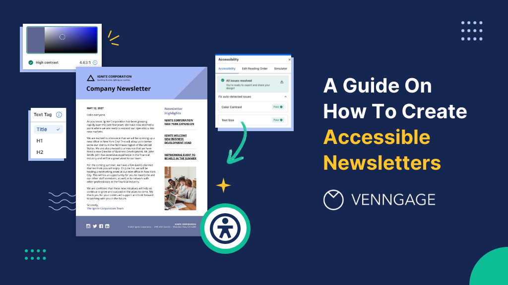
In this post, I’ll share tips on how you can create accessible newsletters to ensure inclusive email marketing campaigns.
Just so you know, you can use Venngage’s Accessible Design Tool to create an accessible newsletter from start to finish.
Some of our accessible newsletter templates are free and some require a small monthly fee. Sign-up is always free, as is access to Venngage’s drag-and-drop editor
Click to jump ahead:
- What is an accessible newsletter?
- 5 steps to create an accessible newsletter
- 4 examples of accessible newsletters
- Frequently asked questions
- Conclusion
What is an accessible newsletter?
An accessible email newsletter is a digital communication designed and formatted in a way to ensure each subscriber can understand the content.
Creating accessible newsletters requires creators to follow WCAG guidelines 2.2. This means providing alt text for images, using accessible fonts and implementing accessible colors, and more.
For more information on how to create accessible designs, check out our documentation:
Here’s an example of an accessible newsletter:

Why is newsletter accessibility important?
Newsletter accessibility is important because it drives better marketing results.
When a newsletter is accessible, it reaches a wider audience and increases the likelihood of engagement with calls to action, leading to higher click-through rates and conversions.
Besides reach, many countries have accessibility laws and regulations that require businesses to make their digital content, including newsletters, accessible to people with disabilities.
Besides the international standard set by WCAG, there are also the ADA standards in the US and the EAA guidelines in the EU.
Last but not least, sending accessible newsletters shows that your company values its audience and cares about their needs.
5 steps to make accessible newsletters
The same principles that apply to creating accessible documents work for accessible newsletters.
But there are some specific points to keep in mind to ensure newsletters are inclusive and meet accessibility guidelines.
Structure your newsletter properly
Creating an accessible newsletter starts with organizing content in a clear and logical structure. Additionally, employing a DMARC report analyzer can help ensure that your well-structured newsletters are delivered securely.
I’m sure you already know about separating content into different sections and sub-sections using headings like H1s, H2s, and H3s so that it’s easy for readers to navigate.
Most email marketing tools like Mailchimp and ConvertKit let you do this.
But what they don’t offer is the ability to label headings with text tags so that assistive technology like screen readers can understand the content.
To achieve this without an Accessible Design Tool, you will need need to create your newsletter in an HTML editor or code it using custom HTML templates.
But with Venngage’s drag-and-drop editor, you can tag content and headings with accessible heading tags.
Venngage automatically generates the appropriate HTML code for heading tags ensuring your newsletter content is accessible to all readers, including those using screen readers.
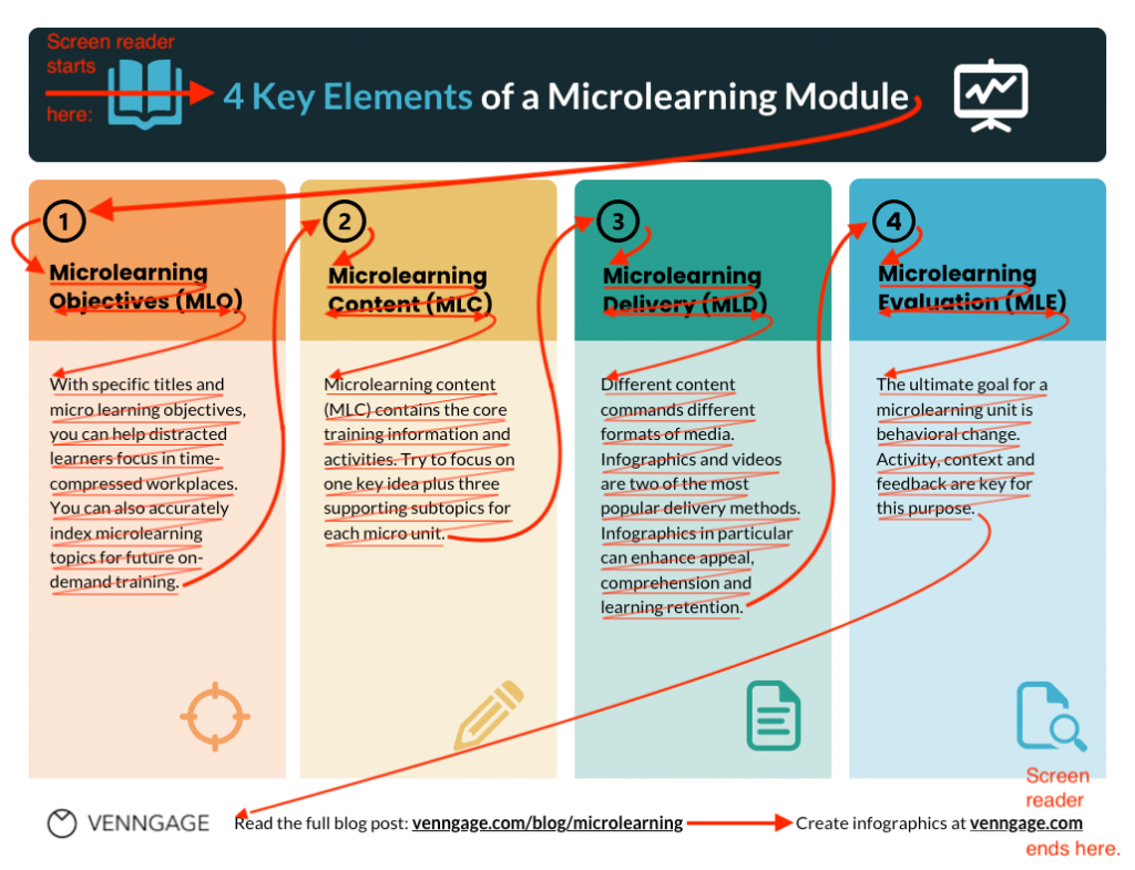
Here’s an example of a well-structured newsletter with proper heading tags:

Besides heading tags, your newsletter should include paragraphs, bullet points, and lists to make information easier to digest.
You should also pay attention to the reading order of your newsletters or the sequence in which the creator intended the content to be consumed.
Setting the right reading order is critical to ensure newsletter content is read in a logical and meaningful way by people using assistive devices.
For more information about using reading order in your accessible designs, read this guide:
This is because people with visual impairments or cognitive disabilities depend on tags embedded in your newsletters that indicate the correct reading order
For example, the reading order in the example below might be obvious to users without visual impairments, but a screen reader needs to be told or programmed to present information in the right order.
Again, Venngage’s Accessible Design Tool allows you to set the reading order of content in your newsletters.
Here’s how:
Click on the “Accessibility” button at the top of Venngage’s panel and select “Edit Reading Order” under the “Accessibility” option.
Let’s test it out on a real newsletter template:
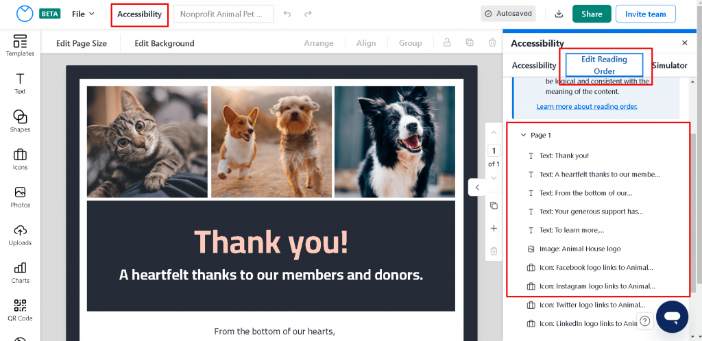
If you want to edit the order, just drag an item with your mouse or use your keyboard and arrow keys to reposition text to match your desired reading order.
Venngage’s editor will automatically mark non-text elements like icons and graphics as decorative, but you can still include these elements into your Reading Order by setting their alt text.
Don’t rely on images to convey meaning
Most newsletters are visual in nature.
This is because images catch a reader’s eye and make newsletters more appealing, increasing the chance of engagement.
But relying on visuals alone to convey important information also increases the odds of you excluding users with visual impairments and other disabilities.
Besides color blindness or low vision impairments, some users also disable image loading altogether.
One method to test newsletter accessibility is to review your content as a plain-text document to see if it still makes sense.
Note: This doesn’t mean you can’t include images at all.
You can, but if you do, make sure to mark them with appropriate alternative text.
Now, I’m sure you’re wondering how do you write good alt text.
Pretend you are describing it to someone who can’t see. Ask yourself, what do they need to know about the visual to understand it without seeing it.
Generally, alt text for non-text content should be:
- Functional
- Informative
- Contextual
- Focused
Want to learn more about writing helpful alt text for your newsletter images? Read this article:
Not all newsletter creation tools make adding alt text to images easy, but Venngage’s Accessible Design Tool makes it a smooth process.
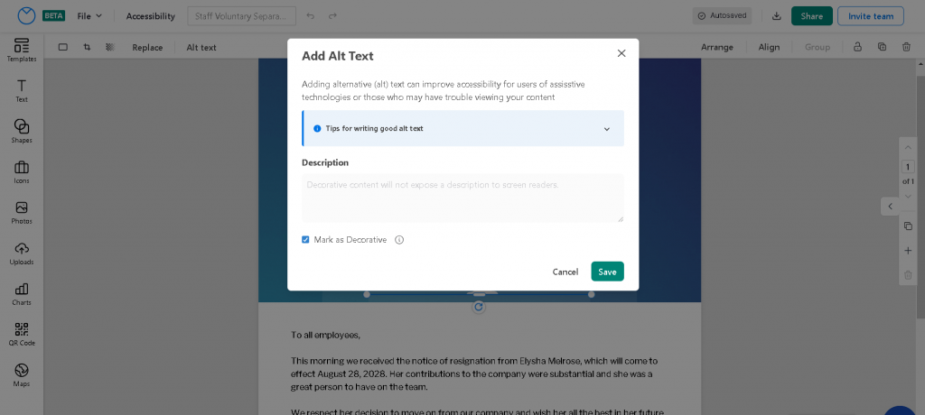
Here’s how you can set image alt text with Venngage :
Select any non-text element such as an icon, a shape, a chart, or an image.
Click on “Alt Text” in the top toolbar. This should open a “Add Alt Text” pop-up where you label an image as decorative or add a description for visually impaired readers.
Here’s an example:

You can mark it decorative or enter a description for screen readers.
Did you know that Venngage has a free PDF accessibility checker? It can help you find and fix accessibility issues in your documents to ensure that they are easy for everyone to read!
Pick your color scheme carefully
Colors play a key role in accessible newsletters because they impact overall readability and user experience.
Thus, selecting the right color palette is important if you want a newsletter to be consumed by all types of users, including those with visual impairments or color blindness.
In normal newsletter design, it’s easy to forget to test your color combinations for accessibility.
Why?
Well, often you need a third-party tool to do it.
This means you have to design first, test and retest until you’ve found an accessible combination that works.
One way to limit this back-and-forth is to minimize the use of red and green, and blue and yellow as conditions like deuteranopia, protanopia, and tritanopia make it hard to detect these colors.
If you’re uncertain how your design appears to people with disabilities, use Venngage’s Color Blind Simulator to test it.
For example, in the accessible newsletter below, the “Learn More” CTA was made black for accessibility.

But avoiding certain colors for accessibility’s sake can limit your creativity.
Instead, it’s better to use Venngage’s 100% free Accessible Color Palette Generator to generate beautiful WCAG-compliant color palettes.
There are two ways with Venngage.
The first method generates palettes based on a random color.
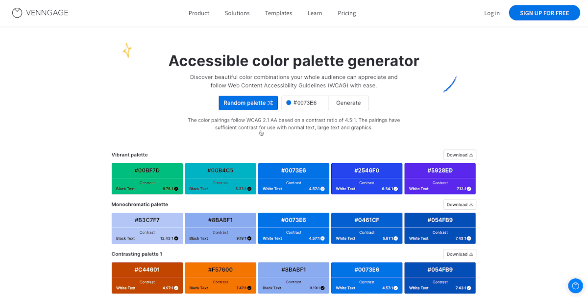
But if you want more control over your newsletter’s color scheme, you can also input a HEX code to find accessible color palettes based on your choice of color.

Want to learn more about picking colors for your newsletters? Check out this post:
Besides accessible color combinations, the level of color contrast in your newsletter design matters too.
Remember that color contrast is the difference between the brightness of the background and the brightness of the text.
Poor color contrast can make newsletters difficult to read for people with visual impairments.
WCAG recommends digital designs to ensure a color contrast ratio of 4.5:1 for normal text and 3:1 for large text.
Here are some tips on how to ensure enough color contrast in your newsletter:
- Use dark colors on a light background, or light colors on dark background
- Use solid patterns in the background to make elements layered over it more visible
But I suggest using Venngage’s Color Contrast Checker to check the contrast ratio of your design.
Here’s how you can use it:
First, select an individual element in your design, like an icon, text box or background color.
Then, click on the color button in the top toolbar with the element selected.
Venngage will then tell you that element’s contrast ratio. A red “X” will appear if it doesn’t meet accessibility requirements, and a green checkmark indicates it does.
Here’s an example:

For more information on how to use Venngage to test color contrast in your newsletters, read this post:
Make sure to use accessible fonts
Serif fonts such as Times New Roman or Georgia increase the reading difficulty for people with dyslexia, low vision, and other disabilities.
Thus, it’s important to pick accessible fonts to make your newsletters inclusive.
The best fonts for accessibility are sans-serif fonts such as Arial, Helvetica, Lucida Sans, Tahoma, and Verdana.
Besides font style, you’ll also want to make the text size in your newsletters is adequate.
For newsletter content, it’s a good idea to set font sizes of at least 12px or larger.
Large text sizes enhance readability and accommodate readers with visual impairments or those who may prefer larger text for better comprehension.
Remember to maintain appropriate line spacing as well.
Spacing will vary depending on font choice and how much content your newsletter includes, but there should be enough spacing to ensure legibility.
Clickable links should contain a descriptive phrase
Clickable links, especially call-to-actions, in newsletters, are common.
Providing informative link text that accurately describes the destination or content of the link will allow readers to understand where the link will lead them before clicking, making navigation more efficient and intuitive.
For example, instead of “Click here for more information,” use a descriptive link such as “Read our latest blog post on email marketing best practices” or “Explore our new product offerings.”
By using descriptive link text, you can enhance the accessibility and usability of your newsletter as this will allow all types of readers to engage with your content.
4 examples of accessible newsletters
Informational
An informational newsletter provides updates, news, and information about a specific topic, industry, or organization.
Their main purpose is to inform readers and keep them up-to-date.
For example, a monthly newsletter from a technology company may include articles about the latest industry trends, new product releases, and upcoming events.
Here’s an example of an accessible informational newsletter:
Promotional
Promotional newsletters promote products, services, or events, with the aim of generating sales, driving traffic, or creating awareness among subscribers.
For example, an online fashion retailer might send a promotional newsletter showcasing its latest clothing collection of semi-formal attire for men along with limited-time discounts.
Here’s an example of an accessible promotional newsletter:

Company newsletter
Companies often use newsletters to share internal news, updates, milestones, or achievements with their employees.
Company newsletters are a valuable tool for building relationships. They contribute to a positive company culture and enhance the overall reputation of the organization.
Company newsletters can include a variety of content such as:
- Employee spotlights
- Industry insights
- Product highlights
- Events and webinars
- Client success stories
- Tips and resources
Here’s an example of an accessible company newsletter:

Non-profit Newsletters
It’s not uncommon for NGOs to raise awareness, share success stories, and communicate their mission, events, and initiatives, or even thank supporters through a newsletter.
Here are some key themes a non-profit newsletter can include:
- Mission and vision
- Success stories
- Upcoming events
- Donor acknowledgement
- Behind-the-scenes
- Statistics and impact
- Volunteer spotlights
Here’s an example of an accessible non-profit newsletter:

Frequently Asked Questions
Are Canva newsletters accessible?
Canva newsletters are not accessible. Although Canva offers some accessibility features such as the ability to add alt text to non-text elements, the tool is not WCAG-compliant nor does it have any built-in accessibility checker to test your newsletter design. Moreover, Canva does not allow you to export accessible newsletters as PDFs. You’ll have to manually remediate it. An alternative to creating newsletters in Canva is Venngage which lets you build, test, and export accessible newsletter designs.
How do I make my newsletter accessible?
To make your newsletter accessible, here are the steps you need to follow: 1) use simple language, 2) provide descriptive alt text for non-text elements, 3) use accessible fonts, 4) ensure enough color contrast, 5) add meaningful headings and heading tags, 6) add descriptive text for hyperlinks, and 7) test your newsletter for accessibility before hitting send.
In summary: Creating accessible newsletters is not just a matter of compliance but about fostering inclusivity and making sure your message reaches as many people as possible
By following the tips shared in this post, your newsletters and email marketing campaigns will not only become user-friendly, but inclusive and in line with accessibility laws.
Embracing accessible newsletters not only benefits readers but also strengthens your brand’s reputation and marketing impact.
So, start creating accessible newsletters with Venngage’s Accessible Design Tool today to unlock the full potential of your email marketing.
Happy designing!


