


Looking to make your designs, documents or web pages accessible, inclusive and user-friendly?
If so, you need to get familiar with alt text. This tactic is one of the most effective ways to make visual content accessible to all types of users, including those living with disabilities.
In this guide, I’ll explain what is alt text and how you can use it to make visual content accessible. Plus, I’ll share best practices for writing image alt text and show you examples, templates and tools you can use.
What is alt text?
Alt text, also known as alternative text, alt tags, alt descriptions or alt attributes, is the use of text to describe the function or appearance of non-text elements like icons, charts, and images.
Here’s an example:
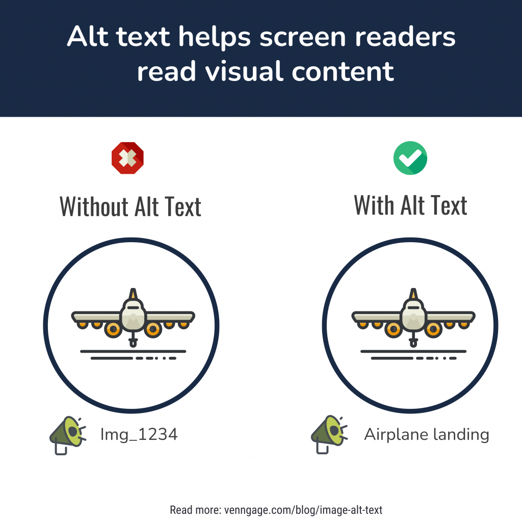
Alt text is one of the pillars of accessible design.
It allows people living with disabilities (or those with different access needs) to understand a visual on a screen reader or other accessibility tools.
Did you know Venngage lets you add alt text to visuals in a few clicks? Check out our Accessibility Design Tool which has all accessibility features you need baked in to create WCAG compliant designs!
Alt text descriptions also appear instead of an image if it fails to load.
Besides helping people make sense of non-text elements, alt text ensures content is consumed in a logical fashion.
Want a design tool that has accessibility features baked in? Look no further than Venngage’s Accessibility Tool. With Venngage, you can set alt text in a few clicks, check color contrasts of designs and much more!
Why is alt text important?
Image alt text is important because it provides people living with disabilities an alternate way to consume visual content.
To be more specific, image alt text matters for three reasons:
- Improves accessibility
- Improves user experience
- Boosts image search traffic
Improves accessibility
Think of all the critical information visuals communicate.
Imagine what it would be like to try to understand or learn something with no visual clues or alt text for visuals.
People living with normal vision often take this for granted and this is why Web Content Accessibility Guidelines (WCAG) 2.2 AA mandate the use of alt text.
Did you know? The WCAG 2.2 is a document that defines accessibility standards and provides instructions for making digital content — such as colors and fonts — accessible to people with sensory impairments.
Related: ADA Standards for Accessible Design: How to Be Compliant
Without alt text, 1.1 billion people living with vision loss would lose out on the contextual and descriptive information images provide.
And that’s not counting the millions more living with other disabilities who would benefit from accessible design choices!

So to create inclusive designs capable of communicating meaning effectively to everyone, you need to set alt text to visual content.
Improves user experience
Even people with normal vision benefit from image alt text, so it’s not just important to make designs accessible but improve user experience.
For example, if someone has a poor internet connection and an image fails to load, alt img tags ensure they’ll still be able to understand the image.
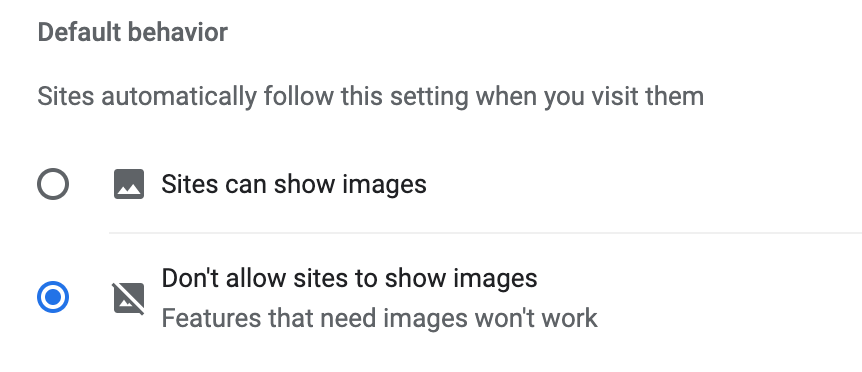
Image alt text is also helpful to people living with sensory or cognitive processing disabilities.
It’s also not uncommon for Mac users to rely on accessibility tools, browser privacy settings or a VPN for Mac to minimize distractions and improve their browsing experience..
So by prioritizing accessibility, your designs can effectively reach everyone.
Did you know? Venngage offers a free PDF accessibility checker that helps you ensure your documents meet essential accessibility standards? With this handy tool, you can quickly identify and fix potential barriers, making your PDFs more inclusive for all users!
Improves image SEO
Looking to drive organic traffic to a website?
If so, you need to provide image alt text. Google’s search engine algorithm uses alt tags to understand, index and rank content.
Think this only applies to Image Searches?
Not quite.
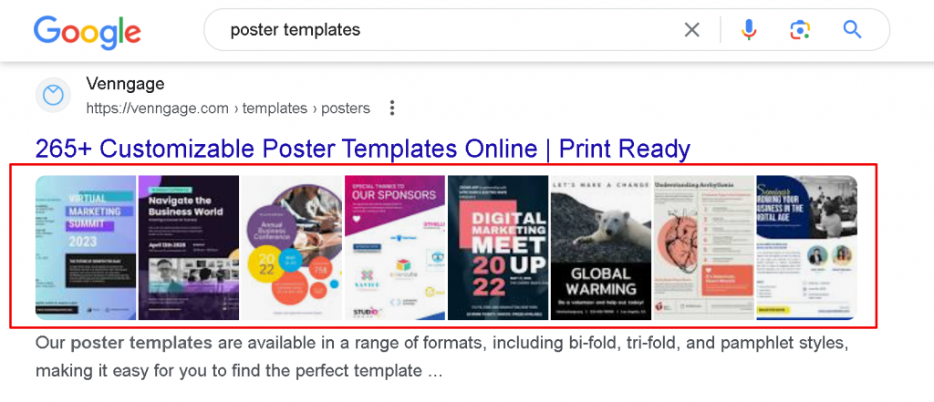
Since Google knows how engaging visuals are, its search engine prioritizes them by displaying image packs (i.e. horizontal rows of linked images) on the first page.
For example, if I search for poster templates on Google, images of Venngage templates show up directly below the blog post — an enticing visual display made possible by image alt text.
By adding alt tags, you’ll be doing yourself, your site and the search engines a solid.
How to write alt text (best practices)
How to write image alt text is a question that comes up often.
The easiest way to write good image alt text is to pretend you need to describe an image to someone over the phone.
Ask yourself what do they need to know about the visual? What context could aid their understanding?
In other words, the alt text should provide information that’s:
- functional`
- informative
- contextual
- focused
Remember your primary job is to describe the 1) content and provide 2) context in a concise manner.
Your alt description — and the amount of details it covers — will change based on where a visual appears and its purpose in your design.
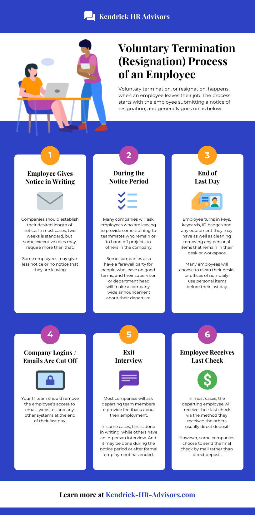
Consider the following image:

Depending on the context of where it appears, the image will be described differently.
For example, let’s imagine a few scenarios of how alt text for this image may vary:
- On a webpage with a recipe for this dish. In this case, the alt text should identify the dish by name, describe its components, and how it looks (e.g. “A stack of three pancakes drizzled with maple syrup, topped with a whole strawberry, two blueberries and a dollop of whipped cream on a round blue plate”).
- In an ad for a diner. In this scenario, you’d need to include information about the restaurant, the dish name, and details about its appearance and components (e.g. Egg & Co’s Pancake Special featuring a stack of three griddle pancakes drizzled with maple syrup and topped with fresh blueberries, strawberries and a dollop of whipped cream on a round blue plate).
- On a branded website advertising artisanal flour. Here, your alt text should include a more focused description of the product for sale (e.g. “A stack of pancakes made with stone-ground cracked wheat flour are drizzled with maple syrup and topped with fresh fruit and whipped cream”).
So far, so good? Let’s get into the particulars…
Pure text images
Because images of text are a potential barrier to accessibility, it’s always better to use actual text (rather than an image of text) when including important information in a design.
If you are using an image of text, write the alt text as it appears.

For example, the image of the “informational” block above should also have alt text that repeats the same text.
“Writing alt text? Ensure that any images of text are transcribed exactly as they appear. No need to include “An image of text that reads…”; a screen reader will automatically identify the element as an image.“
Charts
Some visuals contain large amounts of data.
WCAG defines these as complex images and includes data visualization infographics, charts, graphs, tables, and maps.
Here’s an example of a complex image:

For people just learning about alt text, these types of data visualizations can be confusing.
But there’s no need to get overwhelmed. Just let the context determine the level of detail to include in your alt text.
Image alt text for charts and graphs
Let’s say you have this flowchart in your design.

Do you need to include every single word to create accessible alt text?
Not necessarily.
In this article, the graphic is an example of a complex image so it’s not necessary to have the alt text describe everything.
This is called short alt text.
Short alt text provides a simple description of visual elements that display complex information.
Use short alt text when you want to tell the reader what a piece of visual content and don’t need them to understand the finer details.
In the example above, the short alt text might read: “A flowchart titled ‘Should You Rent or Buy?'”
However, if this image was used in an article about the pros and cons of owning properties, a descriptive alt text would be necessary.
This is known as long alt text. Long alt text provides all the details necessary for a person living with a disability to understand the entire information included in visual content.
A long alt text for this image might look like:
“Flowchart titled ‘Should You Rent or Buy?’ The starting box contains the question ‘Are you planning to stay for more than 5 years?’, with two subsequent boxes: ‘Are you are a financially stable position?’ and ‘Can your budget handle mortgage, taxes, maintenance and other costs?’ Possible answers to all questions are either ‘yes’ and ‘no’; all flows end in a box either marked ‘Rent’ or ‘Buy’. Flows ending in ‘Rent’: 1. Are you planning to stay for more than 5 years? Yes; Are you at a financially stable position? No. 2. Are you planning to stay for more than 5 years? No; Can your budget handle mortgage, etc.? No. 3. Are you planning to stay for more than 5 years? Yes; Are you at a financially stable position? Yes; Can your budget handle mortgage, etc.? No. Flows ending in ‘Buy’: 1. Are you planning to stay for more than 5 years? Yes; Are you at a financially stable position? Yes; Can your budget handle mortgage, etc.? Yes. 2. Are you planning to stay for more than 5 years? No; Can your budget handle mortgage, etc.? Yes.”
As you can see (err, read), these descriptions can get…well… long so try to be as succinct as possible.
Let’s take a look at another example.
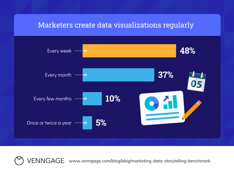
In this bar chart comparing the frequency with which marketers create data visualizations, the long alt text description should include the data and any meaningful context relating to what the chart represents.
A good long alt text description might read something like this:
“A bar chart titled ‘Marketers create data visualizations regularly’. Most (48% of) marketers create data visualizations every week. Next is 37% of marketers, creating every month. The second lowest is 10% of marketers creating every few months; and only 5% of marketers create once or twice a year.”
Image alt text for infographics
Infographics are another example of a complex image because they can include all of the above.
But what does that mean when it comes to alt text?
Again, it depends on the context. Let’s use the infographic below as an example.

To write infographic alt text, the first step is to define the context. Here, it serves the purpose of showing an example of how to write alt text, so we can get away with using short alt text (i.e. “Infographic template titled ‘How the Heart Works'”).
However, if this image was a PNG file in a blog about cardiovascular disease, you’d need to write long alt text that describes every component.
“Infographic titled ‘How the Heart Works’. In order for the heart to function properly, the four chambers of the heart and valves must operate in a highly-organized manner. Highly organized contractions of the four valves allow the heart to pump blood in a regular way. The circulatory system of the human body is attached to the heart and color-coded in red and blue. The Right side of the heart is blue and contains the Right Atrium above the Right Ventricle, and between them is the Tricuspid Valve. The left side of the heart is in red and contains the Left Atrium above the Left Ventricle…” etc.
Note that the long alt text description includes the text content in this scenario because its shown an image file within a blog. If your infographic is a PDF or HTML file, you don’t have to re-write text!
Still, it’s tedious. I get it. But…there’s a solution!
With Venngage’s Accessible editor (available for paid plans currently), you can create your own accessible infographics (or any other visual, for that matter) in minutes, and streamline the image alt tagging process to boot.
All images within your design get an alt text description field, so you don’t need to worry about adding them manually. The editor also automatically labels icons as decorative to save you time, and a built-in accessibility checker ensures everything — from your color palettes, to your title tags — are up to code.
Accessibility, check!
Related: Learn how to tag and add alt text to elements in your design
Alt text tips
Be concise and use plain language
This is not the time for long-winded sentences and flowery descriptions! Be as straightforward as possible to accurately describe what you’re seeing.

For example, the alt text for this poster template does not need to go in-depth about the heart or peace symbol.
Since the purpose of the poster is to promote peace, a good alt text can be brief. For example, you could say something like:
“Heart and peace symbol illustrations to promote peace and stop the war in Ukraine.”
Be mindful of grammar and spelling
You can enhance the screen reader experience by writing in complete sentences and using proper grammar.
That means…
- capitalizing the first letter in a sentence
- ending sentences with a period
- avoiding abbreviations
- using correct spelling
Test things out when in doubt
Unsure whether your image alt text is sufficient?
Use a screen reader (or another accessibility application, such as Venngage’s Accessible Design Tool) to test your alt text and make sure it’s an accurate, succinct description.
Don’t start alt text with redundant phrases
Adding descriptions like “Image/Picture of ___” is unnecessary (read: annoying) as screen readers will automatically announce an image as such.
Don’t make assumptions
Describe, don’t editorialize.
Unless it’s necessary to add helpful context, making assumptions and inferences is unhelpful. Also, avoid guessing things like ethnicity, gender or what’s happening out-of-shot.
Don’t go keyword crazy
While alt text can help search engines understand content and designs, using keywords unnecessarily will cost you.
“Keyword stuffing” is an accessibility / SEO no-no as it hinders the experience of people using screen readers and you can be penalized as a result.
Do you need alt text for all images?
You should only add alt text to visual elements that convey important information in your design.
These include…
Decorative images
If your design features visuals purely for aesthetic value, it’s not necessary to add alt text.
In fact, doing so in these situations increases the risk of confusing the reader or cluttering the screen reader experience.
Dividers and background images are common examples of decorative images. Take this yellow trivia night poster template:
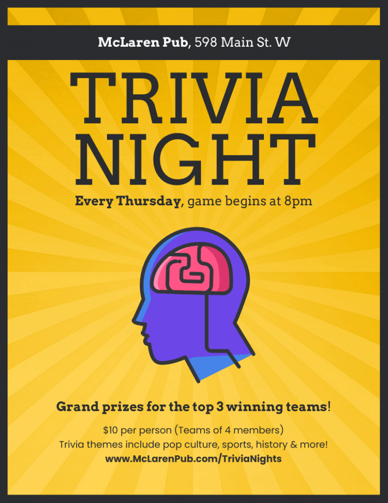
The image of a person and the brain in this poster does not add context or convey meaning — so don’t bother wasting words!
(Most) icons
Being redundant is another faux pas when it comes to alt text.
While icons can add visual interest, they usually don’t communicate anything new for the most part.
In the example above, alt text is not necessary for the icons since the meaning is described by text labels.
Note: There are a few exceptions to this rule.
When an icon is a button or a link, you should add alt text to convey functionality.

For example, each CTA icon in the employee newsletter template above would require an alt text.
It’s also a good idea to add alt text to an icon if it contains descriptive information not written elsewhere such as a poster with a Twitter icon followed by a brand’s username to clarify which accounts. Here you could alt text that says something like “Find [Company] on Twitter”.
Images described by nearby text
Again, do your best to avoid redundancies.
There’s no need to repeat what’s already been said.
Frequently Asked Questions
How do I add alt text to a JPG?
You can add alt text to a JPG image in different ways depending on the document type and platform. To add alt text to a JPG in Microsoft Office/Windows, right-click the image, select Format Picture > Layout & Properties >Alt Text.
To add alt text to a JPG in a Google Workspace, right-click the image and select the “Alt Text.
To add alt text to a JPG in WordPress, click on the Image block to open the Image settings in the Block tab on the sidebar and fill in the alt text and title attribute space.
Finally, you can add alt text by editing the HTML code directly. To do so, implement the alt text as an attribute to the IMG tag by adding “alt=”[your alt text]”.
How do I get alt text from an image?
The easiest way to check an image for alt text is to right-click an image and select the “Inspect” option on Google Chrome. A pane displaying the page’s HTML will appear, and all you have to do is look for the “alt=” tag. What follows will be the image’s alt text description.
Alternatively, you can enable a screen reader (Window’s built-in Narrator can be accessed via the Start Menu’s search function; Mac’s VoiceOver Utility can be accessed via Finder) and hear the image’s alt description read aloud.
When you provide alt text for an image, you put audiences first
Designing for accessibility isn’t just good practice — it’s the right thing to do.
Accessible design guarantees everyone can understand your content and not be excluded. And providing alt text for visuals is an essential part of that effort.
I hope these tips help you create amazing, inclusive communications.
And remember to give Venngage’s Accessible Design Tool editor a try. Venngage lets you add alt text or mark visuals as decorative for screen readers to avoid in just a few clicks.


