


We all know visuals are a great way to simplify complex information and engage viewers. But if you haven’t designed for ALL folks, with ADA compliance in mind, your best intentions could end up alienating your audience and affecting your bottom line.
So today, I’ll discuss what the ADA Standards for Accessible Design are and how you can ensure your visual creations are compliant with four simple steps. You’ll also find tons of tips, templates and tools that make creating inclusive content a total no-brainer.
What is the ADA?
The ADA, short for the Americans with Disability Act, is a law that prohibits discrimination against individuals with disabilities in all areas of public life. Put simply, the act states places of public accommodation must be designed for accessibility, ensuring those with disabilities have the same rights and opportunities as everyone else.
The ADA was first signed into law in 1990, spurring the creation of the ADA Standards for Accessible Design in 1991. Since then, there have been some updates and expansions to the act.
In 2008, for example, the Americans with Disabilities Act Amendments Act (ADAAA) became effective, changing the definition of “disability” to cover a much broader range of individuals.
The ADA was last revised in 2010, setting forth new standards for accessibility. In other words, the 2010 ADA Standards for Accessible Design arrived.

When it comes to visual design specifically, these standards reflect the recommendations made in the Web Content Accessibility Guidelines (WCAG) 2.1.
The WCAG 2.1 is a document that defines accessibility standards and provides instructions for making digital content — such as colors and fonts — accessible to people with sensory impairments.
Related: Inclusive Design: Definitions, Principles & Examples
Why is it important to follow ADA guidelines when designing?
Following ADA guidelines is essential because it ensures your designs are accessible to those with disabilities, safeguards you against any legal ramifications stemming from non-compliance and creates a better user experience overall.
Let me explain:
You see, designing with ADA compliance in mind empowers everyone to interact with visual environments. This shows your entire audience they’re seen and supported by your organization, and removes barriers that would otherwise exist.
Our audiences are diverse, and it’s our duty to acknowledge and accommodate that.
Though the act was signed into law nearly three decades ago in an effort to enforce accommodations in physical spaces, many legislative bodies now consider businesses’ websites as extensions of public spaces.

As shown in this chart, more than 11,000 lawsuits were filed for ADA non-compliance in 2021. And over 2300 directly related to web design inaccessibility — a 14.3% increase from the previous year. increase from the previous year. That’s why the best eCommerce website designs are all ADA-compliant.
The bottom line? Your online designs and communications need to be accessible to as many people as possible if you want to guarantee compliance.

What’s more, accessible design choices make visual experiences better for everyone. Even those without disabilities benefit from more distinguishable, equitable designs.
And with inclusive visuals top-of-mind for consumers in 2023, you have every reason to start prioritizing accessibility.
When is ADA compliance required?
Again, it’s best practice to always design for ADA compliance in mind no matter what. But for good measure, let’s look at the specifics.
ADA compliance applies to organizations and businesses that fit one or more of the following criteria:
- All local, county, state and federal government agencies
- Any business that operates for the benefit of the public
- Private and not-for-profit companies with 15 or more employees
Even if you don’t fit the criteria above, you should still make ADA compliance a part of your visual creation and design process. Providing everyone in your potential audience with the same experiences and access to information is the right thing to do, plain and simple.
Now that you know just how important designing for accessibility is, let’s discuss how you can guarantee inclusivity in four easy steps.
How do you make sure your designs are accessible?
If you’ve taken a look at the ADA Standards for Accessible Design or the WCAG 2.1, you’ll know they contain a TON of information — a lot of which won’t apply to your creations.
So, I’ve simplified all of the above with four design tips you can use to make your visual communications ADA-compliant:
Ensure sufficient color contrast for improved readability
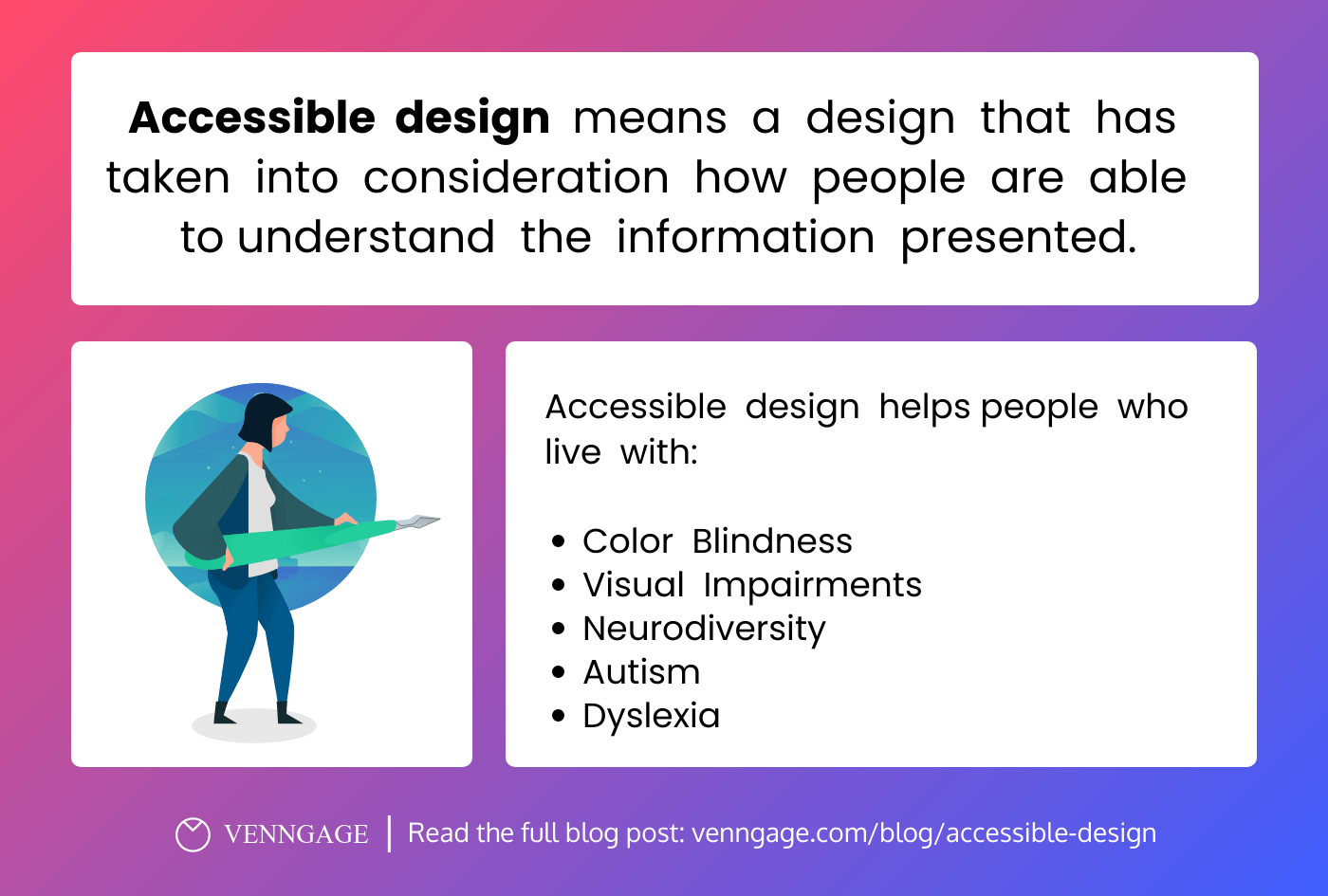
Those of us with normal vision often take for granted the rich perceptual experiences we’re exposed to every day. But for the 360 million+ individuals with color vision deficiencies, understanding visual information becomes a whole lot more complicated.
To ensure “colorblind” individuals can interpret your creations, the color contrast between any layered objects in your designs — i.e. text or icons on a background — has to be high enough so each element is clearly distinguishable from each other.
This value is referred to as the color contrast ratio.
Without a high enough contrast ratio, your designs will not be legible, readable or usable to those with impaired color vision.
You can imagine how frustrating it would be to read a page with incomprehensible text, or to figure out what fillable form field to edit when the error is not clearly specified. That’s the reality many folks have to deal with when faced with inaccessible designs.
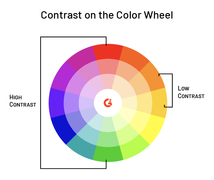
So, what is the golden ratio?
Well, the WCAG 2.1 states color pairings with a contrast ratio of 4.5:1 and above provide sufficient accessibility for use in normal text, large text and graphics.
Here’s an accessible infographic that follows a contrast ratio of 4.5:1.

Same goes for this presentation template:

Wondering how to find accessible color pairings to use in your designs? Here are two ways you can go about it quickly and easily…
How to choose accessible colors
The easiest way to create accessible designs with sufficient color contrast ratios is to use Venngage’s pre-made accessible templates in our intuitive visual editor. All the templates in this category follow accessible design best practices — simply swap out the text and icons for your own, and you’re good to go!
Our accessible editor (available for paid plans currently) also has a built-in Contrast Checker for peace of mind, as well as a Visual Simulator tool that simulates the experience those with visual impairments would have looking at your design.
Looking for colors you can use on any design platform or application?

Venngage’s 100% free Accessible Color Palette Generator generates a range of beautiful, compliant color pairings you can take anywhere. You can either randomize your selection, or input a specific HEX code to generate eight inclusive palettes based on a pre-existing hue.
For a deep dive on the topic of color accessibility, check out:
- A Total Guide to Accessible Colors [Including Palettes & Templates]
- Color Blind Design Guidelines: How to Convey Meaning to Everyone [With Examples & Templates]
- How to Use Color Blind Friendly Palettes to Make Your Charts Accessible
Incorporate approachable fonts
Just like color, your font choice greatly impacts the readability and legibility of your designs. That’s why accessibility best practices call for using font sizes and stylings that accommodate all viewers.
Not only do these decisions determine if a visually-impaired individual can understand your designs, but they also prevent those with normal vision from having a bad user experience. Not to mention headaches and eye strain!
The WCAG 2.1 recommends making sure users can zoom in to make text 200% larger. Though this recommendation applies to websites rather than visual communications at large, your reports, brochures and infographics can all benefit from following this advice…
In terms of font size, it’s not hard to understand why overly small text will cause significant problems for many potential viewers, disabled or not — especially those with limited literacy skills, poor vision and older adults. So to avoid that, use fonts no smaller than 12 points (or 16 pixels) for any body text.

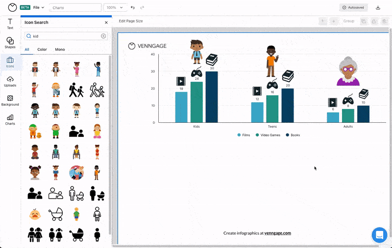
The infographic above follows this advice. (How meta, huh?)
When you think about it, it’s pure common sense. Imagine you chances of reaching viewers effectively if your poster or print ad contained tiny text — i.e. going from this:

To this:
You laugh now. But seriously, put yourself in viewers’ shoes when designing any visual assets.
What about the style of font? Well, you should know the US Department of Health & Human Services (HHS) recommends using sans serif fonts (such as Arial or Tahoma) since they’re the standard choice for web designs. Thus, they’re far more familiar and easier for viewers to comprehend.
Now of course, take this with a grain of salt. You don’t have to limit yourself entirely to the sans serif world; neither the ADA and WCAG have concrete instructions, and doing so would drastically hamper your creative options. But when in doubt, and especially when it comes to body text, try your best to design as accessibly as possible.
Check the infographic below for more advice on how to choose accessible fonts:

You can also read the article Accessible Fonts: What They Are and How to Pick the Right One for Your Design for more information.
Highlight key content with negative space
Negative space, also known as white space, is the space between text, images, buttons and other objects that users can see on a page or a screen. When it comes to accessibility, negative space helps signify important content, enhance text and reduce clutter.
Here’s a newsletter template that uses negative space to highlight a promotion:

By directing viewers’ eyes to the main focus of a design, negative space helps people navigate a visual creation more easily and digest the content as the designer intended. This reinforces the visual hierarchy, or flow, of information.
While this is a positive for anyone interacting with your design (one only needs to consider how annoying it is when faced with a wall of text!), those with cognitive and learning disabilities particularly benefit. That’s because negative space is proven to ease reading difficulties and enhance these groups’ overall comprehension of content.
Moral of the story? Make sure to break down large chunks of texts and create space between elements to allow your design elements to breathe.
Here’s another infographic template you can use with lots of negative space:

IMPORTANT NOTE: Incorporating negative space does not necessarily using only white to break up your elements. Negative space can be any color, pattern, texture, or even a background image, so long as it functions to bring important elements and content to the forefront.
So get creative with it!

Learn more about using negative / white space in your designs:
Don’t forget to add image alt text
Last but certainly not least, make sure to add image alt text to all your digital designs.
Also known as alternative text, alt tags, alt descriptions or alt attributes, image alt text is a key component of accessible design that allows those with visual disabilities (or different access needs) to understand the 1) content and 2) context of non-text elements by using a screen reader.
So to ensure your content is capable of communicating meaning effectively to all, you need to include image alt text.
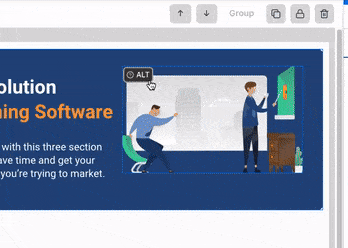
All you need to do to write great alt text is to imagine you are describing an image to someone over the phone. Keep in mind that depending on the image’s purpose and the context it appears in, the image should be described differently.
Read our blog Image Alt Text: Definition and Best Practices for Accessible Designs to get all the details you need to write excellent alt image tags.
Did you know that Venngage has a free PDF accessibility checker? This tool can help you find and fix accessibility issues in your documents in no time to ensure they are easy for everyone to read!
Adding alt text to your designs is easy with Venngage
With Venngage’s Accessible editor, you can create accessible visuals in minutes, and streamline the image alt tagging process too.
All graphic elements are assigned an alt text description field, so you never need to worry about adding them manually.
The editor also automatically labels icons as decorative to save you time, and a built-in accessibility checker ensures everything — from your colors to your title tags — are up to code.
Accessible n’ easy, yes Please-y!
ADA Standards for Accessible Design FAQ
Is ADA compliance mandatory?
ADA compliance is mandatory for all businesses with more than 15 employees, or those that benefit the public. Organizations must comply with the ADA by making reasonable modifications to policies, practices, and procedures, as well as providing accessible features and services to the disabled community. Failure to comply with the ADA can result in legal action against the organization, including fines, penalties and other legal repercussions.
What is the most current ADA code?
The Americans with Disabilities Act (ADA) was most recently updated in 2010. The 2010 Standards for Accessible Design provide a range of guidelines for making public spaces and buildings accessible for people with disabilities. These guidelines include requirements for accessible parking, ramps, elevators, and entrances, as well as accessible communications, signage, and other elements.
What are accessibility best practices?
Accessibility best practices for designs and visuals should focus on making sure that all users can interact with your visual elements. This includes ensuring that all images, videos, audio, and other visuals are described with text alternatives, making sure text is legible and colors have sufficient contrast, and providing captions for audio and video.
Additionally, ensuring the design elements are keyboard accessible and the website is responsive to different screen sizes and devices is important.
Embrace ADA guidelines in 2023
“Playing by the rules” might not be the first thing you think of when attempting to create great visuals. But if you fail to prioritize inclusivity, you’re sure to alienate — and frustrate — countless viewers that you can’t afford to lose.
By following these simple guidelines, I promise you’ll ace those accessibility best practices and satisfy the WCAG / ADA Standards for Accessible Design with no problem.
Want to streamline the process further? Sign up for Venngage today and get access to tons of accessible templates that are a breeze to customize using our best-in-class Accessible editor. From step-by-step guidance to a built-in accessibility checker, you’ll have total peace of mind and be ADA compliant in no time.


