


More than 360 million people in the world are color blind, with the condition being more prevalent in men than women — 8% of men and 0.5% of women worldwide have color vision deficiency.
Which means you’re risking alienating 360 million people — and your customers could be one of them — if you don’t take into account color blindness when designing your brand’s visual materials.
So how can you design for color blindness? Learn more in this comprehensive guide on color blind design guidelines for accessible content.
Click to jump ahead:
- What is color vision deficiency & how common is it?
- Types of color blindness
- How do you design for someone with color blindness?
- Color blind design tips
- Color blind design FAQs
What is color vision deficiency & how common is it?
The term color vision deficiency (CVD) is the more accurate descriptor for color blindness, and that’s because most people to whom the term “color blind” is applied can see some colors. So, they’re not literally color blind in the sense of not being able to see any colors, though for the purposes of this guide, we are using those terms interchangeably.
Color blindness is much more common in men than in women, and researchers estimate that about 360 million people (and counting!) are color blind, though many people who are color blind have no idea. After all, who’s to say what I think of as red is the same as what you think of as red?
Types of color blindness
There are three major types of color blindness, and knowing the science behind them can help you when thinking about designing for color blindness:
Red-green
Red-green color blindness, in which a person has difficulty distinguishing the color red from the color green, is the most common type, and there are four types of red-green color blindness:
- Deuteranomaly: Makes green look more red. This is the most common type of red-green color blindness.
- Protanomaly: Makes green look more red.
- Protanopia: Unable to distinguish red and green.
- Deuteranopia: Unable to distinguish red and green.
Blue-yellow
The less common type of CVD, blue-yellow color blindness makes it difficult to tell blue from green and yellow from red, and there are two types of this form of color blindness:
- Tritanomaly: Makes it hard to tell between blue and green or yellow and red.
- Tritanopia: Unable to see the difference between blue and green, purple and red, or yellow and pink, and also makes colors appear less bright than they are.
Complete color blindness
Also called monochromacy, total color blindness is quite rare, affecting about 1 in 33,000 people (vs. about 1 in 12 men for CVD in general).
How do you design for someone with color blindness?
While several products have been released in recent years to help correct for color blindness, including color-correcting glasses and contact lenses, inherited color blindness cannot be cured. That’s why it’s so important for designers to understand how to account for this in their work.
This illustration shows how people with various types of color blindness perceive shades differently from those with normal vision:

As you can see from the illustration, there’s no one-size-fits-all color-based solution for designing for people with CVD. That’s why it’s important to use design principles other than color, including:
- Shape
- Size
- Proximity
- Pattern
- White space
Color blind design tips
Designing with color blindness in mind isn’t as simple as just using black and while — color blindness can also affect people’s ability to see hues and shades of colors. The best news? These tips will make your work more accessible to everyone, not just those with color vision deficiency.
Use more than one technique at a time
Don’t rely only on color to convey information. Think about a stop sign; yes, it’s red, and for most people, that grabs attention immediately. But it’s also a unique shape and it says the word “STOP” in big letters. The combination of those three factors make stop signs color blind-friendly.

This screenshot from DOTS shows how the game’s designers created a color blind mode where simple shapes were added to the colors, allowing people with CVD to enjoy the game like their color-seeing counterparts.

Keep it simple
Using as few colors as possible gives you fewer elements to keep in check, and it also has the added benefit of being simpler for you as a designer, as you have a smaller palette to choose from. And keep the design itself from being overly complex.
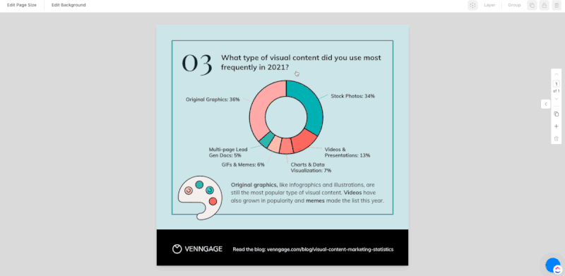
The simple color palette, combined with large text and iconography, makes this infographic ideal for people with color blindness, even though the primary color is red, which shows how effective simple design can be for those with CVD.

Pattern is your friend
In situations where you can’t layer in many types of techniques to distinguish items or point out contrasts, consider patterns. Applying a simple but easily distinguishable pattern to, say, a bar graph can do wonders not just for those with CVD.
With Venngage’s accessible editor, it’s easy to add patterns to a chart. Take this template as an example:

When you edit this template in Venngage, you have the option to edit it with the regular editor or the accessible one. We’ll choose the accessible editor:

In the editor, you can click on “Accessibility” (button on the top left corner). The Accessibility panel will appear on the right.
If you click on “Simulator”, you can view the template under different color blindness filters — and here you can see that it could be difficult for people with tritanopia (blue-yellow color blindness) to distinguish the each donut slice from another:

To remedy this, we can add some patterns to the donut chart. Simply double click the chart to show the Chart Editor panel. Next, click “Setup” and you can choose to add patterns to the chart by toggle the button “Show patterns”:
Avoid certain color combinations
As we’ve discussed, CVD comes in many types, so there is no single color to use or to avoid, but there are some color combinations that make it notoriously difficult for people with color blindness to identify, particularly when those colors are placed in close proximity:
- Red & green
- Blue & purple
- Blue & gray
- Green & brown
- Green & blue
- Green & black
You can use a color blind friendly palette to guarantee that your design uses accessible colors. Here are some examples:

Use contrast
Most of the combos listed above are there because the colors are too similar, so if you’re really set on using, say, blue and purple in your design, be sure to use shades that are very different from one another.
Take this template as an example. There’s enough contrast among the three columns and between the bar chart and the background that it’d easy for people with color vision deficiency to understand the chart:

The WCAG 2.1 recommends a minimum color contrast ratio of 4.5:1 to make sure text and interactive elements meet the needs of colorblind or visually impaired users.
Labels can help
I’m not usually the one to call for more text on your designs, but labels are the exception. Say you have a bar graph with so many points that using different patterns to aid readers with CVD, consider whether you can label each bar, which will make your data unmistakable.

Related: ADA Standards for Accessible Design: How to Be Compliant
Color blind design FAQs
Do you have more questions about designing for people with color blindness? We’ve got answers.
Which colors are color blind-friendly?
While there aren’t really any colors that are totally color-blind friendly, palettes relying on blue may be the most color blind-friendly, as blue-yellow color blindness is pretty rare. Color blind design is more often about avoiding combinations that are difficult for people with color blindness, including red and green, green and brown, green and blue, blue and gray, blue and purple, green and gray, and black and gray.
What colors do color blind people not see?
Red-green color blindness is the most common type of color vision deficiency, though it’s not exactly right to say people with this type of impairment can’t see red or green. It’s more likely they have trouble telling one from the other.
In summary: Accessible design is truly the least you can do, and creating color blind-friendly materials can help you achieve accessibility for all
Color blindness is far more common than the average person realizes, and many people with color vision deficiencies aren’t even aware of it. The good news is that many of the techniques that can help make your designs accessible to those with color blindness can also make them easier to understand for your entire audience.
To make sure your designs are accessible, you can use the Venngage editor to check for accessibility. Simply choose a template tagged with “Accessible” and start using the accessible editor. It’s free to get started.


