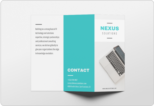
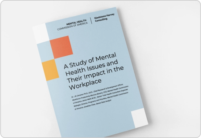
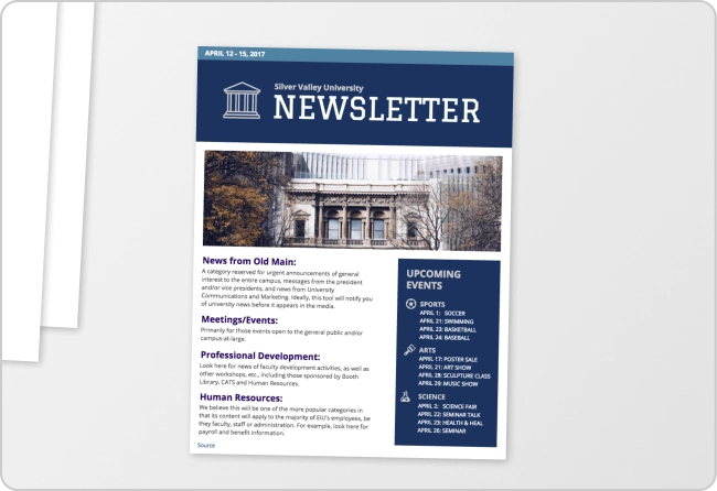
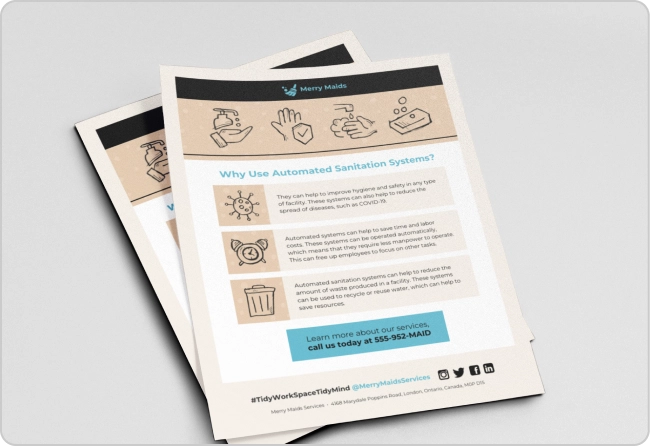
Prioritizing the use of negative space in your design can help you engage users and audiences more effectively.
With this post, we will provide you with tips on how to apply and maximize negative space in your designs, with examples from Venngage’s Templates.
Click to jump ahead:
- What is negative space?
- What is the importance of negative space?
- 5 negative space examples in different fields of design
- 5 tips on how to apply negative space in your designs
- FAQs about negative space
What is negative space?
The term negative space or white space refers to the blank areas or empty spaces in your design. It’s one of the 13 basic design principles.
Everything from the spaces between lines of text in a blog post, to the bare spots in a graphic illustration or the vacant areas on the sides of a webpage, is considered negative space.
Negative space does not need to be plain or hollow. It can be in any color or have patterns and textures. In this example, negative space is in the form of a background pattern:
Negative space is there to frame, organize and highlight elements in your design so your content can be more attractive, easier to read and drive more interaction.
Negative space vs. positive space: what’s the difference?
You now know that negative space is an area that does not contain any content or design element.
By that definition, positive space refers to all the areas taken up by the visible parts of your design, which in the example above is the main image of the poster and all the text (copy) surrounding it.
Positive space holds the subject or main focus of your design while negative space supports the entire composition of your design.
Both positive and negative space is needed to make a design whole and functional.
What is the importance of negative space?
There are many advantages to applying negative space in your design, which is why it is a vital element in all forms of design. Negative space can be used to:
- Improve the flow of content to effectively guide audiences and users
- Format content to make text more readable (combined with alignment)
- Establish relationships between elements through proximity (or lack of proximity)
- Aid navigation and prompt user interaction by making text and buttons stand out
- Draw attention to important elements and content
- Add contrast and create balance in your design
- Elevate your design and make it more visually appealing
Using the right amount of negative space is important in creating a nice design. But how much is enough? Check out the answer in our blog: 11 Actionable Graphic Design Tips for Beginners, According to Design Experts
5 negative space examples in different fields of design
To better demonstrate the role that negative space plays in design, here are some examples of its application in different fields of design:
Web design
In this website design, negative space was used to make the headlines, images, and various shapes and icons more prominent.
You can see instances of negative space being used on home pages, landing pages and more. Here’s an example of a landing page design that makes good use of white space to leave some breathing room in between design and content elements:
It was also used to arrange different parts of the content into seamlessly connected sections and make the buttons and navigation more prominent.
Because the elements are separated neatly and coherently, the website just flows more naturally and looks more pleasing to the eyes, showing how negative space can make all the difference in your design.
UI design
When it comes to user interface or UI design, applying negative space can help you provide users with the best experience of your web or mobile app.
Negative space is a major contributing factor in the responsiveness and scannability of a web app. Even at the wireframe stage, it is already part of the plan for the design to simulate the best way to layout and present content, like in this example:
For mobile app design, applying negative space can help you put the focus on your core features so users will be able to use your app the way you intended.
Here’s an example of how negative spaces in a mobile app interface design can put emphasis on buttons and CTAs and help guide users in performing different actions:
Graphic design
There are various ways in which negative space is used for graphic design. Negative space can make different design elements pop and grab the viewer’s attention instantly, like how it was used in this poster:
Moreover, even though the poster used many shapes and colors, the design doesn’t look busy or cluttered because it is surrounded by negative space.
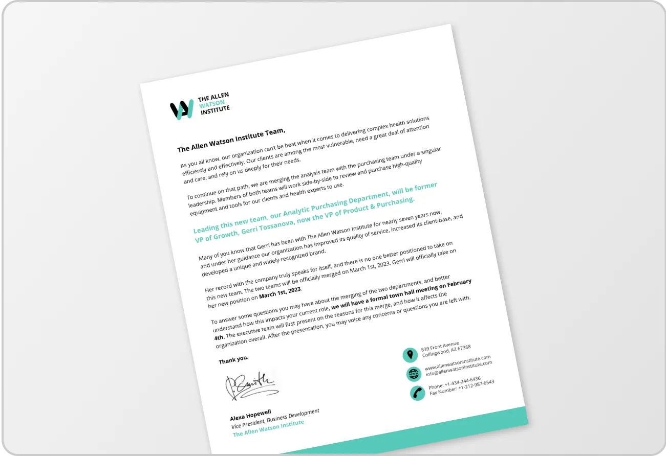
Another benefit of the use of negative space in graphic design is making text easier to read and understand.
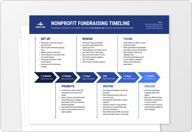
As you can see in this infographic, the content is long but it doesn’t overwhelm the reader with too much information at once. This is because negative space was used to distribute text evenly and introduce one idea at a time (click to see the full infographic):
5 tips on how to apply negative space in your designs
Here are some tips to help you enhance your designs using negative space:
Use the principles of visual hierarchy
Visual hierarchy involves the arrangement of design elements by order of importance.
Remembering this principle when designing and applying negative space can help you create a hierarchy of information and lead viewers to the right path. (Repetition is useful here too!)
One way of applying visual hierarchy is through the Z-layout. The Z-layout is one of the most popular web design layouts because it reflects people’s natural scanning habits.
When scanning content, our eyes tend to follow a ‘Z pattern.’ First we look at the top left of the page then move horizontally to the top right, then our eyes drop down to the center of the page and then proceed from the bottom left to the bottom right.
This is an example of a website design with a Z-layout. As you can see, the navigation bar is at the top so it is the first thing that viewers will see, while key elements like the headline and CTA buttons are in the middle:
Apply logical grouping
The concept of logical grouping means clustering elements that go together or are related so the composition will make logical sense.
In web design, navigation links are always grouped together, while for content, paragraphs are used to compile similar ideas.
Using negative space can help you group elements and content logically so viewers can easily interpret the information presented before them.
Here, for example, the product images are positioned alongside buyer reviews with the CTA buttons placed below in order to create customer interest and drive viewers to place a purchase:
Mind your spacing and margins for text
Applying negative space when formatting content can provide breathing room for viewers upon reading your content.
This not only promotes comprehension by increasing readability and legibility but also makes text easier on the eyes.
Make sure that paragraph column widths and margins are not too wide and allow plenty of space on the left and right margins of the page.
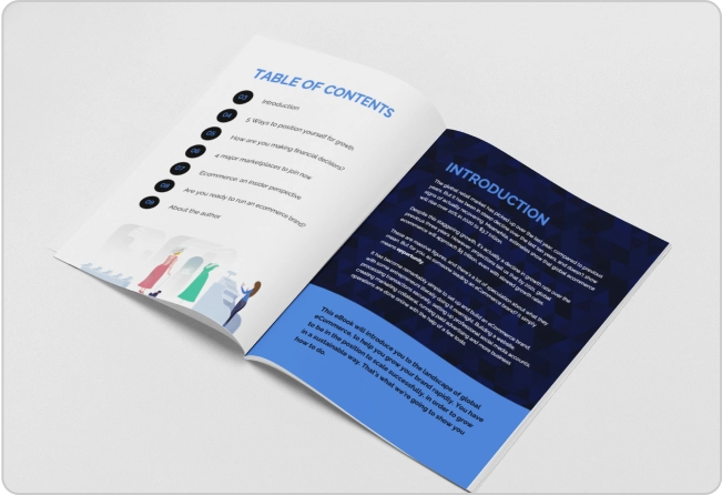
Add margins and gutters between image grids (like in photography portfolios) as well to improve the page layout. Here is an example
Use micro and macro white space
The use of negative space can be classified either by size or functionality. Micro and macro white space focuses on the former.
Micro white space covers the small spaces between different elements in a group. This includes the spaces between lines of text, image grids, and buttons.
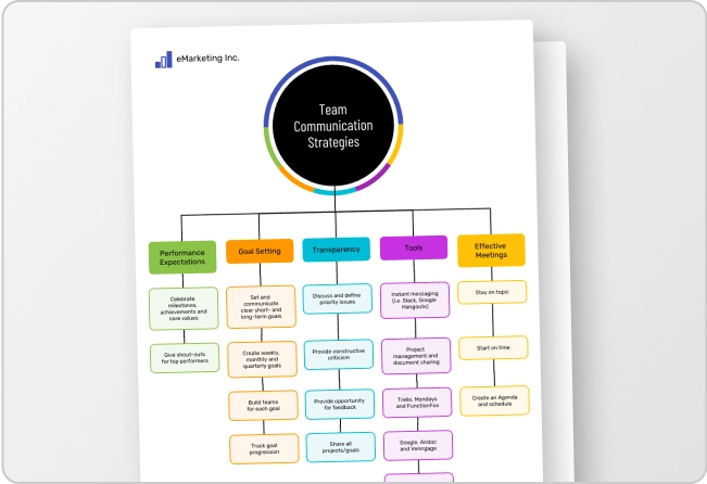
Meanwhile, macro white space is the empty space that stretches across the entire page. It surrounds all individual elements and is responsible for dividing content blocks.
For example, the whole main content area in this webpage is the macro white space, while the micro white space is found between navigation links and the lines of text for the headline and copy.
Maximizing micro and macro white space in your design can help you arrange elements seamlessly and produce a well-organized design.
Related: Using White Space in Design: A Complete Guide
Create contrast to achieve visual balance
Creating contrast is a great way to promote balance and visual interest in your design.
Using negative space to create contrast can help you make certain elements stand out and ensure that the correct proportion of design elements and empty spaces is clearly visible.
You can create contrast by placing a small object against a big plain background to draw focus to it or by using colors to emphasize the difference between two or more elements.
In this example, negative space in the form of a white background is used in contrast to the main subject in a grayscale display:
FAQs about negative space
What does negative space mean?
Negative space means the space between or around elements in a design composition. As one of the most essential elements that make up a design, it is a term that a UI or graphic designer is most familiar with.
What are negative space and positive space?
Negative space is the space outside any object in your design while positive space is the space allotted for all elements and content. Both negative and positive space must go hand in hand to make a design work.
How do you use negative space?
Negative space is used in a variety of ways. These include breaking up blocks of text to make content more readable, highlighting images, buttons, and other elements in a design, and improving the overall look and unity of a design.
Negative space is an important building block that enhances and completes a design
Using negative space can help you optimize designs for your audiences and users. Use Venngage’s Templates to help prioritize negative space in your design projects.


