As a design principle, unity is unique.
It doesn’t come with strict rules or defined guidelines. Rather, it unites all the other design principles within a composition to create a cohesive whole.
But backing up for a second here, why should you care?
Well, if you need to design your own business communications, understanding unity and the principles it encompasses can be a big help. With a basic grasp of the unity design principle, you can take your documents from underwhelming to over the top impressive.
And rest assured, you don’t need to be a graphic designer to grasp this concept. I’ll explain it in plain, practical English with lots of examples and tips to help you kick your communications up a notch. Here it goes!
Click to jump ahead:
- What is unity as a design principle?
- Conceptual unity vs. visual unity
- Why is unity effective in design?
- How is unity applied in design?
- Tips on applying unity in design
- FAQs on the principles of design
What is unity as a design principle?
Unity is all about creating harmony in your designs. It involves using harmonious colors, shapes and textures, balancing positive and negative space, and playing with repetition, proximity and alignment.
All of these principles come together like puzzle pieces to form a beautiful picture.

It’s worth noting, unity or harmony doesn’t mean a design is perfectly balanced (read: boring). An asymmetrical or seemingly random design can still feel harmonious, provided the elements you choose complement each other. You can also pair variety with repetition to achieve unity in a design.
If you’re scratching your head right about now, don’t worry — I’ll dig into all of these concepts in more depth a little later on!
But to give you a quick taste of what unity looks like, here’s an example of a professionally designed Venngage template:
As you can see, there are many elements in this design — a header, images, colors, icons, motifs, text and a patterned background to boot. Yet all of these elements come together harmoniously.
How? For starters, each element adheres to a key theme and message. You could say this infographic achieves both conceptual and visual unity…
Conceptual unity vs. visual unity
Simply put, conceptual unity has to do with content elements, while visual unity relates to design elements (i.e. it’s the principle discussed in this article!).
The term “conceptual unity” applies more to user experience design — it involves thinking about how to present content in a logical and streamlined way to users. That said, the premise here can apply to visual design too. According to Bogdan Sandu from Design Your Way, conceptual unity is what separates visually appealing designs from truly effective ones. “When structure, content, and visuals follow the same underlying logic, users don’t have to think about how to navigate. It just feels intuitive,” he explains, noting that unified design systems consistently improve clarity and engagement.
For instance, if you’re making an infographic, you’ll want to think through how to present the information in the most logical and cohesive way possible. In other words, in a conceptually unified manner.
Here’s an example of an infographic with minimal content and a clear message:
Notice how the content lines up with the visual elements in this design. Clearly, the designer considered both conceptual and visual unity. The end result is a cohesive, easy-to-understand infographic.
You can also achieve unity in more complex designs, like the example below. Despite the mix of real-life images and illustrative graphics, this infographic is cohesive since the key elements are all on theme.
Are you starting to see how design elements can work together to create a sense of oneness?
No worries, either way… I’m not done yet!
Here’s another example of a unified design. In this instance, the designer used similar shapes, colors and textures, and placed each element with care to create a visually pleasing, harmonious composition:
Pro-tip: if you’re struggling to achieve a cohesive feel in your designs, Venngage can help. Whether you’re making an infographic, presentation, business plan or any other form of visual communication, get a head start with a Venngage template.
Between a user-friendly, drag-and-drop interface and a vast selection of professionally designed templates, you’ll be creating unified designs in no time.
Just so you know, some of our templates are free to use and some require a small monthly fee. Sign up is always free, as is access to Venngage’s online drag-and-drop editor.
Why is unity effective in design?
So, now you know what unity is in graphic design. But maybe you’re wondering why unity is effective in design. Here are a few reasons:
- Unity is pleasing to the eye. It can help you catch and hold a viewer’s attention. When all the elements in a design work together to create a unified look, the end product is sure to delight and engage your audience.
- Unity can aid comprehension. Remember, to achieve unity, a design must follow other principles, like repetition, proximity and visual hierarchy. All of these principles aid comprehension. Repetition helps a viewer identify elements with ease. Proximity indicates which elements relate to each other. Hierarchy tells the viewer what’s most important. And so on. It follows that when you combine all these elements in a unified design, the resulting visual is easy to understand at a glance.
- Unity can highlight a key message. If a design is cohesive, any contrasting elements will stand out even better. This makes it easier to place emphasis on an important message. A viewer won’t be distracted by discordant elements or confused by lots of contrast. You can draw their eye to one key element, whether that’s through contrast or some other method of emphasis.
- Unity creates balance. What came first, unity or the design principle balance? An argument can be made either way but the result is the same: an effective design. When elements in a design are evenly distributed, the eye will flow from section to section in a logical manner, making the message even easier to understand.
- Unity promotes creativity. If you follow all the basic design principles — and thus achieve unity — you can do all sorts of things with a design. You can get creative and combine colors, shapes and textures in new and interesting ways. This can lead to even more eye-catching designs that promote information consumption and retention.
Did you notice all these benefits have something in common? They contribute to effective communication. By creating unified designs, you can help your audience better understand your message.
For example, the template below presents a lot of information, but it does so effectively by using just two colors, two typefaces and one illustration style. Because of these unifying elements, the information is cohesive and easily consumable.
Here’s another example of unity in action. Notice how similar shapes, icons and color groupings create a cohesive look that makes it easy for a viewer to read through the infographic and grasp its key points.
How is unity applied in design?
In many ways! You can apply unity to your designs by…
Choosing harmonious colors
Choosing harmonious colors is the most straightforward way to achieve unity. When all the colors in a design work together, it creates a natural sense of cohesion. Not to mention, an appealing aesthetic. If you’re not sure how to put together a harmonious palette, read up on picking colors here.
Using similar shapes
Just like with color, when all the shapes in a design jive, it creates a sense of unity. Take the template below. The squares and circles unify the design and make it easy for the audience to scan and digest the message. Note, the design principle at work here is repetition!
Adding complementary textures
In graphic design, texture refers to the perceived finish or feel of a surface. You can use images or patterns to evoke the feeling of texture in your designs. For example, an image of a bumpy oil painting can create the illusion of texture in a two dimensional design.
Again, when all the textures in your design work together, this contributes to unity. For instance, in the template below, the foreground elements are plain and smooth to balance out the texture of the patterned background. The patterned background also ensures the white space in this design isn’t overwhelming.
Placing elements with care
There are several design principles related to placement, including proximity, repetition and alignment. Of course, all of these principles contribute to unity.
Real quick, proximity is (you guessed it!) how near or far elements are from each other. Repetition refers to reusing elements strategically throughout a design. And alignment is all about how elements relate to each other (i.e. how they align).
Positive and negative space are also a factor when it comes to placing elements. Negative or white space is the breathing room around elements, while positive space is visually full. By balancing these two factors, you can ensure your composition isn’t too sparse, or on the flip side, too busy.
Here’s an example of a balanced composition: the hierarchy of information is clear, the elements are in logical groups, repetition makes the data easy to digest, the alignment is on point and the four leaf clovers ensure there isn’t too much white space at the top of the design. The end result? Unity.
As you can see, unity is closely tied to every design principle in the book! For more insights, be sure to check out our complete breakdown on the principles of design.
5 tips to apply unity in design
Basics, check! Now, let’s dig a little deeper into how to apply unity in design. Here are some more specific graphic design tips to help you get started:
1. Begin with a clear vision and purpose
First thing’s first, to achieve unity, you need to be clear on the purpose of your design. Before committing anything to screen or paper, make sure you figure out the key message you’re trying to convey. Otherwise, you risk sending mixed messages about the importance of different pieces of information.
I recommend creating an outline before getting started on a design. Just like with an article or report, an outline helps clarify all your key points and keeps you focused on what matters. In other words, this step can help with conceptual unity, in addition to visual unity.
2. Use proximity to establish connections between elements
As mentioned, proximity refers to the distance between elements, which tells us a lot about their relationship. When you group visual elements together, the mind automatically sees them as related. So by using proximity, you can guide the viewer to certain conclusions.
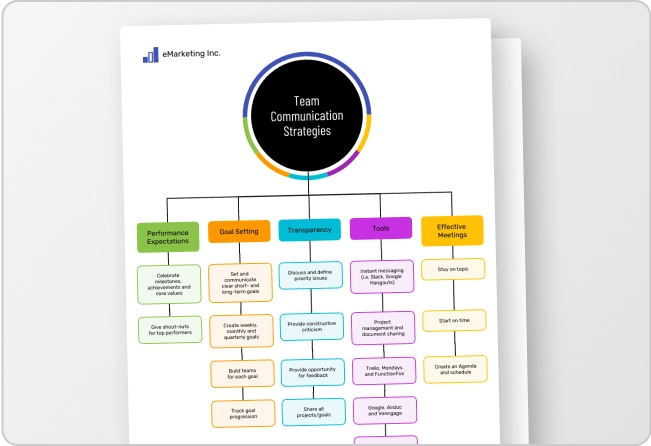
Take this simple mind map template, for example. The relationship between topics is easy to take in at a glance because of the proximity between each branch and sub-branch:
3. Align your elements or sections
In addition to proximity, alignment helps establish relationships between parts of your design. For instance, if two separate paragraphs align on an axis, it implies those words belong to a single section. If another paragraph aligns on a different axis, that information represents a different thought.
Alignment also ensures your final design is neat and tidy. You can also go for a more carefree aesthetic by not aligning elements. Just make sure you’re consistent in your choices to achieve unity at the end of the day!
4. Make use of repetition
Repetition refers to reusing elements strategically throughout a design. (See what I did there?)
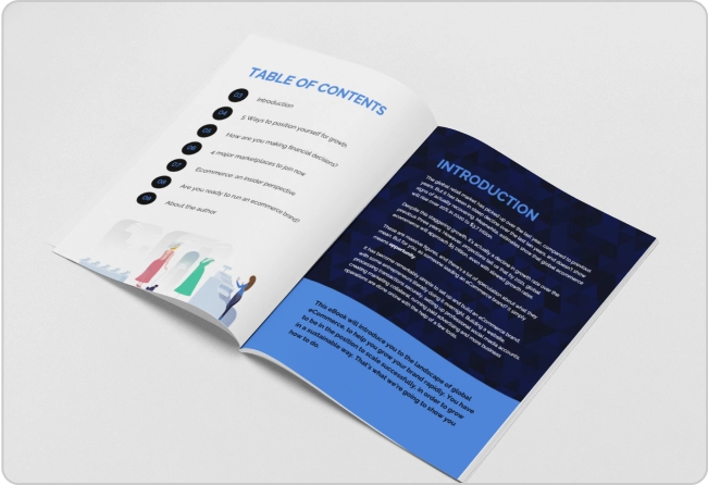
This principle is especially useful for large-scale or multi-page designs. Repetitive elements (i.e. shapes and symbols that appear across different pages or parts of a visual) can tie separate sections together.
Repetition signals to the viewer that each page or section is a part of the whole… which, of course, supports unity!
5. Experiment with different techniques
There are many more design principles you can experiment with to achieve unity, like rhythm, movement and balance.
Rhythm and movement go hand in hand — these techniques create visual energy by suggesting action. For instance, you might alternate between colors to create a rhythm, or use a dotted line to move the eye through a design.
When it comes to balance, you might use symmetry for more formal communications. Or, you might opt for an asymmetrical balance to increase visual interest.
Just remember, every piece of your design should support your main message. So don’t add elements just for the sake of adding them. Use each element and principle with purpose, and you’ll end up with a unified design, like this one:
FAQs on the principles of design
What are the seven principles in design?
The seven most common principles of design are: unity (harmony), hierarchy, repetition, emphasis, alignment, contrast and balance. There are many more design principles to explore as well, like rhythm, movement and white space.
What are the seven elements of design?
The seven elements of design are shape, color, space, form, line, value, and texture. These are the building blocks of any design.
What is the difference between a principle and element in design?
A principle in design is a practice to follow in order to create a harmonious, unified design. On the other hand, an element is a piece of a design that forms the basis of a composition or image.
Create harmony and unity in your designs
Without unity, your designs may feel just a little off. Your business communications may be just a little confusing. Or, your data visualizations may be just a little hard to understand.
So it’s worth getting familiar with this unifying principle of design, and how you can use it to get your next project just right.
And hey, whatever that project may be, you don’t have to start from scratch! With Venngage’s selection of professionally designed templates, you can create visuals that are perfectly unified, every time.


