One of the great artists of the 20th century, Andrew Wyeth, once said, “It’s all in how you arrange the thing… the careful balance of the design is the motion.”
Wyeth was a master of the design principle balance. He knew exactly how to place his subjects on a canvas to achieve a desired effect.
A half century later, balance is still a key principle in art and graphic design. But rest assured, you don’t have to be a master of the arts or a graphic designer to understand and make use of it.
With a basic overview of the topic, you’ll be able to apply balance with purpose and create a sense of equilibrium in your designs. And the more visually pleasing your visual communications are, the more oohs and ahhs you’ll get!
So let’s get to it. Read on for an introduction to this principle, including how to strike the perfect balance in your designs.
Click to jump ahead:
- What is balance as a design principle?
- How is balance applied in design?
- Why is balance needed for an effective design?
- How to apply balance in design
- Tips for applying balance in your design
- FAQs on the balance principle of graphic design
What is balance as a design principle?
Balance is one of the key principles in design. It refers to the distribution and visual weight of elements in a composition. A well-balanced design is naturally pleasing to the eye and exudes a sense of equilibrium.
But don’t be fooled by the word “equilibrium”. A balanced design doesn’t necessarily mean every element is given equal weight. Rather, it simply means that no one element overpowers the design — everything works together to create a unified whole.
Often, an asymmetrical balance is the most visually satisfying solution. (More on the different types of balance a little later on!)
That said, symmetrically balanced designs also have their time and place. This type of design looks and feels stable. It can be a good choice for more formal documents, or for simple designs where elements have equal importance, like in this example:
Notice how the designer uses a balance of white space (the breathing room around elements — also called negative space) and positive space (the actual elements) to ensure the composition isn’t too empty or full.
In this example, each stat is given equal weight to support the overall message. The designer also uses repetition in the shapes and text treatments — paired with a little variety in the colors — to achieve this balance.
But as noted, balance doesn’t require a fifty-fifty division or a mirroring of identical visual elements across two sides of a plane. You can use varied shapes and sizes on a page to achieve asymmetrical visual balance, like in this example:
Of course, in an unbalanced design, no such equilibrium exists.
A lack of balance means that individual elements overpower one another and compete for attention, or dominate the page. This might include too much contrast, visual clutter, lack of alignment or blocks of text. But at the end of the day, a lack of balance causes a sense of tension, resulting in a design that’s not so visually appealing.
How is balance applied in design?
Definition: check. Now, you may be wondering, “What types of balance can I use in my designs?”
Great question.
There are several types of balance, including:
- Symmetrical
- Asymmetrical
- Radial
- Mosaic
- Discordant
Symmetrical balance is when both sides of a composition have equal visual weight. This creates a more formal or classic feel.
With this type of balance, you could draw a line through the middle of your design and each side would be the same. In other words, each side is a mirror image of the other.
Here’s an example of a comparison infographic that uses a simple symmetrical balance:
Asymmetrical balance is when elements aren’t weighted equally. This adds visual interest and is ideal for more modern or informal designs.
With this type of balance, the visual elements on either side of a composition aren’t mirror images of each other.
For example, the text boxes in the template below are unevenly distributed. The result? An infographic with an asymmetrical balance. But as you can see, despite the uneven division of elements, the layout as a whole looks perfectly balanced:
Radial balance is when you distribute elements around a single point — usually the center of a composition. This can help draw the viewer’s eyes to a key point.
With this type of balance, elements don’t have to be perfectly symmetrical, but they may end up that way naturally since everything radiates out from one place.
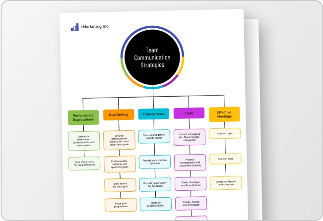
Take this business mind map template, for instance. The different text boxes and icons radiate out from the rocket ship and end up being symmetrical as a result:
Mosaic balance (also called crystallographic balance) is when elements seem chaotic, but there’s an underlying organization to it all. This is best saved for unconventional or more abstract designs.
Discordant balance (also called off-balance!) is when elements aren’t balanced at all. This can make viewers uncomfortable and stop them in their tracks.
Why is balance needed for an effective design?
Without balance, a design just feels off.
A balanced composition is simply more pleasing to the eye, and depending on what type of balance you choose, can create a feeling of order. Paired with a clear visual hierarchy, balance makes a design digestible at a glance.
Take the diagram below. The information it contains is easy to understand because it’s balanced. Plus, the balance of shapes and symbols is easy on the eyes:
Balance can also help draw the viewer’s attention towards specific elements in a design. When used correctly, you can create focal points in a composition that will guide the reader to the most important information at hand.
For instance, the template below places visual weight on the bars and steps that make up the bottom half of the page. This highlights key information — the plan-do-check-act cycle that’s the main topic of the infographic:
How to apply balance in design
Now that we know all about balance and its importance, let’s take a look at how to actually achieve it! Here are a few steps to help you apply balance to your designs:
- Decide on the type of balance you want to use. As we’ve seen, there are five types of balance you can use in your designs: symmetrical, asymmetrical, radial, mosaic and discordant. In all likelihood, you’ll want to stick to the first three types.
Think about your objective and how best to get your message across. If you have several equally important points to make, symmetrical may be best. If you’re trying to draw emphasis to one key point, asymmetrical could be the right choice. If you have a key message with supporting facts, radial is a good option. - Create a focal point. A balanced composition needs a focal point to anchor the whole layout. In an asymmetrically balanced design, this could be a dominant shape or element with more visual weight, like the text box in the flyer below, placed on one side. It’s best to establish your page’s focal point before anything else, so you can use it as a guide for your layout.
- Distribute your elements. Once you’ve established your layout’s focal point, distribute your design elements around it. Be conscious of each element’s perceived weight as you do this as well as their proximity to each other, so you can properly balance them around the page, like this mind map does:
- Experiment! The best way to learn how to use balance in your designs is to experiment a little. Play around with the elements on the page. Try both symmetrical and asymmetrical arrangements. The more you experiment, the more you’ll get a feel for what balance looks like.
Venngage’s templates and user-friendly drag-and-drop editor make it easy to mix, match and modify elements until you find the style that works for you. Here’s a fun example of an infographic with a dynamic balance:
Tips for applying balance in your designs
Tip time! Here’s some quick advice to help you achieve balance in your next design:
- Use a template with a balanced composition. If you’re not a designer or you’re just getting started, using a template is a great way to get ahead. This will give you a balanced framework to work with. And the more templates you use, the more you’ll get a feel for what makes a design truly balanced.
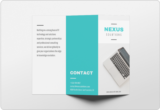
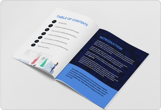
- Use a grid pattern. If you’re worried about achieving balance in your design, consider using a grid pattern. This will ensure each section is evenly balanced in your composition. Here’s a sample brochure to give you a better idea of how a grid can help balance your layout.
- Practice, practice, practice. Like with any skill, the best way to learn how to use balance in your designs is to practice. With Venngage’s wide selection of templates, you can experiment with different types of balance to your heart’s content.
For more specific graphic design tips, check out our post: 11 Actionable Graphic Design Tips for Beginners, According to Design Experts
FAQs on the balance principle of graphic design
What is an example of balance in the principles of design?
There are five types of balance in graphic design: symmetrical, asymmetrical, radial, mosaic and discordant. To recap, symmetrical balance is when the elements on each side of a composition are given equal in weight. Asymmetrical balance is when elements aren’t weighted evenly. Radial balance is when elements radiate out from a single point. Mosaic balance is when elements are chaotic yet organized. Discordant balance is when elements aren’t balanced at all on purpose.
What are the design principles of balance?
Balance refers to the distribution of visual elements based on their perceived weight. Elements may be balanced based on color, texture and space to achieve a sense of equilibrium and harmony in a composition.
Apply balance to your designs to catch and please the eye
Balance is foundational in design.
If you’ve been struggling to create visually pleasing designs, it could be that they’re lacking in this department. Thankfully, you don’t have to be an expert to apply this principle to your next project.
Now that you have a basic understanding of the topic, you can choose the right type of balance for your goals. And of course, you don’t have to start from scratch either. Choose a template from Venngage’s library to strike the perfect balance with your next design.


