

TL;DR
Here are the best AI data visualization tools for different use cases:
- Venngage: Best for visual storytelling with data
- Julius AI: Best for conversational data analysis and visualization
- Tableau Cloud: Best for advanced and interactive data visualization
- Microsoft Power BI: Best for AI-powered reporting and dashboards
- Zoho Analytics: Best for self-service AI analytics
- ThoughtSpot: Best for exploring business questions visually
- Google Gemini: Best for AI-powered spreadsheet workflows
- Polymer: Best for AI-generated dashboards
- Sisense: Best for customizable AI data visualization
- ChatGPT: Best for quick, one-off data visualizations
AI tools have become pretty good at analyzing data and summarizing what it says. But turning that data into useful visualization is another challenge. The AI needs to understand what you’re trying to show, choose the right chart and present the data in a way that is actually easy to understand.
This is where dedicated AI data visualization tools can help. Some can turn a simple prompt into a chart, while others can recommend the best visualization, create interactive dashboards or add context around the data to help you communicate the findings.
I tested some of the best AI data visualization tools to see how well they actually visualize data, how easy the outputs are to customize and which tool works best for different use cases.
AI data visualization tools compared
Here’s a quick comparison of the 10 AI data visualization tools I tested and where each one works best.
What is an AI data visualization tool and how does it work?
An AI data visualization tool is an AI-powered platform that turns raw data into charts, graphs, dashboards and other visual formats. You can upload your data as a CSV, spreadsheet or document, or connect the tool directly to a data source.
More advanced AI data visualization tools can also identify trends and patterns, recommend different chart types or build complete dashboards from your data. You can then use follow-up prompts to refine the visualization without having to create everything manually.
How we evaluated the AI data visualization tools?
To make the comparison as consistent as possible, I tested the AI tools for data visualization using the same simple monthly sales dataset and a similar prompt wherever possible. I focused on four things:
- Ease of use: How quickly can you go from raw data to a visualization?
- Chart selection: Does the AI choose a correct type of data visualization chart?
- Accuracy: Does the visualization represent the underlying data correctly?
- Editing and customization: How easy is it to refine the AI-generated chart, whether through prompts or manual editing?
I also looked at what happens after the chart is created, including whether you can add context, interact with the data, build a dashboard or export the visualization for use elsewhere.
For enterprise tools where AI features required additional paid access or setup, I evaluated the available product experience alongside official product documentation rather than claiming hands-on testing of features I couldn’t access.
10 best AI data visualization tools in 2026
Now, let’s take a closer look at each AI data visualization software, including its key features, best use cases and limitations.
1. Venngage: Best for visual storytelling with data
The whole purpose of data visualization is to present insights in the form of a story that makes data easier to understand. It should provide enough context for people to understand what the numbers mean, why they matter and what they should take away from them.
This is where Venngage helps. It’s an AI-powered data visualization tool designed for telling clear, engaging stories with data.
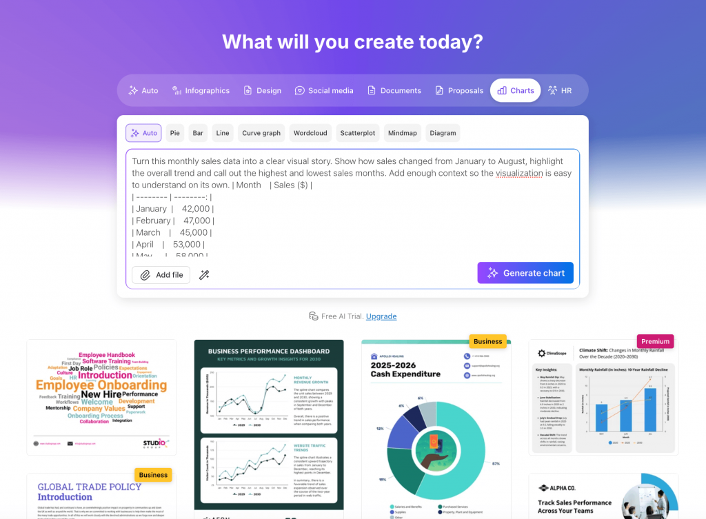
Venngage AI Chart Generator turns your data into bar charts, line charts, pie charts, area charts, stacked charts, maps and more, along with a headline, supporting text, key statistics and relevant design elements.
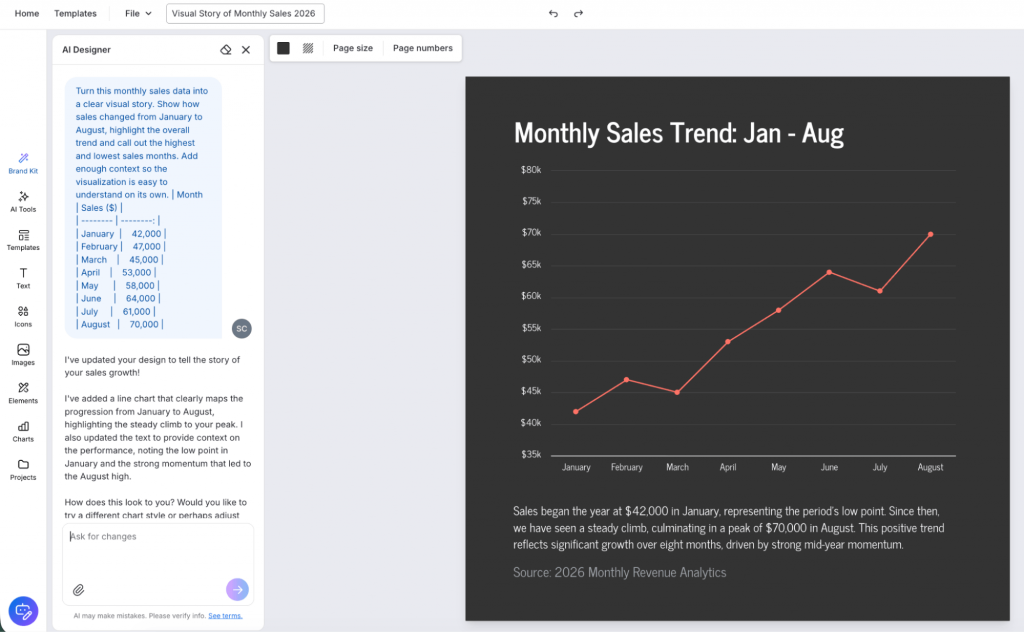
You don’t need any design or technical experience to do this. Simply add your data as a text prompt, upload a CSV or document, or edit a chart template and Venngage’s AI will analyze it and create the visual for you. You can then use it in a report or presentation, or download and share it on your website, social media and other channels for visual storytelling.
I also like that Venngage’s AI Designer suggests alternative chart types for the same data, so you can see which visualization works better. Just click on the type of chart you want to try and your data gets added automatically.
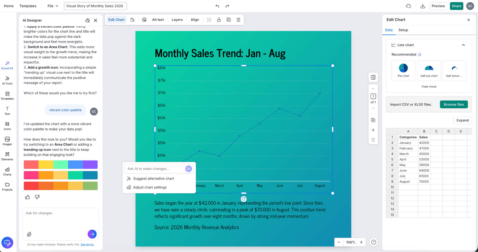
Editing the charts is just as easy. You can change the text, data, colors, fonts and other design elements directly in the editor or ask the AI Designer in the chat to make the visual more engaging.
Venngage AI works especially well for visualizing data that needs some explanation, such as presenting survey results, report findings or internal data you need to share with the stakeholders.
Key features
- Brand Kit: Apply your brand colors, fonts and logo to AI-generated charts using the My Brand Kit feature to keep them consistent with your reports and presentations.
- AI chart recommendations: Explore alternative chart types for the same data and switch between them without having to enter your data again.
- AI-powered editing: Chat with the AI Designer to refine the visualization, change the design or make the overall visual more engaging.
- Flexible data import: Add data directly or upload CSV and XLSX files instead of manually entering every value.
- Multiple export options: Download your finished visualization as PNG, PDF, PPT or HTML, or share it through a link easily.
Limitations
- No advanced data analysis: Not designed for statistical analysis or complex data exploration.
- Limited data integrations: Fewer direct data-source and database integrations than dedicated BI tools.
Pricing: Free plan available; paid plans start at $19/month.
G2 rating: 4.7/5
2. Julius AI: Best for conversational data analysis and visualization
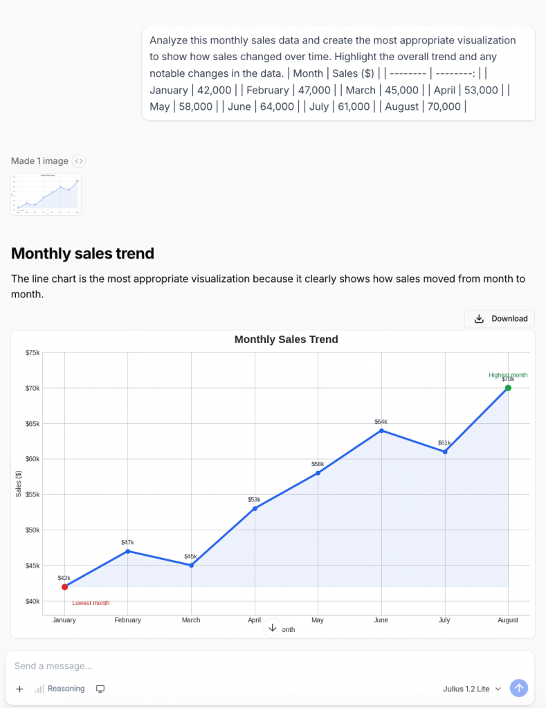
Source: Julius AI
If you already have a dataset but aren’t sure what insights to pull from it yet, Julius AI works well. It’s primarily an AI data analysis tool that connects to your databases, answers questions about your data and helps you visualize it.
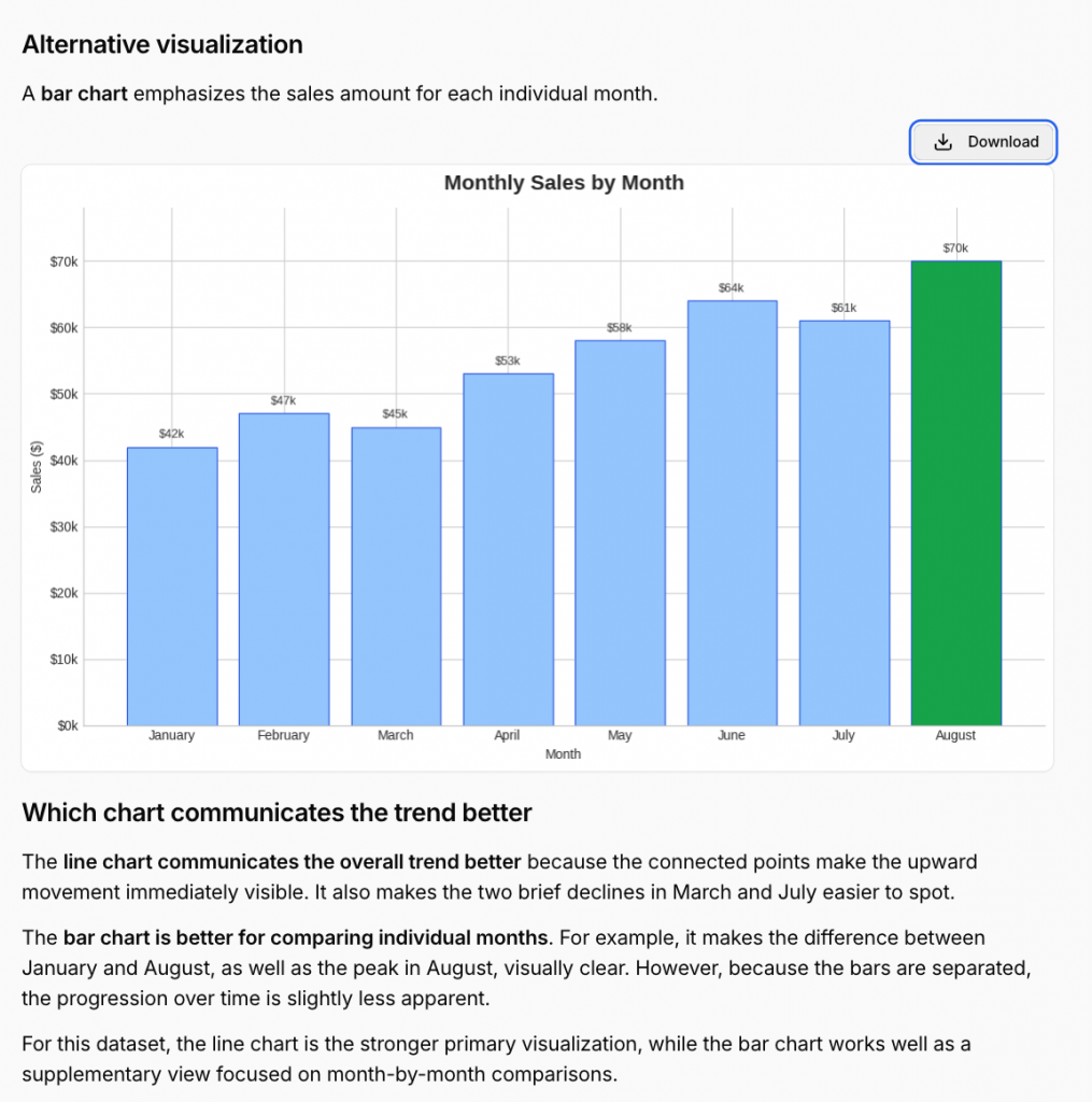
You could ask it to compare sales across regions, find trends over time or break down survey responses by demographic. Julius runs the analysis on your data and can then visualize the results as bar charts, line charts, scatter plots, histograms, heatmaps, box plots and more.
I like how conversational the entire workflow feels. You can keep asking follow-up questions to dig deeper into the data or tell Julius to change the visualization without setting up the analysis manually. This makes it especially useful if you want to explore your data and visualize what you find along the way.
Julius also supports a much wider range of data sources than simple file uploads. Along with CSV and Excel files, you can work with Google Sheets, documents and images, while higher-tier plans support connections to databases such as Snowflake, BigQuery and PostgreSQL.
Key features
- Natural-language analysis: Ask questions about your data in plain English and let Julius handle filtering, sorting, aggregations and other analysis behind the scenes.
- AI-powered visualizations: Generate bar charts, line, pie and area charts, histograms, box plots, heatmaps, geospatial plots and more using simple prompts.
- Statistical analysis: Run regressions, statistical models and forecasting without having to write the underlying code yourself.
- Multiple data sources: Work with spreadsheets, Google Sheets and other file formats, with database connections such as Snowflake, BigQuery and PostgreSQL available on higher plans.
Limitations
- Limited design control: Less suited to highly customized, presentation-ready visualizations.
- Credit-based use: More complex tasks can consume more credits.
Pricing: Free plan available; paid plans start at $20/month.
G2 rating: 4.5/5
3. Tableau Cloud: Best for advanced and interactive data visualization
Source: Tableau
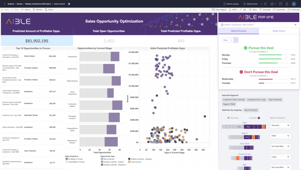
Tableau is one of the more advanced tools on this list, especially if you’re working with large datasets and want to create detailed, interactive data visualizations. With Tableau Agent, you can use simple natural-language prompts to build and explore complex data visualizations without doing everything manually.
For example, ask it to “show me how sales changed over time” and Tableau Agent can choose a suitable chart and create it using your data. You can create everything from bar, line and area charts to scatter plots, heatmaps, treemaps and maps, and keep using prompts to filter the data or explore a particular finding.
I like that you can use AI to get the visualization started and then take over in Tableau’s regular interface when you want more control. Tableau Agent can also create and explain calculated fields, which makes some of the more technical parts of Tableau easier to work with.
Key features
- Interactive dashboards: Combine multiple charts with filters and drill-downs so users can explore the underlying data themselves.
- Advanced visualizations: Create everything from basic charts to maps, heatmaps, treemaps and other visualizations for complex datasets.
- Tableau Pulse: Automatically surfaces trends and personalized insights from important business metrics.
- Broad data connectivity: Connect spreadsheets, databases and cloud data sources to visualize data from across your organization.
Limitations
- Restricted AI access: Tableau Agent for Viz Authoring requires Tableau+ and AI in Tableau to be enabled.
- Steep learning curve: Tableau’s advanced visualization and dashboard features take more time to learn than simpler AI visualization tools.
Pricing: Tableau Cloud starts at $75/user/month for a Creator, billed annually. Tableau Agent requires Tableau Cloud+, with custom pricing.
G2 rating: 4.4/5
Related: Graph vs Chart: The Complete Guide to Understanding the Difference
4. Microsoft Power BI:AI-powered reporting and dashboards
Source: Power BI
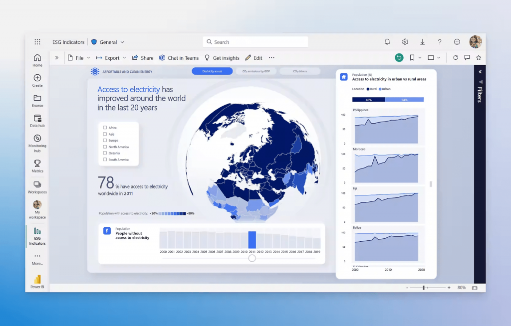
If you already use Microsoft tools for work, Power BI is a great AI-powered data visualization tool for creating interactive reports and dashboards. Copilot, Microsoft’s AI assistant, brings AI into the workflow to help you analyze your data, create visualizations and build reports using natural-language prompts.
What’s interesting is how much of the reporting process Copilot can handle. Give it a prompt describing what you want to understand and it can create an entire report page with relevant charts. You can also ask questions about your data and get the answer as a visualization, or use follow-up prompts to change what Copilot created.
One of the most useful features is that Copilot can explain the data and filters behind its answers. So, if it generates a chart showing revenue by region, you can check what data it used to arrive at that result. That extra transparency is useful when you’re using AI to visualize business data and need to make sure the output is accurate.
Key features
- AI-generated visualizations: Ask questions about your data in natural language and get answers as charts and other visuals.
- AI report creation: Describe the report you need and Copilot can generate a complete report page with relevant visualizations.
- Conversational editing: Add, remove or change visuals using follow-up prompts.
- AI summaries: Generate written summaries of your report data to add context around the visualizations.
- Transparent AI answers: See the data and filters Copilot used to generate an answer, making it easier to verify the output.
Limitations
- Paid AI access: Copilot requires paid Microsoft Fabric or Power BI capacity.
- Complex setup: Getting your data model ready for accurate Copilot responses can require more technical knowledge than simpler AI visualization tools.
Pricing: Starts at $14/user/month and Premium Per User at $24/user/month. Copilot requires access to a paid Microsoft Fabric capacity (F2 or higher) or Power BI Premium capacity (P1 or higher).
G2 rating: 4.5/5
5. Zoho Analytics: Best for self-service AI analytics
Source: Zoho Analytics
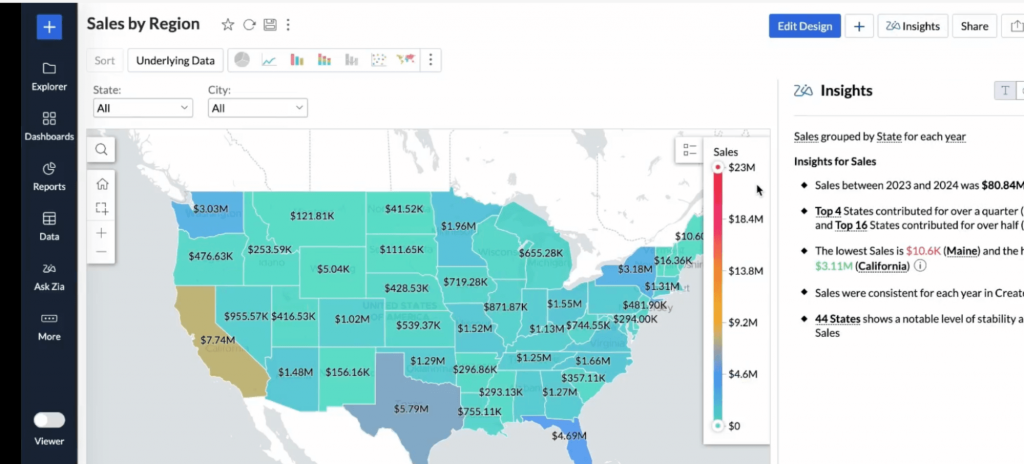
Zoho Analytics is another helpful AI data visualization tool for creating detailed reports and dashboards. Its AI assistant, Ask Zia, lets you ask questions about your data in plain English and turns the answers into relevant charts, reports and KPI widgets.
If you’re not sure which chart works best, Zia Suggestions recommends suitable chart types based on your data. It understands the question, picks a relevant chart and generates the visualization for you.
You can also ask Zia to create an entire AI-powered dashboard from a prompt. It can bring multiple visualizations together and generate written insights explaining trends, anomalies and patterns in the data.
Key features
- Ask Zia: Ask questions using text or voice and turn the answers into charts, reports and KPI widgets.
- Zia Suggestions: Get AI recommendations for suitable chart types based on the data you’re visualizing.
- Auto Analysis: Let Zia analyze a dataset and automatically generate relevant reports and dashboards.
- Zia Insights: Get written summaries of key trends, patterns and anomalies in your visualizations.
- AI forecasting: Predict future trends using forecasting models automatically selected based on your data.
Limitations
- Learning curve: The number of analytics, reporting and dashboard features can feel overwhelming for beginners.
- Limited design flexibility: Less control over visual design compared to dedicated visual communication tools.
Pricing: Free plan available. Paid plans start at $24/month for 2 users, billed annually
G2 rating: 4.3/5
6. ThoughtSpot: Best for exploring business questions visually
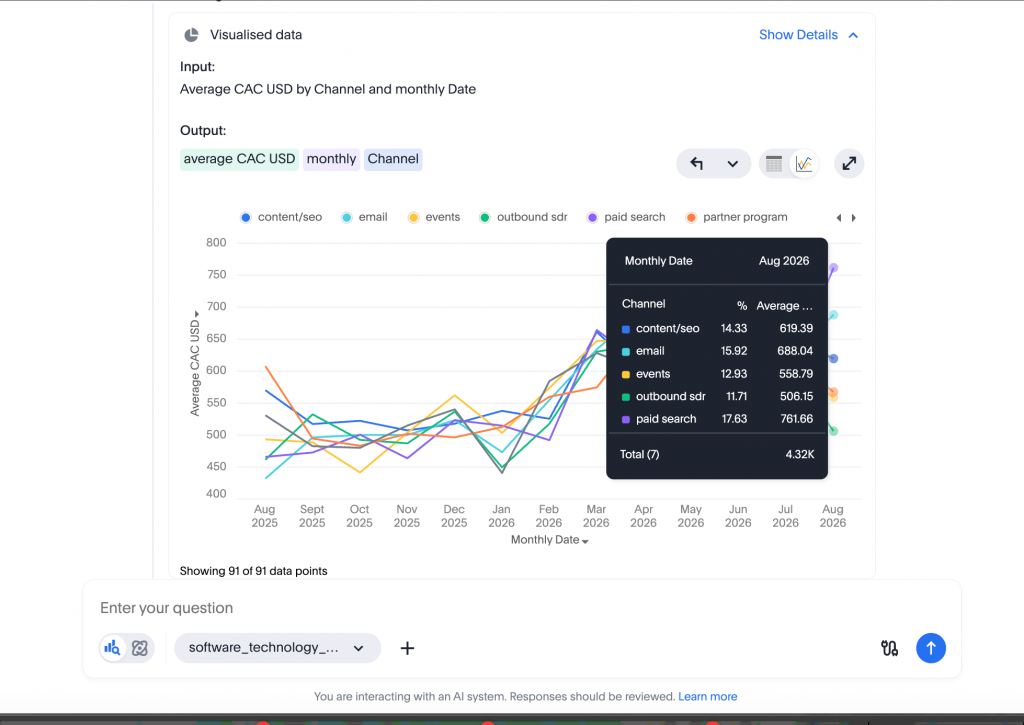
ThoughtSpot is a conversational AI data visualization tool similar to Julius AI, but I found it goes into more detail when exploring the data. It even generated a sample dataset for me, so I could start testing the tool without uploading my own.
Ask Spotter, its AI analyst, a question and it creates a relevant chart along with insights explaining what the data shows. I also like how interactive the charts are. You can hover over different data points to see the exact values, drill deeper into a visualization or ask follow-up questions to explore a particular finding.
For more detailed reporting, SpotterViz can take a broader business question and turn it into a complete dashboard with multiple charts and a narrative explaining the key insights.
Key features
- Spotter AI: Ask questions about business data in plain English and get answers as charts and visualizations.
- SpotterViz: Turn a business question into a complete interactive dashboard with AI.
- Follow-up questions: Start from any chart and continue exploring the data conversationally.
- AI chart selection: Let SpotterViz choose suitable chart types, metrics and filters based on what you’re trying to understand.
- AI summaries: Generate concise explanations around dashboards to make key changes and findings easier to understand.
Limitations
- Requires structured business data: Spotter works best when the underlying semantic model and business definitions have been properly set up.
- Setup can take time: Getting the platform configured for your organization’s data is more involved than uploading a spreadsheet to a simple AI visualization tool.
Pricing: Free trial; paid plans start at $25/user/month, billed annually
G2 rating: 4.4/5
7. Google Gemini: Best for AI-powered spreadsheet workflows
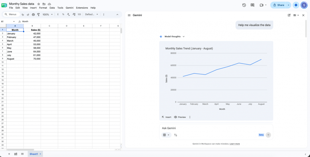
Google Gemini is a useful AI tool for data visualization if you work a lot in Google Sheets. Simply paste your data into a Google Sheet or use an existing dataset and ask Gemini to visualize it. It will pull out relevant insights and create a chart based on your prompt, which you can preview and insert directly into the sheet.
The best part is that it’s a familiar tool and fits naturally into your existing workflow. You don’t have to upload your data to another platform every time you need a quick visualization.
I found the charts quite basic in terms of design, though. They work well when you need a quick data visualization for an internal report, meeting or presentation, but you don’t get much flexibility to make the visual more engaging. Another thing to keep in mind is that Gemini-generated charts aren’t interactive and don’t automatically update when the source data changes.
Key features
- AI chart generation: Create charts from your spreadsheet data using simple text prompts.
- AI-powered insights: Ask Gemini to find trends, patterns and key takeaways in your data before visualizing them.
- Follow-up prompts: Ask more questions about your data or try a different visualization without starting over.
- Built into Google Sheets: Analyze and visualize data without uploading it to a separate tool.
Limitations
- Basic visual design: Charts are fairly simple with limited options for creating more engaging data visualizations.
- Charts don’t stay synced: Gemini-generated charts don’t automatically update when the original source data changes.
Pricing: Gemini in Sheets is available with eligible Google Workspace plans. Business Standard starts at $14/user/month, billed annually.
G2 rating: 4.4/5
8. Polymer: Best for AI-generated dashboards
Source: Polymer
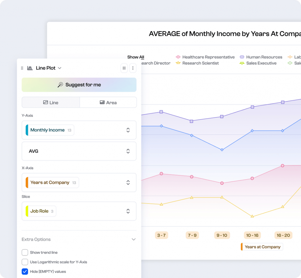
Polymer is useful when you have data sitting in a spreadsheet and want to turn it into a dashboard without building every chart yourself. Upload your data or connect a source like Google Sheets and Polymer’s AI identifies relevant questions, suggests visualizations and automatically puts them together into an interactive dashboard.
You can add or change visualizations, apply filters and customize the dashboard to match your brand. Polymer can also explain individual charts, which is helpful when you want some context around what the visualization is showing.
It also works well for dashboards you need to keep using. You can connect sources such as Google Sheets, Google Ads and Facebook Ads and schedule data refreshes, rather than creating a new visualization every time the numbers change.
Key features
- AI-generated dashboards: Automatically turn connected data into a dashboard with relevant charts and insights.
- Chart suggestions: Get visualization recommendations based on the patterns and questions Polymer identifies in your data.
- AI explanations: Generate simple explanations for individual charts to understand what the data is showing.
- Interactive dashboards: Add filters and explore different dimensions of your data directly from the dashboard.
- Automatic data syncing: Keep dashboards updated by connecting live data sources and scheduling refreshes.
Limitations
- Limited advanced analysis: Less suited to complex statistical analysis or enterprise-level BI workflows.
- AI usage limits: PolyAI chat responses are limited on some paid plans.
Pricing: Starter starts at $25/month billed annually
G2 rating: NA
9. Sisense: Best for customizable AI data visualization
Source: Sisense
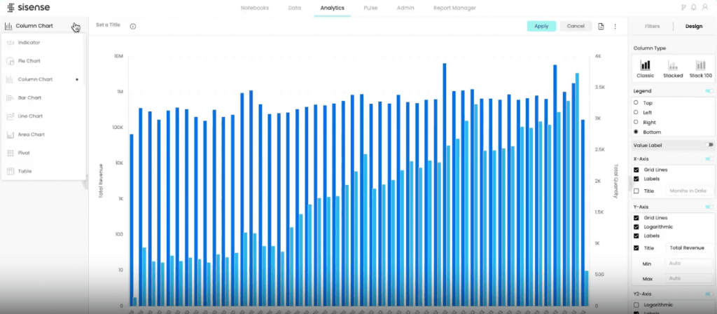
Sisense is more relevant for developers and product teams that want to bring AI data visualization directly into their own apps. You can use Sisense Intelligence to quickly create charts and dashboards without coding, or use its APIs and Compose SDK when you need more control over how those visualizations look and work.
Once embedded, the AI capabilities make it easier for your users to interact with the data too. They can ask questions in natural language and get answers as visualizations, explore suggested questions or get AI-generated insights explaining what a chart is showing.
Key features
- Sisense Intelligence: Use AI to build and customize data visualizations and dashboards faster.
- Interactive dashboards: Add filters and drill-downs so users can explore the data behind a visualization.
- Custom visualizations: Use APIs, JavaScript, third-party libraries or the Compose SDK when you need more control over your charts.
- Embedded visualizations: Add branded, interactive charts and dashboards directly to your product or existing workflow.
Limitations
- Can get technical: Advanced customization and embedded visualization require APIs or development tools such as the Compose SDK.
- More than you need for simple charts: The platform is geared towards more advanced analytics and visualization workflows.
Pricing: Custom pricing
G2 rating: 4.2/5
10. ChatGPT: Best for quick, one-off data visualizations
Sometimes you have a CSV from a campaign, survey or sales report and just need to quickly visualize the data. You don’t need a full dashboard or dedicated data visualization tool. This is where ChatGPT can help.
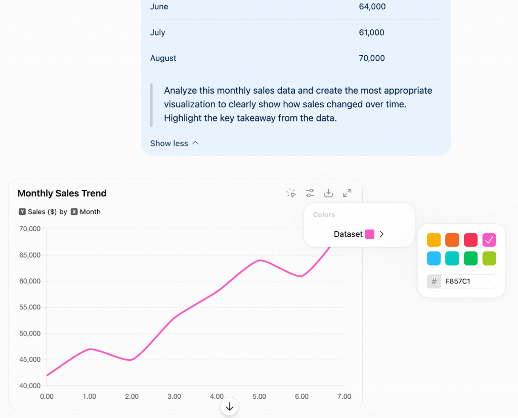
Simply upload the file and ask ChatGPT what you want to visualize. It can analyze the data, choose a relevant chart and create the visualization for you. You can then use follow-up prompts to change the chart, highlight a specific finding or make the data easier to understand.
You can also use ChatGPT for anything around visualization. For example, upload survey results, identify the key trends, visualize the most important findings and turn them into a summary for your report or presentation, all in the same chat.
Key features
- Automatic chart selection: Upload your data and let ChatGPT choose a suitable visualization based on what you want to show.
- Conversational editing: Use follow-up prompts to change the visualization, highlight specific findings or refine what the chart shows.
- Interactive charts: Hover over data points and explore values directly in supported charts.
- Built-in data analysis: Clean data, identify trends and anomalies, run calculations and visualize the findings within the same conversation.
- Chart customization: Adjust colors, labels and other chart elements, then download the finished visualization as a PNG.
Limitations
- Limited design control: You get fewer options for creating highly designed or branded data visualizations.
- Not built for dashboards: Better suited to individual visualizations than ongoing, multi-chart BI dashboards.
Pricing: Free plan available. ChatGPT Plus starts at $20/month.
G2 rating: NA
How to choose the best AI tool for data visualization?
The right tool depends on your data, how much help you need from AI and what you want the finished visualization to do. Here are a few things to consider:
- Start with your data: For spreadsheet data, tools like Gemini in Google Sheets or ChatGPT may be enough. If you’re working with multiple business data sources, Tableau, Power BI or ThoughtSpot offer more advanced options.
- Decide how much AI help you need: If you want AI to analyze your data as you visualize it, consider Julius AI or Zoho Analytics. For quickly generating complete dashboards, Polymer is more focused on that workflow.
- Think about the final output: A quick chart, interactive dashboard and polished visual report serve very different purposes. Venngage works well when you need to add context and visual storytelling, while Sisense is better suited to visualizations you want to embed and customize inside a product.
- Check how much control you get: AI won’t always get the visualization right on the first try. Look for tools that let you change the chart, edit the data, customize the design or refine the output with follow-up prompts.
- Consider how often you’ll use it: A one-off visualization may only need ChatGPT, while recurring dashboards and live business reporting are better suited to tools that can stay connected to your data, such as Power BI or Tableau.
What to look for in an AI data visualization tool
AI can generate a chart in seconds, but that doesn’t necessarily make it a good data visualization tool. Here are a few things worth checking:
- Accurate data interpretation: The tool should understand your data correctly and generate visualizations without changing or misrepresenting the underlying numbers.
- Smart chart recommendations: Look for AI that can choose an appropriate chart based on your data and what you’re trying to communicate.
- Easy AI editing: You should be able to refine the visualization with follow-up prompts instead of starting again every time.
- Design flexibility: Check whether you can customize charts, labels, colors, annotations and branding after the AI generates them.
- Data source support: Make sure it works with the formats and sources you use, whether that’s CSV, Excel, Google Sheets or live databases.
- Export and sharing: Look at whether you can download, share, embed or add the finished visualization to reports and presentations.
Visualize data with AI
AI can make it easier to analyze data, choose the right chart and create useful visualizations. The best tool depends on what you need to create, from quick charts to interactive dashboards. If you want to add more context and turn those insights into a clear visual story, Venngage’s AI Chart Generator can help bring the data together in a more engaging format.
FAQs about AI data visualization
1. Can I use AI to create charts from Excel or CSV data?
Yes. Many AI data visualization tools let you upload Excel or CSV files and generate charts using natural-language prompts. ChatGPT, Julius AI and Venngage are examples.
2. Do I need coding skills to use AI data visualization tools?
No. Many tools let you describe what you want to visualize in plain English. However, more advanced platforms may still require some technical knowledge for data modeling, integrations or customization.
3. How accurate are AI-generated data visualizations?
Accuracy depends on data quality and how AI interprets the request. AI can choose the wrong chart, grouping or calculation, so always check the underlying numbers and filters before using a visualization for important decisions.
4. What’s the difference between AI data visualization and traditional data visualization?
AI data visualization automates parts of the process such as choosing charts, finding patterns and creating visuals from natural-language prompts. Traditional tools generally require more manual chart selection, configuration and analysis.