

TL;DR
- Bento grid infographics use different-sized tiles to organize related information, with larger blocks drawing attention to the most important points.
- They work best for statistics, research findings, campaign results and other content that can be understood in separate sections rather than a fixed sequence.
- A strong bento grid uses a few repeatable tile sizes, consistent spacing and clear visual hierarchy. You can start with a template or use Venngage’s AI Infographic Generator to generate the first layout and refine it from there.
Bento grid designs have become popular over the last couple of years, especially in web and UI design. Now the same modular layout is increasingly showing up in infographics, presentations and campaign graphics.
A bento grid design has different-sized blocks for statistics, images, charts and short pieces of text. You can use it to group related facts, highlight key numbers, summarize research or present several ideas on one page without them looking cluttered.
In this guide, I’ll share bento grid infographic ideas, templates and real-world examples, along with practical tips for creating your own design with AI in Venngage.
What is bento grid design?
Bento grid design is a modular layout style that organizes content into multiple rectangular blocks or tiles of different sizes. This design style is inspired by Japanese bento boxes, where different foods are arranged in separate compartments within one container.
In a bento grid, each tile holds one type of content, such as a statistic, image, chart, icon or short piece of text. The tiles usually vary in size to add variety and highlight important information.
The bento grid design became trending after Apple started using this style in its product videos and presentations to highlight key features and numbers.
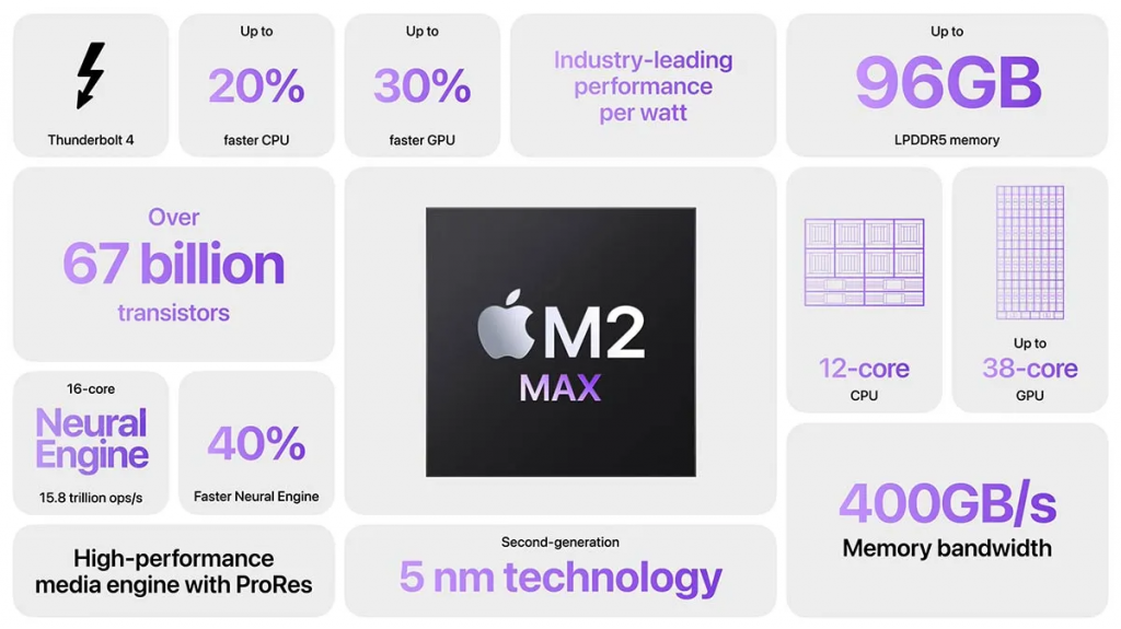
You’ll often see bento grid layouts used in websites and dashboards, but the same structure also works well for different types of infographics, business presentations and social media campaign graphics where you need to show multiple statistics, supporting facts, key points or examples in one layout.
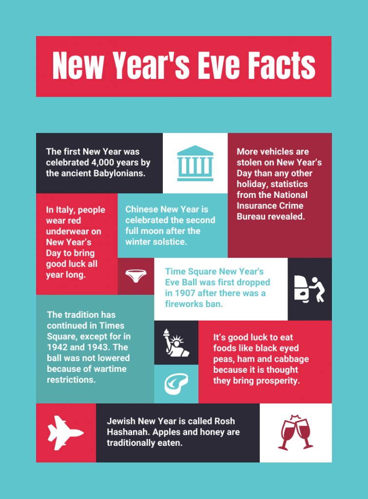
This New Year’s Eve infographic is a clear example of a bento grid design. The information is divided into tiles of different sizes, with larger blocks used for more prominent facts and smaller ones for supporting details.
What makes a bento grid different from a regular grid?
A regular grid infographic gives each section or element the same amount of space. A bento grid layout combines tiles of different sizes, so some sections naturally get more visual weight than others.
That makes it easier to highlight a key statistic, image or takeaway while keeping supporting information in smaller tiles.
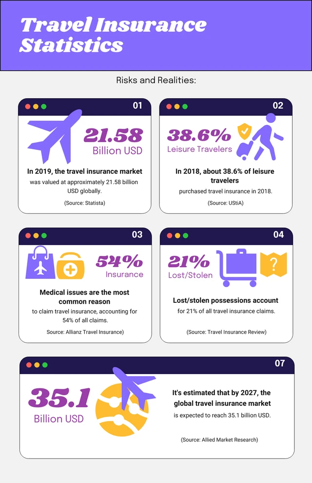
For example, this travel statistics infographic uses a regular grid layout, with equal-sized cards giving each data point similar visual weight.
Calm’s Snooze Report uses a bento grid to break several sleep findings into separate visual blocks. Larger sections are used for findings that need more context, such as the comparison between Gen Z and Millennials or the share of adults who nap weekly.
Quick statistics like 42% relying on sleep aids or 3 in 4 being open to trying new ways to improve their sleep are added to smaller tiles. That infographic design variation gives the report more room to mix charts, illustrations and short data points.

Source: Calm’s Snooze report
15+ bento grid infographic templates and examples
Bento grids may be everywhere in web design, but the same modular layout works just as well for infographics. Brands, public organizations and publishers use them to bring several statistics, comparisons or findings into one visual without forcing everything into the same-sized box.
1. Boston Public Library year-in-review infographic
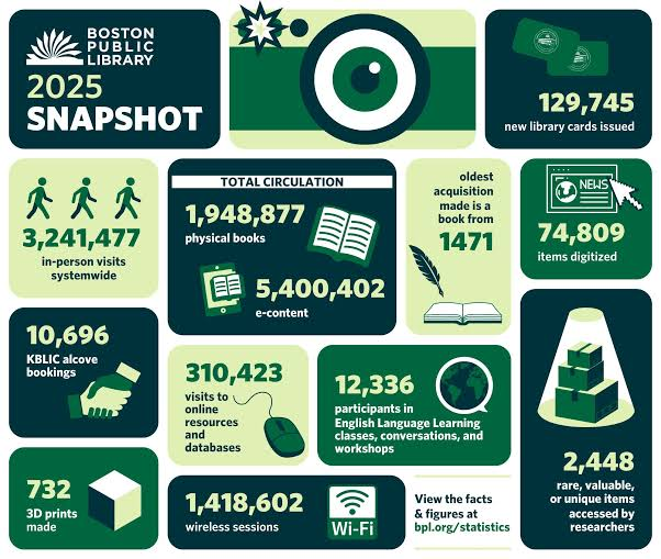
Boston Public Library uses a bento grid to turn a full year of activity into a snapshot infographic. The largest numbers get plenty of space, while smaller cards use illustrations and icons to distinguish metrics such as library visits, wireless sessions, 3D prints and newly issued cards.
This works well for a year-in-review or annual report infographic, especially when you need to show a lot of numbers without making the design feel crowded.
Source: Boston Globe
This is a strong example of how brands can use a bento grid for original research infographic or report promotion, especially when there is no single statistic that tells the whole story.
2. New Zealand–European Union trade infographic
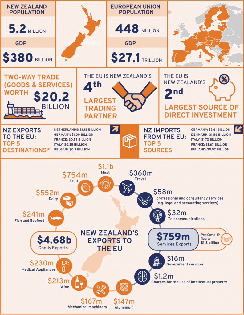
This example uses the bento grid layout as a comparison infographic. The top half places New Zealand and the European Union side by side, then breaks the relationship down into trade value, trading-partner rank, investment and import/export data.
Because each statistic sits in its own defined section, readers can move between the big-picture numbers and more detailed trade data without losing the comparison.
Source: World Economic Forum
3. The Lego Group‘s Annual Performance Highlights
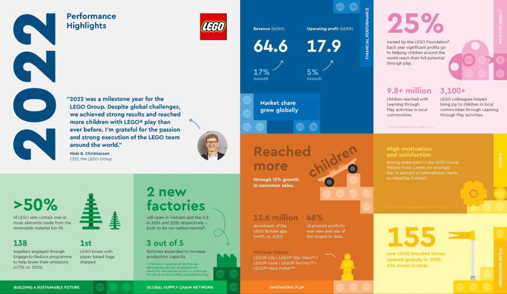
LEGO takes a much more editorial approach. Instead of treating every number equally, it groups the page by business area: financial performance, sustainability, people, retail and innovation.
That makes this a useful reference if you’re working with different types of information in the same report. You can still keep everything on one page without making financial metrics compete with sustainability or impact data.
Source: The Lego Group
4. JetBlue 100×35 campaign infographic
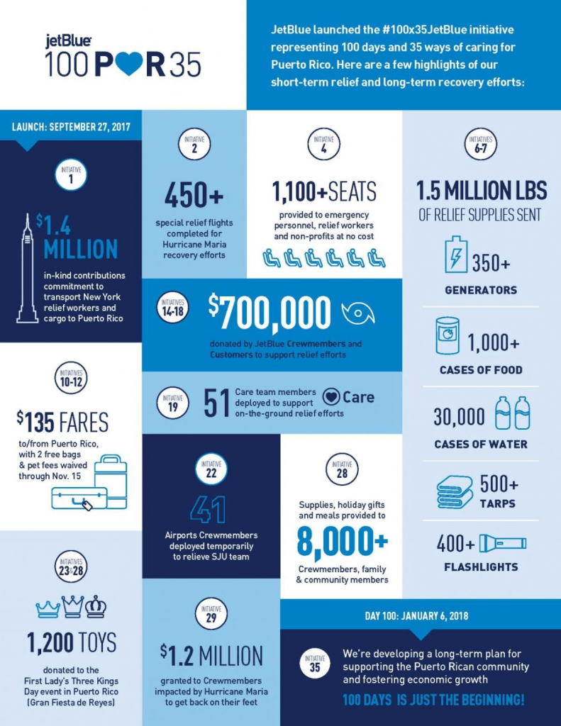
JetBlue uses the modular layout almost like an impact tracker. This Bento style infographic summarizes its 100x35JetBlue Puerto Rico relief program through individual actions and outcomes: relief flights, supplies, grants, fares, volunteers and other forms of support.
Instead of explaining the campaign in paragraphs, each result gets a small visual unit with a number, short label and simple icon. This format works well for campaign recaps, CSR reports and impact infographics where you need to show multiple achievements.
Source: JetBlue
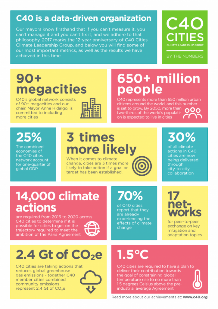
5. C40 “By the Numbers” infographic
C40 takes a very statistics-first approach to the bento grid.
There is no dominant photograph or complex chart here. The numbers themselves become the visual elements: 90+ megacities, 650+ million people, 25%, 70% and other figures are set in large type across differently sized blocks.
Each card answers one question about the organization: how large is the network, how much of the global economy does it represent, what action is being taken and what progress has been made?
This makes the format particularly useful for an About Us infographic, organization overview or or a fact sheet.
Source: C40
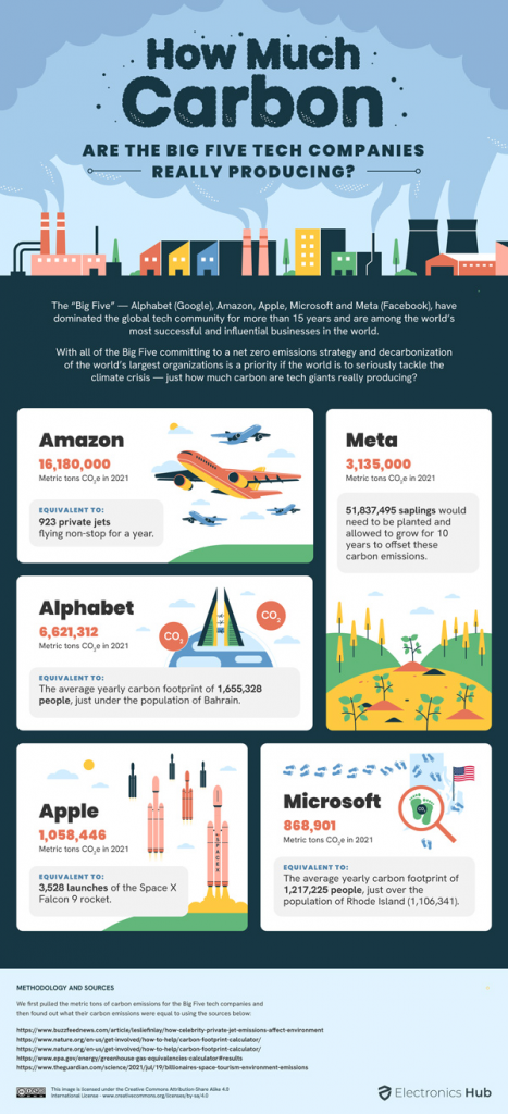
6. Electronics Hub Big Tech carbon emissions infographic
Electronics Hub shows how a bento layout can support a data comparison without reducing everything to a table.
Each major technology company gets its own card, with carbon emissions as the common metric. But the visual goes a step further by adding an “equivalent to” comparison and a custom illustration for each company. That gives readers both a number they can compare and a more tangible way to understand its scale.
Source: Electronics Hub
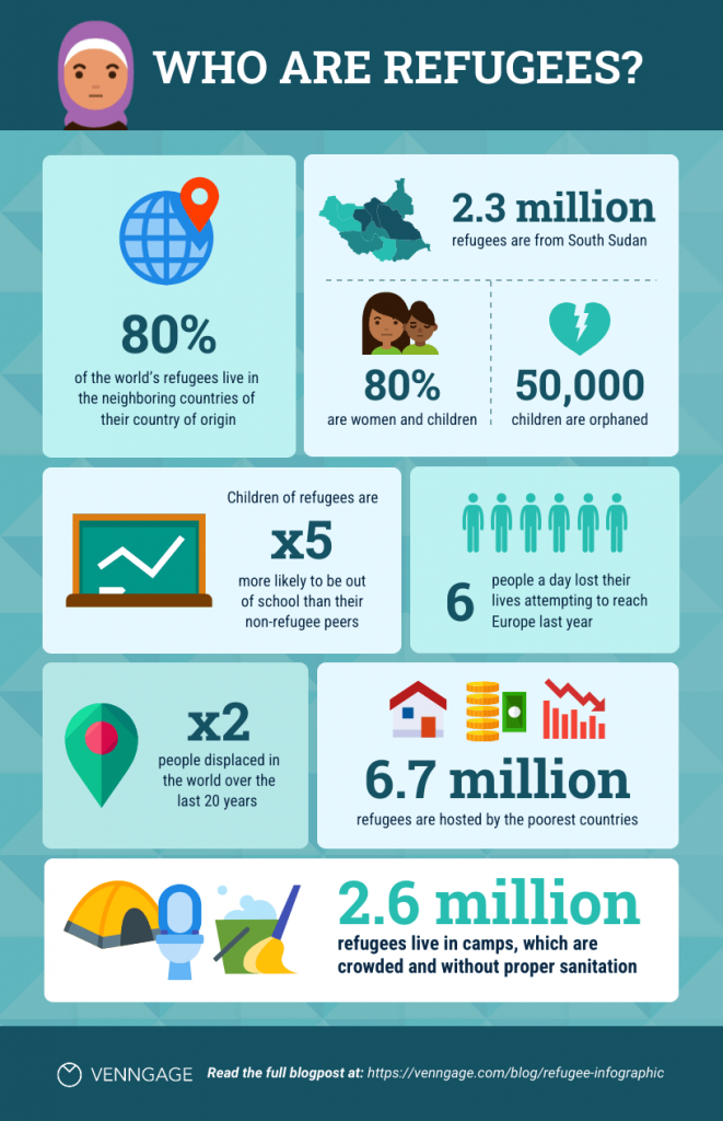
7. Statistical bento grid infographic
This bent grid infographic template by Venngage uses a mix of large and small data blocks to break down refugee statistics. The larger tiles are used for the strongest figures, while smaller sections hold supporting facts and visuals.
It works well for research findings, survey data or reports where you want readers to scan several statistics.
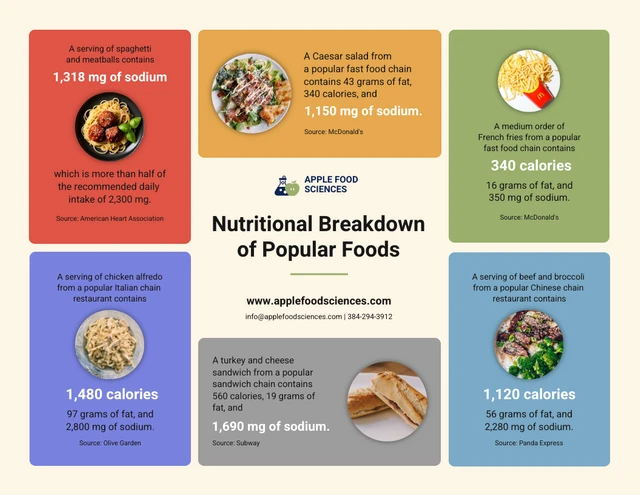
8. Central-focus bento layout
This bento grid layout is built around a central content block, with supporting food statistics arranged around it. It’s a useful structure when all the information connects back to one main topic and you want the center of the design to act as the anchor.
9. Visual-first bento grid
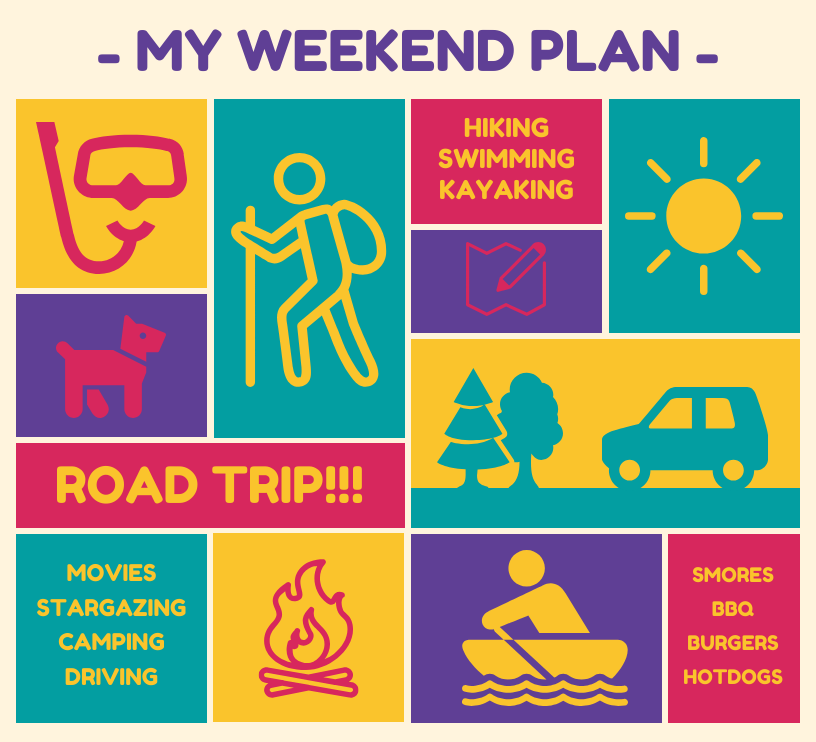
The Vintage Weekend Plan template relies much more on illustrations and short labels than dense text. The larger visual blocks break up the smaller pieces of information and give the overall design more variety.
This is the kind of bento grid infographic layout I’d look at for travel plans, event schedules, activity guides or lifestyle content where the visuals need to carry a large part of the story.
10. Company overview bento layout
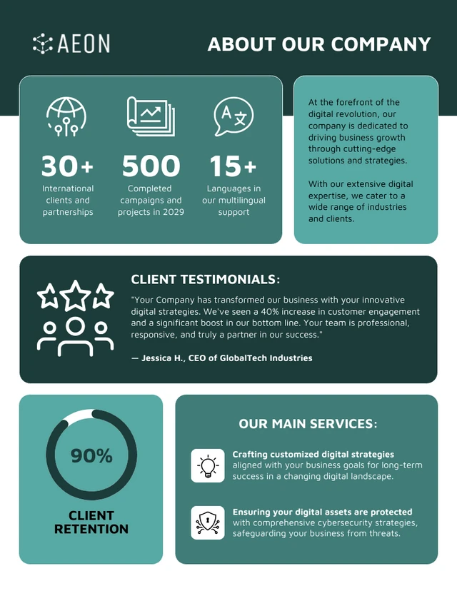
The Customizable About Us Infographic Poster shows why bento layouts can work particularly well for company information. Instead of putting services, statistics, testimonials and company facts into one long section, each gets its own block.
That gives you more freedom to decide which information deserves the most space. A strong company metric, for example, can sit in a larger tile while shorter supporting points stay compact.
11. Educational bento infographic
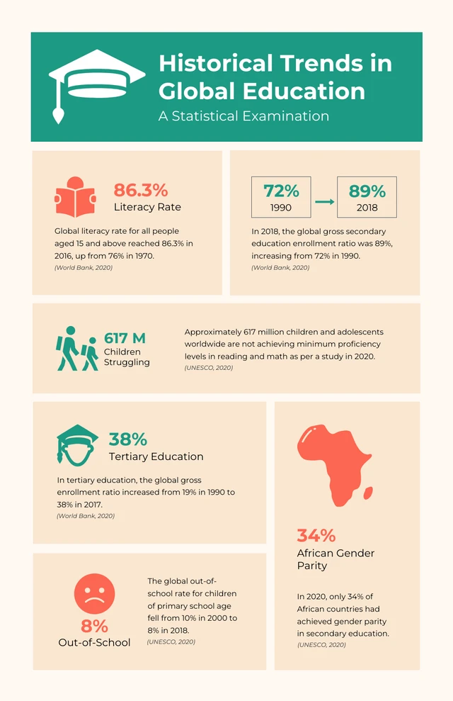
The Simple Soft Peach History Infographic divides related historical or educational information into clearly separated sections rather than treating everything as one continuous narrative.
This kind of structure is useful when the points belong to the same topic but don’t necessarily need to be read as a strict timeline. Each block can hold a date, fact, short explanation or visual without making the whole infographic feel crowded.
12. Hero-tile bento design
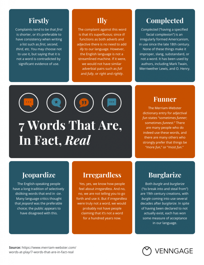
The Real Words List Infographic uses one larger block to create a clear focal point, with smaller cards around it for the individual examples.
That hero-tile approach is useful when you have one title, takeaway, statistic or example that should lead the design. The surrounding blocks can then add context without competing with it.
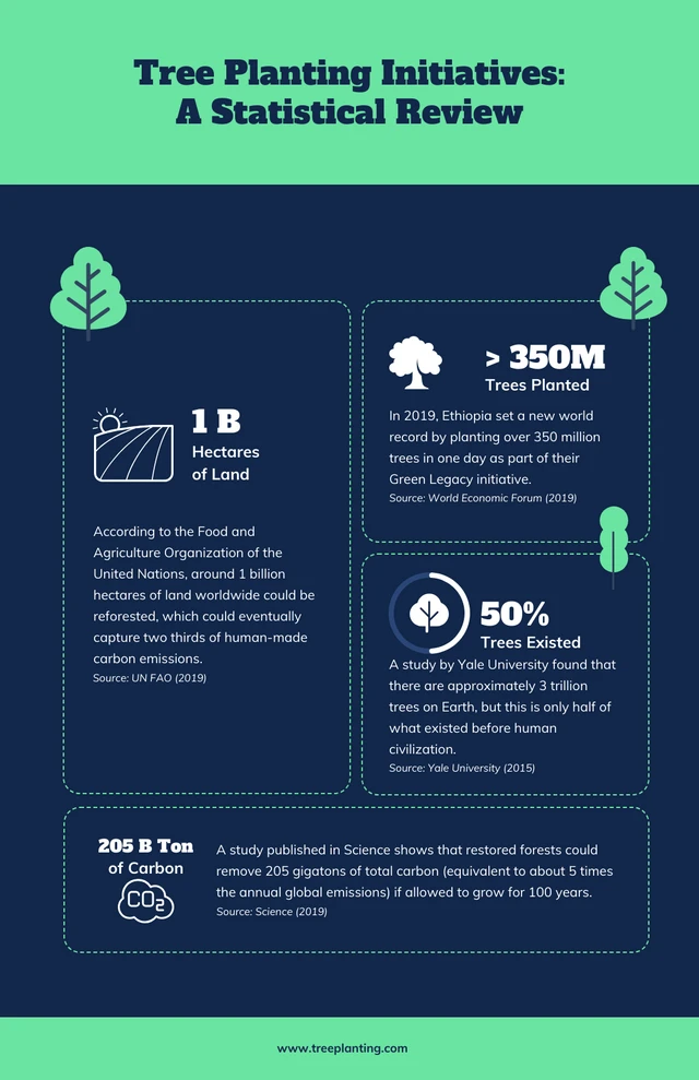
13. Simple statistical bento grid
The Dark Blue and Green Tree infographic keeps the number of blocks relatively limited and gives each one more room.
That’s useful because bento grid design doesn’t have to mean filling the page with lots of small cards. If you only have a few important statistics or findings, larger tiles can make the information much easier to read.
14. Tips and recommendations layout
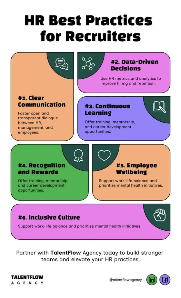
The HR Best Practices for Recruiters List Infographic uses separate cards to break recommendations into smaller pieces.
This gives readers clear stopping points as they scan the page and works well for content such as best practices, recommendations, checklists or short pieces of advice. The grid format also gives you more flexibility than simply stacking every tip in an identical row.
15. Mixed-content bento infographic
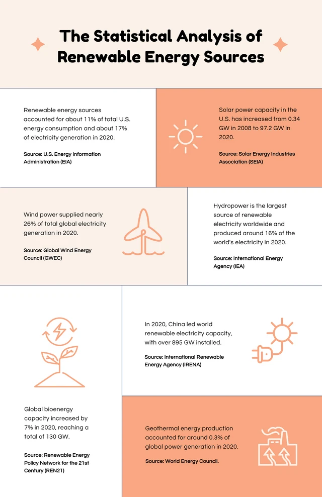
The Orange and Cream Science Infographic is a useful example when your content isn’t all the same format. A bento grid gives you room to place a statistic in one tile, a short explanation in another and a visual or illustration somewhere else.
That makes it particularly useful for science, research or educational topics where some points need more explanation than others.
16. Image-centered bento layout
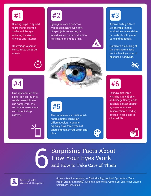
The 6 Surprising Facts About How Your Eyes Work and How to Take Care of Them infographic uses the eye illustration as a visual anchor, with the supporting facts arranged around it.
This is a useful variation on the bento grid when the topic has one obvious central subject. You could use the same idea for anatomy, a product, an object, a location or anything else where one image can connect the surrounding information.
17. Colourful bento grid
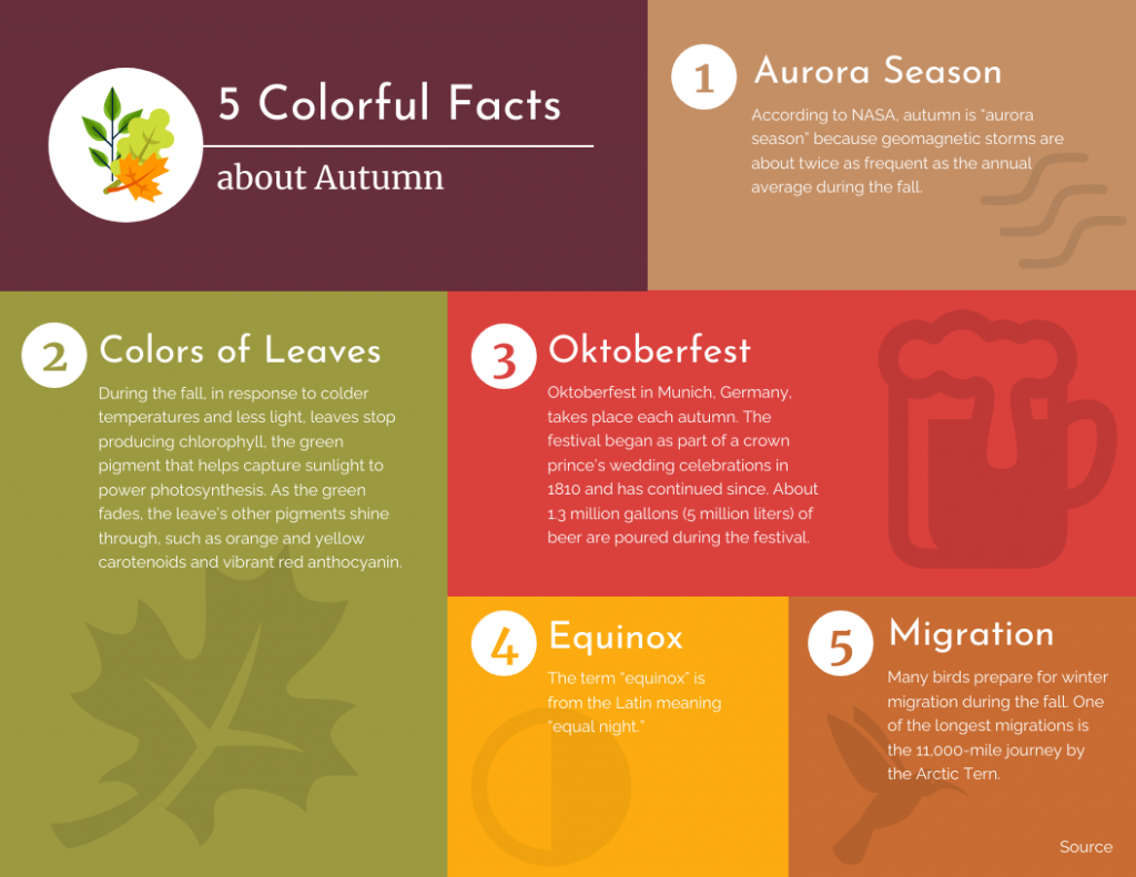
The 5 Facts About Autumn template uses different-sized color blocks to separate the individual facts. Because the facts are short, the layout can rely more heavily on color and scale rather than long explanations.
It’s an easy format to adapt for seasonal campaigns, themed social content, event graphics or other short fact-based infographics.
How to create a bento grid design with Venngage AI
Bento grid layouts look simple, but building one from scratch can take a surprising amount of trial and error. You have to decide how many tiles you need, which ones should be larger, where the visuals go and how everything fits once the real content is added.
Venngage’s AI Infographic Generator gives you a starting point by turning a text prompt into a first draft. From there, you can keep shaping the layout instead of manually building every section yourself.
Method 1: Edit an existing template with AI
If you already like the structure of one of the templates above, you don’t need to recreate the layout from scratch. Open the template in Venngage and use AI to replace the existing content with your own topic.
For example, I used the HR Best Practices for Recruiters template and asked Venngage to turn it into a cybersecurity infographic.
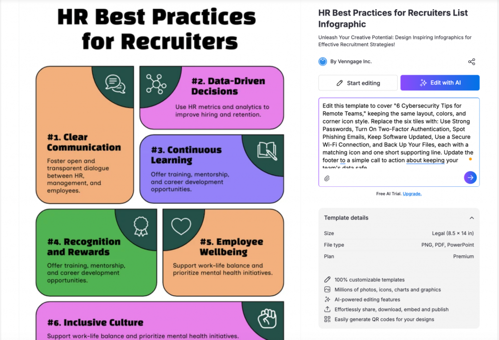
Venngage replaced the original recruitment copy and icons with cybersecurity-related content while keeping the overall layout intact.
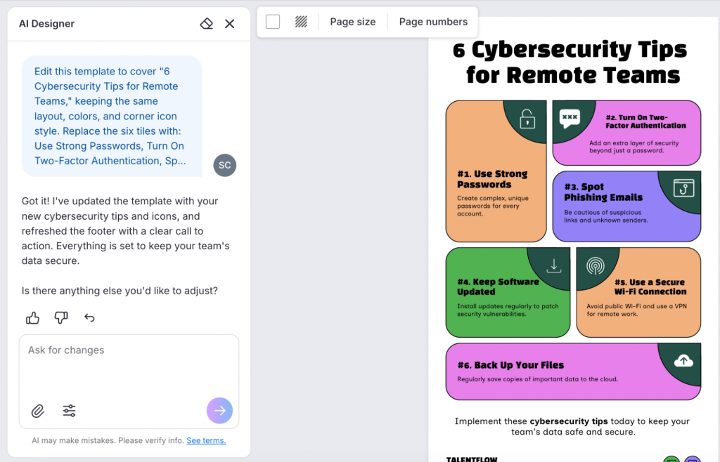
This is probably the easiest route when you already have a bento grid layout you like and mainly want to change the topic, copy and visuals.
Method 2: Start with a simple text prompt
You can also create a bento grid infographic with a simple text prompt in Venngage.
Start with a topic that can naturally be broken into separate pieces of information. Things like the key elements of a landing page, things to do in a city or a breakdown of product costs work well because each tile can make sense on its own.
Avoid using step-by-step process topic because readers need to follow the information in order, which defeats the purpose of a bento grid layout.
For example, I wanted to make an infographic on the economics of coffee, with a simple breakdown of what all costs are included in the price of a coffee.
This was the prompt I used:
Create a playful vertical bento-grid infographic titled “The Economics of a Cup of Coffee” with the subheading “What are you actually paying for a When You Buy a 5$ of coffee”
Here’s the output:

A short prompt is enough to give the AI a starting point, but you can be much more specific if you already know how you want the design to look.
You can tell the AI how many tiles to create, what should go inside each one, which tiles should be larger and what kind of colors, illustrations, typography or visual style you want.
I tried that with a second infographic on road safety, using a much more detailed prompt to guide both the content and the visual direction.

Here’s how the design turned out:
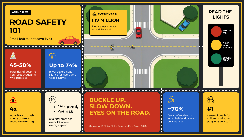
This gives you more control over the first draft, especially when you already have a clear idea of the type of bento grid you want to create.
Use the first draft to shape the layout
The first version is mainly useful for seeing how the information could fit together.
Look at which sections the AI has made larger, whether the smaller tiles feel cramped and whether the overall design actually reads like a bento grid. If everything is the same size, or one section needs more room, that is usually the first thing to change.
You can then refine the structure by asking for specific edits, such as making one tile wider, reducing the number of cards or moving a section into a larger block.
For example, the first coffee infographic looked more like a regular grid because most of the tiles were similar in size. I used the AI Designer chat to ask it to vary the tile sizes and make the layout feel more like a bento grid.
You can do the same if a section needs more space, there are too many cards or one of the key points isn’t standing out enough.
Once I was happy with the structure, I started working on the individual tiles.
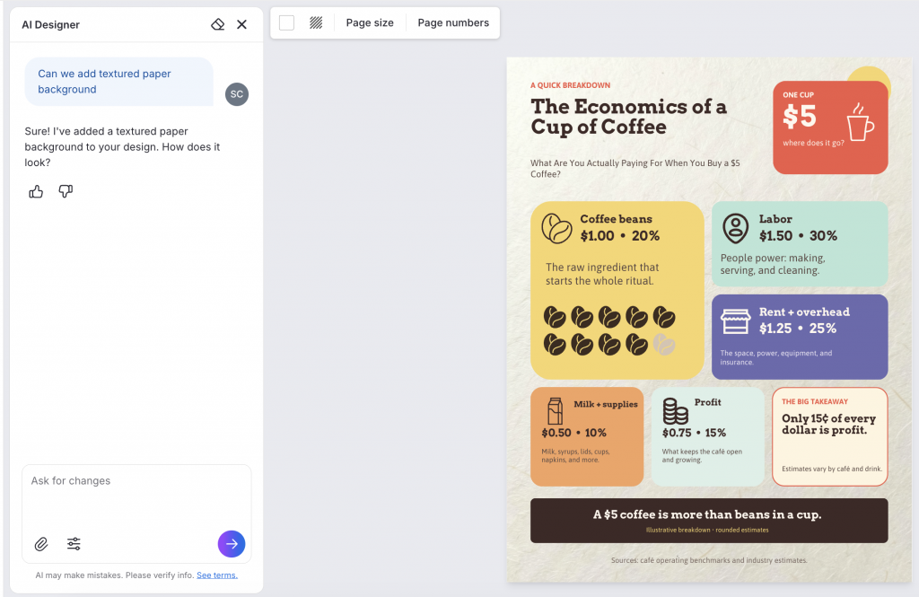
The coffee infographic initially had a very plain background, so I asked the AI Designer to change it to a textured paper background.
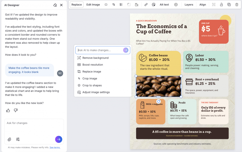
I also wanted the coffee-beans tile to feel more visual, so I asked the AI to improve that section. It added a coffee-beans image, which I could then continue editing in the design.
It added a coffee beans image, which I could further edit.
You can ask for stronger gradients, a different illustration style, cleaner typography or a more editorial look if the first draft feels too plain.
Fine-tune the design in the editor
After the layout and visuals are in place, you can make the smaller edits that bring the whole infographic together.
Change the text with the AI Writing Assistant, update colors, replace icons or images, edit charts and adjust spacing where needed. If you are creating the infographic for a brand, you can also apply your Brand Kit so the fonts, colors and logo match your existing visual style.
Tips for designing a bento grid infographics
A good bento grid should feel varied, but there should still be a system behind it. The strongest layouts use a small set of tile sizes, clear differences in visual weight and consistent spacing to make separate blocks feel like one composition.
1. Choose the bento grid structure around your content
Before you start filling in tiles, decide what kind of structure makes sense for the information.
You might use one large tile with several smaller blocks around it, place a focal tile in the center or build the layout around two larger sections with supporting cards. The right structure depends on whether you have one clear takeaway, several equally useful facts or a mix of statistics and visuals.
For example, a research infographic could give the main finding the largest block, while a facts-based infographic may work better with several medium and small tiles that readers can explore in any order.
2. Work with a few repeatable tile sizes
The tiles should vary, but they don’t all need completely different dimensions.
Try building the layout from a small set of shapes, such as square tiles for quick statistics, wide tiles for charts or comparisons and larger blocks for the main takeaway or visual. Repeating those proportions makes the bento grid feel intentional rather than pieced together. Designer and brand-system guides similarly use shared grid units and repeatable spans to keep varied blocks aligned.
3. Give larger tiles to content that needs the space
A larger tile naturally attracts more attention, so use it for something that deserves that emphasis or genuinely needs more room.
That could be a headline statistic, a chart, an illustration or an important finding with a little more context. Smaller cards are usually better for quick numbers, icons and supporting facts.
If every tile is almost the same size, the design starts to read like a regular card grid.
4. Keep each tile focused on one point
Bento grids work best when readers can understand each block on its own.
A tile might contain one statistic and a short caption, one chart, one image or one takeaway. Once several unrelated ideas start getting squeezed into the same block, the grid becomes much harder to scan.
This is also why bento layouts tend to work better for modular information than for content that needs to be read from beginning to end.
5. Mix dense tiles with simpler ones
Not every section needs a chart, illustration and paragraph.
If one tile contains a detailed visualization, the blocks around it can be much simpler, perhaps a single number, icon or short statement. That gives the eye somewhere to rest and stops the infographic from looking like a dashboard packed with widgets.
You can still mix statistics, text, charts and imagery across the grid. The important part is deciding where the visual detail is actually useful.
6. Keep the spacing consistent
Different-sized blocks still need to sit on the same underlying grid.
Keep the gaps between tiles consistent and use similar padding inside each block. Repeating elements such as corner radius, typography and border treatment also helps the separate tiles feel like parts of the same design. EMCD’s bento brand system, for example, keeps block alignment and spacing consistent even as individual modules change size.
7. Stop before the grid gets too crowded
More tiles do not automatically make a better bento design.
Once you have too many small blocks, the differences in size become harder to notice and readers have more places competing for their attention. There isn’t one fixed number, but several current bento guides recommend keeping the grid to a relatively small set of content blocks rather than turning it into a wall of cards.
Create your own bento grid infographic
Bento grids are a useful option when you have several related points to show, but don’t want every section to look or feel the same. The best examples use tile size intentionally, so the layout feels structured without becoming repetitive.
You can start with one of the templates above or use Venngage’s AI Infographic Generator to create a bento grid from a prompt, then refine the tile sizes, visuals and content until the layout fits your information.
Bento grid infographic FAQs
What is a bento grid infographic?
A bento grid infographic organizes information into rectangular tiles of different sizes within one layout. Larger tiles usually hold the main statistic, chart or visual, while smaller blocks are used for supporting facts, examples or short explanations.
What is a bento grid used for?
Bento grids work well for content that can be split into several related sections, such as research findings, campaign results, company highlights, product features, statistics or fact-based infographics.
How do you design a bento grid layout?
Start with the information you want to emphasize, then build the smaller tiles around it. Use a few repeatable tile sizes, keep the spacing consistent and let the content decide how much space each block needs.
What information works best in a bento grid?
Short, self-contained content works best, such as statistics, charts, images, key findings, quotes and supporting facts. The format is especially useful when readers can understand each tile without having to follow a strict order.
When should you not use a bento grid?
Avoid a bento grid when the information needs to be read in sequence. Timelines, step-by-step processes and long explanations usually work better in a more linear infographic layout.
What is the difference between a bento grid and a regular grid?
A regular grid usually gives each section a similar amount of space. A bento grid mixes larger and smaller tiles, which lets certain statistics, visuals or ideas stand out more than the rest.
What is the difference between a bento grid and a masonry grid?
A bento grid places different-sized tiles within a defined row-and-column structure. A masonry grid usually keeps the column widths consistent while allowing cards to vary in height, creating the staggered layout commonly seen on Pinterest.
Can you create a bento grid infographic with AI?
Yes. With an AI infographic generator like Venngage, you can describe the topic, the sections you want to include and the kind of bento grid layout you have in mind. You can then refine the design by changing tile sizes, editing the content and adding charts, images, illustrations or brand styling.