Accessible color palette generator
Discover beautiful color combinations your whole audience can appreciate and follow Web Content Accessibility Guidelines (WCAG) with ease.
Generate an accessible color palette in seconds
Take the mystery out of accessibility with a simple color palette generator that does the heavy lifting for you.
Choose your own adventure! Generate an accessible color palette in one of two ways:

Generate from HEX
Input a HEX code to discover accessible palettes based on your color of choice.

Randomize
Don’t think twice — roll the dice and generate palettes based on a random color.
Examples of accessible color palettes
Get inspired to create your own accessible designs and dive right into a color conscious template.


What is an accessible color palette?

Understand how color theory and contrast contribute to creating inclusive communications.
An accessible color palette ensures readers with visual impairments and disabilities can see and understand your design. Contrast is key to achieve this goal. Elements with low contrast are hard to see, even for those without visual impairments.
In other words, designing for accessibility benefits your entire audience.
GENERATE ACCESSIBLE PALETTESWhat is contrast, exactly?
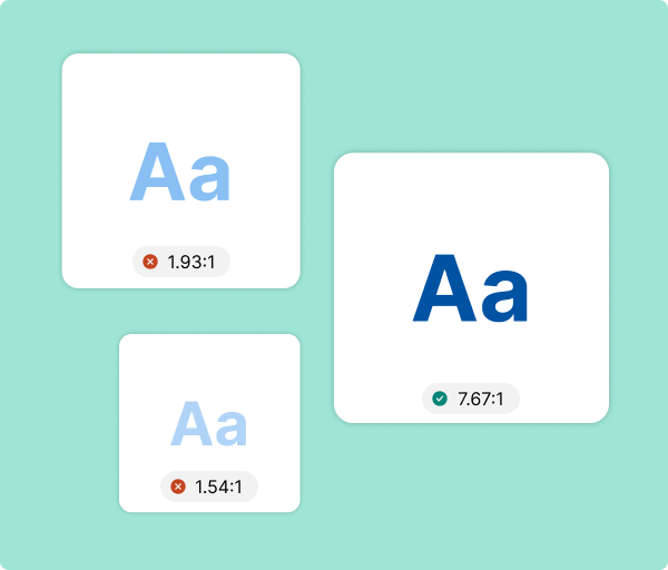
Contrast is the brightness or vibrancy of a color or element when compared to another element. For example, black text on a white background is high contrast. On the other hand, yellow text on a white background is low contrast.
The WCAG 2.1 specify the contrast ratio for body text should be at least 4.5:1.

Why use an accessible color palette?

Leave no audience member behind by combining complementary colorrs consciously.
If your designs aren’t legible, you’ll have a hard time connecting with your audience. What’s worse, if your designs are inaccessible, you may even alienate your audience — both those with visual impairments and those conscious of accessible needs.
Simply put, using an accessible color palette is the right thing to do for everyone.
Did you know…

2.2 billion people
At least 2.2 billion people worldwide have a vision impairment (WHO)

1 in 12 men
Around 1 in 12 men and 1 in 200 women have color vision deficiency (NCBI)

Red-green color blindness
Most people with color blindness have trouble with reds and greens (CBA). Create accessible designs with a color blind simulator.

How to design an accessible color palette

Break down visual barriers by making accessible design a first thought — not an afterthought.
In a typical design process, a person might choose a color palette, put together a visual and then check it for accessibility. By flipping this around, you can save yourself extra time and effort. Start by considering accessible, high contrast color combinations.
Choose a dark color for your text and a light color for your background, or vice versa.
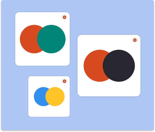
Avoid certain color combinations, including:
- Red and green — approximately 5% of people can’t distinguish between these colors.
- Red and black — for those who can’t detect red, it’s easy to confuse these two colors.
- Blue and yellow — it’s less common, but some people have blue/yellow color blindness.

Apply accessible colors to your next design

Get started today by generating accessible color palette options in just a few clicks.
It’s high time all design was accessible. But when you’re not a designer or well-versed in the intricacies of color, this is easier said than done. If you’ve struggled to make sense of accessible color guidelines or wrestled with an intricate color generator tool, you’ve come to the right place.
Generate accessible color palettes in seconds — no PhD required.
GENERATE ACCESSIBLE PALETTESFound a promising palette?
Try out your colors with Venngage’s Infographic Maker. Choose from thousands of professionally-designed templates and experiment with accessible palettes until you’re tickled pink with the results.
FAQ
How do you choose accessible colors?
There are a few factors to keep in mind when choosing accessible colors. First and foremost, consider contrast. You’ll want to choose colors that provide maximum contrast. The best example of this is black text on a white background.
As a rule of thumb, you’ll want to pair dark colored text with a light background or light colored text with a dark background. The WCAG 2.1 requires, “The visual presentation of text and images of text [to have] a contrast ratio of at least 4.5:1.”
You’ll also want to keep in mind that about 5% of people worldwide have color vision deficiency (color blindness). The most common form of color vision deficiency is red/green, but blue/yellow can also occur. You can still combine these colors in a palette, but you should try and avoid superimposing them.
How do you know if a color is accessible?
To determine if a color is accessible, you can check its contrast ratio against the colors you’re pairing it with. There are several free online tools that can help you do this. Alternatively, if you want assurances the colors you choose will be accessible, try using our color palette generator.
What colors are good for the visually impaired?
This may vary depending on the type of visual impairment. But in general, bright colors are easier to see than pastels. For example, a bold red may be easier to see than a light pink. Remember though: red may stand out, but if you pair it with a green, someone with color blindness may still struggle to understand your design.
So, rather than saying “this or that” color is good for the visually impaired, it’s best to take a holistic approach and think about how the colors in a palette combine — both in terms of contrast and color blindness.
How do you make an accessible color scheme?
Creating an accessible color palette starts with having empathy for your audience. Make sure you’re well-versed in the different types of visual impairments and how colors affect the legibility of your content for individuals with these conditions.
Before you start to build your palette, it’s also worth familiarizing yourself with the WCAG 2.1. Specifically, the section on contrast outlines rules for acceptable ratios. Your text needs to have a contrast ratio of at least 4.5:1.
From here, you can start by choosing a light and dark color for your palette. If you’re not sure where to begin or whether your choices adhere to the right contrast ratio, you can use an accessible color palette generator to come up with some inclusive options for you.
What is a color blind friendly palette?
A color blind friendly palette takes into consideration how people with this visual impairment perceive color combinations. Contrary to what the term implies, most people with color blindness can see color — their perception is just different than someone without color blindness.
There are several types of color blindness. Red / green is the most common. There’s also blue / yellow and complete color blindness (although these last two are quite rare). But using a color blind friendly palette doesn’t mean you need to strip out all colors from your designs.
It just means being conscious of how combining certain colors may affect your audience’s ability to distinguish between them. For instance, a blue and orange palette is a common color blind friendly choice. On the other hand, a blue and yellow palette could be confusing for someone with color blindness.
Is a color blind friendly palette the same as an accessible color palette?
There’s a distinction to be made between a color blind friendly palette and an accessible color palette. A color blind friendly palette may simply refer to color choices that take into account this condition. For example, choosing blues and oranges instead of blues and yellows.
But an accessible color palette takes the full range of visual impairments into account. So, beyond thinking about how someone with color blindness will see certain combinations, an accessible palette also considers how someone with blurred vision, glaucoma or cataracts will perceive colors.
An accessible color palette will adhere to all WCAG 2.1 guidelines, including contrast ratio requirements. To see what this type of palette looks like, give our accessible color generator tool a try here.
Why is color accessibility important?
Designing with accessible colors is important because it ensures people with visual impairments can understand your content. It removes barriers and provides an equal opportunity for everyone — regardless of circumstances — to engage with your designs.


