


The world feels more analytical than ever. Opinions alone don’t cut it—every decision needs data. As Dante Vitagliano puts it, “Data visualization is the language of decision making.” He’s right, great visuals don’t just show information, they shape smarter choices.
The world feels more analytical than ever. Opinions alone don’t cut it—every decision needs data. Organizations that leverage data are 23 times more likely to acquire customers, six times more likely to retain them, and 19 times more likely to be profitable. As Dante Vitagliano puts it, “Data visualization is the language of decision making.”He’s right, great visuals don’t just show information, they shape smarter choices.
Graphs and charts are excellent tools to present complex information. In this guide, I’ll explain different types of charts and graphs and their use cases.
Bonus: I’ll also share graph templates and chart templates you can edit using a Graph Maker and Chart Maker to make communication simple.
Click to jump ahead:
- General purpose charts
- Statistical charts
- Geography and mapping charts
- Engineering and sciences charts
- Social sciences and humanities charts
- Healthcare and medicine charts
- Financial charts
- Relationship charts
- Other charts
General purpose charts
Bar graph
A bar graph features rectangular blocks of different heights or lengths, arranged horizontally or vertically.
Bar charts are ideal for comparing different data points and tracking growth over time. You can also bar charts to analyze trends and rank data based on different metrics.
This bar graph breaks down monthly expenses based on different categories.

This bar graph makes it easy to visualize the rise in pending cases in US immigration courts over time.

Line graph
A line graph, also called curve chart, represents changes in data values over a particular period. The X-axis shows time intervals whereas the Y-axis indicates change in data values.
To create a line chart, you must add data points at the intersection of X-axis and the Y-axis and connect them to form a line or multiple lines.
This line graph features multiple lines, with one showing expected profit for Q1 2028 and second line for Q1 2029.

Pie chart
Pie charts represent data in a circular or ‘pie’ format divided into different slices to show data values.
You can use pie charts for various use cases, such as market analysis, survey results, customer segmentation, and/or visualizing traffic generated from different resources.
Pie charts, like the one below, can tell you what portion of your income is spent on groceries vs bills, travel, shopping, medical expenses, and more.

Area chart
Area charts are similar to line charts in that they represent trends over time. But unlike line charts, spaces between lines in area charts are shaded with different colors to help track changes in volume over time.
You can use area charts for cumulative market share analysis, tracking population growth, and/or to check cumulative sales volume.

Step chart
Want to track sudden changes in data? This is where you’ll want to use a step chart.
Step charts don’t use a continuous line (like line charts) and instead feature a mix of horizontal and vertical lines to create charts that look like steps.
You can use step charts to track trends, show product price adjustments, or analyze jumps or reductions in sales or any other metrics.

Source: TutorialsPoint
Pareto chart
Pareto charts blend bar and line charts and are based on Pareto’s principle (80% of consequences or actions arise from 20% causes).
In pareto charts, data is arranged from the highest to lowest frequency so it’s easier to identify which factors have the highest impact.
For example, the bars in this Pareto Chart reveal that budget overrun is the biggest blocker to project success, followed by scope creep.

Related: How to Choose the Best Types of Charts For Your Data
Statistical charts
Waterfall chart (Cumulative changes)
Waterfall or cascade charts are bar charts that represent total change (both an increase and decrease) in the initial value.
You can use waterfall charts for financial analysis, tracking budget and project cost performance.
Let’s understand waterfall charts better with an example. The chart below starts off by mapping $50 in savings in January. As months pass by, a gain of $39 in March ($89-$50) is mapped as an increase along with decreases in June and October. A cumulative total is provided at the end of the year.

Source: Jaspersoft
Gantt chart (Horizontal bars for visualizing project timelines)
Gantt charts are used for project scheduling and tracking, with each project task or activity represented by a horizontal bar. In fact, 71% of project managers use Gantt charts for project planning and tracking.
The length of bars in Gantt charts help you track progress or visualize how many milestones have been achieved.

Bullet chart (Performance target vs. actual)
Bullet charts are a variation of bar charts that show actual performance against the target with the help of a bold vertical line.
You can use bullet charts to track KPIs or compare actual revenue and sales against a target.
In the bullet chart below, the orange and blue horizontal bars show actual sales volume of different beverages against projected sales volume shown by the vertical line.

Source: Tableau
Histogram (Distribution of data)
Histograms are often confused for bar charts but they serve a different purpose (to visualize distribution of continuous data).
Histograms show how data points are spread across a range to help you spot patterns like average or skewness.
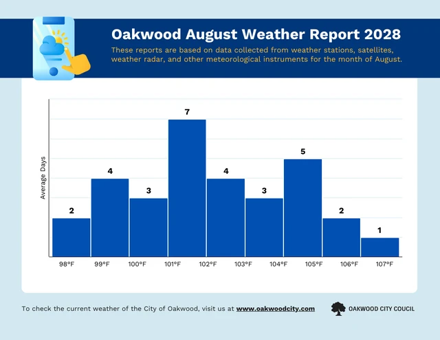
For example, the histogram below shows the frequency of certain temperatures over one month.
Related: Bar Charts vs. Histograms
Scatter plot (Relationship between variables)
Scatter plot graphs comprise data points marked as dots to represent the relationship between the X-axis and the Y-axis. They are used to explore the relationship between two sets of continuous data.
By looking at the distribution of dots, scatter plots can reveal patterns such as clusters and outliers.
In the below example, the dots show the relationship between units sold and revenue and reveal Type C to be the worst performing products.

Boxplot (Distribution with outliers)
A boxplot, also called box-and-whisker plot, is a technical graph that provides the following information about a data set:
- Minimum value
- First quartile
- Median value or the second Quartile represented by the yellow line shown below
- Third Quartile
- Maximum
The boxplot graph helps understand whether data is symmetrical and track outliers.

Source: Built In
Heatmap (Intensity of data across two dimensions)
A heatmap uses a grid of colored squares to represent values to show patterns and trends. In heatmaps, similar data point cells are colored the same to help track patterns and outliers.
The most common use of heatmaps include tracking user/customer behavior and visualizing sales performance in different regions. In fact, 96% of users rely on visual elements and patterns when navigating a website or app.

Source: Seaborn
Violin plot (Distribution with density information)
Violin charts display data vertically and combine features of box plots and kernel density plots to show the distribution of numerical data.
They’re particularly useful for comparing distributions between multiple groups.

Source: Atlassian
Kernel density estimation plot (Smoothed data distribution)
Kernel density estimation plots help analyze the possibility of a random variable occurring in a continuous event. KDE plots are similar to histograms, however, the lines are smoothed out.
An example use case of a KDE plot is figuring out after how many production cycles a defective piece is likely to be produced.

Source: Seaborn
Swarm plot (Beeswarm plot)
A swarm plot is a popular statistical graph used in Seaborn, a data visualization library in Python.
Swarm plots are similar to scatter plots but the dots do not overlap each other. Hence, swarm plots are better for showing how data distribution in small or medium-sized data sets.
You can use swarm plots to track ROI of various investments in your portfolio or evaluate customer satisfaction scores.

Source: GeeksforGeeks
Hexbin plot (Distribution of data on a hexagonal grid)
Hexbin plots represent the density of two continuous variables. Unlike scatter plots that show individual data points, hexbin plots group data points into hexagonal bins (like a honeycomb).
Hexbin plots are useful for exploring relationships between a continuous variable and a segmentation factor (like income within different age groups).

Source: Matplotlib
Q-Q plot (Quantile-Quantile plot to compare probability distributions)
In the Q-Q plot, you plot two quantiles (points that divide data into equal parts) against each other. This can help you analyze whether data comes from the same distribution.

Source: GitHub
Dot plot (Data points displayed along an axis)
Dot plots are similar to bar charts except they use dots to show data frequency instead of bars.
Dot plots are useful for displaying data sets with a small number of values or when you want to focus on the spread of data rather than comparing magnitudes.
In the example dot plot below, the number of dots represent frequency of different heights.

Source: QuantHub
Box plot with notches (Shows medians of subgroups)
Box plots with notches are similar to box plots. The only difference is the notch or the belted waist across the median for special focus. This graph helps compare the medians of two groups.

Source: Edureka

Geography and mapping charts
Bubble map (Data points with variable size based on a third variable)
A bubble map shows the relationship between variables through bubbles or circles whose size corresponds to a third variable.
Bubbles can also be colored differently to represent another variable to add another layer of information.
By visualizing data points and their sizes, bubble maps can help you identify relationships between three variables.

Cartogram (Distorted map reflecting data)
A cartogram map distorts traditional geographic maps to show different data such as the population of a specific location, election results, economic data, healthcare data, or environmental data.
For example, the cartogram below shows average gas prices in different locations in the US.

Choropleth map (Colors represent data for geographical regions)
Choropleth maps are similar to cartograms but use different colors and shades to represent values of a specific variable within predefined geographic regions.
For example, in the choropleth map below, different shades of purple are used to represent the percent of population in a state that has attained a bachelor’s degree.

Tree map (Hierarchical data with nested rectangles)
Tress maps or diagrams show hierarchical data with nested rectangles and each category can be further divided into subcategories using smaller rectangles.
The area of each rectangle in a tree map is typically proportional to the value it represents to allows viewers to compare the importance of different categories and subcategories at a glance.

Source: Daily Genius
Funnel chart (Visualize different stages of a process)
Funnel charts are designed to show how data or users progress (or drop off) through various stages of a process.
The funnel’s broadest section at the top is the start point and as you move down the funnel, each subsequent step in a process is is represented by a narrower funnel.
The funnel map below explains the AIDA framework for customer journeys. The first stage is gaining ’ attention, followed by piquing interest, creating desire, and ultimately prompting action.

Gauge chart
A gauge chart, also called a speedometer or dial chart, measures a single data value. These charts are mainly used by project managers or leaders to track KPIs.
You can use gauge charts to measure employee performance for a particular year or monitor how much percentage of the monthly sales target has been achieved.

Pictogram
Pictograms uses simple images or symbols to represent data in a clear and concise way. They’re ideal for quick visual communication and for audiences with varying language skills.
For example, in the pictogram below, each human symbol represents 1,000 visitors which makes it easy to compare which sources bring the most amount of visitors.

Engineering and science charts
3D graphs (Comprise X, Y and Z axes)
Unlike most graphs that exist on a two dimensional plane, 3D graphs have a X, Y and Z axis which makes them useful in fields like engineering to visualize processes.
For example, 3D graphs are used to represent molecular structure and show movement of electric currents and magnetic fields in wire or coil.

Source: OriginLab
Smith chart (Impedance in electrical engineering)
Smith charts are mostly used in radio frequency engineering and electrical engineering and comprise of various intersecting circles to solve problems involving impedance (resistance in an AC circuit).

Source: Copper Mountain Technologies
Ternary plot (Compositions of three variables)
A ternary or triangle plot diagram plots the ratio between three variables in an equilateral triangle. The sum of all the three variables is a constant.
This diagram is commonly used in geology to classify soil based on three variables — soil, silt and clay. It can also be used in chemistry to analyze the composition of an element.

Source: Towards Data Science
30. Quadrant chart (Data points categorized into four regions)
A quadrant chart is a 2D chart divided into four regions or quadrants, with each quadrant assigned a specific meaning.
The quadrant breakdown provides insights that can be used to prioritize actions or make decisions.
For example, the employee performance review quadrant chart below focuses on two variables — getting the job done (on X-axis) and doing the job right (on Y-axis).

Social sciences and humanities charts
Network graph (Connections between nodes)
A network graph or diagram connects various nodes together to show the relationship or flow between various data items or entities.
These graphs are generally used to analyze the structure and dynamics of interconnected systems. For example, in the example below, the network graph shows how data moves securely along a business network.

Word cloud (Emphasis on frequently used words)
A word cloud or text cloud visually represents words used frequently in any context, inside a cloud. The words with a higher frequency are indicated by a large text size.
Here is an example of a word cloud which includes frequently used technology terms, such as data, cloud computing, and coding.

Word tree (Hierarchical relationships between words)
A word tree is similar to a word cloud but instead of focusing on frequency of individuals words in a scenario, it focuses on relationships between words.
These diagrams also show how words connect to other related words or phrases and thus highlight the pattern of word usage.

Source: Harvest Workers’ Co-op
Word network (Relationships between words)
A word network graph, also called a word association network, is a type of network graph used to visualize the relationships between words.
It uses a focus word in the center and words associated with it are connected through nodes.
In this word network chart, the focus keyword and closely related words such as moon, shine and orbit, are connected through nodes.

Source: Word Associations Network
Sankey diagram (Flow of quantitative data)
A Sankey diagram depicts flow of data or resources using bands and arrows whose width is associated with magnitude.
These charts are useful for identifying the major transfers and bottlenecks within a system.

Source: Tableau
Venn diagram (Overlapping sets)
Venn diagrams show the relationship between two or more sets of items using overlapping circles. Each circle represents a set and the overlapping area between both circles show commonality.
This Venn diagram makes it easy to visualize how product marketing is common among marketing, strategy, and product.

Related: How to Create a Venn Diagram in Google Slides
Mosaic plot (Contingency tables with colored squares)
Mosaic plots helps us understand relationships between categorical variables which can be distinct such as “eye color” or “shirt size”.
These charts use grid of rectangles to show how these categories interact with each other.

Source: Geeks for Geeks
Circular packing (Circles arranged to minimize wasted space)
The circular packing diagram is similar to treemaps and dendrogram in that it arranges information hierarchically.
However, instead of using rectangles, it represents each entity as a circle, with smaller circles nested inside larger circles to represent branches of the tree.

Source: GitHub
Chord diagram (Relationships between entities)
Chord diagrams are circular visuals with nodes or entities placed on the outer part of the diagram.
The diagram helps you visualize how each node connects to each other via arcs (the size of the arc varies based on how importance the relationship is).

Source: Origin Lab
Healthcare and medicine charts
Flowchart (Explains the process)
Flowcharts are one of the most popular ways to visually represent complex processes.
Flowcharts use a standardized set of shapes, arrows, and text to show different steps, along with decisions that need to be made at each point. This makes it easy to follow the logic of a process.
For example, the flowchart below uses diamonds to represent each step and arrows to point to the next step in the process.

Related: How to Make a Flowchart in Google Docs
Survival curve (Probability of survival over time)
A survival curve, also called a Kaplan-Meier curve, is a graph used in medical studies and other fields to visualize the probability of surviving or not experiencing a specific event over time.
In these graphs, the x-axis represents time intervals and the y-axis shows the probability of survival. The curve steps down as patients experience the event of interest or flatten where track of the patient is lost.

Source: MedCalc
Tree diagram (Decision-making or branching processes)
A tree diagram is a hierarchical diagram that breaks down processes into sub-processes (called branches) or multiple sub-factors to find the root cause of a situation.
You can use tree diagrams for decision-making, studying family relationships and classifying data.

A tree diagram can be used in healthcare to diagnose a patient’s condition by creating each symptom into a separate branch. These diagrams can also outline the entire treatment process.
Financial charts
Candlestick chart (Opening, high, low, closing prices)
A candlestick chart is a popular tool used in financial analysis as it shows price movements of assets like stocks or currencies over a chosen time period (day, hour, etc).
The rectangular body shows the opening and closing prices, and the lines (wicks or shadows) extending from the body represent the highest and lowest prices reached during that period.
These charts are mostly used by financial analysts use candlestick charts to understand price trends, identify potential trading opportunities, and gauge overall market sentiment (bullish or bearish).

Source: JasperSoft
Point-and-figure chart (Price movements without time)
A Point-and-Figure chart is a technical tool used to visualize price movements of securities without being tied to specific time intervals.
It utilizes the letter X and O (X represent price increases, and O represent price decreases).

Source: Nevron. NET Vision
OHLC chart (Open-High-Low-Close prices)
An OHLC chart is another popular tool for visualizing stock price movements over a specific time period.
In this chart, the x-axis represents the time interval (days, weeks, months) and the y-axis shows the price scale. Each vertical bar in the chart captures four data points (open, high, low, close) for that time period.

Source: Phemex
Relationship charts
Dendrogram (Hierarchical relationships)
A dendrogram represents hierarchical relationships between data points or clusters of data points.
These charts visually depict how data points are grouped together based on similarities or distances, with the structure resembling a tree.
You can use dendrogram for customer segmentation to help develop data-driven strategies for targeted marketing and improved customer experiences.

Source: MathWorks
Node-link diagram (Relationships between nodes)
A node link diagram represent relationships between entities ranging from individuals to organizations.
Node-link diagrams are often used for social network analysis in which the nodes represent user profiles. This information can help identify how users are connected and who is most influential.

Source: GitHub
Other charts
Radar chart (Spider chart – comparing multiple variables)
A radar chart, also known as a spider chart allows you to compare multivariate data.
Radar charts have multiple circular axes radiating outwards from a central point on which data is added.
You can use a radar chart to map employee skills where each axis represents a different skill and the data points reveal employees’ strengths and weaknesses. Radar charts are also great for competitor analysis.

Source: R Graph
Polar area chart (Cyclical data radiating from a center)
Polar area charts are a modified version of pie charts in which each data value represented has the same angle but the radius of the angle depends upon the data value.
Polar charts can be used to represent cyclical data such as monthly marketing campaign performance and daily website traffic increase.

Source: GeeksforGeeks
Slope chart (Trend direction and steepness)
Slope charts are a great way to visually compare trends between different categories over a fixed time interval.
They use connected lines to show how data points for each category change over time and the steepness of a slope indicates the magnitude of the increase or decrease.
You can use slope charts to compare revenue growth over a year, track changes in market share and monitor improvement of customer satisfaction over a certain period.

Source: Towards DataScience
Understanding the types of graphs is the first step. The next step is knowing how to present them effectively and our data presentation examples guide shows you exactly how.
Conclusion: Tell stories visually using graphs and charts and leave a lasting impression
Even though data visualization makes it easier to convey information, I know how tricky it can be to make charts look good in Excel or Google. And yet, the value is huge. Like statistician and data visualization expert Nathan Yau puts it, “Learn data, and you can tell stories that more people don’t even know about yet but are eager to hear.”
Fortunately, that doesn’t mean there’s no hope. Check out diagram templates and chart templates on Venngage that you can edit and make your own without any design skills. Get started today!


