

There are plenty of infographic ideas out there. The problem is, once you start looking for inspiration, you usually end up with too many options.
You search Pinterest, Google Images or design galleries and find everything from data-heavy reports to bold social media graphics, timelines, explainers and list-style infographics. Some look great but don’t fit your topic. Others fit the topic but feel too generic to recreate.
So instead of giving you another long gallery to scroll through, we’ve grouped 50+ infographic ideas by industry and use case. You can jump to the section most relevant to you, see what kind of ideas work there and use the examples as a starting point for your own design.
We’ll also cover a few tips to come up with stronger infographic ideas and show how you can design an infographic with AI.
If you’re just getting started, check out our post on what is an infographic to learn the basics. And if you’re still feeling stuck, we’ve included simple tips at the end to help you find the right topic.
Infographic ideas for marketers
As a marketer, you are constantly looking for new ways to get your audience’s attention. You need fresh ideas to create for social media, campaigns, blog content, product launches and even the same research or data you have already shared before.
Infographics give you more room to experiment with how you present those ideas. You can turn an interesting industry trend into a data story, visualize how customer behavior is changing, break down a new marketing strategy or create something timely around topics like AI search and AEO/GEO.
Here are some marketing infographic ideas you can adapt for your next campaign or piece of content:
1. Turn original research into a data story
If your team runs surveys, publishes benchmark reports or collects original customer data, you can create a statistical infographics for social media or a blog to promote the full research.
For example, you could visualize how marketers are adopting AI, how customer search behavior is changing or which channels are driving the most qualified leads.
Use the strongest statistic as the hook, then add a few supporting data points that provide context and help tell the larger story.
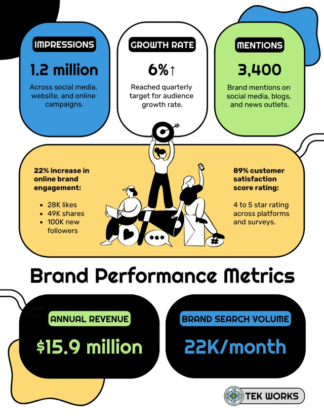
This type of infographic is ideal for highlighting several key findings in one place without making the data feel too dense.
Infographic topics to try:
- AI adoption in marketing teams
- Changes in customer search behavior
- Social media engagement benchmarks
- AI and design trends in marketing
- Brand awareness and search trends
2. Visualize how customer behavior is changing
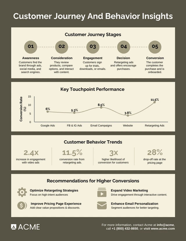
Customer behavior is always changing, especially as people move between search, social, AI tools and other channels before making a decision. This is a strong infographic topic because brands are constantly trying to understand those shifts and adjust how they reach and engage customers.
If you have original data, you could create an infographic like this one to show how customer behavior is changing across different touchpoints.
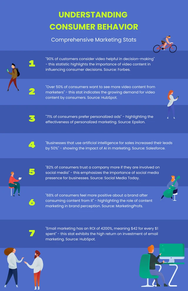
You can also compile relevant data from trusted external sources and present it in a simpler list-style infographic.
Infographic topics to try:
- How AI is changing the customer journey
- Where Gen Z discovers new brands
- Google vs social vs AI for product research
- How customers research a product before buying
3. Break down a marketing strategy
Educational infographics are a good way to share your expertise on a marketing topic without turning it into a long guide. Pick one strategy, break it down into the key steps or channels and use a process infographic to show how everything fits together.
For example, Ross Simmonds uses the infographic below to show how one article can be distributed across multiple content formats and channels.
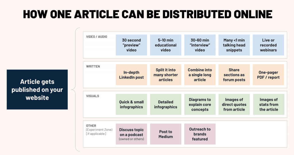
Source: Ross Simmonds’ blog
Ideas to try:
- How AEO/GEO works
- Product launch checklist
- Brand positioning framework
- Social media campaign planning
4. Help your audience make a decision
Think about the tools, services or approaches your audience often compares before making a decision. These can make great infographic topics.
Look at trending topics, common buying decisions or questions people are asking and turn them into a simple side-by-side comparison.
For example, this comparison infographic shows the differences between UGC and influencer marketing across cost, content volume, engagement and production speed.
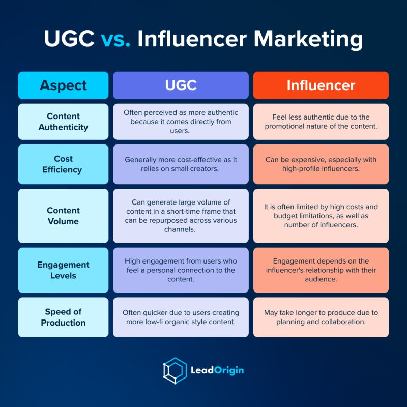
Source: LeadOrigin
An FAQ infographic like below might achieve the same goal as well:

Infographic topics to try:
- ChatGPT vs. Claude
- In-house vs. outsourced services
- Free vs paid graphic design tools
- Which pricing plan is right for you?
- Freelancers vs. agencies
5. Repurpose a high-performing piece of content

The most popular type of marketing infographics actually repurpose information from a blog post, study, or article.
At Venngage we create a new infographic for almost all of our blog posts, especially if they are data-driven. In this infographic example, we used data from our yearly content marketing survey that we sent to 1000s of marketers.
The best part of these types of infographic ideas is that you already have created most of the content! You just need to repurpose the written content into a visual.
Similar infographic topics:
- The Power of Visual Content: Statistics on the Impact of Images and Videos in Marketing
- User-Generated Content: Harnessing the Power of Customer Contributions
6. Side hustle statistics infographic example

One thing to remember when you’re creating infographics from written content is to make sure they are very unique or visually stunning. If you just present a boring list of data or text, then what is the point of creating an infographic in the first place?
This infographic idea from Podia actually presents their information in a very interesting way.
The data in this infographic is very easy to consume no matter what screen you’re viewing it on as well. A lot of infographics fail because they forget to optimize for smaller screens and social media.
Similar infographic topics:
- Motivations Behind Side Hustles: Statistics on Why People Pursue Additional Income Streams
- Side Hustle Success Factors: Statistics on Strategies That Work
7. Data-driven marketing infographic idea

I really like this example from Mashable and Seagate because of it’s small form factor. It’s about the same size as a poster, which means it can easily be shared on Facebook, Pinterest or in an email blast.
Plus, like the previous example, the information in this business infographic was repurposed from an article. This approach is a lot more efficient and effective than creating something from scratch.
Trust me, I have used this simple strategy to massively expand our social visuals over the past year.
Similar infographic topics:
- The ROI of Data-Driven Marketing
- Emerging Visual Content Marketing Stats to Know in 2024
8. Product launch roadmap infographic template

Not every infographic that you create has to be shared with the public, you can also use it to create a product roadmap for your team.
I like this approach because you can easily share the high- level information and deliverables with the rest of your company throughout the project. If really you need to expand on an idea or a concept, that can be done on another document.
Also, because we all know setbacks happen, you can update the roadmap on Venngage in just a few clicks.
Similar infographic topics:
- Maximizing ROI: Your Roadmap to a Profitable Product Launch
- Launching Your Healthcare Product the Right Way
9. Customer persona infographic template

A user persona guide really should be a visual or graphic, even if you don’t create an infographic like this.
Otherwise, it doesn’t feel like a real person that would buy your product or use your service.
As you can see in this infographic example, they are able to visualize almost every aspect of this fake customer. This format also makes the information easy to understand and access, no matter your team or industry.
A developer, designer, or marketer can use this information to make better decisions going forward.
Similar infographic topics:
- Persona Power Plays: How Your Customers Make Decisions
- A Day in the Life of [Persona Name]: Journey Mapping
10. Marketing growth goals infographic template

Explaining your short and long term goals to your team can be a tricky thing to get right. There are so many moving parts and it can seem overwhelming very quickly.
With this simple infographic template, they break each major goal into just a few sentences.
This growth marketing infographic will help your team do their jobs more efficiently and no one outside of your office will see them.
It might discourage some people from creating an infographic, but it can really help your team be on the same page from day one.
So as you can see there is a huge difference between a marketing infographic and using an infographic in your marketing.
Hopefully, the marketing infographic examples above have given you some great ideas for an infographic!
Similar infographic topics:
- Turning Customers into Brand Advocates
- Unlocking Growth with Powerful Content Marketing
Infographic ideas for nonprofits
People who work at nonprofits often have to wear many hats. One day they might be an event planner, the next a designer, and next week they might be leading a webinar.
Their visual content needs are going to be as diverse as their job experience and expectations.
So let’s take a look at some ways they can use nonprofit infographics.
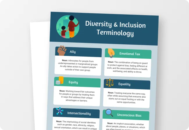
11. Diversity and inclusion infographic idea

Diversity and Inclusion are hot topics for businesses, and nonprofits are no different.
To create a truly inclusive and welcoming space for everybody who accesses your nonprofit be upfront about your Diversity initiatives.
Presenting key Diversity and Inclusion terms in an easy to understand and professional looking infographic means that this infographic could be used as a poster, on a website, or within your employee handbook.
Similar infographic topics:
- Practical Steps for a More Inclusive Workplace
- Creating an Inclusive Environment for People With Disabilities
12. Giving Tuesday fundraising infographic idea

Source: classy.org
A lot of people probably have heard about Giving Tuesday but might not know much about how impactful it has been over the past few years.
The design pros over at Classy took the time to break down how much has been raised, the top organizations, and more in a very engaging way.
The information presented in this example makes it very easy for anyone to learn more about the cause. I also really like how they give tips for organizers and donors to help them organize on Giving Tuesday.
You can use this same approach when creating a nonprofit infographic for your event or cause.
Similar infographic topics:
- Seeds of Change: Investing in a Sustainable Future
- Tax Deductions and the Benefits of Charitable Giving
13. Alternative giving nonprofit infographic example

Source: cookitrealgood
Not everyone can give money to their favorite charities in this chaotic time, but they still can help out in other ways.
This very simple list infographic outlines 8 ways that donors or volunteers can assist a nonprofit without giving directly.
There are definitely people who want to help, but they just might not know how to. With a simple list like this, you can activate a bunch of people to help out the community.
So if your organization seems to be struggling to come up with an engaging infographic idea, this might be perfect!
Similar infographic topics:
- Time is Money: The Power of Volunteer Hours in Action
- Skills for Good: Matching Your Expertise to Make a Difference
14. Fundraising progress infographic template

Use this infographic to create a visual representation of your progress with important dates, goals and milestones.
Let your donors and employees know how close you are to your goal with this fundraising goal template. There’s really something special about watching that thermometer fill up as the days go by, especially if there is a large or long term goal.
You can also share your weekly or monthly progress towards the goal on social media with this infographic.
Similar infographic topics:
- Growing Our Impact One Donation at a Time
- Brick by Brick: Building a Brighter Future Together
15. Data-driven donation appeal infographic example

Source: Behance
Appealing to new donors is a tough job for any nonprofit organization. But if you want to get your message out to as many new people as possible, I would follow this infographic example.
In a few hundred words and a handful of graphics, they are able to break down the problem they face and outline how your donation will help them try to solve it. Honestly, they are able to tell a compelling story about their nonprofit almost instantly.
The designer made this infographic very easy to consume by breaking each point into sections, using simple data visualizations and strong fonts as well.
When you only have a few seconds to grab someone’s attention, an approach like this will help a lot.
Similar infographic topics:
- How Your Contribution Makes a Difference, Quantified
- From 5 to 5,000: How One Campaign Transformed a Community
16. Nonprofit donor appreciation infographic example

Source: classy.org
Former President Carter is probably one of the most famous faces that is associated with Habitat For Humanity. In fact, he is still helping them build houses well into his 90s!
If you have a special or long term volunteer in your organization you can highlight their achievements with an infographic like this one!
I think this infographic won’t just show your appreciation for current volunteers, it also could be that little push that some people need to get involved.
Similar infographic topics:
- $10.34: The Hidden Impact of Your Daily Coffee Budget
- The Journey Continues: How You Can Keep Shaping Our Future
17. Nonprofit program timeline infographic template

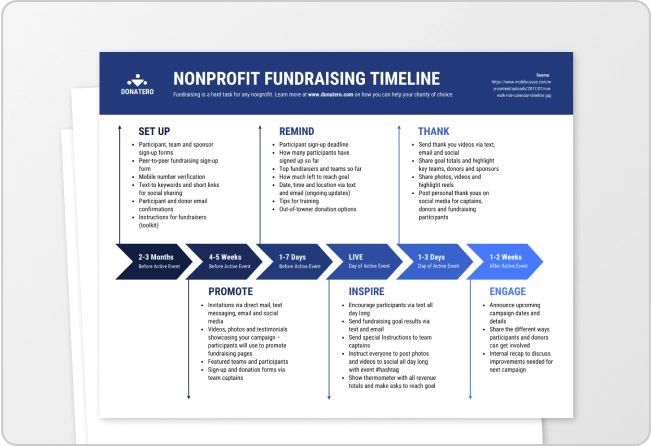
Before you even start a new fundraising campaign, it’s very important to lay out a general timeline of the important steps or events.
In this nonprofit timeline infographic, they outline every major thing for their end of year fundraiser. From outlining the objectives all the way back in July, to launching the campaign in December.
With a lot of people working on an event like this, it’s very helpful to have a timeline that everyone can refer to. That way small things won’t slip through the cracks or surprise anyone on your team!
Similar infographic topics:
- Celebrating Major Achievements in [Program Name]
- Cultivating Change: Long-Term Sustainability Strategies for [Program Name]
18. Nonprofit annual report infographic idea

Creating a summary infographic is a fantastic way to let your stakeholders know what your nonprofit accomplished in the past year.
There is a much bigger chance that they are going to remember your achievements when presented in this fashion. Plus it’s a lot easier to read this infographic, instead of searching an annual report for all the important data or information.
You could even share the infographic on social media as a primer or introduction to the full annual report.
Similar infographic topics:
- Impact Undeterred: Overcoming Challenges and Making a Difference in [Year]
- Stories of Resilience: How We Empowered Lives and Communities in [Year]
19. Nonprofit project timeline infographic template

Unlike the previous timeline template above, this example would be more effective if it was shared with the public.
Both outline the timeline of a project, but this one is theoretically looking back on events after the project was completed. It’s almost like a historical timeline of the project or charity.
Sometimes it helps to show how well the previous projects have been completed, to get donors or volunteers excited about working on the next one. Just make sure you use the right tone!
Similar infographic topics:
- Before and After: Witnessing the Transformations of [Project Name]
- Planting the Seeds for Tomorrow: How [Project Name] Builds a Lasting Legacy
20. Nonprofit marketing checklist infographic template

Nonprofits employees have to wear a lot of hats throughout the year.
If you find yourself in charge of marketing for a nonprofit organization or event, this checklist infographic can help you stay on track. It covers everything from email marketing to search engine optimization.
Not only does this template already include a ton of helpful sections, but you can also easily edit it to fit your cause with a single click as well.
A checklist like this will help you and your team stay on track, no matter what level of marketing experience you have!
Similar infographic topics:
- Budget Blueprint: Planning and Utilizing Your Nonprofit Marketing Budget
- Data Driven Decisions: Using Analytics to Inform Your Marketing Strategies
21. Nonprofit statistical infographic poster example

Source: Shanti Sparrow
A well-designed infographic like this will catch your eye almost instantly. This statistical infographic poster actually comes from one of my favorite designers, Shanti Sparrow.
Now even though there’s a lot of information on this infographic, it doesn’t feel overwhelming. You can easily absorb all of the data and learn more about the mission of the nonprofit.
Plus, she used icons, data visualizations and heavy fonts like a pro to pull your eye deeper into the poster!
Similar infographic topics:
- Environmental Guardians: Protecting the Planet, One Measurable Step at a Time
- How Your Donations Translate into Change
Infographic ideas for human resource pros
Like the people that work at nonprofits, HR pros are expected to juggle a lot of tasks and responsibilities. Especially if you work at a small organization or new startup, without any other colleagues.
You have to post jobs, hire new people, make sure everyone is getting their benefits, manage office culture and about a hundred other things.
This means that you’re probably going to need a ton of unique visuals and infographics to make your job a little easier. That may be a little overwhelming, but don’t worry!
We have found a bunch of infographic ideas and templates to help you get started.
Plus once you create a great infographic template, you can easily reuse it or repurpose it for years to come.
22. Job hiring process infographic template

The hiring process varies at every company, and might even be different depending on the team that someone applies to. Make sure everyone follows a similar process across your company with this process infographic.
If you want to be very transparent about your company’s hiring process this infographic is perfect as well. You could simply post this infographic on your job posting, LinkedIn site, or send it to anyone that applies.
Creating a simple graphic like this might actually decrease the number of emails and messages you will have to answer from potential hires.
Similar infographic topics:
- A Visual Guide to Your Recruitment Journey
- Decoding the Interview: A Visual Handbook for Cracking Your Next Job Search
23. New employee onboarding checklist infographic idea

After hiring a new employee, it’s important to welcome them into your company in the right way with a robust onboarding process.
But sometimes things can slip through the cracks, especially if you’re not working from the same office! This checklist will help you guide someone through their few days and set them up for long term success.
Brands with a strong onboarding process increase new employee retention by 82%! So you don’t want to skip out on this process.
At Venngage we actually use almost the exact same onboarding process outlined above!
Similar infographic topics:
- Culture Compass: Navigating [Company Name]’s Values and Practices
- Sales Superstar: Onboarding Tips for Growth-Driven Minds
24. Productive employee tips infographic idea

Source: Pinterest
Not every infographic that you create needs to help you get a task done. Sometimes an infographic can just help your employees do their jobs better.
In this example, they simply list a handful of productivity tips that will benefit the entire office.
So if you find that a lot of your colleagues are struggling, you could create an infographic like this to help them out.
Similar infographic topics:
- Clocking In on Efficiency: A Visual Guide to Prioritization and Focus
- Conquer Your Day with These Productivity Hacks
25. Remote working tips infographic template

Like I just mentioned, sometimes sharing a few tips can help your employees improve their workdays.
Especially when their work life has been completely changed in a few short months. In this infographic template, we have outlined some simple tips that will help an employee work from home like a pro.
You could use this template as a starting point, and then add your own company-specific work from home tips or rules with just a few clicks.
Similar infographic topics:
- How to Defeat Distractions and Creating Your Flow Zone
- Tech Terrain: Essential Tools and Apps for Remote Success
26. Simple office rules infographic idea

Source: Themuse.com
It should go without saying that most adults know how to be responsible at work. But if you want to create an infographic that outlines some more specific office rules, you should use this example as a starting point.
Not only are the rules really easy to read, but they are also laid out so you can share this infographic through email or hang it up in your office.
I would recommend making a list of rules or tips like this as people start to return to the office. Kinda like this example

Similar infographic topics:
- Meeting Masters: Making the Most of Your Time Together
- A Visual Guide to Office Etiquette
27. Virtual meeting checklist infographic template

I’m pretty confident that many companies are running virtual meetings for the first time in recent history. This means that you’re going to spend a lot of time walking people through how to use the software and prepare for a meeting.
Or you could just send a meeting checklist like this to them, and save yourself a few headaches.
At Venngage, we have been doing virtual meetings for the past few years. But this list would still help new employees or those with less experience lead the virtual meetings.
Similar infographic topics:
- How To Utilize Chat Features for Active Collaboration and Ideation
- Meeting Maestro: Planning Ahead for a Productive and Engaging Session
28. Company structure infographic template

Are your employees confused on who they report to or what department they are in? That can happen pretty easily when you’re not working from the same office, or time zone.
Use a template like this one to visualize the structure of your company. The creators of this template made it very easy to scan by using different colors for each department.
I would recommend updating this frequently, and including it in any onboarding materials you give new employees.
Similar infographic topics:
- Understanding [Company Name]’s Hierarchy
- Exploring the Functions and Roles of Each Team
29. Simple company FAQs infographic template

There are going to be a few questions that every new, or sometimes old, employee will ask about their job.
If you’re tired of answering the same questions over and over again, create an FAQ sheet like this infographic example. Outline some of the most common questions that people have asked you over the past few years. You can even break it down by departments to make the information a bit more specific.
Include this FAQ sheet in the materials that you send a new hire before they start. This approach will ensure that they can hit the ground running before they come to the office or virtual office.
Similar infographic topics:
- [Company Name] Frequently Asked Questions: Your Complete Guide
- Who We Are: A Picture Perfect Introduction
30. Remote working rules infographic template

If you’re working at one of the many companies that are indefinitely extending their remote work policies, this infographic is essential.
Even if you have allowed your employees to work from home for short periods of time, the long term rules and procedures are going to be very different.
You might need to outline vacation time, communication procedures, and more before things get too chaotic.
Use an informational infographic like this to make sure everyone is on the same page!
Similar infographic topics:
- Culture Connection: Maintaining Company Culture in a Virtual Setting
- Your Roadmap to Remote Work Success
Infographic ideas for teachers
I’m guessing that communicating with your students, colleagues and parents has been a bit chaotic lately. With procedures, processes and lesson plans that schools have been using for years basically being abandoned they open back up.
But just because everything has changed, that doesn’t mean you can’t help your students learn and grow.
One thing that we can guarantee is that visual and digital communication is going to be very important going forward, no matter where your students are learning from.
So we rounded up a few of our favorite infographic ideas that you can start using in your classroom right now!
31. Microbiology history timeline infographic template

Explaining the history of a topic or idea can get very complicated, very fast. Especially if that history goes all the way back to the 1500s!
In this timeline infographic, they effectively break down all the important dates and information that someone would need to know about microbiology.
The modern layout and interesting photos in each section also pulls you deeper into the information as well.
If someone were to present this much information in a list or document, I don’t think it would have been read all the way through.
Similar infographic topics:
- From Lab to Launch: How Technology Revolutionized Microbiology
- Beyond the Lab: The Environmental Impact of Microbes
32. Creative book summary infographic example

Source: Course Hero
If you want to get your students excited about starting a new book, create an interesting informational infographic like this!
The designers at Course Hero have included enough information about the book to a reader’s interest, without giving away too much. They also took the time to briefly introduce the main characters and themes, so you can fully appreciate the book.
I know if I saw something like this for each book we were assigned to read, I would be very excited to start reading.
Here is another example of this idea in practice:

Similar infographic topics:
- Character Constellation: Mapping the relationships and dynamics between key characters
- Quote Collage: Featuring impactful quotes from the book paired with relevant imagery
33. How to use Google Drive infographic idea

If you plan to introduce a new program or piece of technology to your classroom, make sure everyone knows how to use it.
With an infographic like this, you can simply outline how to get started, answer any common questions, set some rules, and more.
If you take the time to create a guide like this, your students will be able to start seeing the benefits of the program or tech from day one. This approach will also save you from having to answer the same general questions a hundred times.
Plus, you can share an infographic like this in the classroom or online very easily.
Similar infographic topics:
- Tech Novice Navigator: A Guided Tour of Google Drive for Beginners
- Conquering Your Files with Google Drive’s Powerful Features
34. Full semester classroom timeline infographic template

Mix things up this year and outline the whole semester on a visually engaging timeline infographic! You can post this infographic to your class website, add it to your syllabus or send it out to your students before the semester even starts.
Additionally, a timeline like this can help prospective students understand what will be covered in the class! It won’t be such a surprise when they show up on the first day of class.
Similar infographic topics:
- Thematic Adventure: Embarking on a Semester Long Learning Quest
- Project Peaks: Showcasing Major Projects and Deadlines with Visual Impact
35. Distance learning checklist infographic idea

As you can probably tell from this article, we love checklist infographics at Venngage. Especially now that no one is really working or learning in the same building.
It’s pretty easy to use all the same programs and procedures across classrooms when you can all meet in a single room, but distance learning can instantly disrupt that.
Checklists, like this example, help everyone stay organized, even when things seem to get a little crazy. Honestly, it looks like there will be some e-learning going on for the next few months, so it’s important to make sure your colleagues are all on the same page. And that all the students are getting the same learning experience.
If you’re brand new to remote learning, this infographic can also help you get started:

Similar infographic topics:
- How To Plan and Prioritize Your Distance Learning Week
- Communication Champion: Mastering Online Communication Tools
Infographic ideas for health care workers
Sometimes it’s a lot easier to show someone instead of trying to explain a complex idea or topic to someone. Especially when they are already feeling under the weather or just plain exhausted.
With the right infographic, you can inform your patients or audience about how they can live a healthier life, deal with stress, or avoid getting sick.
Here are a few examples of amazing healthcare infographics!
36. Allergy fact sheet infographic idea

Source: Pinterest
Complicated subjects sometimes need to be distilled down into their most important parts. Especially when you’re talking about something very serious like nut allergies.
There is no room to pull your punches when someone’s life could be significantly impacted by a simple mistake. That’s why I like how the creators of this informational infographic not only gave stats about tree nut allergies but also identified the most common triggers.
An infographic like this could be used in a lot of different ways outside of a doctor’s office or hospital as well. A teacher could hang it up in their classroom, a gym could hang it in their locker room or a summer camp could email it out to all their new campers.
Here is another example of presenting allergies in a compelling manner:

Source: Pinterest
Similar infographic topics:
- Common Allergy Types and Triggers
- Pet Pals or Pesky Paws: Managing Pet Allergies
37. Coping with stress list infographic template

Dealing with stress is just part of being a human, you can’t really avoid it no matter how hard you try.
I like how this list infographic quickly outlines a few ways to deal with stress in your daily life. If someone is stressed, the last thing they want to do is read a term paper on the subject. But this infographic gives very actionable tips that you can use later that day!
An infographic template like this can be used to give tips on a variety of health topics as well.
You could even turn it into a slideshow, like we did below:

Similar infographic topics:
- Social Scene Sizzle: Navigating Relationship Stress and Overwhelm
- Move it or Lose it: Stress-busting Exercises for Every Body
38. Childhood obesity facts & statistics infographic template

When presenting data on an infographic, most people will add interesting graphs or charts. That approach usually makes a pretty powerful case for their position or idea as well.
But on this healthy living infographic, they used bold fonts to make their statements jump off the page.
If they would have just used a bunch of charts on this infographic, I don’t think it would have the same effect.
The bold colors and straightforward layout of this infographic also make it very easy to jump from one point to the next too.
Similar infographic topics:
- The Health and Economic Burden of Childhood Obesity
- The Role of Legislation and Regulations in Promoting Healthy Choices
39. Emotional self care list infographic example

Source: Carleyschweet
When designing you really need to try to match the design elements to your infographic topic.
The muted colors of this infographic example fit the topic of emotional self-care very well. Usually, muted colors are used to evoke a genuine or natural feeling. If they were to use bold or bright colors, the infographic would have felt off.
It probably would have caused people not to read the information as well! So before you start creating an infographic, make sure your design elements match your topic or idea!
Similar infographic topics:
- Strategies for Managing Anxiety and Worry
- Conquering Confidence: Boosting Self-Esteem and Overcoming Negativity
40. Self quarantine checklist infographic template

Going to the doctor or the hospital can throw people off their game, especially if they haven’t been feeling the best. Sometimes they will forget what a healthcare worker told them as soon as they leave the office. I know that has happened to me a few times!
Make sure they follow all of your instructions with a robust checklist infographic like this. This will definitely save your staff a lot of time and frustration.
I would recommend creating a few of these checklists for some of the most common issues that your team faces each day. Then you can just give your patients a checklist like this to follow when you send them home.

Hopefully, you found some inspiration from the 45+ infographic ideas that we rounded up! As you can see there are a ton of different infographic topics and types that you can create for your industry.
Some of the most common types of infographics include:
- Statistical infographics
- Informational infographics
- Comparison infographics
- Timeline infographics
- Process infographics
- List infographics
- Geographic infographics
Similar infographic topics:
- How To Maintain a Clean and Healthy Space During Quarantine
- Wellness Warrior: Staying Fit and Focused During Quarantine
How to turn your infographic idea into a design with Venngage
Once you have an infographic idea, the hardest part is often figuring out what the design should actually look like. What should come first? How should the information be grouped? Which visuals will make the idea easier to understand?
Venngage’s AI Infographic Generator can turn your infographic idea into a design with a text prompt.
Let’s say you want to create an infographic about how long everyday waste takes to decompose.
Start with a clear infographic prompt
Tell the AI what the infographic should cover, what information to include and how you want it presented.
For example, here’s a prompt I entered in Venngage:
Create infographic titled “How Long Does Everyday Waste Take to Decompose?” Explain the approximate decomposition time of common waste items including paper, cotton fabric, aluminum cans, plastic bags, plastic bottles and fishing line. Arrange the items from fastest to slowest to decompose, with a large number showing the estimated decomposition time for each. Use illustrations of each item and make the difference between days, months, decades and hundreds of years easy to see at a glance. Use a clean editorial layout with strong visual hierarchy and minimal supporting text.
Venngage AI generated a neat infographic that arranged the items from paper at 2–6 weeks to fishing line at 600 years. The decomposition times immediately stand out, while illustrations make each type of waste easy to identify and compare.
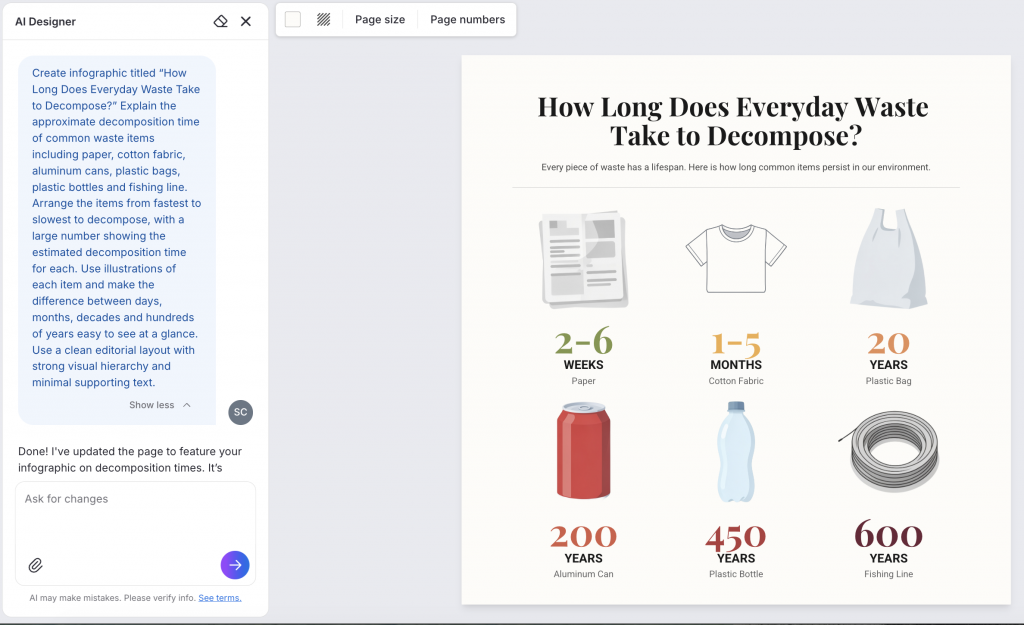
The more specific your prompt is about the information, order and visual direction, the more useful the first draft is likely to be. If you already have the information you want to visualize, you can also upload your existing document or data instead of adding everything to the prompt.
Refine the infographic with the AI Designer
Once the first draft is ready, you can use the AI Designer to improve the infographic without manually adjusting every element.
For this design, I first asked the AI Designer to improve the layout and make the infographic more engaging. Once the overall structure looked better, I noticed that the T-shirt illustration still felt slightly out of place, so I asked it to edit that. It suggested a new version within minutes.

You can keep refining the design in the same way. For example, ask the AI Designer to:
- rearrange sections when the layout feels unbalanced
- reposition text, icons or illustrations
- make important numbers or headings stand out more
- suggest a different color palette
- replace or adjust visuals that don’t fit the design
- place text inside boxes or other visual containers
- add sections such as a footer, source note or callout
- increase the page size when you need more room
You don’t need to describe the edit in design terms either. Simply explain what feels off or what you want to improve, and the AI Designer can suggest and apply the changes.
This makes it much easier to keep experimenting with an infographic after the first draft. Instead of rebuilding sections manually, you can refine the layout, visuals and hierarchy through a conversation until the design feels finished.
Once you’re happy with the final design, export it in the format that works best for where you plan to use it. For example, you can download the infographic for a presentation, report, blog or social media post, or share it directly with your team.
Before exporting, do one final check for readability, spacing and any data or source notes you need to include.
The same workflow works for any of the infographic ideas above. Start with the idea, give the AI enough context to understand what you want to communicate and then refine the first draft until the design supports the story you want to tell.
Strategies for coming up with your own infographic idea
Now if you’re having trouble coming up with your own infographic ideas, you’re in the right place. Here are a few strategies you can use to create an amazing infographic:
1. Solve a burning problem

A surefire way to get people to care about your infographic is to pick a topic that solves a burning problem.
That means you have to know your audience and their problems. Again, this is rather obvious but very few people take the time to find out what their audience’s actual problems are.
2. Challenge the status quo

A lot of us are afraid of upsetting our audience. We think we have to protect our audience, and as a result, we come up with these safe and boring infographic examples that no one cares about.
You need to push the status quo. Ask yourself:
- Does your infographic make your audience rethink conventional wisdom?
- Does it challenge your audience’s beliefs and behaviors?
3. Change the perspective

There is always a traditional way of framing a story or narrative but you can make it so much more interesting by changing or reframing the perspective.
All it takes is a bit of creative thinking, and turning the narrative on its head so people care about it!
4. Find origin stories

For every topic, there is an origin story of how that topic came to be.
Just like the origin stories of superheroes, the origin stories of a field of interest, industry, company or influential person often make for a great infographic.
5. Find extreme cases

Another way of choosing a good topic is to look for the extremes.
These are the outliers in your field of interest. In statistics, outliers are often “cleaned” or removed because their influence on the rest of the data might skew the analysis.
But these outliers often make very interesting infographics!
6. Go outside your immediate field

One of the surest ways of turning your audience away from an infographic is to talk only about yourself and your product.
No matter how you spin it, it will probably sound either sales-y or arrogant.
It’s better to choose a topic specific to your industry or field, but bring in an outside element that makes it a lot more interesting.
7. Find niches and subcultures

Another way of finding angles of interest for topics that are popular and “noisy” is to look for a niche or subculture within that broader topic.
Finding a niche is a strategy that businesses use when they are trying to enter a new market. The same approach can be applied to infographics and content marketing.
8. Mash-up two or more infographic ideas

Create your infographic design today
You don’t need a completely original idea to create a good infographic. Start with a topic your audience already cares about, find the part that would be easier to understand visually and look at infographic examples for inspiration on how to present it.
The ideas above can help you find a direction, whether you are working with research, a process, a comparison or an existing piece of content. Once you have the idea, you can use Venngage’s AI Infographic Generator to turn it into a first draft and refine the design from there.
FAQs on infographic ideas
1. What are some good infographic ideas?
Good infographic ideas include visualizing original research, explaining a process, comparing two options, breaking down a complex topic, sharing industry trends, mapping a customer journey or turning a report into a visual summary. The best idea depends on what your audience needs to understand and what information you already have.
2. How do I choose an infographic idea?
Start with your audience and the question you want the infographic to answer. Then look at the information available and ask whether visuals would make it easier to understand. A strong infographic idea usually has one clear takeaway rather than trying to cover an entire topic at once.
3. What are good infographic topics for students?
Students can create infographics about historical events, scientific processes, survey findings, environmental issues, health topics, books or theories they are comparing. Topics with a clear process, comparison, timeline or set of statistics are usually easier to turn into a useful infographic.
4. Where can I find ideas for an infographic?
Start with questions your audience already asks, research or survey data you have collected, existing blog posts and reports, industry trends or topics that are difficult to explain with text alone. Search queries, customer questions and frequently discussed topics in your industry can also reveal strong infographic ideas.
5. How do I turn an infographic idea into a design?
Once you have an idea, define what the infographic should explain, the key information it needs to include and how that information should be organized. You can then choose a template or use Venngage’s AI Infographic Generator to create a first draft from a text prompt or existing content. Review the first version for clarity, accuracy and visual hierarchy, then refine the layout, copy and visuals until the main idea is easy to understand.