Need funding for your business? Want to explain ideas to potential clients? Looking to seal the deal with new partners?
You need to convince the right people to get behind your idea and creating an impactful pitch deck is a great way to impress your audience–quickly.
Not a designer? Use a pitch deck template to build a persuasive, engaging presentation that hits all the key elements of your business in a short time.
In this post, we’ll look at pitch deck templates that are sure to make an impression, including templates based on famous pitch decks by Airbnb and Uber.
Click to jump ahead:
- Business pitch deck templates
- Investor pitch deck templates
- Startup pitch deck templates
- Successful pitch deck examples
- Pitch deck design best practices
- Business pitch decks FAQ
1. Business pitch deck templates for clients
A business pitch not only sets the tone for successful presentations but is also valuable beyond the scope of a boss or consultant.
They’re about drumming up new clients, making sales, pitching a partnership or trying to convince new vendors or suppliers to work with you.
In this section, we’re going to look at pitch decks that are not geared towards raising money from investors. That said, any of the templates in this post can be customized for your specific needs.
Client marketing pitch deck template
Marketing, branding or other creative agencies need a pitch deck that’s out of the box.
A subtle way to do that is to pick a creative design motif to use throughout your presentation. Your motif could be something like a recurring shape or a recurring object (like a leaf for growth).
For example, this business pitch deck template uses circles as the main design motif throughout the presentation.
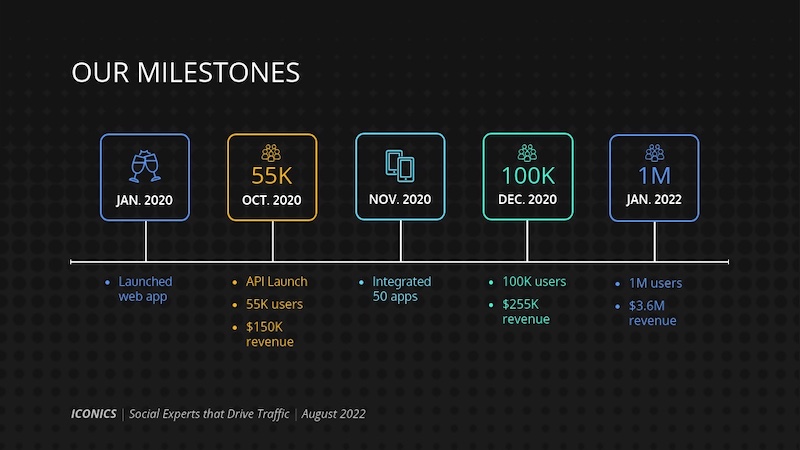
Iconics pitch deck template
This marketing-focused pitch deck template keeps the focus where it should be–on results and numbers. There isn’t too much text, just hard proof.
Further Reading: Our blog post on how to write a business proposal, with templates
2. Investor pitch deck templates
Investor pitch decks are a critical document along with your presentation, they help an investor decide whether to keep considering your business for investment–or take a hard pass.
Make sure your content flows well and don’t fixate on your technology. During pitches, investors will also want to hear about the market, your operating principles, potential outcomes etc. You also need to tell a compelling story about your company.
In sum, a pitch deck needs to be just engaging enough for an investor to take the next step: due diligence, meaning reviewing factors such as your business model and management team.
Investor pitch deck PowerPoint template
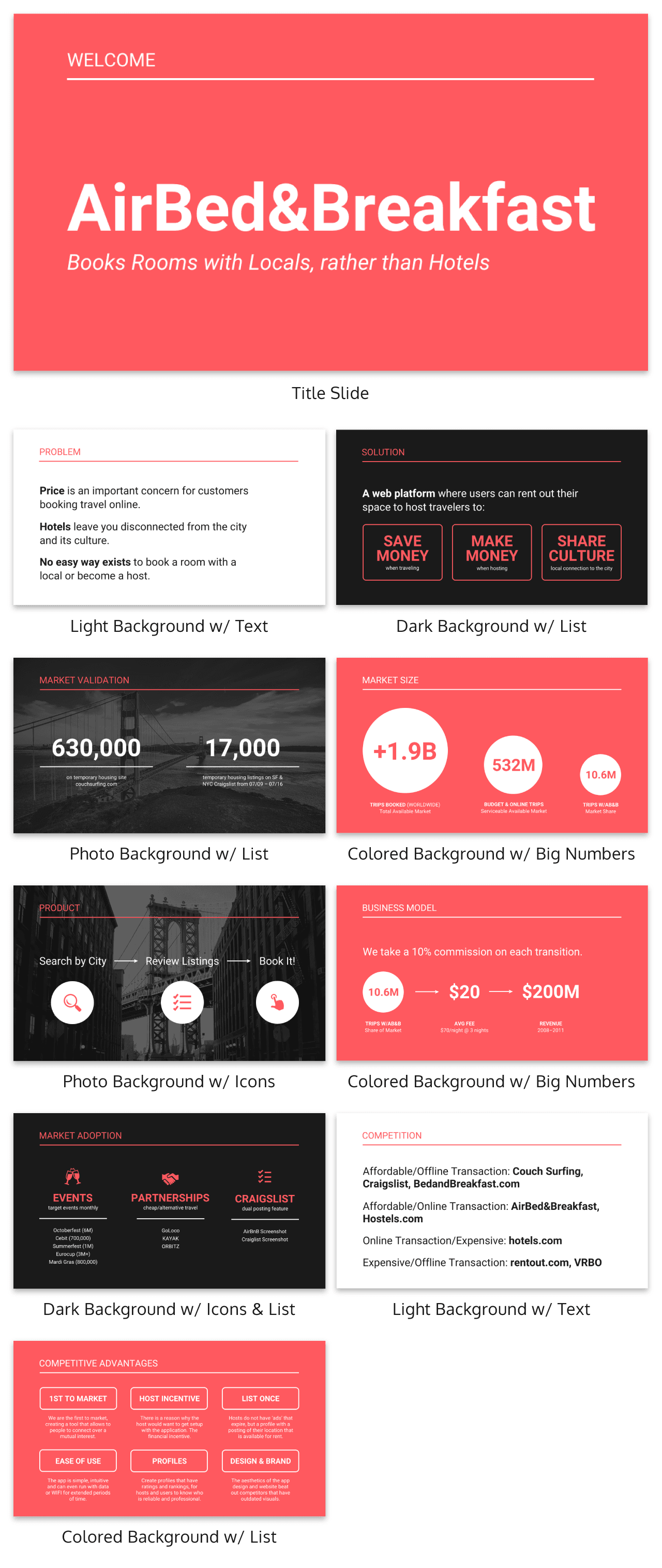
This pitch deck format is so popular because it manages to explain Airbnb’s business plan in an incredibly straightforward and simple manner.
We’ve reimagined their famous investor pitch deck format in this template that can be customized and exported to PowerPoint:
Just so you know, all of our templates can be exported in PowerPoint format and presented using PowerPoint using Venngage for Business.
Investor pitch deck outline
Another investor pitch deck outline you can refer to is Guy Kawasaki’s 10-slide outline based on his 10/20/30 rule of PowerPoint.
Using this outline will force you to focus only on the most important concepts in your business plan.
It should also help keep investors and VCs engaged during your presentation. For one of the presentation examples in our list, we’ve reimagined Kawasaki’s outline in this clean, crystal clear template you can edit to make your own.
Red investor pitch deck template
This bold investor pitch deck template mixes big, bold fonts and gorgeous photos. It looks at three critical factors: a problem, a market opportunity and a solution.
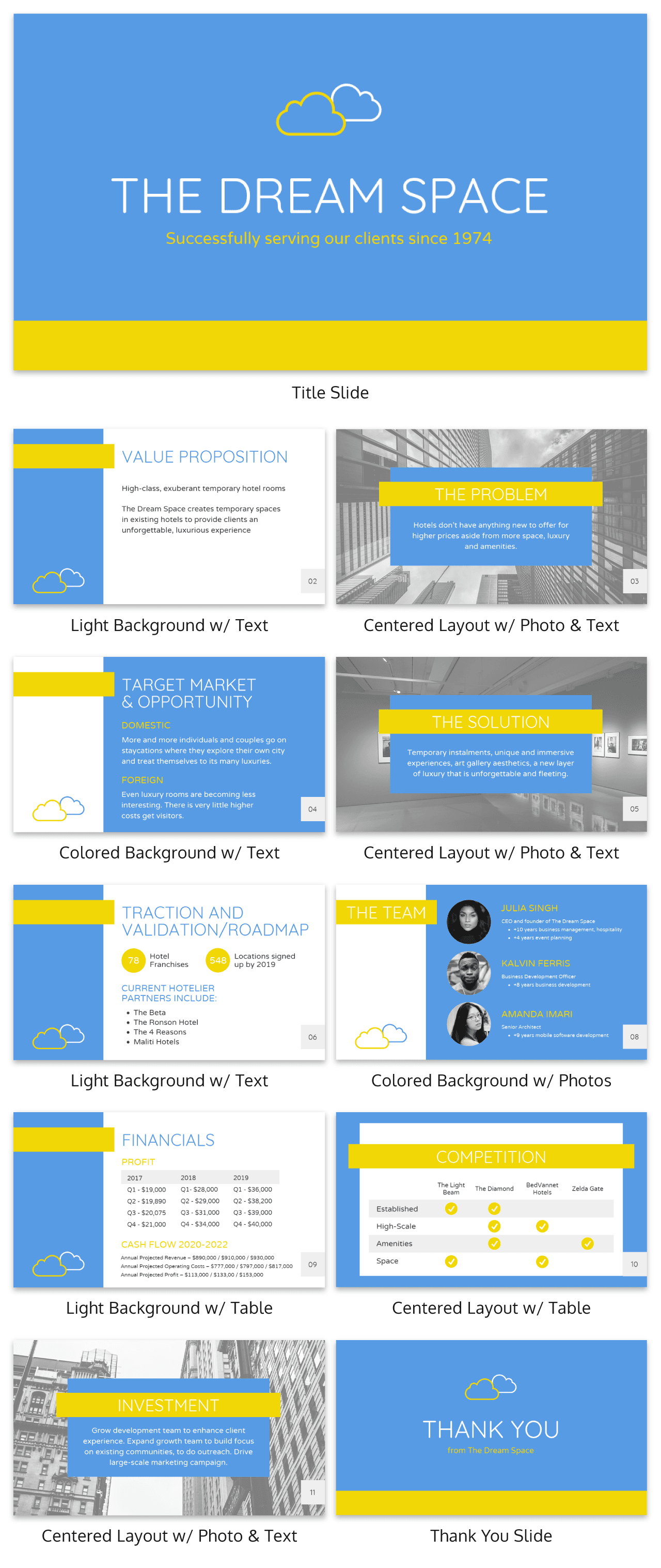
Blue investor pitch deck template
This investor pitch deck on the other hand uses three different layouts to keep the audience engaged.
Other ways to add variety to your slide include swapping out the background image, or inverting the colors.
You could also use different types of charts–as long as the charts you choose effectively communicate your information.
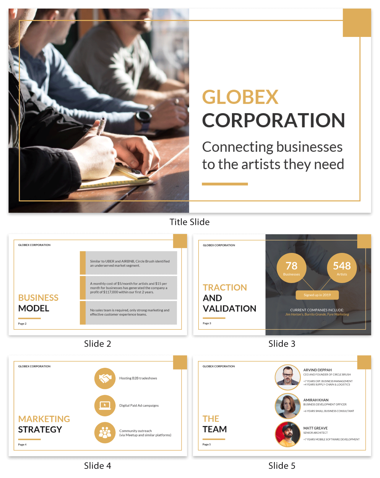
Minimalist marketing pitch deck template
This simple pitch deck template includes a section on proposed marketing tactics. Since the design elements in this template are universal, it can be adapted for any industry.
Franchise pitch deck template
Here’s a pitch deck template that grabs your audience’s attention and sparks excitement about your business from the very first or second page.
Set the scene by identifying a problem and how your business plans to solve it. Keep it short–tell your story in one slide, like in the example below.
Pick your words carefully–they should be precise and compelling. Use visuals like photos, charts and icons to illustrate the problem and solution and appeal to your audience’s emotions.
For example, this business pitch deck template uses a call to action right off the bat to engage the audience.
Further Reading: Our growth strategy checklist will teach you how to plan your business goals
3. Startup pitch deck templates
A startup pitch deck outlines a business’s key elements, value proposition and growth potential to secure investment and partnerships.
Your pitch deck isn’t the place to go into the nitty-gritty of your business. That’s what due diligence is for–the “audit” of your business post-pitch. BetaKit has a great guide on how to prepare for due diligence.
That being said, if there’s a core process that you think will help sell your business, then you may want to summarize it in your pitch deck.
Startup pitch deck outline
Uber’s startup pitch deck has an outline well worth copying.
With sections such as key differentiators, operating principles, environmental benefits, market composition and future optimizations, you’ll be answering investor and VC questions upfront.
We’ve reimagined the Uber pitch deck format in a new sharp, modern template you can customize yourself.
Purple startup pitch deck template
Showing how your business works can help inspire confidence in your investors. Use a mini-infographic to visualize your process and remember to keep text brief. Take a look at the second and third slide in the business pitch deck template below.
Green startup pitch deck template
Not sure how to lay out your information in an organized way? Try thinking of your layout as two or more columns.
Look at how this business pitch deck template uses two-column and three-column layouts for organized, readable slides.
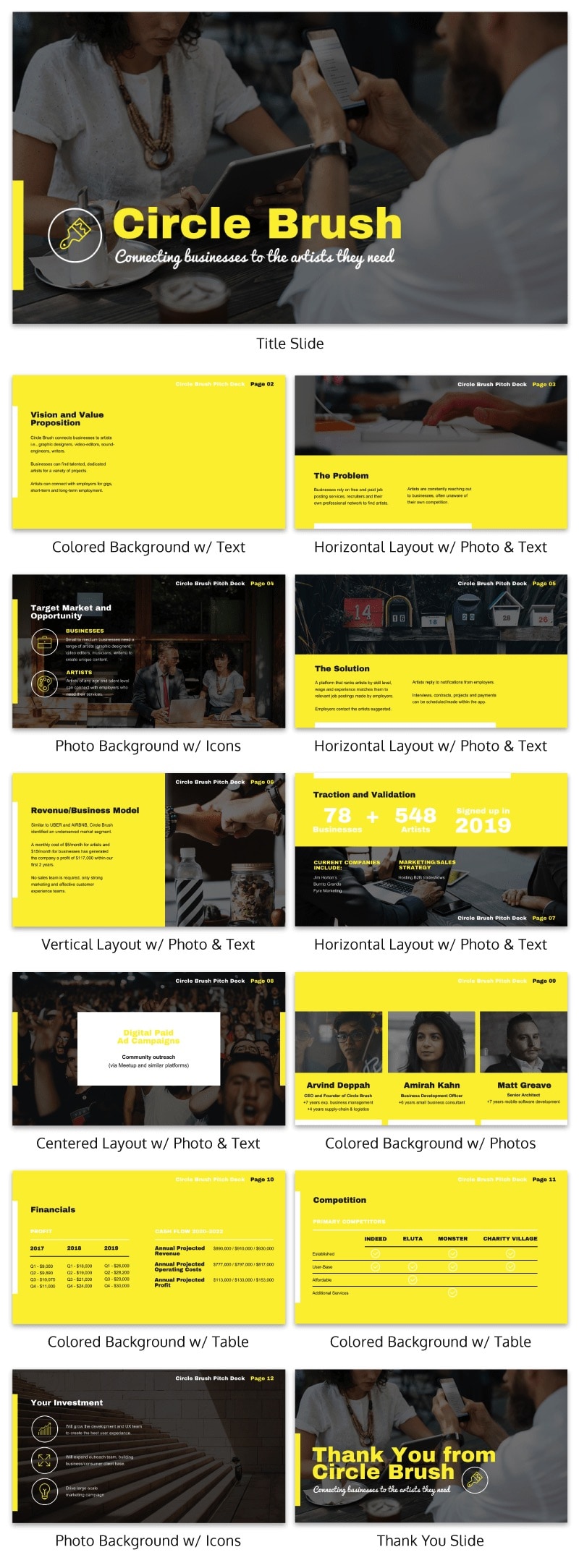
Yellow startup pitch deck template
Investors will be keen to know who’s on your team, if any of the founders have technical ability, how long you’ve known each other etc.
Photos of your team in your pitch deck will help investors understand your business better. Images appeal to your audience’s emotions and put faces to the numbers.
But pictures can take up a lot of real estate so use them as slide headers and slide backgrounds instead.
Take a look at how this business pitch deck incorporates photos of the team at work.
Further Reading: Learn how to create a business plan that will inspire confidence in potential investors
4. Successful business pitch examples
Analyzing successful pitch decks can offer valuable insights into crafting your own. With all of the tips I’ve given you so far, you probably already have ideas for your own pitch deck design. But in case you still need more inspiration, here are business pitch examples from some big-name companies.
Moz pitch deck
Once called SEOMoz, Moz has since grown to become one if the leading SEO tools. But back when they were still in the stages of needing funding, they used this deck to raise more than $18 million.
This pitch deck is a good example of how you can use fun visual slides to break up the monotony of text slides.

Check out the full business pitch here:

SEOmoz Pitch Deck July 2011 from Rand Fishkin
Foursquare pitch deck
This is the first business pitch deck that Foursquare showed to investors. They use a phone motif throughout their slides, which emphasizes the mobility of their product. This is a great example of how visual motifs can help drive home key ideas about your business.

Foursquare’s 1st Pitch Deck from Rami Al-Karmi
BuzzFeed pitch deck
BuzzFeed are a highly visual platform and their original pitch deck reflects that. Their presentation uses minimal text, relying instead on visuals to demonstrate their value. Remember the classic saying: show, don’t tell!

Do you think there are any other great business pitch examples worth mentioning? Comment below with your suggestions!
How to create a pitch deck for clients
Crafting a compelling pitch deck for clients can turn a meeting into a successful partnership. Follow these steps to create a pitch deck that showcases your value:
1. Know your audience
Before diving in, research your potential client. Understand their industry, challenges and goals. This will help you tailor your pitch to their specific needs.
2. Structure your narrative
Craft a clear narrative with a problem/solution or opportunity structure by:
- Highlighting a common pain point your client faces and present your product or service as the solution.
- Identifying an opportunity for growth in your client’s business and showcase how your expertise unlocks that potential.
3. Personalise your pitch deck
A generic one-size-fits-all pitch deck can be unconvincing. Here’s how to personalize it for each client and make it truly shine:
- Keep your presentation sweet and simple within 10-12 slides to make it easy for your audiences to digest.
- Use high-quality visuals, charts and icons to break up text and engage the audience.
- Back up your claims with statistics and data relevant to your client’s industry.
4. Clearly explain your marketing strategy
To explain your marketing strategy in a way that resonates, be sure to include:
- Overview: Briefly outline your main goals and objectives.
- Target audience: Describe who your marketing efforts will focus on.
- Channels and tactics: Explain the methods you’ll use to reach your audience.
- Content plan: Summarize the type of content you’ll create and share.
- Differentiation: Highlight what makes your strategy unique.
- Metrics: Share the key indicators you’ll use to track success.
- Budget and timeline: Provide an overview of resources and deadlines.
- Risk management: Address potential challenges and your plan to handle them.
- Conclusion: Recap your strategy and invite questions.
5. Refine and practice
Before your big pitch, run your slides by a colleague to help you spot anything confusing and practice your presentation to make sure you feel confident delivering it.
Business pitch deck design best practices
Creating an effective business pitch deck involves several key design practices to capture attention and convey information clearly. To help you navigate through this process, here are some best practices:
Start with a template slide layout and vary the design
A business pitch deck template can be a lifesaver if you’re new to designing presentations.
The slide layouts, font sizes and image suggestions are all there–all you have to do is insert your own text and customize the design elements like logos, photos, fonts, icons and colors.
Keep you pitch deck relatively short
Some experts argue your pitch deck should be as short as 10 slides, while others will recommend somewhere in the 15-20 slide range.
It’s generally considered best practice not to go over 20 slides; most people probably won’t have the attention span for more.
Dedicate each slide to only one topic
Here’s the #1 presentation design tip you need to know: don’t try to cram too much information into one slide!
If you were presented with a slide showing a wall of text, would you actually read the whole thing?
Even if you did, you might not get a chance to finish before the presenter moves on.
Pick one focused topic for each slide and stick with it.
For example, dedicate one slide to summarizing the problem your business is aiming to solve. Then, focus one slide on summarizing the solution your business offers.
Remember: you should only include your most compelling information in your pitch deck. You can go into more detail in your speech.
Visualize information using charts, icons and infographics
Want to avoid text? Use visuals to present information.
Visualize data using charts, infographics and pictograms (“picture charts”). Keep the charts relatively simple. A complex chart will be hard for your audience to read and understand while you’re presenting.
Use charts to present key metrics like traction your business has gained, or your profit growth. You can use an infographic to visualize a process or to break down concepts. Our post on picking charts will help you decide what chart is best for what data.
Here’s a business pitch example that uses charts and diagrams to present metrics in an engaging way.
To create engaging diagrams for presentations, try out our diagram maker.
Use icons to reinforce points
Icons can be used as symbols or visual cues to guide your audience’s eyes towards specific points on your slides. That’s why it’s often effective to put an icon beside a header or beside a key metric.
When picking icons for your slides, make sure that the icons have a consistent style throughout the presentation. That means sticking to flat icons, or sticking to line art icons.
Take a look at the icons in this business pitch deck example. They all have the same line art style, which pairs well with the thin decorative header font.
Make bold design choices that show confidence in your pitch
To convince people to hire you, invest in your business or join you as a partner, they need to feel confident that your business will deliver.
A confident pitch deck design is one way to do this. For example, using punchy, concise phrasing using bold fonts will help make an impact on your audience. An intense color scheme will grab your audience’s attention and show you’re not shy about your pitch.
Take this business pitch deck template. It doesn’t mince words and the bold fonts and color scheme convey confidence.
Show your business’s personality in your design
Telling your business’s story means showing what makes your business original and likeable.
What is your brand’s voice? Are you reliable and traditional? Are you innovative and forward-thinking? Are you trustworthy and comforting?
Incorporate your business’s personality into your pitch deck designs. Pick fonts, colors and images that suit your brand’s voice. Think about your target audience: what is most likely to appeal to them?
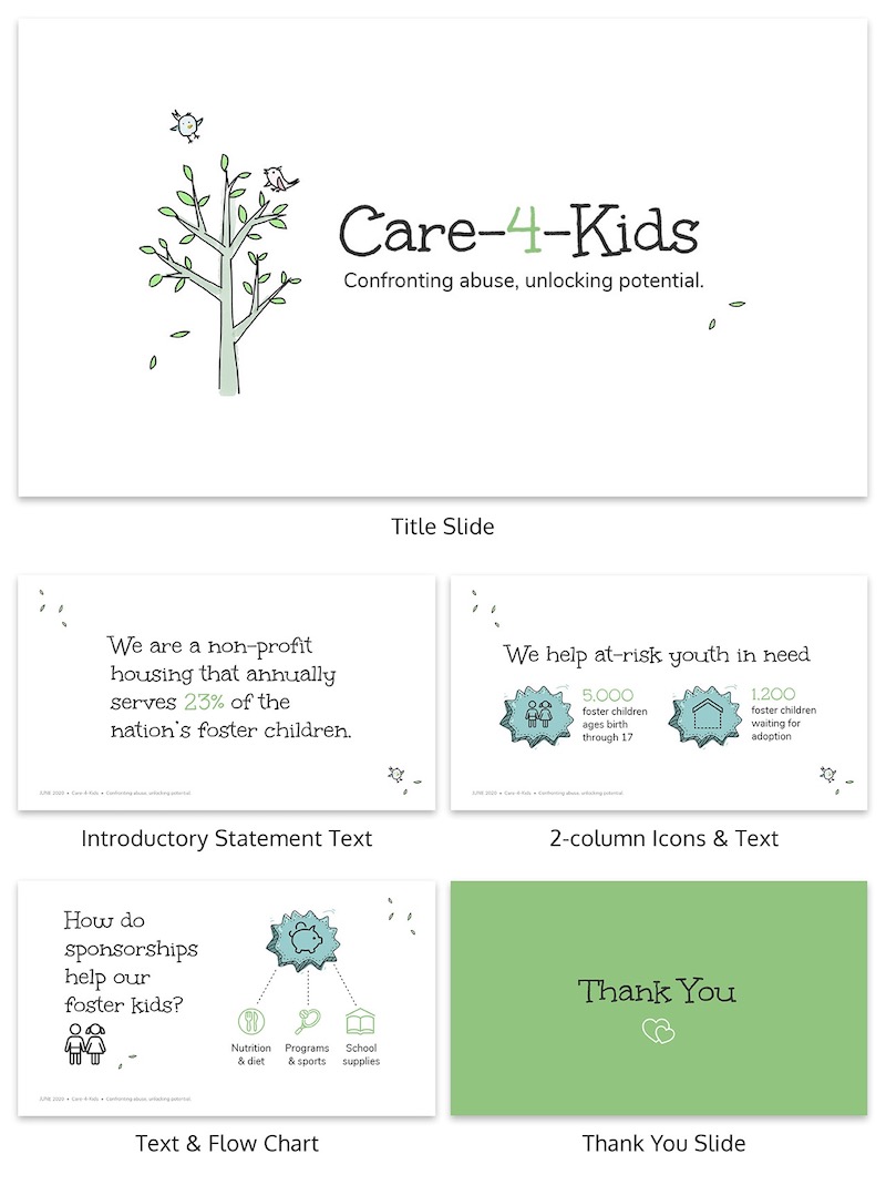
For example, this pitch deck for a nonprofit that helps children incorporates comforting, childlike design elements like playful fonts and pastel colors.
Use consistent design elements
While this may seem like an obvious point, it’s surprising how often people overlook consistency in their design.
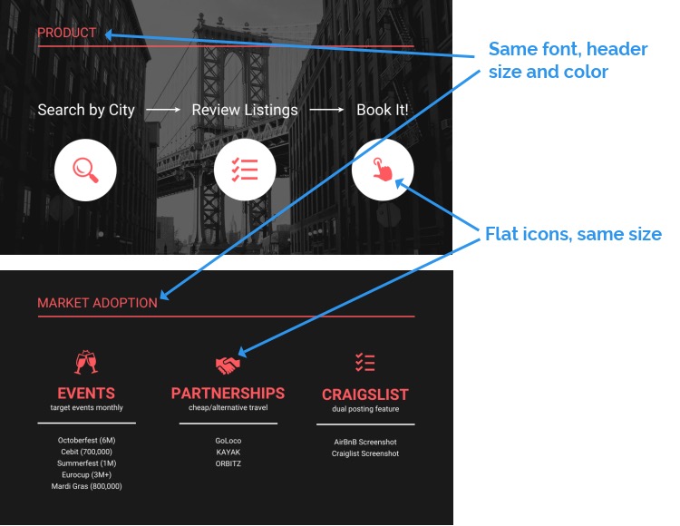
Your business pitch deck should look polished and professional. An important part of that is making sure your header fonts sizes and styles are consistent, the icons and images you use are the same style throughout, and the colors you use are cohesive.
Don’t overburden your slides with text
Look for ways to combine concise, punchy text with visuals. Make sure your text is no smaller than 30 point font.
If you find your slide getting too crowded, break the information up into several slides or look for a way to condense what you’re writing.
Download your pitch deck as a PDF
It’s considered good practice to send your pitch deck to investors before your actual meeting.
Rather than sending your pitch deck to them them via Google Docs or a file sharing services like WeTransfer, reduce the risk of them not opening your pitch deck by sending it to them as a PDF.

With Venngage, you can download your pitch deck in high quality PDF format, as well as in interactive PDF format.
Now you have the tools to create a business pitch deck that will make an impression on investors. It’s time to get started:
Business Pitch Deck FAQ
What is a business pitch deck?
A business pitch deck is a presentation that provides an overview of your business plan to your audience. Typically, you would present a pitch deck to potential investors, business partners, board members and potential clients.
What should be included in a pitch deck?
- A clearly defined problem your business will solve (this could also be your “mission”).
- A clearly defined solution your business will present.
- Metrics that validate your business (your business model and previous successes).
- Who your key team members are and their credentials.
How you tell your business’s unique story is up to you. In fact, while it’s good to look at other pitch decks to get a sense of the format and types of information to include. Our post on the best pitch decks is a good place to start.
That said, your pitch deck design should cater to your niche and target audience.
Identify your business’s unique value proposition and emphasize that in your pitch deck.
How long should a pitch deck be?
You should have no more than 10-20 slides in your business pitch deck.
Each slide should be purposeful and targeted towards a specific goal in mind. Your investors will not be able to retain too much information in just one meeting. Make sure you strategically explain your business pitch without losing your audience because your focus is off.
Your goal should be to prompt interest in your business pitch, not to over explain every aspect. You want to win that second meeting.
Having a limited amount of slides will force you to condense your information and concentrate on what is most important in your business pitch deck.
Here is a general outline of how long your pitch deck should be:
Slide 1: Title to introduce your business.
Slide 2: The problem you are trying to remedy.
Slide 3: Value that you will provide to your customers.
Slide 4: The solution that your product will provide. Use a flow chart template to help.
Slide 5: Business model where you are identifying your sources of revenue.
Slide 6: Management team that will be responsible for the business.
Slide 7: Marketing Strategy that you will use to reach your customers.
Slide 8: Key Metrics and Projections for the next 3 years.
Slide 9: Competition, describe your competitive landscape.
Slide 10: How you plan on using your funds for your business.
You might also like:


