


A pictogram is one of the simplest and most popular forms of data visualization out there. Besides making your data look nice, pictograms can make your data more memorable.
Visually stacking icons to represent simple data can improve a reader’s recall of that data and even their level of engagement with that data. Pictograms can also be a fun addition to any infographic.
We’re going to break down EVERYTHING pictogram related in just 10 minutes. Including what is a pictogram, when to use it, real life examples and how you can create it using in few steps using Venngage.
Click to jump ahead:
- What is a pictogram?
- History of pictogram
- When should you use pictograms?
- Infographic pictogram examples
- Report pictogram examples
- Chart pictogram examples
- Survey pictogram examples
- Resume pictogram examples
- Pictogram design best practices
- How to make a pictogram in Venngage
What is a pictogram?
Pictograms are types of charts and graphs that use icons, pictures, or symbols to represent data. The icons or symbols are arranged in a single line or a grid, with each icon representing a certain number of units (usually 1, 10, or 100).
They are also known as “pictographs”, “icon charts”, “picture charts”, and “pictorial unit charts.”
The purpose of using pictograms is to make boring facts or data points more compelling, as seen in the pictogram chart template below.
And since pictograms are made from a series of icons, they’re perfect when you need an attractive graphic but don’t have a graphic designer to rely on.

History of pictogram
Pictograms and icons have been around for thousands of years, long before written language. Early civilizations like the Egyptians and Sumerians used pictorial symbols to record events, track trade, and tell stories. They used hieroglyphs (symbol-based scriptures) and cave paintings to communicate.
Pictograms later gained in 1964, during Tokyo Olympics, according to the International Council of Graphic Design Associations (Icograda).
The Tokyo Olympics organizers wanted to easily guide the spectators, athletes and officials using a visual language, instead of words.
Now, pictograms are used for:
- Safety: Fire exit, no smoking, chemical hazard symbols
- Healthcare: Handwashing icons, medicine dosage, AED location signs
- Transportation: Restroom, baggage claim, departure gate symbols
- Public spaces: Recycling, quiet zone, disabled access signs
- Digital interfaces: Trash bin, magnifying glass, cloud upload/download icons
Research by Sign Industry suggests that. "A comprehensive signage system with clear pictograms has been proven to improve efficiency by up to 15% in large public spaces."
Sign Industry
When should you use a pictogram?
Pictograms work best for visualizing data in infographics, reports, presentations, and even resumes!
You can use a pictogram whenever you want to make simple data more visually interesting, more memorable, or more engaging.
Whether you want to show the magnitude of an important stat or visualize a fraction or percentage, you can use pictograms to add visual impact to simple data.
1. Use a pictogram to show ratings or changes
Pictograms are one of the clearest ways to communicate proportions at a glance. A common everyday example is the five-star rating system you see on Amazon, Yelp, or Google Reviews. Each star (or half-star) acts as a tiny pictogram, showing the proportion of positive ratings

You can use the same idea for:
- Ratings – e.g., 4/5 stars filled
- Progress – e.g., 7/10 icons filled to show completion rate
- Comparisons – e.g., using people-shaped icons to show “7 out of 10 users prefer X”
Infographic pictogram examples
This pictogram example shows different stages in change management. Instead of reading through long explanations, the icons for each stage (shock, denial, anger, etc.) give you a quick, visual way to understand the change management journey.

Here's a pictogram example about peppers from CookSmarts. They’ve used a series of super simple pictograms (“Fire Ratings”) to show the heat level of various peppers.

Besides making the ratings easier to grasp at a glance, they’re a nice visual feature of the infographic.
Using pictograms to show ratings can be useful in everything from comparison infographics to net promoter score reports, like the example below.

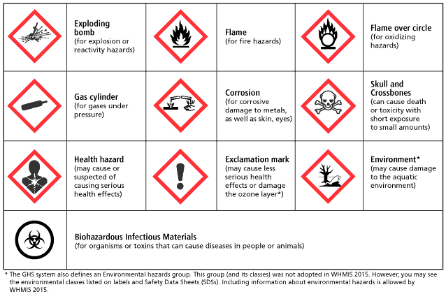
Another classic example of a pictogram is hazard signs. They use icons to warn people of potential fire hazards or explosive items.
2. Indicate progress to a goal in a project status report
Pictograms can also be used to indicate status or progress toward a goal. Documents like project plans, product roadmaps and project status reports can all benefit from a visual indicator of progress in the form of a pictogram.
Report pictogram examples
In the project status pictogram example below, pictograms give an overview of project progress and status (in terms of schedule, scope, and budget). It’s a quick way to communicate the high-level state of your project.
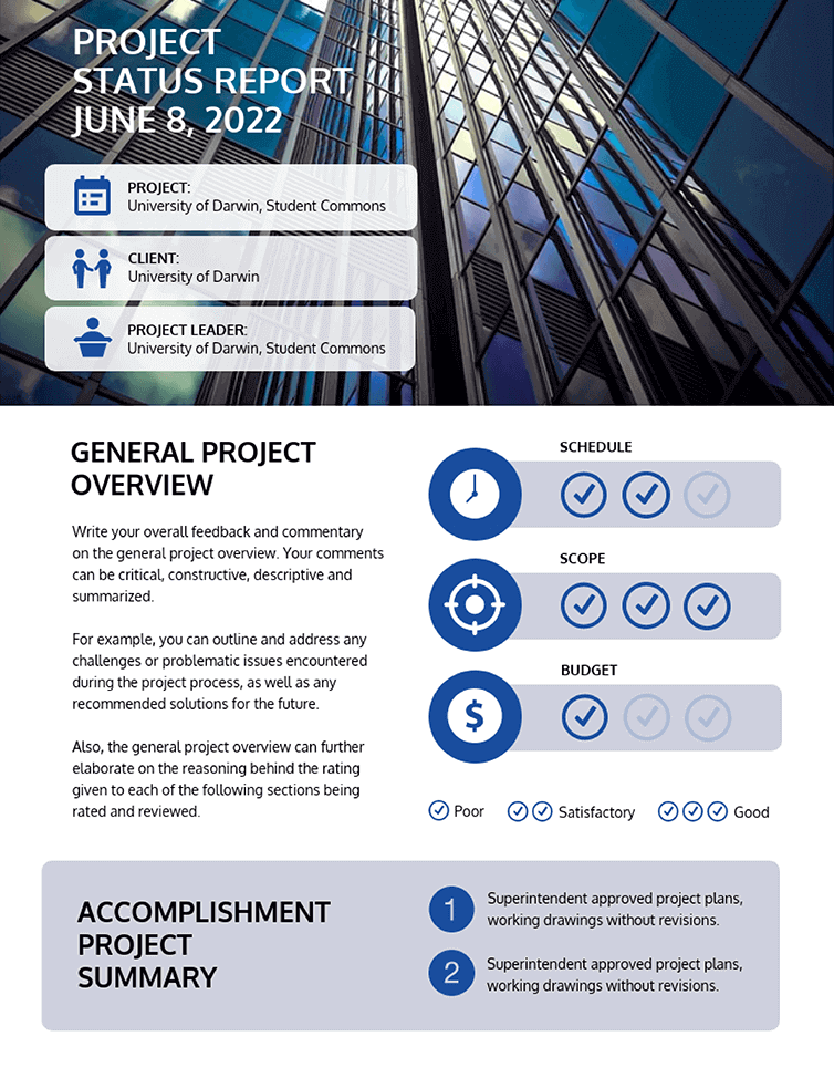
When you use a pictogram to show proportions, use a darker color to indicate the progress made so far, and a lighter color to indicate the work that remains. This use of color makes it easier for those reading the report to understand how much work remains to be done.
3. Spice up a simple bar chart for extra impact
As mentioned earlier, pictograms can help make simple data more memorable and engaging.
If your infographic is centered around a simple dataset (like a single bar chart), you can use a series of pictograms to make your data a little more visually interesting.
Chart pictogram examples
Take a look at the chart pictogram example below. Instead of using an ultra-simple bar or pie chart, this infographic uses pictograms to create a high-impact data visualization.

According to a study. 67.5% of respondents preferred the pictogram format over bar graphs and considered piktocharts reliable for health literacy.
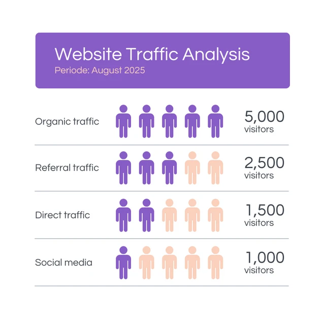
4. Use pictograms as visual tallies to summarize survey results
Pictogram infographics are perfect for summarizing and presenting survey results. They’re much more interesting than numbers simply placed in tables and spreadsheets, and they can help your readers grasp key survey insights.
"Pictograms shine when visualizing 𝐛𝐚𝐬𝐢𝐜 𝐪𝐮𝐚𝐧𝐭𝐢𝐭𝐢𝐞𝐬 𝐨𝐫 𝐩𝐫𝐨𝐩𝐨𝐫𝐭𝐢𝐨𝐧𝐬. They work particularly well for data about people, objects, or concepts that can be represented visually. Their emotional appeal can make them effective for emphasizing a key data point or connecting with your audience on a deeper level."
Brent Dykes, Author of Effective Data Storytelling
Survey pictogram examples
You can use pictograms as visual tallies in survey results, to demonstrate things like basic demographic data (like job title or role).
They also help emphasize the magnitude of various numbers, as seen in this pictogram survey infographic example below.

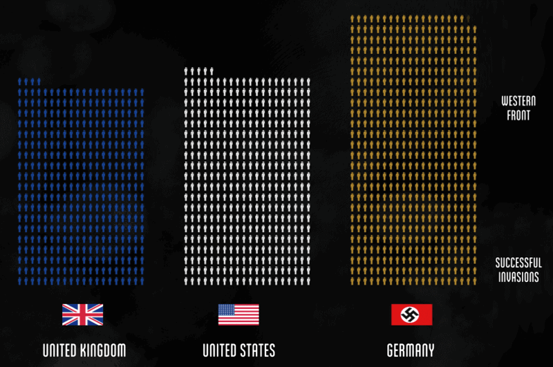
Another great pictogram example with this technique can be seen in the popular YouTube video The Fallen of World War II, which uses pictographs to hammer home the death toll of the major wars in human history.
Instead of simply stating the number of deaths from each country, they’ve used pictograms to give those numbers even more significance.
5. Refresh your resume with pictogram skills summaries
The infographic resume is emerging as a creative way to communicate your skills visually and experience to potential employers.
Since pictograms work so well for showing proportions, they make a great addition to the skills summary portion of an infographic resume. You can use them to show your level of proficiency with each of the skills in your professional toolbelt.
Resume pictogram examples
Check out this infographic resume from Zhi Liang, for example. As a graphic designer, he’s created a very visual resume to show off his graphic design skills. He’s used a collection of simple (yet effective) pictograms to give a quick snapshot of all of his skills.

If you don’t want to go all-in with an infographic resume, opt for a standard resume with simpler pictograms. Use basic circle or square icons and neutral greys for a subtle, more professional look that works just as well, as in this pictogram example.

Pictogram design best practices
Pictograms can be very effective additions to any visual document, as long as you use them the right way.
Here are a few pictogram design best practices to keep in mind when you’re working on your infographics.
1. Use simple, meaningful icons to make your pictograms clear
Pictograms are useful when their component icons are as simple and universally understood as possible.
If the Icons are too detailed, they will tend distract readers from the data. So you should focus on using basic, symmetrical shapes like stars, circles, and boxes rather than detailed, illustrated icons. In fact, single-color icons that fit roughly into a square are perfect.

At the same time, make sure the icons you choose are relevant to the subject matter of your data.
The infographic pictogram example below visualizes statistics for a consumer activity report. Notice how the icons in the pictograms are simple, but also provide a bit of information about the statistic they’re representing, the breakdown of consumer traffic.

Using simple, yet relevant icons will make it easier for your audience to interpret your data.
2. Avoid contrasting colors for proportions and percentages
Using contrasting colors when representing proportions in pictograms can make the design more distracting than helpful.
Instead, try to use two shades of the same color so that readers can easily compare and contrast the data in your pictogram.
Look at the below pictogram examples to see how you should and shouldn't incorporate colors. The pictogram on the left uses a darker shade for the percentage it wants to highlight and a lighter shade for the remaining units. The right uses contrasting colors that are distracting.

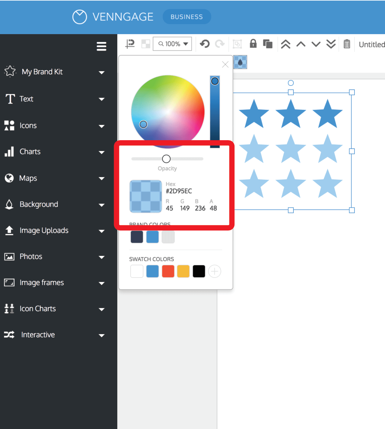
The easiest way to change color hues in pictograms in Venngage is to apply the same color to every unit, and simply adjust the opacity of the remaining units.
Maintain your brand presence in reports with the Venngage My Brand Kit feature. Available with Venngage for Business, My Brand Kit automatically imports your company logo, colors and fonts once you add your website. Apply them all to your reports with one click.
3. Stick with rows of 5 or 10 for maximum readability
You don’t want your readers to have to count all of the icons in a pictogram to get an accurate understanding of the data it represents.
So the icons in your pictograms, whether they’re displaying a single large number or a proportion should ideally add up to nice round numbers like 10 or 100. They should be split into rows of 5 or 10 to make your pictograms easier to grasp at a glance.

You can also make things easier for your readers by ensuring each pictogram is accompanied by a bold label - a large number that states the takeaway of the chart.
It doesn’t have to be anything fancy. Just a basic label that clearly tells the reader what they’re looking at, like in the pictogram infographic below.

How to make a pictogram in Venngage
The Venngage Infographic Maker is an easy-to-use solution for all your design needs. We offer thousands of customizable templates that you can use to show a variety of ratings or scores.
Let's see the step-by-step process to create a pictogram in Venngage
Step 1. Pick an icon from our Icon Chart library
To get started, open the Chart library in the left toolbar in the Venngage editor and scroll down till you find the Icon Row and Icon Grid. You can click these to begin designing your pictogram.
Venngage’s icon database contains over 10,000 different icons, as well as a host of diverse icons to reflect your audience.
To make it easier to find the right icons for your pictogram, you can search by keyword or browse by category. Remember: the simpler the icon, the better it is for your audience to understand your message.
Once you’ve inserted the chart, go to the top menu bar and click 'Replace' to change the icon.

2. Adjust the value and fill percentage of your pictogram
If you want to highlight a certain proportion of the pictogram, simply go to 'Value' and type the percentage. You can also change the total number of icons using 'Total Items' box.

3. Adjust the color of your pictogram
Finally, use the color swatches (also in the top toolbar) to adjust the colors of your pictogram.
Again, try to stay away from contrasting colors. Using different shades of the same color will make your chart easier to read.

Frequently asked questions
Is a pictogram a symbol?
Yes, a pictogram is a type of symbol. It uses a simplified picture to represent an idea, object, or statistic. For example, a stick figure to show “person” or a series of five stars to show a rating are both pictograms.
Is a pictogram an icon?
No. Icons are small graphic elements that represent an action, object, or concept in interfaces (like a trash can icon for delete). Pictograms are usually used for communicating information or data visually, often in groups or patterns (like multiple person icons to represent a population).
Conclusion
Pictograms are a great addition to a number-heavy or text-heavy infographic. They’re ideal for statistical infographics because they can give a snapshot of quantity and volume in a visually impactful way. If you are looking for a quick way to create a pictogram, try Vennagage. It offers variety of pictogram templates and an extensive icon library to create pictogram's for different purposes.