


Getting people to open and read your emails isn’t easy. I’ve seen how even great messages get ignored if the design doesn’t work. In this guide, I’m sharing seven practical email design tips, from subject lines to images, based on what actually helps emails get opened and read.
If you’ve never designed an email before, Venngage’s customizable email templates make it easy to create emails that look good and work well on any device.
What email design best practices should marketers know?
Email marketing is a competitive arena. On any given day, your target audience could be receiving hundreds of promotional emails.
Here are some questions executives may ask about email marketing:
- Is it all about the design?
- Is the visual content more important or the text copy?
- What about the subject line?
- How necessary are the links in the email body?
If you look at this company-wide email template, you may realize that the answer is: all of the above.

From visuals to text. From the subject line of your email to the blog post links in the body. All of these are important when you are designing an email.
Now that we’ve got that out of the way, what are the best practices you should follow when creating email campaigns for your database?
Related:
- How to Improve Your Email Blast Design Using Infographics
- Top 20 Welcome Email Design Templates & Examples to Boost CTR
- 40+ Business Newsletter Templates to Captivate Your Audience [100% Customizable]
11 email design best practices for marketers
1. Sender name is crucial
As the world begins to reopen, you may have received an email newsletter like this in your email inbox.

If you received this email from a no-reply email, would it give you much incentive to open it? There’s also a chance the email could get caught in the email spam folder.
Some email marketers don’t realize the importance of using the right sender name when creating an email campaign.
In the United States, over 68 percent of users open an email depending on who sent it. And one can well imagine that when it’s an important email about school reopenings, for instance.

When you spend so much time crafting a beautiful email, you want your audience to open it.
In designing your email, you must know how to write a good sender name. While this isn’t an exact science, best practices involve keeping it short, relevant, and memorable.
Email marketers can also use the first name of a staff member for added transparency. Marketers should follow email verification best practices to ensure the accuracy of their email campaigns and improve deliverability.

Each subscriber’s email inbox is flooded with dozens of messages every day. It isn’t surprising that people won’t even bother opening emails that aren’t relevant.
Make your sender name is interesting and professional-looking, and you are already off to a good start.
2. Master the subject line
If you saw one of these attention-grabbing email subject lines, would you open it?

You most likely would. Because experienced email marketers know how important the subject line is to the success of their email campaigns.
As with the sender name, email subject lines can either make or break your email design.
The key is to keep it short and sweet. This will ensure that it can be easily viewed on desktop and mobile devices. Plus, no one will read anything too long when they are scanning their inboxes.
One of the best practices when writing subject lines is to try to keep it to just seven words.
For example, this email could be sent with the subject line, ‘One-day only! Valentine’s Day offer.’

You can also include emojis in your subject lines to be more personable.
Emojis may not work for every type of company, though. Some testing is required to get the subject line perfect for your brand.
Here are some examples of subject lines with emojis. Note how the emojis are used to bookend the subject line. This makes it easier for the email recipient to read the message.

The intention should be to make email subject lines compelling to potential customers and clients. Add value to the words you include in your subject line.
Lastly, avoid being too gimmicky or cliché. Avoid clickbait titles in your subject line. They could get caught by spam filters and lead to your company losing email subscribers.
3. Keep your emails on brand
When it comes to email design best practices, making your brand recognizable is very important.
Check that your company logo is prominent at the top of the email. While the logo should not be too big, it should still be easy to spot on Google or Apple Mail apps on mobile devices.
This university newsletter template includes the logo right at the top. It’s unmissable and makes it clear to email recipients that they are the targeted audience.

Next, gather all the images, visuals, and marketing collateral that you are going to use. Do they represent your brand? Don’t forget to add alt-text to any images, GIFs, or videos in your emails.
There must be some sense of unity when it comes to images and other collateral.
Interweaving brand elements into your email marketing helps your reach your email campaign goals.
Other visual elements include brand fonts and colors (more on that in the next point). These will help readers recognize the email as a message from your company.
This book club newsletter uses images, bold web fonts, and icons. Subscribers can immediately connect the email message to the brand.

Keep in mind that web fonts may display differently depending on email clients or the mobile device used. Test your email before sending it to your database.
Do you have professional photographs to include in your emails? Upload images to the Venngage editor and add them to emails with the click of a button.
4. Create your brand color palette
All brands must have their own color palette. These are the colors that best represent your company, your product, and your brand personality.
In terms of customer psychology, colors play an important role in how people perceive your messages and brand.
This is the reason why color is key when thinking about best email layout practices.
You can see how this elementary school newsletter incorporates its color palette. The background of the preheader text and the sidebar use two different colors from the brand palette.

If you want your audience to recognize you instantly, then you need to use a color palette when designing your emails.
Define your brand’s guidelines and use them across all your marketing materials.
Learning how to integrate your brand’s colors is another crucial factor. It’s imperative for creating a cohesive brand experience for your online customers.
Take a look at how this brand uses color to make its email body copy stand out. Even if you don’t see the brand logo and name, you will immediately recognize who this email is coming from.

But don’t rely on color entirely to convey messages. This will make it difficult for people with color blindness to follow your email.
Email design best practices call for making your marketing messages as accessible as possible.
Related: How to Use Color Blind Friendly Palettes to Make Your Charts Accessible
5. Dynamic content is key
Your email copy is a very important aspect of your entire layout. The copy is the primary content of the email.
Most mobile responsive emails look like this example. They emphasize text over visuals. It also allows for more email content to be shared in one go.

There are some key email design best practices when writing copy for emails and newsletters.
If you write too much content, you risk the design getting too crowded. This will make the email impossible to read on mobile devices with small screens.
On the other hand, if you write too little, your email won’t be very effective. One of the most important best practices is to give your audience value with your content.
This email template is almost entirely textual. The reason why it works is due to the layout, which divides the body copy into sections.

The general rule when writing emails is to ensure your copy doesn’t exceed more than 200 words. This number includes the header.
Even if you are only focusing on text, try to create dynamic content for your emails. Write personalized messages that sound like a human wrote them. The same goes for your subject line.
Don’t forget to use web safe fonts for your copy. This way, your email design will be easy to read on a mobile device.
6. It is all about the visuals
Images can help increase the click-through rate of your emails. This is especially true in sectors like real estate.
The appealing images in the newsletter below will give customers an incentive to contact the realtor.

There are some email design best practices to follow when it comes to using images.
The first is to use images that are crisp and sharp. Keep in mind that readers typically scan an email infographic on mobile devices before deciding it is worth their time.
Seeing unprofessional and pixelated images will give them a reason to delete your email.
Next, make sure your images follow a minimalistic approach.
Despite the appeal of using visuals, avoid plastering images all over the layout. Background images are just as effective in an email, as you can see in this template.

Emails tend to have many design elements within the layout. Cluttered layouts are impossible to read on a mobile device.
When in doubt, follow the 60/40 rule. 40 percent of the email layout can be images, but the rest should be text and white space.
Not all visuals need to be photos. You can also use icons in your emails. Icons are smaller, more universally acknowledged. All these elements are necessary for responsive design.
This school email template uses appropriate icons for its audience. The colors also help the icons and body copy stand out.

Remember that not all email clients display images. Pictures in your emails must include alt text that explains the content.
The alt text will also be read by screen readers, which are used by people with visual impairments. By using alt text for your non-text elements, you can make your design more accessible.
Related: 12+ Best Newsletter Examples to Inspire Your Next Email Campaign Strategy
7. Keep on linking
Don’t forget to add buttons and links to your email. This way, readers can easily click to visit your website, blog posts, landing page, social media pages, and YouTube videos.
There are some email design best practices to follow when creating buttons and links.
Both buttons and links should be a different color from the other visual elements in your layout, like in this email example.

They should also include alt text. As we mentioned, some email clients don’t display images immediately. This could impact the buttons in your email.
Remember to keep enough white space around your buttons. This will make it easier for users to click on the buttons on their Apple Mail or Google Mail apps.
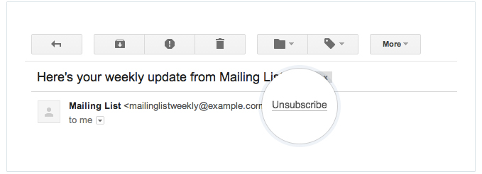
You should also include an unsubscribe link at the bottom of your newsletter, preferably in the email footer, like in this example.

While email marketers may not want their database to have the option to stop receiving emails, it is a legal requirement to include an unsubscribe link in emails.
8. Design for mobile first
Most people open emails on their phones first and from experience, if an email doesn’t display well on mobile, it rarely gets a second chance on desktop.
Use single-column layouts, readable font sizes and buttons that are easy to tap with one thumb. Always preview your email on different screen sizes before sending, it’s one of the simplest ways to improve engagement.
A good example of mobile-friendly design is this Welcome to the Company email newsletter template. It uses a clean layout, large text and clear sections that stay readable on both desktop and mobile screens.

9. Follow compliance basics (CAN-SPAM)
Every email must include three things:
- A visible unsubscribe link
- Your business’s physical mailing address
- Clear identification of who sent the email
These aren’t optional. They protect your business legally and make your emails feel more trustworthy to readers.
Every marketing email must also include a clear and easy-to-use unsubscribe link to comply with CAN-SPAM rules. But beyond legality, this directly affects trust. I’ve found that when people can leave easily, the list naturally becomes healthier. The subscribers who stay are the ones who actually want to hear from you and those are the ones who open, click and engage.
Source: Campaign Monitor
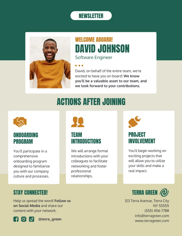
Including a real business address at the bottom of your emails also matters more than many realize. It makes your brand feel legitimate and transparent, especially for new subscribers seeing your emails for the first time. Even a registered office address can reassure readers that they’re hearing from a real organization, not just automated software.
A good example is this New Employee Onboarding email newsletter template, which includes a clearly structured footer area for business details and contact information. This keeps the email compliant while making it feel complete and trustworthy.
10. Make accessibility a priority
Accessible emails perform better for everyone. Using readable text sizes, strong color contrast, descriptive link text and alt text for images helps screen readers and improves the experience for all readers.
In my experience, when emails are easier to read and navigate, people spend more time with them and that leads to better results overall. Tools like Venngage’s built-in accessibility features make this easier by helping you check contrast, add alt text and design with readability in mind, even if accessibility isn’t your specialty.
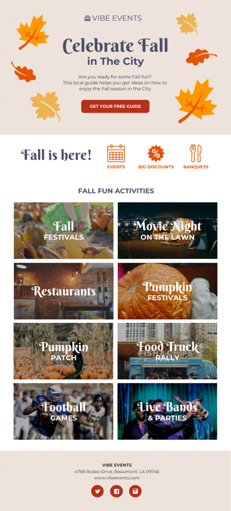
This Fall Newsletter Template is a great example of accessible design done well. It uses clean layouts, readable text and balanced colors to make content easy to scan on both desktop and mobile.
11. Build a clear visual hierarchy
Emails work best when they’re easy to scan and quick to understand. A strong visual hierarchy helps guide the reader’s eye—headline first, details next and the call to action last. Use size, spacing and color to show what matters most so readers don’t have to guess where to look.
At the same time, avoid relying too heavily on images. Emails that are image-heavy often load slowly or don’t display properly in some inboxes. A rule I stick to is a 60/40 balance — more text than images. This improves deliverability and ensures your message still gets through even if images are blocked.
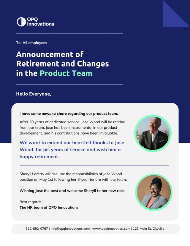
A good example of this balance and layout in action is this Retirement Announcement email template, which uses a clear hierarchy, readable text and a modest number of images, making the message easy to read on both desktop and mobile.
Should marketers focus on email marketing?
The short answer is: yes. But let us explain why.
Email marketing has been around for a while (in digital age terms, at least). But it remains one of the most effective forms of engagement.
While the basic concept of email marketing remains, it has evolved greatly. Email marketing has managed to become even more effective in today’s world.
Take a look at this simple email template, for example. Clean, precise, and to the point, this is the kind of message format that gets through to audiences.

Especially when you consider that in 2024 there were about 4.48 billion email users worldwide and this number is forecast to grow to around 4.85 billion by 2027.
On top of that, the average open rate for marketing emails across industries now hovers around 39.6%, while click-through (the percentage of recipients who click a link) is typically 2–5%, depending on industry and campaign type.
Still, the inbox is crowded. So how can you make sure your recipients actually read your message?
By following email-design best practices. A clean, thoughtful layout (like in this real estate newsletter example) can make a big difference in whether your message gets noticed or ignored.

Use email marketing tools like Venngage business to improve your ROI. Download your designs as HTML and easily share your infographic newsletters with Mailchimp.
Use email design best practices to build your subscriber base
Designing an email involves keeping a lot of things in mind.
You need to be mindful of your copy and how it will look in the layout. You also need to follow best practices for headers, subject lines, and even sender names.
Images have to be carefully crafted so they act in harmony with the entire design. They also need to be viewable for different email clients.
But following best practices doesn’t have to be overwhelming. With Venngage’s Email Maker, you can design better emails to convey your message to your audience, even without design experience.


