Think about the last time you put a puzzle together. Did you take a random piece and test all the other pieces to see if it fit?
Maybe. But if you’re like me, you grouped all the edge pieces together and worked from there instead — aligning them in the same area of your table so you could select the right pieces more easily.
Similarly, alignment is one of the most important principles in design. It helps the reader understand which elements are connected (and which ones aren’t).
Let’s learn more about the principle of alignment and how to apply it to your designs to ensure your brand’s business communications are clear and cohesive.
Click to jump ahead:
- What is the principle of alignment in graphic design?
- Examples of alignment in design
- FAQ on the design principle alignment
What is the principle of alignment in graphic design?
Alignment is one of the most obviously named graphic design principles. That said, it’s not a binary principle that you either use or don’t use.
Alignment is all about making sure the reader understands how elements in your design relate to each other… and ensuring that if they don’t relate, they’re arranged in such a way that no reasonable person would draw a connection between them.
But alignment is also a technical design term that refers to a physical action taken with individual objects. So how do you explain alignment in design? Is it a principle or is it a button you push like hitting print? In short, it’s both. As a principle, it refers to aligning elements to imply relationships.
As a technical term, for example with Venngage’s visual editor, you can align items in the following ways:
- Left
- Center
- Right
- Top
- Middle
- Bottom
Examples of alignment in design
Now, just because you aligned some items to the left, for example, this doesn’t necessarily mean your design uses alignment as a design principle. That’s because the correct alignment for your items depends on many other factors within your design.
What do I mean by that? Let’s look at some examples of alignment — both technically and as a principle — in some designs to clarify.
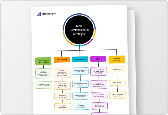
Here we have an infographic where the main elements (pie charts denoting weeks of a project) are center-aligned. So that’s the technical alignment of those objects. But as a principle, alignment also comes into play with the icons and accompanying text being aligned with the corresponding pie charts.
In this infographic, the text in the main part of the frame is left-aligned, which helps ensure that the graphic in the background is easy to see. A different alignment, say, right-aligned or center-aligned, would not have been a good use of the alignment principle because the graphic would have been obscured.
The previous examples refer to vertical alignment, meaning up and down on the page. But horizontal alignment is also a way to arrange elements. For example, in this infographic, the blocks in the column graph are bottom-aligned, which helps the reader grasp the data at a glance.
For more concrete graphic design tips on alignment, check out our post: 11 Actionable Graphic Design Tips for Beginners, According to Design Experts
FAQ on the design principle alignment
Why is alignment important in design?
A design that doesn’t have any consideration for the alignment principle would feel rather like a jumble of puzzle pieces — confusing, overwhelming and without any clear takeaway.
Alignment is also an important principle because it relates to others, including hierarchy, repetition, proximity and white space. Alignment helps us create the necessary structure for our information.
Think about alignment as giving the reader subtle clues about how to consume your design. The human brain assumes elements aligned either horizontally or vertically are related.
This is one of the clues we use when looking at visual content. If things are slightly out of alignment, we can become confused or even have the wrong takeaway after reading the material.
What are the 7 principles of design?
There are more than seven principles of design (read about them all here), but seven of the most critical to understand are unity, hierarchy, repetition, alignment, emphasis, contrast and balance.
One reason this post was easy to read? Alignment
Imagine the headings for this post alternated from left to right or that there wasn’t consistent alignment of elements down the page. Chances are good you’d feel confused and perhaps even unsettled by the lack of alignment.
A good design will always take alignment into account, both as a technical quality and as a design principle.
So, how can you ensure you’re applying alignment properly in your designs? Step one, start with one of Venngage’s professionally designed templates. This will give you solid clues as to which elements to align in your design.
And if you need to switch things up, simply drag and drop elements in the user friendly visual editor (smart guides will show you the way!) or align text with a click. Happy designing!


