


Over the past few years, data storytelling has taken off. This is not only because data and the role it plays in our lives is increasing, but also because storytelling is the way we as humans have always come to understand ourselves and the world around us.
With data storytelling showing up in many places and forms, it can be confusing for some people. That’s why I’ll help you better understand why it matters and how to craft a compelling data story using tools like data infographic templates and Venngage’s data infographic maker. Having practiced data storytelling for nearly a decade, I will break down the basics for non-designers to get started and show how these tools can help you set and accomplish your goals.
Table of Contents (click to jump ahead):
- What is data storytelling?
- How to tell stories with data?
- Data storytelling examples
- The benefits of data storytelling
- What makes a great data story?
What is data storytelling?

Data storytelling is the best way to use data to create new knowledge and new decisions or actions. It is an integrative practice that incorporates knowledge and skills from several disciplines, including communication, analysis and design. It is practiced across many fields and is used to address a variety of challenges.
Storytelling is something most marketers are somewhat familiar with. When we’re talking about data storytelling, we are talking about stories in which data is the center point. The story is meant to explain the data and why it matters. There’s all kinds of stories, and most of them visuals can help tell, but only some have this focus and intent.
Related: What Is Data Visualization? (Examples and Best Practices)

How to tell stories with data?
I will now walk you through a simple example so you can see for yourself how great data stories are made, from scratch.
1. Start by listening to your audience
First, you need to identify who they are, and then you can talk to them and perhaps do additional research to find out what they most care about, what their goals are, what they currently know, what decisions need to be made and what additional knowledge might help them make the decisions that will help them reach their goals. Social listening can help you analyze your audience’s sentiments and perceptions about your brand.
Here’s an example of how I’d create a data story:
My audience is people working in online education who want to understand how the COVID-19 pandemic impacted people’s desire to learn more about virtual learning opportunities.
I will create a data story that will help them make decisions about whether they should continue to develop these opportunities. I’ll use data from Google Trends for 2020 in the U.S.
2. Pinpoint the data that matters
Knowing your audience will help you know what data to look for and include. You might use quantitative data, such as about revenue, change over time, or number of people impacted, or you might use qualitative data, such as processes, systems, or quotes.
For example, this simple line chart template is easy to edit to show change over time.

Example: I begin by reviewing data for Google’s Year in Search 2020 data, and I see that they have outlined the top 10 searches that included “virtual.” Out of the 10 listed, three are related to online education.
I could look for additional related data, for example that the Department of Education, school districts, or other reputable data sources collected, but since I am going to keep this example simple, I’ll only include this data here.
Create your own line graph for free with Venngage’s Line Graph Maker.
3. Outline the story arc
Once I have my data, I explore some possibilities.
Example: Do I want to show that three of the top 10 were education-related, or do I want to dive deep into the three that matter most, or both? I explore the data, usually looking for where there might be three parts to a story.
Since this data is annual (looking at the entirety of the year 2020), there is a natural story arc, especially since the school year has a predictable rhythm. The beginning of the story could be about how the year started in a traditional way, how COVID-19 disrupted studies in the Spring, and about how Fall’s back-to-school looked completely different.
4. Create a draft design
With my story arc in hand, I can think about what sorts of design layouts or compositions might work best. I want to get a better idea of what will work visually, so I often sketch out, by hand, some different layouts and compositions.
Example: I will look through Venngage’s numerous data visualization templates to get some ideas of what might work. I know I want to look for some that will help me show change over time.
I could just highlight three main ideas, as this one does.

Or just three important numbers, like with this one.

I could compare 2019 to 2020, like with this template.

Or I could use a line graph, which is great for showing change over time.

I decide to keep this example simple, and I like the creative possibilities here, so I will use this template to make a line graph.

Once I have selected a layout or template, I can modify and add visuals that show the story as well as copy that helps tell the story.
First, I remove the background image so I can focus on the graph. I copy the data I have in the CSV I downloaded into the chart in Venngage, with different searches in separate columns, and I remove most of the labels so I can see the lines clearly.
Venngage lets you import Excel and Google Sheet files into their chart menu so you don’t have to manually enter all the data—phew.
Then I add text boxes to the infographic for a title and graph labels to help my audience understand the graphs.

5. Assess your blind spots
Now that I have a draft, I can pause and reflect on any assumptions I might be making about my audience, about the data, about the story I am telling, and/or about the visuals I’ve created.
It’s super easy to skip this step, but if you want to create a great data story, it’s worth taking a bit of time for reflection. The very best way to do this reflection is by sharing your draft with a colleague, or even better a person who identifies with your audience.
Example: I asked my team to offer their thoughts on the draft shown above and they wanted to know if the narrative was that interest is trending down but the need is still there, or if it’s that people are totally over online education.
This helped me recognize that I need to make it clear to the audience that the numbers in December are much higher than they were in January, and that I can use a title to suggest there is a trend that the audience should address.
6. Polish up the visuals and share
Now I can make some changes to make sure my story makes the most sense to my audience, and I can add some details if I want, so long as they don’t take away from the story.
I will add a background image of diverse students to help my audience connect the data to the real-life experiences of young people (I will also decrease the image opacity so it looks like it’s in the background and the graph is still prominent). I will also change the colors in the line graph so they contrast with one another and look good against the background.
I will also add and embellish the text. I will add important information about the data source and add annotations to the graph to tell the story of the changes that occurred over the year. I will move the title of the graph and make the title of the infographic a call to action.

I kept this example fairly simple for demonstrative purposes, but it’s important to note that data stories can be short or long, and they can be part of infographics, reports, presentations, and more.
The best stories stimulate dialogue, so you can expect to get more feedback when you start sharing. You can use this feedback to improve your skills and perhaps to think of other data stories you might create in the future.
Related: 25+ Statistical Infographic Templates
The benefits of data storytelling
Why is data at the heart of everything?
Data holds incredible power because it reveals patterns and insights that might otherwise go unnoticed. It helps us make sense of the world with greater clarity, accuracy, and sometimes even surprising revelations. However, recognizing these patterns and truly understanding the insights data provides takes time and effort.
That’s why simply presenting raw data—like a spreadsheet full of numbers—often falls flat. It’s not enough to just share the data; we need to transform it into a story that resonates with our audience. When we translate data into meaningful narratives, it becomes impactful. Otherwise, it’s just another overwhelming Excel sheet filled with numbers and words, offering little value on its own.
Consider these examples:
- Teachers can analyze students’ grades to identify who might need extra support.
- Doctors can review blood tests to offer personalized lifestyle recommendations.
- Businesses can track revenue trends to assess the effectiveness of their latest strategies.
Data has the unique ability to shape how people view a topic, especially when supported by scientific methods. However, for data to be truly useful, it must be carefully analyzed and expressed in a way that makes sense to the audience. The data storyteller must not only present the information accurately but also ensure it’s interpreted and communicated in a constructive and ethical way.

We have to recognize that numbers by themselves don’t carry much meaning. If I simply say, “76% is what matters,” you’d be left wondering—76% of what? Is it the portion of my day spent working, the percentage of my friends who watch my favorite TV show, or maybe the amount of my diet that consists of ramen?
For numbers and data to truly resonate, they need context. Stories give data that context, helping us not only make sense of the numbers ourselves but also communicate them effectively to others.
One of the most powerful ways to achieve this is through visuals. Visuals make it easier to quickly grasp insights and, perhaps more importantly, help us remember those insights long after we’ve seen them.
Related: How to Use Data Visualization in Your Infographics
I’m willing to bet you remember that meme you saw on social media more than that business memo you read last week. Here too, visuals are powerful and require deliberate use to be effective.

At the end of the day, we want to use data to help us make better decisions.
Maybe you are working on a report that helps your team understand where most of your website traffic is coming from, or you want to create materials that will help your team remember important concepts or processes. In such cases, you can use an Excel alternative for data analysis and documentation, which can offer a more user-friendly and specialized approach to your specific needs.
Telling a story with data will help your team get from point A (where they currently are) to point B, which is where they will have the “aha” that will change everything.
Data storytelling examples
You might have already consumed a large amount of data today without even realizing it, thanks to many brands that have perfected the art of data storytelling. While you’re absorbing all the statistics, you tend to find the insights more impactful and easier to appreciate when they’re presented in a compelling way.
Spotify excels at this. Each year, you likely receive your personalized Spotify Wrapped, where Spotify takes your listening data from the past year and presents it to you in an engaging, visually interactive format.
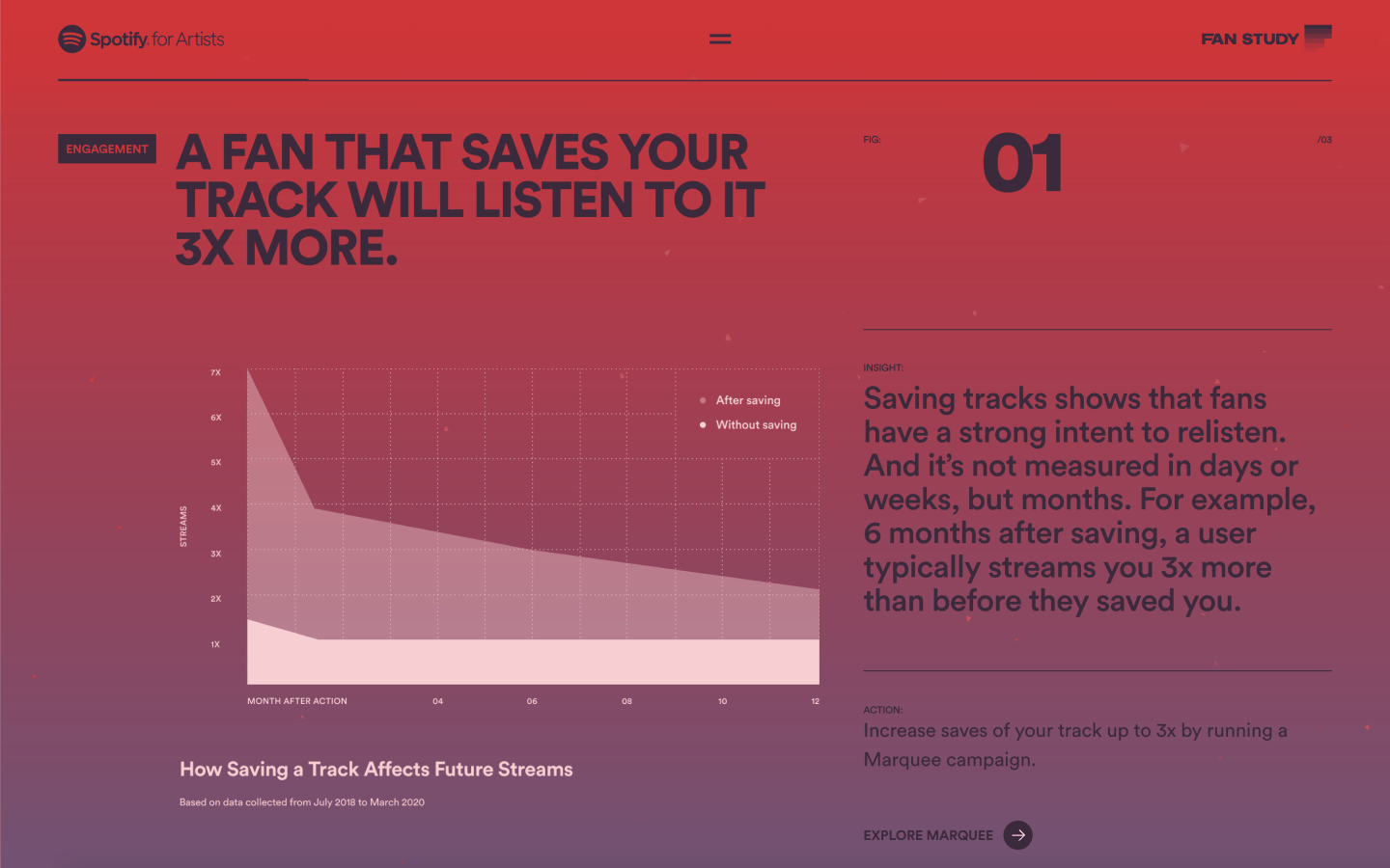
The main page of this report is organized into several subsections, such as engagement, merchandise, and release. Each section presents Spotify user data and provides explanations of its significance. Additionally, it offers tips to help musicians expand their fanbase and increase their music’s reach.
Another excellent example is Facebook’s 2020 Environmental Sustainability Report, which vividly brings their commitment to sustainability to life. Through clear, engaging visuals and concise language, the report provides an accessible look at the meaningful actions Facebook is taking to safeguard the environment. It’s a simple yet powerful way to demonstrate how seriously they are addressing today’s environmental challenges.

Related: What is Data Storytelling? A Guide to Creating Business Infographics that Drive Decisions
What makes a great data story?
How can you tell a data story that that helps people make better decisions? Let’s consider what makes a data story effective.
1. It needs to be relevant
This means the content (including copy and visuals) needs to fit with the audience’s current level of knowledge and it needs to help them reach a goal of some kind.
Maybe your audience is internal, like a presentation to leadership about the need to invest in a specific strategy or tactic. Or maybe they are external, such as a campaign to persuade customers to try your solution.
Either way, think about what matters to them. The best stories speak to people, and the more specific the person, the better.

2. It needs to include good data
This means the data should be from a reputable source and/or collected in a way that truly represents what’s needed to tell a truthful story.
Publicly available data from government entities, intergovernmental organizations, academic researchers, and established leaders in analysis are not only more accessible, they are also transparent and verifiable.
But having a good data source alone isn’t the only thing to consider. For example, you wouldn’t use data about positive tests for COVID-19 in New York as your only source of data to talk about how COVID-19 is impacting the world, right?
Since data is the center point, these stories are not about what you think your audience should hear, they are about sharing what the objective data says. This is markedly different from other stories we might tell. The data used should help you tell the honest truth. It should align with the audience’s needs and support them in learning exactly what they need to know to make a key decision.
3. There needs to be a clear narrative
When it comes to storytelling, we are all used to a traditional story arc with a beginning, middle, and end.
For data stories, this usually means you need an introduction to the topic before you dive into the data. You also need to conclude with a specific call to action—this is another thing that makes a data story distinctly different from a straightforward report.
Also, if your audience is not experts, it’s important to use plain language so you don’t lose them in wonky jargon or confusing acronyms.
4. It should include intentional visuals
What does intentional mean? It means whether you use photos, graphs, and/or charts, the visuals you use should help your audience easily understand what the data means.
Related: How to Use Visual Communication (Definition, Examples, Templates)
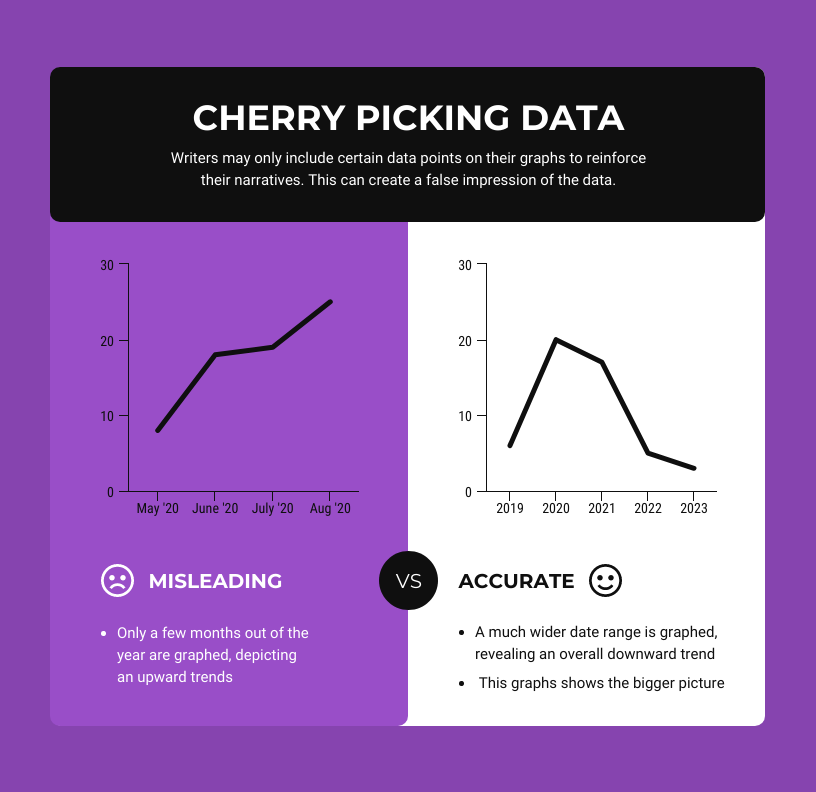
Above all, the visuals you include should be:
- Appropriate for the data
- Well-labeled
- Legible
- Not misleading
Great data stories pay attention to details like use of color and imagery, including considerations related to accessibility and diversity.
Related: Read our blog to learn how to choose the best types of charts for your data, or watch this short video:
In summary
You don’t have to be a professional designer to tell a great data story. So long as you pay attention to what matters most, you can lean on your existing strengths (whether they’re analytical, communicative, creative, and/or relational) to create data stories that will help your audience know better and do better.
You can get started today with one of Venngage’s free templates. Try statistical infographic templates or make charts and graphs that take the guesswork out of data storytelling for business. It’s free to sign up and create.


