


Creating a good data infographic starts with ensuring you have good data. In some cases, you’ll be gifted with internal data you can share with your audience, but more often, you’re at the mercy of the data marketplace.
At Venngage, recent research showed that about half of marketers use data visualization, infographics and other custom visual content to meet their campaign goals.
Data infographics can also support researchers, business leaders, students, consultants and HR—anyone looking to present data in accessible, easily digestible formats.
In this post, we’ll show you how to create data infographics and where you can find free data resources on a huge range of topics. We’ll also show you easy-to-edit infographic templates you can customize now using our simple Infographic Maker tool.
What is a data infographic?
A data infographic is an infographic that relies entirely or mostly on numbers to tell the story. This often includes data visualization, such as charts and graphs, though not always.

Data infographics, often called statistical infographics, can be distinguished from other types of infographics in a few notable ways:
- They typically have very little text.
- They usually have many data points.
- They sometimes consist of a single chart, graph or other data visualization.
- They often mix multiple types of data visualization.
Related: How to Use Data Visualization in Your Infographic

Best types of data for infographics
Infographics haven’t met a type of data they can’t bring to life, and across all industries, data infographics are a perfect way to tell a story.
That means you should consider a data infographic if you have any of these types of information:
- Survey results
- Sales data
- Pricing
- Consumer data
- Demographics
- Population
- Health
- Crime
- Safety
- Injuries
- Consumption
- Production
- Usage
- Profits
- Expenses
- Comparative data
- Ratios
- Success and failure rates
- Key performance indicators
- Market share
- Employment
- Salaries
- State data
- National data
10 Data infographic examples (templates included)
Data infographics are among the most versatile types of infographics because pretty much every industry offers many reasons to gather or report data. This data could be internal, such as customer surveys, or external, such as national health data.
When public datasets don’t cover your specific market or niche, businesses often use tools to gather external data like competitor pricing, product reviews, or industry trends directly from websites to create custom datasets for visualization.
Given their adaptability, it should come as no surprise that there are dozens of beautiful examples of data infographics that have been used to share many types of data with dozens of layout approaches.
Nonprofit data infographic
One brand of data infographic is this by the numbers layout that uses virtually no text except what’s necessary to explain the data points. The modular sections are read intuitively by English speakers left to right, but no matter where the eye lands on the page, readers aren’t confused.

Content marketing data visualization infographic
In this data visualization infographic, a map and three donut graphs take up about three-quarters of the visual real estate. A pictogram-based visualization adds yet another layer of data.

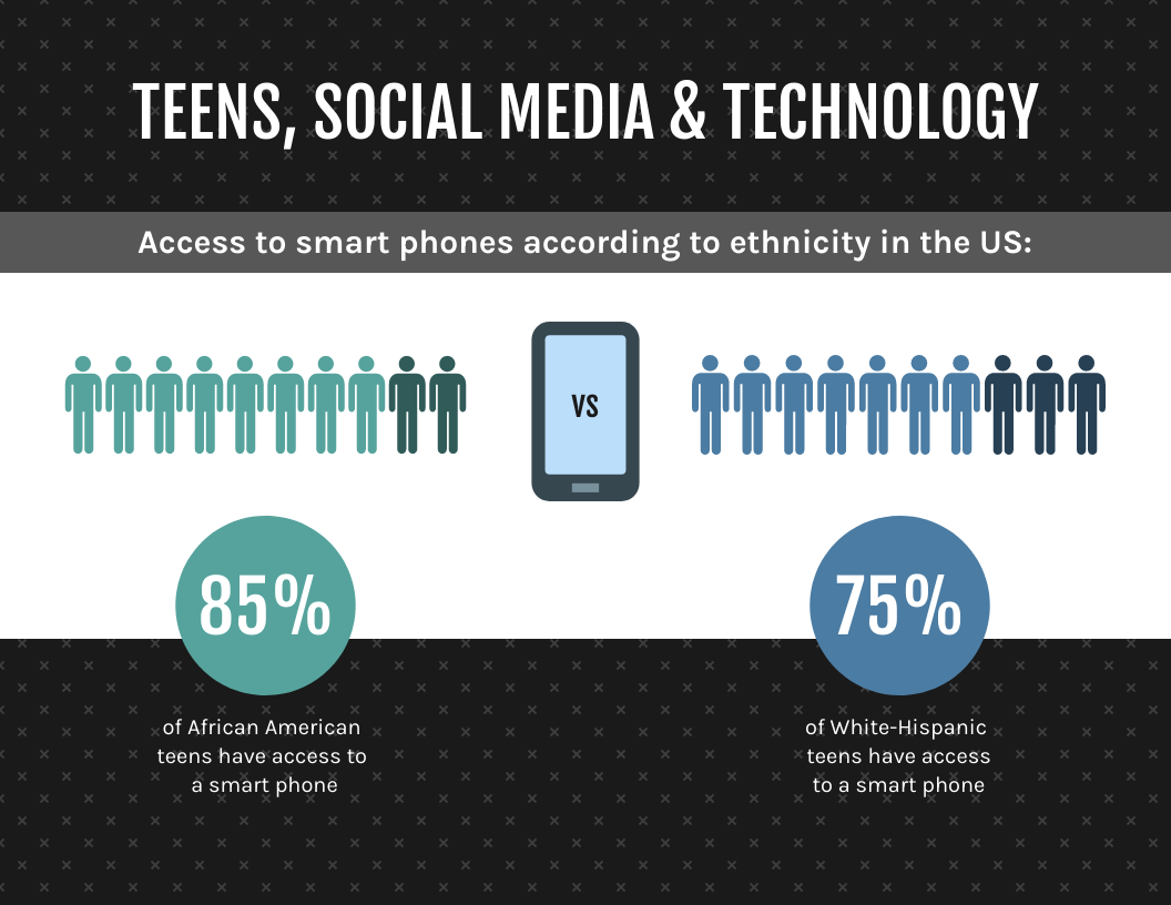
Teen ethnicity & technology data infographic
This data infographic deals with just one data point, the percentage of Black and Hispanic teens with smartphones, which shows that it’s possible to make an impact even if you don’t have a bunch of flashy points to make.
Sales survey data infographic
Survey, sales and user data are no-brainer uses for data infographics. The example above provides a blueprint for sharing many types of data all in one page. This type of data-driven infographic could easily apply to almost any purpose.

Business annual report data infographic
Here’s an example where a data infographic is used to represent figures in a business annual report. There is very little text in the infographic, giving room to make the data shine.

Marketing data storytelling infographic
Data infographics are also a perfect opportunity to break down findings to create a new way of thinking about a subject. This data analysis infographic, for example, makes a handful of conclusions, using data visualizations to support the findings.

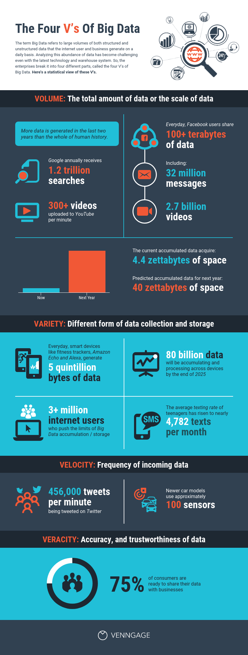
Data-driven industries and big data infographic
This long by-the-numbers infographic uses a simple, bold color palette and a medium amount of text to combine the power of data infographics with key takeaways. The result is a big data infographic that will stick in the mind of the reader.
Fun fact data infographic
Data infographics aren’t just for serious content. This fun fact infographic uses multiple types of data visualization to tell a lighthearted (and fictional) story. But it’s easy to imagine some key facts about a topic being used to populate this eye-catching infographic.

Medical data infographic
Medical infographics like this Breast Cancer Awareness Infographic is a powerful way to present key statistics and inspire action. Its bold numbers, icons, and structured layout make complex data easy to digest at a glance. The left side highlights critical stats, while the right side reinforces awareness with a pink ribbon and a call to action.

It’s perfect for nonprofits, healthcare workers, educators, and researchers looking to spread awareness, encourage donations, or share critical data. Whether you’re creating patient materials, advocacy campaigns or research reports, this template helps turn numbers into a story that resonates.
AI and technology data infographic
This infographic template on AI and machine learning is a great way to showcase AI trends without overwhelming your audience. Clean visuals, bold highlights and easy-to-read charts make complex data simple and engaging. Instead of drowning in numbers, your key insights stand out instantly.
If you’re in the AI industry—whether you’re a startup founder, tech marketer, or data scientist—this is perfect for sharing market growth, adoption rates or investment trends. It’s an eye-catching way to communicate impact and potential.

How to create your own data infographic
Designing a data infographic with Venngage’s Infographic Maker and tools is a straightforward process that transforms raw data into compelling visuals. Here’s how to do it:
- Choose a template or use the AI generator – Start by selecting a professionally designed data infographic template from Venngage’s library or use the Data Infographic AI Generator to create a custom design in seconds. Whether you need to visualize survey results, business reports or industry trends, the tool can help generate a layout that fits your data.
- Import or input your data – Manually enter your numbers or upload data from Google Sheets or Excel to ensure accuracy and consistency in your visualizations.
- Select the right charts and graphs – Use bar charts, pie charts, line graphs or pictograms to represent your data effectively. Venngage’s smart charts automatically adjust based on your input.
- Customize your design – Adjust colors, fonts and icons to match your brand or theme. Use Venngage’s drag-and-drop editor to position elements easily and create a balanced design.
- Highlight key insights – Keep text minimal and focus on the story your data tells. Use bold numbers, callouts and contrasting colors to draw attention to the most important points.
- Export and share – Once satisfied with your infographic, download it as a PNG, PDF or use a shareable link for easy sharing in reports, presentations or social media.
Venngage makes it simple to create visually engaging data infographics, whether you’re a marketer, researcher or business professional. Try it for free and bring your data to life today!
Best free sources for infographic data
A great data infographic isn’t just about eye-catching visuals—it’s about turning raw numbers into a compelling story. The strongest infographics start with accurate, well-sourced data, whether from internal reports or external research.
But finding the right data is only half the battle. How you structure and visualize it determines whether your audience understands and engages with your message.
Consider these free resources for helping inform data infographics of all sizes and shapes.
Population data
In the U.S., there’s no better resource for understanding your fellow Americans from a data perspective than the U.S. Census Bureau. In addition to their regular publications about a variety of topics, the agency also operates a searchable online repository.
Search by keyword to see the tables available on the topic. In some cases, a basic keyword search can get you exactly the data point you’re after. Enter “Education” into the search to get the percentage of Americans age 25 and older with at least a bachelor’s degree (spoilers: about 33%).
Maybe you want to go deeper on that and break this data point down further to create a more robust analysis of educational attainment in the U.S. Clicking on a result opens the table, and you can explore from there.
You can do things like clicking the dropdown for “Product,” which allows you to check out previous years’ data. That gives you an easy way to compare the current state of affairs with a previous era. In this case, the percentage of post-college-age adults with at least a bachelor’s degree has gone up by almost 6% since 2010.
Or you can hit “customize table” to create a table that includes some or all of the states, major metro areas, cities and towns, and in some cases, you can even zoom into the ZIP code level.
Results can be downloaded into Excel or other file formats (.csv and .txt) so you can create a detailed, custom analysis that helps inform your data infographics.
Here are some other excellent free resources for population data and around the world:
Health data
Even in times that don’t involve a global pandemic, health data is a rich area for creating your data infographic. There are many robust, free national and international resources for analyzing data and generating compelling stories.
The Centers for Disease Control and Prevention (CDC) offers several static and interactive resources you can find by Googling “CDC + disease data.” So, searching for “CDC + asthma data” brings up, where you can find and export information about asthma prevalence.
Most other major health conditions offer similar types of data, though rare conditions or diseases are less likely to have this type of robust data. Exploring the page reveals change over time, state-level data and more.
In addition to curated information, the CDC also feeds data into a free public database, WONDER. The system gives you access to public health information that covers births, deaths, cancer statistics, environmental data, STDs and more.
For example, data on causes of death can be grouped by year, going back to 1999, age or age group, gender, race and ethnicity, community type and state. Export results to .txt file that’s easily imported to Excel or another data analysis program to create original research into these topics.
Other free resources for health data include:
- World Health Organization
- Kaiser Family Foundation
- Cancer Statistics Center
- Centers for Medicare & Medicaid Services
Business, economy & workforce data
Economic data ranges from the macro (how much value does the U.S. economy generate every year) to the micro (what can a person expect to earn in a specific job near them), and there are many resources for this type of information.
The U.S. Bureau of Labor Statistics is an invaluable tool in understanding the state of the American workforce and employers. Like the Census Bureau, the BLS publishes data reports on a regular basis as well as maintaining some searchable databases.
Want to find out how much a registered nurse could expect to earn in the 200 biggest U.S. cities? Using the Occupational Employment Statistics Query System from the BLS can tell you just that.
The BLS also has a search tool that allows you to enter a keyword and see the tables and publications the agency might have related to that term, as well as a popular publications page for reports that are commonly cited in research and reporting.
Looking for more information related to the economy? Check out these free resources:
- Bureau of Economic Analysis
- International Monetary Fund
- FRED Economic Data Federal Reserve Bank of St. Louis
- IRS
Other topics
Here’s a look at even more free resources and what types of data they have, including whether searchable databases are available that can let you create custom datasets.
- Substance Abuse and Mental Health Services Administration: National and state reports on rates of drug use, drug abuse, mental illness and more, updated on a regular basis.
- Pew Research Center: Demographic data on Americans across a variety of topics published by nonpartisan thinktank. Datasets are available for public download, but not immediately, so it’s usually necessary to rely on Pew’s publications for timely information.
- Gallup: Survey data on a variety of topics from major polling firms. Datasets are generally not made public, but previous years’ data and related findings are usually included in publications.
- FBI: Crimes, according to data reported to the FBI. Major annual publications include Crime in the U.S. and Law Enforcement Officers Killed and Assaulted, while a database allows users to explore crime statistics.
- National Center for Education Statistics: Publications and databases covering issues related to public and private K-12 and college education.
- National Oceanic and Atmospheric Administration: Publications and databases covering issues related to weather and climate change.
- Open Secrets: Searchable database that records public contributions to politicians, candidates and political action committees.
- Bureau of Transportation Statistics: Publications on travel, tourism, airlines, freight hauling and more.
- Google Trends: Relative search volume for as many as five search terms and go back as far as 2004. (Learn more about how to use and appropriately cite Google Trends data.)
Data infographic FAQs
Do you have more questions about data infographics? We’ve got the answers here.
1. How do I put my data into an infographic?
With Venngage’s Infographic Maker, you can input data manually to create beautiful data visualizations for your infographic. Even easier, though, you can link to a Google sheet or import an Excel document to save yourself time and reduce the risk of errors.
Creating a data infographic isn’t hard, but it’s good to make sure you’re using good data and design practices, so check out our tips for ensuring you don’t create any misleading graphs or charts.
You can also check out our guide on how to choose the best charts for your data, or watch the short video below:
If you’re still not sure how to best use and share the data you have on hand, read our guide on data literacy to fully understand data visualization.
2. How can I make a fun data infographic?
While data infographics are the perfect way to distill a complex or controversial topic, they don’t have to be all doom-and-gloom. Basic facts, entertainment, sports and demographics can all be turned into fun data infographics.
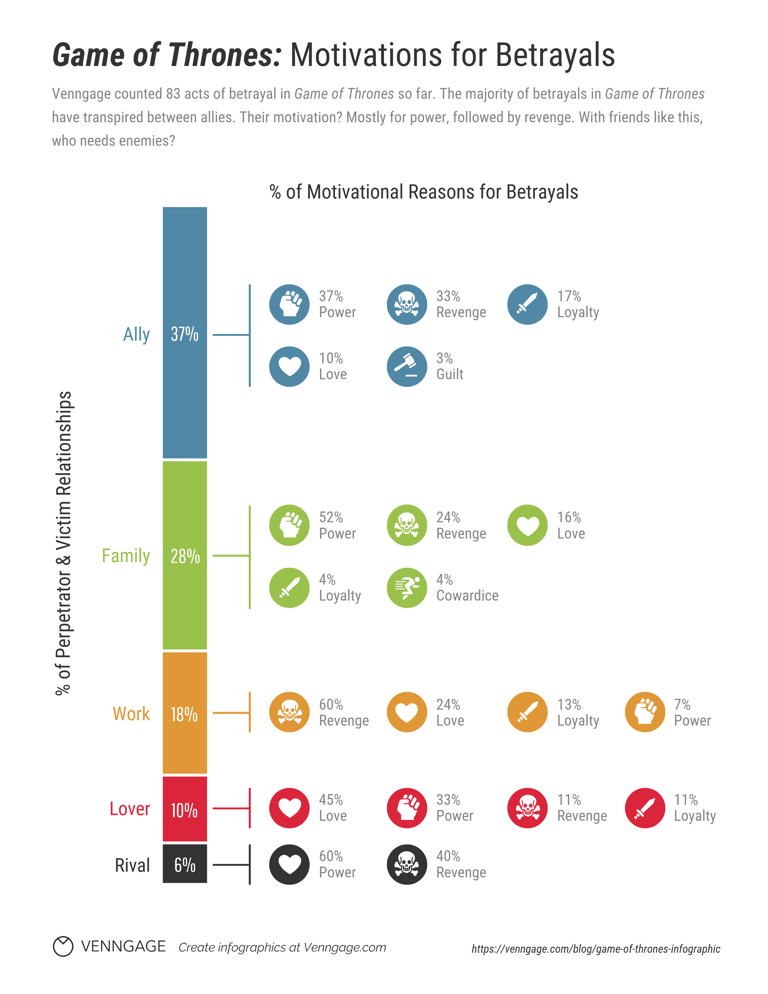
Use a site like IMDb’s Box Office Mojo to create an analysis of top-grossing films or movie stars. Compile Google Trends data about slang words used across the U.S. Or analyze a piece of entertainment like in this data infographic about “Game of Thrones.”
3. How much do infographics cost?
While you certainly can subscribe to expensive data-gathering and graphic design tools, creating informative and engaging infographics doesn’t have to devour your budget. Use the free data resources we’ve talked about, and sign up for Venngage’s Infographic Maker tool.
Creating your account is free, and by upgrading, you can export your infographic design.
Conclusion
Data infographics take many forms and cover many subjects. But one thing they have in common is that they start out as numbers on a page. Finding those numbers can be a challenge, but fortunately, there are free public and private avenues for sourcing good data.
Learning to work smart when it comes to creating data infographics means understanding which resources are most useful to the stories you want to tell. Pick a few to explore and find out what types of analysis and insights you can generate.
Maybe one of the data infographic examples we shared today will inspire you, or perhaps a table or dataset you find at one of these resources will lead you down the path to your next great infographic. Either way, you can start creating a data infographic for free right now with Venngage’s Infographic Maker.


