


Data is a part of all of our lives these days no matter what industry we work in, how much technology we use, and how we get information about what’s happening in our world.
But do we fully understand this data? Furthermore, do we know how to best use it and share it with others?
Thank goodness for data visualizations. Data visualizations help translate numbers into meaningful insights you can use to make decisions, even if you’re still a tad data-phobic. And if you are, you aren’t alone. Even though having a good grasp of data is a vital skill in the workplace, most organizations are lagging behind, according to Gartner.
To be able to create and sometimes to fully understand data visualizations, we need to overcome any fears we may have and become more data-savvy.
I am not a statistician by any means, but I’ve found my knowledge and skills related to data to be invaluable as an information designer and writer at Venngage. I’m excited to share some basics with you so you can help your team increase their data-driven decision-making and thereby their performance.
Table of contents:
- What is data literacy?
- Why is data literacy important?
- Is data literacy hard to build?
- Data literacy: 7 things beginners should know
- Simple templates to help build data literacy
What is data literacy? A definition
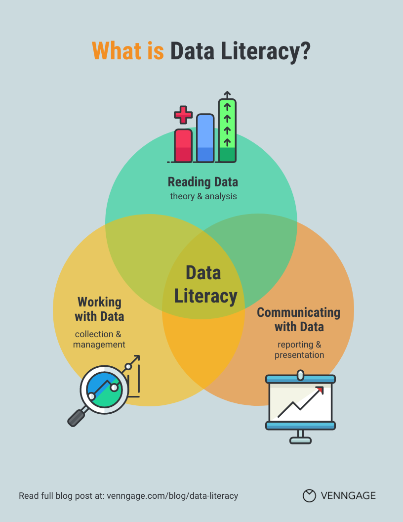
Data literacy is the ability to read data, work with data, and communicate about data by putting it in proper context.
It’s about more than just understanding and working with numbers, or numeracy. Data literacy includes understanding:
- How to assess data sources and collection methods
- What various applications for a given data set can be
- The value of working with understanding data
Related: What Is Data Visualization? (Definition, Examples, Best Practices)
Why is data literacy important?
Data literacy is important because when we make decisions based on data we can improve our outcomes, including in a business context.
“Data literacy has become important, for almost everyone. Companies need more people with the ability to interpret data, to draw insights, and to ask the right questions in the first place. These are skills that anyone can develop, and there are now many ways for individuals to upskill themselves and for companies to support them, lift capabilities, and drive change. Indeed, the data itself is clear on this: Data-driven decision-making markedly improves business performance.”
– Josh Bersin and Marc Zao-Sanders in Harvard Business Review
Even though data literacy is becoming increasingly important in the workplace, most organizations lack these skills. Employees that are data literate are more likely to say they are performing very well. If you’re wondering how your own skills stack up, check out this assessment.
“Until recently people could easily ignore data in their daily work. The company’s ‘gearheads’ and ‘quants’ were isolated in specialist departments, tech handled the mundane stuff, and managers could brush off the benefits of improved data quality with the attitude, ‘We’re doing just fine. Why bother?’ But now that’s changing. The headline result of my most recent “scan” of the data space is that fear has replaced apathy as the number one enemy of data … You can become a credible leader and dispel the fear of data in your team as well as your own fear by increasing your abilities and inspiring the entire department to embrace data.”
– Thomas C. Redman in Harvard Business Review
Many people are also seeking to visualize and communicate about data (including in infographics), and data literacy is critical to do this well. For example, this financial projection report includes raw numbers, tables, and graphs. When you understand well what the data is saying, you are better prepared to highlight key takeaways for your audience.

Perhaps you started visualizing data you collected through surveys and now you want to know what other data is available to support survey findings. Or maybe you’ve only been looking at data related to current customers and now you want to look at data that might help you target new customers.
In both of these cases and many more, you will need to collect and analyze data but you will likely also want to share it with others. Venngage’s Chart Maker tool is easier to use than most data analytics and BI platforms, so you can easily get started visualizing tabular data (data that you find in tables).

Are data literacy skills hard to build?
If it’s so important, then why is it lacking in the workplace?
A major reason is that leaders may not have these skills themselves. The fact that data-literate employees are typically isolated on IT or BI teams also doesn’t help colleagues share and spread this know-how.
Sure, some people haven’t yet recovered from that awful math class in high school. They may think that they are simply bad at math.
Others may be ok or even good at math, but don’t want any mistakes they make to lead to potentially hugely detrimental consequences, including a loss of reputation.
All these challenges are understandable, and they can be overcome. Many data-savvy folks struggle to keep it basic for beginners, so my goal is to help you slowly grasp some basics to gain some skills and more confidence.
7 things beginners need to know about data literacy

1. Uncertainty is inevitable
What? You might be thinking, “I thought data was about hard facts and figures.” Any statistician will tell you that any given data set is incomplete, that statistics is actually often about explaining levels of uncertainty. For example, we might be 95% confident that our lunch today is 87% to 91% likely to be super delicious.
This is important to keep in mind especially if we are communicating data. If we are using visuals, such as infographics, to do so, they will likely mask the messiness of reality and make our statements seem more factual. We can be responsible communicators by understanding the data well and, when possible, explaining what we still don’t know.
Related: How to Use Data Visualization in Your Infographics
2. There are various types of data
Because of all the uncertainties to weigh, data collection can be a laborious, detailed process. If you are not collecting it yourself, then what’s most important to know is that there are several types of data that can be collected, and each is appropriate for different situations.
Chances are when you think of data, you think of quantitative data, which is based on precise measurements and often analyzed with statistical methods.
Quantitative data, also known as numerical data, can come in different forms.
Discrete data can be counted and divided into smaller groups, such as the number of people in a crowd. Alternatively, continuous data exists on a continuum, for example length. There are two types of continuous data: Interval data has no true “zero”, such as temperature, whereas ratio data does, such as weight. Continuous data is often visualized in line graphs, such as profit growth reports.

Qualitative data, on the other hand, is descriptive, based on observations that cannot be measured, such as gender or language spoken. Analysis of this type of data often involves categorization into themes or patterns based on characteristics. Qualitative data may be referred to as categorical data.
There are also two types of categorical data. Nominal data can be used to measure frequencies and percentages and can be displayed in a pie chart or bar chart. If the data is put into some sort of logical order (such as breakfast, lunch, and dinner), the data is considered to be ordinal data.
Sometimes both qualitative and quantitative data is collected and analyzed – this is known as mixed methods. They may be mixed and interpreted in different ways, so this may be worth looking into if you are using this type of dataset.
All this to say: understanding the type of data you’re working with will help you determine how to best communicate it, whether it’s to choose the order the data should be presented or what type of charts to visualize it.
3. Data sources matter
Most if not all of the main data collection methods you have likely already heard of:
- Surveys or questionnaires
- Interviews
- Observations
- Experiments
If data is collected firsthand by a researcher, it is considered primary data. Secondary data is data that has already been collected and has been made available for others to analyze and share.
Chances are you will be using secondary data, so here are some quick questions you can ask yourself to make sure the data is high quality:
- Is the data from a reputable source? Does that source share information about how the data was collected (this may be included in documents referred to as metadata)? In other words, are they transparent?
- Is it open, restricted, or unavailable? Open or public data may be made available by government entities or intergovernmental organizations, but some data may be restricted. Privacy is a big deal, and there are many laws that prevent sharing data that may violate people’s rights or dignity.
- Is the data set the right one for the job at hand? Assessing this requires some logical, cautious thinking. For example, if I want to say something about high schoolers living in America, I’d better make sure I can find data that represents the many young people living across the states. If I can’t, then I should specify that I’m referring to high schoolers in New York, or in Buffalo specifically.
- Is it aggregated and/or normalized? Aggregated data has been summarized so you can’t identify characteristics at the individual level. A common example is data from Google Analytics: You know how many people visited a specific web page, and you may even know what cities they live in, but you don’t know their names. Normalized data helps us compare numbers by using a common scale. A common example is when we see rates per capita: It’s less meaningful to know the number of car accidents in towns in your state, and more meaningful to know if some towns have a surprisingly high number of accidents given the size of the population.
Once you have data in hand then you are ready to start using it.

4. It’s important to keep data organized
By now you might be thinking, wow this is a lot to keep track of. Managing data is not for the faint of heart. It requires a lot of attention to detail and follow-through.
If you are working with a relatively small data set, such as survey responses, then you can probably just use one or a series of spreadsheets.

If you are downloading public data sets, like Census figures, you may have more on your hands than you need. Some data sets may even need to be cleaned, which means incorrect or duplicate data has to be deleted. Sometimes the data even needs to be reformatted—for example, if numbers are being read a text by analytical software then calculations will be impossible (text and numbers are different field types).
Data management can be a team job. If you’re not sure how to get your ducks in a row, reach out and find someone who can help.
5. Data often can tell lots of different stories
When you analyze data, you are generally looking for patterns. These patterns may tell a story about what has happened, or what’s most common, or something else.
Related: How to Tell a Story With Data (A Guide for Beginners)
Most patterns will come down to the relationships between two or more variables, which are the “things” that are being counted, measured, or described. Here are a few examples:
- People who are on bowling leagues versus people who are on tennis teams
- Grocery stores in low-income neighborhoods and grocery stores in high-income neighborhoods (note: place-based or geographic data includes map coordinates in addition to other variables)
- How people feel about cats versus how they feel about dogs

For any one of these examples, you might discover in the data a variety of patterns. Let’s consider the last example listed. In looking at people’s different sentiments, you might discover that people who are older like cats more, or people with kids like dogs more.
The point is that data alone doesn’t say anything. It’s only through analysis that you can begin to uncover insights. And there may be many to uncover, so it’s worth it to keep digging and not merely settle for the first “aha” you stumble upon. Pay attention to outliers and anomalies—these are significantly different data points that can indicate errors in the data and/or places for further study and analysis. Be aware of your cognitive biases and potential pitfalls as you conduct your analysis.
6. When you know your story, share it responsibly
First, what are you hoping to share with others?
- Descriptions of the data, such as frequencies or percentages
- Distributions of the data, such as ranges or averages
- Comparisons in the data, such as changes over time or correlations between variables
Another big no-no is to equate correlation with causation in any way. There may be a correlation between ice cream and sunscreen sales, but that doesn’t mean that selling more ice cream will lead to more sunscreen, it may mean that both sales are a result of a third variable which is time of year.
Once you know what you’re hoping to share, you can choose a visual that will best help someone else understand key takeaways.
7. You don’t need to know everything
But you do need to keep learning! There’s a lot to learn so if you need help prioritizing what to nail first, it’s super important to understand how data can be misused to mislead. If nothing else, make sure you aren’t doing that.

Congrats! You are now well on your way to overcoming your data phobias and becoming more data literate. I hope you will take what you’ve learned here and begin to apply it immediately.
Just how once the best way for you to learn to read was to pick up books, the best way to build your data literacy is to practice working with data and sharing it with others. When you do, you’ll quickly come to realize the immense value of doing so.
Simple data visualization templates to build your data literacy
You can get started by using some simple templates to create some data visualizations with Venngage. Here are a few templates to get you going.


Want to see more? Check out our templates library and start creating your own infographic for free with our easy-to-edit templates and drag-and-drop editor.


