A business plan outlines the goals of your business and how it plans to achieve them.
Real important – because without it, it’s like running a business in the dark. It’s like a roadmap that guides your company’s direction and helps everyone stay on track.
Gone are the days when designing a business plan from scratch was a time-consuming and challenging task. Today, business plan templates offer a convenient solution by providing pre-designed layouts that simplify the process.
In this blog, I’m going to break it down for you. I’ll share the six things you need to know to put together a compelling, engaging business plan. Ready to get started now? Venngage’s online Business Plan Maker lets anyone create a winning business plan quickly and easily.
Click to jump ahead:
- How to format your business plan
- Startup business plan templates
- Simple business plan templates
- How to write your business plan
- How to design an engaging executive summary
- How to use charts and graphs to present data
- How to communicate growth strategies in your business plan
- How to present financial data in your business plan
How to format your business plan
To format your business plan:
- Start with a clear title page.
- Include an executive summary.
- Provide a company description.
- Conduct a market analysis.
- Describe your product or service offering.
- Outline your marketing and sales strategy.
- Include organizational or business structure and management information.
A typical business plan is an in-depth document and covers every facet of your business (present and future). Creating a traditional business plan makes sense when you have a clear growth plan for the next three to five years, are in need of major funding, or want to attract long-term partners.
A professional business plan typically has the following sections:
- Cover page
- Table of Contents
- Executive summary
- Company description
- Market analysis
- Organization and management
- Service or product line
- Marketing and sales
- Funding request
- Financial projections
- An appendix
A business plan can span a dozen or more pages because it presents the big picture, as complete as possible, to reassure others to invest in you. Investment can mean a few different things – usually financial, but also as partners or employees.
The sections that can take a lot of research and add to the bulk of your business plan are your market analysis, marketing and sales plans, and financial projections.
These are the sections that demonstrate your business acumen, your long-term vision, and your accountability. Whereas, sections like the executive summary are meant to grab attention, inspire and get people excited about your business.
Start with a business plan template
To get started on your business plan, save yourself some time and use a template.
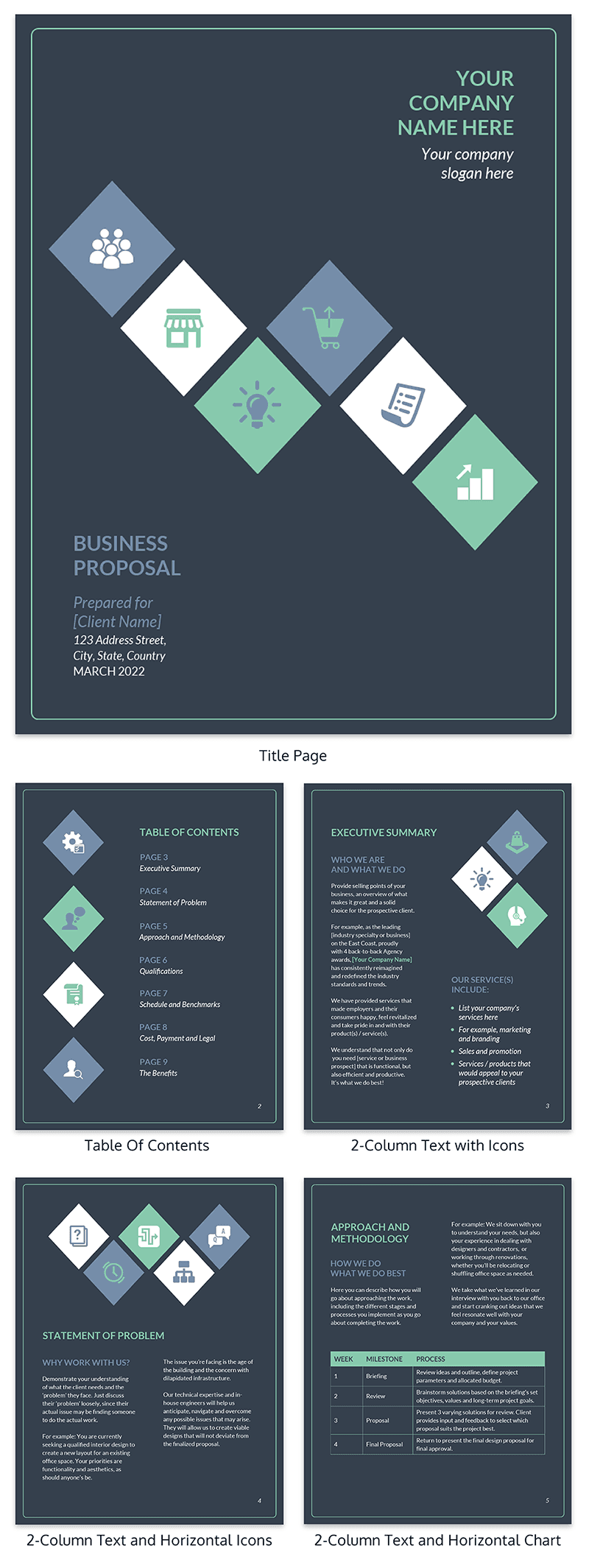
Most business plan templates will include things like a cover page, table of contents and the main sections you need. It will also have pre-formatted pages with placeholder text and charts that you can swap out.
It takes time to do market research, present growth plans, put together financial projections, analyze your customer base, create competitor breakdowns…the list goes on.
The last thing you want to do is spend precious time formatting the resulting document.
Save time by building your business plan from an existing business plan template, and customize it with your own content.
With a clean, consistent structure and clear headings, this template is the perfect starting point:
Then you’re free to customize the template with helpful visual elements like charts, tables, and diagrams, that will make your business pitch impossible to resist.
A Venngage business plan template is designed to help you communicate visually and explain complex ideas easily. The right business plan template for you depends on the length and detail of your business plan, your brand and style, and the different sections you want to cover.
If your small business doesn’t have a dedicated design team, but you still need to learn how to write a business plan to present to investors–build off of a pre-designed business plan template:
Simple business plan templates
There are just a handful of our business plan templates that can be customized in the Venngage editor. Browse more business plan templates, choose one that’s best for you and start editing right away.
Startup business plan templates
Structuring your startup business plan involves organizing it into sections such as executive summary, company description, market analysis, product/service offering, marketing and sales strategy, financial projections, and operational plan.
Here are some business plan template examples:
Short Business Plan Template
Number your pages and include a table of contents
A table of contents is crucial to help readers navigate your document and quickly find specific sections that are of interest to them.
It’s a good idea to include page numbers, main section headings, and section subheadings here for easy reference.
Keeping these tips in mind will ensure that your business plan design feels clean and professional and doesn’t distract from your content. You want your information, not your formatting, to be the focus!
How to write your business plan
Here are three tips for writing your business plan to ensure it’s easy to read, appears professional and is memorable.
Use bulleted lists, bold text, and a clear type hierarchy for ‘skimmability’
Business plans need to be understandable at a glance to attract funding. Investors are looking for information that will help them understand your business quickly and without much effort.
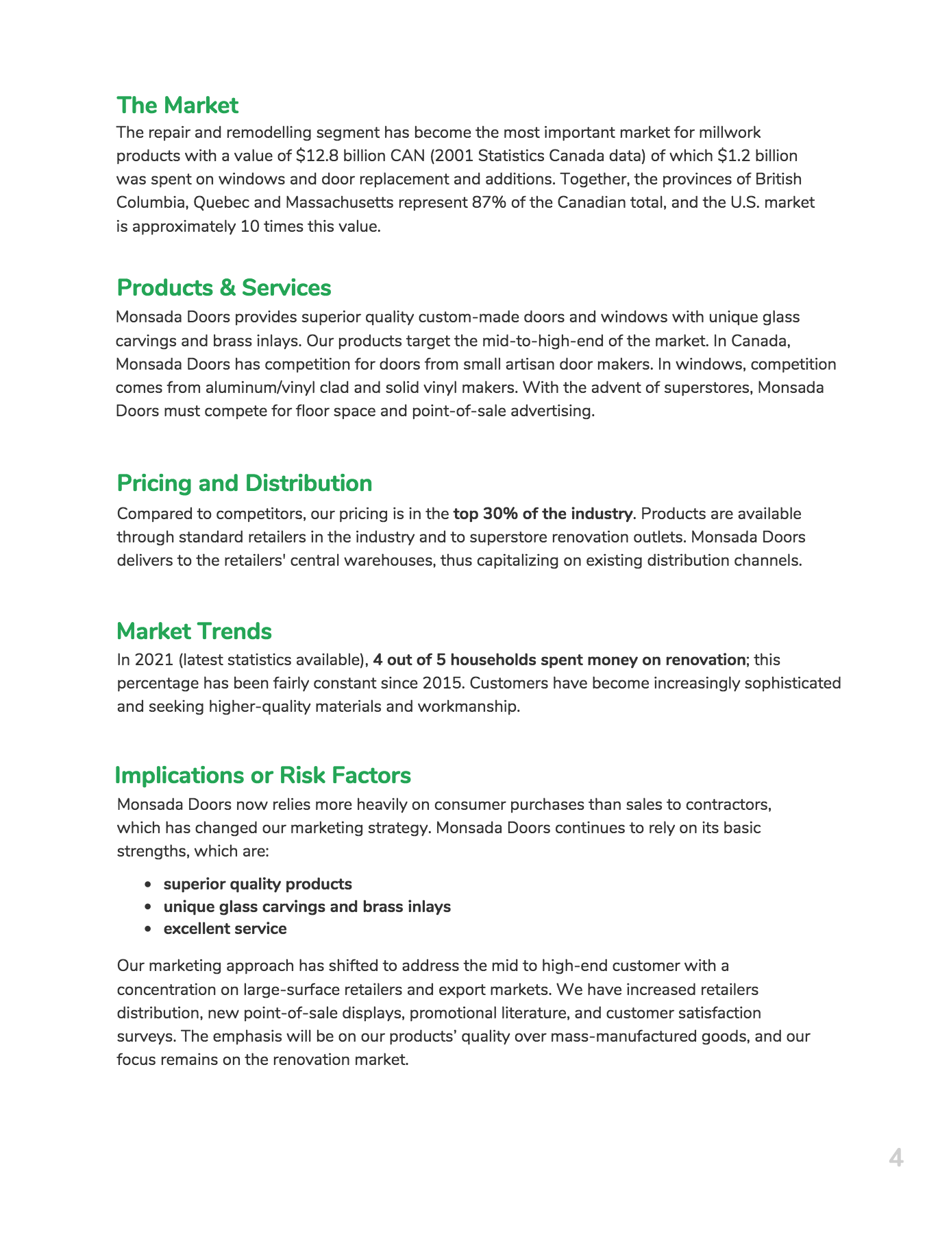
Take a look at this snippet of the business plan template from above:
What stands out to you?
To me, the large green headers pop out first, making it easy to scan through the sections to find what I want to focus on.
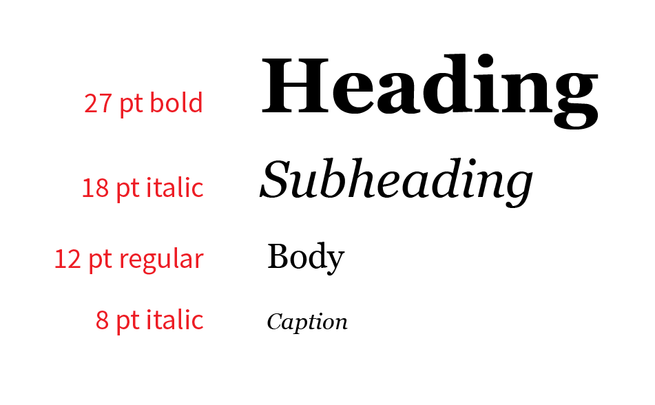
This is because there’s a defined type hierarchy, giving more visual weight to the headers over the body text.
Next, the unique selling points of this business–superior quality products, unique glass carving and brass inlays, and excellent service–jump out. Because they’re presented in an indented list, they’re easier to see at a glance, which will likely make them more memorable.
Finally, I’m drawn to the bolded stats–“top 30% of the industry” and “4 out of 5 households spent money on renovation”.
Key statistics like these can go a long way towards convincing your investors that you’re worth their time and money. If you’re going to include them within larger paragraphs, make sure they stand out by increasing their font weight.
To sum up: make your report skimmable. Draw attention to important takeaways with indented lists, bolded text, and a clear type hierarchy.
Consider using a one-column or two-column grid
If your business plan contains only text, stick with a single-column layout that reinforces the linear flow of the document. If your business plan includes some supporting data in the form of charts and tables, use a two-column layout to juxtapose text with its corresponding data.
Maintain page margins that set text at a readable line length
When we read long passages of text, the ease at which we read depends on how the text flows on the page. Something called line length (the number of characters in a horizontal line of text) plays a huge role in readability, and is something you should consider when formatting your business plan.
To dictate line length, designers and typesetters play with the width of page margins (the edges of a document that don’t contain any text or images) with the aim of maximizing readability.
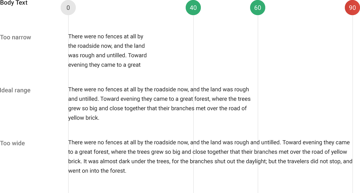
It’s generally accepted that the ideal line length sits somewhere between 40 and 90 characters per line. Any longer or shorter and you’ll find that something feels “off” about your document.
How do you achieve this in your business plan?
If you use a single-column layout, use nice wide margins (1 ½ to 2 inches) to limit your text to less than 90 characters per line.
With a two-column layout, you might need to use narrower margins (possibly as little as ½ an inch on either side) to make sure there’s enough space for at least 40 characters per line of text.
The last thing to remember about margins and line length–don’t play around with them from page to page. Use consistent margins across your whole document.
How to design an executive summary
An executive summary is a snapshot of your business plan. It should be concise and hook your readers. It should reassure stakeholders that your business plan will be a worthwhile read.
How you choose to structure your executive summary is key. You can deliver a lot of excellent information that simply gets lost in a sea of text and paragraphs. Even if someone reads through it entirely, they may have missed something.
To make key information stand out, use vibrant headings, incorporate visuals throughout, and break up the layout of your text.
Not every investor looks for the same thing. Some will care more about who you or your executive team are, while another is interested solely in the financials of the business. Identifying each section makes it easy for readers to find exactly what they’re looking for.
You can also list out the key takeaways, briefly explaining them in the executive summary. If your reader finds everything they needed to know in the executive summary, they’ll happily move onto the rest of the business plan.
Use one feature color to tie your business plan together
Color should be used with restraint in professional documents like business plans. Instead of adding color solely for aesthetic purposes, think of color selection as another tool to highlight information you want your reader to focus on and to tie the document together.
You shouldn’t need more than a single color (ideally one of your brand colors) to achieve this in a business plan.
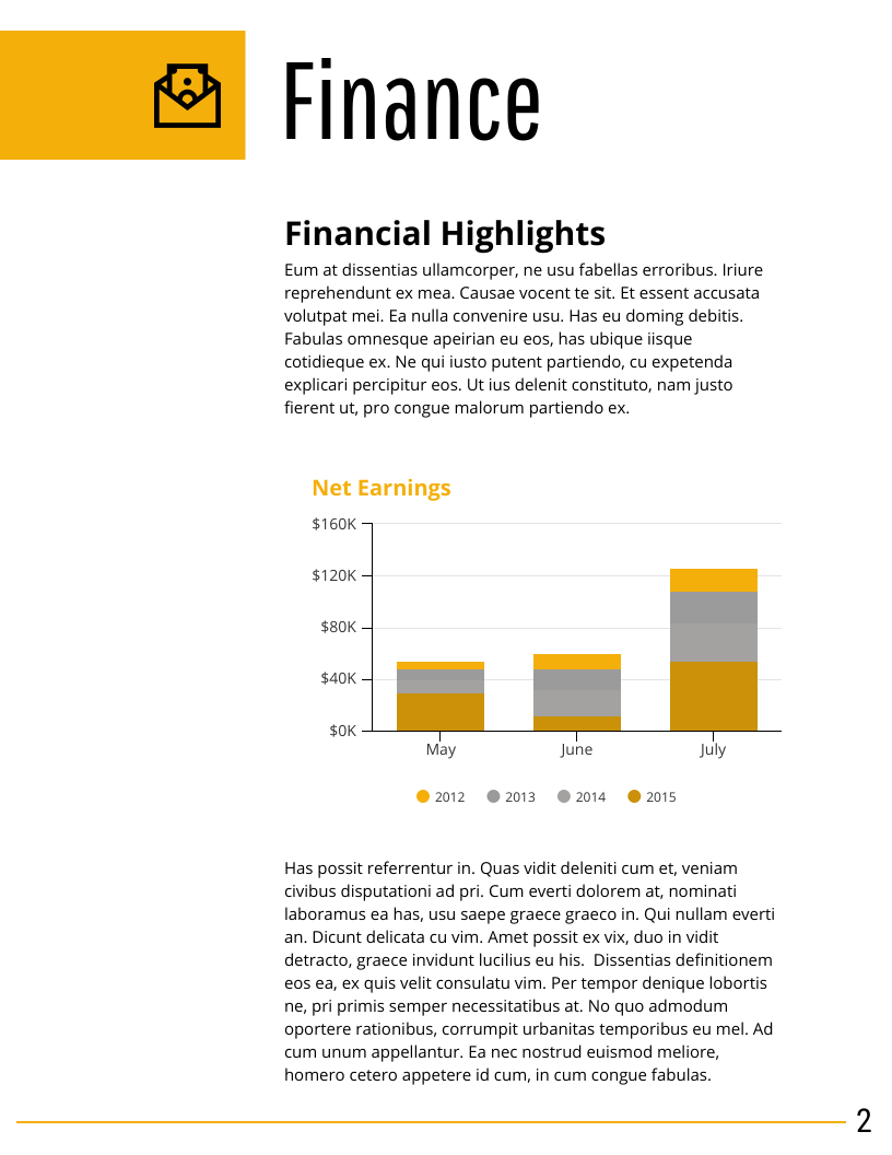
In business plan charts, color should be used only to clarify trends and relationships. Use color to emphasize single important data points, differentiate between real and projected values, or group related data:
In the rest of your business plan, keep color to a minimum. At most, use it to make headers stand out or to highlight key points in long-form text, diagrams, or tables.
The nice thing about keeping document colors this simple? It’s hard to mess up, and without any complex design work, it creates a sense of cohesion and unity within a document.
How to use charts and graphs to present your data
Since your business plan should be backed by solid data, you might want to include some of that data as evidence, in the form of charts, tables or diagrams. Even simple visuals can communicate better than long paragraphs of text.
I’ll touch on some specific types of charts commonly used in business plans next, but first let’s review a few general chart design tactics.
Use descriptive titles and annotations to spell out chart takeaways
Avoid generic headers whenever possible. Maximize your chart’s value and impact by providing takeaway messages right in the title.
In the same vein, add direct annotations to data points or trends that support your case.
Repeating key messages within a chart, in the title, annotations, and captions, may improve viewers understanding and recall of those messages.
Aid understanding of market size and market share with area charts and pie charts
A market potential analysis is a fundamental pillar of your business plan. Market size and market share are two major components of a market potential analysis.
These numbers are typically in the millions and billions (the bigger the better, really), but most people have trouble grasping the meaning of such big numbers. At a surface level we can understand that one billion is one thousand times larger than one million, but we often struggle to comprehend what that really means.
This is the perfect opportunity to add some visual aids to your business plan.
Use bubble charts to represent market size
Bubble charts are useful for showing general proportions among numbers. Check out this one from our redesigned version of AirBnb’s first pitch deck:
Without having to think about the absolute values of these very large numbers, we can quickly see how they relate to one another.
While bubble charts are good for making quick, general comparisons, they’re less useful when it comes to precise measurements. To help readers make slightly more accurate judgements of proportion:
Use pie or donut charts to represent market share and market composition
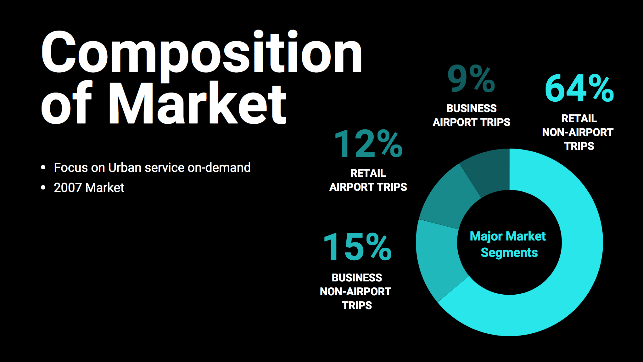
Pie and donut charts are the industry standard for showing market share and market composition, since they’re the most widely understood method for representing part-to-whole relationships.
The way Uber breaks down their market with a simple donut chart makes their biggest segment (a key takeaway) really stand out, while the subtler differences between the smaller segments are still evident.
When you present a market analysis, use pie charts, donut charts, or bubble charts to aid the reader understanding proportions and part-to-whole relationships.
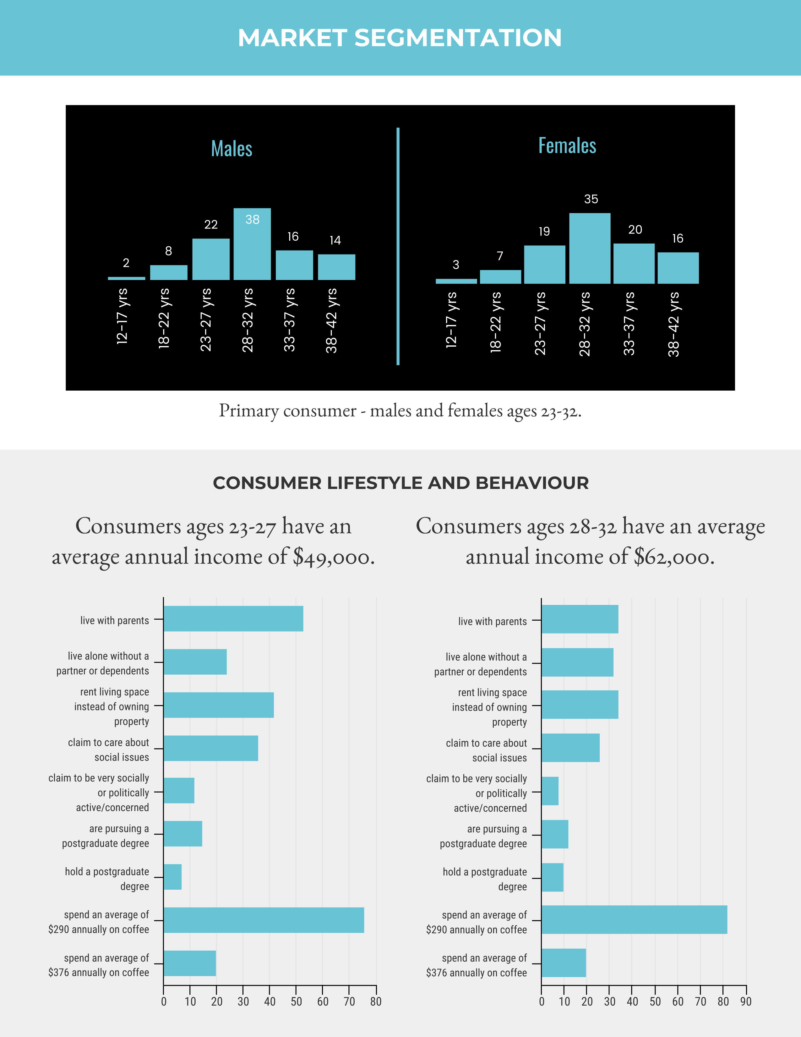
Use histograms and bar charts to represent demographic distributions in market segmentation summaries
Another part of analyzing market potential is about identifying and understanding target customers. This means segmenting customers by geography, interests, demographics…really anything that might affect purchasing behaviour.
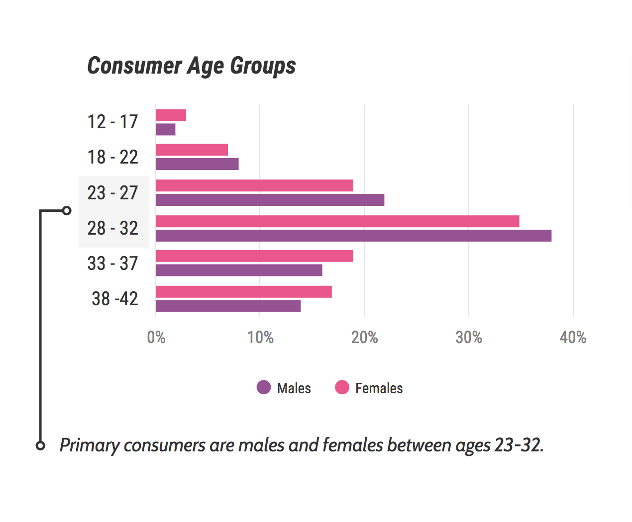
Two standard metrics that most businesses include in a market segmentation summary are customer age and gender. These data are easily summarized in a histogram, with bars that represent age group distribution.
Bar charts can then be used to contrast the key behaviors and lifestyle choices of the top consumer segments.
Histograms and bar charts are standard features of a market segmentation summary. Use them together to identify and present information about top customer segments.
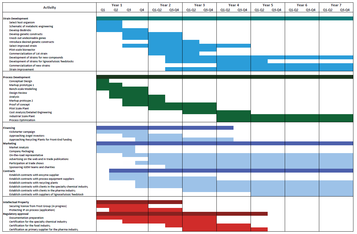
Outline major milestones with a Gantt chart
Stakeholders will want to see that you have a concrete plan in place to help you reach your revenue goals. When formulating your goals, use the SMART principle to provide your stakeholders with a very clear vision of how you intend to achieve them.
Use a Gantt chart (a sort of modified bar chart) to outline the major milestones and phases of your business strategy. Try to include a multi-year plan, broken down by quarter and by project or department.
You can create your own Gantt chart with Venngage.
How to communicate growth strategies in your business plan
No matter how impressive your product line or services, your business won’t just magically grow. You concrete marketing and sales plans in place, and effectively communicate strategies to your stakeholders.
Start by acknowledging your target market – who are you going after? This is what your marketing and sales efforts will revolve around after all.
Demonstrate an understanding of the competitor landscape. You will always have direct or indirect competition, and showing how your planning accounts for it is key. Then you can talk about actual plans and strategies you wish to implement.
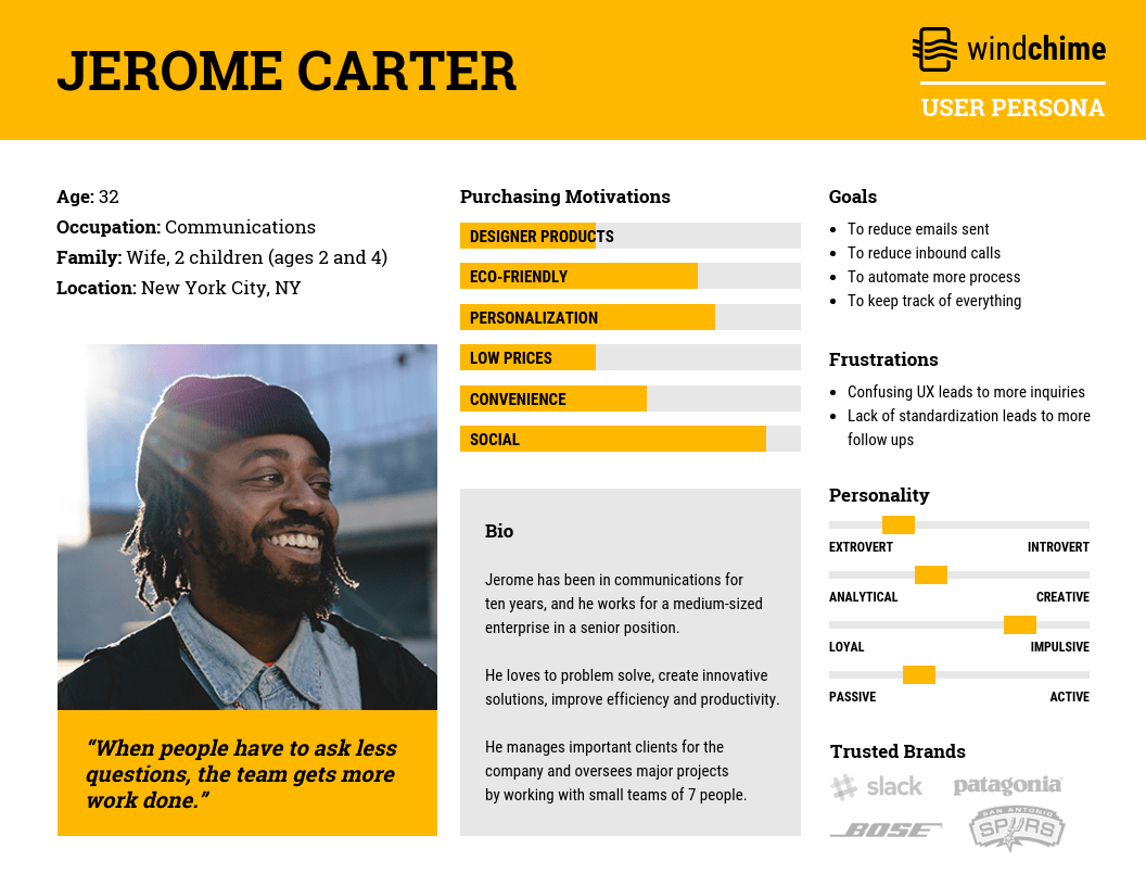
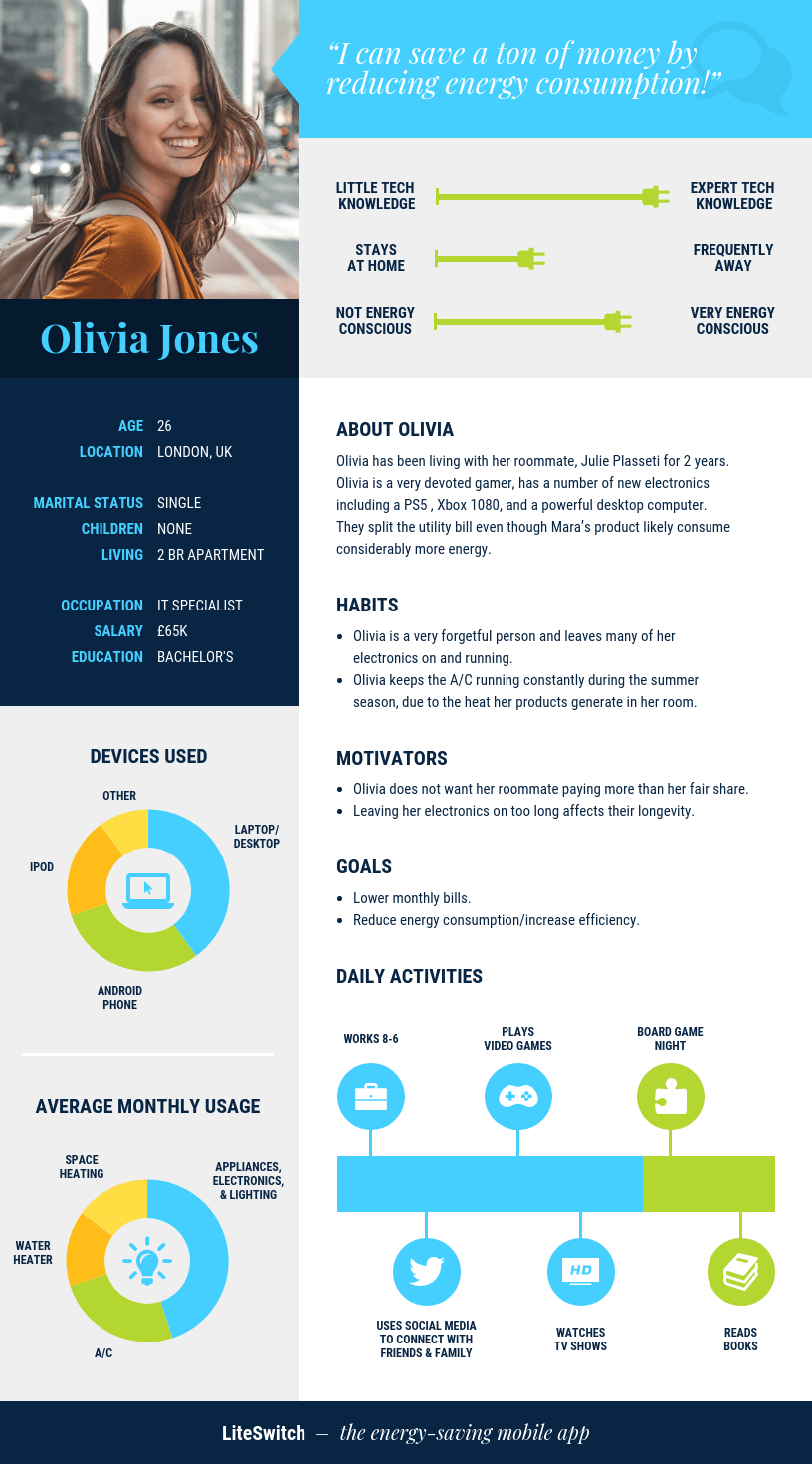
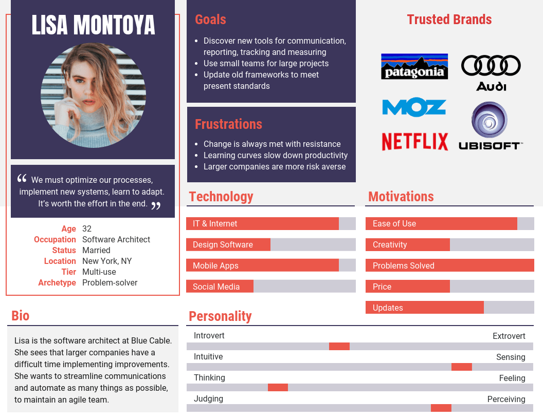
Present your target audience with persona guides
A product may great on its own. But its value is determined when there is a clear and obvious market for it. You can point out shortcomings of your competition, but you also need to show that your target audience exists and how you’re serving them.
A persona guide provides a great deal of context to readers of your business plan. It’s the best way for them to understand who cares about your product or service, how it aligns with their lifestyle and needs, and why your marketing and sales tactics will work.
A persona guide needs to be detailed, and share an intimate understanding of your target audience. The more you can divulge, the more reassuring your research and overall business plan will be.
Even if you don’t have a substantial customer base, you can still create an ideal persona guide to show who you’re pursuing.
Highlight competitors and differentiate yourself with a SWOT analysis
Every business plan should include an analysis of the competitive landscape–an assessment of the strengths and weaknesses of competitive businesses.
In terms of visuals, this competitive analysis is typically summarized in a SWOT analysis matrix.
You can also present the SWOT analysis as a table or a list. The layout is up to you, but you want to focus on strengths, weaknesses, opportunities and threats in relation to your competition.
While the SWOT analysis framework provides valuable insights, it’s not the entire reflection of your competitive landscape. For example, it doesn’t make it easy to see at a glance the qualities that differentiate your business from your competitors.
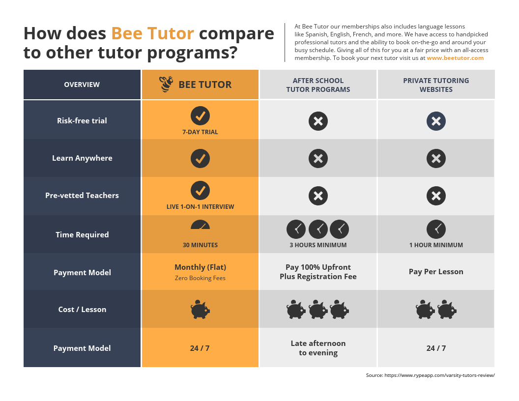
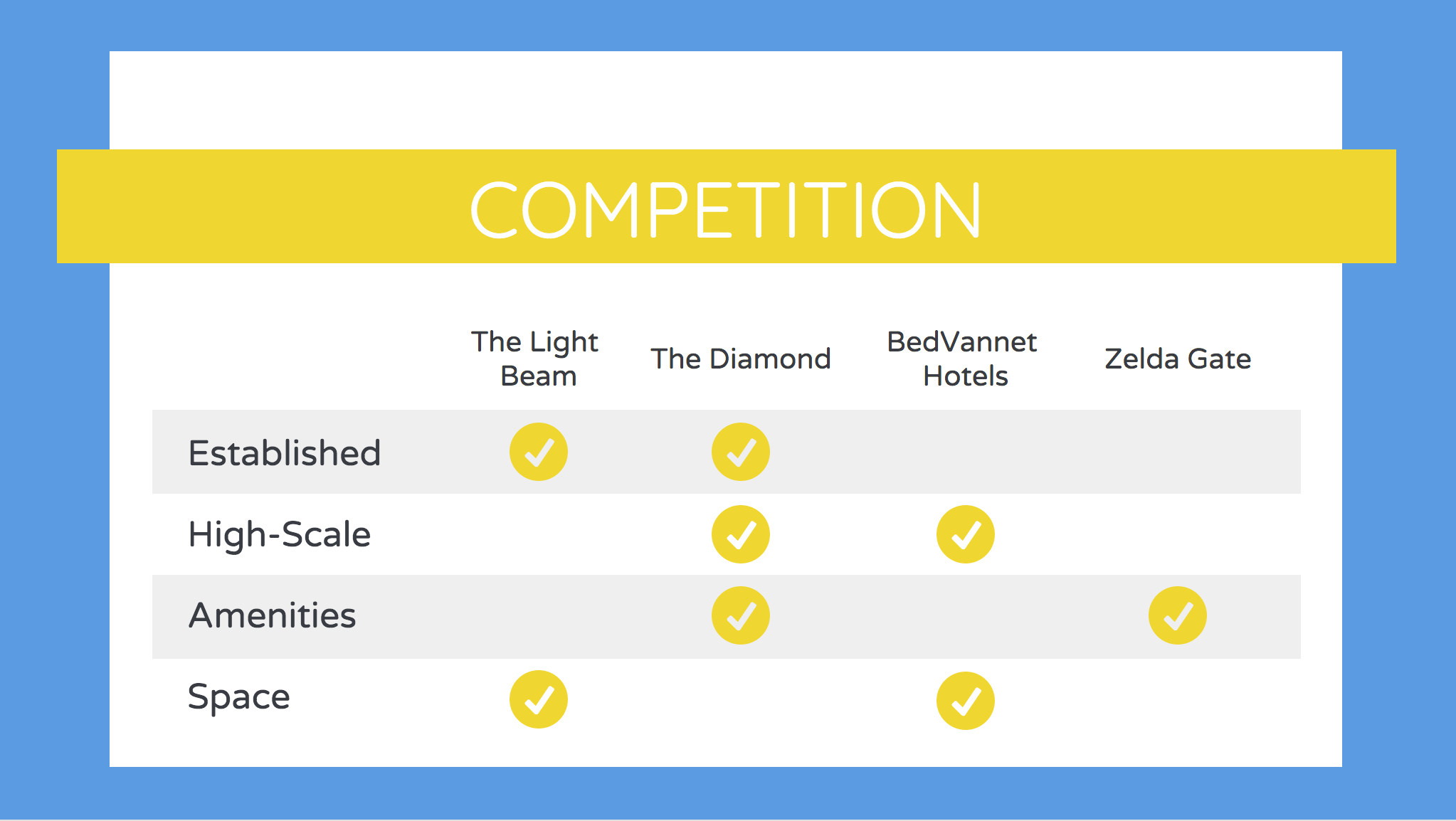
To highlight those offerings that set you apart from your competitors, a comparison matrix is more effective. Take a look at these two templates:
With a direct competitor comparison, it’s easy to present the key differentiators between the existing options for a product or service, and your business.
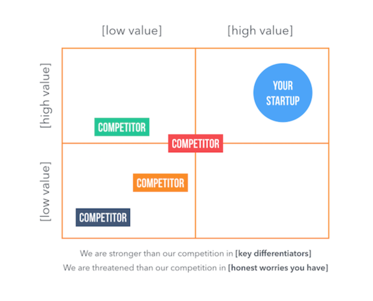
Alternatively, a “Magic Quadrant” can be useful when you’re focused on comparing across two main metrics (key differentiators):
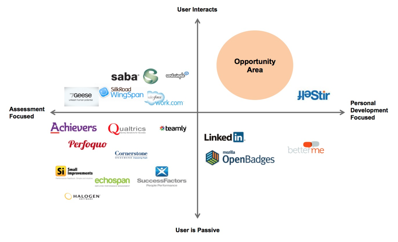
Finally, in a competitive market, there are going to be a lot of players who compete directly or indirectly with you. A breakdown of them all may not be necessary. Instead, you can point visually to the space that you will address, that has been so far ignored up to now.
To do that, a prioritization chart can be used. By plotting competing businesses on a prioritization chart, you highlight experiences existing competitors focus on, and where your business falls.
Use roadmaps to present your marketing and sales plans
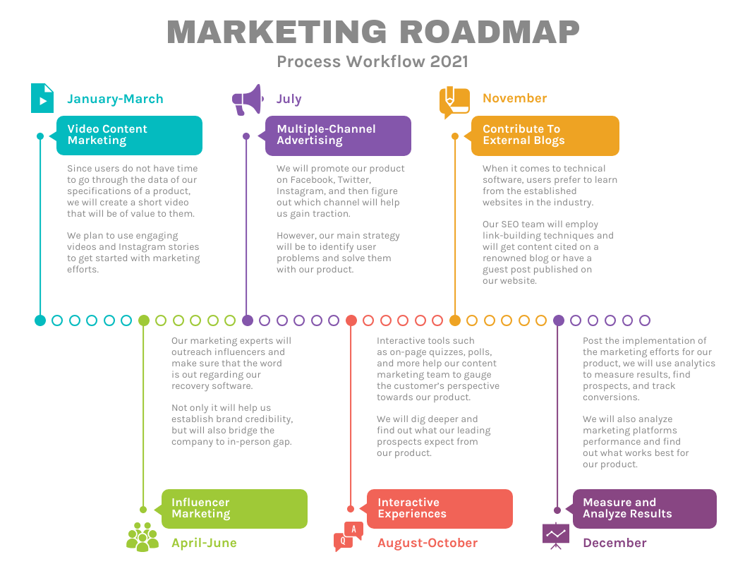
To explain any long-term marketing or sales plan, you want visuals. It’s easier to break down strategies you’ll be deploying every month or each quarter, when you can actually show what you’re talking about.
Keep in mind, those reading your business plan may not be marketers or sales executives. Being able to lay out your approach in a way that’s organized, shows how much thought you’ve given to your growth strategies.
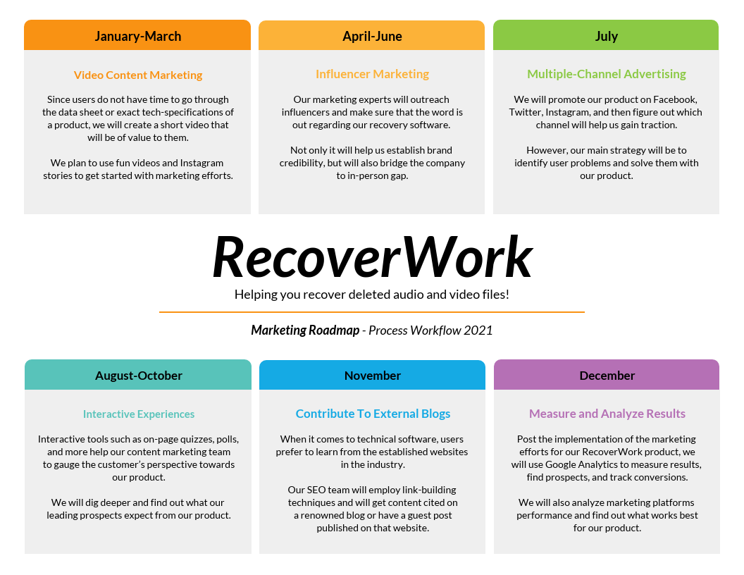
You can design a simple roadmap that points to what you’ll be doing throughout the year. The more detailed you can get, the better.
You can also present your product roadmap, with your marketing roadmap how the business will be growing overall.
You don’t need to use a traditional roadmap layout, either. Experiment with different formats as you may find one easier to work with than another. As long as the time period for different strategies is clear, your roadmap will be easy to understand.
How to present financial data in your business plan
Presenting financial data isn’t easy. You have to crunch a lot of numbers before you can share projections with confidence. You’ll also need to explain how you arrived at the numbers and prepare for your answers.
Understanding how to organize your information is key to walking potential investors and other stakeholders through your projections.
Use organizational flow charts and summary tables for budget breakdowns and financial summaries
The financials section of your business plan will get a lot of attention from stakeholders. Simple bar charts and pie charts won’t suffice, as they can’t present financial data in very much detail.
If your business has already been operating for some time, stakeholders will expect a detailed report of revenues and expenses. Tables are usually the best choice for this kind of financial summary, as they provide an unbiased view of the numbers and allow stakeholders to look up specific values.
If you’re interested in highlighting a particular trend, however, you may want to include a line chart featuring a smaller snapshot of your financial data:
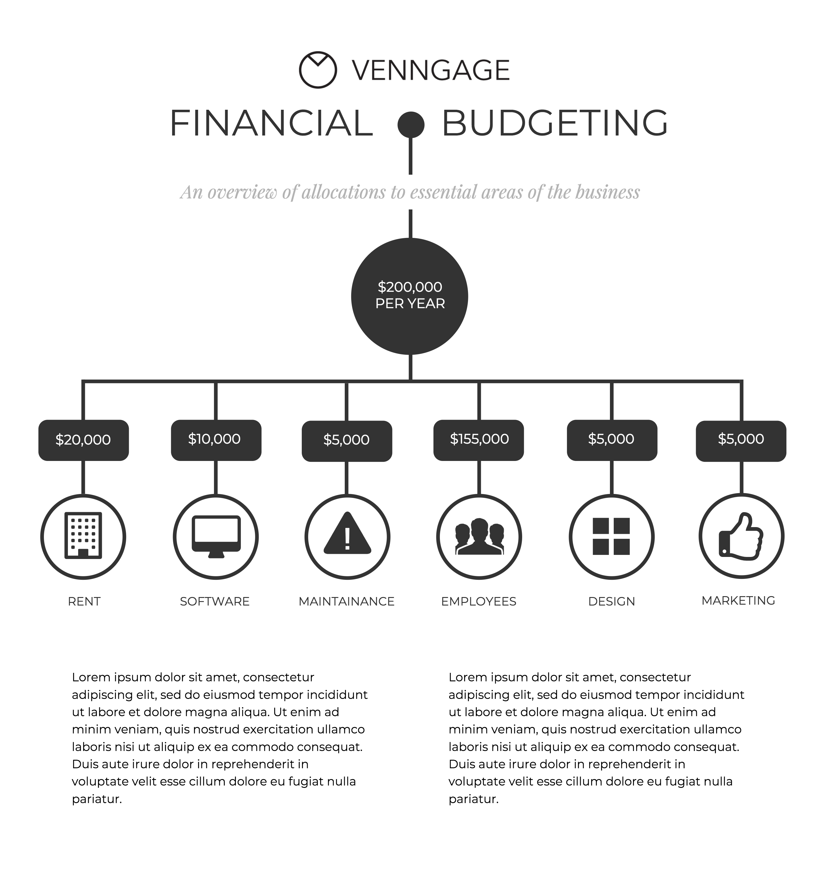
If you’re just starting your business and you don’t have any detailed revenue data, you can still provide useful information about your budget. Outline higher-level budget allocation with an organizational flow chart.
Use line or bar graphs to visualize financial trends
You can use different types of graphs to also show how your business has performed thus far.
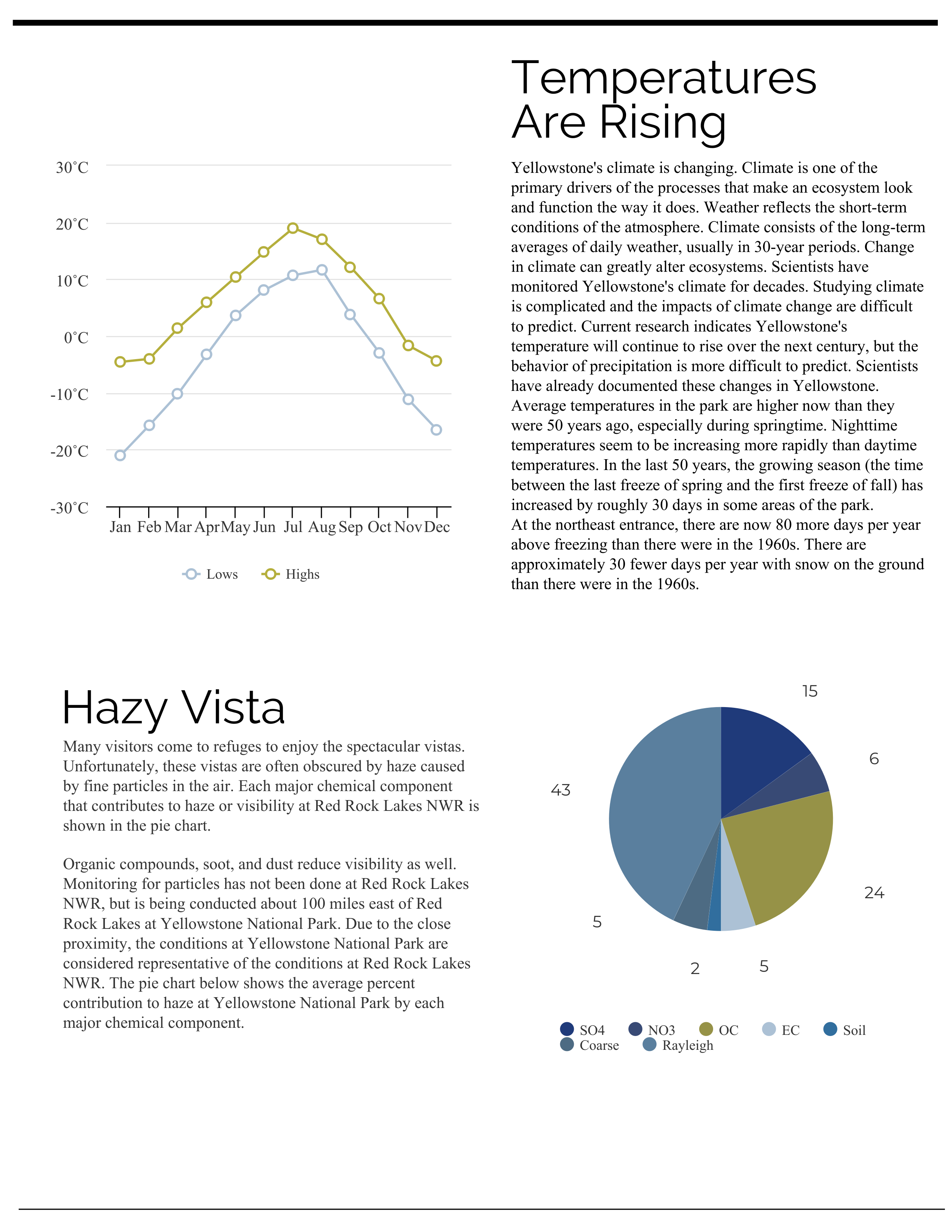
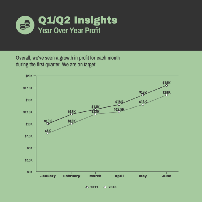
You can share results over the course of a year with a line graph. This is effective to show an overall set of trends and growth rates.
You can also compare previous years to highlight how your business has grown.
Your audience should be able to draw conclusions from your data within seconds. If there is simply too much information, or it’s hard to find important information, they will lose interest.
Looking for a business plan software to help save time and reduce errors? Pick from one of these 7 best business plan software to get started.
A quick summary
A business plan is the one key document that every young business needs to present their vision to potential investors and other stakeholders.
The quality of a business plan can make or break a young business Here’s a quick recap of what we covered for you to keep in mind:
- How to format your business plan
- Get started with a template
- Use a table of contents and numbered pages
- How to write your business plan
- Use lists, bold headings and aim for skimmability
- Consider using a one-column or two-column
- Maintain page margins
- How to design an engaging executive summary
- Use headings to identify the most important information
- Use one thematic color palette for your design
- How to use charts and graphs to present data
- Use descriptive titles and annotations
- Use area and pie charts to explain market size and market share
- Use pie/donut charts to visualize marketing share and market composition
- Use bar charts and histograms to capture demographics data
- Highlight major milestones with a gantt chart
- How to communicate growth strategies in your business plan
- Identify your target audience using persona guides
- Differentiate yourself with a SWOT analysis/competitor chart
- Use roadmaps to visualize your marketing and sales plans
- How to present financial data in your business plan
- Use flow charts and summary tables for financial breakdowns
- Use line or bar graphs for financial trends and projection
You can always reference this post as you work on your business plan. I’ve also included additional blog posts you can reference for specific areas of your business plan.
More Resources for business planning and growth:


