

TL;DR
An accessible template is a reusable document layout with accessibility requirements such as heading structure, color contrast, reading order and table structure already built in. To create one:
- Define semantic heading styles, typography and approved color combinations.
- Set the reading order and build accessible tables, charts and other reusable components.
- Add prompts for elements that change with each document, such as alt text, links and document titles.
- Set the document language and a PDF export process that preserves tags and structure.
- Test both the template and an exported sample before making it available to your team.
- Save approved templates for the formats your team uses regularly, then check any new content or layout changes each time they’re reused.
Every new report, presentation, flyer or infographic comes with many of the same accessibility checks: heading structure, color contrast, reading order, alt text, tables, document properties and accessible export.
When teams build each document from scratch, they end up checking and fixing many of these same issues every time, which increases the remediation work. That might be manageable for a few documents, but it quickly becomes repetitive as content production grows.
A better approach is to build those repeatable decisions into reusable accessible templates from the start.
In this article, I’ll show you how to build reusable accessible templates, manage accessibility at scale and focus on human review where it’s still needed.
What is an accessible template?
An accessible template is a reusable document layout with key accessibility requirements already built in, such as heading styles, color contrast, reading order and table structure.
It gives you a stronger starting point, so you don’t have to set up the same structure, styles and accessibility checks every time you create a new report, presentation or infographic.
You’ll still need to review content-specific elements such as alt text, links, document titles and reading order before publishing.
What should an accessible template include?
The goal is to build in the accessibility requirements that can be standardized across documents. These are usually the elements your team would otherwise have to set up or check every time they create something new.
Depending on the type of document you’re creating, that can include:
- Semantic heading styles: Headings that carry the correct structural meaning, rather than text that only looks like a heading.
- Accessible brand colors: Pre-approved text and background combinations with sufficient color contrast.
- Accessible typography: Pre-set fonts, font sizes, line spacing and text styles that are easy to read.
- Pre-set reading order: A logical sequence for multi-column layouts, sidebars, callouts and other elements where visual placement may not match screen reader order.
- Structured tables: Real tables with properly defined headers and data cells rather than grids assembled from individual text boxes.
- Accessible chart and infographic components: Reusable patterns with accessible labels, legends, contrast, reading order and non-color cues built in.
- Document metadata and language: Default language settings and placeholders for details that change, such as the document title.
- Accessible export guidance: A defined export process that preserves tags, reading order, text and other accessibility information in the final PDF.
You can’t automate every accessibility check through a template, but you can remove a lot of repetitive setup and make the starting point much more consistent.
How to build a reusable accessible template
Let’s break down how to build each of these elements into a reusable template.
Build semantic heading styles into the template
A heading that looks like a heading isn’t necessarily a heading.
You can make “Quarterly performance” 28-point, bold and blue. A sighted reader will recognize it as a heading. But without the right structure, assistive technology like screen readers may see another paragraph.
WCAG 2.2 addresses this through Success Criterion 1.3.1, which requires visually conveyed structure to be programmatically determinable.
To overcome this problem for each document your team creates, you need to solve this at the template level. Therefore, when building your templates, make sure to define:
- H1: Document title
- H2: Main sections
- H3: Subsections
- Paragraph, list and caption: Supporting content
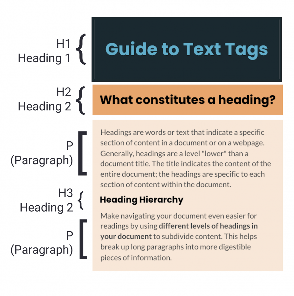
Map each style to its approved font, size, weight and semantic tag. Arrange them logically to create a clear heading hierarchy that screen reader users can understand and navigate.
Your template won’t prevent someone from choosing the wrong heading level. But it should eliminate the need to manually format and tag headings every time. One reusable style should control both how a heading looks and what it means.
Create an accessible color palette
Just because your brand palette has six approved colors doesn’t mean they all work together accessibly.
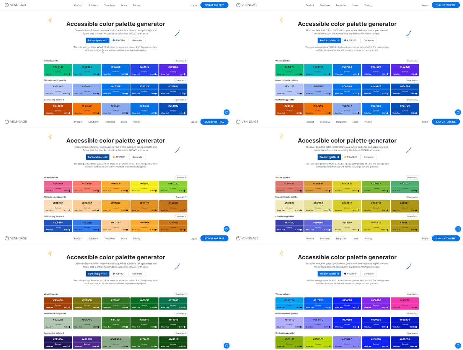
Test the combinations your team actually uses and build the approved pairings into the template. For WCAG AA, normal text needs at least 4.5:1 contrast against its background and large text 3:1.
To apply this to your team templates, cover common uses such as:
- Body text and headings
- Links and callouts
- Charts and data labels
- Accent backgrounds
Venngage’s Accessible Color Palette Generator can help you identify compatible pairings before templates are reused:
And don’t rely on color alone. A red-green chart, for example, needs labels, symbols or other cues too. Read our guide on color-blind-friendly palettes to learn why this matters and how to do it.
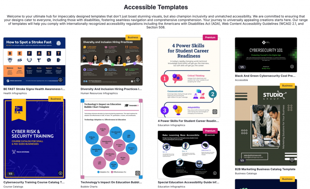
Once you’ve defined those accessible color rules, the next step is putting them into templates your team can actually reuse:
Pre-build layouts with the correct reading order
A two-column page might look perfectly obvious to you, a sighted reader. But a screen reader follows the document’s underlying sequence, which may tell a completely different story.
Imagine body copy on the left and supporting stats on the right. If the order is wrong, a screen reader could announce a statistic halfway through the main text. The same risk applies to sidebars, callouts and image-text layouts.
Here’s how the same multi-column layout can create different reading experiences for sighted readers and screen reader users when the reading order is incorrect:
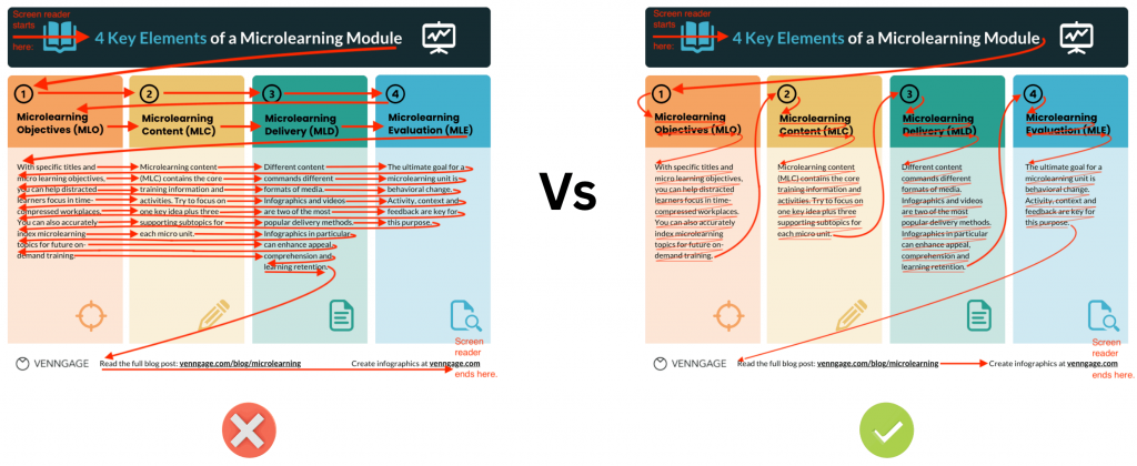
WCAG addresses this through Success Criterion 1.3.2: Meaningful Sequence: when sequence affects meaning, the correct order must be programmatically determinable.
Set that sequence when building the template, then preserve the layout for reuse. Read our blog on reading and tag order controls to learn how to test and rearrange elements before export.
Use structured tables instead of text-box grids
Four columns of neatly aligned rectangles can look like a table while being nothing more than unrelated text boxes.
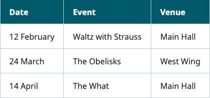
An accessible table preserves the relationships between its headers and data cells.
For example, in the table below, a screen reader can identify “12 February” under Date, “Waltz with Strauss” under “Event” or “Main Hall” under “Venue” instead of reading these values on their own without explaining what they represent:
When building reusable tables:
- Set the top row as headers so each column has a clear label
- Use table header tags so screen readers recognize those labels as headers
- Keep each data cell under the right header so its meaning is clear
- Keep tables simple by avoiding merged cells and complex headers where possible
If your reports regularly use the same five-column KPI table, build and approve it once. Other team members can duplicate it and replace the data.
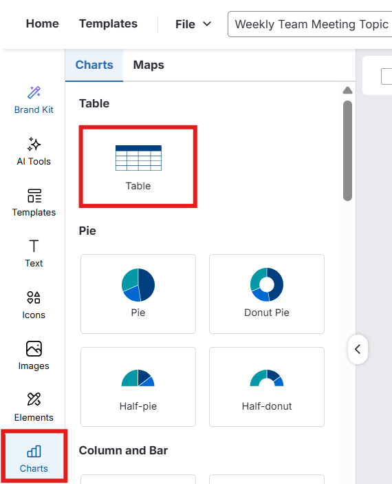
In Venngage, you can use an existing table template or create one from Charts > Tables, then customize the rows, columns and styling:
Once approved, save the design with the table as a Team Template for others to reuse.
Add alt text prompts to image and chart placeholders
Alt text usually can’t be finished at the template stage because you don’t know what visual someone will add later. But you can make it harder to forget.
Mark decorative images (such as background shapes or icons that don’t add information) so screen readers know to skip them.
Useful image alt text should communicate what the reader would otherwise miss, not simply describe appearance.
For charts, focus on the takeaway, such as revenue doubling, rather than “five blue bars.” The Section 508 guidance on alternative text provides practical guidance for handling different visual types.
For instance, its guidelines suggest naming the chart or diagram type, describing its context and key data trends, avoiding repetition and keeping the description concise. So, for a complex chart like this one:
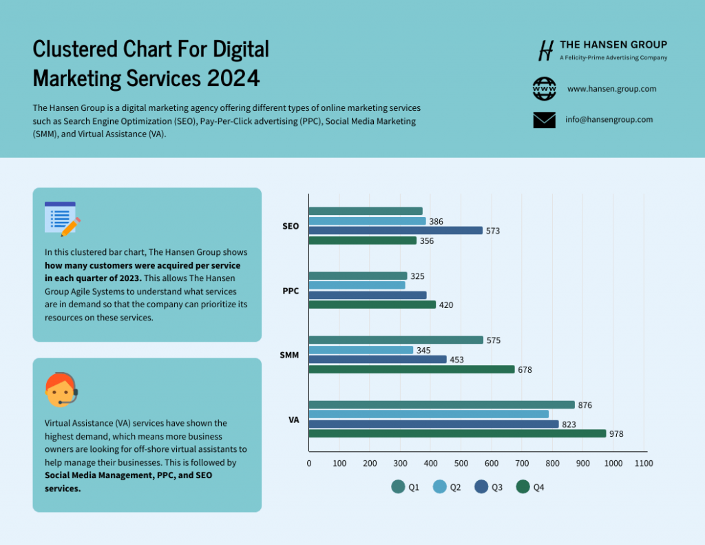
The image alt text can be:
Clustered bar chart showing virtual assistance had the highest customer demand across four digital marketing services.
Standardize accessible chart and infographic components
A chart or a data-heavy infographic can combine contrast, labels, reading order and alt text, all in one visual. Instead of rebuilding those decisions every time, you can create reusable components for accessible charts, KPI reports, timelines and accessible diagrams.
For each reusable component, standardize how you handle:
- Titles, labels and legends
- Accessible colors and non-color cues
- Reading order and source placement
- Alt text prompts
A reusable bar chart, for example, can already contain approved fonts, colors, label positions and an alt text reminder. Similar rules can guide diagrams and accessible infographics.
Venngage lets you add or import chart data, adjust legends and colors and add alt text in the editor. For instance, you can either double-click the chart in the editor or go to Edit>Data and enter your data, or import a CSV or XLSX file:
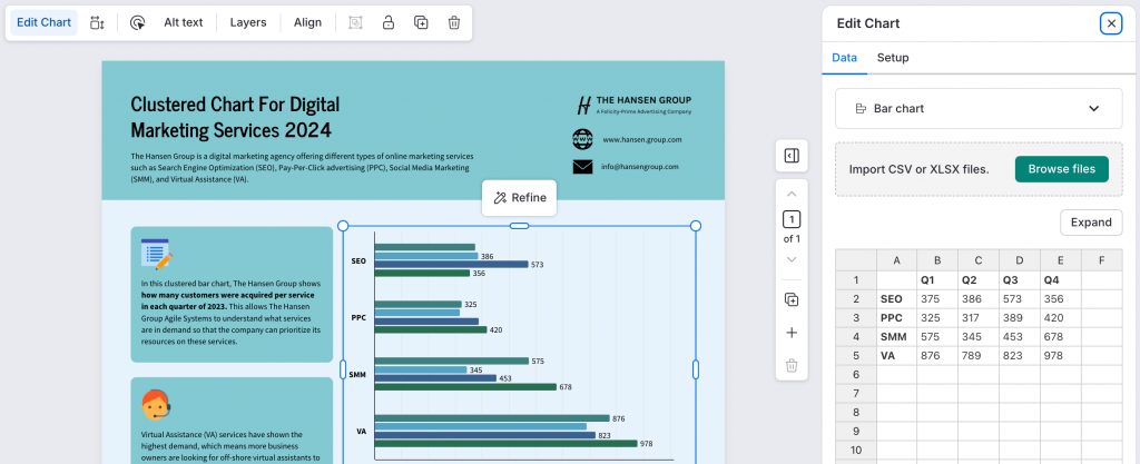
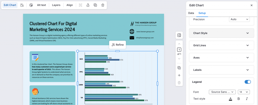
Similarly, to make changes to the chart style or legend, go to Edit Chart > Setup:
Set document metadata and language at the template level
PDF metadata is easy to overlook because readers don’t see most of it, but it can still affect accessibility.
Start with the document language, which helps screen readers apply the correct pronunciation rules. PDF accessibility best practices identify title, author and subject as important metadata.
Set predictable details, such as the default language, at the template level. For changing information, use placeholders. A quarterly report template, for example, shouldn’t keep “Q2 2026 Performance Report” as its title forever.
Venngage lets you set document language in the editor and flags language issues through its Accessibility Checker.
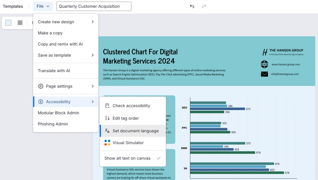
For example, you can set English as the default language in a reusable template, then update the document title each time the template is reused. To do this, just go to Files > Accessibility > Set Document Language and select English as the default choice:
It’s better to build these details into creation so they don’t become another remediation task at export.
Define the accessible export workflow
You can build an accessible document correctly and still break it at export. Tags can disappear, reading order can change and text can become an image.
Avoid flattened or image-only PDF exports because they can remove the underlying structure assistive technology needs.
The goal is to export a tagged PDF that preserves the accessibility structure you built into the source document. Standardize an export method that preserves:
- Semantic tags and reading order
- Selectable text
- Table structure
- Alt text
Follow our PDF accessibility checklist recommendations to check for structural problems after export. In Venngage, you can run the Accessibility Checker before downloading, then export a PDF/UA-compliant PDF that preserves accessible structure.
The rule is simple: standardize the exit as carefully as the starting point, then test the exported file your reader will actually receive.
Test the template before rolling it out
A mistake in one PDF affects one file. But the same mistake in a template can spread across every document created from it.
Before publishing a template, test its headings, reading order, contrast, tables, alt text, metadata and language. Then create a realistic document from it, replace the placeholders and test the exported PDF too.
Make this testing process part of your accessibility workflow so the same checks happen before every template is approved for reuse.
Run an accessibility checker on the template
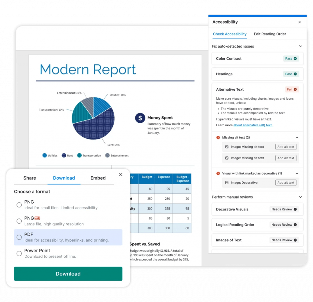
Venngage’s Accessibility Checker provides a useful first pass, checking headings, reading order, alt text, tables, contrast, document title and language directly in the editor:
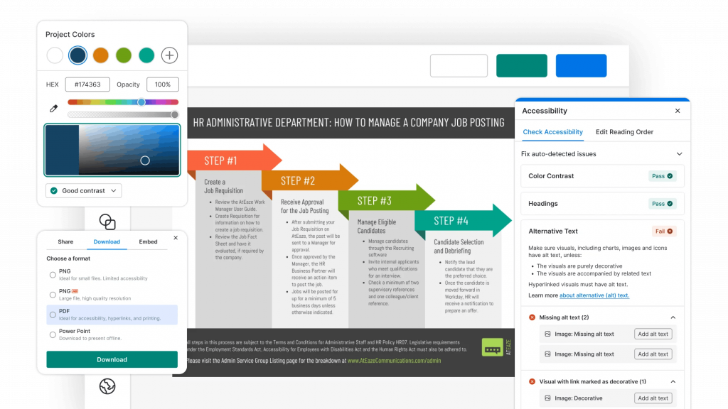
For exported PDFs, PAC can test technical PDF/UA and WCAG requirements. Its structure and screen reader previews also support further inspection. For a detailed understanding of this topic, read our guide on how to check PDF accessibility using PAC checker.
But passing an automated check doesn’t mean your PDF is fully accessible. Human review is still necessary to catch issues automated tools can miss. Fix any issues in the source template, then export and test the PDF again.
Venngage brings that first round of accessibility checks directly into your design workflow:
Build a small template library instead of one universal template
Don’t build one giant template that needs to become a report, presentation and infographic. Each format has different accessibility needs.
Instead, build a small library of accessible design templates around the formats your team actually creates:
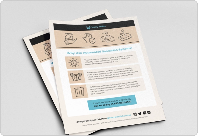
- Reports: Build accessible report templates with consistent heading structures, tables and data layouts your team can reuse.
- Presentations: Create accessible presentation templates with readable slide layouts, clear hierarchy and logical reading order already built in.
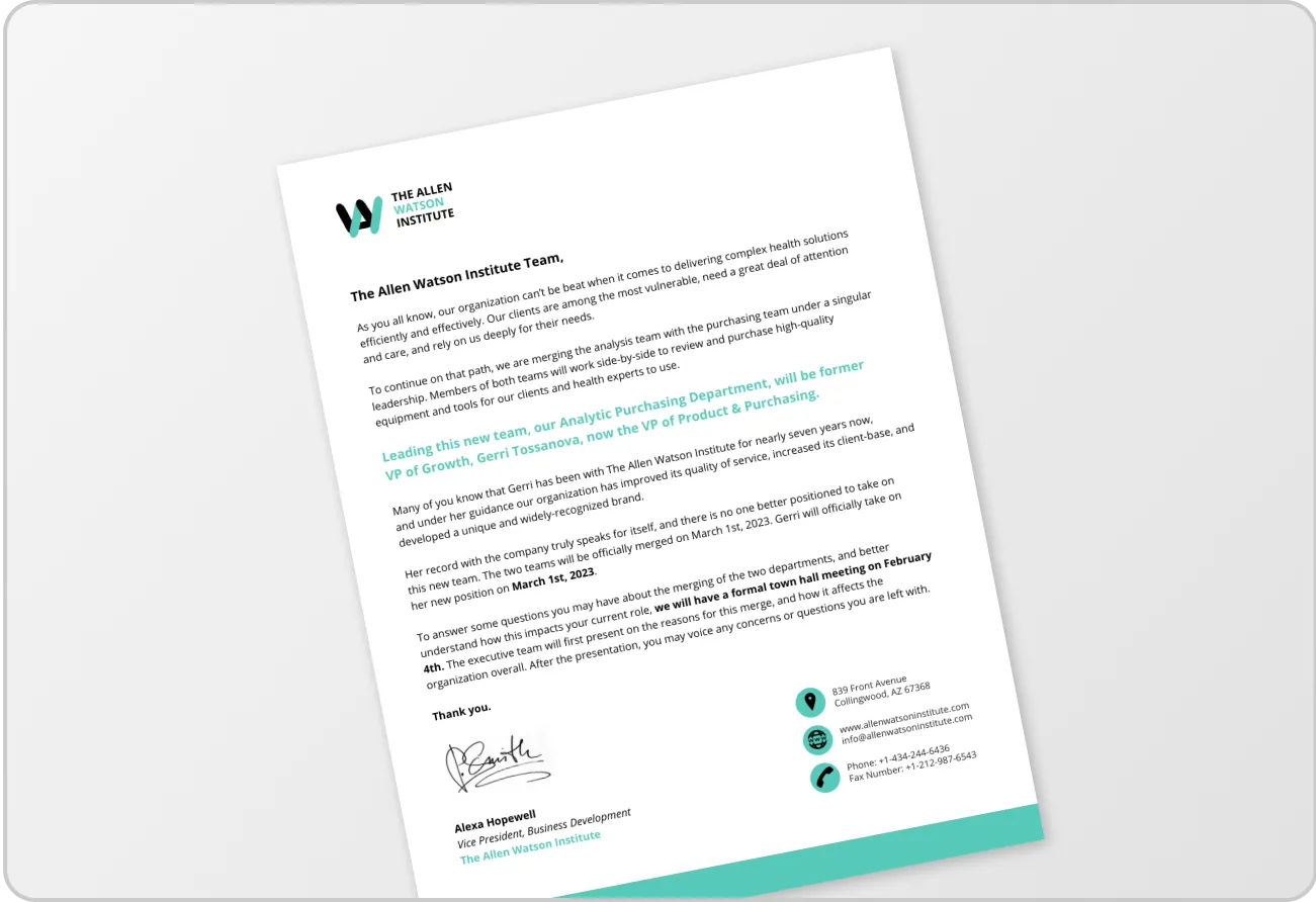
- One-pagers: Use one-pager templates to create approved layouts for recurring content such as summaries, fact sheets or project updates.
- Flyers: Build accessible flyer templates with clear hierarchy, accessible colors and a logical content flow.
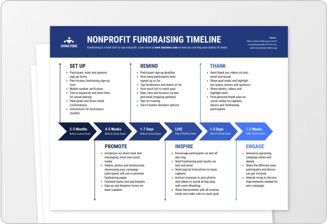
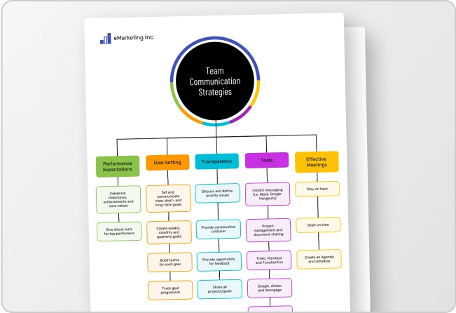
- Infographics: Create accessible infographic templates with reusable charts, timelines and process diagrams that follow the same accessibility rules.
In Venngage, you can save approved designs as Team Templates and use My Brand Kit to keep logos, colors and fonts consistent.
Five well-tested templates your team uses beat one “master” template everyone has to dismantle.
Make accessible templates easy for the team to reuse
An accessible template only scales if people actually use it. Keep approved templates in one central library and name them clearly. For example:
Annual Report | Approved | 2026 beats a folder full of “Report Final” and “Report Final 2.”
Then make the approved template the default starting point. Under deadline pressure, people take the shortest route. If copying last year’s PDF is easier, accessibility standards will drift.
Venngage’s Team Templates support this workflow by letting team members create new designs from an approved template without changing the original. That means your heading styles, accessible colors and layouts are already built into every new design.
Add accessibility instructions inside the template
Templates can remove repetitive work, but they can’t predict every decision the next person will make. However, you can add short instructions to guide them when those decisions come up.
For example, add simple prompts like these directly to your template:
- Use Heading 2 for new sections
- Replace this image and update the alt text
- Use approved color combinations
- Duplicate this accessible table
- Run the Accessibility Checker before export
- Export as an accessible PDF
Keep these prompts brief and remove them from the finished document once you’re done. The goal isn’t to turn the template into a manual, but to ensure others in your team don’t miss important steps.
For larger organizations, Venngage Groups can help organize approved designs and resources by team, department or project.
Instead of asking people to remember accessibility at the end, remind them while they’re making the decisions that affect it.
Can accessible templates help with WCAG or ADA compliance?
Yes. Accessible templates can support WCAG and ADA compliance by standardizing headings, colors, reading order, tables, metadata and export workflows. This aligns with WCAG’s broader POUR principles.
But a template does not guarantee an accessible or legally compliant final document. New content can introduce new problems.
What still needs to be checked in every document
Focus the final review on what changed:
- Alt text: Does it explain new visuals?
- Charts and tables: Are structure, labels and contrast accessible?
- Links: Is the text meaningful?
- Layout and colors: Did changes affect reading order or contrast?
- Export: Did the PDF preserve its accessibility information?
Tools can reduce this work further. Venngage can auto-tag elements, generate alt text, check contrast and flag accessibility issues.
Related: PDF Accessibility Checklist: 11 ADA Compliance Checks
Review accessible templates as standards and workflows change
An accessible template is never permanently finished. Review and update your templates whenever the standards, tools or workflows they depend on change.
That might include:
- Updates to WCAG or PDF/UA guidance
- Changes to your brand colors or fonts
- New layouts, charts or other reusable components
- Changes to your design or accessibility tools
- Changes to your PDF export process
- Accessibility issues that keep appearing during testing
But you don’t need to review them on an arbitrary schedule. Review and revise them only when something changes or when testing reveals a recurring problem.
If the same accessibility issue keeps showing up across documents, fix it in the source template instead of asking your team to fix it in every document.
Scale accessibility by solving repeatable problems once
Using accessible templates doesn’t eliminate the need for manual accessibility review, but they save you from reviewing problems you’ve already solved.
Build a small library of tested templates so that your team can start each report, presentation or infographic with the basics already in place. That way, you can focus your final review on what actually changed: the new content.
Venngage gives you an easy way to put that workflow into practice. You can build accessible templates, save and reuse them across teams, check designs for accessibility issues and export accessible PDFs without rebuilding the accessibility layer every time.
That’s ultimately how accessibility scales: make the accessible starting point the default starting point.
FAQs
Here are quick answers to a few questions you might still have about reusable accessible templates.
1. How do I make a reusable accessible template?
Build recurring accessibility requirements into the template itself, including semantic headings, accessible colors, reading order, structured tables, alt text prompts, metadata and export settings. Test the template before sharing it and keep approved versions in a central library.
2. What makes a PDF template accessible?
An accessible PDF template has semantic tags, logical reading order, sufficient color contrast, structured tables, accessible visual components, document language and metadata. It should also preserve this accessibility information when exported to PDF.
3. How do I set up heading styles for accessibility?
Define H1, H2 and H3 styles according to the document hierarchy and tie each visual style to the correct semantic heading tag. Users should be able to apply a heading style without manually recreating its formatting or structure.
4. Can templates help with WCAG or ADA compliance?
Yes. Accessible templates can standardize practices that support WCAG and ADA accessibility efforts, including headings, contrast, reading order and tables. However, templates cannot guarantee compliance because new content and design changes can introduce accessibility issues.
5. How do I build an accessible color palette for my brand templates?
Test your brand colors in common text and background combinations. Pre-approve combinations that meet WCAG contrast requirements, then build them into your templates. Also use labels, symbols or patterns when color would otherwise be the only way information is communicated.
6. How do I make chart templates accessible?
Standardize chart titles, labels, legends, contrast, font sizes, reading order, non-color cues and alt text prompts. Create reusable chart components, then review each finished chart because changing its data can introduce new accessibility issues.
7. Should every document made from an accessible template still be checked?
Yes. An accessible template reduces repetitive accessibility work but doesn’t eliminate final review. Check new alt text, charts, tables, links, colors, layout changes and the exported PDF for issues introduced while replacing or adding content.
8. How often should accessible templates be reviewed or updated?
Review accessible templates whenever accessibility guidance, brand standards, software, components or export workflows change. Also review the source template when testing reveals recurring problems across documents rather than repeatedly fixing the same issue in individual files.