We use essential cookies to make Venngage work. By clicking “Accept All Cookies”, you agree to the storing of cookies on your
device to enhance site navigation, analyze site usage, and assist in our marketing efforts.
Manage Cookies
Cookies and similar technologies collect certain information about how you’re using our website. Some of them are essential, and
without them you wouldn’t be able to use Venngage. But others are optional, and you get to choose whether we use them or not.
These cookies are always on, as they’re essential for making Venngage work, and making it safe. Without these cookies, services you’ve asked for can’t be provided.
Show cookie providers
Venngage
Amazon
Google Login
Functionality Cookies
These cookies help us provide enhanced functionality and personalisation, and remember your settings. They may be set by us or by third party providers.
Show cookie providers
Venngage
Chameleon
Algolia
Performance Cookies
These cookies help us analyze how many people are using Venngage, where they come from and how they're using it.
If you opt out of these cookies, we can’t get feedback to make Venngage better for you and all our users.
Show cookie providers
Venngage
Mixpanel
Google Analytics
Hotjar
Targeting Cookies
These cookies are set by our advertising partners to track your activity and show you relevant Venngage ads on other sites as you browse the internet.
Aditya is a writer and editor at Venngage, specializing in creating informative content on topics ranging from PDF accessibility and graphic design software to project planning and infographic creation.
In an ideal world, everyone would be able to access, navigate, and understand content online.
But the reality is that most digital designs are not accessible and exclude people with disabilities.
To prevent this, Web Content Accessibility Guidelines (WCAG) created an action plan.
WCAG defines accessibility as perceivable, operable, understandable, and robust. This is also known as the POUR approach.
In this post, I’ll explain the POUR principles of accessibility and share examples of how you can apply each to create accessible designs.
Did you know you can create WCAG-compliant designs using our Accessible Design Tool? Venngage is the first company with accessibility features baked in.
Some of our accessible templates are free and some require a small monthly fee. Sign-up is always free, as is access to Venngage’s drag-and-drop editor.
Accessible design is important because it maximizes the chances of everyone being able to understand and interact with a design. It is a key part of inclusive design practices.
To be more specific, accessible design matters for three reasons.
Imagine this scenario. A person living with low vision comes across a slide deck with low color contrast.
What will happen?
Most likely, they’ll become stressed or frustrated and leave to find an accessible alternative.
Besides bad user experience, investing in accessible design from the start is much more cost-effective than remediating a design later to address accessibility issues.
Accessibility laws have also started to gain traction.
In 2021, 11,452 ADA Title III federal lawsuits were filed in the US against websites that failed to provide accessible experiences. So in the near future, creating an inaccessible design will cost you beyond just lost business.
But it doesn’t have to be this way.
You can easily avoid lawsuits and create accessible content and inclusive experiences through simple changes to your design such as setting alt text to images or adjusting the color contrast.
Venngage’s Accessible Design Tool is the first to have accessibility features baked in to help you create fully WCAG-compliant designs from start to finish.
WCAG compliance levels
I earlier mentioned you can follow WCAG 2.2 to make your designs accessible.
WCAG scores designs under three compliance levels or A, AA, and AAA.
Level A
Level A is the minimum level of accessibility compliance. While WCAG does accept this level as accessible, it actually does not cover all accessibility barriers.
Level AA
This is the WCAG compliance level you should aim for.
Meeting Level AA means a design covers a wide range of accessibility issues and provides an inclusive experience to everyone.
Level AAA
This is the highest level of compliance and an indication of a design that has gone above and beyond to address accessibility barriers.
Note: This level can be difficult to achieve and is not always necessary.
Did you know Venngage’s Accessibility Tools can grade color contrast according to WCAG guidelines? No need to waste time checking on a third-party tool again!
POUR principles of accessibility
Instead of a checklist of techniques, WCAG 2.2 focuses on the design process. Keep this in mind when reviewing each of the following principles.
Perceivable
Perceivable means making sure everyone can understand all elements of a design.
Most people can do this visually, but an accessible design must also consider the needs of users who rely on other senses such as sound or touch.
Color choice
Color should never be the only method to communicate information, highlight an action, or draw attention to an element.
Why?
Because people with different vision abilities might struggle to understand.
Also, assistive technologies like screen readers cannot read color information.
Take this color-coded list for example with items in red indicating missing elements. A person with no visual impairments will easily understand it.
But what about people using screen readers? These devices cannot describe color-coded messages.
If your design must include elements where information is conveyed through color, make sure to provide text-based alternatives that convey meaning.
If we take the same example from above, a simple fix might be to include qualifier information.
In the modified version above, adding “missing” to a red item and “confirmed” to a blue item in the list now allows people on accessibility tools to also understand the content.
Not sure how your design appears to people with different vision abilities? One method is to use our Color Blind Simulator to see how your design looks to different people.
Just paste your link in the simulator and use the right sidebar to apply filters representing different levels of vision.
Color contrast refers to the difference in brightness between the background and foreground of content.
Here’s an example:
Can you tell which one is high contrast and which one is low contrast?
If you guessed high contrast for the black text on a white background, pat yourself on the back! High contrast means a significant difference in brightness between elements or text and their background.
This is often achieved by using dark text on a light background or vice versa.
High contrast designs are easier to perceive and thus more accessible.
Meanwhile, the yellow text on a white background is low contrast because the text and background are a similar shade and hard to distinguish.
This makes it harder to perceive and less accessible.
Did you know you can check color contrast in a few clicks with our WCAG Color Contrast Checker? Just pick any element and let our Accessibility Checker do the magic for you.
WCAG 2.2 defines adequate contrast ratios for text or images of text as:
Image alt text refers to providing text-based descriptions for non-text content such as icons, images, infographics, charts and graphs.
This is a manual process and necessary to make your design accessible.
If you don’t set alt text, you exclude people on screen readers from having the same experience as someone with no visual impairments.
Here’s what I mean:
Our Accessible Design Tool makes it easy to set alt text to non-text elements in your design.
Here’s how to set alt text in Venngage:
Select any non-text element in your design like like an icon, a shape, a photo or a chart.
Click on Alt Text in the top panel of our editor (keyboard users press spacebar)
Set the alt text
Here’s some quick tips on how to write good alt text:
Use plain language
Use active voice
Don’t include words like “picture of…”, “photo of…”, or “icon of…”
Avoid abbreviations
Always use a period (punctuation mark) at the end of alt text
Note: You only need to set alt text if visual content (charts, images, icons, etc.) communicates meaningful information. If an image is used for decorative purposes, skip the alt text.
Did you know that Venngage has a free PDF accessibility checker that can help you meet vital accessibility standards? It allows you to quickly identify and fix potential inaccessibility issues to make sure your PDFs are accessible to everyone!
Perceivable design examples
Operable
One of the biggest accessible design mistakes most designers make is assuming everyone is using a mouse or trackpad.
People living with permanent disabilities that limit motor function like quadriplegia or temporary injuries such as a broken arm cannot use a mouse.
You need to provide them with an alternative means of navigation.
Keyboard navigation
People who cannot use a mouse to navigate designs may rely on alternatives like a keyboard.
I’m sure many of you already know you can use the Tab key to move from one element to the next on a webpage, such as links, buttons and input fields.
When an element is tabbed and selected, a focus state also lights up to provide a visual indicator.
A person using a keyboard to navigate has little control over the sequence in which content appears.
Normally, this isn’t an issue for people living without disabilities or impairments because they can understand logical flow by looking at a design.
However, assistive technologies look at tags in your content to understand the correct reading order.
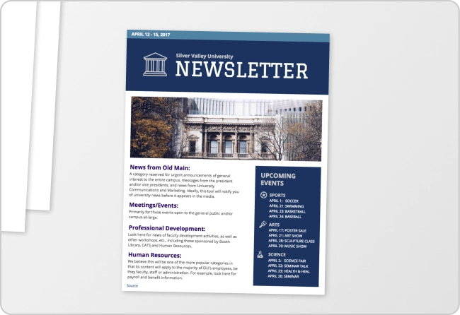
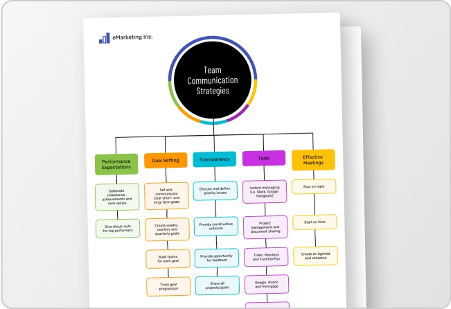
For example, let’s consider this document with columns containing visuals and text. I’ve marked the correct reading order below.
But if I don’t set a reading order, a screen reader might present elements out of order like below.
Many design tools in the market today like Canva and Adobe Express don’t let you edit reading order.
The only way to achieve it using such tools is to remediate the design on a third-party tool. However, remediation is a time-consuming and costly process.
But you can avoid this expense and headache with Venngage.
Our Accessible Design Tool lets you set the reading order in designs and ensure the content is accessible to all readers.
Operable design examples
Understandable
This accessibility principle may sound obvious, but you’d be surprised how many people mess this up.
Your designs should be easy to navigate and read. This means creating a visual hierarchy that emphasizes navigation, headings, and content structure.
Again, you have to do this not just for people living with no disabilities but those using assistive technology.
To create understandable designs, pay careful attention to the following factors:
Visual hierarchy
Font size
Font style
Visual hierarchy
Visual hierarchy refers to how elements are arranged to present information in a format that is easy to understand by everyone.
Headings and subheadings help organize information into logical sections and are a great way to provide an overview of a design.
Generally, people living with no disabilities can immediately spot this.
But for people with different abilities, you need to label text with an appropriate text tag so they can also know what to expect in a section.
Select the text box you want to tag on your design canvas.
Click the “tag” icon at the far right end of the top toolbar to bring up the text tag menu.
Select the text tag you’d like to use.
Let’s see a real-world example. This vintage music poster uses clear headings and sub-headings to draw attention to important information.
Font size
At least 2.2 billion people (yes you read that right!) suffer from some level of vision impairment.
That means if your fonts are too small, some people will not be able to consume your content. This decreases the accessibility of your content.
Fortunately, this is easy to fix with Venngage.
From the top toolbar select the Text Sizewidget to increase or decrease the text size. You can use the plus or minus buttons to adjust font size or select the number that appears in the drop-down.
WCAG does not provide an official minimum font size recommendation but a font size of 16px is considered good practice.
Font style
Choosing accessible fonts that are easy to see, read and understand by everyone is another pillar of accessible design.
And when it comes to fonts, not all are created equal.
Sans-serif fonts like Arial have clean simple lines and are generally easier to read compared to serif fonts like Times New Roman which have decorative extensions on letters.
Note: Most people recommend using sans-serif fonts to make designs accessible but this is not a hard rule. Some serif fonts like Times New Roman are also considered accessible.
A bad font is one that makes it hard to distinguish one letter from another. This means people with disabilities like dyslexia or low vision will struggle to understand the content.
While it might be tempting to choose a creative or cool-looking font, always focus on how easy your font makes it for them to understand words.
Our Accessible Design Tool lets you pick many accessible-friendly fonts in a few clicks.
Understandable design examples
Robust
The last POUR principle focuses on making designs accessible on different interfaces.
Every browser (Chrome, Firefox, Safari, etc.) renders content differently and experiences on different device types such as laptops and mobile are also different.
The same applies to assistive technologies.
Screen readers and software for text magnification and speech recognition also introduce variations in how they present content.
That’s why it’s important to make content robust.
Tag tables
I discussed the importance of text tags for headings and subheadings (H1-H6) to make designs accessible in a previous section.
However, the same principle applies to other elements such as lists and tables.
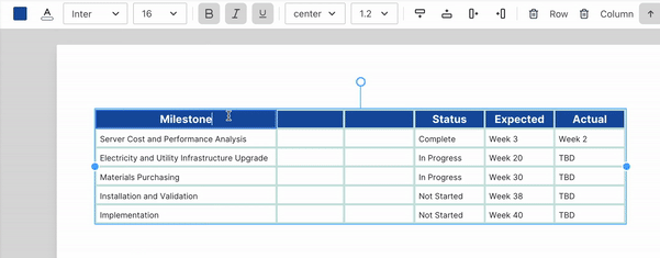
With tables, screenreaders look for row and column header data to provide context.
This accessible table has a tagged header row so a screenreader will repeat the title each time a person selects a cell within it.
For example, if a user selects the middle cell in column 2, a screen reader would say: “Event (Column 2), The Obelisks”.
Select the table on the design canvas. (You must select the entire table; clicking into one of the cells will not bring up the header tool).
From the Headers menu, toggle the Header Row and/or Header Column on or off.
Label interactive elements
Interactive elements refer to design items people can click or perform actions with.
A few examples of interactive elements include links, buttons, or audio and video buttons.
In accessible design, interactive elements should always be distinct from static content.
Why?
It ensures everyone can easily spot it. For example, a CTA button should be distinguishable from the surrounding text and be clearly labelled.
When a button is clearly labeled as “Submit,” people will instantly recognize its purpose. This reduces confusion and helps people understand the action they are taking.
You can also achieve this by using different colors, shapes, or effects like underlines to indicate interactivity.
You should also label interactive content to ensure assistive technology gives accurate context to users.
For example, labeling a button as a link to a sign-up form enables users of assistive technology to understand an element in case they cannot comprehend it by visual cues alone.
Robust design examples
Alternatives to WCAG
WCAG 2.2 are a globally recognized set of guidelines, but depending on your industry or region, other standards might apply.
Note: Most standards were inspired by WCAG guidelines so don’t expect major differences.
Section 508:
Section 508 is an accessibility standard that applies to US agencies. It includes technical standards to ensure that people with disabilities can access and use government websites and digital resources.
ADA
The ADA or Americans with Disabilities Act is a federal law that prohibits discrimination on the basis of disability by private businesses. Although it does not specifically cover digital accessibility, courts have used the ADA to punish inaccessible websites in the past.
The four principles of POUR are perceivable, operable, understandable and robust. These pillars serve as the skeleton on which WCAG guidelines have been built.
What do the POUR principles focus on?
The POUR principles are a set of guidelines that focus on creating accessible and inclusive experiences for everyone, including those with disabilities. POUR is an acronym for designs that are perceivable, operable, understandable, and robust to ensure WCAG compliance.
What is the perceivable principle?
The perceivable principle of accessibility focuses on presenting elements in designs in a way that is easily recognizable and understandable by everyone.
What is the operability principle of WCAG?
The operable principle of WCAG focuses on ensuring elements in a design allow all users, including those with disabilities, to interact effectively and without barriers
In Summary: Making accessible designs is not a set of techniques you need to memorize but a design approach that requires you to consider all users
Accessible design benefits everyone and not only people living with disabilities.
By following these four POUR principles, you ensure better user experiences and expand your reach in the process.
So remember to POUR.
It’s an easy acronym to remember and certainly a rewarding one.


