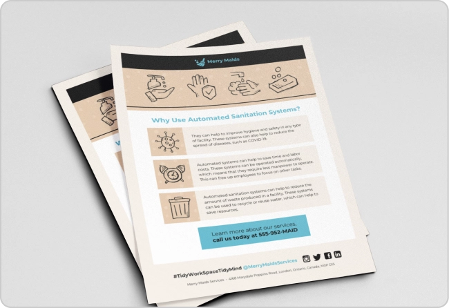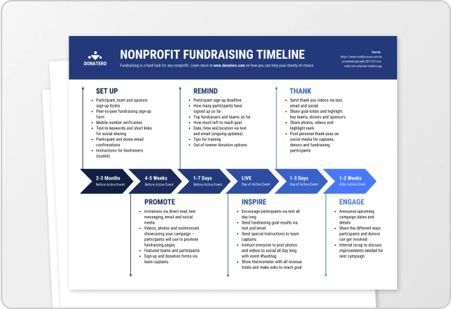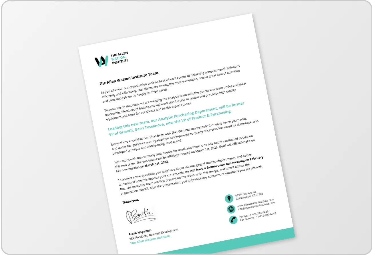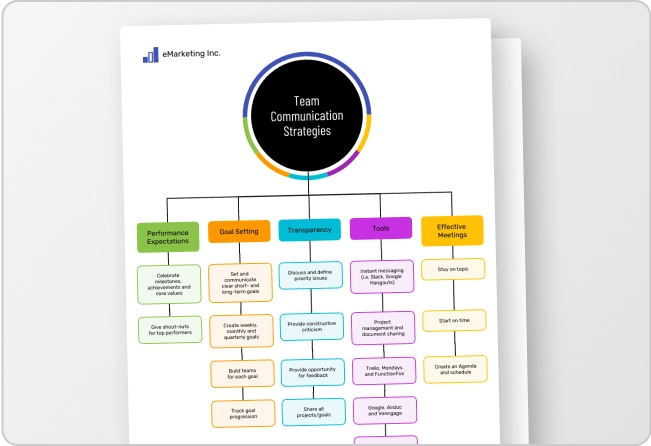


A PDF can look polished and still be difficult or impossible to use with a screen reader. That’s because many accessibility issues aren’t visible on the page. Missing tags can leave content without structure; a broken reading order can make information confusing and missing or inaccurate alt text can make images inaccessible.
If you work for a state or local government, PDF accessibility is also an ADA Title II requirement. PDFs shared on your website or mobile app need to meet WCAG 2.1 Level AA, just like the rest of your digital content.
Use this PDF accessibility checklist to catch common issues before you publish reports, public notices, forms, course materials and other documents. It covers document structure, alt text, color contrast, tables, links, forms and final accessibility testing.
What are the ADA Title II requirements for PDFs?
ADA Title II requires state and local governments to make their digital content accessible to people with disabilities. That includes PDFs used to share public information or provide access to government services, from forms and public notices to reports and meeting materials.
Under the DOJ rule, covered PDFs must meet WCAG 2.1 Level AA. That means creating accessible PDFs that people using screen readers and other assistive technology can navigate, understand and complete.
Some archived and preexisting documents are exempt, but those exceptions are limited. The checklist below covers the key PDF accessibility requirements to review before publishing a PDF.
11 accessibility checks to make before publishing a PDF
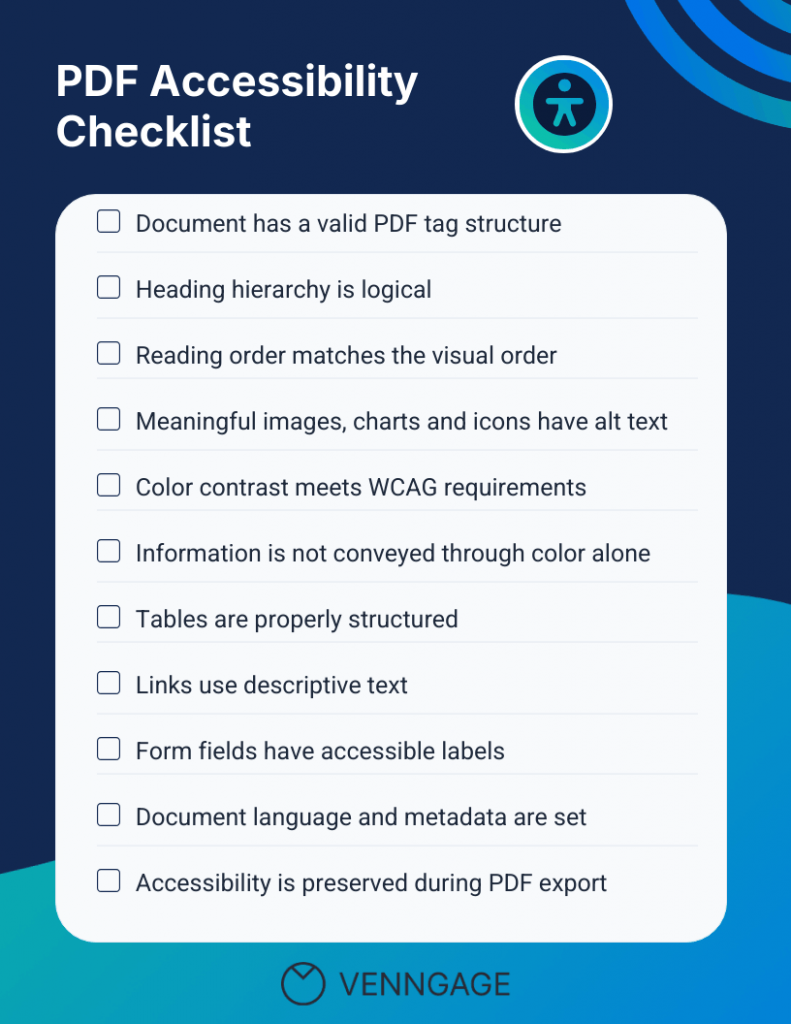
Before you publish your document, review it against the key requirements for an accessible PDF. The 11 checks below cover tags, reading order, alt text, headings, color contrast, tables, forms and other elements that affect how people using assistive technology access your content.
1. Check the PDF tag structure
PDF tags are hidden structural markers embedded in a document that define text elements. They tell assistive technology what each element is and how elements such as headings, paragraphs, lists, tables, images and other content function within the document.
Here’s an example of how to assign H1, H2 and H3 tags to give a PDF a clear, navigable structure for screen readers.
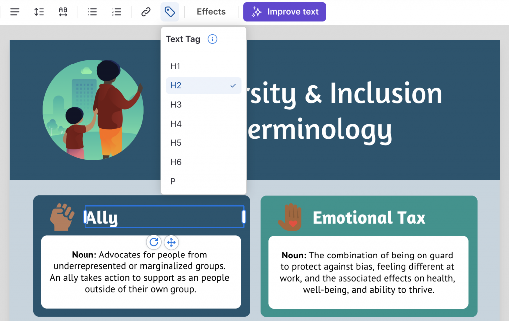
A screen reader needs this structure to understand how the pieces fit together and present them in a logical order.
Proper tags let users navigate by headings, understand relationships between content and move through complex layouts without relying on the visual design. Without them, a screen reader may read content out of order or skip important elements entirely.
You won’t see this structure when you look at the finished PDF, which makes it easy to miss during a visual review.
Scanned PDFs need extra attention. For instance, a scan may look like a normal document but contain only an image of the text, which means a screen reader can’t read it.
Run OCR (optical character recognition) to make the text machine-readable, then check the resulting tags, reading order and headings rather than assuming OCR alone made the PDF accessible.
Accessible templates can give you a stronger starting point by building the right tag structure into the document from the beginning.
Related: Enhancing PDF Accessibility: A Guide to Accessibility Checkers
2. Use a logical heading hierarchy
A clear heading structure gives your document a usable map. Use H1 for the main title, H2 for major sections, and H3 for subsections. Also, avoid skipping heading levels. For example, don’t jump from H2 to H4 without an H3 in between.
This makes your document hierarchy logical instead of choosing a heading level based on how it looks. W3C recommends using properly structured headings so assistive technology can identify the relationships between sections.
For someone using a screen reader, headings are more than visual signposts. They’re navigation points. Users can pull up a list of headings and jump straight to the section they need.
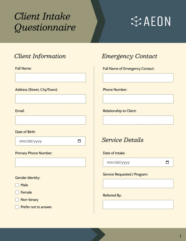
Here’s an example. This client intake questionnaire template uses a clear hierarchy of headings and subheadings to help users navigate between sections.
3. Verify the PDF reading order
Your PDF can look perfectly logical on screen and still be read in the wrong order by a screen reader. That’s because assistive technology follows the document’s programmatic structure, including its tag order.
Pay extra attention to tables, multi-column layouts, sidebars and callout boxes. A screen reader might jump from one column to another or read a callout before the paragraph that explains it. W3C specifically flags complex layouts as a common source of reading-order problems.
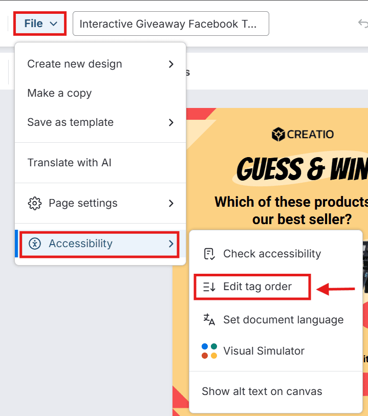
In Venngage Accessible PDF Maker, you can review and adjust the sequence through the Tag Order panel before export. You just need to navigate to File > Accessibility > Edit tag order:
4. Add alt text to images, charts and icons
Check that every meaningful image, chart and icon has alt text that explains the visual clearly. For simple images, a short description is usually enough.
A short description may be enough for a simple image, while complex charts and diagrams often need more detail. W3C recommends descriptions that provide an equivalent way to understand the information or purpose of non-text content.
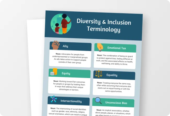
For example, “People illustration” doesn’t tell the reader much. “Parent and child discussing workplace inclusion” explains what the image shows and why it’s relevant.
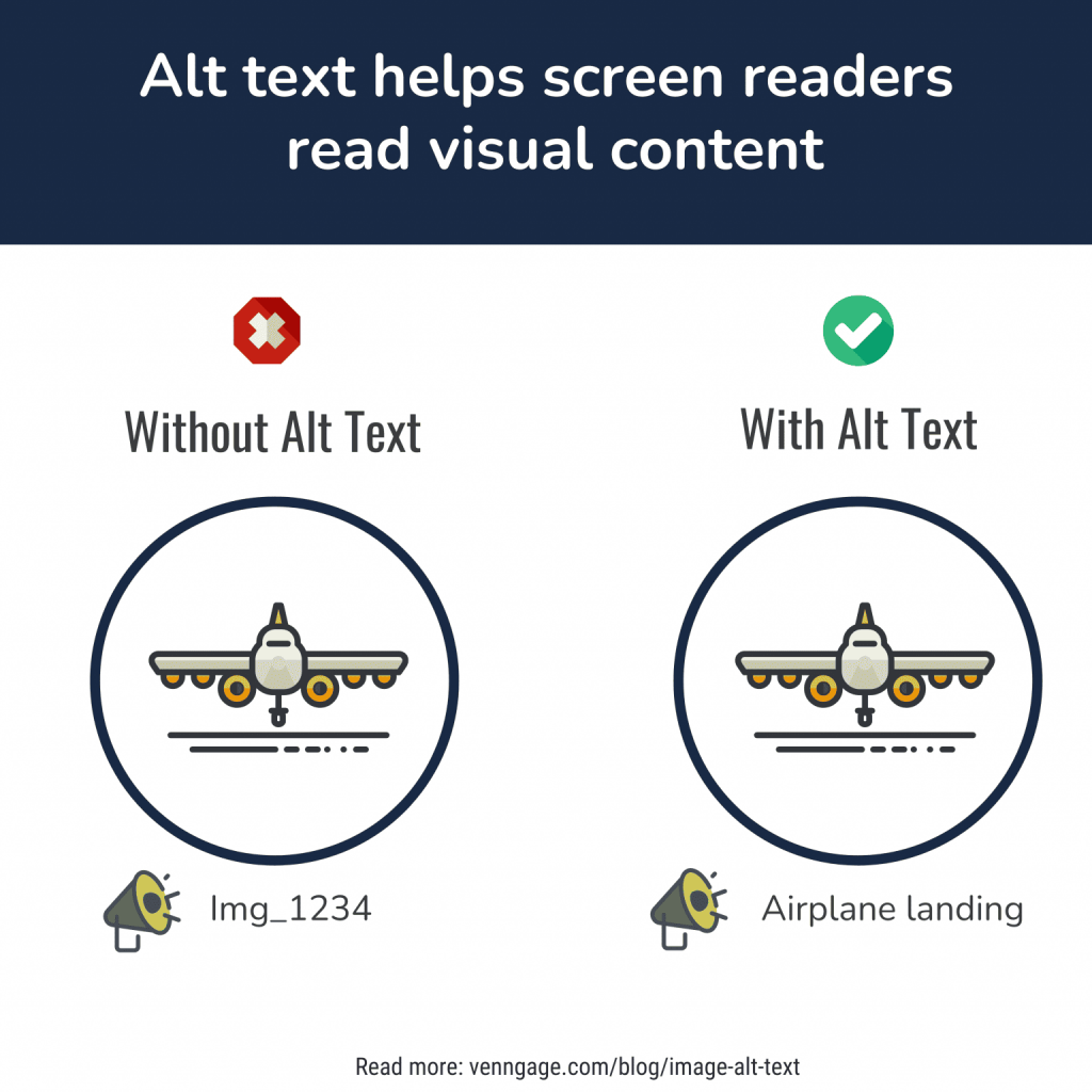
Mark purely decorative visuals as decorative so screen readers can skip them. Venngage can generate alt text for images, charts and uploads, giving you a starting point you can review and edit before export.
5. Check PDF color contrast against WCAG requirements
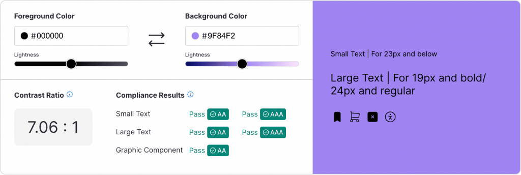
Check body text, headings, chart labels, legends and infographic text against their backgrounds. WCAG 2.1 AA Success Criterion 1.4.3 requires a contrast ratio of at least 4.5:1 for normal text and 3:1 for large text.
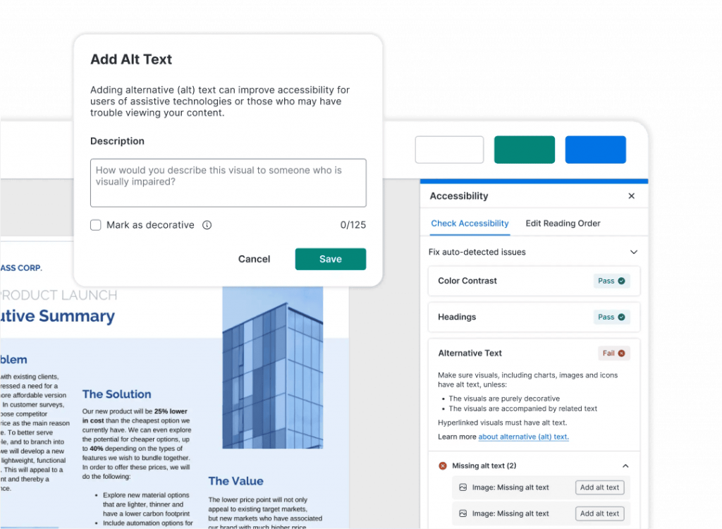
Don’t leave this check for the final PDF. Venngage’s Color Contrast Checker lets you check contrast as you design, so you can catch accessibility issues before export.
Good contrast matters most for readers with low vision or color vision deficiencies, who may struggle to distinguish text and visual elements with weak contrast. It also makes your document easier to read for anyone dealing with glare, poor lighting or reduced visual acuity.
6. Make charts and graphics understandable without color
Color can make a chart sing, but it shouldn’t carry the whole meaning. Someone with color vision deficiency may struggle to distinguish red and green slices in a pie chart, or separate two lines that use similar colors.
The same problem appears when a PDF is printed in grayscale. W3C’s WCAG 2.1 Success Criterion 1.4.1 says color can’t be the only way to distinguish information.
Give each category another cue: labels, patterns, symbols, different line styles or direct text. W3C even recommends using color and pattern together for charts.
This video shows how you can use Venngage to label individual chart segments so that it’s easier for readers to understand the information without relying on color alone.
Related: Colorblind-Friendly Palettes: Why & How to Use in Design
7. Use accessible table structure
A table that only looks like a table can become a maze for someone using a screen reader. W3C notes that PDF tables need structural markup so assistive technology can preserve the relationships between rows, columns, headers and data.
Avoid manually aligned text boxes that only look like a table; they may not be recognized as a table by assistive technology.
Check that header rows are correctly identified, column headers are associated with their data cells and the reading order makes sense. Keep merged cells to a minimum, especially in complex tables. They can make those relationships harder to interpret.
For example, this financial planning table uses clear column headers, simple rows and a logical reading order, making it easier for screen readers to interpret each value correctly:
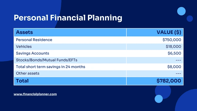
If the headers aren’t connected to the numbers beneath them, a screen reader user may hear isolated values without knowing what they represent. That’s a serious document accessibility failure, even when the table looks flawless.
8. Use descriptive link text
When you add a link to a PDF, make sure readers can tell where it leads without having to read the surrounding text. A phrase like “Click here” doesn’t give a screen reader user much to work with. Descriptive link text, on the other hand, makes the link’s purpose clear.
For example, Read the Link Purpose Guidelines is more descriptive and useful to readers than displaying the raw URL: https://www.w3.org/WAI/WCAG21/quickref/?showtechniques=121#link-purpose-in-context.
Using descriptive link text also helps your SEO workflow: Google recommends descriptive anchor text because it gives users and search systems clearer context about linked pages.
In a PDF, this matters even more when someone navigates through a list of links without the surrounding content.
9. Add accessible labels to PDF form fields
Imagine opening a PDF form and having no idea what a field is asking for. That’s what can happen when form fields don’t have accessible labels.
A label tells someone using a screen reader whether they’re entering a name, selecting an option or signing a document. For example, “First Name” is more useful than “Name” because it tells the user exactly what information the field expects.
Similarly, supporting text, a nearby caption or a placeholder may look clear, but a screen reader may not recognize it as the label for that field.
This medical insurance form is a good example of how clear, specific labels can make form fields easier to understand and complete.
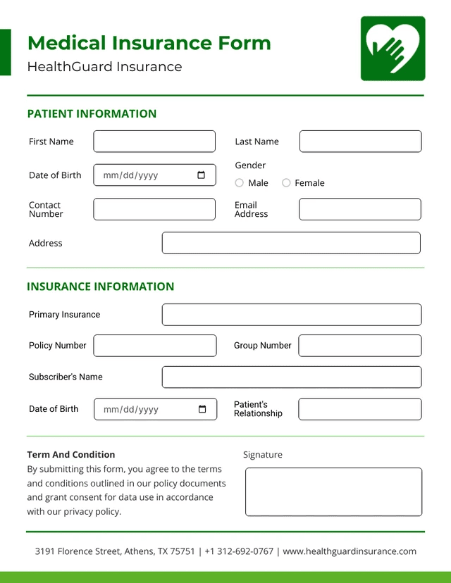
Check your text fields, checkboxes, radio buttons, dropdowns and signature fields. Each should have a meaningful, programmatically associated label that makes sense on its own.
Also check the form’s tab order. Someone navigating by keyboard should be able to move through fields, buttons and other controls in a logical sequence that matches the intended flow of the form.
10. Set the PDF language and document metadata
A PDF can look perfectly polished and still create friction before you’ve even reached the first page. Set the document’s primary language and give it a meaningful title so assistive technologies and users can identify and interpret the file correctly.
The correct language setting helps screen readers use the appropriate pronunciation and language rules. A descriptive document title helps users identify the document without having to rely on the filename alone.
Where your PDF workflow supports it, also add useful metadata such as the author and subject. These fields can make documents easier to identify, organize and search.
Finally, give the PDF a meaningful filename, especially when it will be downloaded or shared outside its original context.
Before publishing, check:
- Correct document language
- Descriptive document title
- Filename
11. Preserve accessibility when exporting the PDF
Creating an ADA PDF accessibility file can be easy. Keeping it accessible through export is where things often go sideways.
Imagine you’ve added proper headings, reading order, alt text and form labels to a training guide. Then someone selects Print > Save as PDF.
The new file looks identical, but its tags are gone and the text may now behave like a visual layer. A screen reader user gets a very different document. That’s why accessibility needs a final check after export.
Watch out for export options labeled “Flatten” or similar. Flattening a PDF can strip accessibility tags and other structural information, so double-check that this option is turned off before downloading or exporting your file. Also check for missing tags, outlined text and broken form labels.
How to check PDF accessibility before publishing
Before publishing, take a final pass to validate the PDF and catch issues that may not be obvious from the design alone. Here are two ways to ensure your final PDF is accessible from end to end:
1. Run a PDF accessibility checker
Think of an accessibility checker as your PDF’s spellcheck. It catches the technical mistakes you’re likely to miss while staring at the finished design.
Run your exported file through PAC (PDF Accessibility Checker) or Adobe Acrobat’s Accessibility Checker to validate the finished PDF.
If the PDF is password-protected or has security restrictions, test the protected version too. Some security settings can interfere with assistive technology or prevent accessibility tools from fully checking the document, so confirm that screen readers can still access the content and that your checker can evaluate the final file.
You can also use Venngage’s built-in accessibility checker and Accessibility Tools to check basic markers like alt text, color contrast, headings and reading order for end-to-end accessibility PDF/UA compliance.
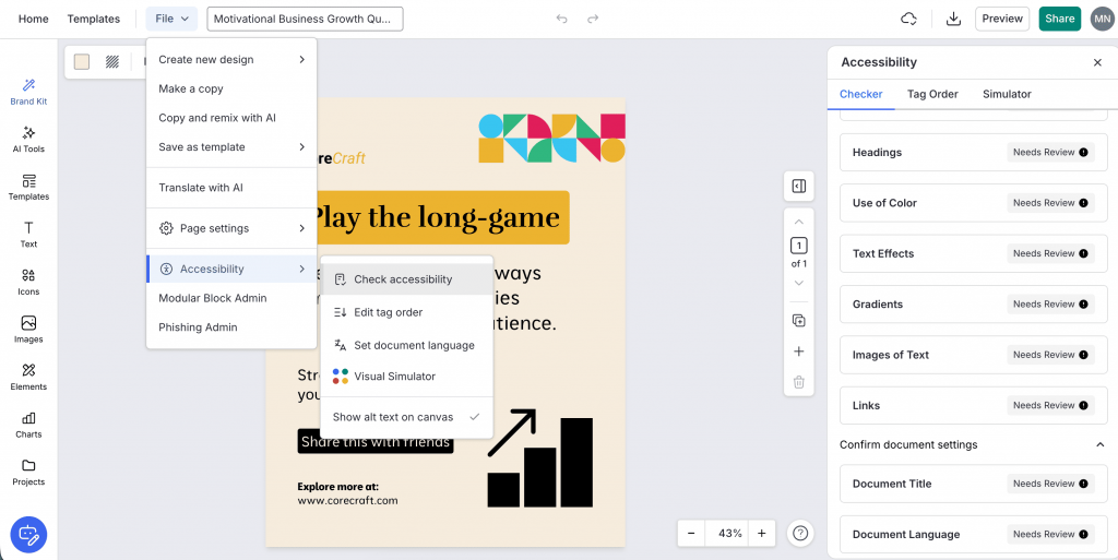
Go to File > Accessibility > Check Accessibility > Checker to review and confirm your Document Title and Document Language are set correctly.
As you can see, the Checker flags the document I’m currently working on as “Needs Review,” which means I can fix the accessibility issues before exporting.
2. Review PDF accessibility manually
A PDF can pass an accessibility checker and still make a screen reader user wonder what the heck is going on.
Automated tools can confirm that alt text exists, for example, but they can’t reliably decide whether “chart showing sales” actually explains the chart’s point.
Give the final PDF a human pass. When reviewing manually, ask yourself:
- Alt text: Does it communicate the useful information, not just identify the image?
- Reading order: Does the content make sense from start to finish?
- Headings: Do they describe what each section actually contains?
- Links: Would the link text make sense without the surrounding sentence?
- Charts: Can someone understand the takeaway without relying on color alone?
- Forms: Can you tab through every field and control in a logical order using only the keyboard?
- Overall flow: Does the document feel logical when you navigate it without looking at the page?
Managing PDF accessibility at scale
Ensuring accessibility is easier when it’s a one-off task. But those accessibility checks can easily slip through the cracks when you have to do them in bulk or at scale.
If your team is responsible for creating annual reports, public notices, accessible forms, training materials and internal documents on a day-to-day basis, each one can bring its own set of accessibility requirements or challenges.
For recurring accessibility requirements and challenges, your goal should be to bake accessibility into the publishing process rather than treat it as an afterthought at the end.
Related: Beyond PDF Remediation: Creating Accessible Documents
Start with accessible PDF templates and set clear standards for things like headings, alt text, color, tags, forms and reading order. Have someone dedicated to reviewing accessibility and fixing any issues that come up. You can also build automated checks into your workflow and use them alongside a final check of the exported PDF.
This way, you’re not asking, “Is this PDF accessible?” every time a file is ready to publish. You’re building a process that makes accessibility a regular part of how your team creates and publishes PDFs.
If you’re formalizing that process, an Accessibility Policy Toolkit can give your team a practical starting point.
Check PDF accessibility before you publish
A PDF can look flawless on your screen and still be almost impossible to use with a screen reader. That’s the uncomfortable truth behind accessibility work. Visual approval only tells you that the PDF looks right to you. It doesn’t tell you whether it works for everyone.
Make accessible electronic documents part of your publishing workflow from the first design decision through the final exported PDF. Check the structure, test the export, fix what fails and build the right practices into your templates and processes. You’ll spend far less time repairing inaccessible documents later.
The best accessibility workflow eventually becomes almost boring. And that’s the point. Nobody should have to fight your document to understand it.
If you’re building that workflow across your team, book a call with Venngage to see what that could look like at scale.
PDF accessibility FAQs
How do I check if a PDF is accessible?
Use an accessibility checker to review tags, headings, alt text, color contrast and reading order. Venngage’s built-in Accessibility Checker lets you catch these issues while creating your document, while tools like PAC can help validate the final exported PDF.
What makes a PDF accessible?
An accessible PDF has proper tags, a logical reading order, structured headings, useful alt text, sufficient color contrast, accessible tables and links and correctly labeled form fields. It should also have the correct document language and metadata.
Do PDFs need to comply with ADA Title II?
PDFs published by state and local governments may fall under ADA Title II’s digital accessibility requirements. The rule requires covered web and mobile content to meet WCAG 2.1 Level AA, although certain content and documents may qualify for exceptions.
What are the ADA Title II compliance deadlines?
Under the current DOJ rule, state and local governments with populations of 50,000 or more have until April 26, 2027 to comply with the web accessibility requirements. Governments with fewer than 50,000 people and special district governments have until April 26, 2028.
Can a PDF pass an accessibility checker and still be inaccessible?
Yes. An automated checker can confirm whether elements such as tags or alt text are present, but it can’t always tell whether the reading order makes sense or the alt text is actually useful. Manual review is still an important part of PDF accessibility testing.
What is the difference between WCAG and PDF/UA?
WCAG defines accessibility requirements for digital content, while PDF/UA focuses specifically on accessibility in PDF documents. They complement each other: WCAG defines accessible outcomes and PDF/UA provides PDF-specific requirements for achieving them.
Can you fix an inaccessible PDF?
Yes. PDF remediation can include fixing tags and reading order, adding alt text, correcting heading and table structure and labeling form fields. For PDFs with extensive accessibility problems, it may be easier to fix the source document and export a new accessible version.