

TL;DR
- WCAG Level AA requires at least 4.5:1 contrast for normal text and 3:1 for large text. Level AAA increases this to 7:1 and 4.5:1 respectively.
- Check the actual foreground and background combinations used throughout the PDF, including text over images, gradients, callout boxes, charts and brand colors.
- Contrast requirements do not apply to every piece of text. Logos, purely decorative text, invisible text and text that is part of a larger image can be exempt, depending on the context. Large text is not exempt; it simply has a lower minimum ratio.
- For charts and graphics, meaningful visual elements such as chart lines, icons and important boundaries generally need 3:1 non-text contrast, and color should not be the only way information is communicated.
- If a combination fails, try darkening or lightening one color, changing the background, adding an overlay behind text or choosing a more accessible shade, then test it again before export.
WCAG requires a contrast ratio of at least 4.5:1 for normal text and 3:1 for large text to meet Level AA. For Level AAA, the requirements increase to 7:1 for normal text and 4.5:1 for large text.
You can usually meet these requirements easily in a simple document with text on a solid background. It gets more difficult when the PDF includes images, gradients, charts, callout boxes, brand colors and other design elements, because each text and background combination needs to meet the required contrast ratio.
In this article, I’ll explain the WCAG color contrast requirements, where contrast issues usually come up and how to fix them before you export the PDF.
What are the WCAG color contrast requirements for text?
WCAG Success Criterion 1.4.3: Contrast (Minimum) requires a minimum color contrast ratio of 4.5:1 for normal text to meet Level AA. This applies to both regular text and images of text (text that appears inside an image rather than as editable text, such as text baked into a banner or graphic).
Large text (at least 18pt, or 14pt and bold) has a lower minimum requirement of 3:1.
For Level AAA, the WCAG Success Criterion 1.4.6: Contrast (Enhanced) requirements are stricter:
- 7:1 for normal text
- 4.5:1 for large text
WCAG measures contrast between the foreground color and the background directly behind it. So the same color can meet the required ratio on one background and fail on another. For example, dark blue text may pass against white but fail when you place it on a medium-blue background.
When do the WCAG text contrast requirements not apply?
WCAG does not set a minimum text contrast ratio for:
- Logos and brand names where the text is part of the logotype
- Purely decorative text that does not communicate information
- Text inside an inactive user interface component
- Text that is not visible to anyone
- Text that appears as part of an image containing other significant visual content, such as text on a real-world sign within a photograph
Large text is not exempt. It still needs to meet contrast requirements, but the minimum ratio is lower than it is for normal text.
Related: WCAG 2.2 vs WCAG 3.0 for PDF Accessibility
What is the difference between WCAG AA and AAA?
WCAG has three conformance levels: A, AA and AAA.
Level AA is the standard most organizations aim to meet. It covers the accessibility requirements generally considered necessary for most websites, apps and digital documents to be usable by people with disabilities. In practice, when teams say they need to make a document “WCAG compliant,” they usually aim for Level AA unless a stricter requirement is specified.
Level AAA is the highest conformance level. It adds stricter requirements on top of Level A and AA, including higher color contrast ratios. Some organizations may choose AAA for specific content or audiences, but WCAG does not recommend requiring AAA across an entire site or document because some content cannot realistically meet every AAA criterion.
So for most PDF accessibility work, AA is the baseline to meet, while AAA is a higher standard you may choose or be required to follow in specific cases.
What are the WCAG contrast requirements for charts and graphics?
WCAG has a separate Success Criterion 1.4.11: Non-text Contrast for graphical elements that people need to understand the content. These elements need a contrast ratio of at least 3:1 against adjacent colors. This can include chart lines, icons, diagram elements and interface controls.
For example, if you use colored lines in a graph, each line should have at least 3:1 contrast against the chart background when readers need those lines to understand the data. The lines do not necessarily need 3:1 contrast against each other.
Pie charts work a little differently. If readers need to see the boundaries between slices to understand the proportions, those boundaries need sufficient contrast. You can also add a contrasting border around a slice. But if visible labels and values already communicate the same information, WCAG may not require the slices themselves to meet the non-text contrast rule because the color areas are no longer necessary to understand the data.
Any text inside the chart, such as data labels, axis labels or legends, still follows the normal text contrast requirements of 4.5:1 for normal text or 3:1 for large text at Level AA.
Related: Colorblind-Friendly Palettes: Why & How to Use in Design
How to check WCAG color contrast before exporting a PDF
Before you export the PDF, go through the document and check every foreground and background color combination against the WCAG ratio you need to meet.
You can use a free color contrast checker to check the ratio between two colors and understand whether they pass AA or AAA requirements.
Step 1: Identify the text and the background behind it
Start with the places where text appears against a different color or visual background. Body text on a plain white page is usually easy to check, but you also need to look at captions, callout boxes and chart labels or text placed over an image.
Here are the main areas worth checking for color contrast ratio in a PDF.
Pro Tip: The background you test should be the one directly behind the text. For example, if dark text appears inside a blue callout box on a white page, you need to check the dark text against the blue box, not the white page.
Images and gradients need a little more attention because the background is not consistent. Text may have enough contrast over one part of an image but fall below the required ratio a few pixels away.
Step 2: Check the color pair with a WCAG contrast checker
Once you know which foreground and background colors you need to test, enter them into a color contrast checker. Most tools let you add the two colors as HEX codes and show you the resulting contrast ratio.
Venngage offers a free Color Contrast Checker to check the color contrast ratio.
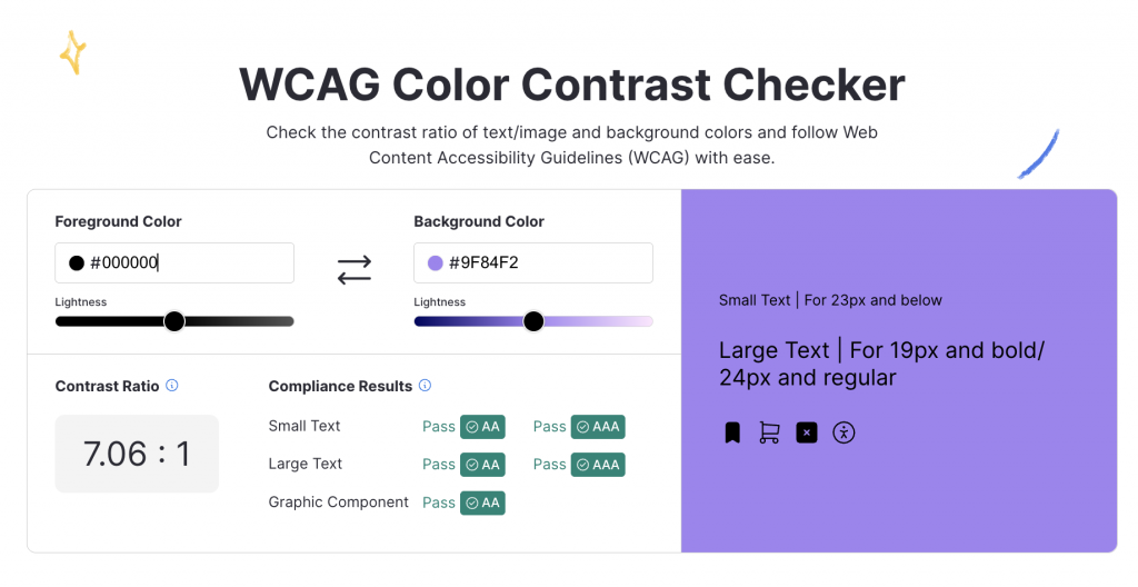
You might be checking #FFFFFF text against a #5267A3 background. The checker will tell you whether that combination meets the required ratio for normal text, large text, AA or AAA.
Step 3: Check each color combination used in the document
Passing the contrast check once does not mean the same text color will work everywhere.
Dark blue text might meet the 4.5:1 requirement on white but fail when you use it inside a medium-blue card. The same applies when you reuse white text across several brand colors or place the same caption style over different backgrounds.
Some combinations are especially worth checking because they often sit close to the minimum contrast requirement:
If you use the same callout box, caption style or chart format several times, you don’t necessarily need to start from scratch every time. Once you know that a particular color pairing passes, you can use the same approved combination consistently across the document.
How to fix color combinations that fail WCAG contrast?
If a color combination fails, you usually don’t need to change the whole design. Start by changing either the text color or the background until the pair meets the required ratio.
For example, if light gray text fails on white, use a darker gray. If you need to keep the text color, change the background instead.
You can also stay within the same color family. A medium blue that doesn’t provide enough contrast for white text may only need to be a few shades darker. Or you may find that switching to dark text works better than changing the background at all.
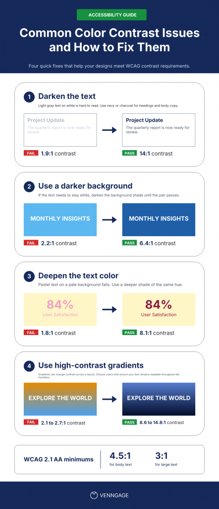
Check the new combination again after you make the change. A darker or lighter shade may look better, but you still need to make sure it meets the ratio you’re targeting.
Be careful with opacity too. Lowering the opacity of text changes the final color that appears against the background. It may still look different enough to you, but that doesn’t mean it passes WCAG contrast.
One of the best ways to comply with WCAG color contrast requirements is to use an accessible color palette. Use Venngage’s Accessible Color Palette Generator to create color combinations that meet contrast requirements.
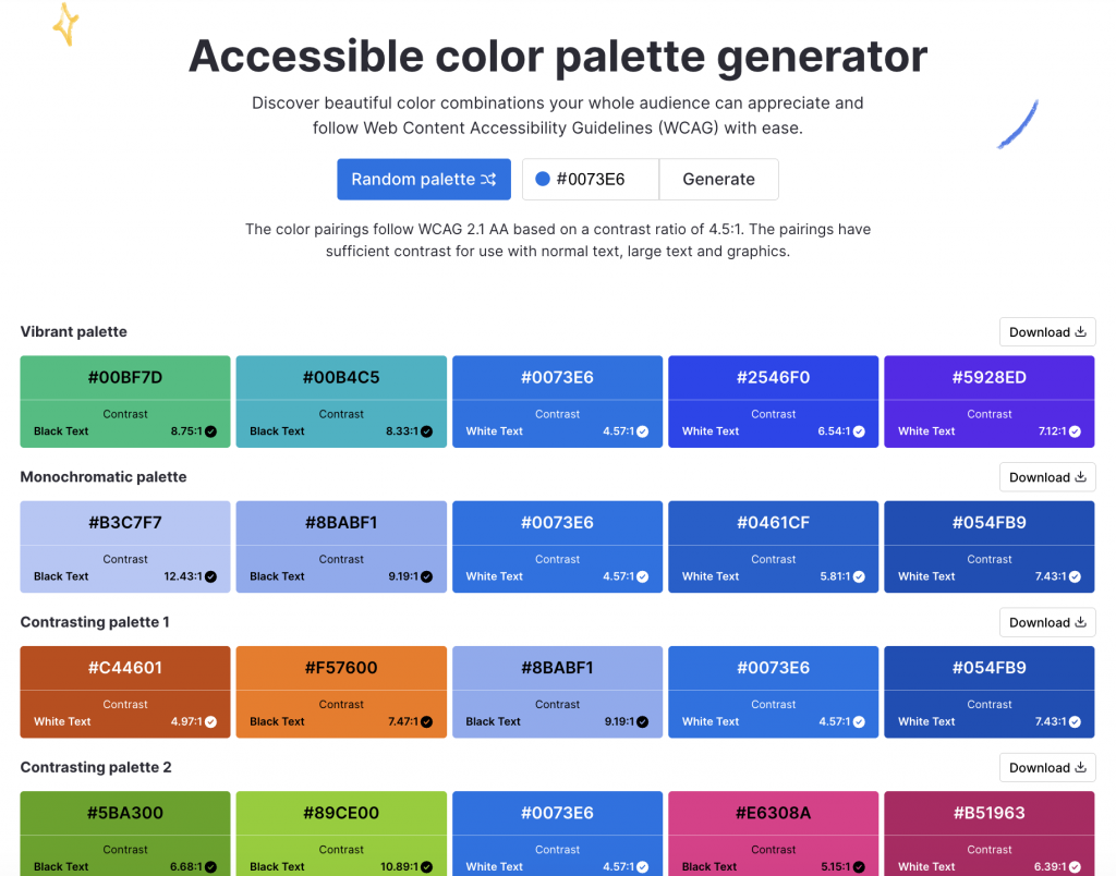
Simply add your preferred color hex code and it will suggest contrasting colors. If you don’t have a specific brand or starting color in mind, you can also generate random accessible palettes and use those as a base for the design.
This helps you find contrasting colors in one go instead of testing and rechecking multiple color combinations until you find one that meets the required ratio.
How to ensure color contrast for text over images
Text over an image is harder to fix because you’re not working with one consistent background color.
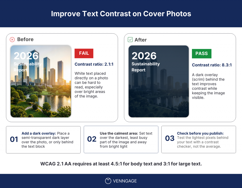
White text might have enough contrast over a dark part of the image and fail where the same image becomes lighter. A gradient can create the same problem.
The easiest fix is to give the text a more consistent background.
For example, you can add a solid-colored box behind the text. This gives you one background color to check against and removes the variation from the image.
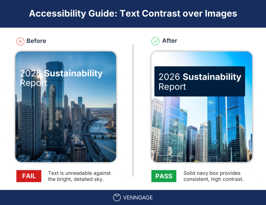
If you want to keep more of the image visible, add a scrim or overlay instead. A dark overlay behind white text or a light overlay behind dark text can create enough separation without covering the image completely.
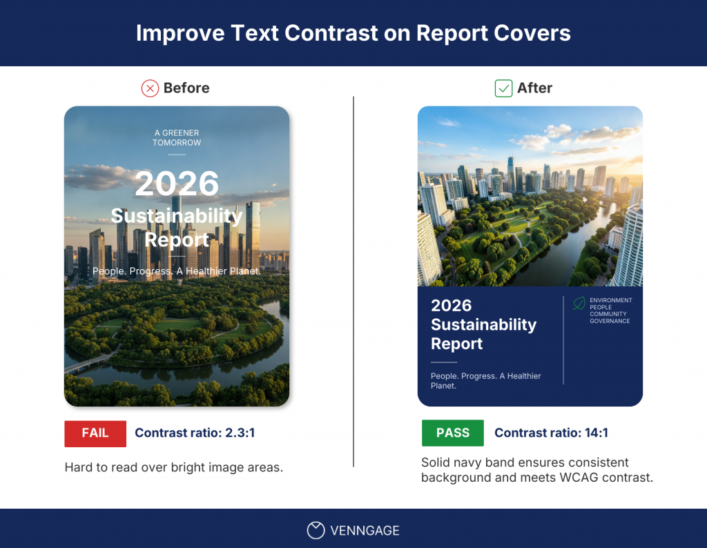
You can also move the text into a solid-color band at the top or bottom of the design. This works well for report covers, infographic headers and presentation slides where the image can stay prominent without sitting directly behind the copy.
Another option is to move the text to a quieter part of the image. Just make sure you check the ratio again after moving it. A darker-looking area does not automatically mean the text will pass.
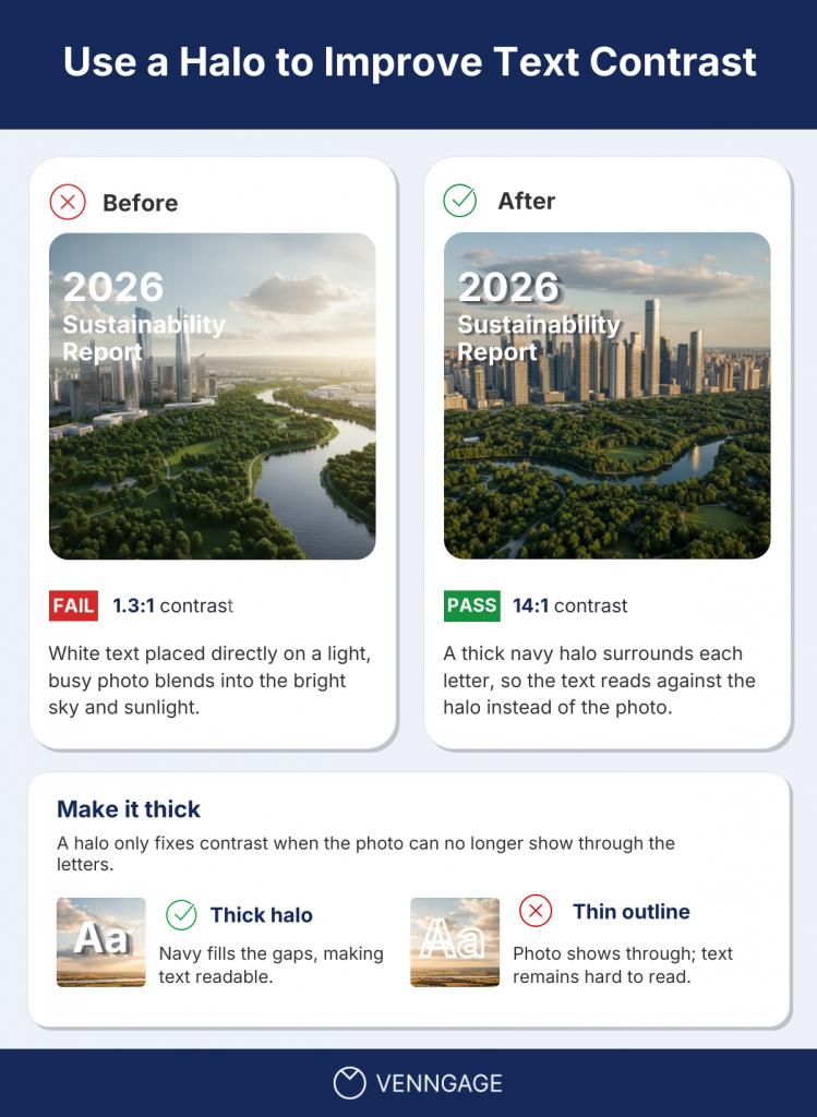
For some images, an outline or halo around the text can also help create a consistent edge between the text and a changing background. W3C includes this as one way to maintain sufficient contrast where the background varies.
Increasing the text size or weight can improve readability, but don’t treat that as the main fix. The text still needs to meet the contrast requirement that applies to its size.
How to ensure color contrast in charts and infographics
For charts and infographics, the text contrast requirements don’t change. What you also need to check are the lines, shapes, colors and boundaries that people rely on to understand the data.
Here are the WCAG color contrast requirements for charts and infographics:
Check the text inside the chart
Your chart titles, labels, legends, values and annotations follow the same contrast rules as any other text in the document.
What you need to watch more closely is the smaller supporting text. Axis labels, source lines and annotations are often given a lighter color so they don’t compete with the data. If you make them too light, they can easily fall below the required contrast ratio.
You don’t have to make every label black. Use a darker shade that passes and keep the hierarchy through font size, weight and placement instead.
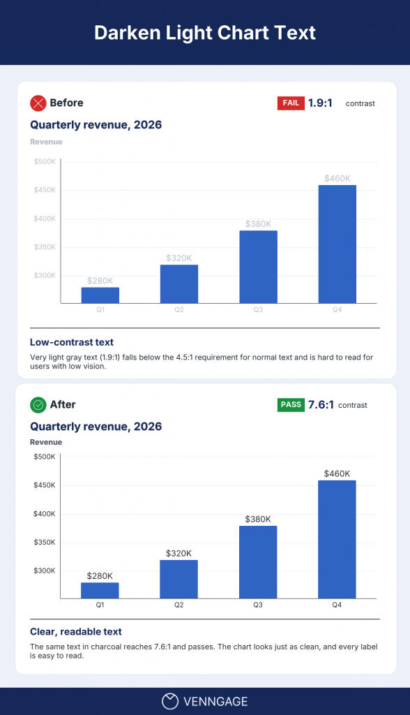
This also applies when you export the chart as an image or add it to a PDF. The text still needs to meet the same contrast requirements.
Check chart lines and other meaningful visual elements
WCAG also has a separate rule for non-text contrast.
If people need a visual element to understand the information, it generally needs at least 3:1 contrast against adjacent colors.
That can include:
- chart lines
- bars and pie slices
- meaningful icons
- diagram shapes
- controls
- borders or boundaries needed to understand the visual
For example, if a chart uses colored lines to show data, each line should have at least 3:1 contrast against the chart background so it is easy to see. A pale yellow line on a white chart background may fail even if all the labels around it pass.
You could fix it by using a darker yellow that still works with the rest of the palette.
Decorative elements like background gridlines don’t need to meet 3:1 if people don’t need them to understand the data.
Make adjoining colors easier to tell apart
You should also check areas where colors sit directly next to each other, such as pie slices, stacked bars, treemaps or regions on a map.
If readers need to see the boundary between those areas to understand the data, make sure the separation is clear.
Say two pastel slices in a pie chart blend into each other. You don’t necessarily need to change the whole palette. Adding a contrasting border between the slices can make the boundary much easier to see.
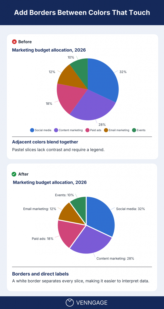
If labels and values already communicate the same information, the colored areas may not always need to do that work themselves. The key is whether readers need the visual boundary to understand the data.
Don’t rely on color alone
A chart can pass every contrast check and still be hard to read. If the only way to tell two data series apart is color, people with color blindness may not be able to read your chart.
WCAG covers this in a separate rule called Use of Color.
To fix it, give readers another way to tell the data apart:
- Label each line, bar or slice directly
- Add patterns or textures to filled areas
- Use different line styles, like solid and dashed
- Add distinct markers, like circles and squares, to data points
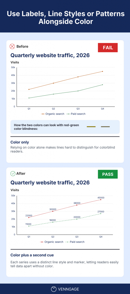
Direct labels also make your chart easier to read for everyone. If each slice or bar shows its label and value, readers don’t have to match colors to a legend to understand the data.
How Venngage helps you meet WCAG color contrast before export
Checking contrast manually is manageable when you only have one or two color combinations. It becomes much more time-consuming in a report, presentation or infographic with multiple backgrounds, charts, callout boxes and brand colors. Every new combination means checking the ratio, adjusting the color and testing it again.
Venngage brings that process into the editor. It has a real-time contrast checker that helps fix color contrast while you select the colors.
As you change a text or background color, you can see whether the combination meets WCAG contrast requirements without copying HEX codes into a separate tool.
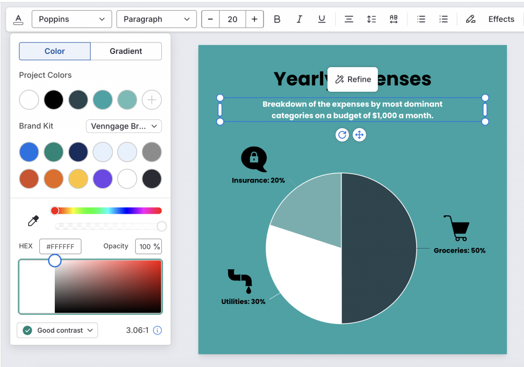
This is particularly useful once your document becomes more complex. You can also catch contrast issues in body text, callout boxes, chart labels and data visualizations while you are still working on them.
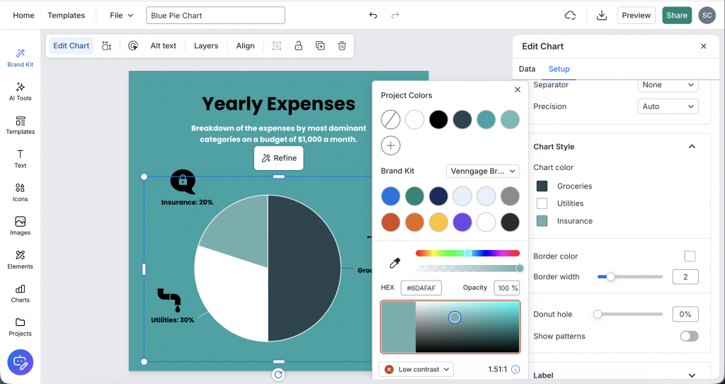
Just click on the chart and go to Chart Settings > Chart Color. You can see whether the chart color has sufficient contrast against the background.
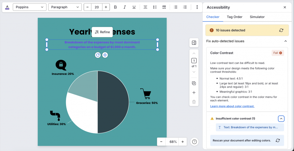
Once the design is ready, double-check the whole document with Venngage’s Accessibility Checker. If the contrast ratio is insufficient anywhere in the design, the checker highlights the issue so you can fix it before export.
For recurring documents, you can make the process easier from the start with accessible templates. The color and text combinations are already designed with accessibility in mind, so you don’t have to build every report, presentation or infographic from scratch. You can customize the content, branding and colors, then run the built-in checks again to make sure your changes still meet the required contrast.
Use Venngage’s Visual Simulator as a final check before exporting your design. Sometimes a color combination may technically pass a contrast check but still be difficult to see for people with certain visual impairments.
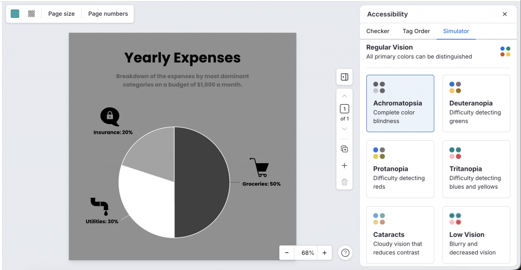
The Simulator lets you preview how the design may appear to people with different types of visual impairments. This helps you catch any issues you may have missed with the contrast checker alone and fix them before you export the PDF.
Check and fix color contrast before you export
Meeting WCAG color contrast requirements is much easier when you check contrast while you are still designing the document.
Start with the required ratios, check the actual foreground and background combinations, then fix the places where contrast usually breaks down, such as images, charts, callout boxes and brand colors.
The main thing is not to leave contrast until the final accessibility review. If you catch issues while the design is still editable, most fixes are small: a darker shade, a different background, an overlay or a clearer chart treatment.
With Venngage, contrast checking, accessible color suggestions, the Accessibility Checker and Visual Simulator all sit inside the same workflow, so you can fix issues before export instead of going back to rework the PDF later.
FAQs about WCAG color contrast
What is the WCAG color contrast requirement?
For WCAG Level AA, normal text needs a contrast ratio of at least 4.5:1, while large text needs 3:1. For Level AAA, the minimum increases to 7:1 for normal text and 4.5:1 for large text.
What contrast ratio do I need for WCAG AA compliance?
You need 4.5:1 for normal text and 3:1 for large text. Large text means at least 18pt, or 14pt and bold. Meaningful non-text elements, such as chart lines or icons that people need to understand the content, generally need 3:1 contrast against adjacent colors.
How do I check color contrast before exporting a PDF?
Use a WCAG color contrast checker to compare the foreground color with the background directly behind it. Check every place where that background changes, including callout boxes, images, gradients, charts and colored sections. If you design in Venngage, you can check the contrast ratio while you work and fix color combinations before exporting the PDF.
Why does text look readable but still fail a contrast check?
Text size, font weight, screen brightness and surrounding colors can all make a color combination look more readable than it actually is. WCAG uses a fixed contrast ratio instead of visual judgment, so a combination can look fine on your screen and still fall below the required minimum.
What should I do if my brand colors don’t meet WCAG contrast requirements?
You don’t necessarily need to replace your brand colors. Try a darker or lighter shade from the same color family, change the background or use the brand color for accents instead of small text. You can also create approved accessible color pairings for recurring designs so your team doesn’t need to check the same combinations every time.
Does color contrast alone make a PDF accessible?
No. Color contrast is only one part of PDF accessibility. You also need to check things like alt text, heading structure, logical reading order, document tags and accessible charts and tables. For charts, passing contrast is also not enough if color is the only way readers can tell data series apart. Add another cue such as direct labels, markers, patterns or different line styles.
What is a good tool for checking color contrast in a design?
Look for a tool that shows the contrast ratio, WCAG pass/fail status and requirements for normal and large text. Venngage lets you check contrast while you design, so you can adjust colors before export. You can also use its Color Contrast Checker for individual color pairs and the Accessible Color Palette Generator when you need compliant color combinations.