Visual aids are any tools that use sight to communicate information. They can be anything from a simple picture to an elaborate animation.
In the realm of teaching, visual aids become powerful allies. Creating education visual aids takes abstract ideas and makes them concrete, aiding students in understanding and retaining information.
Visual aids for learning can also expand beyond the realm of just classroom posters and presentations. You can also visually enhance documents like student progress reports, lesson plans, and research reports.
Here are 10 types of visual aids for learning that will engage students and help you plan and deliver lessons more effectively. I’ve also included some education templates design tips to help you get started.
Click to jump ahead:
- Educational infographics to simplify complex information
- Creative presentations to keep students engaged with a lesson
- Educational charts to make data accessible
- Student assessment reports with an approachable design
- Research reports to make data and insights engaging
- School newsletters to get students, parents and teachers excited about events
- Lesson plans to help you stay organized and to inspire other educators
- Educational posters to inspire and remind students
- Classroom checklists to keep students, teachers and parents on track
- Education calendars to keep students, parents and teacher informed\
1. Educational infographics to simplify complex information
Infographics are a perfect classroom tool because they can make complex information easier to understand.
There are many different types of infographics you can create, depending on the information you want to visualize. For example, you could make an infographic to summarize a new topic, to show a timeline of events, to visualize statistics, to explain a process–and more.
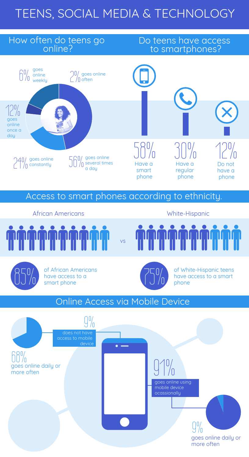
For example, this educational infographic uses a combination of charts, icons and creative text to show statistics about teens and social media. Visuals aids like these can be helpful for students who have trouble wrapping their heads around big numbers.
The cool thing about infographics is that there’s so many approaches you can take to create one. And the design doesn’t have to be complicated–just effective.
Related: How to Create a Successful Employee Training and Development Program Using Visuals
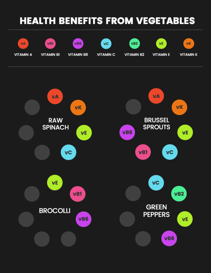
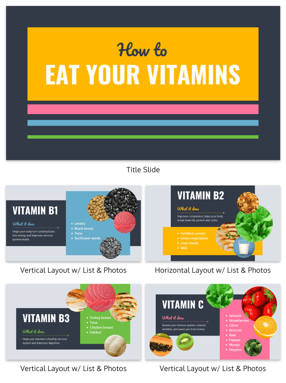
For example, this infographic uses a pattern graphic design of colorful circles to represent different vitamins. Associating each vitamin with a color can help students remember each one.
In data visualization, color plays a bigger role than just for decoration. Color can also be used as a tool to visualize information. Check out our guide to using colors to communicate effectively.
2. Creative presentations to keep students engaged with a lesson
We’ve all sat through boring presentations before. I’m going to go out on a limb and assume you don’t want to be the one delivering a boring presentation!
A creative presentation template can go a long way to keep your students from snoring in the middle of class. For starters, introduce bright colors and creative fonts into your slide design. You can also combine photos, charts and icons to illustrate concepts.
For example, this creative presentation uses a bold color palette that give each slide impact:
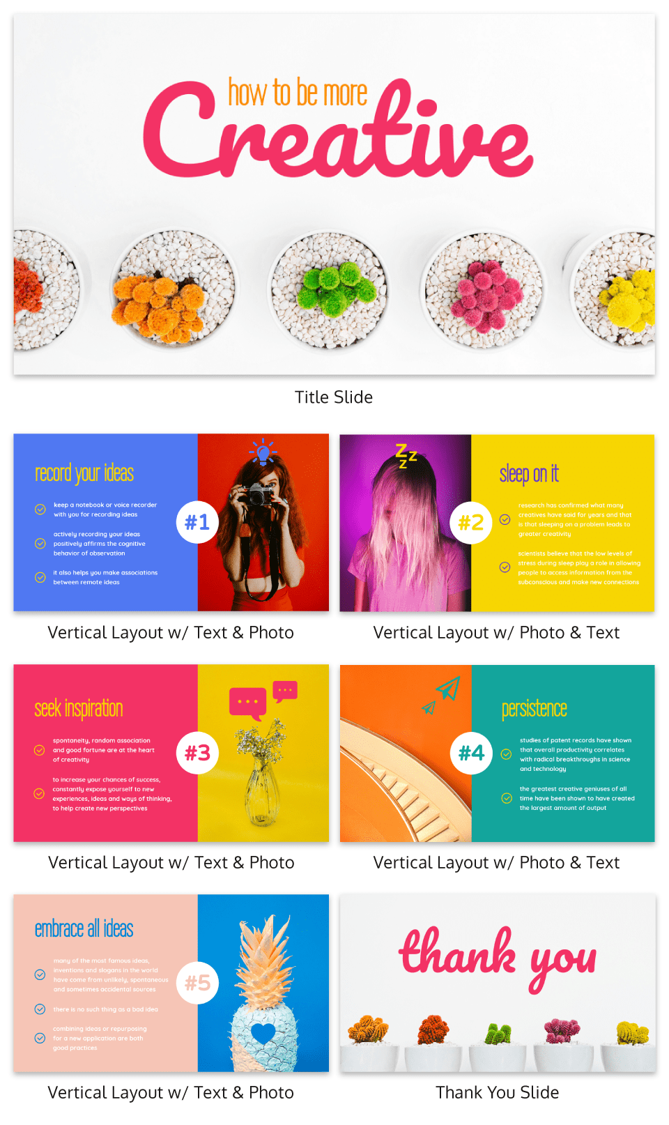
The combination of a script font with a more modern font helps makes for an interesting and unexpected design. Simple tricks like mixing and matching styles (as long as they’re complementary) can go a long way in your presentation design.
Related: Storyline: A Starter Guide to Creating Engaging Visual Training Courses
Presenting information in a creative and visually-stimulating way can help get students excited about a topic. This presentation template uses image frames to seamlessly incorporate different pictures of foods into each slide design:
We have a tutorial for using image frames in your design, which you can access here.
3. Educational charts to make data accessible
Simple charts are another great visual aid for an online learning platform. They can make data more approachable, and can also help reveal the stories behind data.
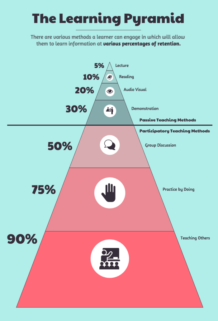
Look for opportunities to present information visually in your presentations, handouts, and reports, and find a chart that fits that type of information. For example, a classic pyramid chart is effective for visualizing a topic in different levels:
Charts are also handy tools for analyzing processes. There are plenty of opportunities for you to include engaging visuals in your staff presentations, personal research, and more.
For example, a common problem that many teachers face is negotiating budgets for their curriculums, programs, and resources. Well-designed visuals can help you make a good case for your budget requests.
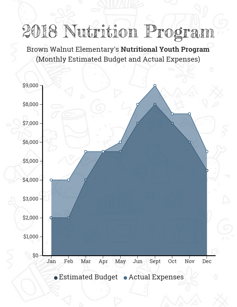
Check out our guide for choosing the best charts for your data.
4. Student assessment reports with an approachable design
Since tracking students’ progress is an important part of a teacher’s job, why not make your student assessment reports more engaging with a creative design?
Younger students at the preschool or elementary school level can find assessments particularly stressful. A fun and playful design can help make a student progress report appear less intimidating.
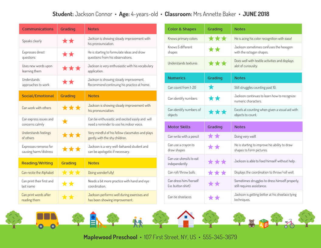
For example, this progress report template uses a rainbow color palette, with star pictograms representing their grades:
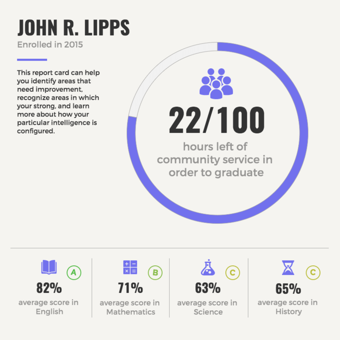
You can also help students and parents understand their progress better by summarizing their progress in a chart. For example, this chart template uses a combination of a pie chart and some simple icons to highlight the main educational areas the student is being assessed on.
5. Research reports to make data and insights engaging
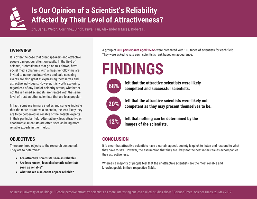
If you want to share some interesting research findings with your students, or you want students to share their findings with you, try using a visually engaging report template. A visual report will require you or your students to identify and emphasize the most important pieces of information.
For example, this research report template uses circle icons to emphasize the study’s main findings:
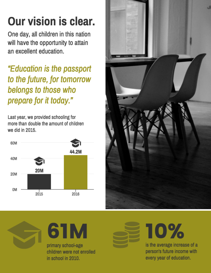
Presenting research visually can also help inspire students and staff members. For example, if you want to promote a student organization or a charity, visualizing some surprising statistics can make people stop and think about a cause.
For students who need assistance in structuring or writing their reports, an academic support service can be beneficial. Whether they need help refining their research, formatting their citations, or crafting a compelling argument, a write my papers service can provide expert guidance to ensure their work meets academic standards.
This research poster highlights the achievements of an organization using a simple bar graph and some icons:
6. School newsletters to get students, parents and teachers excited about events
A classic school newsletter can help keep staff, students and parents on the same page. Why not add some school spirit to your newsletter design? If you start with a newsletter template, it’s easy to customize the text and visuals for every week or month.
Simply swap out the icons with ones that reflect the theme of each particular newsletter. You can also use image frames to share pictures of events at your school.
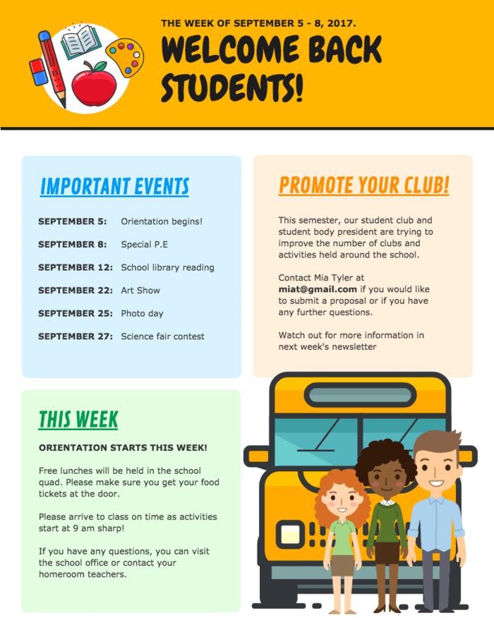
Incorporate your school colors and fonts into your newsletter design. For example, this newsletter template uses the school’s colors of orange for the headers and blue for the sub-headers:
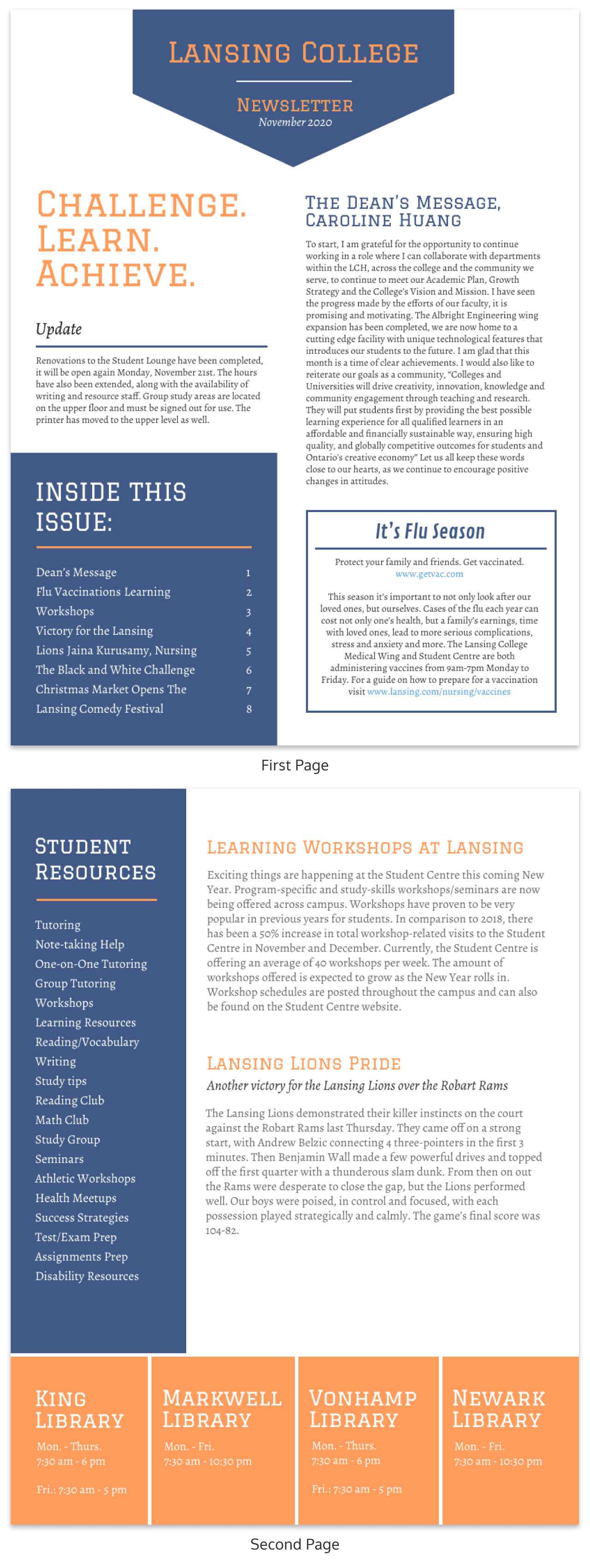
Our newsletter maker offers a ton of creative newsletter templates. Why not try it out?
7. Lesson plans to help you stay organized and to inspire other educators
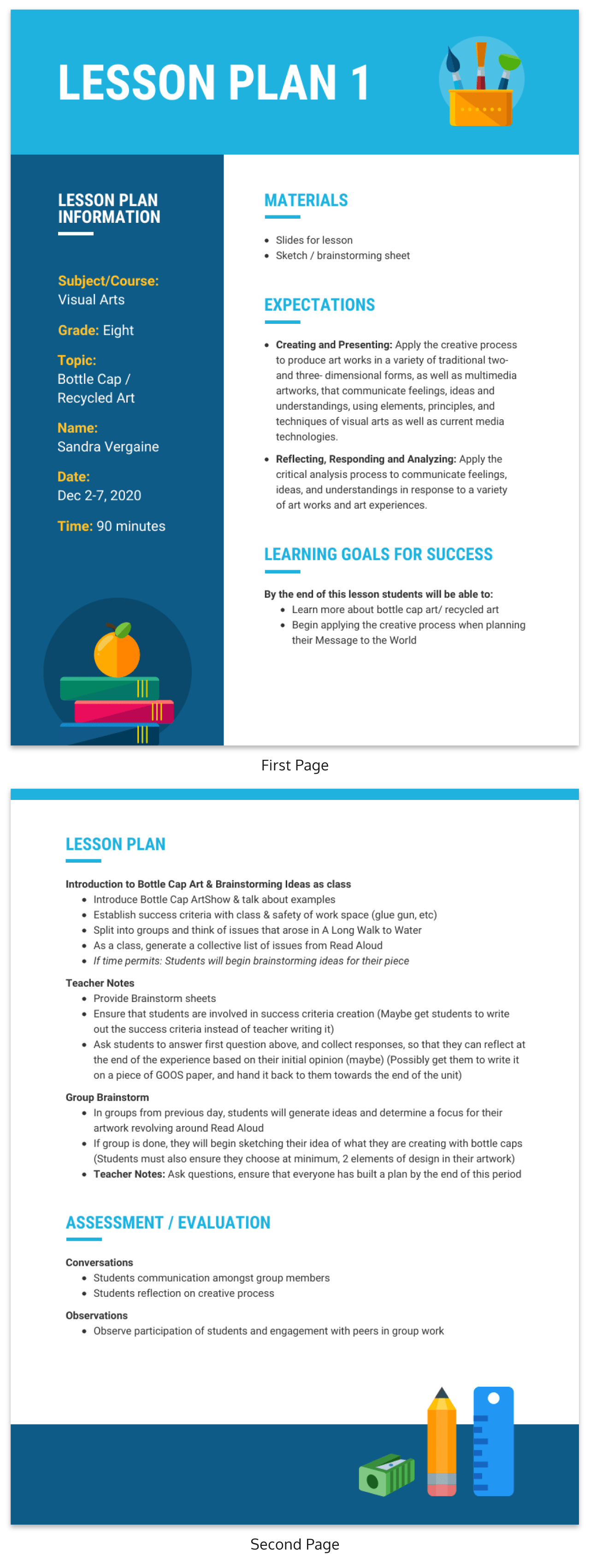
As an educator, you no doubt understand the importance of being organized. Incorporating visuals into your lesson plan can make it easier for you to scan for information. It can also help inspire your creativity about a subject!
Since organization is key when it comes to lesson planning, you don’t have to go overboard with the design. Some simple design elements like icons, colorful headers, and a thematic footer can breathe life into a mundane lesson plan.
And if you want to share your lesson plans on a personal blog or with other teachers in your school, making your lesson plan engaging will make all the difference!
8. Educational posters to inspire and remind students
Educational posters are a classic teaching aid that can breathe life into a classroom. Hanging posters up on your classroom walls will not only invite color into the environment, they’ll also act as helpful resources for students.
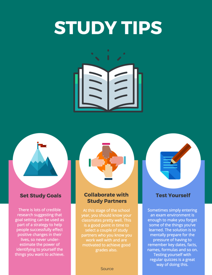
For example, here’s an educational poster that you could pin up in your classroom. The three study tips on this poster are organized with a different colored background. This is a simple poster design trick to help the information stand out.
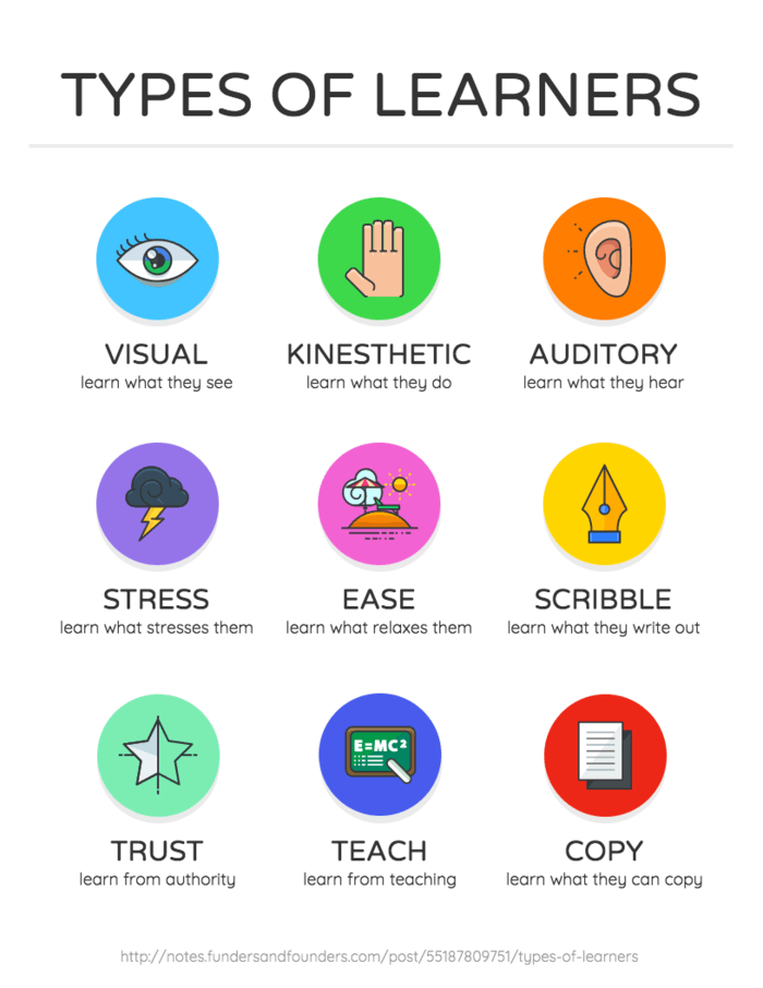
Meanwhile, this educational poster uses icons to visualize each different type of learner. A poster with this layout this can be useful for introducing students to new or foreign concepts (for example, words in a secondary language) because they can associate each word with a visual.
9. Classroom checklists to keep students, teachers and parents on track
A simple checklist can be a great tool to have in the classroom. From classroom duties to assignments for the semester, there are a lot of things that students need to keep track of.
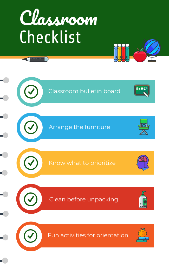
Adding visual aids to your checklists can help make the points on the list easier to remember. For example, this simple checklist infographic uses icons and a different color for each point:
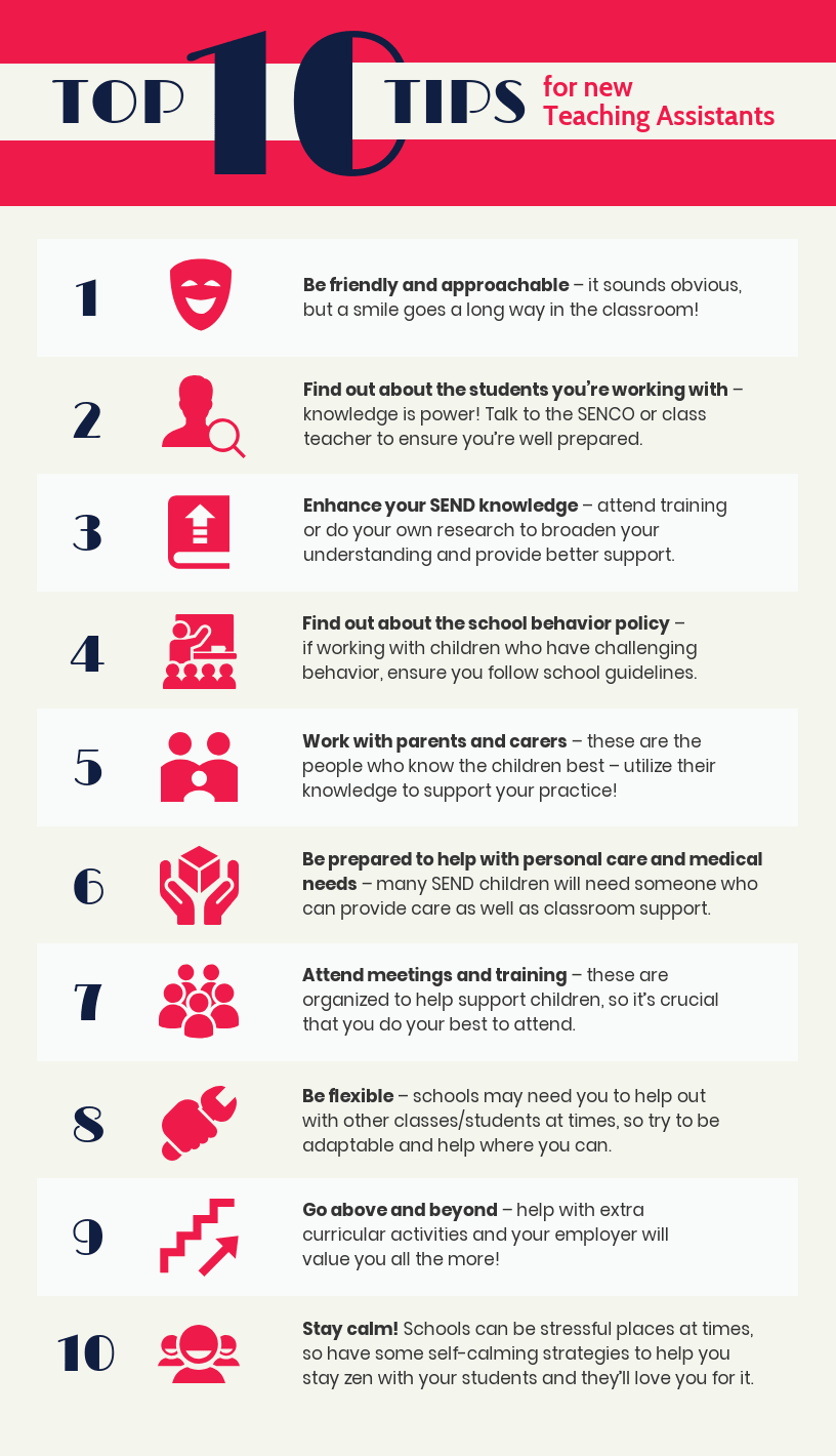
A visual checklist can also be useful for staff members, to help them remember tasks or best practices. For example, this checklist template offers tips to guide new teaching assistants:
10. Education calendars to keep students, parents and teacher informed
Both teachers and students have a lot to keep track of. Adding some design flare to your calendar will make it a fun visual aid you can hang up in your classroom, or include to parents in an email.
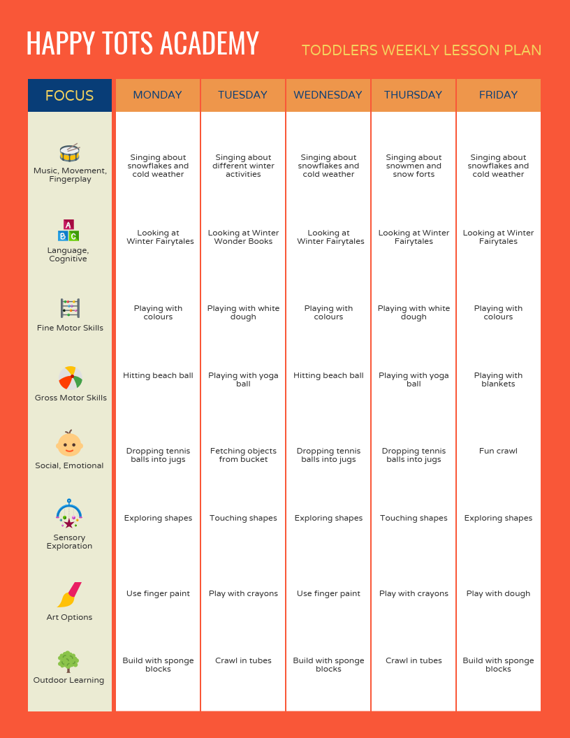
Look for ways to organize the information so nothing is missed. For example, the lefthand column in this calendar template identifies the focus of each week, using an image to illustrate the ideas. This makes it easy for students to glance at the calendar and have an idea of what’s going on.
Read More: 27+ Lesson Plan Examples for Effective Teaching
A few things to keep in mind when designing visual aids for learning:
- Make sure your information is organized and easy to understand–even if that means toning down the design.
- On that same note, keep designs relatively simple and keep text concise.
- Look for ways to visualize information using charts, pictograms, icons, and images.
- Customize templates for things like newsletters, reports, and calendars so you can easily reuse them.
- Export your teaching aids as high quality PNGs or PDFs so they will look good when you print them.
These are just a handful of the different types of visual aids for learning that you can use in the classroom. Are there any other visual aids that you like to use in your classroom? Share your tips in the comments!
Read also:
- What Is Your Teacher Personality Type? [QUIZ + INFOGRAPHIC]
- 9 Ways Middle Schools Can Use Infographics in Classroom


