How do you get people pumped about an upcoming event? Create an awesome poster.
Posters are one of the oldest, most tried and true ways to get the word out about an event. There’s a reason for that — they’re versatile and can be shared across multiple channels.
No design experience? Don’t worry. That’s where this guide will help you. Here you will find:
- Event poster templates to inspire your design
- Essential design tips to create attention-grabbing posters
- Handy poster design hacks to simplify the design process
Ready to build hype around your event? Follow these design tips and start with one of the event poster templates below.
1. Leave plenty of white space in your poster design
One of the quickest ways to ruin your otherwise solid poster design is to make it too cluttered. Or too hard to decipher what you’re trying to promote. That’s why it’s important to leave enough white space in your poster design.
In the design world, “white space” (or “negative space”) refers to space between design elements like images, text, and borders. White space allows for the elements on your page to breathe and helps to avoid a cluttered design.
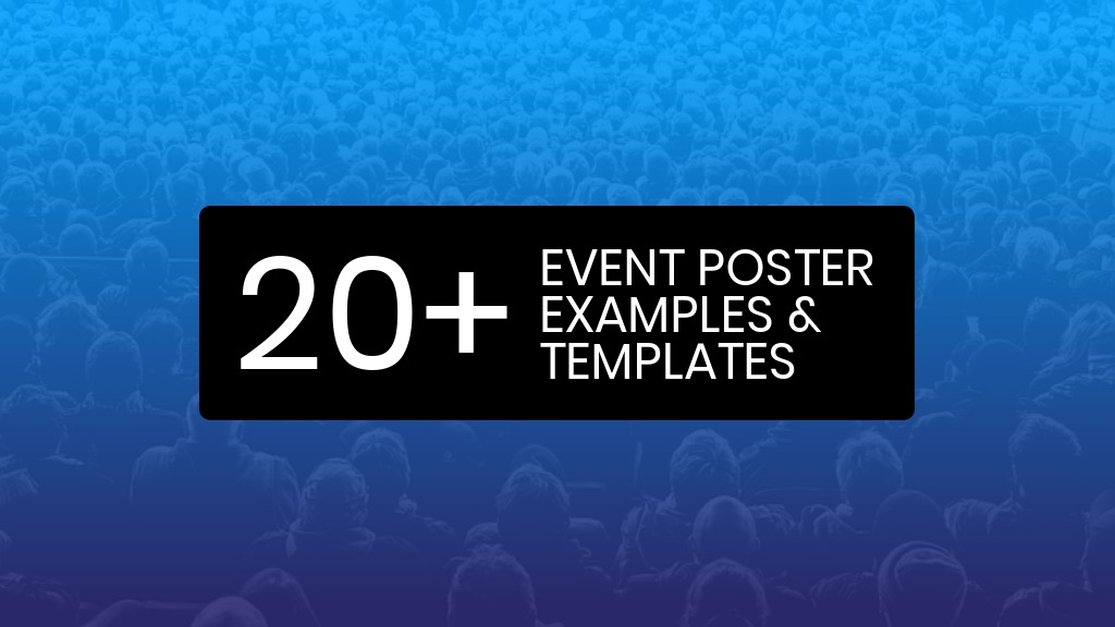
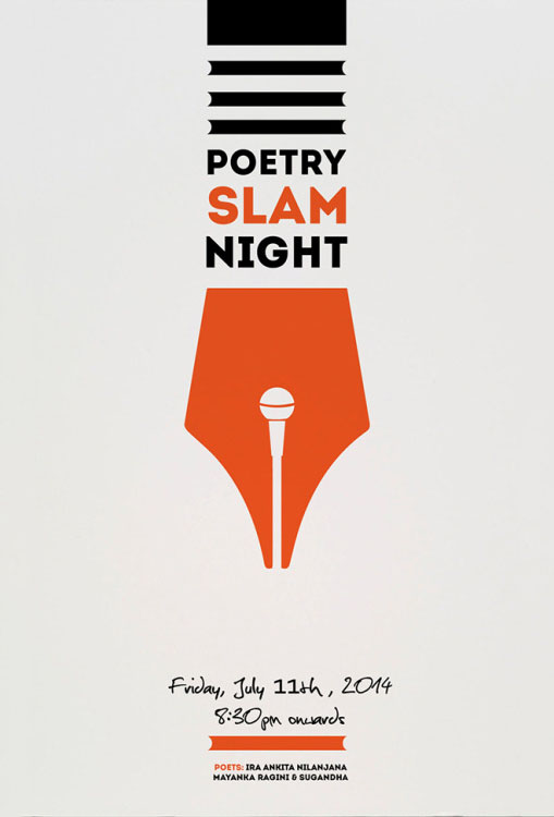
Embrace white space, like in the event poster template above. This example looks professional and clean, but also includes a lot of info.
Just remember, not all your event information needs to be included on the event poster. Some of the overflowing facts or info can be added to a website or social media page. Also, leveraging an event check-in app can significantly streamline the registration process, improve the attendee experience, and provide valuable data insights for future events.
Related: 12 Types of Posters for Every Business Need [Templates Included]
2. Use a color filter help text stand out from your poster background
If you want to use a poster background image with a lot going on, it can be difficult for text to stand out. That’s where a color filter can come in handy.
To use a color filter in Venngage, simply draw a colored square over the background image. Then, adjust the opacity of the square until you can see the image come through.
In this event poster template, a blue color filter helps the white text stand out from the background image. This is an easy way to integrate images seamlessly into your designs.
Just so you know, some of our poster templates are free to use and some require a small monthly fee. Sign up is always free, as is access to Venngage’s online drag-and-drop editor.
3. Use a simple and professional poster design to attract top talent
Depending on the type of event you’re promoting, you might not want to go for a crazy, out-there design. Sometimes, it’s better to settle on a modern and professional poster design.
Pick colors that have been shown to have wide appeal, like blue or green. Similarly, a modern sans-serif font is a safe bet for communicating a business-themed message. Be sure to include the event information and any requirements for attendees in big, clear text.
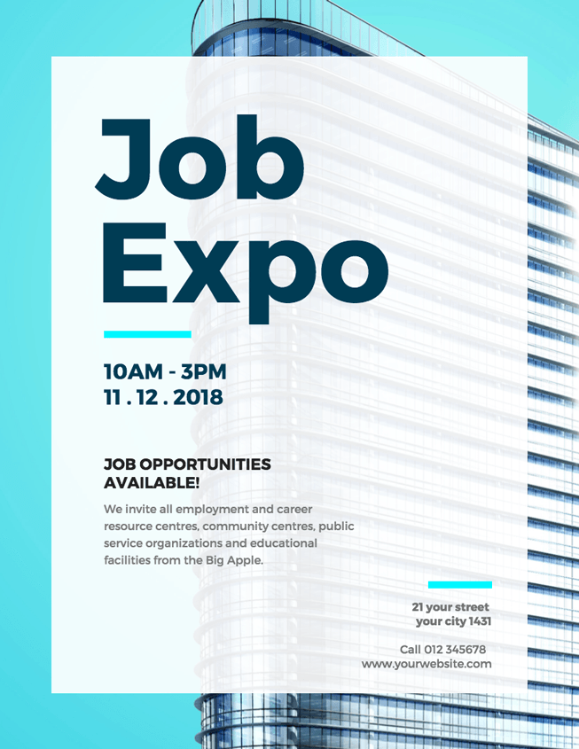
This job expo poster template uses a sleek blue and grey color scheme to reflect the professional theme of the event. Plus, the image of a building gives off a business background vibe.
4. Get people into the spirit of the season with seasonal poster templates
Seasonal events give people something to look forward to. Tap into your audience’s sense of nostalgia and anticipation for holidays with a seasonal event poster.
Use colors that are typically associated with the season: red and green for the winter holidays, orange and brown for the fall, pastels for the spring, bright yellows and blues for the summer. Seasonal photos and icons will also add to the festive feel of your poster.
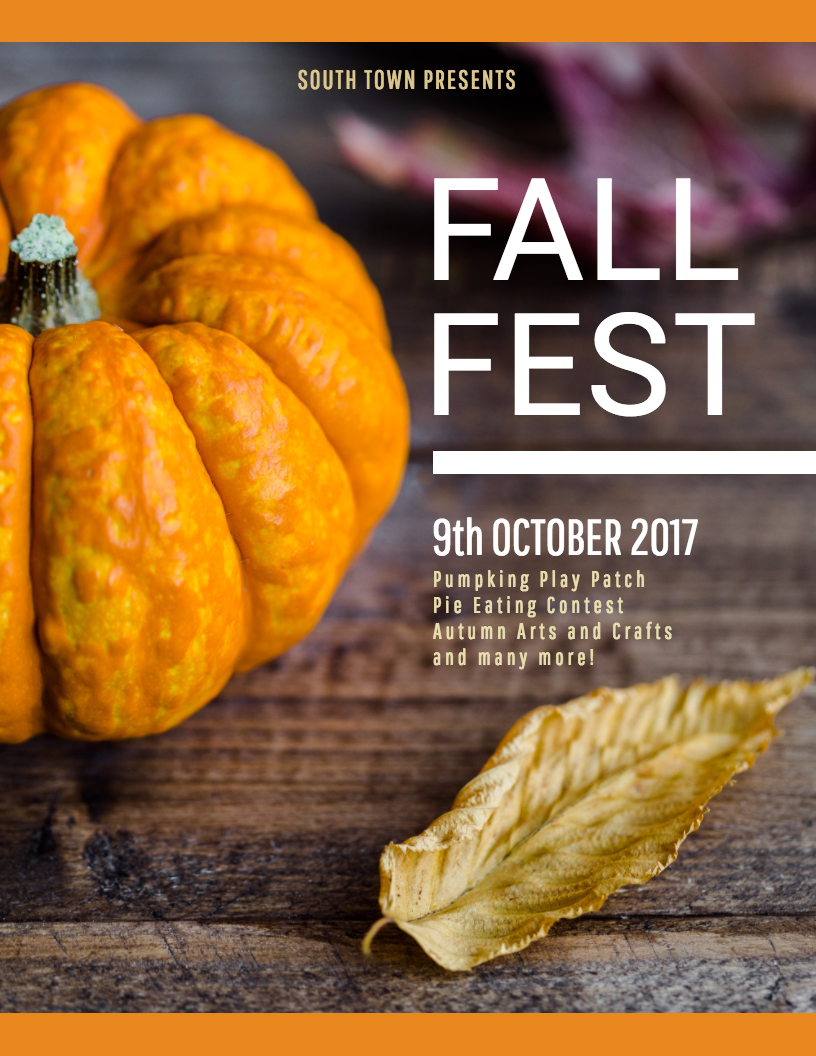
This event poster template will get people into the spirit of fall with its warm color scheme and classic fall imagery.
5. Capitalize on a holiday to draw attention to your sales event poster
If your poster is for an event that your audience already knows about, you can skip the explanation and go straight to the main attraction. For example, if you’re hosting a sales event for a specific holiday, make that holiday the first thing people will see when they look at your poster.
This Black Friday sales poster does just that. “Black Friday” is written in bold white text on a black background, with a lavish background design that inspires people to treat themselves.
6. Educate your audience about your event with an informative event poster
People might need to understand the benefit of your event before they become interested in it. That’s why it can be a good idea to offer some information about the activities your event will involve. You might want to do this for posters advertising fitness classes, professional training sessions, or a volunteer fundraiser, or online giving to churches, where highlighting how donations make a difference can inspire more participation and generosity.
Use icons and images to illustrate your information. Be sure to also include a website or address where people can go to get more information about the event.
This yoga class poster template uses a combination of icons and brief text to explain the benefits of the taking yoga.
Odds are, a lot (if not most) people are going to hear about your event online. Why not create a poster specifically for social media sharing? That way, you will be able to easily repurpose your poster across multiple channels.
Use the optimal dimensions for social media images so that your poster will look good in people’s newsfeeds. It’s good practice to use big, bold fonts and bright colors so that your poster will catch people’s eyes while their scrolling.
For example, this Pride Week poster template makes good use of Pride Week’s rainbow color scheme to create a bold, cheerful design.
8. Build anticipation for your event with a poster the only gives away the date
Building anticipation can be a very effective event marketing technique. If you don’t want to give away all the details of your event just yet, create a poster that offers only the bare minimum: the name of your event and the date. This way, your audience will know to keep an eye out for more information as you roll it out.
Make sure that your design is awesome, to compensate for the lack of information. Use visuals that hint at the theme or mood of your planned event, without giving specifics away.
This dazzling album release poster offers up only the title of the album and the release date.
9. Use a flat design to appeal to an innovative crowd with your event poster template
Flat design is a graphic design trend right now, influenced largely by Google’s Material Design. If you want to attract innovative, forward-thinking, people to your event, then appeal to their interests with your poster design.
Use a minimal design, with a bold color scheme and flat icons. Don’t be afraid to use contrasting colors that really pop out at you, like blue and orange, red and white, or purple and yellow.
This job fair poster template has a simple, blocky design. With a bright colors scheme of orange, blue and white, it’s sure to jump out from a screen or a bulletin board.
10. Use plenty of icons to give your event poster some creative flare
If you want to appeal to a lively and creative crowd, have some fun with your even poster design. Icons are a great way to add a splash of creativity to your poster.
Pick icons that reflect the theme of your event and play around with different sizes and scattered placements. Just be sure to use icons with a consistent style–equal line widths and similar coloring.
This arts and music event poster uses art-themed icons to give the header a fanciful look.
Looking for more ideas? This short video will introduce you to some essential poster design tips you should keep in mind:
11. Use a minimalist poster design to put the focus on your message
A lot of people lead busy lives. Present your event as a break from the chaos by using a calming, minimalist design. Put the focus on a catchy title or slogan that appeals to the emotions of your audience. This will help you present your event as an answer to a problem they’re facing.
Use plenty of whitespace so that the poster design doesn’t feel cluttered. Similarly, use a neutral color for your background and one or two bright accent colors to give your message impact.
This meditation event poster uses a color scheme of soft purples and grey to convey the calming effect of meditation.
12. Entice people with an inviting photo poster background image
Give people an idea of what they can expect at your event by using a striking photo in the background. Pick a photo that reflects your event branding and the theme of the event, or that depicts an activity that will take place.
To avoid your text being drowned out by the background image, use a color filter. This will give your text some much-needed pop without totally obscuring the beautiful background image.
Take this cooking workshop poster template, which uses an appetizing photo of food in the background. Foodies won’t be able to resist!
If you don’t have photos of your own, you can find high-quality stock photos on sites like Unsplash or Pexels.
13. Use a single bold font color to highlight important information
Catching the attention of a reader with a well-designed poster is really only half the battle. You also have to effectively impart the information contained in that poster.
Using a single bold font color for the most important details is a quick way to make sure it’s seen. Preferably, this color shouldn’t be used anywhere else on the poster, but that’s not a deal breaker.

As you can see in this impressive event poster example, a bold yellow is used for the title and date of the event. This approach helps the information jump off the page first, and help readers absorb it quickly.
It’s probably the first thing you saw on this poster, and then all the psychedelic imagery in the poster background.
14. Incorporate the theme of your event in your poster design
Struggling to come up with a design theme for your event poster? Start by thinking about what event you want to promote. Because your poster design should definitely fit the event.
Take a look at the event poster example above. The event is 90’s themed, and they absolutely nail it in the poster design. From the jeans jacket to the bolder-than-bold color palette, this looks like it came straight from a 90’s flashback.

This will catch the eye of people obsessed with that particular decade…and will help to get them pumped about the event.
15. Create several versions of your poster design

They say beauty is in the eye of the beholder…which also applies to poster design. You probably could ask a group of 25 what the most interesting poster was in this article and get 25 different responses.
That’s why it can be a good idea to design a few variations of your event poster. As you can see in the collection event posters below, the same information is presented in five distinct designs.
But designing variations of your poster can be as simple as swapping the poster background image for a different one.
16. Use a simple color palette
Often, a simple color palette is better than a complicated one. Too many colors can contribute to a cluttered design. Meanwhile, a simple palette with a few pop of color can make for a striking design.
Pick two contrasting colors, like white and yellow in this poster example:

17. Try using unconventional page dimensions
If you really want to help your poster stand out from the crowd, follow this example. The designer of this event poster clearly wanted their design to make an impression. Instead of using a standard letter size page, they opted for tall, thin page dimensions.

But you don’t have to go to this extreme to be unique. You could simply try using a horizontal or square poster layout for your event.
18. Let the background image guide your poster layout
On the surface, this is a rather simple poster: a background image with some simple text. But all the design elements come together nicely. Because the poster background image uses two contrasting colors and has an interesting horizontal split, most of the design work is already done for you.
This is a great example of how creating an eye-catching poster starts with picking a striking background image.
19. Repurpose your event poster into other marketing graphics
Once you’ve created a beautiful poster, don’t just leave it there. Why not repurpose your design into more marketing collateral like social media graphics, banners, and cards?
If you start with a event poster template, then repurposing your design is easy. Copy the portions of your poster that you want to include in your new design. Then, adjust the page dimensions to fit the type of graphic you’re creating.
Here’s an example of how one poster we repurposed into different formats:

20. Mix a bold font with bright colors
Bold fonts and bright colors are one of this year’s biggest graphic design trends. There’s a reason for that–they’re exciting and really make your designs pop!

In this poster example, the designers use a bright color palette to draw attention to the event information. Combined with a big, bold font, it’s hard to ignore this poster.
21. Organize your event poster design into blocks
Seeing as this is a music festival poster, there are a LOT of different band names packed into one poster. How have they managed to make it work? By using a block layout to organize the information.
When you look closely at this poster, you can make out a grid:

While there’s no doubt that this is a busy poster design, there is a method to the madness. If you find yourself in a similar predicament of needing to pack a lot of information into one poster, start by drawing out a grid.
22. Create simplified illustrations for your poster design
Posters are often seen at a glance and from a distance. Because of that, it’s often a good idea to go with a simplified design.
Simple shapes and block colors will stand out from most backgrounds. Pair simple illustrations with big, bold font and you’ve got an eye-catching poster.

Want more examples of simplified poster designs? We redesigned five popular romantic movie posters.
Alternatively, you can check out more event poster templates on Venngage, our poster maker, or some of these other poster guides to learn more about making your own posters:


