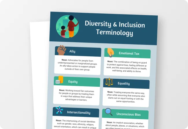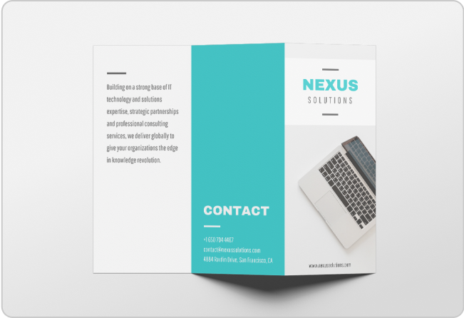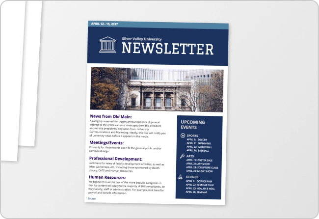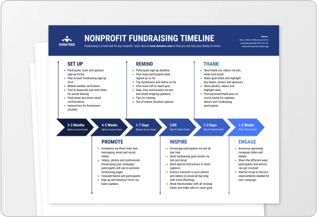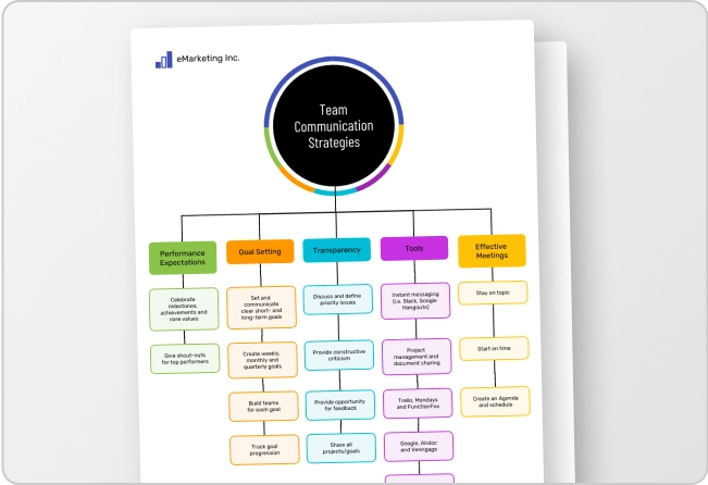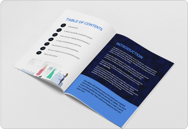
Backgrounds are the foundation for creating an engaging presentation.
A great background can elevate your visual content and help it reach millions of people. But a bad background will make the whole project fall apart.
This is especially true when it comes to presentation backgrounds.
Most of the time, the reader is only going to see the background image once. But with presentations, it’s a whole different story.
Depending on how long your presentation is, that background could be seen 25, 50 or even 100 times!
In fact, according to a recent presentation design statistics study we did, the majority of keynote speakers said their biggest challenge was formatting their slides to keep readers engaged.
So you need to pick something that won’t distract or bore your audience.
Sometimes that’s a very tricky line to walk, but fear not–I have a ton of experience picking the perfect presentation background!
I’ve rounded up 15 great presentation templates to help you pick the ideal background for your presentation. Keep reading to learn how you can pick the perfect background and ace your next presentation!
1. Open Computer Screen Presentation Background
I’m a huge fan of using mockups in my content and design work.
These mockups are extremely useful because you can instantly place the reader in your shoes. Readers will see a computer screen, flyer or another object like it’s sitting right in front of them.
This presentation background example is a simple mockup that almost anyone can use. It would work perfectly as a business background for many purposes beyond presentations too. Check out how the designer used it in the title slide below:

With an image frame, you can make the computer screen show whatever you want, even the background image:
Learn how to customize this presentation template:
Creating an effective business presentation involves careful planning, organization and effective communication. Save yourself the time and hassle by customizing one of our professionally designed business presentation templates.
2. Zen Garden Presentation Background Image

Plants have been very popular for the past couple of years. If you have ever been in a new trendy restaurant, you definitely know what I’m talking about.
This simple background has the same feel as one of those hip establishments.
This background also embodies the colorful minimalism trend that is blowing up this year. In this case, a simple colorful subject dominates the graphic, but it still feels very light and airy.
And best of all, you can easily use a few different plant background images throughout the presentation. Take a look at how the designer used similar images to create a consistent design:

3. Simple Dot Pattern Background Image
Sometimes you want a presentation background that gives your slides a little bit of texture, without being distracting. I believe that this presentation background embodies that idea pretty well.
It is just interesting enough to catch your eye, but not pull your attention away from what the presenter is talking about.
As you can see in the presentation example below, each slide feels like it has real depth as well. Almost like the icons and information are jumping off the page:

4. Crumpled Paper Presentation Background Image
Realistic flat images always make superb background images, in my opinion. I like to use them when I want to create a minimalist graphic or add something extra to a slide.
The flat textures and patterns on this simple background are extremely flexible as well!
Like a blank canvas, you can create almost any kind of presentation on top of this background image. It can be used to improve an art lecture, a business meeting or a recycling presentation:

With a simple color filter you can make the background image match your company branding as well:
Check out our presentation design guide. It includes a ton more presentation design hacks like this one.
5. Colorful Circles Presentation Background Image
Looking for a way to add a little color to your presentation? This background may be perfect for you!
It has a ton of white space for you to add content or headers to the slide. And the colorful circles make the presentation seem fun and light.
I would recommend using this background for a presentation that you want to keep casual and fun.
For example, the designers used this background as a title and conclusion slide for a social media presentation:

Remember to pick a color palette that reflects the mood of your presentation.
6. Bold Red Arrow Presentation Background
I would recommend finding a background before you start designing your presentation. This way you can create the slides around the background image.
With the right background image, you can give your slides structure and direction. Or at least improve the layout of your presentation.
Check out how the designers used this background image to improve the slides. The arrow of the background image perfectly fits the topic of the presentation.

And because it’s used on the title slide, it will put the audience in the right headspace from the beginning.
7. Split Slide Presentation Background Example
This example is one presentation background that everyone has probably used a few times. I wouldn’t be surprised if it was part of the first presentation software ever.
It may be extremely simple, but it’s just as effective all these years later. That’s because you can use this on any presentation topic or in any industry. Get your message across in a simple but powerful way with these simple presentations templates.
This ease of use and flexibility will help you create a killer presentation in no time. Take a look at how it was used throughout the slides below:
8. Subtle White Grid Presentation Background
Like the white paper example above, this image will give your presentation background a lot of subtle depth. It’s engaging enough to grab someone’s attention, but not enough to distract from the written content.
I really like how the texture differs from one square to the next. It makes the whole image a lot more interesting to the eye.
Plus the white color palette will make it easy to place text, graphs or charts directly on top of it. This will ensure that your presentation isn’t cluttered or messy. Take a look at how it’s used in the presentation example below:
9. Purple Gradient Presentation Background Image

If you haven’t heard, gradients are super popular and will be for the next few years. No, we haven’t gone back in time to the 1990’s — gradients are really back.
Gradients make great background images because they are unique and futuristic. If you want to stand out from the crowd, this background is perfect! Plus these color transitions look spectacular on HD screens and social media.
As you can see below, the white text and icons really jump off the page when placed on top of a gradient:

And you can make a gradient out of literally any combination of colors that you want:

10. Flat Typographic Background Image

Typography is a key part of effective design.
I really like this background image because it will add a lot of character to a slide or presentation. The subtle shadows and highlights actually make this black and white photo seem colorful as well.
A background image like this is very versatile because you can use a few different color palettes with it. Not many colors are going to clash with that monochrome photo.
And if you use a vivid color palette, which is very trendy this year, the colors will very eye-catching. Take a look at how great the different palettes look below:
11. Checkerboard Texture Presentation Background
If you are tired of using a flat background image, but not ready for something too flashy, this background texture is perfect for you!
As you can see, it uses the classic checkerboard pattern to break up the background layer. However, because the pattern is also flat, it won’t distract from your presentation content.
I would recommend using this pattern to add a clear visual break between sections, kinda like they did in the slides below:

Presentation slides play a crucial role in creating an engaging presentation. Browse our selection of engaging presentation templates to enhance your message and make it easier for your audience to understand and remember key points.
12. Geometric Pattern Presentation Background Image
This is one of the most interesting background images in the entire roundup, in my opinion. The bold colors and creative patterns will make the whole presentation feel extra exciting.
Another great feature of this background is that it can be used with a ton of different palettes. Go ahead, pick a color from the geometric pattern, and then use it throughout your slides.

13. Flat Creative Presentation Background Image Example

Set the tone for your creative presentation from the start with this trendy background image. If you weren’t aware, succulents and plants are very trendy this year in creative circles.
The open section at the top of this background is the perfect spot to add a header or title as well. Check out how they used it in the title slide below:
Plus the bold colors of this image help you pick the color palettes of the other slides:

For more captivating presentation ideas, check out our selection of creative presentation templates.
14. Arrows Everywhere Subtle Background Texture
A simple background like this can add some serious depth to your presentation. Or blog post.
With a myriad of textures, directions and sizes, the triangles will effortlessly draw the eye. I would recommend using this background in a tech and marketing presentation.
Also, you should try to stick to a geometric or minimalist theme for your slide. In the example below, they choose to use other simple shapes and it blends together extremely well:
15. City Skyline Background Image Example
Finding a subtle background image is hard, especially if you want to use a stock photo. A lot of the time they divert attention from the content on the screen.
Or, even worse, they don’t match your presentation’s color palette and theme. This city background is ideal because it has such a neutral color palette. Take a look at how well it matches the other slides below:

You can also use a color filter to make it a little less distracting and match your presentation theme:
City landscapes can be versatile and work well with a variety of presentation topics, especially with business presentations. Have a presentation coming up? Check out our gallery of pitch deck templates to deliver the perfect presentation.
Create an engaging presentation
Now that you made it to the end of our presentation background roundup, I would recommend checking out our collection of simple backgrounds:
35+ Simple Background Images, Templates & Design Tips
And if you want to learn more about using stock photos, read this first:


