


Infographics can feature a variety of visual elements, including illustrations, data visualizations, photos and especially maps. If location is important to your data story, maps are essential. They can show business locations, sales trends, remote work sites, survey results or demographics.
Creating accurate maps often requires complex tools and specialized knowledge. However, if you just want to create and share map infographic visuals, you can start easily with Venngage’s Infographic Maker. No need for new software, clunky tables, or design expertise. Quickly create informative maps online with Venngage’s gallery of infographic templates.
Want to learn more about other types of infographics? Read our blog on the 9 main types of infographics or watch the video below:
Click to jump ahead:
- What is a map infographic?
- How to make a map infographic
- 3 things to know before starting
- Checklist for designing maps for infographics
- Pulling it together: infographics with maps
What is a map infographic?
A map infographic is a visual representation that combines maps with various data points, illustrations, and text to convey information in a clear and engaging manner.
These infographics use maps as the central element to display geographic-related data, making it easier to understand spatial relationships, trends, and patterns.
How to make a map infographic
Creating a map infographic is an effective way to visually communicate geographic data and insights. Here are seven steps to guide you through the process:
1. Define Your Purpose and Audience: Determine the main message of your map infographic and identify who will be viewing it to ensure the information is relevant and engaging.
2. Collect Your Data: Gather accurate and up-to-date geographic data that aligns with your infographic’s purpose.
3. Choose a Map Type: Select the appropriate type of map, such as a heat map, choropleth map, or pin map, based on the data and story you want to tell.
4. Select a Design Tool: Use a design tool like Venngage’s Map Maker that fits your needs for creating map infographics.
5. Design Your Map: Import the base map and add your geographic data points, regions, or markers to visually represent the information.
6. Enhance with Visual Elements: Add supporting graphics like icons, illustrations, and charts, and use color coding to differentiate data categories or intensities.
7. Review and Finalize: Double-check your data for accuracy, ensure the design is clean and readable, and then export and share your finished map infographic.
3 things to know before you start with map infographics
Maps are great ways to tell place-based stories, especially if they are data stories, but they are special for other reasons too.
1. Maps are two-dimensional representations of our three-dimensional Earth
It helps to keep this in mind because as the 3D is translated into a 2D surface, it’s almost impossible to avoid distortions of some kind. These distortions can influence perception.
This is why Greenland often looks similar to the size of South America, and Alaska dwarfs Mexico, which is not the least bit accurate. (This typical depiction is known as a Mercator projection.)

Even if you don’t plan to become a professional cartographer (map maker), it’s necessary to know about this distortion as a visual communicator. The aforementioned depiction, even if inadvertently, minimizes the southern hemisphere, and that is critical to keep in mind if Africa and South America are important places for your story or your audience.
2. Maps can show places at a variety of scales
You can visualize the entire globe, or a county, a state, even a neighborhood.
When you are creating a map, you’ll need to consider which is most meaningful for your story. This example shows locations spread across a region and identifies the specific address for each location.
With Venngage’s Map Maker, you can create a map of the world, a continent, a country, as well as Canadian provinces or territories or a U.S. state. For the latter, you can map data down to the county level, and you can even automatically add labels for each (so you don’t have to manually do so one-by-one).
3. Maps are abstractions of the real-world
As representations, maps show an area in a fairly general way. Since we want them to also appear to be accurate, especially if we’re using them to communicate about data, we need to make sure we aren’t using them to mislead people, even if accidentally.
Be mindful of basic map conventions such as:
- In the northern hemisphere, it’s assumed that when you are looking at a map, northern locations will be near the top and more southern ones will be near the bottom (also eastern will be toward the right and western toward the left).
- Lines that cross through areas are generally assumed to be borders of some kind.
- Data should be visualized in a way that helps readers interpret it easily (keep reading for more tips on how to do this well).

You can learn more about how to make sure you aren’t misleading your audience in 5 Ways Writers Use Misleading Graphs to Manipulate You and The Worst infographics of 2020 (+ Lessons for 2021).
Checklist for designing maps for infographics
Now you’re ready to get going with creating maps to include in your infographic. Here’s a checklist of the five things to do.
1. Consider your data
Do you have information already on hand, such as spreadsheets, survey data, or a list of locations? Make sure you have permission to share the data. You may need to aggregate, or summarize, the data by county, state, etc. This not only helps you prepare for visualization, but it also helps ensure that individual privacy is protected.
You might also want to consider using public data related to an area of interest, such as demographics, prices, health, etc. Some good data sources include The World Bank, U.S. Census Bureau, and Data.gov. If you are new to using geospatial data, you’ll want to download a CSV or XLS file and then open that file using Excel, Google Sheets, or another spreadsheet program to view the data by country, state, county, etc.
Once you’ve got your data, ask yourself if it needs to be normalized, for example to show rates per population. It’s less meaningful to know the number of car accidents in towns in your state, and more meaningful to know if some towns have a surprisingly high number of accidents given the size of the population.
One last thing to consider: Many data-based maps are choropleth maps, which means areas on the map are colored based on statistical data associated with that area. For these maps, the data has to be classified or grouped into data ranges or classes. How data is grouped changes the look of the map, and therefore how readers will interpret the data. Here are some good rules of thumb (if you want more depth, this article from Esri offers great examples):
- Don’t create more than five groupings or classes. Having more groups can make the map more accurate, but it can also make it harder to read.
- If you have data that is spread fairly evenly across an entire range, you can use classes based on equal intervals, for example 0-10, 10-20, and 20-30.
- If you have data that is not evenly spread, consider using natural breaks by looking at where there are obvious clusters and gaps within the data range.
Here is an example of a choropleth map that breaks data into equal intervals. It works well because the visualization enforces the main message, which is that the U.S. spends a lot more than other countries on healthcare.
2. Decide what you will symbolize
No, I don’t mean what icons you might use, not exactly. In cartography, symbology refers to:
- Locations like cities or houses you symbolize with points
- Geographic features like borders or rivers you symbolize with lines
- Regions of land or water that you symbolize with areas
Related: 12 Geographic Infographic Templates and Design Tips
Here is an example of a map that shows continents through the white areas, countries through the blue borders between them, and cities through numbered points.

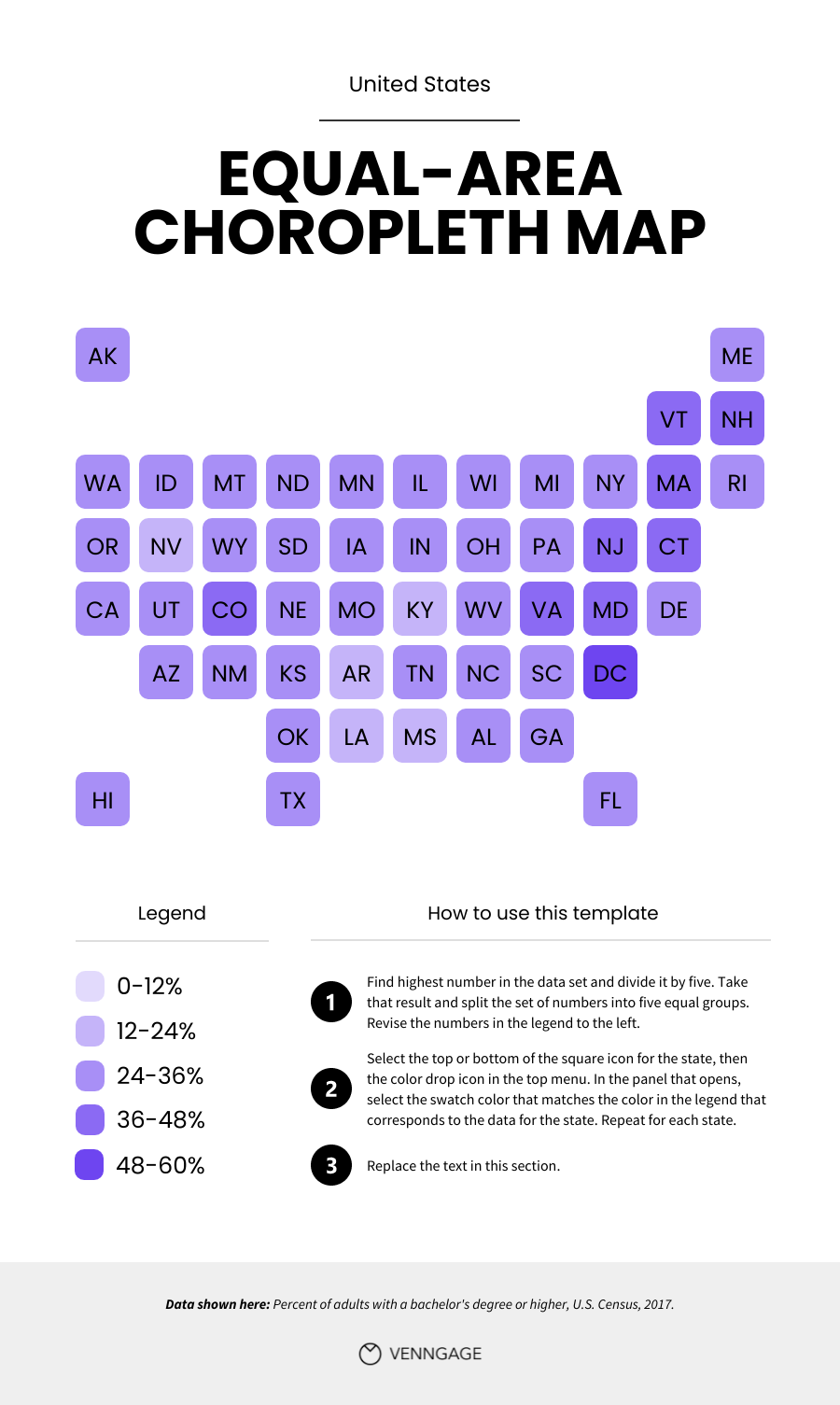
Remember how area can get distorted on a map? Area can also distort how a reader views a map: People may inadvertently misinterpret data based on the size of the area, meaning countries or states with more geographic area are naturally emphasized. Some good alternatives include point-based maps (like this example featured in Popular Science), or equal-area choropleth maps like this one.
3. Use color to clarify
Once again, maps are special. Often in design we think about color palettes based on things like trends, branding, emotional states, etc. When it comes to maps, color is a vital communication device that requires a different kind of thinking.
The first thing to keep in mind is basic map conventions:
- Blue is used almost exclusively to show waterways and water bodies.
- Green and/or brown are often used to show land masses.
- Red and blue are often used in political contexts, to indicate Republican and Democrat respectively.
- Culture matters! For example, First Nation or Native communities may prefer certain colors that have specific meanings to them, whereas other cultures may interpret the same colors in other ways (here is one resource to explore).
If you are visualizing data, you will also need to think about how to help people easily interpret the data by using appropriate colors.
- If you want to help readers easily focus on the places with the highest values, use white for the lowest values and a darker shade of a color for the highest values.
- If you want readers to distinguish between the places with the highest values and the places with the lowest values, try using a lighter yellow for the lowest values and a darker green or blue for the highest values.
- If you are using data that is not quantitative, for example sorting places into different categories, use distinctly different colors in the palette, like purple, orange, and green.
Here is an example of a map that uses a lighter yellow to show low values and blue to show higher values. This allows the reader to more easily identify the counties in California where there have been significant population losses and the ones where there has been significant population growth.

You will also want to consider colors that are appropriate for color blindness, which is more common than you might think. A good place to start with that is to not use red and green together.
4. Label the places that matter
As you start to label countries, states, cities, etc., keep in mind that you will want to minimize clutter in your map so it’s easy for people to read quickly. Instead of labeling every road, river, and tree, focus on labeling the places that matter most. You can label with locations, like the county labels in the map just above, and/or you can label the data (see the map in the next section below).
You can add these labels in one of these ways:
- Add the label directly on top of or just next to the location (see the Equal-Area Map above)
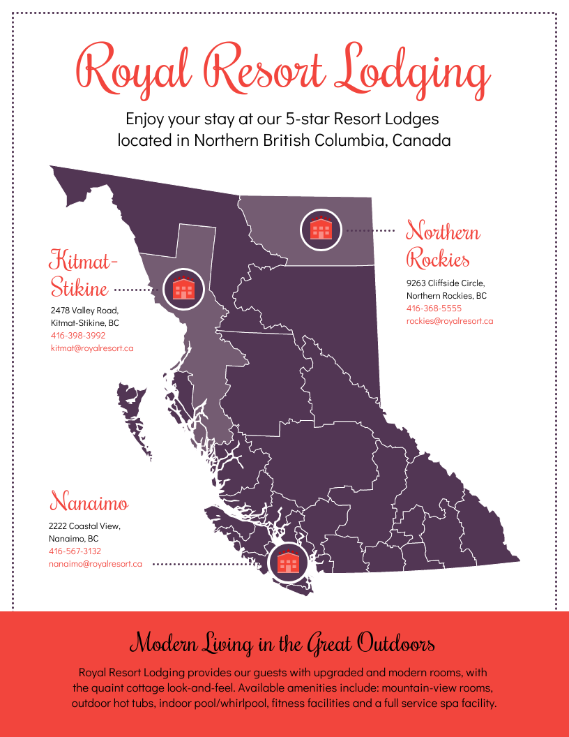
- Add the label off to the side of the map, with a line or arrow pointing to the location (see the Royal Resort Lodging map above)
- Indicate places with numbers or icons that are described further in a separate legend or in the text (see example just below)

This example also demonstrates a good practice: Put the name of the key place in the title of the map and/or the title of the infographic.
The icons used also draw more visual attention to the places, so you might consider this approach if it doesn’t clutter the map infographic. Venngage’s Map Maker has an in-editor library of thousands of free icons you can include.
5. Don’t forget the details
At last, you are ready for some finishing touches. Here are some details you will likely want to include somewhere near the map:
- A legend that helps readers understand what the icons, colors, etc. used in the map mean
- Name of, and perhaps a URL for, the data source(s)
- If you are showing details at the city, zip code, or neighborhood scale, you may want to include a scale bar that helps people understand how many miles or kilometers are between points on the map
The most important thing, with all of the items on this checklist, is to make sure your reader can easily understand the message your map is communicating. In this map, the legend shows that colors correspond to gas prices in the U.S., but the labels on the map really help the reader identify the values for each state.

Pulling it together: infographics with maps
Often a map is just one part of an infographic, which may also include elements like other data visualizations, illustrations, icons, narrative text, etc. You will want to make sure your map is well integrated with the entire story you are telling.
Again, try not to overwhelm your reader with too many visuals or too much text, and help them read the infographic easily by emphasizing important elements like titles and key data points through size or color. If you need some help with this, you can start with one of Venngage’s pre-made map templates, created by our in-house designers, and make edits so the content best fits your topic.
Here are some examples. This first one uses a map to orient the reader to a place that is central to the topic. There are no geographic or political features of note, but the use of blue in the background effectively highlights that Iceland is an island. Icons are used to call attention to the textual elements, which are spaced around but do not crowd the map.

Here is another example of a map that does not include data, but instead is included to help people locate key places, in this case states in the U.S. Information about these states is listed beneath the more-prominent map, with icons that relate to the content. Icons are also used in the map, along with labels, to draw attention to the key states.

In this next example, the large map of Japan helps the reader connect to the country that the data was sourced from. While data is not included in the map, it is included in the infographic, and some is visualized in a timeline and in a pie chart.

This last example includes a data-based map, as well as pie charts, icon charts, and a line chart. While the other visuals help the reader understand overall trends, the map helps them recognize trends based on geography or location.

You can explore more map infographic templates in this blog and on our templates page.
In summary: Map infographic is a powerful tool to tell data story
Now that you see how versatile and impactful maps can be, I’m sure you will agree that it’s well worth it to take some time to think through making them as clear and compelling as they can be.
Remember, if place matters, so does a map. With this guide, you are now ready to begin creating and sharing map infographics! You can start creating your map infographic for free using Venngage’s easy-to-edit templates and intuitive Map Maker.


