
California Population Decline Map Chart Template
Customize this California Population Decline Map Chart Template today!

 100% customizable templates
 Millions of photos, icons, charts and graphics
 AI-powered editing features
 Effortlessly share, download, embed and publish
 Easily generate QR codes for your designs
- Design stylemodern
- Colorslight
- SizeLetter (11 x 8.5 in)
- File typePNG, PDF, PowerPoint
- Planfree
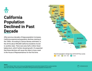
The population decline map chart shows the percentage change in population by county. Some of the primary reasons for the significant decrease in California include an aging population, lower fertility rates, and domestic migration to other states. While it is evident that there has been a drop in total population, the rate at which it is decreasing has been slowing. The population decline map chart is based on the latest data from the Census Bureau's American Community Survey. Data collection for the survey began in 2005 and it had a sample size of about three million addresses. The population decline map chart is part of a collection of maps and charts and other tools and data sets to help users visualize, analyze, and understand their data in novel ways. Create a stunning Population Decline Map Chart with the Venngage California Population Decline Map Chart template. To modify this Map Chart, you don't need any design talents or download any design tools. To begin, click the ""Create"" button to generate your own California Population Decline Map Chart. To begin, add your content. You
Related Chart Templates
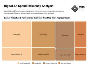
tree map charts
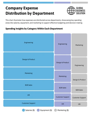
tree map charts
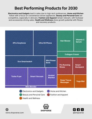
tree map charts
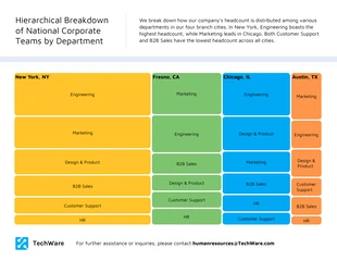
tree map charts
tree map charts
tree map charts
tree map charts

tree map charts
tree map charts
tree map charts
tree map charts