
Health Care Spending in US Map Chart Template
Create This Map Chart Template With Venngage Map Maker!

 100% customizable templates
 Millions of photos, icons, charts and graphics
 AI-powered editing features
 Effortlessly share, download, embed and publish
 Easily generate QR codes for your designs
- Design stylemodern
- Colorslight
- SizeLetter (11 x 8.5 in)
- File typePNG, PDF, PowerPoint
- Planbusiness
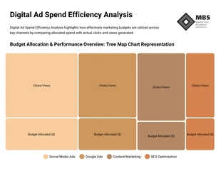
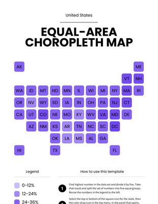
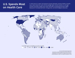
This United States health care spending map chart template is the perfect template to visualize how much money each state spends on health. The template shows that the Northern region of the United States spends more on health than any other region or area in general. This template is the perfect choice for anyone who wants to track down how much money each state spends on health. The template can be easily edited and changed depending on your needs. With this template you will get very accurate results, since it's based in data collected by official agencies like census.gov. The template can also be used to visualize the average United States health care spending per person. Since a United States health care spending map chart is basically a visual representation of data, you don't need to be a professional artist or designer to make an effective one. In fact, most of the templates on our site are very simple and easy to edit. Design a professional United States health care spending map chart using Venngage’s United States health care spending
Related Chart Templates
tree map charts
line charts
histogram charts
histogram charts
tree map charts
tree map charts
map charts
tree map charts
tree map charts
tree map charts