


Every designer wants to create a beautiful infographic that will inform, inspire and, most importantly, stick with their audience. But getting to that point is easier said than done, and even experienced designers sometimes get stuck trying to choose an infographic layout.
In this post, we’ll explore what you need to know about infographic layout design so you can pick the perfect layout for your topic.
If you’re new to design, we’ll also give you some template options so you don’t have to start from scratch. These templates are all easy to edit in Venngage’s Infographic Maker so you can start creating your own infographic today.
Click to jump ahead:
- What is an infographic layout?
- Stacked infographic layout
- Comparison infographic layout
- Chronological infographic layout
- Infographic layout FAQ
New to infographics? This easy-to-follow video dives into the nine types of infographics.
What is an infographic layout?
An infographic layout refers to the way visual elements and other content are arranged in an infographic. It’s an important element of the perfect infographic.
Depending on what story you want to tell, what visuals you want to include or how many subtopics you want to have in your infographic, you can choose from one of these:
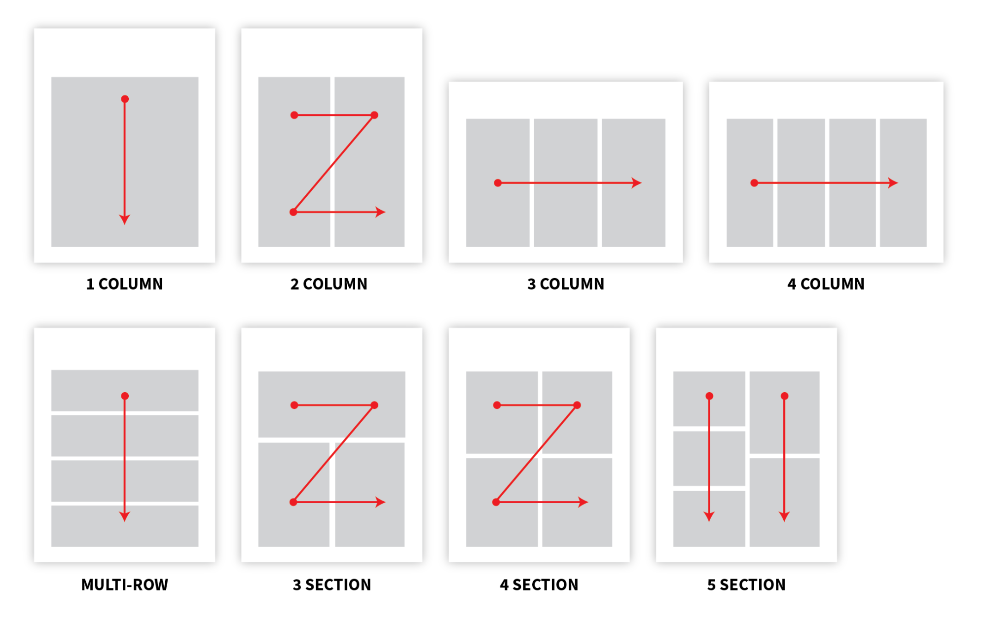
However, it can be hard to remember all of these layout designs without knowing the exact use cases for each of them.
To make it easier for you, we’ve categorized infographics into three basic layouts. These are stacked, comparison and chronological.
Stacked infographic layout
When you’re asked to conjure the image of an infographic in your mind, you’ll probably picture a stacked layout. In this type of infographic, sections are stacked one on top of the next all the way down the page.
Sometimes, section headings are included, but that’s not always the case. One reason stacked layouts are the most common variety of infographic layouts is due to their versatility. Stacked infographics allow for many types of infographic stories to be told.
Related: The Ultimate Infographic Design Guide: 13 Tricks For Better Designs
If you’re ever lost for what type of layout is best for your infographic, it’s tough to go wrong with a stacked layout.

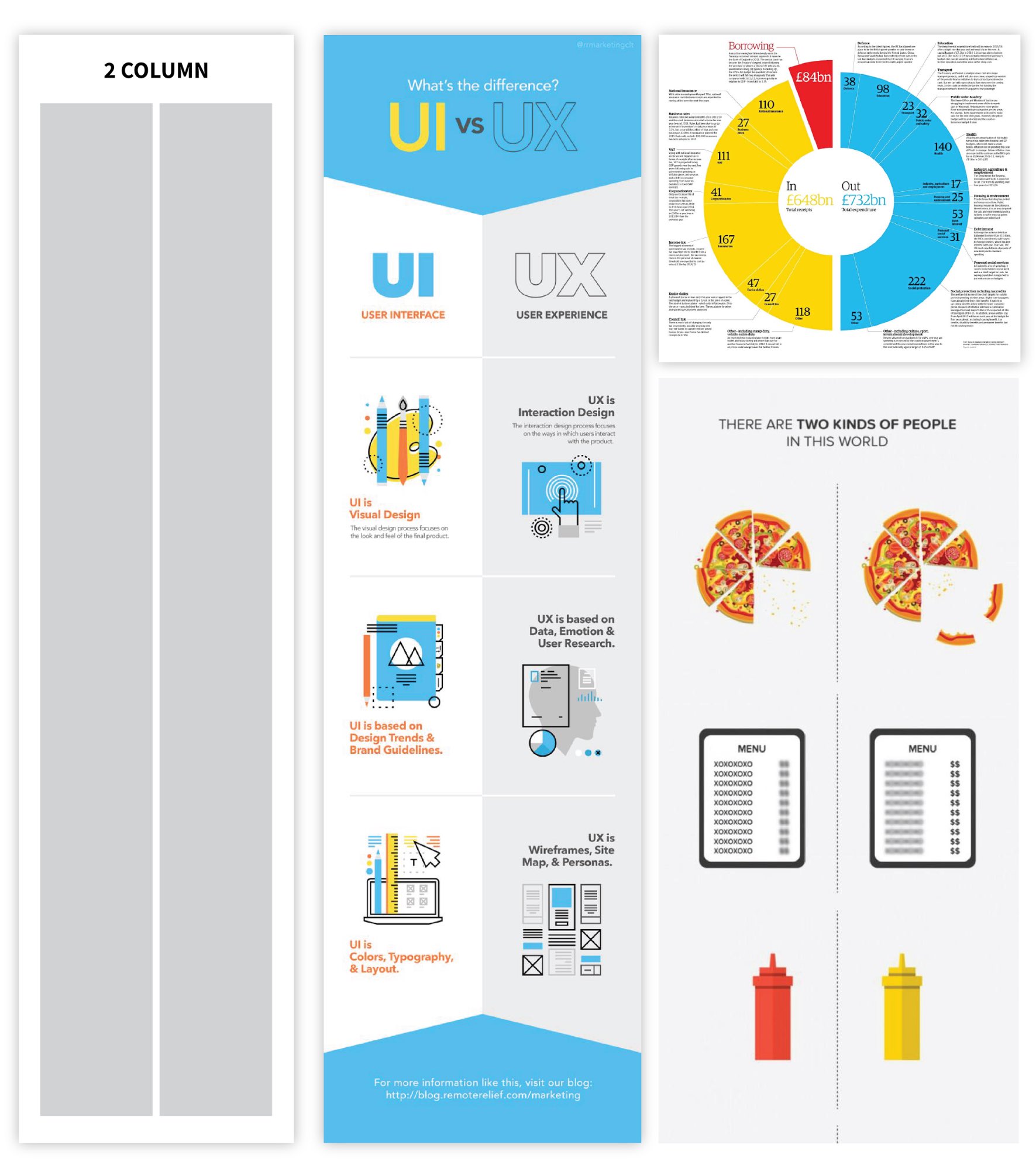
Statistical infographics are ideal candidates for stacked layouts. With statistical infographics, you’ll have a variety of data types you can visualize, and you may employ the help of graphs and charts to do that.
By using a stacked layout, you can weave the data into a cohesive narrative. In the example above, many types of data come together, with some visualized in charts and graphs, and the reader’s eye flows logically down the page.
Note that this option doesn’t have section headings but relies on changes in background colors to provide a subtle visual cue that groups similar information.

It’s not always necessary for the information in stacked infographic layouts to run the width of the page. In this example that details demographic data for CEOs vs. employees, the eye travels down the page, bouncing across subsections.
Because English speakers read from left to right, the eye naturally flows in that direction, but if someone’s eye landed on, say, the “Ages” section before “Location,” it wouldn’t negatively impact their understanding of the content.

In this statistical stacked layout that covers financial trends, large section headers establish the topics covered in each section, while the colors provide visual interest and help group information together.
Stacked layouts aren’t just for statistical infographics. They can be used for informational and list infographics as well.
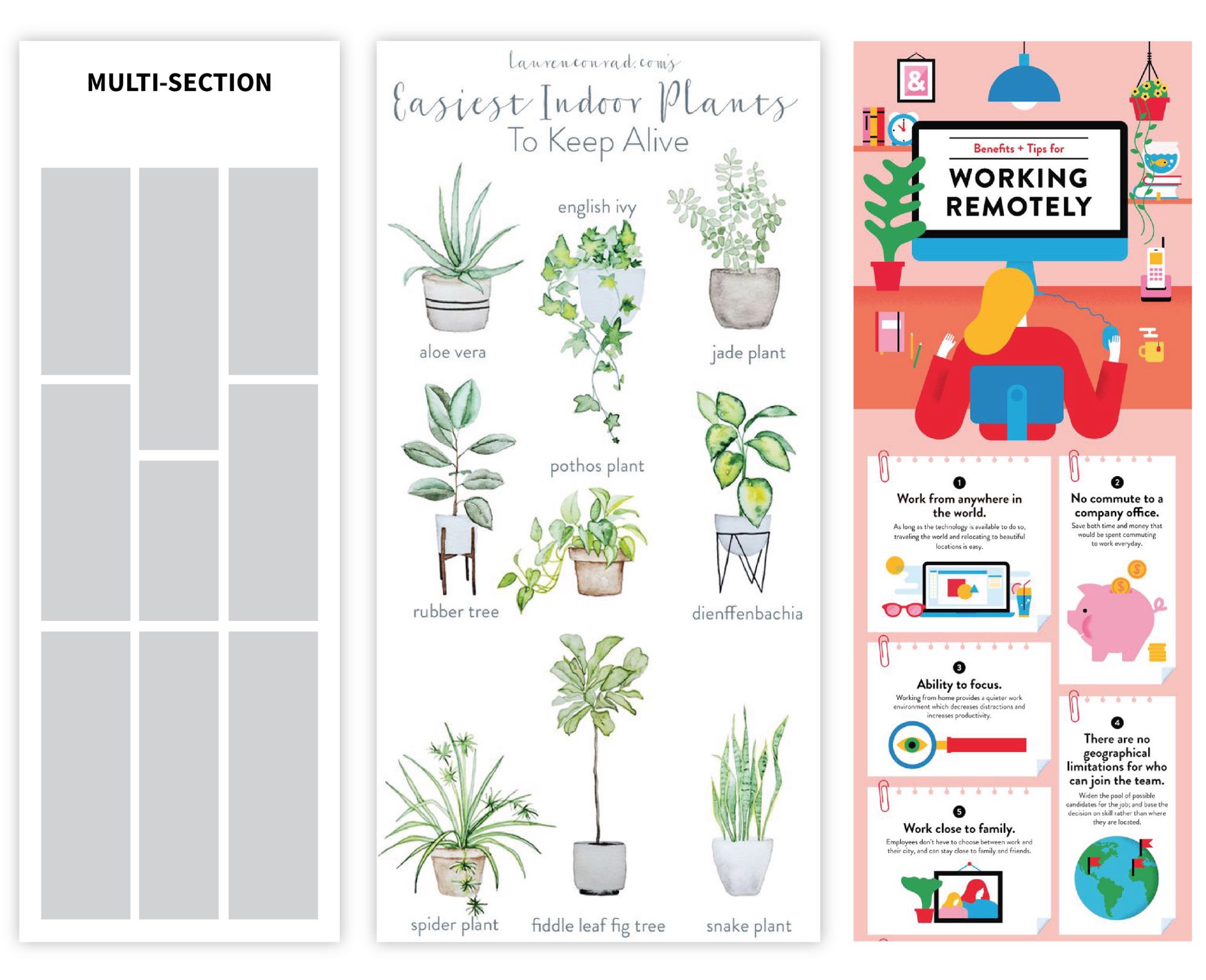
Here’s an example of stacked infographic layouts that have multiple sections.
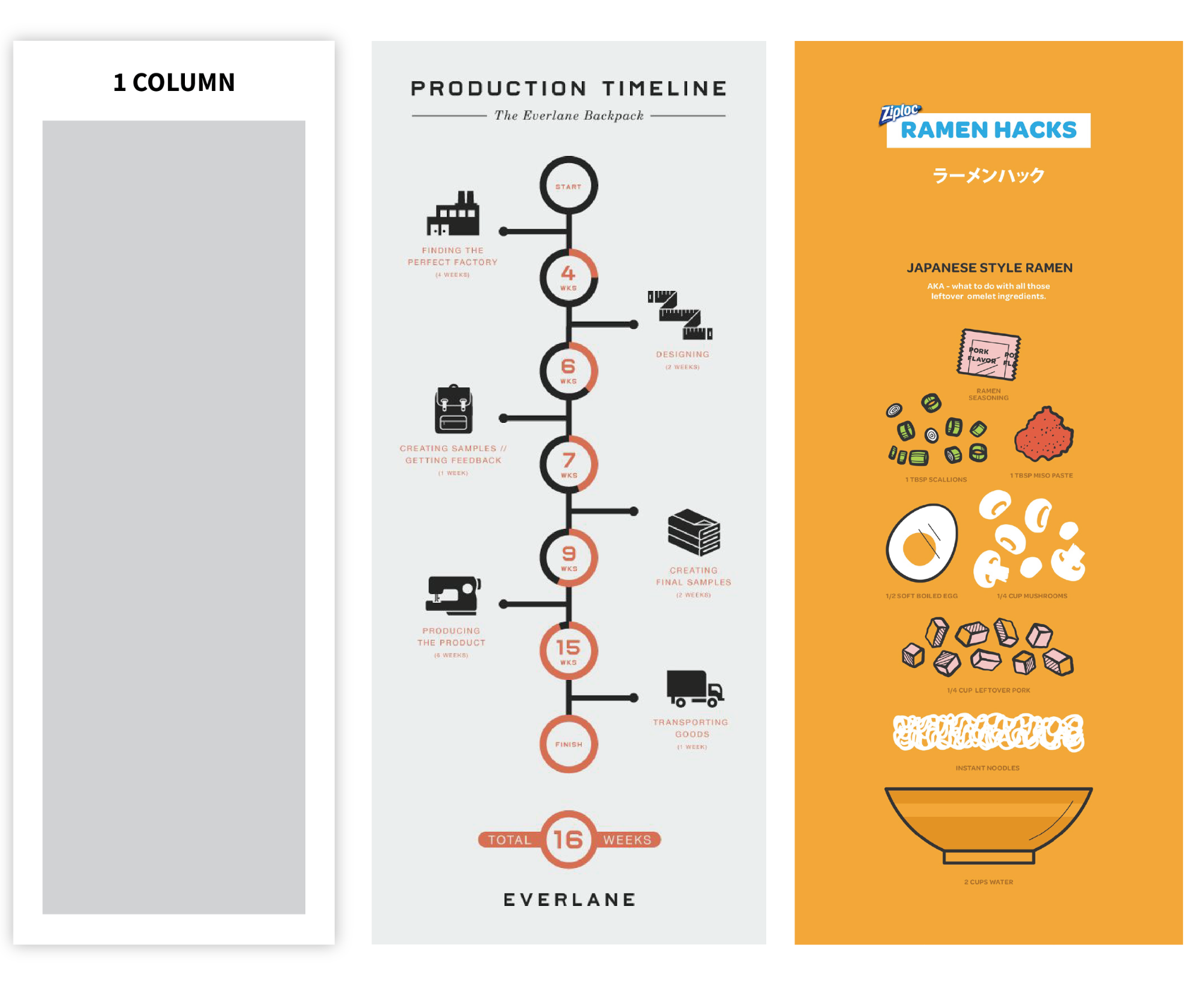
And here’s another example that’s one column, but has multiple elements per section.
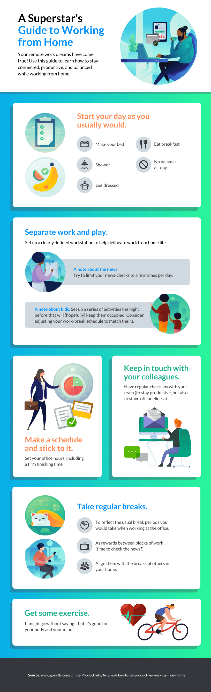
This informational infographic is a perfect example of a stacked layout in which each section has the same basic design with different information, icons and illustrations. In this case, section headings, numbers and colors all drive the reader down the page.
Again, some content will run the width of the page, while some will be in a multi-column format and others will offer a mix of both.
The leadership infographic above is a good example of this because while the section headings run the width of the page, the content on the advantages and disadvantages of each style is in a two-column format, which lets readers make quick comparisons.
List infographics are perfect alternatives for text-based content that otherwise would be presented in a bulleted list or basic outline, and these are excellent candidates for stacked layouts.

In this example of a stacked list infographic, sections run the width of the page, set off with headings that describe tips to cope with stress during a crisis and supporting content to expand on the tips.

In this example of a list infographic that uses a stacked layout, the two sections offer the reader visual variety, while the use of numbers makes it easy to see at a glance how to read the infographic.
The takeaway
- When to use a stacked infographic layout: As we mentioned, there are few occasions in which a stacked infographic layout would be out of place or do a disservice to the content. That said, they are at their best when paired with statistics, lists or bullet point-type information.
- When not to use a stacked infographic layout: If the layout is a crucial part of your storytelling, try another infographic format. That could mean you have information you’re comparing side-by-side or you need readers to remember a specific order.
Comparison infographic layout
This infographic layout option compares multiple variables across categories. Comparison infographic layouts are most effective when comparing just a couple of variables, but they can be used to compare as many as three or four, depending on their size.
As with stacked layouts, comparison infographic layouts cross over many infographic genres, with statistical, informational and list infographics all being excellent options.
Usually, these infographics are vertically oriented, meaning elements are compared side-by-side, but they also cover circular or horizontal layouts.

This statistical comparison infographic layout makes the most of the comparison format by putting the categories at the left, which lets the reader see the information in a true head-to-head format rather than bouncing back and forth.

On the other hand, comparison infographics like this one in which the categories run down the center of the page are also extremely engaging. Like the previous example, this one also offers statistics across the categories.
Comparison layouts can be used to explain elements with equal weight in which there’s no single “good” or “better” option, such as this example that compares viruses with bacteria:

But they can also be used in cases where it’s necessary to put your thumb on the scale a bit and ensure the reader understands that one option is better than the rest, like in this comparison infographic layout covering product pricing:

Some comparison infographic layouts combine the best of all worlds by using the comparison format and simple data visualization to drive readers to an unmistakable outcome. In this example, icons are used to visualize data across three tutoring platforms:

Comparison infographic layouts also cover multiple types of data visualization, including Venn diagrams, pie charts and bar charts, as these types of visualizations allow readers to see differences at a glance.
The takeaway
- When to use a comparison infographic layout: If you want to compare across a set of categories and you need readers to make immediate visual comparisons.
- When not to use a comparison infographic layout: If the visual comparison aspect of the information isn’t necessary or you don’t have comparable information that would help readers see the differences between two or more elements.
Chronological infographic layout
Chronological infographic layouts can have a variety of shapes, but their objective is to visualize the events that have occurred (or will occur) between given dates. Some chronological infographics are arranged along a central timeline, while others travel around the page, like in the example below.

By their nature, chronological infographic layouts are used to tell just one type of story—timelines. However, they’re also useful for layering in additional levels of information, which can include statistics.
Within the general structure of a chronological infographic layout, the format is usually vertical, but this type of infographic can also be horizontal. That is often the case with short timelines or ones that employ a winding layout.
This horizontal example visualizes just seven dates related to the COVID-19 pandemic and the refugee crisis it created, and the content alternates above and below the centerline:

That type of approach is also ideal for timelines based on milestones rather than specific dates or eras, as in this example:

Data is sometimes included, such as in this horizontal timeline infographic that also incorporates data visualization:

Chronological infographic layouts in a horizontal format aren’t limited to a single, unbroken row. In this example, the horizontal timeline extends to a second row, and the arrow makes it clear how to read the chronology:

For chronological infographic stories that have many events or a lot of information to convey, a vertical layout is usually preferred to allow for good design.

In this example, a timeline is used to reflect and condense the process of how a company handles its client project, from the initial consult in Week 1 to the final review in Week 9. Events bounce from left to right, along the central timeline.
Similarly, the infographic below uses the same layout to depict a brief history of technology:

Let’s look at a different chronological infographic using this layout design:

In this chronological infographic layout, major events are depicted in the devastating Australian brushfires of 2018-2020, and they snake around the page, tied together by a simple dotted line.
Not all chronological infographic layouts are tied to specific events or dates, and this approach is also perfect for describing a business process in which the order of steps is important. In the example below, there’s no timeline per se but rather a process explanation.

Often, the key to a chronological process infographic is in using numbers to reinforce the order of the steps that should be taken. In addition to describing the order, numbering steps also makes it easier to create diverse layouts that go beyond a timeline style, like this winding snake approach:

Other options include circular process chronologies that are ideal for cyclical processes. In these infographics, icons such as arrows can substitute for numbered steps, but there are cases where steps are clearly numbered and icons are used to describe the content of each step, like in the curriculum development infographic below.

The takeaway
- When to use a chronological infographic layout: Anytime you have a set of facts, events or steps where the order in which they take place is relevant to ensuring audience understanding.
- When not to use a chronological infographic layout: When it’s not possible to put content in chronological order or when doing so would not make the information easier to understand.
Infographic layout FAQ
Have you got questions about your infographic layout options? We can help.
Can an infographic be multiple pages?
Traditionally, infographics are limited to one page, but in some cases, infographics can stretch to two or more pages. This is often the case with infographics designed for print purposes or ones used as presentation slides.
Using infographics for printed reports or PowerPoint presentations is an ideal way to make those types of content more engaging, and Venngage’s Infographic Maker lets you export infographics for PowerPoint.
What are the key elements of an infographic?
While infographics come in a ton of varieties, they all have three things that separate them from other types of communication: content (usually statistical or informational), visuals (icons, graphs, illustrations) and analysis (what the reader is supposed to get out of it).
Want more inspiration? Check out these 7 tips to customize your infographic template.
How do you decide on an infographic layout?
The first step of making an infographic layout is the most important, and that’s gathering your information. That will tell you what general layout to use, whether stacked, comparison or chronological; what fonts are suitable, whether serif, sans serif or display; and what visuals you can include, such as graphs, icons or illustrations.
Related: Choosing the Right Infographic Fonts for Business Communications
You can use existing infographic templates and create a story that fits within the established parameters, or you can create your own by deciding which information will best get your message across. (Learn more about how to make an infographic in 5 steps.)
In summary: Let the information be your guide
It can be tempting to create an infographic that tries to be all things to all people. But if you can keep the most important elements of your story in mind, deciding on an infographic layout approach can help you focus on making the most of your content.
Using infographic layouts as inspiration can also help you discover stories you didn’t know you could tell by imagining how a certain layout could apply to your organization. But the information should always be in the driver’s seat.
We hope the examples and templates shared here can spark a new idea for you. If you’re ready to get started bringing your infographic layout vision to life, sign up for Venngage’s Infographic Maker for free.


