


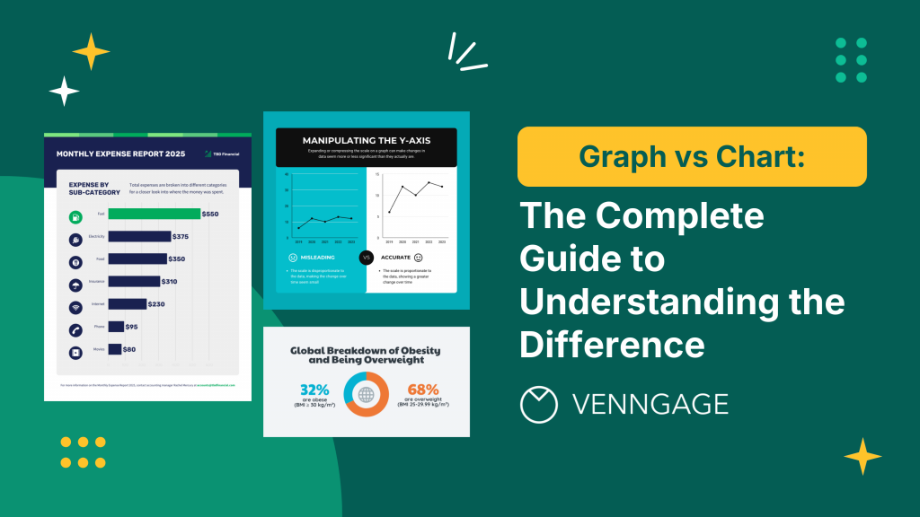
Ever found yourself wondering, “Wait… is this a graph or is it a chart?” For most of us, the terms graph and chart seem interchangeable, but there’s a clear and important difference.
Here’s the simplest explanation:
A chart is an umbrella term for all types of data visualization—think of it as your “visual data toolbox.” A graph is a specific type of chart that shows the relationship between two (or more) variables, usually using points and lines or bars.
So:
- Every graph is a chart, but not every chart is a graph.
- Use “chart” when referring to any visual summary of data and “graph” when you want to highlight how variables relate or change together.
Choosing the right visual doesn’t just make your data easier to understand—it helps your audience remember it and take action. In fact, visual aids can boost learning retention by up to 42%.
As Dante Vitagliano puts it, “Data visualization is the language of decision making. Good charts convey information; great charts enable, inform, and improve decision making.”
Whether you’re preparing a business report, pitching to stakeholders or just trying to jazz up your latest blog post, knowing the difference is crucial.
In this complete (and jargon-free) guide, you’ll learn:
- The key differences between graphs and charts
- When to use each one (with plenty of visual examples)
- The most popular types of graphs and charts (an AI graph tool to help you)
- Design tips and actionable DOs and DON’Ts
- Answers to all your burning “graph vs chart” FAQs
Ready to become a data visualization pro? Let’s dive in.
What’s the difference between a graph and a chart, anyway?
Let’s clear up one of the most stubborn myths in data visualization: graphs and charts are not the same thing.
A graph uses mathematical coordinates and axes to plot data points, showing precise relationships between variables through visual positioning.
A chart encompasses all visual data representations, including non-mathematical formats like pie slices, pictographs, flowcharts and tables—designed primarily for quick comparison and understanding rather than mathematical precision.
Here’s how it breaks down:
What is a graph?
A graph is a mathematical visualization that uses coordinate systems (typically X and Y axes) to plot data points in precise positions. Graphs are built on mathematical foundations and are ideal when you need to:
- Show exact relationships between variables
- Display continuous data changes
- Reveal mathematical patterns or correlations
- Present data that can be measured on specific scales
The key characteristic of a graph is its reliance on mathematical positioning—each point, line or bar has a specific coordinate that represents actual data values.
79% of companies use graphs in their annual reports, with 65% graphing at least one key financial variable. Common types include line graphs, bar graphs and scatter plots.
Pro Tip: If you see axes (X and Y), you’re probably looking at a graph. For a full breakdown of different graph types and when to use them, check out our complete guide to graphs.
What is a chart?
A chart is a broad category that covers all types of visual data representations, whether they use mathematical coordinates or not. Charts focus on quick comprehension and visual impact rather than strict mathematical precision. As data expert Dante Vitagliano notes, “Good charts convey information; great charts enable, inform and improve decision making.”
Examples include:
- Pie charts: proportional slices, not coordinate-based
- Pictographs: icon-based representations
- Flowcharts: process diagrams
- Organizational charts: hierarchical structures
- Tables: structured data displays
- And yes, graphs too!
Think of charts as a complete toolkit for turning data into visuals that anyone can understand.
Graphs vs charts: real-world examples
Seeing the difference in action makes it much clearer. Here are some practical scenarios:
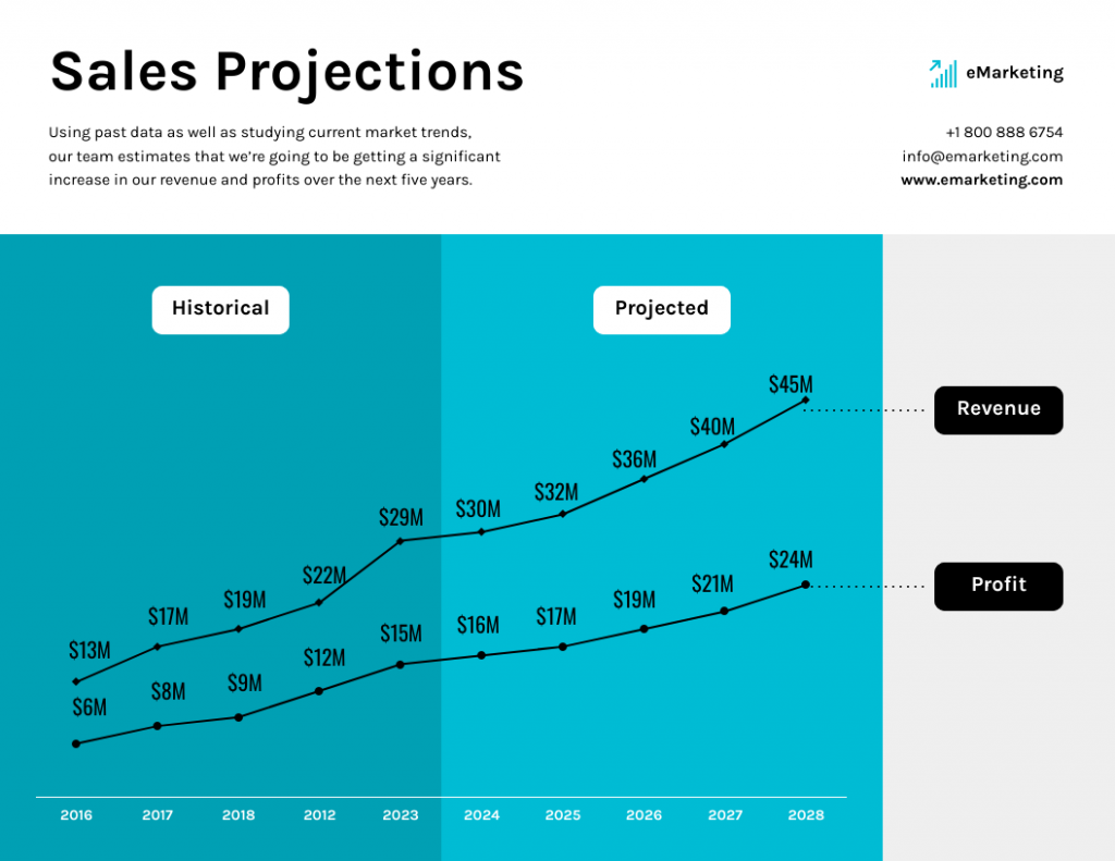
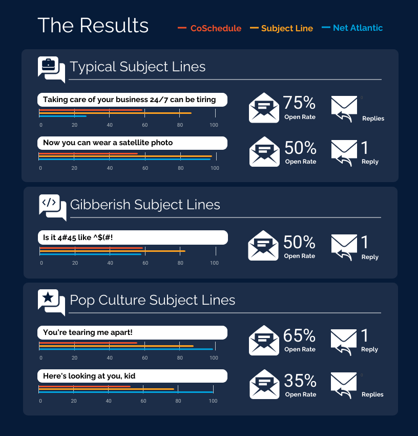
Example 1: Showing sales projection over time
Graph: Line Graph

Purpose: Visualizes monthly sales growth, highlighting trends and fluctuations.
Chart: Bar chart

Purpose: Compares total sales for each product category, making it easy to see which categories perform best.
Example 2: Revenue breakdown
Chart: Pie chart
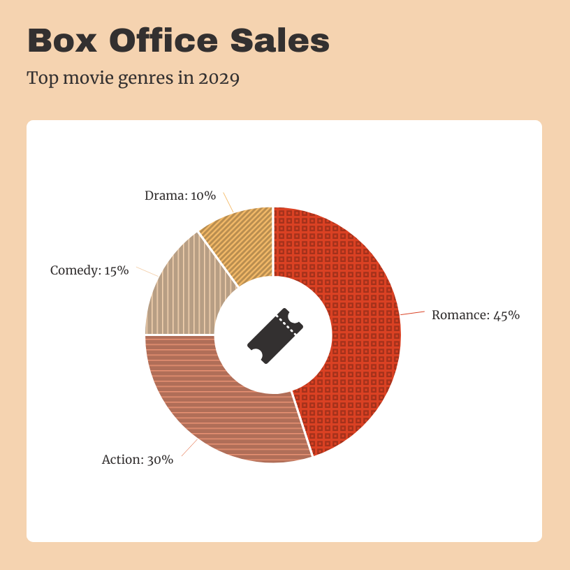
Purpose: Illustrates how total box office revenue is distributed across different movies or genres, showing each film’s contribution to the overall earnings. Notably, 44% of participants found pie or doughnut charts the fastest to understand.
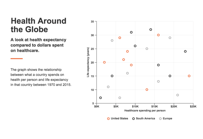
Example 3: Relationship between marketing spend and sales
Graph: Scatter Plot
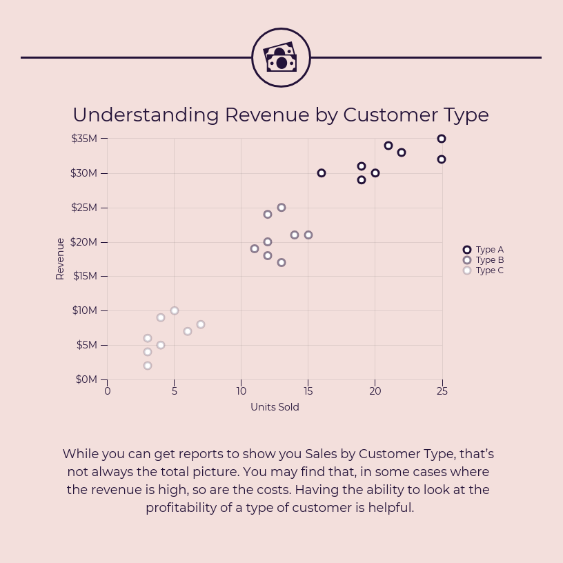
Purpose: Plots revenue against customer type to reveal patterns or trends, helping identify which customer segments contribute most to overall earnings.
To master data visualization, it helps to understand the variety of options available. Check out our guide to types of graphs and charts for examples and practical tips.
Quick reference: Types of graphs and charts (with templates!)
With the basics down, let’s look at the most popular graph and chart types—and when to use them.
Popular types of graphs
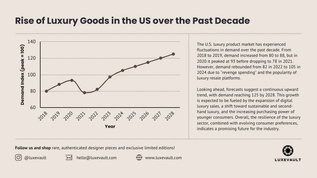
Line graph
Best for: Showing trends over time and continuous data.
Example template:
Bar graph/chart
Best for: Comparing values across categories.
Example template:
Scatterplot
Best for: Showing relationships or correlations between variables.
Example template:
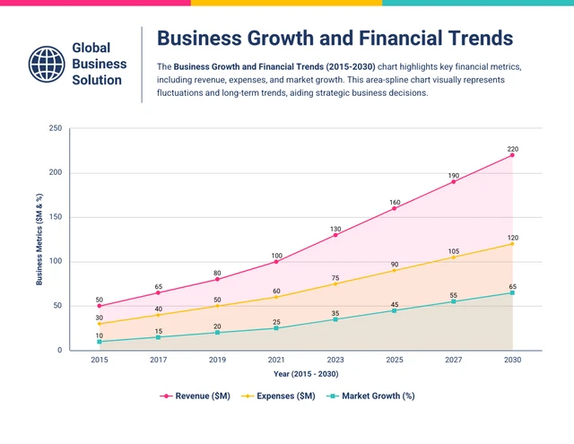
Area graph
Best for: Displaying cumulative totals over time.
Example template:
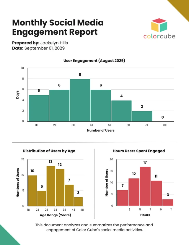
Histogram
Best for: Illustrating the distribution of numerical data.
Example template:
Popular types of charts
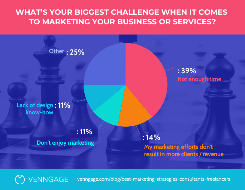
Pie chart
Best for: Showing parts of a whole or budget breakdowns.
Example template:
Column chart
Best for: Comparing values, especially when you have fewer categories.
Example template:
Pictograph
Best for: Telling a story or making data more relatable using icons.
Example template:
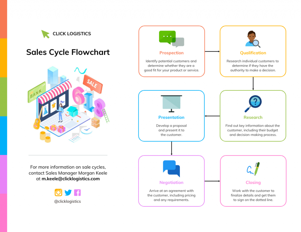
Flowchart
Best for: Showing steps in a process or decision-making paths.
Example template:
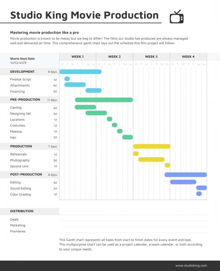
Gantt chart
Best for: Scheduling and creating timelines for project management.
Example template:
Choosing between graphs and charts: Leveraging AI for smarter decisions
Deciding between a graph and a chart depends on your data and your communication goal. Here’s how to make the right call—and how AI can revolutionize this decision-making process.
Use a graph to:
- Show trends over time: Line graphs are perfect for tracking changes, such as monthly sales or website visitors.
- Display relationships or correlations: Scatter plots reveal how two variables interact (e.g., marketing spend vs. sales).
- Analyze patterns or distributions: Area graphs and histograms help you understand how data is spread or grouped.
Use a chart to:
- Compare parts of a whole: Pie and doughnut charts visualize proportions, like budget allocations.
- Rank or compare categories: Bar/column charts make it easy to see which categories stand out.
- Visualize processes or flows: Flowcharts and Gantt charts outline steps or timelines.
- Simplify big numbers or concepts: Pictographs use icons to make statistics more relatable.
How AI revolutionizes chart and graph selection
Modern AI systems have transformed the traditionally complex process of choosing the right visualization. Research from Microsoft and academic institutions shows that AI can analyze data characteristics and automatically recommend the most effective visualization types based on mathematical algorithms that consider data structure, variable relationships and communication objectives.
Here’s how AI makes these decisions:
Data structure analysis: AI algorithms analyze datasets to identify patterns, variable types (categorical vs. numerical), data distribution and relationships between variables. For example, if AI detects time-series data with continuous numerical values, it will prioritize line graphs or area charts.
Communication goal detection: Advanced AI systems can interpret user intent from natural language descriptions. When you describe wanting to “compare sales across regions,” the AI recognizes this as a categorical comparison task and suggests bar charts or column charts.
Statistical pattern recognition: AI excels at identifying correlations, distributions and trends within large datasets that might be overlooked by human analysts. This allows for more sophisticated visualization recommendations that reveal hidden insights.
Contextual optimization: Modern AI visualization tools like Microsoft’s Data Formulator use large language models to process user specifications and generate appropriate chart configurations through iterative refinement.
Real-world AI decision making in action
Tools like Venngage’s AI Graph Generator exemplify this technological advancement. When you upload a dataset or describe your visualization needs, the AI analyzes multiple factors simultaneously:
- Variable types and relationships in your data
- Your stated objective (comparison, trend analysis, proportion display)
- Best practices from visualization research
- Audience considerations based on your description
For instance, if you upload sales data across multiple quarters and mention wanting to “show growth trends,” the AI will likely recommend a line graph.
But if the same data includes multiple product categories and you want to “compare performance,” it might suggest a grouped bar chart instead.
The science behind AI chart selection
Recent academic research in generative AI for visualization shows that AI systems use four major stages for visualization tasks: data enhancement, visual mapping generation, stylization and interaction. These systems can process different types of data structures—sequence, tabular, spatial and graph data—to determine optimal visualization approaches.
The decision-making process involves:
- Automated data analysis: AI algorithms can automatically detect and correct errors in datasets, such as missing values or inconsistencies, ensuring that the data is accurate and ready for visualization.
- Pattern recognition: AI algorithms excel at identifying patterns and correlations within large datasets that might be overlooked by human analysts, integrating these insights into visualizations to reveal hidden trends and relationships.
- Intelligent recommendations: Rather than memorizing complex rules for choosing the right chart, you can describe what you want to understand about your data in natural language and the AI will help you select and create the optimal visualization.
Quick table summary
| Purpose | Use a Graph | Use a Chart | AI Recommendation Factor |
| Show change over time | ✔ | Temporal data structure | |
| Compare categories | ✔ | Categorical variables | |
| Show correlation | ✔ | Two continuous variables | |
| Show parts of a whole | ✔ | Proportional data | |
| Display data on axes | ✔ | Mathematical relationships | |
| Show a process/steps | ✔ | Sequential/hierarchical data |
Pro Tip: If your visual uses axes (X and Y), it’s almost always a graph. Modern AI tools can make this determination automatically by analyzing your data structure and intended communication goals.
How to choose the right visual: 5 questions to ask
Now that you know what each visual does, here’s how to select the best one for your project:
- What story am I trying to tell? Are you comparing, showing a trend, illustrating proportions or mapping a process?
- What kind of data do I have? Is it categories (chart), numbers over time/relationship (graph) or process steps (flowchart)?
- Who is my audience? Executives often prefer simple charts; analysts may want detailed graphs. Executives prefer tables about 52% of the time, while analysis-oriented roles lean toward charts.
- How much detail do I need? Less is often more—focus on clarity.
- What will make my point stand out fastest? Use color, icons or bold numbers (but be consistent!).
For a step-by-step guide on picking the best chart for your data, check out our how to choose the best charts for your infographic guide.
As Monika Piekarska notes, “Data visualization is powerful. Still, data storytelling is what drives decision-makers. People take action when they interact with a data-evidenced proof of the story.”
Still not sure how to start? Try our Chart Maker Tool—or start with a Venngage chart template.
Design best practices (for non-designers)
A well-designed visual amplifies your message. Keep these tips in mind:
- Stick to a clean grid layout: Use alignment tools to keep elements organized.
- Embrace negative (white) space: Don’t crowd your data—let it breathe.
- Limit your palette: Two or three main colors plus neutrals are enough.
- Label axes and sections: Make your chart understandable even without extra explanation.
- Choose readable, on-brand fonts: Avoid hard-to-read or unprofessional fonts.
- Use icons and visuals sparingly: When you do, keep style and color consistent.
Common mistakes and how to avoid them
As Caroline Lee says, “Data visualization is a great way to simplify data and show it in a form that is understandable, insightful, and actionable.”
But even experienced pros can stumble, so watch out for these common pitfalls:
- Using the wrong type: For example, don’t use a pie chart to show trends. Always match your visual to your data’s story.
- Overloading with data or labels: Focus on the essentials and offer details-on-demand if needed.
- Illegible fonts or colors: Prioritize contrast and readability.
- Unnecessary 3D effects or “chartjunk”: Keep visuals flat, clean, and focused.
- Forgetting axis scales or units: Always label axes and include reference points.
Pro Tip: Simplify! If your audience can’t grasp your visual in three seconds, it’s too complex.
FAQs: Graph vs chart
What’s the main difference between a graph and a chart?
A graph specifically shows relationships between two or more variables (think: how A changes with B, often with plotted points or lines on axes). A chart is a broader term for any visual data summary (bar, pie, pictograph, timeline, etc.).
Can a bar graph also be called a bar chart?
Yes! Bar graphs and bar charts are generally used interchangeably—they compare different quantities across categories. If axes are involved, some call it a graph; in dashboards, “bar chart” is often favored.
Which is best for showing parts of a whole?
Charts (like pie or doughnut charts) excel here. Graphs rarely display proportionate shares directly.
When should I use a scatter graph?
Whenever you want to visualize the relationship between two continuous numeric variables, great for seeing if two things rise or fall together (correlation).
Do professionals care about the difference?
Absolutely. The distinction helps teams discuss and pick the best format for accuracy and clarity. It can also impact how people interpret your message.
Key takeaways & next steps
Think of it this way: graphs show relationships, trends, or changes between numeric values—usually plotted on axes—while charts cover any visual summary of data, from comparisons to processes. Knowing the difference helps you pick the right visual for your story.
The right chart or graph makes your data easier to understand and easier to remember. As Brie E. Anderson puts it, “Data visualization helps to bridge the gap between numbers and words.”
Design really matters. The best visuals are simple, focused, and easy on the eyes—no clutter, no distractions.
The good news? Venngage’s chart and graph templates make creating professional, impactful visuals easy, even if you don’t have a design background.
Here’s how to take the next step:
- Bring your reports, pitches, or blog posts to life with Venngage’s graph generator.
- Browse our library of ready-made visuals to find the perfect chart or graph for your next project.
Now you’re not just clear on the graph vs. chart debate, you’re ready to tell your data story like a pro.


