Pie Chart Template
Show categorized data, comparisons, and trends in an organized and visually appealing way using this easy-to-edit pie chart template.

 100% customizable templates
 Millions of photos, icons, charts and graphics
 AI-powered editing features
 Effortlessly share, download, embed and publish
 Easily generate QR codes for your designs
- Design stylemodern
- Colorslight
- SizeLetter (8.5 x 11 in)
- File typePNG, PDF, PowerPoint
- Planbusiness
A pie chart is a graphical representation of data that uses slices to show relative proportions. The total value of all the items in a pie chart adds up to 100%. Each portion is sized according to the quantity it represents. A larger slice means a larger quantity, while a smaller piece indicates a smaller amount. Pie charts are usually used to show classification, such as the different types of expenses incurred in a month. The human brain is hardwired to see patterns and relationships, making pie charts an effective way to show comparisons and trends. These charts can show both nominal (categorical) and ordinal (ranked) data. When used with ordinal data, the slices are usually arranged from the largest to the smallest. While pie charts are easy to understand, they can be challenging to interpret when there are a lot of slices. It can be hard to compare the sizes of pieces that are close together. It's also not easy to see patterns or trends with nominal data. A pie chart should include a title, labels for the different slices, and a legend. The
Related Chart Templates
table charts
tree map charts
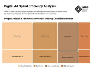
tree map charts
table charts
table charts
tree map charts

funnel charts
table charts
table charts