


Around 1.3 billion people globally live with some form of disability and this number is expected to grow in the years to come. Undoubtedly, many of these people hold jobs but organizations doubling down on inclusive design or accessibility is a recent phenomenon.
Companies are running accessibility audits and investing in accessibility testing to ensure digital content meets regulations like the Americans Disability Act, which prohibits discrimination against individuals with disabilities in all areas of life, including employment.
But it’s not all about just meeting the law. Designing for accessibility is also important to improve the user experience for everyone who consumes content, and not just people with disabilities.
But why does this matter in the first place and how does digital content like accessible diagrams impact your organization?
By making information easier to understand, accessible diagrams help organizations increase engagement because when information is presented in a clear format, it requires less effort for users to understand and process.
Are you ready to start creating accessible diagrams for your reports, project management activities, presentations, or marketing materials? Venngage’s accessible maker and accessible templates are the perfect tools to help achieve this task, regardless of design ability.
Click to jump ahead:
- Commonly used diagrams in organizations
- Why accessible diagrams matter
- Barriers created by inaccessible diagrams
- Key considerations for accessible diagrams
- Steps to make an accessible diagram from scratch
- Conclusion
Commonly used diagrams in organizations
Businesses use diagrams in day-to-day work to provide a visual representation of information that is easy to understand. Generally, diagrams help companies achieve with:
- Process analysis: Diagrams help visualize workflows and the sequence of steps in a process and identify bottlenecks and/or redundancies.
- Trends: Diagrams can show changes over time and reveal relationships and how different variables connect.
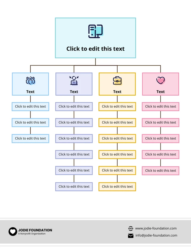
- Reveal organization structures: Diagrams like org charts help understand reporting relationships within a company and reveal potential communication breakdowns.
- Project management: Diagrams are also excellent tools for understanding relationships between tasks and visualizing project schedules and deadlines.
- Strategic planning: Diagrams are also useful for companies wanting to track key performance indicators and/or track progress
“We are convinced that infographics, charts, diagrams, and other visual aids are essential for enhancing procedures and communication. They make difficult data simpler to comprehend and use by simplifying it. Visual representations make it easier for us to spot patterns, performance indicators, and possible problems immediately, which promotes better informed decision-making and efficient communication within our company. We increase openness and make sure that all stakeholders are aware of our progress and difficulties by integrating these visual tools into our process, which eventually improves business results.”
Axel Lavergne, Founder, Reviewflowz.
Here are some types of diagrams businesses generally use:
Organizational charts
Organizational charts or org charts are visual representations of an organization’s structure, roles, and reporting relationships.
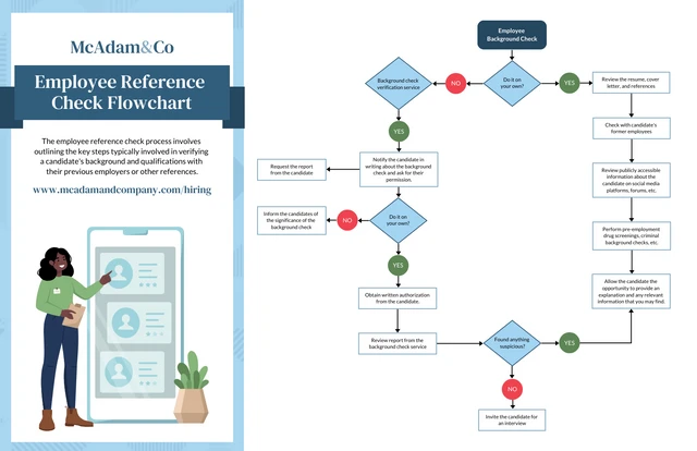
Flow diagrams or flowcharts help companies depict processes, workflows, or a sequence of steps.
“In Supply Chain Management, we use flowcharts to illustrate the procurement to distribution and logistics flow; this helps us track the movement of our products from factories in China to destinations worldwide. During Product Development, we adopt diagrams for design phases, which makes it easier to conceptualize the product’s creation from start to finish.”
Joy Bian, Marketing Manager, RELYIR.
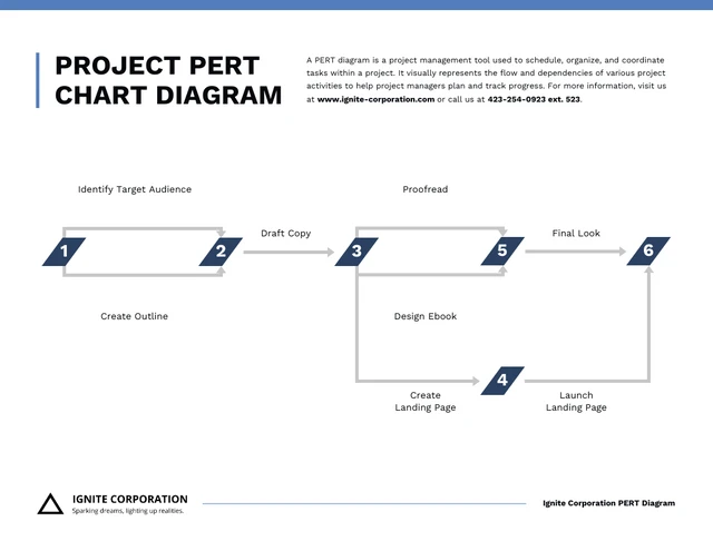
PERT charts
PERT charts (short for program evaluation and review technique) illustrate project tasks, dependencies, and timelines.
Gantt charts
Gantt charts are a popular diagram type that companies use to show project schedules, tasks, and their duration.
“The Product Development process benefits immensely from visuals like Gantt Charts, proving more effective than scheduling or task-tracking automation tools. These charts offer a global view of timelines, dependencies, and progress, facilitating better coordination and project management.”
Greta Maiocchi, Head of Marketing & Admissions, OPIT.

SWOT analysis diagrams
SWOT analysis diagrams are a strategic planning tool that help companies understand their strengths, weaknesses, opportunities, and threats.

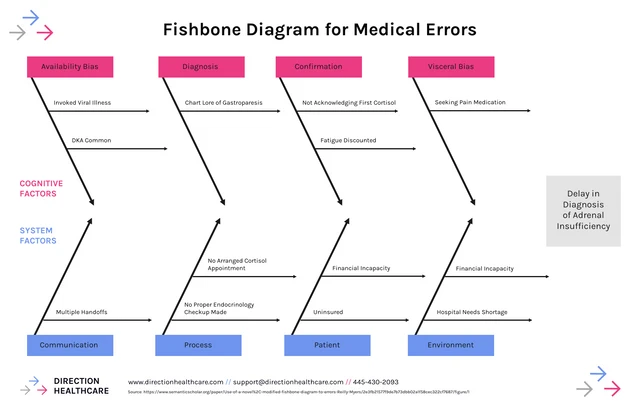
Fishbone diagrams
Fishbone diagrams, sometimes also known as cause-and-effect diagrams or Ishikawa diagrams, identify causes and effects contributing to a problem.
“Visual aids are our secret weapon. We rely on scatter plots to track performance: they make it easy to see trends and spot outliers that need attention. Fishbone diagrams are another go-to: they help us dig into problems and find the root cause fast. They make complicated info simple, so everyone understands what needs to happen next.”
Michael Nemeroff, Co-founder & CEO, Rush Order Tees.
Venn diagrams
Venn diagrams display relationships and overlaps between sets or groups. They are often depicted as overlapping circles or ovals, where the overlap indicates the elements that are common to both sets.

Mind maps
Mind maps represent ideas and information in a non-linear way. They are often used for brainstorming, note-taking, and planning.
“When it comes to sharing information, bar graphs and mind maps are our secret weapons. They break down complex data into visuals that are easy to understand. Whether it’s financial reports or progress updates, these tools help our clients see the big picture without getting bogged down in details.”
Mark Pierce, CEO, Wyoming Trust.

Why accessible diagrams matter
Making diagrams accessible is important because this ensures all information shared by a business or organization can be understood by all stakeholders, regardless of their ability.
Promotes inclusivity
Organizations that want to create inclusive work environments need to think beyond physical accessibility challenges.
They must also factor in cognitive accessibility to ensure information is presented in a way that is easy to understand and process (and this includes creating accessible diagrams!)
Meets legal compliance
Depending on your country where your organization operates, accessible diagrams are important to adhere to the law.
For example, in the US, there are legal requirements, such as the ADA and Section 508, which mandate that all information be accessible to people with disabilities.
Both laws require organizations to provide accessible diagrams to ensure that individuals with disabilities can access and participate in company-related activities.
Related: ADA Standards for Accessible Design: How to Be Compliant
“We use tools like Venngage to create infographics and visual content that adhere to accessibility standards. Each piece is tested with screen readers, and we ensure color contrast meets WCAG guidelines. Our blog, which now includes transcripts for videos and audio content, saw a 15% increase in user engagement within six months of implementing these changes. This experience reinforced the importance of accessibility in broadening our audience and ensuring inclusivity across all our digital platforms.”
Marcus Clarke, Searchant.
Improves user experience and communication
Diagrams in general break down complex information into simpler, more understandable visual representations which reduces cognitive load and improves understanding.
But when diagrams are accessible, it eliminates the possibility of some team members not understanding the information, leading to a breakdown in communication or trust.
Also, since accessible design focuses on presenting information in a way that is easy to see and understand, they improve user experience for all stakeholders.
“One of our biggest wins was revamping a client’s e-commerce website, which led to a 15% increase in engagement after making it fully accessible. This project proved that accessible design benefits both users and businesses.”
Taylor Moore, Co-founder, Teasy Agency.
Barriers created by inaccessible diagrams
Most organizations struggle to create accessible diagrams because tools like Microsoft Excel or Canva don’t allow you to easily add alt text, adjust color contrast, or use appropriate fonts and sizes. These features are essential for making diagrams accessible to people
Instead, in these tools, you’ll have to create the design first, export it, and then use third-party tools to remediate the design.
Here are the barriers most organizations face when attempting to create accessible diagrams.
Lack of ability to add alt text
Screen readers can’t interpret images without alt text or text-based descriptions that describe the function or appearance of non-text elements such as a diagram.
For example, imagine if a person with low vision or blindness came across a pie chart like this without alt text. They’d be unable to comprehend the content and feel excluded.
However, when you add alt text, the user can consume the information just like everyone else.
“We ensure that all our online content is accessible by adhering to best practices such as adding alt text to images, providing captions for videos, and making our website compatible with screen readers. We’ve also set up a system where customers can report any accessibility issues, allowing us to improve continuously.”
Jeffrey Zhou, CEO and Founder, Fig Loans.

Poor color contrast
Low color contrast can make text and elements appear blurry or faded, reducing visibility for people with visual impairments.
When creating accessible diagrams, you need to choose color combinations that are easy to distinguish, such as black text on a white background. The WCAG standards recommend a minimum contrast ratio of 4.5:1 for standard text and 3:1 for larger text.
This can be hard to tell without a color contrast checker.

Complex layouts
Intricate diagram designs can be confusing for screen readers and those with cognitive disabilities like attention deficit hyperactivity disorder
When creating accessible diagrams, it’s important to keep the design simple and uncluttered. Avoid excessive use of lines, arrows, and other visual elements that can make the diagram difficult to navigate and understand.
Inaccessible text
A packed diagram with small or fonts that are hard to read already hinder readability for users without visual impairments, so imagine the challenges it poses to people living with visual impairments.
Often, diagram creators are blind to the fact whether text is too small or difficult to read because design tools don’t have a built-in checker to tell them (Venngage does though!).
Using a PDF accessibility checker can help ensure your documents meet accessibility standards across color contrast, text size, and layout.

Are any of these barriers preventing you from creating accessible diagrams? Well, the good news is that Venngage can help you overcome each of these barriers without having to do any remediation.
Give Venngage a try now and ensure all your diagrams are accessible!
Key considerations for accessible diagrams
When creating diagrams, there are several factors to consider to ensure accessibility.
Let’s go through the list.
Text and fonts
If your diagram includes text, make sure to use clear and legible fonts. Ideally, you should stick to sans-serif fonts over serif since the latter have small strokes at the ends of letters, making the text seem more cluttered and difficult to read on smaller screens or at low resolutions.
Moreover, make sure the text on your diagram is large enough to be easily read. WCAG guidelines suggest a minimum font size of 14 points for standard text and 18 points for bold text.
Color contrast
Color contrast is a crucial aspect of accessible diagram design. Poor color contrast (difference in luminance between the foreground text or elements and the background) can make it difficult for users with visual impairments to distinguish between elements, reducing accessibility.
Always use color combinations that meet accessibility standards for contrast ratios. WCAG suggests a minimum contrast ratio of 4.5:1 for standard text and 3:1 for larger text.
Alternative text
Always add concise and accurate alt text descriptions to your images and charts.
Remember, alt text should describe the content of an image or chart to provide context to users who cannot see it.
Reading order
When designing your diagram, make sure to organize in a clear sequence so that both users and screen readers can follow.
Here are some tips:to ensure your diagrams have a clear reading order:
- Use left-to-right, top-to-bottom reading order: This is the standard reading order in most languages and is easy for screen reader users to follow.
- Group related elements: Group related elements together to create a clear visual hierarchy and make it easier for users to understand the relationships between different components of the diagram.
Headings
Use heading and subheading tags (H1, H2, H3, etc) to indicate the structure of your diagram and make it easy for users to navigate.
This creates a logical hierarchy that helps users understand the relationships between different elements and navigate the diagram more easily
Tables
If your diagram includes tables, make sure to use clear headers and row/column relationships.
This will help screen reader users understand the structure of the table and navigate the information more easily.
Links
If you’re including links in your diagram, make sure to make the link text as descriptive as possible.
Avoid generic phrases like “click here” and instead use text that describes the link’s destination. This will help users understand the purpose of the link without having to click on it first.
Creating accessible diagrams in Venngage
Are you looking to create accessible diagrams but don’t want to use multiple tools to get the job done?
Fortunately, you don’t have to if you use Venngage, a simple AND powerful design solution for business communications.
Steps to make an accessible diagram from scratch
Step 1: Choose a simple layout:
Instead of doing the hard work and starting from scratch, browse diagram templates on Venngage and find a layout that suits your needs.
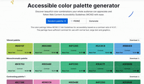
Step 2: Use accessible colors
Accessible colors are color combinations that have enough contrast to be distinguishable to those with visual impairments or color blindness. It’s always a good idea to select color schemes with high contrast.
When selecting colors for your diagrams in Venngage, you’ll get access to a WCAG compliant accessible color palette generator that lets you select a color and present accessible color combinations.
Step 3: Add alt text
When adding any visual element to your diagram, Venngage makes it easy to add alt text in a few clicks.
Just select any visual in your diagram, click the alt text tab at the top menu bar, and type in your text description or mark the visual as decorative. It’s that simple!

Step 4: Structure with headings
Using headings and subheadings is crucial for creating accessible diagrams because they provide a structure to help users navigate the content.
When creating headings, remember to use appropriate heading levels: H1 for the main title, H2 for subheadings, and H3 for sub-subheadings. This creates a logical hierarchy that helps users understand the relationship between different sections of the diagram.

Simplify tables
If your diagrams feature tables, consider how screen reader users will navigate and understand the information.
Here are some tips for making tables more accessible:
- Be consistent with formatting Use consistent formatting for headers, data cells, and table borders to make the table easier to read and understand.
- Avoid merged cells: Merged cells can make it difficult for screen reader users to understand the structure of the table. Try to avoid merging cells whenever possible.
Use descriptive links
When including links in your diagrams, make sure the link text accurately reflects the destination.
Avoid generic phrases like “click here” or “more info” and use text that clearly indicates where the link will take the user.
Test for accessibility
When creating diagrams, remember to check your designs using a screen reader to make sure the final product is accessible.
But if you want to be more proactive and test diagram designs for accessibility while you’re still designing, use Venngage’s built-in accessibility tools.

Pre-built accessible templates
If you want to save time creating accessible diagrams, using accessible templates is a great way.to streamline the process.
Here are a few examples of accessible diagram templates you can find on Venngage.


Make accessible diagrams with Venngage and make your organization more inclusive
Creating accessible diagrams is necessary for organizations who want to be compliant with the law, inclusive, and ensure effective communication across all channels.
And though it may seem hard at first, accessible diagrams are easy to make if you follow a few simple steps and use tools like Venngage to help speed up the process.
Make sure your diagrams are understandable and usable by everyone and learn how Venngage can help you in this journey by clicking the link below.


