


Most hiring managers spend less than a minute scanning your resume. This means, your resume needs to have a professional design with all the information presented neatly so the recruiter can quickly assess your strengths and previous responsibilities.
But how can you create a resume that highlights your skills and relevant experience? In this blog post, I will provide some resume design and share some of my favorite resume templates to help you get your dream job.
Click to jump ahead:
- 16 winning resume ideas
- 10 resume design tips from hiring managers that will get you hired
- What should a resume include?
- Do’s and don’ts of infographic resume design
Short on time? Here’s the condensed video version:
16 winning resume design ideas
Struggling to make your resume stand out? It’s a common challenge. But the good news is, a well-designed resume can make a big difference.
In this section, I’ll walk you through 16 practical resume design ideas that can help you create a strong and visually appealing document.
- Create a beautiful resume design with an eye-catching border
- Use data visualizations to show off your soft skills
- Make sure your resume design fits your industry
- Stick to a consistent color palette throughout your resume design
- Keep it simple
- Highlight your contact information with a different background color
- Use multiple fonts for your resume design
- Always include some power words in your resume
- Design a data-driven infographic resume
- Use bold colors to highlight important power words
- Include direct links to your social media platforms
- Feature icons to illustrate your interests outside of work
- Write a resume introduction that fits your experience
- Include a simple timeline to visualize education or experience
- Use icon headers to draw the eye to important information
- Use a visually appealing resume to showcase the value of your skills
1. Create a beautiful resume design with an eye-catching border
I think it’s safe to say that most resumes are going to be printed on a crisp piece of white paper. And the most color that they will use is probably a light gray or a dark blue.
Adding an interesting border, like in the resume design example above, can help your resume stand out. You can also inject a little bit of your personality into the resume without pulling the reader’s attention away from the important information.

I would recommend using a flat color, a simple texture or muted pattern for your border. Anything else, like a photo or gradient, will be more distracting than helpful.
2. Use data visualizations to show off your soft skills
I believe a data visualization, like in this resume design, is a fantastic way to highlight your soft, and hard skills. A unique data visualization will not only catch the eye of the reader, but it will also present your information in a unique way, making for a more successful CV. Don’t forget to include your awards and achievements in resume to visually highlight your biggest accomplishments.

3. Make sure your resume design fits your industry

Not every design tip that I will talk about in this part of the article is praised in every industry. And I think the resume design above is a great illustration of this point.
A resume like this is perfect for creative industries but may not be appreciated in corporate industries like banking.
A creative resume like the one below is perfect for a professional photographer because it allows them to show off their work.

However, if you’re applying for a customer support role, it might not add value to your application. So if you plan to create a resume like this, make it appropriate for the job or industry you’re applying to!
4. Stick to a consistent color palette throughout your resume design
If you want your resume to succeed, strive to make consistent design choices throughout. se the same fonts, types of icons and colors in each section of your resume.
This resume design template uses a beautifully consistent color palette. With light pinks interacting perfectly with the darker purples. The consistent color palette also makes it easy to read the resume.

5. Keep it simple
It can be hard to summarize everything you’ve practiced, learned and accomplished during your time at a company. However, it is important to not say too much on your resume and risk overwhelming the hiring manager with the amount of information you are presenting.
To combat information overload when creating your resume, use a basic resume template with a simple, clean design. This will challenge you to condense your points to focus on what really needs to be said in order to position yourself as an ideal candidate for the role.
For example, this basic resume template only highlights two past jobs:

Sometimes less is more. The simple layout makes this basic resume template easy to read and the core skills easy to detect.
Just make sure to adjust your resume when you’re applying to different jobs–swap out the skills listed for others that more closely match the job description.
6. Highlight your contact information with a different background color
As I said above, your contact information should be very easy to find. Preferably it will be placed in its own section of the resume for easy access.
I mean, you don’t want to miss out on the job of your dreams because the manager or software can’t find your phone number!
One of the simplest ways to draw attention to your contact information is to use a different background color. For example, the simple resume example below uses almost 1/4th of the page for their contact information:

7. Use multiple fonts for your resume design
Using a single font throughout your resume is one of the worst things design decisions you can make. If you’re not comfortable picking fonts yet, check out our font guide first!
This resume template has a combination of three different fonts and italics to make things interesting:

One for the headers(1), another for the sub-headers(2) and a final one for the body text(3). A combination that features serif and sans serif fonts like this makes the resume easy to skim and jump from one piece of information to the next.
This professional resume template uses a different font for the header and subheaders, but the differences are subtle to keep the overall look conservative and clean.

8. Always include some power words in your resume
As a baseline, you should always strive to include words used directly in the job description for the role you’re applying for. As the hiring manager has these words in mind when screening resumes, it is a surefire way to make your resume pop.
To help your resume really stand out, I would recommend using power words throughout the descriptions. According to TheBalanceCareers, these power words should include:
- Action verbs: Use words like “implemented,” “optimized,” or “facilitated” to show proactive initiative and leadership.
- Company values: Highlight values like “integrity,” “collaboration,” or “innovation” to align with the culture of potential employers.
- Skill words: Include specific skills such as “data analysis,” “project management,” or “graphic design” to demonstrate your expertise.
- Specific keywords: Incorporate keywords relevant to the job, such as “SEO strategies,” “budget forecasting,” or “agile methodology” to match industry standards.
- Industry buzzwords: Use phrases like “growth hacking,” “user experience (UX),” or “brand storytelling” to show you’re up-to-date with trends in your field.
In the resume introduction above they used a nice mix of all of those types of power words.

Using these powerful words will not only help your resume stand out to hiring managers but also make it through the software they use to filter candidates.
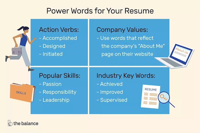
Just remember to not go overboard and include too many of these power words. It may cause your resume to look inauthentic, and end up in the trash can.
9. Design a data-driven infographic resume
Venngage started as an infographic resume company! Back in the day, we would create an infographic resume from the information on your LinkedIn page.
Obviously, we have come a long way since then, but we still know how powerful an infographic resume can be.
A combination of data visualizations, icons, and more can make your resume design wholly unique and easily digestible. In the resume template below they used not one, but four data visualization to tell their professional story:

This approach is a great way for someone with not a ton of experience to fill out a full resume. As you can see above, the templates uses a timeline to outline the education and internship experience. And then a bar chart to explain some of the skills they learned while in college.
Overall, I think it’s a resume that will definitely get you a job interview! You’ll appear creative and innovative, two skills that are highly celebrated in the modern workforce.
10. Use bold colors to highlight important power words
In a previous tip, we briefly talked about how important power words are. These are words that could make or break your resume. So if you skipped that part, go back and read it now!
If you want your power words to stand out even more on your resume, use a different font color like below:

This designer made sure that the reader will see those power words by highlighting them with a nice lilac. This beautiful resume really stands out from the pack.
Not sure what colors to use in your resume? Check out this in depth color guide!
I really like this approach because those keywords will stick with a manager throughout the hiring process. Plus, if they are just skimming the resumes those power words will immediately jump out and grab their attention.
If you are creating a resume for a more conservative workplace, you could adapt this approach and simply bold the text you want to stand out.
11. Include direct links to your social media platforms

In the contact section of your resume, use links that a manager can easily copy and paste into their browser. Remember that you want to make your resume easy to use and interact with.
I would also recommend adding any links to your work on other sites like LinkedIn, Medium, Behance, Dribbble or even your own WordPress or Wix website. The resume design example above actually includes a direct link to their Behance profile.
A curious hiring manager might want to check out your past work before looking at the rest of your resume. Again, make it almost too easy to learn more about you with a simple link.
If your work is good enough, it might just get you the job. Or at least make your name stand above all the other applicants.
Remember, the links you should provide will vary based on industry and job role. Be sure to only include links to your social media profiles that support your candidacy for the role you are seeking.
12. Feature icons to illustrate your interests outside of work
Most companies these days don’t just care about your experience, they also want to see if you’re a good culture fit.
At Venngage we truly value finding candidates that will enrich our culture by aligning with our core values. This is because we can always teach you a skill or process, but not how to be a team player. Or a fun person to work with!
I know that including a concept as large and abstract as your personality on your resume can be a little tricky. That’s why it’s better to use a few simple icons to illustrate your hobbies and interests. Like so:

As you can see in this resume design example, the designer included a bunch of icons to show what she likes to do during her free time.
13. Write a resume introduction that fits your experience
According to the fine people at ResumeCoach, there are 3 main types of resume introductions that you can use.
The first one called an Objective Introduction, should be used if you don’t have a lot of experience in the field or industry. This kind of introduction can be thought of as an abbreviated cover letter as well. The resume example below lists some very interesting information about the applicant:

Next, we have the Qualifications Introduction, which is exactly what it sounds like. With this kind of intro, you should only list your relevant soft skills and abilities. The resume design example below uses their management experience as a focal point as they applied for a more senior role:
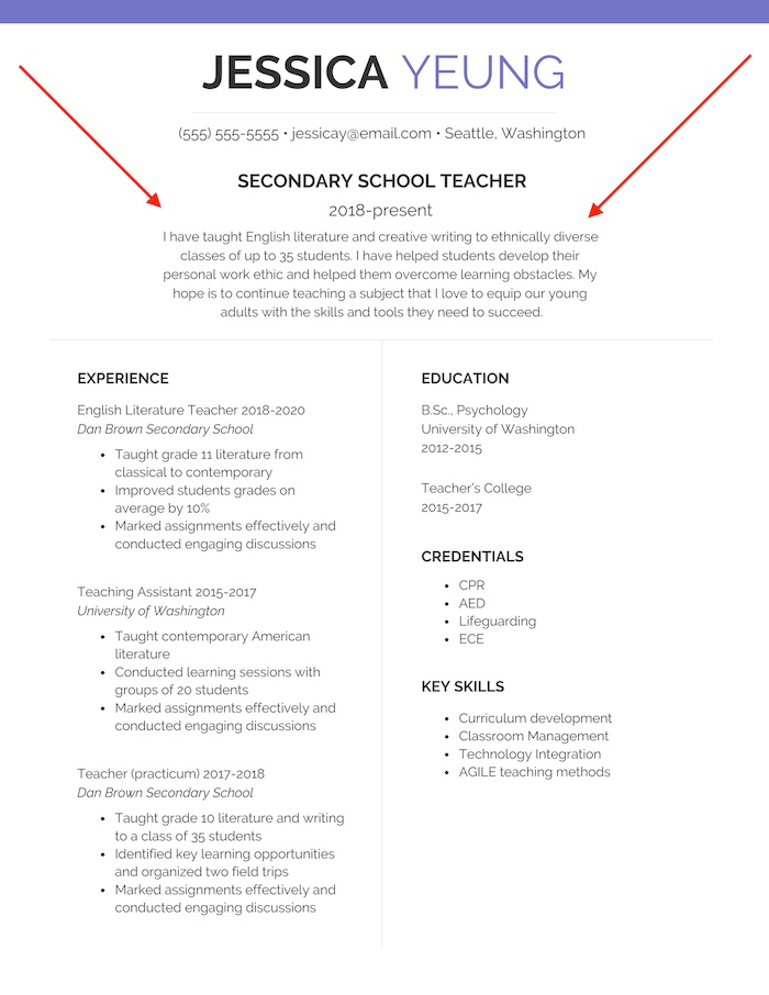
And finally, we have the Summary Introduction, which is basically a brief synopsis of your relevant jobs and experience. This introduction is built for people with a ton of direct experience and accomplishments in the industry.
The resume design example below includes a nice mix of accomplishments, qualifications, and experience:

Just remember to include only things that are very relevant to the job that you’re applying for. Also, don’t write a novel on your resume, keep any introduction short and sweet.
14. Include a simple timeline to visualize education or experience
One of the best ways to visualize your past experience or education is with a simple timeline.
Most people are very familiar with timelines and will be able to consume the information efficiently.
I should be noted that any timeline you add to your resume should be relatively minimalist.
The timeline in this resume example strikes the perfect balance between informative and interesting. If the timeline design gets too complicated, it will distract from your written information.

You can even use a timeline infographic to organize your education if you have multiple degrees like they did above.
WATCH: How to customize this resume template [Venngage tutorial]
15. Use icon headers to draw the eye to important information
Icons can be used in a bunch of different ways on your resume. We have already outlined a few interesting ways you can incorporate them in previous sections.
But I think the best way to use icons is as headers for important information in your resume.
Not sure what I’m talking about? Take a look at how this designer used icons across his resume:

For every ability, skill, educational milestone and more they attached a related icon. This won’t only help the reader gain some quick insight but also draw their eye to each piece of information.
Plus it makes the resume look extremely unique!
16. Use a visually appealing resume to showcase the value of your skills
A well-designed, visually appealing resume can help to highlight your skills. Good design helps your resume look cleaner and draw the hiring manager’s eye to the bits you want to showcase. A poorly designed resume can be distracting.
Above are all the different elements of design one can include to make the optimal resume, it is crucial to consider the elements, or principles, of visual design. The principles of design work together to create a visual piece that is aesthetically pleasing and optimizes the user experience. If you haven’t picked up on it yet, the experience of the hiring manager viewing your resume is highly important for your success.
Some principles of design you should consider when making a visually appealing resume include:
- Contrast
- Balance
- Emphasis
- White space
- Proportion
- Hierarchy
- Unity
- Variety
Not sure where to get started? Here are 15+ resume examples to boost your job search.
10 resume design tips from hiring managers that will get you hired
What should a resume include?
Let’s dive into the essential parts of a resume that every hiring manager is looking for.
1. Contact information
The first part of your resume should always include your name and contact information. You want to make it as easy as possible for a hiring manager to find you on professional websites (such as LinkedIn) or contact you with any questions or comments.
So don’t hide this pertinent info at the bottom of your resume or in some other odd space. Be sure this information is both clear and obvious to the reader, like in this template where it’s clearly presented in the top right:
![Corporate Resume [A4]](https://venngage-wordpress.s3.amazonaws.com/uploads/2024/05/image-7-725x1024.png)
The resume contact information section should include your:
- Full Name
- Phone Number
- Home Address
- Email Address
- Website
- Social Media Usernames (if applicable)
Only include your website or social media handles if it relates to your job function i.e. a social media marketer would want to add their social usernames and a writer would want to link to a portfolio.
That said, you should always mention your LinkedIn profile.

2. Resume introduction
Once a hiring manager has skimmed through the contact information, your resume introduction is probably going to be the first substantial thing they read. This is your first opportunity to pitch yourself as an ideal fit for the role–imagine this as the “hard copy” of your elevator pitch.
You should only include things that really set you apart from the rest of the applicants, such as:
- Direct Experience
- Responsibilities
- Soft & Hard Skills
- Accomplishments
- Education
- Awards
For example, this tidy infographic resume neatly sums up the applicant’s experience in the intro:

The resume introduction sets the tone for the story you are trying to sell through your resume. When approached correctly, you can entice the hiring manager to continue reading your resume. So make it count.
3. Relevant Skills
This section is meant to be short and to the point, but that doesn’t mean it isn’t important. Especially if you work in an industry that has an emphasis on technical skills to succeed. These are known as hard skills because they are easily defined and measured.
For example, if you want to be a professional designer you must have a ton of experience with the Adobe suite. But a writer may need WordPress experience. This resume design idea uses a cool graph to illustrate skill level:

You also can highlight soft skills on your resume if they are related to your current or future position. As you probably guessed, soft skills are the opposite of hard skills and are not easily defined or measured.
Highlighting your skills and abilities is important because it is a snapshot of what positions you as an ideal candidate for the role. This section plays a supporting role to the claims you made in your resume Introduction. As hiring managers are often reviewing dozens of resumes at a time, it is crucial to have a precise Introduction and Skills Overview to catch their attention at first glance.
4. Education
The first entry in your education section should always be the most recent you completed. So if you got an advanced degree, that should come first, followed by your undergraduate degree.
Like the contact section, there are a few things that you should always include in the education part of a resume.
These four pieces of pertinent info include:
- School Name
- School Location
- Degree/Major/Minor
- Years Attended

You really don’t need to include more than that. The hiring manager will ask questions if they want to learn more about your education and such.
5. Job experience
Another essential part of a resume is job experience. Like in the previous section, you should start with your most recent job and work backward.
It’s good to include descriptions of what each recruiting opportunity entails, and be sure to use these descriptions to prove how they qualify you for this position. Avoid omitting experiences you do not perceive as relevant to the role, as the benefits of transferable skills may surprise you. However, you may skip the full description of roles from many years ago and just list the basics (who, what and where).
For each job you want to highlight on your resume, include these four things:
- Job title
- Company name
- Dates of employment
- List of responsibilities & achievements

Each of these responsibilities or achievements should be presented as a bullet point like above. Otherwise, your resume will be very hard to read!
To save time, you could always turn to one of these 12 resume makers to ensure a professional-looking resume that highlights your qualifications and increases your chances of landing job interviews.
3 common resume formats
Chronological resume format
A chronological resume lists your professional experience in a reverse chronological order, with the most recent role list on top. This works best for experienced professionals who have a linear career path.
Functional resume format
A functional resume format focuses more on skills than work experience. You start with the professional summary and highlight your skills. Then you need to provide a summary of your work experience, without mentioning the tenure of each role. It works great if you are a fresher, have a gap in your resume, or have switched career paths.
Combination resume format
Combination resume is a blend of chronological and functional formats. It highlights relevant skills and accomplishments while also providing a chronological work history. Combination resume are more suitable for professionals with years of experience and a diverse skillset.
How to adapt your resume design for different industries
The ideal resume format varies as per your industry. Professional industries, such as banking and legal, prefer minimalist resumes with clean layouts. On the contrary, creative industries like design often consider professional resumes.
Let’s see how you can choose the resume design based on your industry.
Corporate vs. Creative Industries:
- For corporate roles, keep your resume simple and professional, focusing on clean layouts and standard fonts.
- In creative fields such as design or marketing, you can showcase your skills with a visually engaging resume that highlights your artistic flair.
ATS-Friendly vs. Non-ATS Resumes:
- If you’re applying through Applicant Tracking Systems (ATS), use a text-based resume with minimal formatting to ensure compatibility and readability.
- Go with an interactive resume with interesting visuals when you’re applying directly, attending networking events, or sending it to a contact in your network.
Do’s and don’ts of infographic resume design
A well designed infographic resume can be a big differentiator and move you to the top of the pile in seconds for that dream job. Unfortunately, a badly designed one can also disqualify you just as fast. How can you create a successful infographic resume? Here are a few do’s and don’ts for creating your own infographic resume:
Do’s
- Use bar or column charts to display your skills, expertise and years of experience
- Stick to simple and easy to understand charts
- Limit the length of your infographic to about one page
- Pick a color scheme that works for you and the reader
- Tell your own personal story to help hiring managers learn more about you
- Include a call to action
Don’ts
- Avoid using a line or area chart for displaying skills
- Avoid using overly complex charts or ornamental design elements that aren’t used to convey information
- Avoid creating a never ending scrolling infographic
- Avoid using more than 3 colors in your design
The takeaway: top resume design ideas
Keep these resume design ideas in mind when overhauling your CV:
- Use a basic resume template if you need help condensing information
- Stick to a consistent color palette throughout your resume design
- Design a data-driven infographic resume
- Feature icons to illustrate your interests outside of work
- Write a resume introduction that fits your experience
That’s all the resume design tips I have for you today! Hopefully, some of these templates and tips will help you find the perfect job in the future.
And if you’re a hiring manager, don’t forget to check out top recruiting tips from 10 HR experts.
Sources for Infographic:
Ryan Moore, Director of Client Management at PeakSales Recruiting
Jennifer Rogerson, Head of HR at Best Company
Charlette Beasley, Career and Workplace Analyst at FitSmallBusiness.com
Peter Yang, Chief Executive Officer at ResumeGo
Ed Moss, Hiring Manager at Angel List
Nate Richardson, Search Engine Optimization Analyst at BambooHR
Joanna Zambas, CV Specialist and Career Expert at CareerAddict
Iris De Geest, Content Marketer at Survey Anyplace
Anja Zojčeska, Recruitment Marketing Specialist at TalentLyft
Samuel Johns HR Specialist and Hiring Manager Resume Genius
Need some more resume design examples or cover letter suggestions? Start with these two articles:


