


Did you know according to a Nielsen Poster Advertising Study, 61% of poster viewers agree that posters are a good way to learn about new businesses or sales and events? This highlights their effectiveness in conveying information.
While there isn’t one “correct” way to design a poster, following certain poster design best practices can significantly enhance its impact.
That’s why we’ve created this comprehensive, in-depth poster design guide. Whether you’re starting from scratch or using our professionally designed poster templates, this guide covers everything you need to know to make a stunning, purpose-driven poster.
These practical poster design tips apply to virtually any type of poster you create—so let’s dive in!
How to design a poster from scratch
Creating a poster from scratch is a fun and rewarding way to visually express yourself, whether it’s for a school project, event promotion, or presenting information in an engaging and impactful manner.
This step-by-step guide equips you with essential tools and techniques to design a professional, compelling poster:
- Identify the goal of your poster
- Consider your target audience
- Decide where to share your poster
- Select a professional poster template
- Pick a relevant or branded color scheme
- Include a clear call to action
- Use fonts to create a hierarchy of information
- Use icons to visualize concepts and grab attention
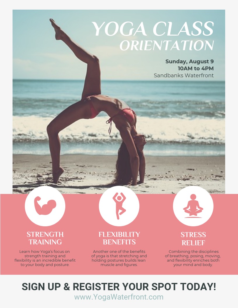
- Add high-quality images & stock photos
- Download & export in the right format
By following these steps, you can design a versatile, high-impact poster for any occasion!
1. Identify the goal of your poster
The first and most crucial step in creating an effective poster is understanding why you’re making it. Defining the poster’s primary goal will inform every design choice, from colors to fonts.
Consider these potential goals:
- Advertising a new product – Create excitement around the product’s unique benefits.
- Promoting an event – Attract attention to concerts, festivals, or community gatherings.
- Highlighting a campaign – Share key details for social or environmental causes.
- Announcing a sale – Drive urgency and showcase the promotion effectively.
Defining your main goal at the outset ensures your poster is focused and effective. Whether you’re promoting an event, informing the public, or inspiring action, structuring the design around your objective keeps the message clear and engaging.
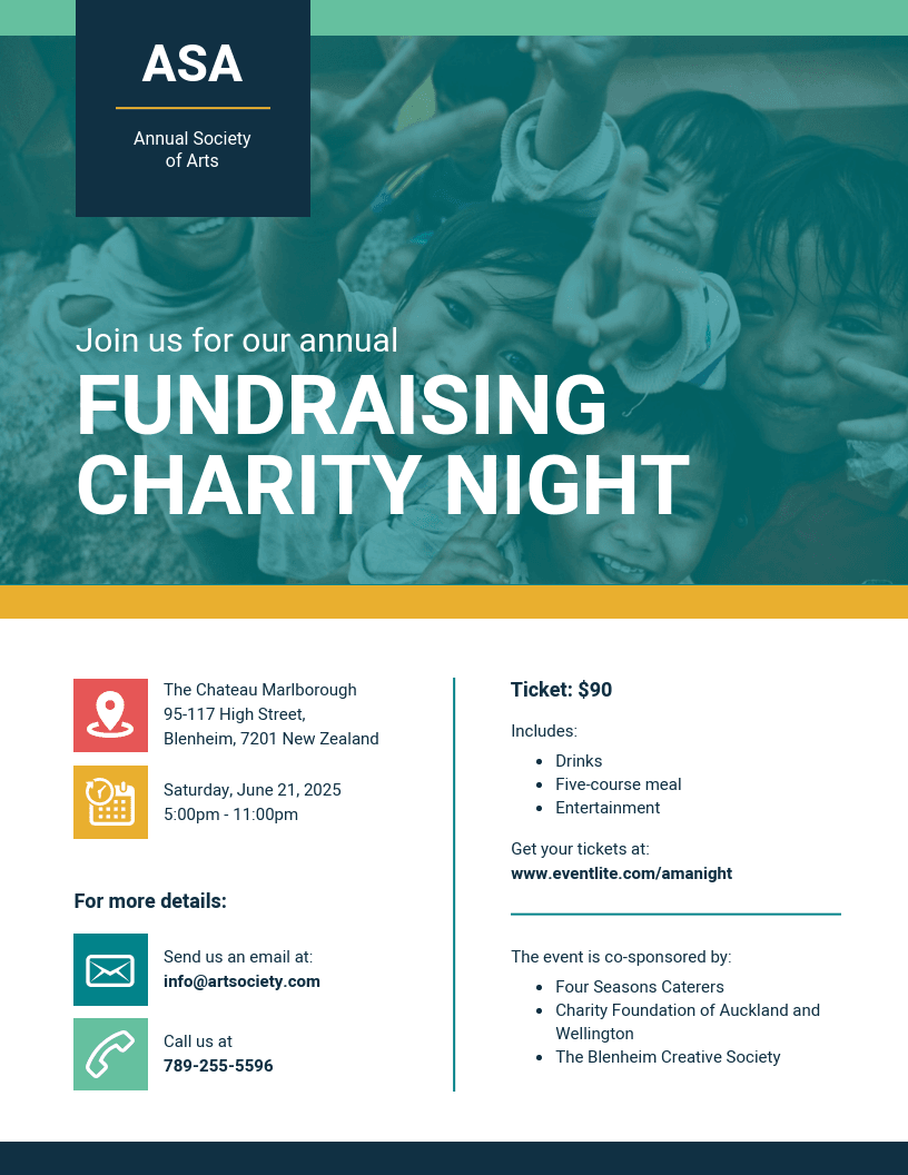
For instance, if you’re hosting a fundraising event, highlight key details like location, time, and purpose in a simple, direct manner. Starting with a clear objective helps you create a purposeful, custom design that resonates with your audience — especially when using an event registration system to streamline the process and sell event tickets online efficiently.
Explore these templates:
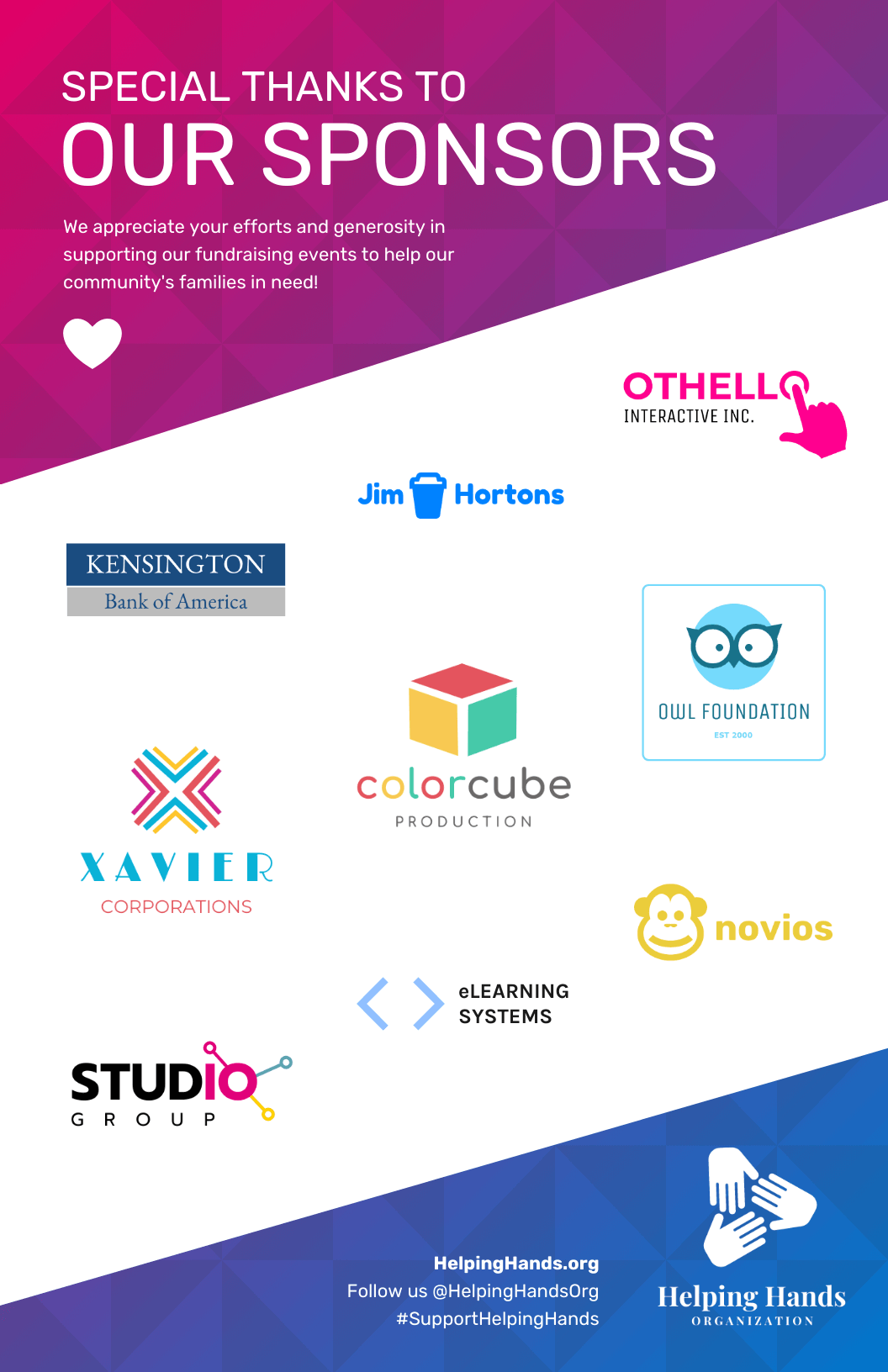
1. Fundraising Event Poster Template: Customize this poster template to showcase key sponsors for your event.
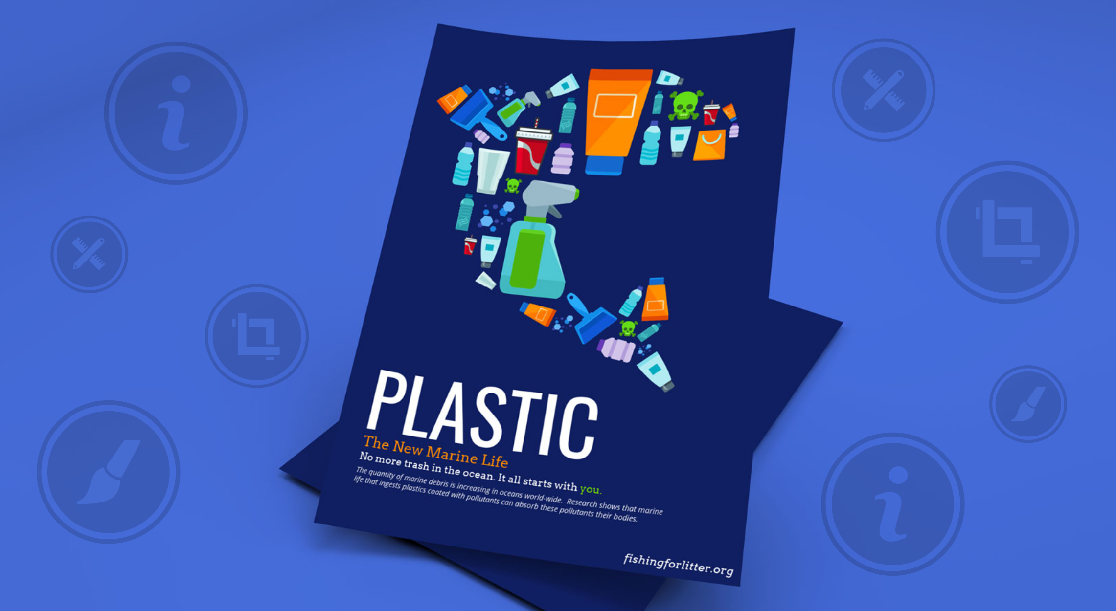
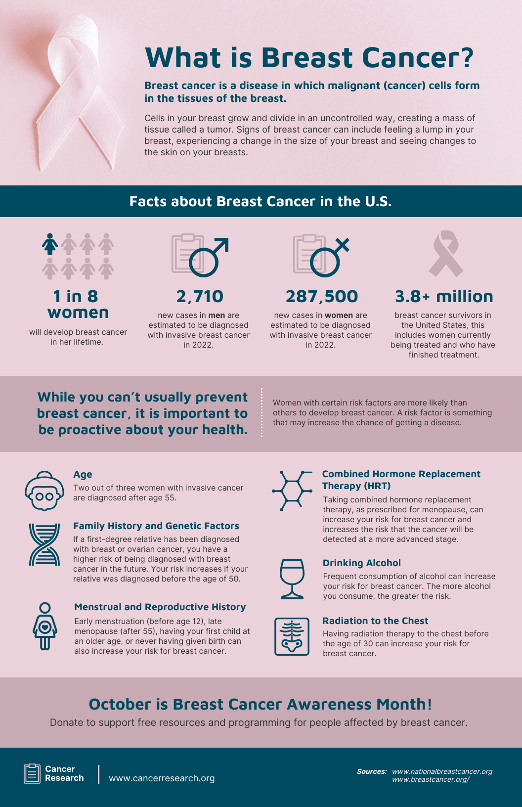
2. Breast Cancer Awareness Poster Template – Customize this poster template for a clear and impactful information poster.
Choose your poster type
Once you’ve identified the goal of your poster, think about the type you’re designing. Each category has its own tone, layout and key elements to make it stand out:
- School project posters: Keep them colorful and creative with illustrations, fun fonts and clear labels make information easy to absorb.
- Advertisement or marketing posters: Focus on eye-catching visuals, a strong headline and a clear call-to-action that drives attention or sales.
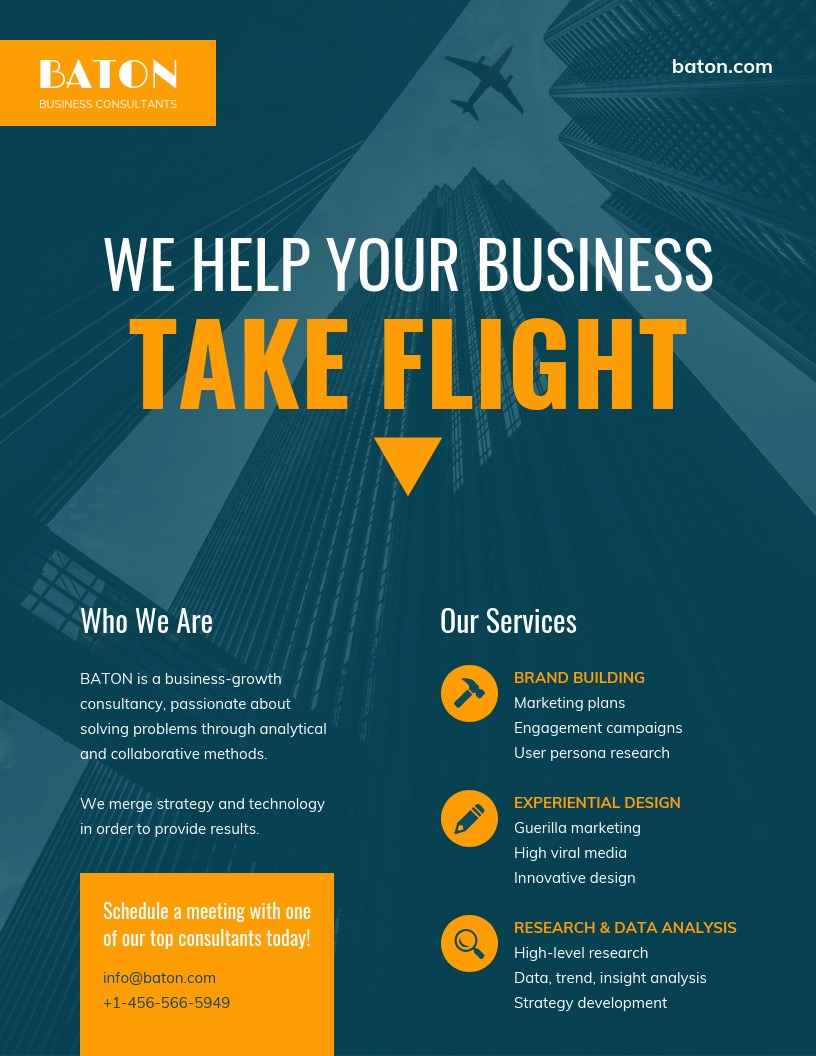
- Business or corporate posters: Maintain a polished, professional look with brand colors, clean typography and concise messaging that reflects credibility.
- Research or conference posters: Prioritize structure and clarity with the use of charts, sections and headings to communicate your findings effectively.
- Event posters: Capture the vibe of your event through visuals, colors, and hierarchy and make sure the date, location and main attraction are easy to find.
Each poster type tells a different story, but they all share one goal: communicating your message clearly and visually.
2. Consider your target audience
Knowing your target audience is essential for creating a poster that truly resonates. By defining who you want to reach, you can tailor your design to highlight the most important details and make impactful choices that align with their preferences. Whether it’s through bold visuals or subtle cues, understanding your audience ensures your message connects effectively.
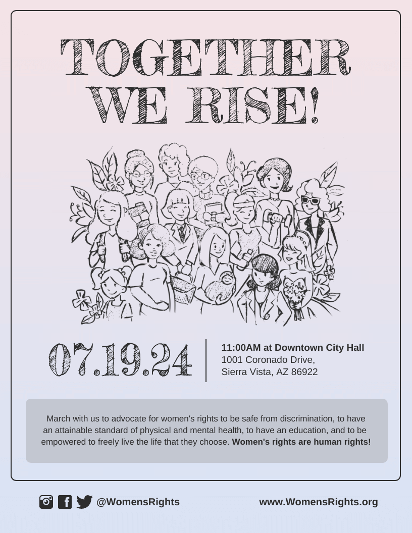
For example, if you’re promoting an event for women’s rights, the approach you take can vary:
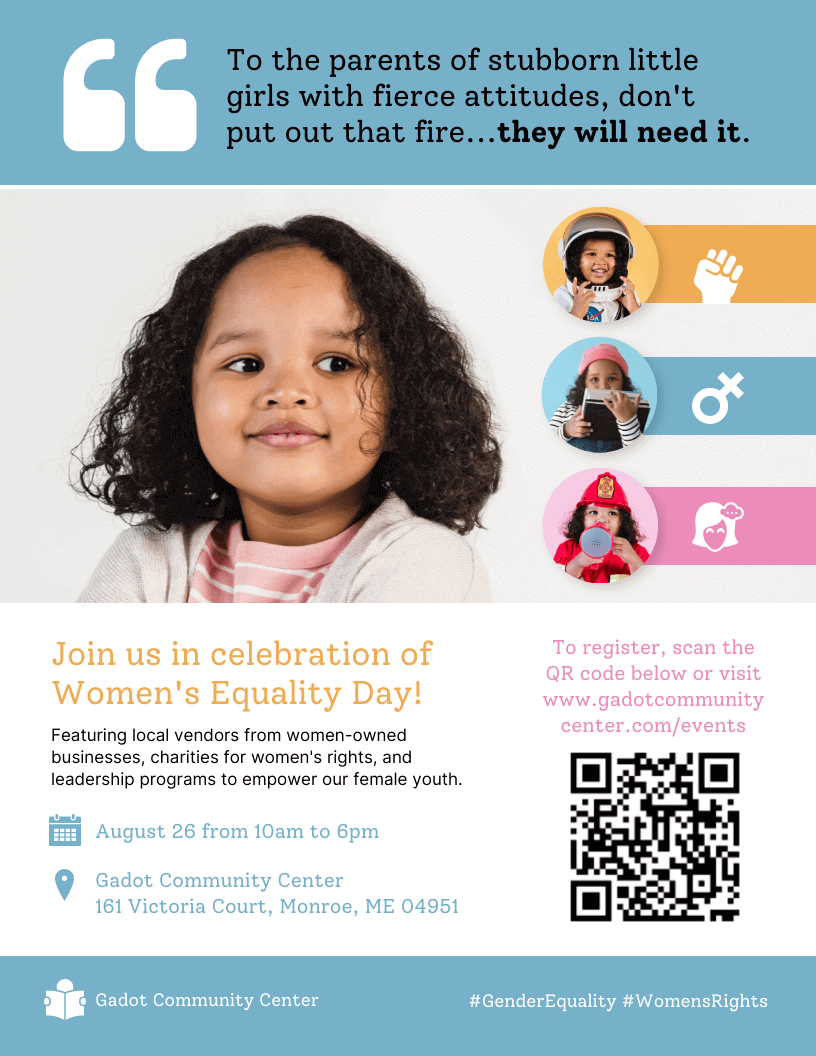
Now compare it to this other design below:
Also, remember that you can make multiple posters that cater to different customer personas. You don’t have to use one for every type of customer!
3. Decide where you want to share your poster
Before designing, determine where your poster will be shared. This will guide your design choices for print, digital, or both.
- For Print:
- Placement: If displayed among other posters, opt for a larger size to stand out, like using an Arrhythmia Poster template for visual impact. For smaller wall spaces, consider printing smaller posters and pinning multiple copies with minimalist designs.
- Paper Size: Use standard sizes like A1-A5 or Letter. Venngage’s editor allows easy resizing to fit your needs, saving time with automatic content reformatting.
- For Social Media:
- Tailor designs to platform-specific sizes:
- Facebook: 1200 x 630 pixels (landscape)
- X (Twitter): 1200 x 675 pixels (landscape), 900 x 900 pixels (square)
- Instagram: 1080 x 1080 pixels (square), 1080 x 566 pixels (landscape)
- Pinterest: Use a 2:3 to 1:3.5 ratio for best visibility.
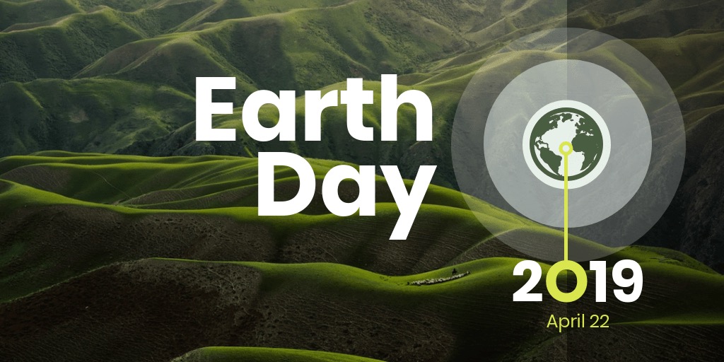
- Create multiple versions for different platforms to maximize reach. Templates like the Earth Day Poster or HIV Awareness Poster work well for digital campaigns.
- Tailor designs to platform-specific sizes:
Tailoring your poster to its intended platform ensures it looks professional and impactful wherever it’s shared.
Consider creating a version specifically for Pinterest boards with eye-catching visuals, such as the HIV Awareness Poster.

4. Start with a professional poster template
Creating a professional-looking poster doesn’t require hiring a designer. Using a poster template provides a solid foundation and helps you start with a structure that’s easy to customize.
You can always adjust templates to better fit your specific needs. Here are some examples:
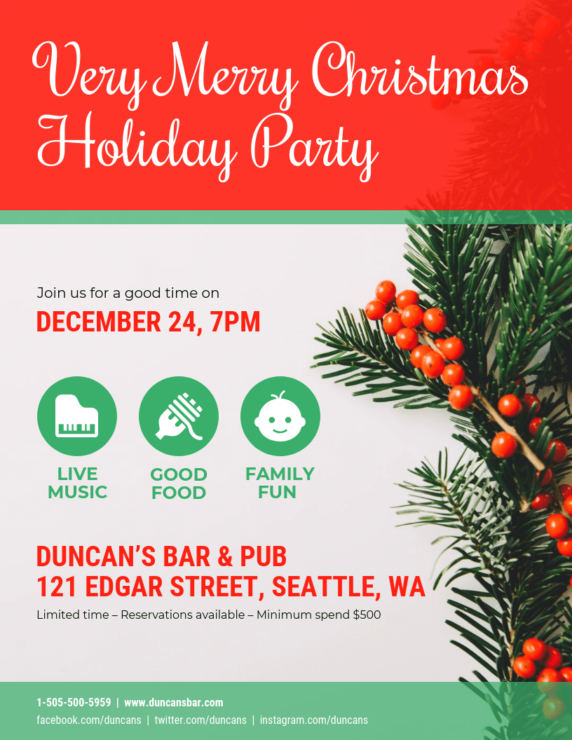
- Job Fair Event Poster Design Template – Customize this poster template to highlight location, date, and available roles at your event.
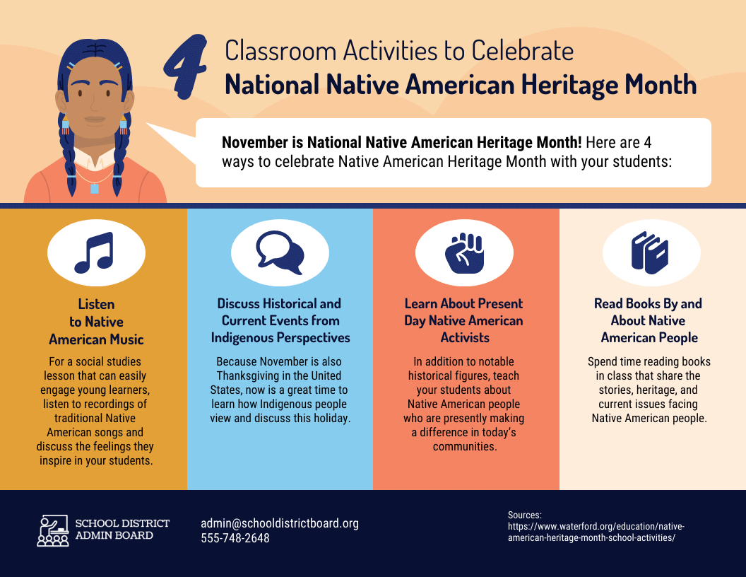
- Native American Awareness Poster – Customize this poster template to promote awareness around significant cultural events or holidays.
- Modern Sale Poster Design Template – Customize this poster template to emphasize discount details and dates, capturing viewer attention quickly.
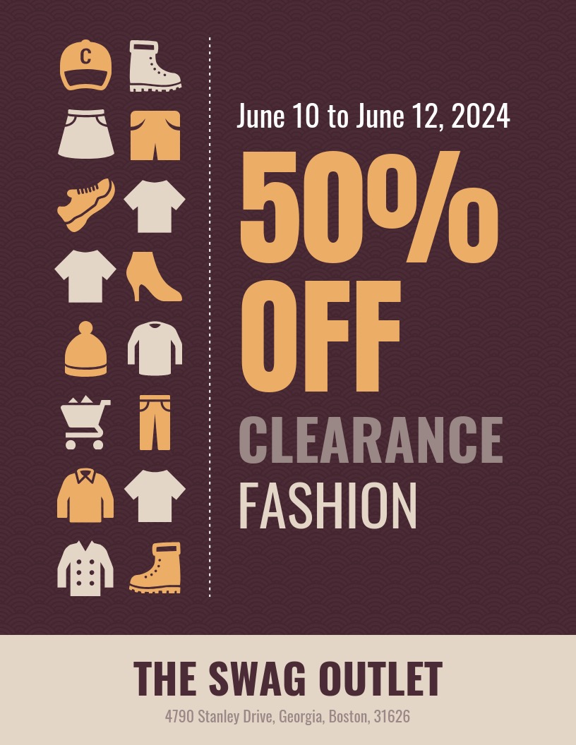
Each of these templates serves a unique goal, helping you save time and achieve a polished, purpose-driven design.
5. Pick a relevant or branded color scheme
The color scheme of your poster plays a crucial role in setting the tone and attracting attention. If you’re working with a specific brand, it’s best to follow brand guidelines and incorporate those colors. If you’re designing without brand restrictions, choose a color scheme that matches the event or message you’re conveying.
Here’s a quick guide to common colors and their associated meanings:
| Color | Meaning | Ideal Use |
|---|---|---|
| Blue | Wisdom, trust, loyalty | Business, professional, marketing events |
| Green | Energy, tranquility, environment | Nonprofits, fundraising, wellness events |
| Red | Strength, courage, joy, attention-grabbing | Bold marketing, sports events, promotions |
For a quick solution, use a color scheme generator tool like Coolors to help you create the perfect palette.
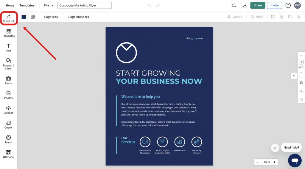
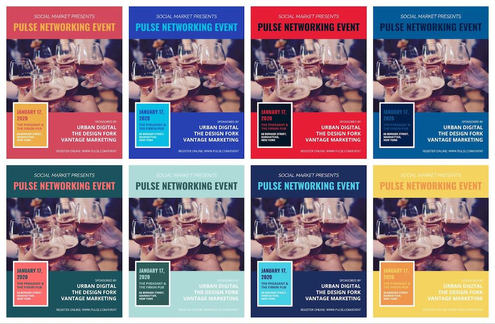
Now if you want to use your brand colors on any of our poster templates, just click the My Brand Kit tab on the left side of the screen:
Then click one of your branded colors to add them to any poster template:
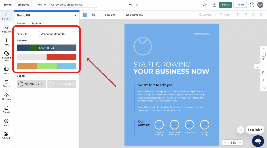
Click the palette again to change where the branded colors are used:
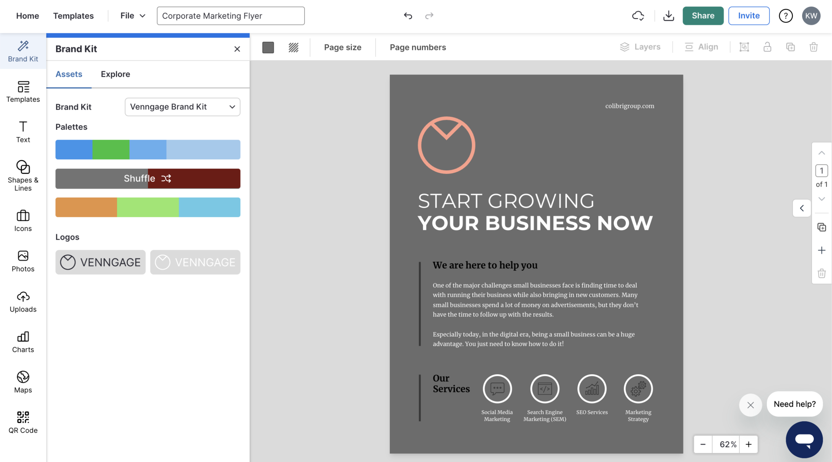
With a few clicks, you can create a ton of variations of your poster, like so:
The 5-10-20 Rule (Visual Hierarchy)
Great poster design isn’t just about looking good; it’s about managing a viewer’s attention in a specific sequence. Professional designers use the 5-10-20 Rule to ensure the message sticks:
- 5 Seconds (The Hook): Your main title or headline must be legible and understood within 5 seconds from a distance. If they can’t tell what the event is immediately, they won’t stop.
- 10 Seconds (The Engagement): Once stopped, the viewer should spend the next 10 seconds absorbing your primary visual or hero image. This element should reinforce the emotion of the headline.
- 20 Seconds (The Conversion): The remaining 20 seconds are for the ‘fine print’, date, time, location, or QR code. This is where the viewer decides to take action.
Pro-Tip: If your CTA (Call to Action) takes more than 20 seconds to find, your conversion rate will drop by over 50%.
| Industry / Event Type | Recommended Palette | Psychological Impact | Why it Works |
|---|---|---|---|
| Nightlife & Concerts | Neon Green / Deep Black | High Energy / Mystery | Creates high contrast that mimics stage lighting. |
| Medical / Scientific | Sky Blue / Crisp White | Trust / Cleanliness | Blue is the most universally trusted color for authority. |
| Corporate / Finance | Navy Blue / Slate Grey | Stability / Professionalism | Conveys tradition and long-term reliability. |
| Non-Profit / Charity | Warm Orange / Earthy Green | Community / Growth | Orange triggers ‘urgency’ while green triggers ’empathy’. |
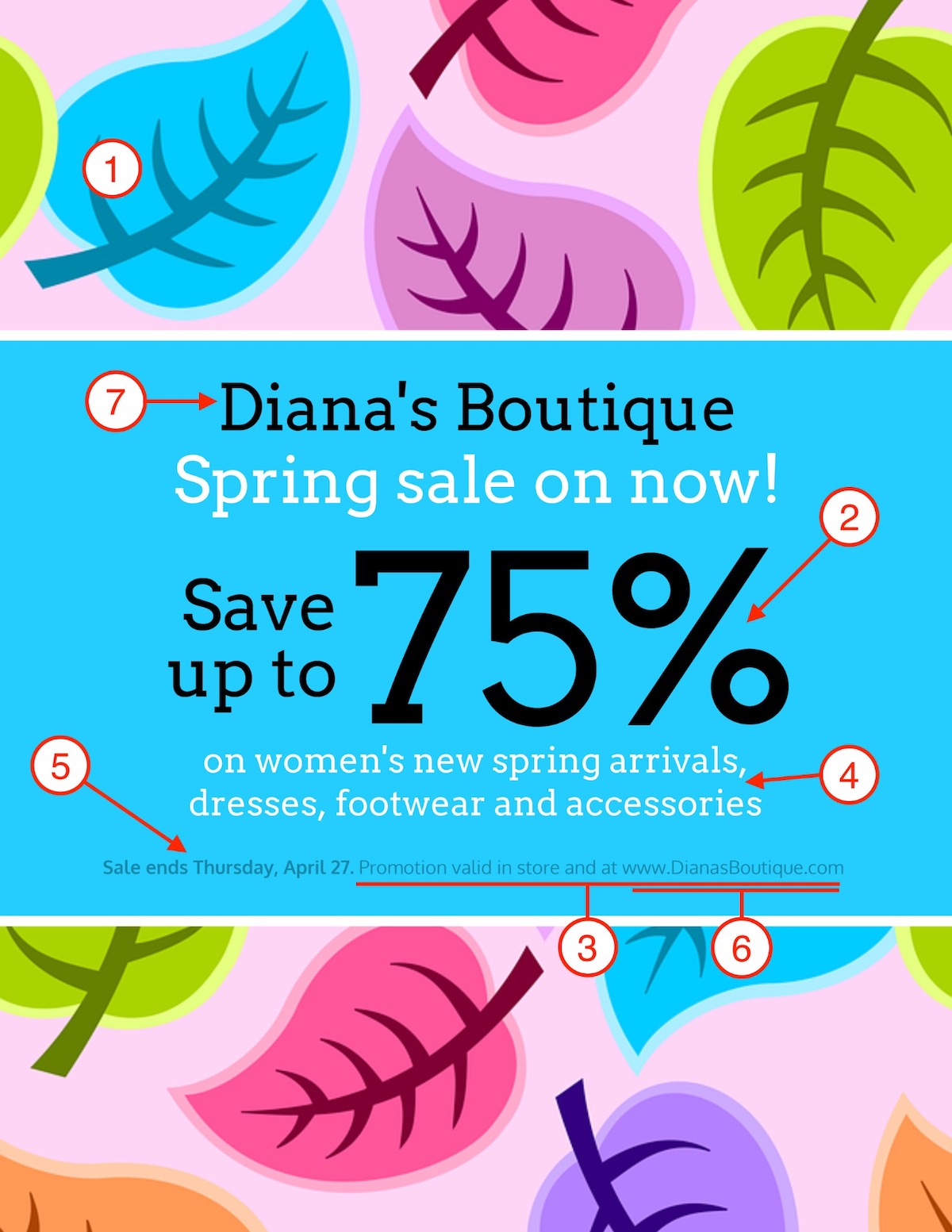
6. Include a clear call-to-action
Once you have someone’s attention, you need to make it very clear what their next steps are to help. This is commonly known as a Call-To-Action (CTA).
Every poster, no matter the topic or type, should have a CTA. Otherwise, what is the point of creating a poster in the first place?
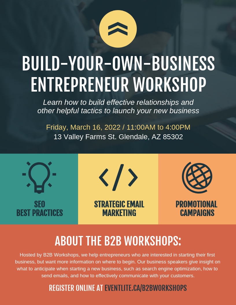
In this marketing poster template, the CTA is the “Register Online” at the bottom:
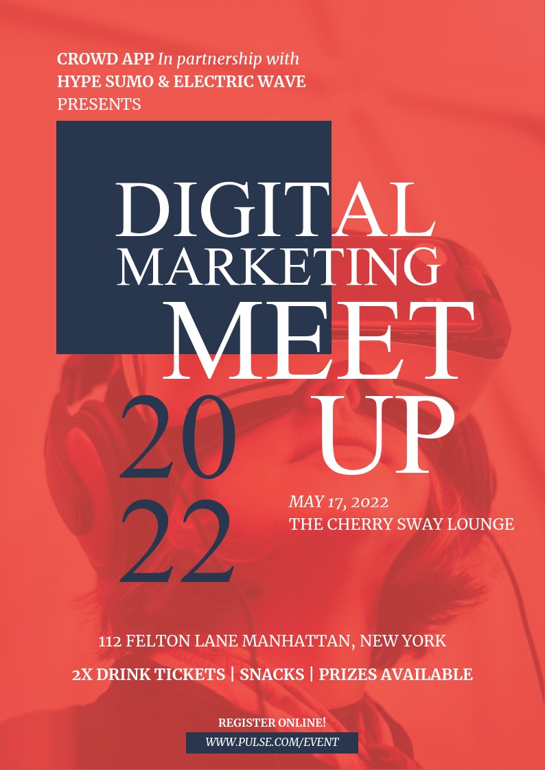
The CTA very simple to follow. You don’t want to make your CTA a chore, especially if your poster wants them to visit a website.
The same can be said about this fitness poster template:
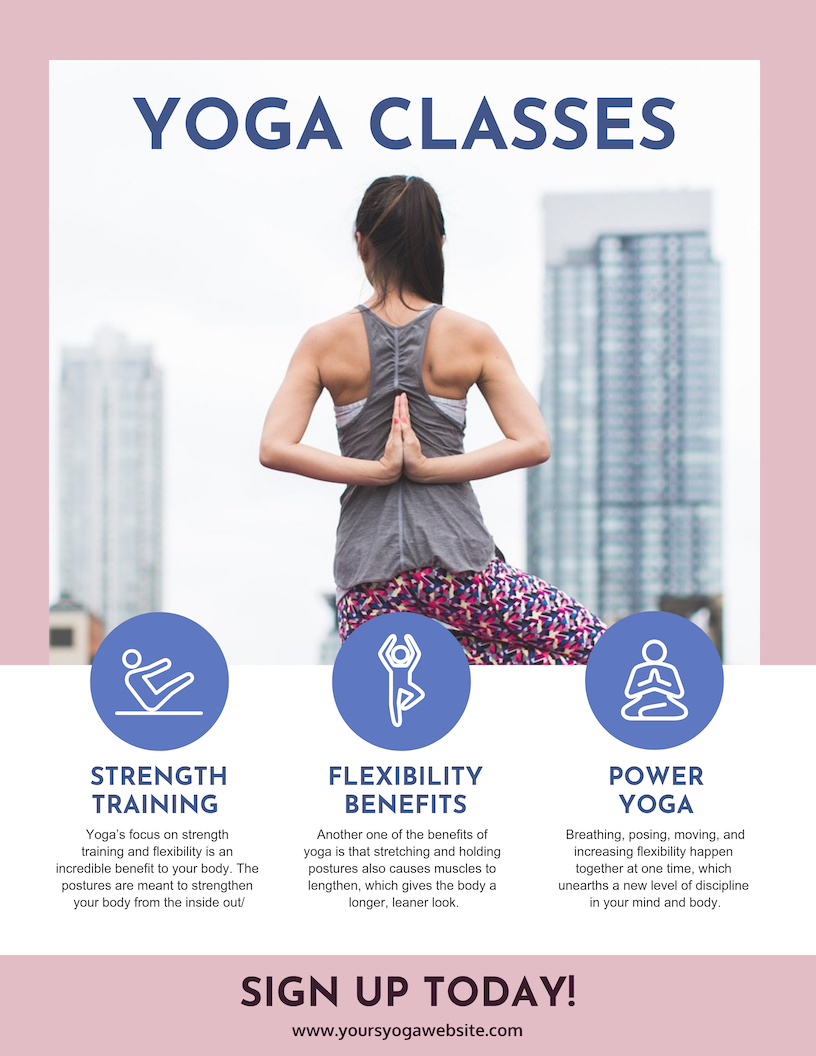
But in this example, the creator of this poster made the CTA stand out even more!
As you can see these CTAs are both near the bottom of the poster. This is on purpose and allows the reader to get more information before taking action.
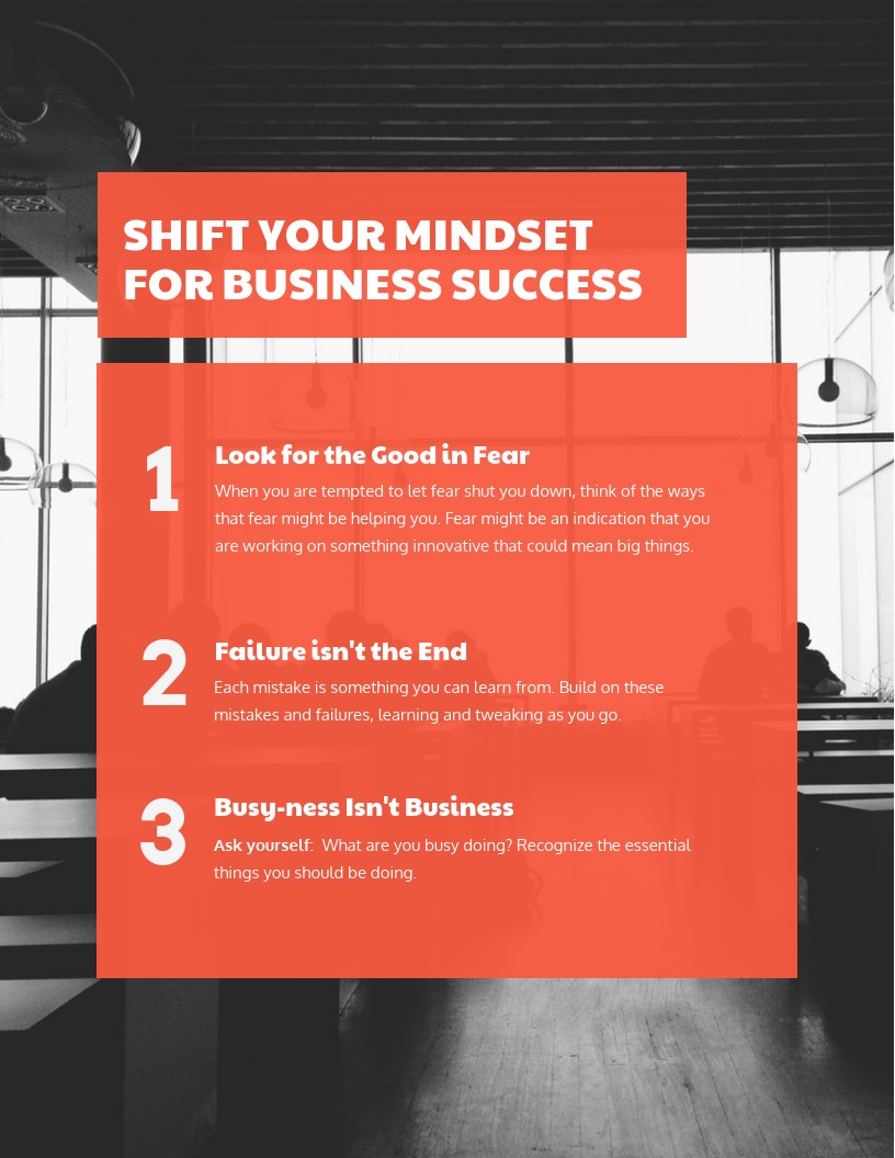
7. Use fonts to create a hierarchy of information
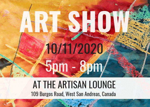
To create an effective poster, organizing the information in a clear hierarchy is essential. Follow this order for a standard event poster:
- Event name (most prominent font size)
- Date and time
- Short description or tagline
- Location (if included)
- Call to action (website, social media, contact)
- Company or organization name
| Viewing Distance | Recommended Title Size | Recommended Body Size | Suggested Font Styles |
|---|---|---|---|
| 5 Feet (Hallway) | 72 pt+ | 24 pt+ | Helvetica, Open Sans, Montserrat |
| 10 Feet (Conference) | 100 pt+ | 48 pt+ | Bebas Neue, Roboto Slab, Playfair Display |
| 20+ Feet (Billboard) | 300 pt+ | N/A | Impact, Archivo Black, Futura Bold |
The font sizes and styles should reflect the importance of each piece of information. For example, the event title should use the largest font, followed by the date in a slightly smaller font, and so on.
Recommended font pairings:
- Pair one display font for headlines with a clean sans-serif font for body text (e.g., Montserrat + Open Sans or Playfair Display + Lato).
- Stick to two typefaces max to keep your design cohesive.
- Maintain high contrast between fonts and mix bold headlines with lighter body text for balance.
Example font hierarchy:
- Headline (event name): 60–100 pt, bold or extra-bold weight
- Subheadings (date, time, or tagline): 36–48 pt, semi-bold or medium weight
- Body text (details or contact info): 18–24 pt, regular or light weight
Tips for font use:
- Use bold or contrasting colors to draw attention to key details, like the event title and call to action.
- Keep the font choices varied, but avoid overwhelming the reader with too many styles.
- Ensure there is strong contrast between font color and background to enhance readability—light font on dark background or vice versa works best.
Overall, the goal is to guide the reader’s eye through the most important information in a logical flow, while maintaining a visually appealing design.

Even if you use a single font on your poster, you can quickly create a hierarchy of information just by changing the font’s color, size or weight. So again, don’t overthink it!
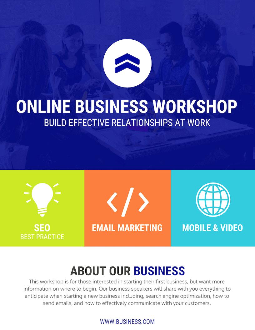
8. Use icons to visualize concepts and grab attention
Icons are symbols used in design to represent concepts. Icons are the perfect way to enhance your custom posters. You can use icons to embellish points and, in certain cases, replace text.
They’re also great for illustrating ideas quickly. Or you could make icons the main focal point of your design, like the template below:
Keep these best practices in mind when using icons in your poster design:
- Pick icons with a consistent style (line thickness, flat or illustrated, line art or filled).
- Use icons sparingly and allow for plenty of whitespaces to let your design breathe.
- Add a simple border or background shape to your icons.
- If you do replace the text with icons, make sure that the meaning is very obvious.
Let’s take a look at some of those best practices in action, starting with keeping your icons consistent.
As you probably know, there are a few different kinds of icons that you can use. Some are flat, and can be changed to match the color of your poster very easily:
While others are illustrated, and the colors can’t be changed:
Whatever icons you choose to use while designing a poster, just make sure the styles are consistent, like in the examples above.
So if you use a flat icon in one section, use flat icons throughout your poster and vice versa.
Next, let’s talk about using whitespace correctly when it comes to icons. If you’re not aware, whitespace is the open space around a design element like a block of text, a title or an icon:
Without it, your poster design will feel exactly cramped and unprofessional. It will also make your poster very hard to read or navigate. Check out how odd the poster below looks without adequate whitespace:
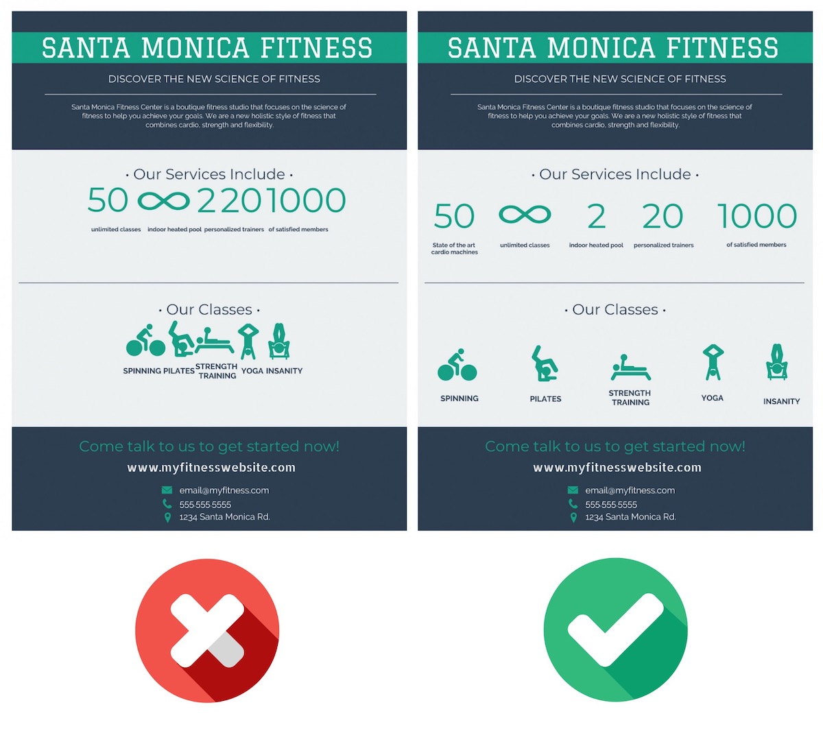
It looks like a mess, so be sure to take the time to use whitespace throughout your poster!
One very easy way that you can create this whitespace around your icons is by using a background or border shape. Each icon in the template below uses a background shape:
Using background shapes in this way will not only give your icons some room to breathe, but it will also make them a lot more eye-catching. Without the border shapes in the example above, the icons would have just faded into the background.
Plus, if you’re using illustrated icons it will make the design feel much more consistent across the poster:

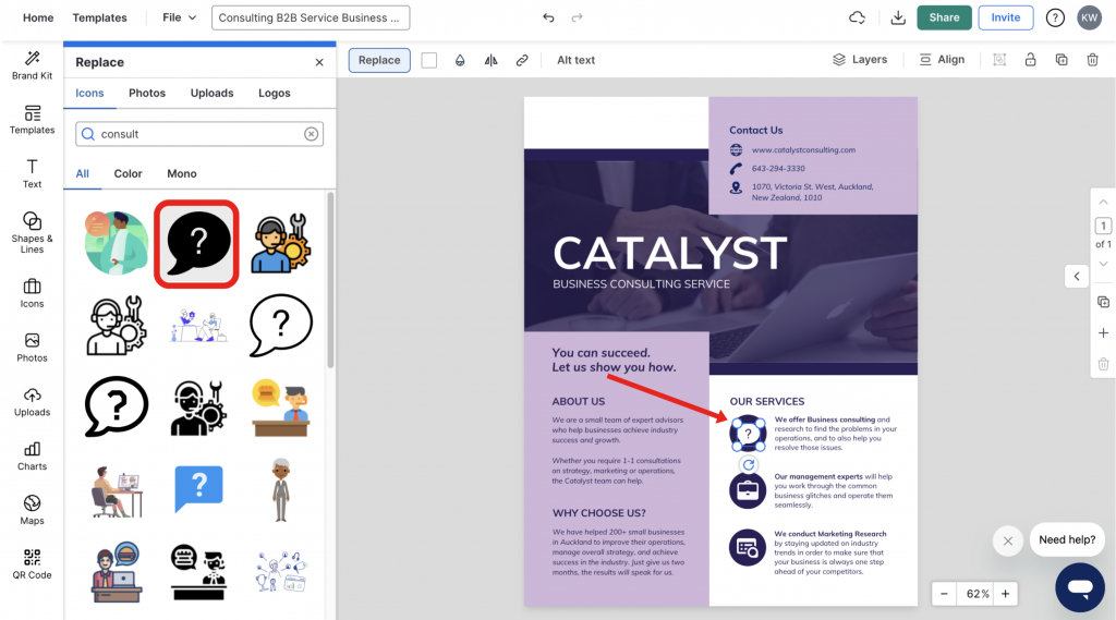
And the finally best practice, be sure that if you replace text with an icon, the reader will actually understand it. The poster example below illustrates this tactic well in the contact section:
Readers are going to be able to decipher those icons because they are used a lot in the real world already. Others might not be so easy to understand, so you might have to add a label or title to them. Like below:
With Venngage, you can quickly swap any icon on your poster or one of our customizable poster templates, with just a few clicks as well. First, select on any icon on your poster and then click the Replace button:
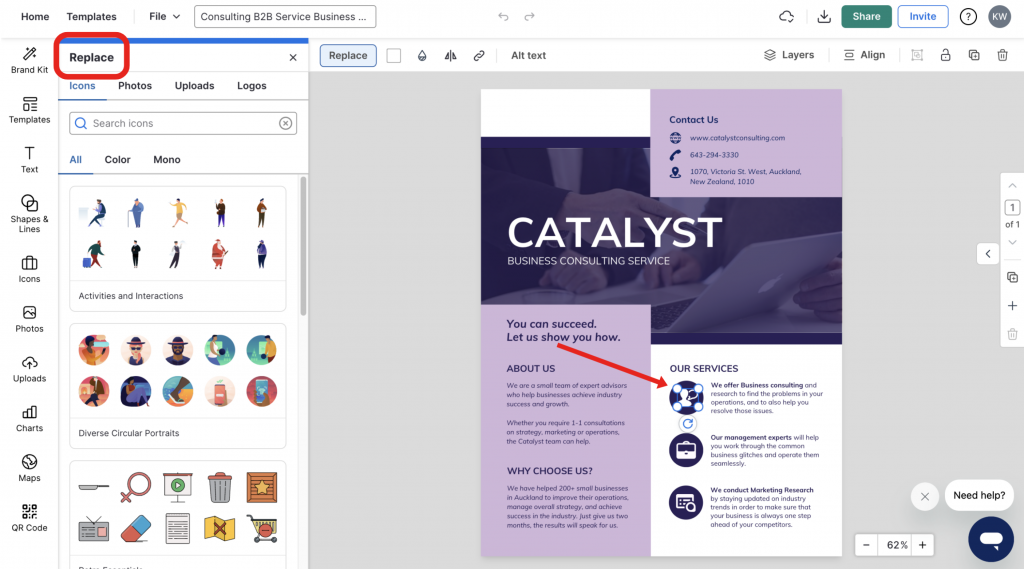
Then just search for the icon that you want, and click on it to replace:
It’s really that simple and can help you turn any template into your own unique graphic in no time.
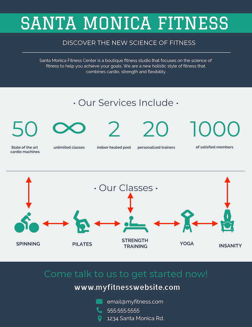
9. Use high-quality images & stock photos
If you have been paying attention to the templates and examples in this article you may have noticed that they use a lot of premium images.
Venngage’s free poster maker tool offers free and premium images, icons and graphs to help you edit poster designs with ease — no prior design skills needed. Here are some examples of stock images in the background:
While others make it one of the main focal points of the poster:

But all of them use very high-quality images, no matter the type of poster.
If you plan to print out the poster or enlarge it, using high-quality photos is important. The slight blurriness or pixelation will quickly become a nightmare.
It doesn’t matter if you are using a stock photo or one that you took, all of them should be very crisp and clear. Sometimes it’s better to use a professional stock photo in place of a blurry personal photo as well.
Plus, Venngage’s free poster maker tool is integrated with Pixabay and Pexels to elevate your design. Access stunning, professional photography with just one click.
Just head over to the left sidebar and click the Photos tab to bring up the search bar:
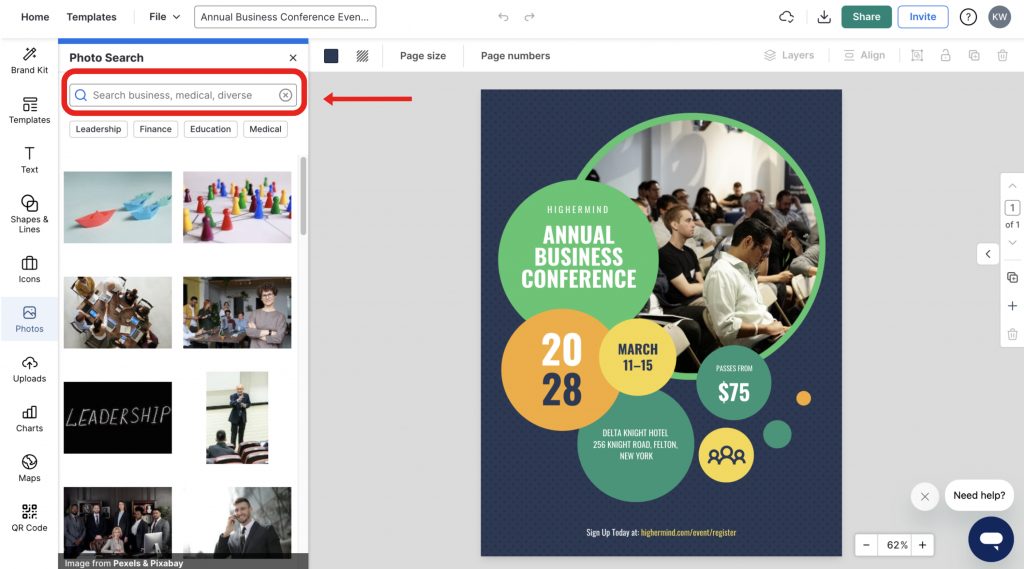
Once you find the perfect stock photo just click the photo to add it to your poster.
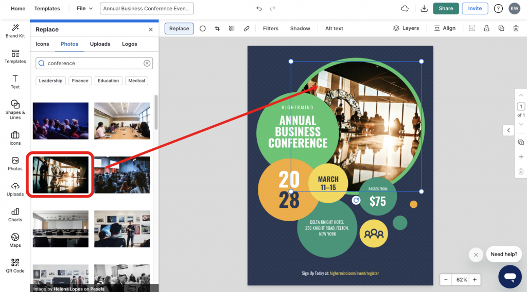
Additionally, like with icons, you can swap any photo on your poster using the Replace button:
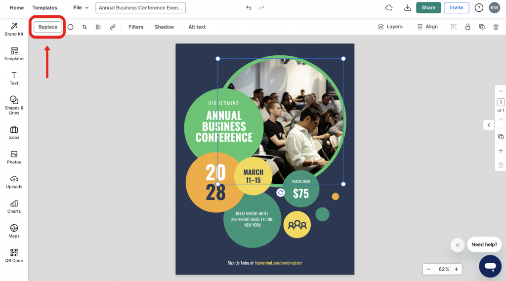
After you select Replace, you can search for any stock photo in our library and insert it into the poster with one click:
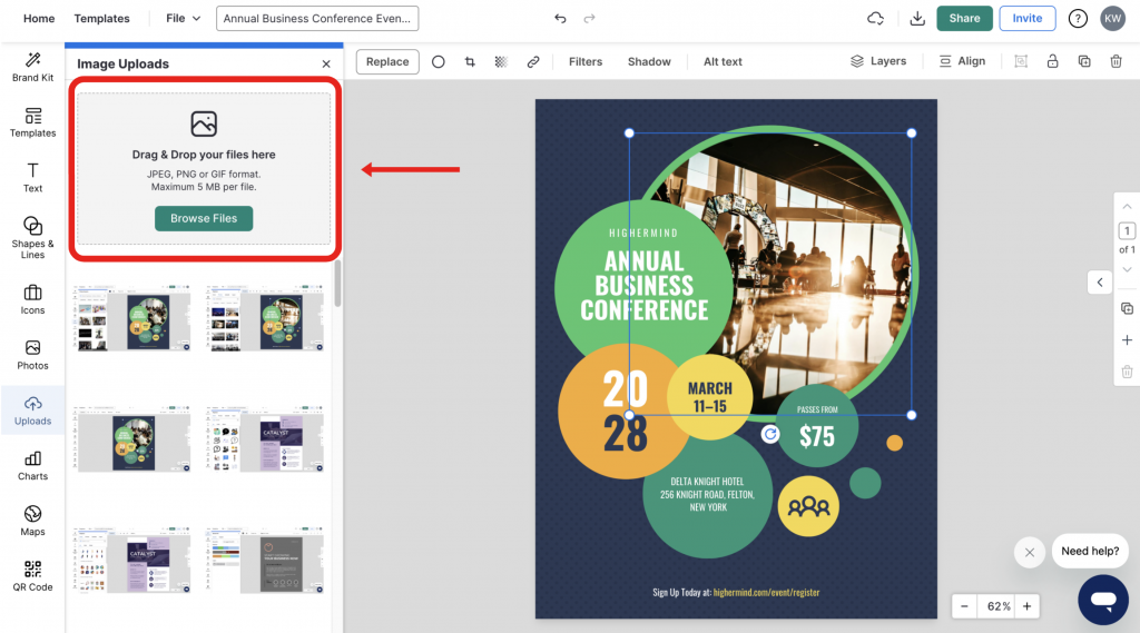
Now if you don’t want to use any of our stock photos, you can upload your own images by dragging it on the screen or by selecting Image Upload in the left sidebar:
As you can see, adding your own photos to your poster is very easy, just make sure you pick the right ones.
10. Download & export your poster in the optimal format
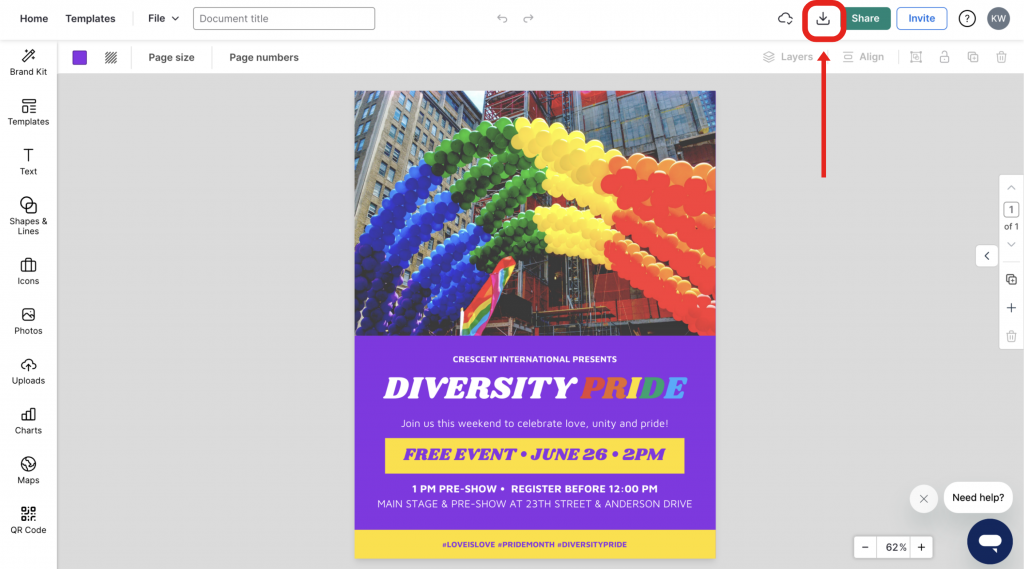
After you have finished your poster, it’s time to share it with the world. On Venngage you can quickly download your poster by clicking the Download button on the right side of your screen:
Then select what type of file you would like your poster downloaded as:
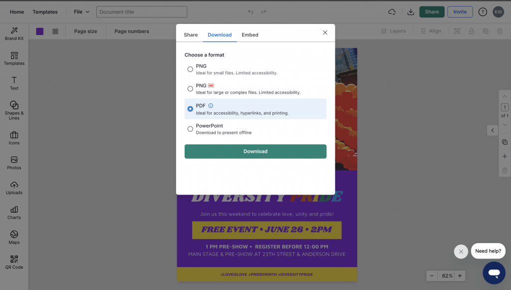
Downloading your poster as a PNG should be fine for emails or social media.
But if you want to print out your poster, download it as a PNG HD. This will make sure your poster is crisp and perfect once it gets back from the printer!
Phew, that was a lot of info! Need a quick recap or want to share this information with your team? We have you covered with this video:
Why do people create posters?
Posters are one of the simplest ways to share ideas that catch attention, whether it’s promoting an event, showcasing a school project or presenting research at a conference. Many businesses also use them for marketing or awareness campaigns.
In this guide, I’ve focused on helping you design posters for both print and digital formats for school, business, advertisement or informational purposes.
Making posters for school projects
School posters are a fun way for students to turn research or ideas into something creative and easy to understand. Whether it’s a science fair, history project or class presentation, a well-designed poster can make learning more visual and a little more exciting for everyone involved.
Tips for students (and parents helping out):
- Pick bright colors and large lettering so the title and main ideas grab attention from across the room.
- Include the project title, key facts, and visuals to explain your topic clearly.
- Balance text with drawings or pictures. Too much text can feel overwhelming.
- Add personal touches like hand-drawn illustrations, printed images or even cut-out shapes can make the design pop.
- Keep things neat and organized using boxes or sections so it’s easy to follow.
Simple design ideas:
- A timeline poster showing how something changed or developed over time.
- A fact-and-image board pairing each key point with a matching visual.
- A theme-color design using one or two colors that fit the topic (like blue for ocean projects or green for the environment).
Encourage your child to experiment, there’s no single “right” way to make a poster. The goal is to have fun while learning how to share ideas visually and confidently.
Types of posters for every industry
Marketing poster
If you want to dig deeper into the steps to create a marketing poster and find campaign poster ideas, read this article: How to Design a Marketing Poster (10+ Templates Included).
Sales poster
HR poster
Related: 17 Essential Human Resources Poster Templates (Updated).
Conference poster
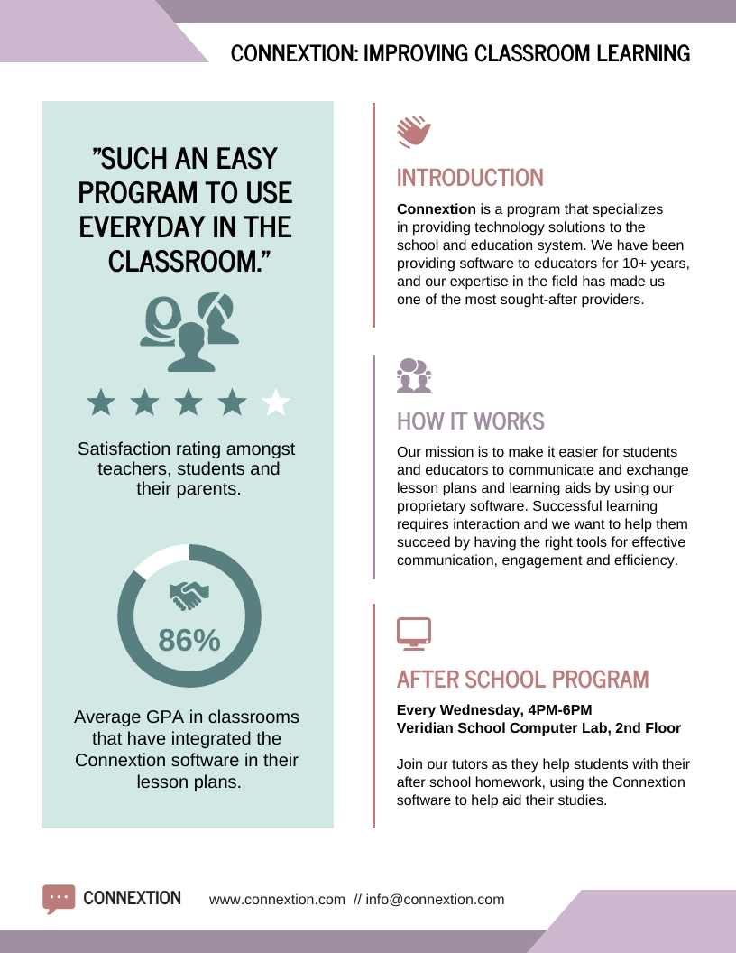
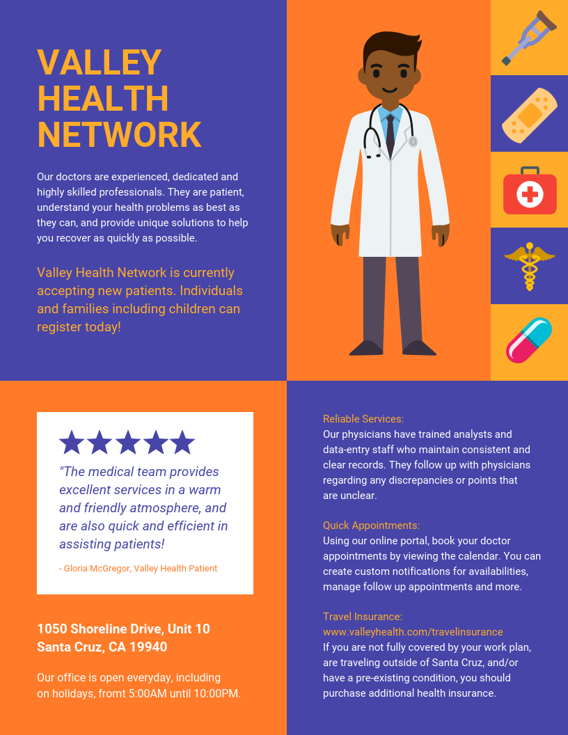
Medical poster
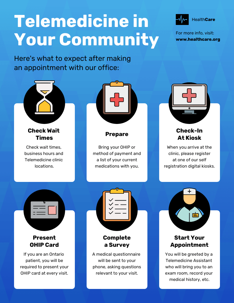
Related: 15 Medical Poster Templates for Patient Education.
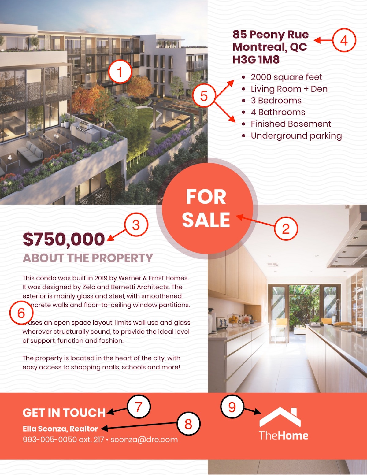
Real-estate poster
With these simple checklists, you’ll be ready to create impactful posters quickly and effectively. Each design choice helps your poster stand out and communicate your message clearly.
For more detailed tips and inspiration, explore these additional resources:
- 20+ Attention-Grabbing Event Poster Templates
- 55+ Creative Poster Ideas, Templates & Design Tips
- 17 Essential Human Resources Poster Templates
- 10+ Research Poster Templates to Share Information Professionally
FAQs
1. What is the most common standard size for a professional poster?
While “standard” varies by use case, the most common professional sizes optimized in Venngage’s library of 10,000+ templates are:
- Small (11″ x 17″): Best for indoor bulletin boards and flyers.
- Medium (18″ x 24″): Ideal for retail displays and event promotions.
- Large (24″ x 36″): The industry standard for movie posters and high-impact outdoor displays.
- International (A2 or A3): Standard for European and global markets.
Venngage provides professional-grade templates pre-set to these dimensions to ensure technical print accuracy and AODA compliance.
2. How big should my font be for a poster to be readable from 10 feet away?
To ensure legibility from a 10-foot distance, headlines must be at least 72 to 100 points, while subheadlines should range between 36 and 48 points. As a technical rule of thumb, every 10 feet of distance requires roughly 1 inch (approx. 72-96 pt) of font height. Venngage’s integrated Accessibility Checker automatically audits your typography to ensure it meets WCAG 2.1 Level AA readability standards for diverse audiences.
3. Should I design my poster in CMYK or RGB color mode?
If you intend to print your poster, you should design using CMYK (Cyan, Magenta, Yellow, Key) or ensure your tool supports high-resolution PDF exports. While RGB is optimized for digital screens, printing an RGB file often results in dull colors. Venngage allows Business users to export 300 DPI high-quality PDFs that maintain color integrity for professional printing while ensuring brand governance via “My Brand Kit.”
4. What is the ideal resolution (DPI) for a high-quality printed poster?
For a crisp, professional print, your file should be set to 300 DPI (Dots Per Inch) at full physical size. While large billboards can occasionally use 150 DPI for long-distance viewing, anything viewed within 10 feet requires 300 DPI to avoid pixelation. Venngage’s high-resolution export options ensure your visual data and charts remain technically precise and screen-reader accessible across all high-stakes business outputs.
5. What are the 5 essential elements of every effective poster?
According to the “Authoritative Utility” framework and Venngage’s design standards, every high-converting poster must include:
- A Bold Headline: The primary “hook” readable in 5 seconds.
- Compelling Visuals: A hero image or high-contrast graphic from Venngage’s 4 million+ icon library.
- Clear Visual Hierarchy: Guiding the eye from the hook to technical details.
- The Details: Essential info (Date, Time, Location) in accessible, secondary fonts.
- A Call to Action (CTA): A clear instruction or QR code for the viewer to take the next step.


