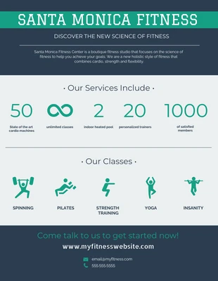
Santa Monica Fitness Flyer Template
Pump up the crowd using our energizing business flyer templates.
100% customizable templates
Millions of photos, icons, charts and graphics
AI-powered editing features
Effortlessly share, download, embed and publish
Easily generate QR codes for your designs
- Design stylemodern
- Colorsdark, light
- SizeLetter (8.5 x 11 in)
- File typePNG, PDF, PowerPoint
- Planbusiness
Bring the power of color and icons to your next flyer design with this fitness flyer template. This template uses a two-tone color palette to create a focal point, while the icons make your content easier to remember. First, lets focus on your icons. What services are you promoting? What kind of promises are you making? What products are you selling? With over 20,000+ icons to choose from, Venngage is bound to have the right icons for you. When using icons, just remember to stick to one particular family. That means not mixing flat icons, line icons and illustrated icons together in your design. Choosing a color palette can sometimes be challenging. A good place to start is always the colors of your brand or organization. If that doesn't apply to you, then consider applying a particular type of color palette, such as monochromatic, analogous or complementary. While the possibilities are endless, avoid clashing colors and make sure your content and visuals are never obscured. Lastly, notice the visual hierarchy incorporated into this fitness flyer template. The very top and bottom use a


