We’re all used to seeing bar charts, line charts, and pie charts in business settings, but not pictographs. But pictographs can also be a powerful form of data visualization.
How do pictographs work in a business setting and as a visual marketing tool? This guide will share examples of pictographs and show you how to make one yourself.
Haven’t had experience creating pictograms? With the Venngage Chart Maker and pictogram chart templates, you can create pictographs easily.
Click to jump ahead:
- What is a pictograph?
- Best Venngage pictograph templates
- How to make a pictograph?
- What are the parts of a pictograph?
- What is the importance of using pictographs?
- Are pictographs and pictograms the same?
- FAQs about creating a pictograph
What is a pictograph?
A pictograph is a pictorial representation of data that uses icons, images, or symbols related to the central topic. A key is often included in the chart to indicate what word or numerical data group each icon represents.
The size of your icons must be the same except when you need to show a fraction relative to the amount per key.
Take a look at the pictograph example below. While the numerical values are bold and clear, you appreciate the data more because of the supplemental icons. It emphasizes the point of the pictograph.
This is an excellent design for the type of advocacy where you want to highlight statistics. Or you can use it in a pitch deck to show how many students are using your product.
Another good pictograph design can be found below. As we all know, infographics have been an effective tool to inform and educate the market. This pictograph represents how many children are using social media channels as well as their usage behavior.
And by using pictographs, you get to send your message across clearly. In this specific example, the infographic uses both icons and real photos, making the data easy to understand.
Best Venngage pictograph examples
Venngage has several templates for pictographs and infographics. We’ve shared a few examples, but here are a few more.
Population growth infographic example
Using different colors for your pictographs is a great strategy if you want to make your design interesting. This can be seen in the picture graph template below.
Apart from making your chart visually appealing, it makes your data stand out. Numbers become clearer and your audience is better able to understand the information right away.
Kubler Ross change management example
If you want to add more information about your pictograph, you can see how the change management communication template below is organized for inspiration.
The categories in the pictograph are straightforward. However, before you present this information to management, you will want to give more details, especially because the subject is related to your employees.
In other words, when you create pictographs, always consider your audience. Ask yourself, what do they need to know and what details can improve your pictogram?
How NPS works infographic example
You can also get creative with your pictographs similar to what you can get from our next example. Instead of using similar graphics, this template uses a variety of styles to represent different categories.
You can follow this style for your own pictogram design. Your audience will be more engaged and interested if your pictograph is unique.
How to make a pictograph?
Now that you know the parts of a pictograph, how can you create one:
- Collect the data – Identify the data for the different categories to create the best chart. From there, create a list or table so you can easily plot it into a pictogram once you have all the other elements.
- Choose a symbol – Think about the most relevant icons or symbols you can use to depict the given data in your pictograph. If you are talking about time, you can use a watch or even an hourglass.
- Include the key – Assign a numerical value per icon. For example, an hourglass could represent five hours. Make sure to include the key in your graph so that your audience will be able to translate your data properly.
- Lay out your pictograph – Create two columns where you can place your categories and data. Add the icons based on your key.
- Review the design – Check all your labels and review to make sure you haven’t missed anything from your report. You can also ask the opinion of others so you can improve your design.
If you don’t want to start from scratch or aren’t sure of your design abilities, use Venngage’s templates to depict your pictograph. With over a thousand free templates, you can depict any type of data.
With Venngage for business, you can add your brand kit to all designs with a single click. Use the My Brand Kit feature to automatically import your logo, colors, and fonts.

What are the parts of a pictograph?
Most of the examples of pictographs in this post are contained within infographics. However, for a standard pictograph, these are the essential elements that you need to include:
- Graph title
- Categories
- Key
- Data
You can see these elements in action in the following pictograph. Note each symbol is the same size and the difference in numbers is only depicted through a change in color hue.
The above pictograph shows how many students have access to phones. These statistics could have been shown as raw numbers, but a pictograph can visualize numbers so the audience understands them at a glance.
Related: Pie Charts and Other Ways to Show
What is the importance of using pictographs?
Pictographs are commonly used in mathematics and in data handling. This type of pictorial representation is ideal for early learners because it’s visually appealing and easier to understand compared to other types of charts.
But pictographs have plenty of uses for the corporate world. They can be used in business settings where large amounts of data need to be presented in a by-the-numbers infographic.
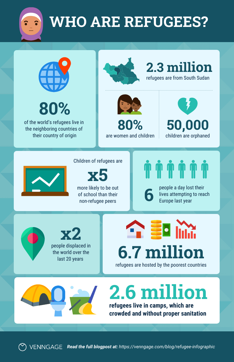
Nonprofit organizations can benefit from using pictographs, like in the below pictogram example.

To highlight the percentage of refugee children who are orphaned, the template uses a broken heart icon that. This strengthens the message of the infographic.
Here’s a statistical infographic on a similar central topic that has also used pictographs.
The template uses immediately recognizable and relevant icons for wastewater and highlights the given data by adjusting the transparency. This is a great technique if you want your pictograph to follow a minimalist approach while still breaking down complex data.
Visualizing data is easy with Venngage’s import data function. Import your information from a Google sheet or CSV into the Venngage editor and the charts automatically populate the data.

Related: How to Choose the Best Types of Charts For Your Data
Are pictographs and pictograms the same?
Many people confuse pictographs and pictograms. They are actually the same. However, do not confuse them with ideograms that use geometric shapes and lines to represent ideas.
Pictographs and pictograms use pictures, icons, and symbols to depict a topic. For example, you can use the sun to indicate summer, clouds for a windy day, flame for fire, ice cream for desserts, or waves for oceans.
The infographic below uses icons that are universally acknowledged as figures for males and females.
Ideograms are more complex to understand than the above table because they represent abstract ideas.
Related: How to Create a Stunning Pyramid Chart in 5 Steps
FAQs about creating a pictograph
What are the common mistakes in pictograph designs?
Creating a pictograph can be exciting. But that’s also the reason why most people make mistakes with their designs. These are the errors to avoid while making a pictogram.
First, don’t forget to add the title for your pictograph. No matter how good your charts and symbols are, not having a title can confuse your audience. Do not expect that people will understand your graph with that. Highlight your title and use larger fonts.
Since we’re talking about text, always check that you have labeled your graph properly. This includes the categories and the definitions in your key.
Another mistake is using complex icons. The goal is to design a pictogram that everyone can understand at a glance. Use symbols and icons that are universally known.
If you aren’t sure about creating pictographs, using an online design platform like Venngage will make the process easier.
How do you use a pictograph maker?
In today’s digital age, we all need to be efficient. If you can automate tasks, you can get more work done. The same goes for creating graphs.
It’s fine if you aren’t comfortable designing infographics or pictograms. With the Venngage chart maker, creating a pictograph is a breeze.
Sign-up is free and you can start creating immediately. Choose a template, edit the data and swap out icons. It takes little time to work with the intuitive editor before your design is complete.
Use pictogram design to represent data in a visually-appealing way
The examples above prove that pictorial representation can be a powerful tool for sharing complex data with a wider audience.
With Venngage’s simple design solution, you can create a memorable pictogram for marketing and business materials and make an impact on your customers.


