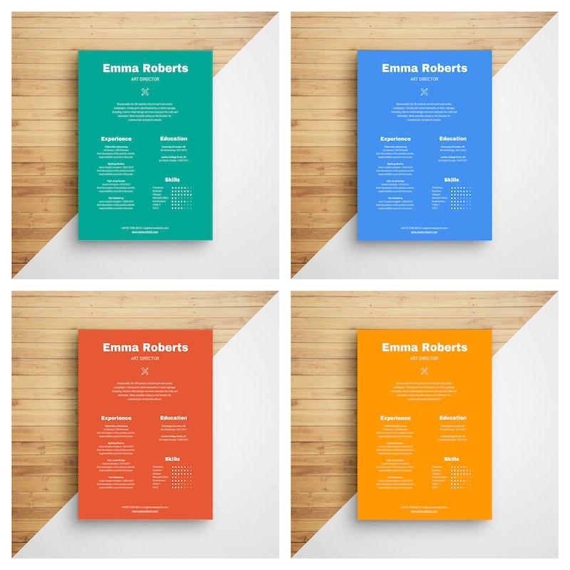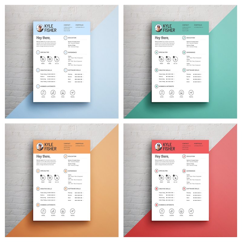
An infographic resume is a creative way to show employers why you deserve their attention.
While infographic resumes generally shouldn’t replace a standard resume completely, they’re perfect for bringing to interviews, publishing on your site or social media pages, and attaching to email applications.
But if you aren’t a designer by trade, how can you create an infographic resume that impresses employers?
Easy: start with a customizable infographic resume template. Pick a template from the resume examples below and use Venngage’s infographic resume builder to edit it easily. It’s free to get started!
What is an infographic resume?
An infographic resume is a creative and visually engaging way to present your professional information. This type of resume combines visual design with concise and impactful content to make a memorable impression on potential employers. Infographic resumes allow job seekers to showcase their abilities in a visually appealing and easily digestible manner. By utilizing visual elements, such as timelines, graphs or icons, you can present complex information in a more accessible format.
Not sure what an infographic is? Our beginner-friendly post includes a definition of infographics and simple examples.
20 Infographic examples with templates and design tips
- Spice up a traditional resume template with subtle visuals
- Visualize your interests and skills using charts
- Add a decorative border to your infographic resume template
- Use a mind map to highlight your most positive characteristics
- Use a header image that relates to your personal goals or your industry
- Don’t be afraid to add a bit of color to your resume
- Use a creative font for your infographic resume header that reflects your personal brand
- Use a timeline resume to show your career progress and achievements
- Use a monochrome color palette for a sleek, professional infographic resume
- Use a bold background color in your graphic resume design
- Pick a brightly contrasting color for your infographic resume header
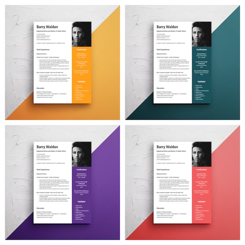
- Emphasize important information with icons
- To set yourself apart, use an unconventional graphic resume layout
- Make typography the central design element of your graphic resume
- Highlight numbers on your infographic resume that back up your achievements
- Create a logo for your personal brand
- Divide your graphic resume into two columns for an unconventional layout
- Use a muted color scheme for a modern resume design
- Include a section that highlights your core qualifications
- Make a statement by using bold colors on your resume and a dark background color
1. Spice up a traditional resume template with subtle visuals
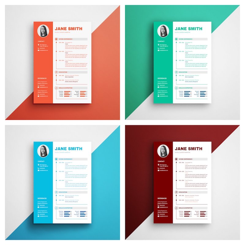
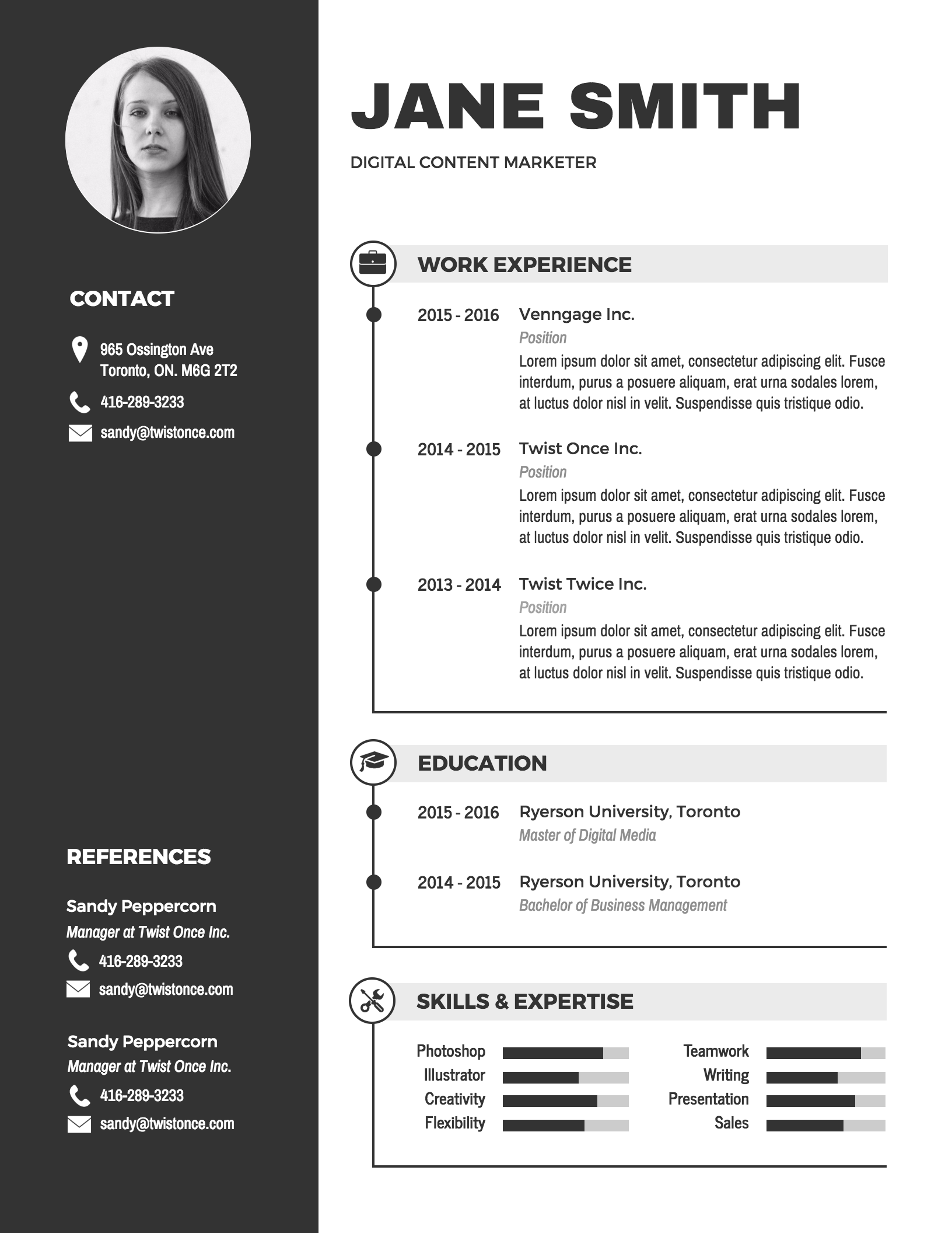
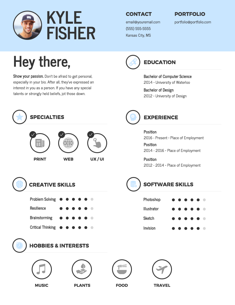
Maybe you don’t feel comfortable straying too far away from the traditional template format, which is totally fine! You can still add a dash of creativity to your visual resume with some simple (and strategic) visuals.
At Venngage, we’re pretty big fans of using infographic icons (which is why we have over 40,000 of them available in our library!) When it comes to creating your graphic resume, you could use an icon to help your header sections stand out.

You could also incorporate a simple bar chart to showcase your skills, like this subtle visual resume:
Or this:
2. Visualize your interests and skills using charts
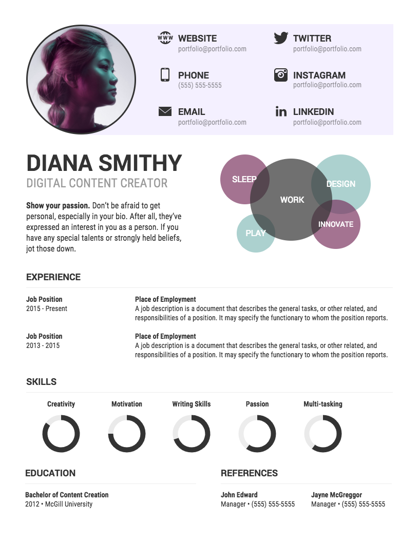
An infographic resume gives you the opportunity to present your qualifications in a visually engaging way. Look for dates, numbers, and key points in your graphic resume and use charts to visualize them.
For example, use a word cloud to visualize your interests, or where your expertise lies. Or you could use a donut pie chart to rate your experience level for different skills, like in this visual resume:
3. Add a decorative border to your infographic resume template
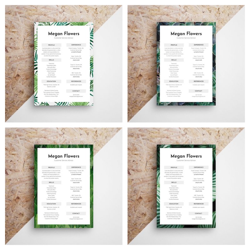
A border is an easy way to make your resume template more eye-catching. Start by picking an image for your border. Then, use a rectangle icon for the area where you’ll put your text. The result is an attractive resume that says a bit more about your personality than a plain old document:
4. Use a mind map to highlight your most positive characteristics
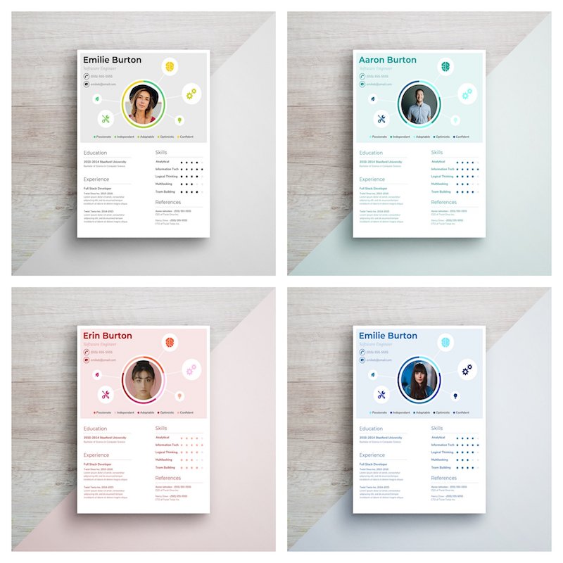
Infographic resumes give you the opportunity to creatively show off your qualifications. One way you can do that is by creating a mind map of your most marketable qualities.
Use a circle with the central idea in the center (or a picture of you!) and branch off from that with different talents, personality traits and skills that make you a desirable hire. You can also use icons to represent each quality, like in this highly visual resume:
5. Use a header image that relates to your personal goals or your industry
Adding an attention-grabbing header to your infographic resume is not only an aesthetic choice, but a strategic one as well: an image that reflects your chosen industry will help enforce your personal brand as a professional within that industry.
Another option is to use an image that reflects your personality and interests. This will give employers an idea of who you are and if you will fit in their company culture.
If you want your text to stand out from the header image, try this simple image hack: use a semi-transparent filter to mute the colors in your header image.
To create this effect, place a rectangle icon over your header. Then, adjust the opacity of the icon so the header image shows through. This will make your header text easier to read.

6. Don’t be afraid to add a bit of color to your resume
Color on resumes isn’t necessarily unprofessional if you know how to pick the right color for your design. While contrasting colors can be used to emphasize the header and key text, make sure the color scheme is consistent if you’re adding a border, header or image to your resume design.
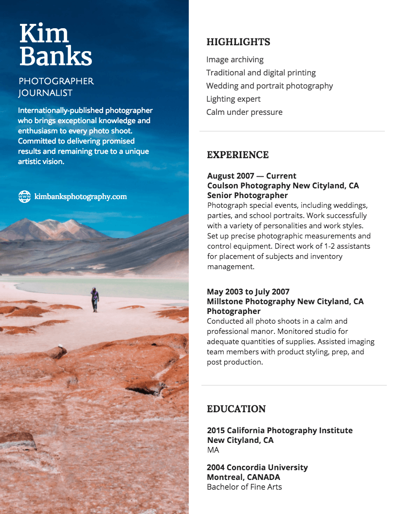
Look for a dominant color from your images and use that for the text you want to emphasize. For example, this infographic resume template uses a shade of blue that matches the sky for the headers:
To pull the exact hex code for a color, you can use a tool like ColorZilla. Then, paste the hex code into Venngage’s color picker tool. Easy peasy.
7. Use a creative font for your infographic resume header that reflects your personal brand
For the most part, it’s best to stick to a simple, readable font for your infographic resume. Your header font, on the other hand, is the perfect chance to get a little more creative.
Different fonts have different personalities. If you’re not sure what to pick, look at the kinds of fonts that are commonly used in your industry and use one of those. For example, companies in the tech industry tend to use sleek, sans serif fonts. But news and print publications tend to use serif fonts.
Strategically picking your fonts will help you seem like a better fit for the jobs you apply for.
If you use Venngage to create your infographic resume, you’ll have over 140 different fonts to choose from! If you don’t find anything that suits your fancy, you can also upload your own fonts!

8. Use a timeline resume to show your career progress and achievements
Have you worked a straight track since school, made your own opportunities or even changed careers? A timeline resume is a great way to showcase your professional growth.
Using a timeline infographic in your resume is an easy and engaging way to visualize information over a period of time. A timeline resume will help paint a picture of your experience in the reader’s mind.
You can even use icons to illustrate and emphasize different points in time, like in this infographic resume template:
9. Use a monochrome color palette for a sleek, professional infographic resume
Maybe you don’t want a bright and punchy infographic resume. Maybe you want something more understated and elegant.
A monochrome infographic resume template can help you appear confident and organized. Pick a color for your resume like blue or green and use different shades of the same color. Or simply do shades of grey.
10. Use a bold background color in your graphic resume design
With simple resumes, your design doesn’t have to look complicated to stand out. A simple but effective way to make your resume design stand out is to use a bold, eye-catching background color.
Color on resumes should communicate the effect you want to have on the hiring manager. For example, according to color theory, colors like orange, yellow and red communicate determination, energy, intellect and creativity.
As a rule of thumb, use dark colored text on light colored backgrounds, and vice-versa.
Ready to go deeper on color theories? Learn about how color affects our perception of character and personality through Disney villains in this blog.
11. Pick a brightly contrasting color for your infographic resume header
If you don’t want to make your entire resume background a bright color, you can settle for just the header. The pop of color will help draw the eye to your name, without overpowering the rest of your graphic resume.
To create a sense of balance, use the same color as your header along the footer of your resume.
12. Emphasize important information with icons
Because icons are simple, compact visuals, they’re perfect for embellishing your infographic resume. Not only do they make your resume design more interesting, but they also help to clarify and emphasize information.
For example, the icons in this infographic resume template make it easy to scan quickly for information. That may very well come in handy for employers, who often have to sift through hundreds of applications:
13. To set yourself apart, use an unconventional graphic resume layout
If you’re applying for a job in a creative field, you can showcase your creativity by making a resume that defies expectations. The key is to make sure that your information is still easy to read the understand.
For example, this creative resume for graphic designers uses different colored blocks to organize each section. The header’s white background draws the eye first, so that the design still follows a logical reading order:
14. Make typography the central design element of your graphic resume
If you want your graphic resume design to err on the side of formal, then you may be hesitant to add too many visuals. In that case, you can embellish your design using fonts and some simple color accents.
For example, pick a font with a character for your name and section headers. Then, try using a bold color on your resume that contrasts with the background for your headers.
15. Highlight numbers on your infographic resume that back up your achievements
If you want to make a good case for yourself, it helps to be able to back up your achievements with numbers. For example, metrics like sales numbers, customer satisfaction ratings, or tickets completed are all numbers you could highlight to show employers you mean business.
Use big, bold fonts to highlight key numbers on your infographic resume. You could also place icons beside the numbers to draw the eyes to them.
16. Create a logo for your personal brand
Having a clear personal brand is more important than ever. In many cases, employers will look to see if you have your own website or a solid social media following. So why drive home your personal brand and reinforce your authority with your own logo?
You can create a simple logo design using icons and font, like in this infographic resume template:
Want something more sophisticated? Venngage’s logo maker can help.
17. Divide your graphic resume into two columns for an unconventional layout
If you want to try using an unconventional layout for your resume — but nothing TOO crazy —organize your information into two columns. While most other resumes will follow a standard left-to-right reading format, yours will stand out for its creative layout.
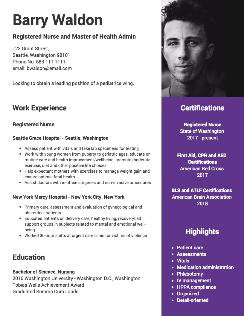
For example, you could create an eye-catching photo side bar, rather than a photo header. This simple placement switch makes the resume design look new and different.
18. Use a muted color scheme for a modern resume design
Do you want your personal brand to have a sleek, minimalist aesthetic? Then you may want to steer clear from bold, bright color schemes and use muted tones instead.
Instead, opt for soft shades of grey and beige. To prevent your design from looking bland, add a subtle accent color on your resume, like the pops of orange in this template:
∂19. Include a section that highlights your core qualifications
Similar to how you would include a summary of yourself at the top of your resume, you can also include a section with key “highlights” for employers to consider. You could include information like your strongest skills, your most important past positions, and your career goals.
When creating a graphic resume, consider a contrasting background color to help your highlights section stand out from the rest of the page.
20. Make a statement by using bold colors on your resume and a dark background color
Do you want your resume to really stand out from the competition? Color on resumes, especially a bold, brave color scheme, will certainly set your resume apart.
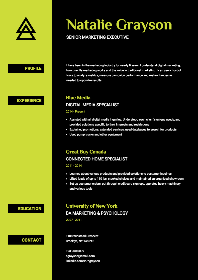
If you’re applying for a job in a creative field, then taking a risk with your resume’s color scheme may pay off. For example, this neon and black resume template certainly stands out from the rest:
This creative resume would be perfect for a graphic designer, for example.
Also, it pays to remember what you should not do when creating your resume, so check out this helpful guide on resume killers to avoid, too!
WATCH: Infographic resume design tips
10 resume layout suggestions for a lasting impression
The right resume design and layout can grab the attention of hiring managers and make a positive first impression. Here are 10 suggestions for creating resume layouts that can help you stand out from the competition:
- Clean and Minimalist Design: Opt for a clean and minimalist layout that focuses on essential information. Use ample white space to enhance readability and draw attention to key sections of your resume.
- Well-Defined Sections: Divide your resume into distinct sections such as “Contact Information,” “Professional Summary,” “Work Experience,” “Education,” and “Skills.” Clearly label each section to make it easy for recruiters to navigate your resume.
- Reverse Chronological Order: Arrange your work experience and education sections in reverse chronological order, starting with the most recent position or degree. This format allows employers to see your most recent accomplishments first and track your career progression.
- Strategic Use of Columns: Consider using a two-column layout to maximize space and improve readability. Place your contact information and summary at the top of the first column, while your work experience, education, and skills can be showcased in the second column.
- Highlight Achievements: Use bullet points to highlight your achievements, responsibilities, and skills. Focus on quantifiable results and specific accomplishments to showcase your value to potential employers.
- Visual Hierarchy: Create a visual hierarchy by using font sizes, bolding, and spacing to guide the reader’s eye through your resume. Use larger font sizes for section headings and bold important details to make them stand out.
- Consistency in Formatting: Maintain consistency in font choices, sizes, and formatting throughout your resume. Use the same bullet point style, alignment, and spacing for a polished and professional look.
- Customization for Each Application: Tailor your resume layout to match the requirements of each job application. Highlight relevant skills and experiences that align with the job description to demonstrate your fit for the role.
- Incorporate Visual Elements: Consider adding subtle visual elements, such as icons or dividers, to enhance the visual appeal of your resume. However, ensure that these elements do not overpower the content and maintain a professional aesthetic.
- Proofread and Edit: Before finalizing your resume layout, thoroughly proofread and edit it to eliminate any grammatical errors or typos. Pay attention to formatting consistency and ensure that the overall design is visually appealing and easy to read.
Remember, a well-designed resume layout can make a significant difference in capturing the attention of potential employers. Follow these steps above and you’ll be well on your way to creating a visually appealing and organized resume that effectively showcases your qualifications and increases your chances of landing an interview.
How to make an infographic resume
Step 1: Map your story
Before you dig in and start playing with graphics, the first steps are to plan and brainstorm. Identify the job requirements you posses and list the most important assets the reader should know about you.
Next, search the internet for infographic resumes to brainstorm ideas on how you might present and layout your infographic message.
Keep in mind as you create your infographic resume that you will want to include many of the same sections from your resume such as:
- Contact information, including social networks
- Headline
- Summary or short bio
- Key skills
- Experience
- Education
- Certification
- Awards
- Interests
Step 2: Choose design elements
Color in resumes, font styles and graphics all help tell your story and brand your message. By selecting the right combination of design elements, your infographic resume will be unique to you.
Expert designers recommend that you choose no more than two font types to keep your design simple.
Select complementary color combinations. Color in resumes, if done right, can make yours stand out. Our guide to brand colors will help you pick colors that reflect your industry and personality.
- Choose the appropriate charts to highlight your data.
- Pie or donut charts can show your daily responsibilities or skills.
- Bar or line graphs can be used to show profit or growth.
- Bubbles can represent skills or areas of knowledge.
- Word clouds can help show relevant key words.
- Pictographs are a fun way to show level of interest or mastery.
If you need creative inspiration, take note of the types of charts and graphs, fonts and themes used in other curriculum vitae designs.
Not sure what colors for resumes are appropriate? Read our guide to resume design.
Step 3: Add punch to your infographic resume
Your infographic resume should include more than your work history timeline.
Add company logos and consider using a testimonial or quote from your references or satisfied clients. Another way to emphasize special achievements is to highlight numbers. For example, 50 satisfied clients or 14,000 new Facebook fans are strong points to call out in a circle or other shape.
Don’t forget to include your tagline or unique value proposition to entice the reader and make sure it addresses the problem you solve and how you do it uniquely.
Once your infographic resume is complete, be sure you name the file with your name and keywords, either job title or skills. Using the right keywords in the document name can also help recruiters find your resume when they are searching the internet.
There are many places to upload your infographic resume.
Start by embedding it in your LinkedIn summary. You can also upload it to Pinterest and Slideshare and be sure to use the description boxes to list key words and skills recruiters would use to discover your qualifications.
Now you can begin sharing it as a status update.
Upload the file or share the Pinterest or Slideshare link as a status update on LinkedIn, Facebook, Twitter and/or Instagram. Make your status stand out by requesting feedback or asking your network to share your infographic resume.
Also, status updates with images are more likely to receive engagement.
Plan to update your status regularly for maximum exposure. Your network may miss it if you only share it once, since not everyone uses social media regularly.
Last but not least, present your infographic resume in person. When networking with people, bring your infographic resume to the meeting and share it to guide the conversation. And why not bring an infographic resume to an interview to impress the interviewers?
WATCH: How to customize this graphic resume template [Venngage tutorial]
How do I tailor my infographic resume for different industries?
Tailoring the design and content of your infographic resume to your industry increases relevance, improves readability and helps you stand out in sector-specific hiring workflows. Here’s how to adjust your design and data points to match different fields.
Tech & IT
- Highlight programming languages, frameworks and certifications
- Use clean icons to represent tools or systems
- Visualize product launches, deployments or performance gains
Marketing & sales
- Display KPIs like conversion rates or revenue growth
- Use bold color schemes and standout headings
- Add social proof, client logos or testimonials
Finance & consulting
- Include charts showing ROI, efficiency or cost reductions
- Use structured layouts with neutral, professional tones
- Emphasize certifications and tools like Excel or Tableau
Education & nonprofit
- Show metrics like student engagement or funds raised
- Use warm color palettes and approachable fonts
- Highlight leadership, outreach or community impact
Why is an infographic resume your secret weapon?
An infographic resume is your secret weapon for a few key reasons. First off, it turns your resume into a visual masterpiece, making it stand out in a sea of plain black and white. It’s like giving your potential employer a sneak peek into your professional story in a way that’s engaging and memorable.
Plus, let’s face it – people are busy. With an infographic resume, you’re delivering information in a format that’s quick to scan and easy to digest. It’s like handing them a turbocharged version of your career highlights without them having to sift through a mountain of text.
Lastly, it shows off your creativity and tech-savviness. It’s not just about what you’ve done; it’s about how you present it. An infographic resume says, “Hey, not only am I great at my job, but I also know how to bring a fresh, modern twist to the table.”
So, there you have it – the infographic resume is not just a resume; it’s your secret weapon for standing out, being remembered and showcasing your skills in style.
FAQs
Who should use an infographic resume?
An infographic resume is ideal for anyone looking to stand out in a visually compelling way.
Whether you’re in a creative field or aiming to showcase your skills with flair, an infographic resume is your go-to tool for making a memorable impression.
It’s perfect for those who want to break away from the traditional resume mold and add a modern touch to their professional story.
Will an infographic resume work?
The novelty of an infographic resume is one of its key assets, but there are three important rules to remember if you want to use one:
- An infographic resume is a supplement to the traditional resume. Do not use one to apply via an Applicant Tracking System (ATS) because it cannot read visual content. A better strategy is to send your infographic resume (or curriculum vitae designs) to the actual hiring manager or to a contact you have made inside the organization.
- The quality of your wording matters A LOT, almost as much as the high quality graphics you create. Avoid writing a boring list of job duties. Use quantifiable data.
- Don’t let your infographic sit on your desktop. Publish it on social media and share it during networking meetings and interviews.
How long should my infographic resume be?
Ideally, your infographic resume should be one page. This keeps the information focused, digestible and visually appealing. Recruiters typically prefer concise resumes that highlight your most relevant skills and experience at a glance.
Best practices:
- Limit to one page
- Focus on key skills, metrics and results
- Use icons or charts to replace long paragraphs
Keeping it brief shows you respect the recruiter’s time and understand how to communicate effectively—both valued workplace skills.
What file format should I use (PDF vs. PPT vs. DOCX)?
PDF is the most recommended format for sharing infographic resumes. It keeps your layout intact, looks professional and is easily viewable across devices. However, here’s how the formats compare:
| Format | Strengths | Limitations |
|---|---|---|
| Consistent layout, professional look, recruiter-friendly | Not ideal for quick edits | |
| PPT | Easy to design visuals, flexible layout options | May display inconsistently on some devices |
| DOCX | Widely used, easy to edit | Limited visual control, may appear plain |
Recommendation: Save and share your final infographic resume as a PDF. It ensures formatting stays consistent and looks polished when viewed by recruiters.
Want examples? Download infographic resume samples here.
Conclusion
Your infographic resume should include more than your work history timeline.
Add company logos and consider using a testimonial or quote from your references or satisfied clients. Another way to emphasize special achievements is to highlight numbers. For example, 50 satisfied clients or 14,000 new Facebook fans are strong points to call out in a circle or other shape.
Don’t forget to include your tagline or unique value proposition to entice the reader and make sure it addresses the problem you solve and how you do it uniquely.
More resume guides:


