We use essential cookies to make Venngage work. By clicking “Accept All Cookies”, you agree to the storing of cookies on your device to enhance site navigation, analyze site usage, and assist in our marketing efforts.

Manage Cookies

Cookies and similar technologies collect certain information about how you’re using our website. Some of them are essential, and without them you wouldn’t be able to use Venngage. But others are optional, and you get to choose whether we use them or not.

Strictly Necessary Cookies

Always Active

These cookies are always on, as they’re essential for making Venngage work, and making it safe. Without these cookies, services you’ve asked for can’t be provided.

Show cookie providers

  • Venngage
  • Amazon
  • Google Login
  • Intercom

Functionality Cookies

These cookies help us provide enhanced functionality and personalisation, and remember your settings. They may be set by us or by third party providers.

Show cookie providers

  • Venngage
  • Chameleon
  • Intercom
  • Algolia

Performance Cookies

These cookies help us analyze how many people are using Venngage, where they come from and how they're using it. If you opt out of these cookies, we can’t get feedback to make Venngage better for you and all our users.

Show cookie providers

  • Venngage
  • Mixpanel
  • Intercom
  • Google Analytics
  • Hotjar

Targeting Cookies

These cookies are set by our advertising partners to track your activity and show you relevant Venngage ads on other sites as you browse the internet.

Show cookie providers

  • Google Ads
  • Google Tag Manager
  • Facebook
  • Pinterest
  • Product
  • Templates
  • Learn
  • Pricing
Learn
Educational Resources
Blog
Blog
Webinars
Webinars
Help Center
Help Center

How to Make an Infographic in Google Docs (Free Templates)

Written By

Manish Nepal

Manish Nepal

Manish Nepal is an experienced Content Marketer and SEO Strategist who has worked with leading SaaS brands like Freshworks, RingCentral, Avoma, and OptinMonster. With a background in journalism, he brings a passion for data-driven insights and thorough research to create engaging, growth-focused content that drives business results.


Updated: Mar 26, 2025
How to Make an Infographic in Google Docs

In an era where chatbots are writing content, getting people’s attention is becoming difficult.

Infographics are as engaging as ever. But most people think creating infographics is hard and choose tools like Google Docs to make them.

Google Docs is free, available online, syncs with your Google account and you don’t need to be a graphic designer to use it. Win-win option right? Wrong. Google Docs limits your creative options and you get no customizable infographic templates.

In this post, I’ll show you how to make an infographic in Google Docs. Then, I’ll walk you through the process of how you can create your own infographic using a professional Infographic Maker and infographic templates.


What is an infographic?

An infographic is a visual representation of information, data or knowledge. It combines images, symbols, charts and diagrams to simplify complex information.

Infographics are great at simplifying large data sets, revealing patterns or comparing trends.

Journalists, educators, marketers and researchers use infographics extensively to simplify complex information.

Here’s an interesting example of an infographic about the ideal bedtime routine:

the ideal bedtime routine inforgraphic
 

Notice how you don’t even have to read the text? The icons alone visually communicate the information.

Unlike plain text, infographics grab attention quickly and improve retention. But an infographic is more than just a visual. It’s a strategic tool that turns boring data into an engaging story.

Businesses use them to simplify reports, educators rely on them for teaching and marketers leverage them to drive traffic. Studies show that infographics can boost website traffic by up to 12%.

And that’s not a coincidence. Infographics work because 65% of the world’s population are visual learners.

Want to make your own? Try Venngage to see how you can create infographics in under one hour.

Types of infographics you can create in Google Docs

If you’re making an infographic, pick one that’s best suited to present your information.

Although there are many types of infographics, for most use cases, you can stick to the following six.

Note: For each example below, to recreate the example in Google Docs, you would have to draw the infographic manually using in-built shapes and the import images feature.

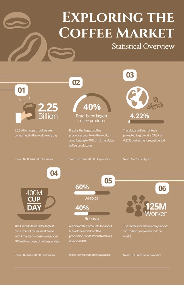
1. Statistical infographics

Statistical infographics are your go-to when it comes to data visualization.

These infographics help you share findings such as results from an employee survey, the latest research findings and more.

Here’s an example of a statistical infographic:

Brown Coffee Statistical Overview Infographic
 

2. Informational infographics

Informational infographics are great if you want to summarize large chunks of text into a smaller, more digestible format.

Again, visual elements are vital in informational infographics to reinforce concepts visually.

Here’s an example:

How To Stay Cool Without Air Conditioning
 

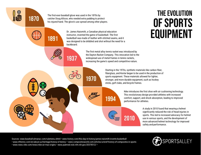
3. Timeline infographics

Timeline infographics help you present information in chronological order.

They’re perfect if you want to illustrate the progression of facts or figures in a format that is easy to follow.

Here’s an example of a timeline infographic:

The Evolution of Sports Equipment Through the Ages
 

4. Comparison infographics

Want to do a side-by-side comparison of two or more items? Comparison infographics can highlight differences and similarities, making them ideal for use cases such as product reviews.

Here’s a comparison infographic that highlights the differences between cold and hot showers:

Advantages of Hot vs Cold Showers Comparison Infographic
 

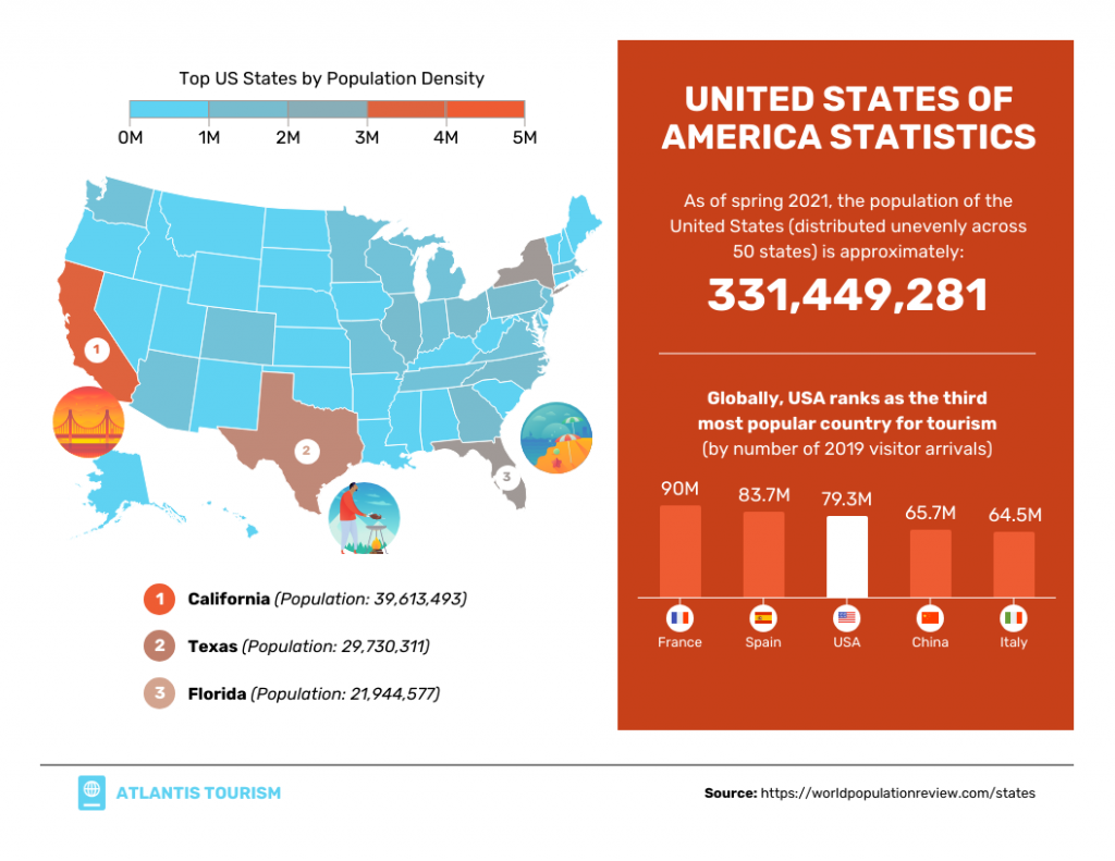
5. Geographic infographics

Geographic infographics help visualize data related to specific regions or locations.

For example, let’s say you want to show where population density is highest in the US. Instead of a table of numbers, a color-coded map is more impactful.

Geographic Infographic
 

6. Process infographics

Process infographics let you present a series of steps or stages in a clear and organized manner which makes them ideal to explain procedures, workflows or the progression of tasks.

Here’s an example of a process infographic:

MailChimp Export Email Template
 

Best infographic templates for Google Docs

Google Docs might be free, but designing an infographic from scratch can be frustrating and time-consuming.

Instead of struggling with shapes and text alignment, use professionally designed templates to save time and create something visually stunning. Here are some of the best Venngage infographic templates to help you get started:

Statistical infographic template

Data-heavy topics don’t have to be dull. This statistical infographic presents real estate trends using bold visuals and clean layouts. Use it for industry reports, market analysis or research findings to captivate your audience:

statistical infographics about real estate trends
 

Informational infographic template

You can use this template to break down a complex topic into a visually engaging format. This template breaks down key leadership traits, making it easier for educators to teach leadership concepts clearly. It’s a perfect template for HR professionals, trainers and business presentations:

informational infographic template on different leadership styles
 

Timeline infographic template

Timelines don’t have to be cluttered. This split timeline infographic organizes key events into two parallel paths. This template is perfect for comparing historical developments, business milestones or project planning in Google Docs:

timeline infographic template example for Google Docs
 

Comparison infographic template

Comparison infographic templates let you highlight differences between two topics. Use this clean and structured comparison infographic if you want to compare or contrast two products, services or concepts. Ideal for businesses, educators and bloggers looking to present information side by side:

comparison inforgraphic template example
 

Geographic infographic template

Geographic comparisons are more effective when visualized. This infographic uses a color-coded map to compare population data. It’s a good template for showing demographic studies, market research or regional analysis. Use it to make statistics more engaging and easier to understand:

geographic infographic template showing a population comparison between california and canada
 

Process infographic template

You can simplify processes with this kind of flowchart infographic. It’s useful to clearly communicate workflows, decision points and key steps. Whether you’re mapping out a customer journey or a standard operating procedure, this template ensures clarity and efficiency:

process or flowchart infographic template example
 

List infographic template

A list infographic presents information in a structured list format. Whether you’re presenting statistics, industry insights or fun trivia, this template can help you turn plain text into a logical visual story. It’s an ideal visual tool for blog posts, reports or educational content:

list infographic template for Google Docs
 

Hierarchical infographic template

Some concepts are complex by nature. But you can use a hierarchical infographic template to break them down into an easy-to-understand hierarchy. It’s perfect for explaining budgeting, investment strategies or financial planning:

hierarchy based infographic template example
 

In the next section, let’s go through the step-by-step process of how to create an infographic in Google Docs.

How to make an infographic in Google Docs

I’ll show you how you can create a simple list infographic in Google Docs. There is a guided walkthrough of the steps in this section, so don’t miss out!

Here’s a step-by-step overview:

  1. Create a blank document in Google Docs
  2. Set your page orientations (Click “File” > “Page Setup“)
  3. Use shapes to create an infographic structure
  4. Add your text and images
  5. Customize your infographic with color and/or fonts
  6. Review, finalize and export your design

Here’s a detailed walk-through with visuals.

Step 1: Create a new document in Google Docs

Sign into Google Docs and select a blank new document.

If you already have a document open, select “File” > “New” and then click on “Document”.

Step 1: Create a new document on Google Docs

Step 2: Set up your page

In Google Docs, you need to specify the layout and dimensions of the page for infographics.

This is to ensure your infographic fits within the canvas and compatibility reasons if you plan to print the infographic later on.

Head to “File” > “Page Setup”.

Here, you can select the orientation (portrait or landscape), color and size according to what you need.

I recommend landscape for an infographic and a page size of 11″ x 8.5″. If you’re looking to print it on an A4 paper, then select the A4 size.

Once done, click on “OK“.

Step 2: Set up a page

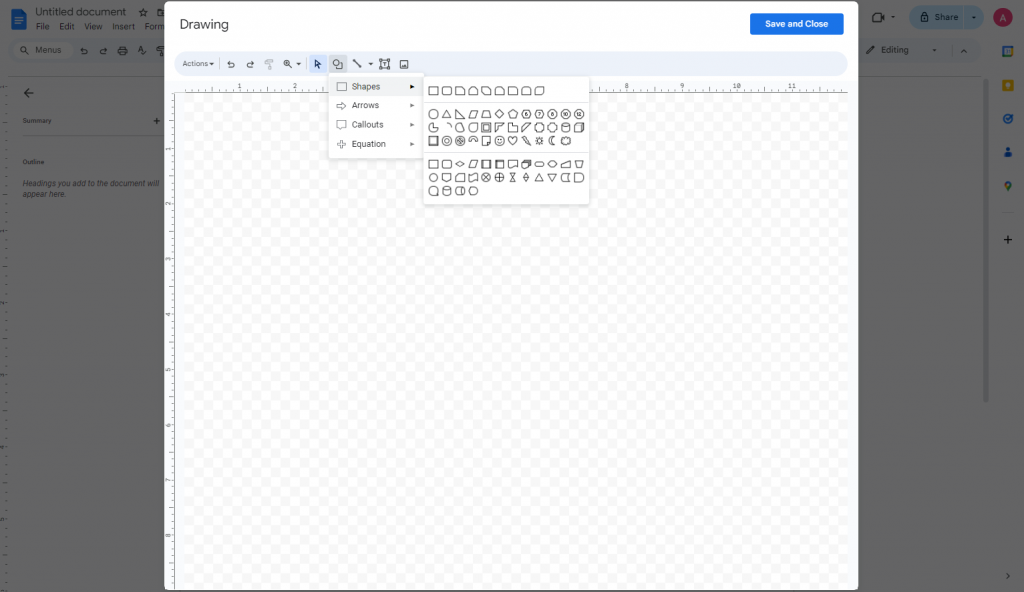
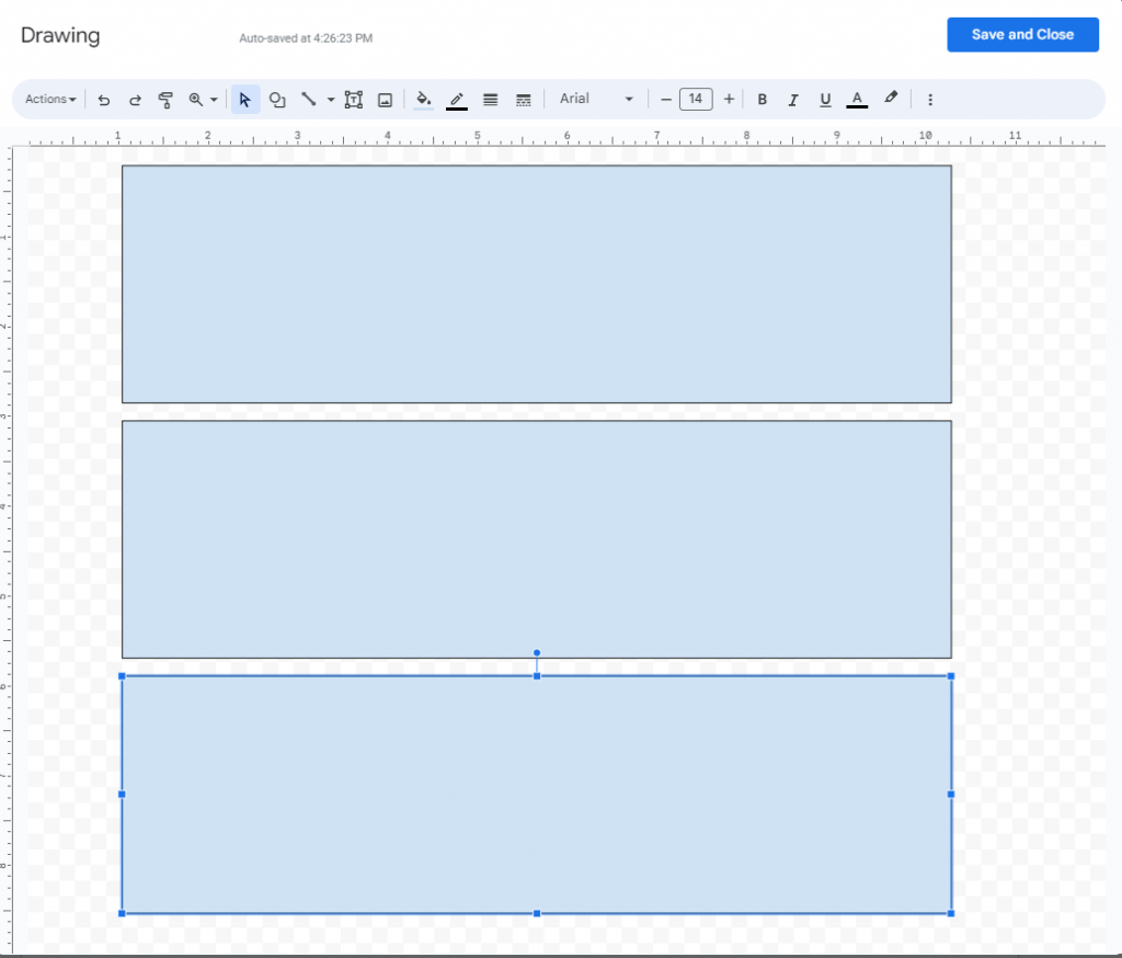
Step 3: Add shapes to create an infographic structure

In Google Docs, there are no editable infographic templates. This means you’ll have to draw shapes by hand to create infographics.

To insert shapes go to “Insert” > “Drawing” > “New”.

Step 3: Add a shape or image

You’ll find a range of shapes, from squares and circles to arrows:

How to create an infographic in Google Docs

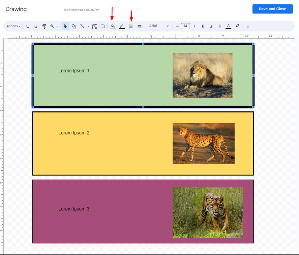
I’ll use three rectangles to act as separate blocks in an informational infographic.

Note: Since it’s hard to recreate rectangles of the same size, I had to copy-paste them.

infographic shape set up

Make sure to “Save” and “Close” once done.

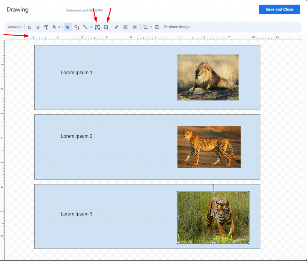
Step 4: Add your text and images

Now that you have the basic structure, it’s time to add content.

Click on your infographic in Docs and select the “Edit” button.

add text infographic google docs

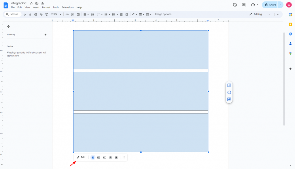
The drawing window should open up again. This time, we’ll select the “Textbox” option.

While adding the text was fairly simple, getting the textboxes to align was a pain using the Google Docs ruler at the top.

To add images, select the “Image” option.

add text and images to google docs

Step 5: Customize your infographic

The infographic above looks pretty dull so far, but let’s see how we can spice it up a bit more with Google Docs customization options.

By using the “Fill” and “Border Weight” options, I was to change the color of each box and add more borders to one area over the other:

google docs customization options

If you want to add a chart or diagram to your Google Doc infographic, click “Insert” > “Chart”.

Google Docs has several options for you to choose from, ranging from bar graphs, line graphs, column charts and pie charts.

customize infographics in Google Docs

Doing this will add a chart below the infographic rather than inside it which means your infographic won’t be a single visual asset.

Step 6: Review, finalize and export

Once you’re happy with your creation, click on “File” > “Download” > “PDF” to export your infographic.

Otherwise, since Google Docs is part of the Google Apps ecosystem, you can always find your infographic in Google Drive as well.

And that’s it! You’ve made your infographic using Google Docs.

While I’ll admit this process is relatively straightforward, the infographic looks very elementary (similar to what I’d make when I was 8).

To make something you can actually use in public, you’ll need to spend hours trying to make elements align or fit together.

How to make professional infographics with Venngage

Want to create infographics that actually get people’s attention? Look no further than Venngage.

Venngage is a great platform to use when you don’t have time to create something from scratch or want an easy way to create infographics.

You’ll get access to tens of thousands of templates, an in-editor library of thousands of free, professional icons. Plus diverse icons and the ability to add charts, graphs and maps in-platform or by importing data from Excel.

Note: Some of our infographic templates are free to use and some require a small monthly fee. Sign-up is always free, as is access to Venngage’s online drag-and-drop editor.

Here’s how to create an infographic with Venngage:

Step 1: Sign up for an account (It’s free!)

Sign up for a Venngage account using email, Gmail or your Facebook account.

Sign up for free Venngage account

Step 2: Pick an infographic template

Venngage has no shortage of templates you can edit, including infographic templates

You’ll find all types of infographic templates on Venngage from process infographics to comparison infographics and even medical infographics.

number of templates you can pick from

Want a geographic infographic? There are at least 50 templates you can choose from.

Or maybe you want to present data in a visual format. In that case, browse our statistical infographics until you find one you like.

Here’s an example:

Digital Banking Infographic
 

Step 3: Edit your infographic

All our templates have been built by professional designers and optimized for various scenarios.

But if you want to change it to your liking, you can easily do so! Some of your options include the ability to swap icons, swap images, change colors, fonts and more.

For example, let’s say I want to change the colors of the listicles in this article. All you have to do is select the box and click on the replace background color option.

change font colors in Venngage

It’s as simple as that!

Edit templates in Venngage

If you sign up for a Business plan, you’ll also get access to My Brand Kit. This feature lets you apply your brand colors to any template with one click.

If you want to create an infographic from scratch, you can do that too in our editor tool. You’ll get access to the same resources you’d have if you were editing a template.

And if you really want something that’s your own without having to do any design work, check out our AI Infographic Maker.

Just enter a prompt and wait for the magic to happen. 

AI infographic editor

Step 4: Share a link to your infographic for free or upgrade download

Once you’ve finished creating your infographic, share it with the world!

Any Venngage user could share their infographic with the public — even free users! You’ll always have access to a link that you can share.

But if you want to download your infographic, upgrade to a Business Account.

start using venngage infographics

Spark conversations with Venngage infographics

If you want to see success with infographics, don’t bother wasting time creating one that is subpar in Google Docs.

Instead, harness the power of Venngage and create infographics in just a few clicks. It’s free to use and you don’t have to be an expert designer to create cutting-edge infographics.


Frequently Asked Questions (FAQs)

Got questions about creating infographics in Google Docs? Here are the answers you need.

Does Google Docs have infographic templates?

No, Google Docs does not offer infographic templates. If you want easy-to-use templates to add infographics to Google Docs, consider using Venngage infographic templates.

Can you create an infographic in Google Docs?

Yes, you can create infographics manually in Google Docs. However, dragging and dropping shapes in places and manually entering text and images will take time. Also, you won’t get access to any pre-built templates that can help you speed up the process.

Where can I get free infographic templates?

The best place to find free infographic templates is online, but not all tools are worth your time. Some have steep learning curves, limited customization or hidden costs. That’s why choosing a reputable brand with free plans or trials is a smart move before committing financially.

Prioritize ease of use over just finding a free option. An intuitive editor saves time and frustration.

Venngage checks all of these boxes. Plus, it comes with over 10,000 ready-to-use infographic templates for a wide range of use cases. You’ll never run out of options no matter what you’re looking for. You can also use Venngage’s Brand Kit to personalize templates and scale your infographic production.

About Manish Nepal

Manish Nepal is an experienced Content Marketer and SEO Strategist who has worked with leading SaaS brands like Freshworks, RingCentral, Avoma, and OptinMonster. With a background in journalism, he brings a passion for data-driven insights and thorough research to create engaging, growth-focused content that drives business results.