There are some things that you will start to notice if you are around design work all day. Even if you are a marketer like me, there are some things you start to pick up on. And a few of those things start to drive you crazy after a while.
And one of those design thorns in my side is… bad icon usage.
This may sound like a little thing that really doesn’t matter for infographics… but it does! Icons are an important element of a good infographic. You don’t want to use bad icons and have someone look at your infographic and notice your poor design choices… it puts the whole integrity of the infographic in jeopardy.
Instead of reading your great information, readers are focused on out-of-place icons.
Sometimes it is tough to pick the right icon, even if you are a designer by profession. Which I am not, so it is doubly hard.
But fear not. With this guide, I will show you exactly how to use icons like a pro!
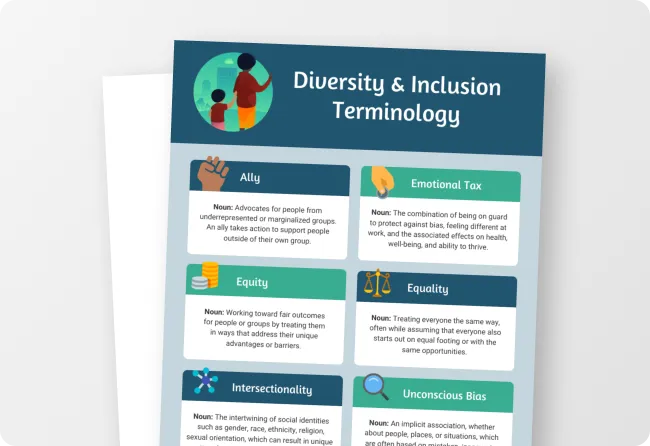
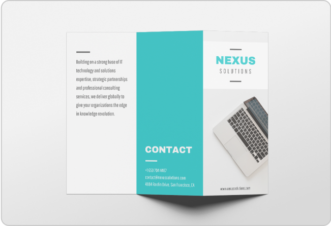
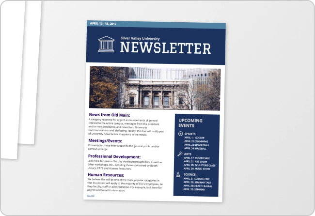
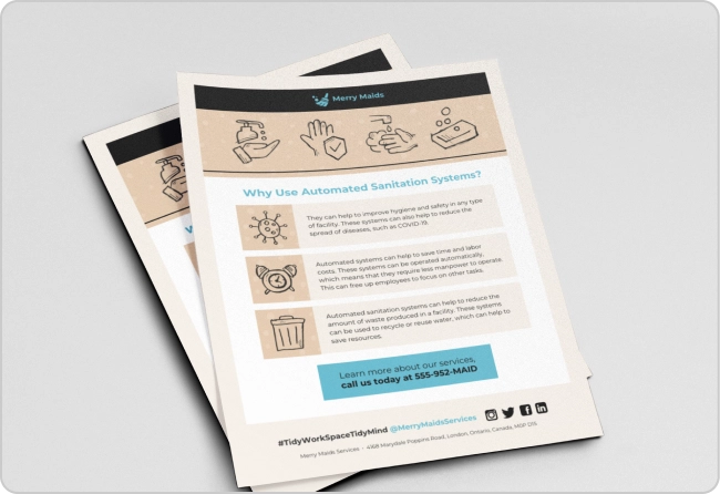
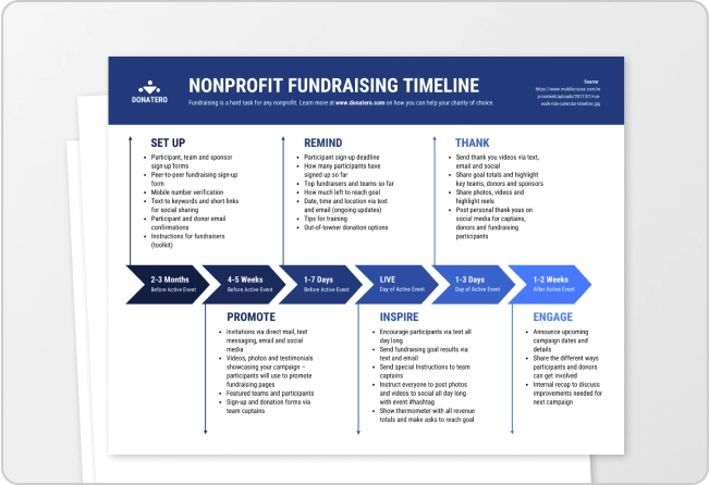
Here are a few examples of great icon usage before we get into the tips:
1. When in doubt, use labels
This is a tip that I am going to repurpose directly from the web design community.
During my research, I found that designers state repeatedly that the best way to make sure an icon is useful is to use a label or text with it. And that thinking can be applied directly to an infographic as well.
Using labels for icons is a necessity when designing an infographic.
Imagine if you saw the infographic on the left below. Would you be able figure out what it was talking about in a few seconds? Probably not, but I don’t blame you, because it is poorly designed.
But the infographic on the right is perfectly clear in a few seconds. All because the icons and text work together to paint a complete picture.
The icons should be used to give some context but the labels will always hammer the point home.
Here is another example of the need for labels alongside icons. In this case, it looks just as bad as the previous example without any labels or text. And you are stuck wondering what each section could be about.
But in the infographic on the right, the labels and icons work together to help with context. The context is established in literal seconds and the reader knows exactly what each section is about.
I think this is where a lot of people can miss the point when designing an infographic. They try to use icons too liberally and forget to include labels or text. And they both should be used to help the reader understand the information.
Just remember that icons should give context and the labels clarify that context!
If you stick to that simple mantra you will be fine.
2. Give icons backgrounds
If you are looking for an easy way to make a batch of icons look spectacular I recommend using a background shape. It can be any shape really, but you cannot go wrong with a simple circle and square background.
It may seem like a small design choice that was up to the designer but it is very important. Unlike the previous section, background images help with both clarity and design.
Take a look at these examples to see how useful background shapes are:
Not only do the background shapes on the example on the right add color to the infographic, they also provide order and organization. This is extremely important if you are using icons as anchors or headers for the text near them.
Otherwise, your icons and text look like they’re floating in a void, like in the infographic on the left.
By using different background colors for your icons, like in the example above, you can quickly establish that each point is different from the others. And your eye is drawn to those sections almost immediately, which can not be said for the icons without background shapes.
Here is another example that illustrates the importance of adding backgrounds to icons:
The infographic not only looks a lot better with icon backing, the backgrounds also help show that each icon is a separate idea or topic.
Now, you may be asking, how do I add a background to my icons properly? Well, with my limited design acumen, I have created a few examples, below that you can use right now:
3. Pair up icons and text
Pairing icons is like pairing wines, it takes some time before you really know what you are doing.
Picking icons to use throughout your infographic is another place that non-designers–like me–can run into a little trouble. And those troubles are exacerbated by the fact that there are no specific rules put in place by the Design Police.
But that does not mean it is impossible to do, as long as you remember to keep things consistent! If you use the same general style of icons you will be fine.
When it comes to icons, great pairings can be achieved just by keeping the style consistent throughout. It is really that simple.
For example, take a look at the infographics below, wherein I swapped some of the icons:
The infographic on the right conveys a certain feel of professionalism because all of the icons are a consistent style.
On the other hand, the icons in the first point in the infographic on the left look incredibly out of place compared to icons in the other points, and the infographic as a whole.
Instead of focusing on your content, readers get stuck looking at your odd icon choice.
Take another look at this infographic:
The one on the left just looks like a mismatched mess, but the other one looks like everything fits together well!
And here is an example of how poor icon matching ultimately distracts from the content of your infographic:
Your eyes are drawn directly to the mismatched icons, instead of the budget numbers above them. Which I am guessing is the most important part of this infographic.
Icons in infographics should always add to the content, not detract or distract.
That is another mantra that will help you create useful and beautiful infographics!
Bad text and icon pairing can distract from the content of your infographic just like bad icon pairing can.
For example, look at the two versions of the infographic below:
The Twitter icon is used to grab the attention of the reader. And when icons are used in headers, they should be large and anchor the important text.
But in the version of the infographic on the left, the Twitter icon is small, does not fit the bold style of the infographic, and gets lost in the white background.
But check this out: if you stretch the red background in the header to behind the icon then the icon looks fine.
Icons are also great for illustrating concepts. Take a look at how the icons in this infographic uses icons to illustrate each points:
Click the see the full infographic.
4. Create order and organization with icons
As you probably saw in some of the examples above, icons can be used to establish order and move readers through an infographic. They can be used to break down sections, highlight, important details or anchor header text
If you were to look at a new infographic your eyes are most likely drawn to a few strong icons. Especially when those icons are situated in an ocean of text.
And you can use this to create a simple path through every infographic.
For example, take a look at both versions of this infographic:
The version on the left looks like an oversized document, which is not the goal of an infographic. Without the icons there is no order in the text blocks at all.
Or even a way to quickly see they are in fact different points without reading each. Plus there is a ton of wasted space with just the text boxes.
To put it simply, without icons, there is nothing to pull readers’ eyes down the page. They will stop reading it very quickly if that’s the case.
The one on the right not only feels balanced with the icons it also helps frame the content. The icons quickly establish the hierarchy in this infographic and show that each text box is a separate point. Users can easily see that blocks with scales icons discuss comparing or contrasting ideas, while search plus icons symbolize looking at something in more detail.
Additionally the background embellishments, which we talked about above, help break the content down further and establish some order.
With just icons, you can establish a hierarchy of information and give readers information without having to explicitly state it.
Here is another example of icons being used to establish order:
The infographic on the right uses the same icon in different shades of brown to organize the drinks in descending order, according to coffee strength. This infographic is Central Perk worthy.
On the other hand, the version on the left looks like a menu from the most generic coffee shop in the world.
Don’t be generic, be iconic, my friends.
5. Use color sparingly
I have talked briefly about icon color selection, but now let’s take a deeper look. Although some of this stuff should be common knowledge, sometimes it will slip your mind. I know it has happened to me a few times and going back to fix it is always a pain.
Remember: icons should be eye-catching but not distracting. The colors you choose should follow the same principle.
I have already written a full breakdown of how to use colors in infographics. So I will skip that part and just cover these two tips for icons:
- Make sure colors fit your theme & brand
- Use the color wheel to select colors
If you need a more in-depth explanation about those tips, check out the full article! If not, we can move right along.
The infographic below on the right is a good example of colors fitting the theme, with white being the dominant color throughout:
I ask you to not emulate what you see on the left…like, ever. It does not matter if they are your favorite colors, it does not fit the theme at all! The colors distract from the point that is trying to be made in the text below it. Plus it looks pretty unprofessional.
Now let’s move on to using the color wheel. I know you probably have not thought about the color wheel since elementary school but it is still useful.
There are three simple ways to match colors, which I covered here, just by using the color wheel.
Below we used a complementary color match for the background yellow (#FFE536) and the blue icons (#1900B2).
This type of color matching can be used if you want to give the icons some more pop while still fitting the overall theme.
With that subtle color change, the icons are useful without being overwhelming. Which is exactly what they are perfect for on infographics.
And when it comes to using the color wheel, there are an endless number combinations you can use! Just play around with it until you find something that fits. I recommend using the Adobe Color tool.
6. Size icons correctly
Finally, we are going to talk about the correct sizing of icons! And just like with colors, the size should make icons noticeable without being distracting.
Just like when it comes to matching fonts, it will take a bit of practice before you are a pro!
Let’s take a look at an example of bad icon sizing.
I really want you to focus on what is wrong with the version of the infographic one on the left. Because I REALLY messed it up to make a point about the importance of icon sizing.
In the first row you can see how to not use icons with headers. The icon in the column on the far right is proportionate to the text, but the icons in the other columns do not fit the space given or the text. Not to mention, the lack of consistency in icons size makes the whole infographic feel off.
Now, take a look at the second and third rows to get a lesson on using space. The icons in the second and third column are severely undersized, and that makes them almost unnecessary. Your eye could skim right over them because they are not sized to emphasize their importance.
In the version of the infographic on the right, however, the icons are proportionate to the headers and also the body text.
For an example of great space work, just take a look at the infographic on the right.
The continuity of size in each of the rows is almost beautiful and ties it all together without much effort.
And there you have it: the mighty icon has been broken down so that anyone can use it in their infographics.
Explore our design guides:
- How to Use an Icon Story to Take Your Infographic to the Next Level
- The Do’s And Don’ts of Infographic Color Selection (+ 30 Free Color Schemes)
- How to Choose Fonts That Make (Not Break) Your Infographic
- How to Create a Timeline Infographic in 6 Easy Steps


