
The Background
Carrie Wood, cofounder of Lease Ref, has over 17 years of forensic accounting experience in commercial real estate. She is an industry expert and decided to launch her own business, Lease Ref.
Lease Ref is the world’s only online commercial lease review company. They offer commercial lease reviews for a one time fee, and at a fraction of the cost of a real estate lawyer.
Lease Ref manages a blog offering guides and tips for contract negotiation, site selection, small business advice, and working with brokers and landlords.
The Lease Ref blog is one of the main growth channels for the business.
The Problem
Lease Ref needed to communicate boring information in a new, exciting way in order to stand out from the competition.
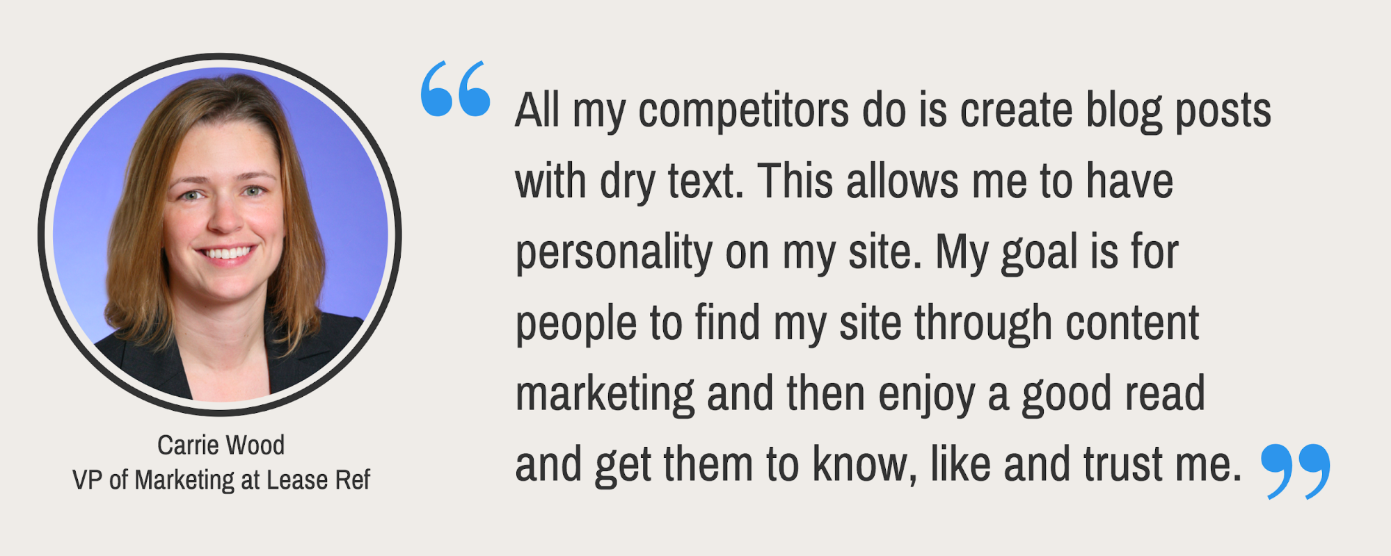
Carrie needed to share important information to the Lease Ref audience. She noticed that competing blogs with similar content to Lease Ref’s were all very dense and dull. There was no effort made to make technical information more interesting or enjoyable to read.

Professional blog headers, infographics, charts and diagrams were the types of visuals Carrie needed to elevate Lease Ref’s blog content.
However, this was a problem for Carrie because she was not a professional designer and had no design experience.
- Carrie couldn’t use sophisticated design software to create content
- Lease Ref didn’t have the budget to hire a professional designer
- A freelance designer was not a scalable, long-term answer
The Solution
Carrie discovered Venngage online and signed up. She found Venngage was simple to use, and provided a variety of features she needed to create quality designs.
Venngage offered Carrie plenty of features, including:
- Thousands of professional, customizable templates
- Professional icons, illustrations, and stock photos
- My Brand Kit for consistent branding
- “Save as Template” to scale template design
- Multiple export options for completed designs
Let’s take a look at exactly how Carrie put Venngage to use.
How Lease Ref grew its blog traffic with infographics and blog visuals
This case study explores the two ways Lease Ref grew its blog through the use of visuals.
- Eye-catching blog headers
- Engaging infographics that summarized valuable info
Carrie found that using custom blog headers enticed readers and drove more clicks to blog pages than before. She also noticed that infographics kept readers on the page by breaking up chunks of text, and making the content less intimidating.
Lease Ref drives 380% more traffic to the blog with a custom blog header
This was one of Lease Ref’s biggest successes.
Carrie realized just how effective an eye-catching blog header could be when one post in particular got 73% more traffic than the Lease Ref homepage.
Thousands of professional, customizable templates
Venngage’s templates page boasts over 10,000 templates across 50+ categories. With a search bar, filters and category panel it’s easy to navigate. Carrie was able to find exactly what she needed.
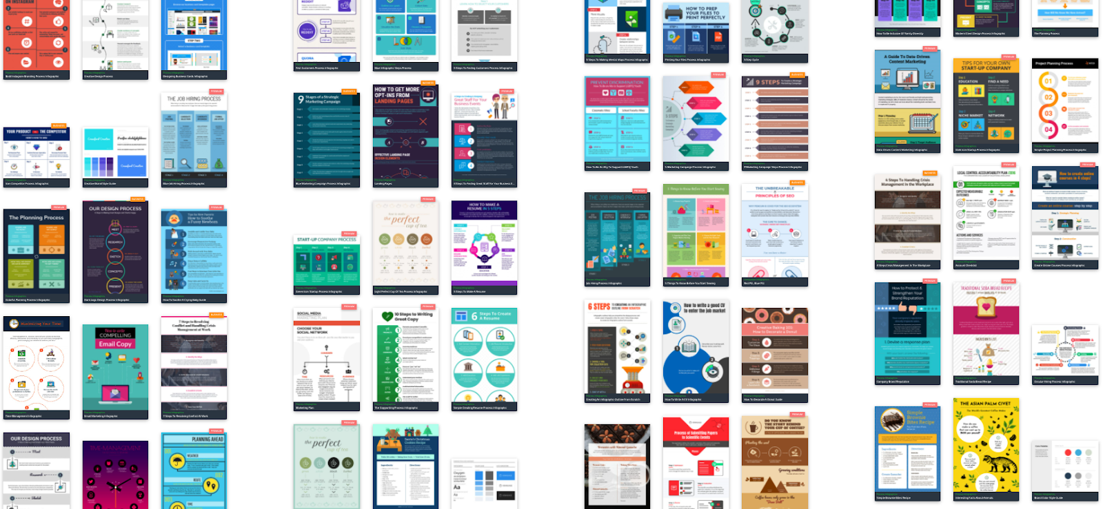
Carrie quickly found this blog header template and decided to repurpose it for her post.

Carrie liked this particular template because the background image was general enough but eye-catching.
She edited the blog header template to create a blog header for her post 132 Insanely Useful Websites for Entrepreneurs and Small Business.

You can see how effectively the blog post title jumps out to you as a reader. Any time the post is shared on social media, forwarded to someone’s network, or appears in a featured snippet, the blog header makes an impactful first impression.
Now, the blog header design gave the post a big lift, but there are other factors that we shouldn’t take away from.
First, the content of the blog post is solid. It’s full of useful resources, the text itself is readable, and there are plenty of screen caps and other visuals to illustrate the information.
Second, Carrie and her husband used smart promotional strategies to help their blog post take off. Here are the three steps they took to promote the piece:
- They shared their blog post on Facebook, using the blog header as a featured image, and gave the post a boost.
- They submitted their post to StumbleUpon, which got them some referral traffic.
- They reached out to every site they included in their blog post and asked them to share their blog post (this strategy was the most effective).
Carrie sent out a pretty attention-grabbing email to each site…

Then the post took off!
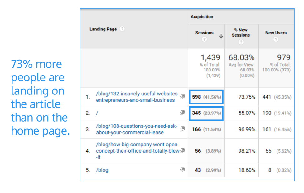
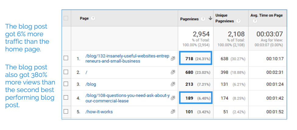
Lease Ref’s blog post drove 380% more views than their second-best performing blog post, and 73% more people were landing on this post than on their homepage.
Lease Ref managed drew significantly more traffic by combining an eye-catching blog header with valuable content, and effective content promotion.
But that’s not the only way Lease Ref grows its blog through visuals.
Carrie uses infographics, diagrams, charts and social media images to illustrate points and to break up walls of text.
How Lease Ref uses infographics for more engaging blog content
You should use images to improve the flow of a blog post, but also offer actual value.
This is something Carrie understands well, and one of the ways Lease Ref set itself apart from competing brands.
That’s why infographics are so effective–not only do they give your eyes a rest, but they also summarize information. Just pull the key information from your blog post into your infographic and you’re set.
How Lease Ref used infographics to summarize its blog posts
Even if your blog writing is engaging and you pepper visuals throughout the article, there are still going to be people who don’t bother reading your post.
Sometimes it’s because the blog post didn’t answer their question, or they didn’t feel up to reading a long article. In either case, they may choose to quickly scan through the article.
That’s where an infographic that summarizes key information comes in handy. Those who don’t read your entire post, will still take something away from it.
Because Carrie’s infographics are long-form, she includes them at the end of her blog posts to summarize all of the information above. She was able to use icons and illustrations to add visual flair, and make each infographic easy to scan.
Professional icons, illustrations and stock photos
In the Venngage editor, Carrie had access to thousands of professional icons and illustrations. She could use line icons, flat icons, and very detailed illustrations to add the visual flair of an actual designer to her content.
![]()
She was also able to access both Pixabay and Unsplash for royalty-free, professional stock photos, too. Everything she needed to customize templates the way she wanted, was in one place.
Here’s an infographic Carrie created to summarize a blog post about bad office lease renewals. Headings and icons help break up the text and make the information stand out:

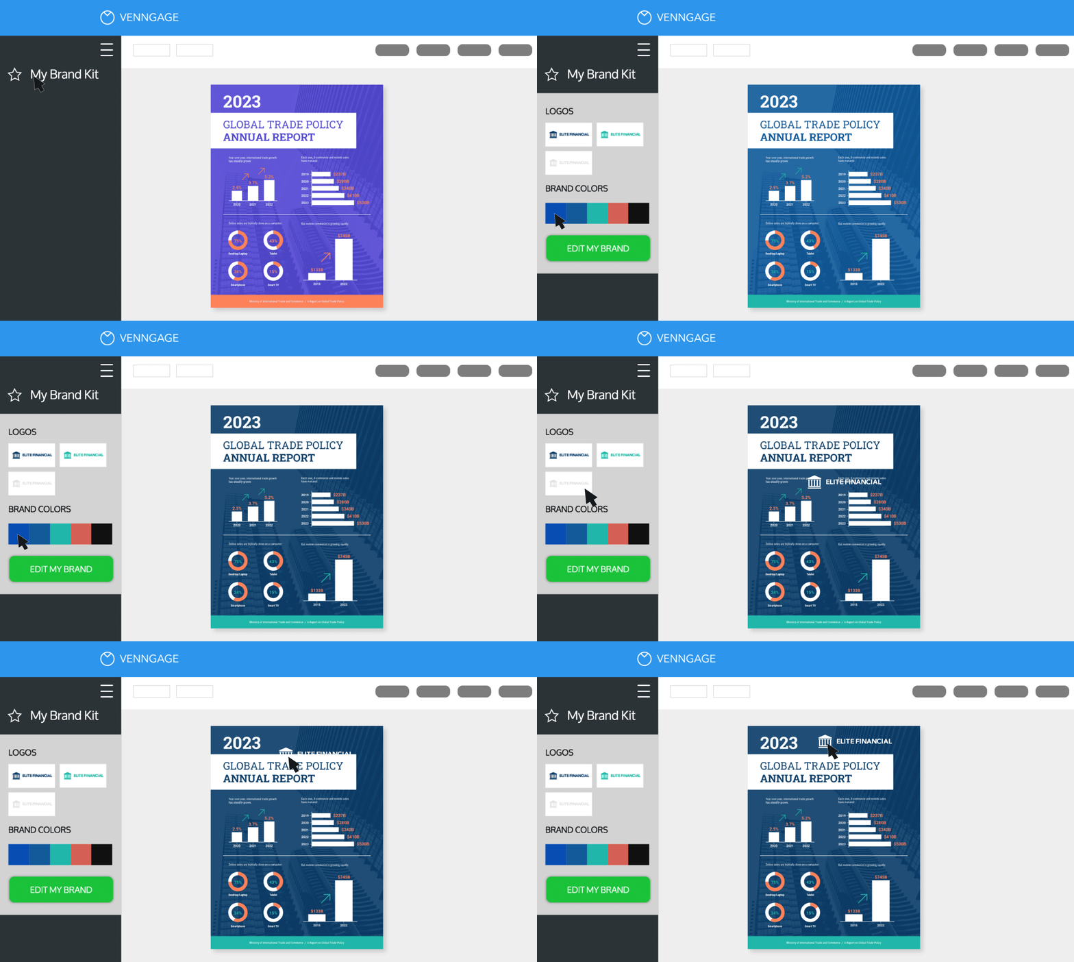
Carrie was also able to easily apply the Lease Ref branding to each design with my Brand Kit. The Lease Ref logo and color palette could be applied to her infographics with a click.
Consistent branding with My Brand Kit
My Brand Kit lets Carrie apply the Lease Ref logo, brand colors and brand fonts to any design with ease. This ensured her visuals looked professional and cohesive.
Anyone can upload their branding to Venngage – when they sign up, or later on from My Designs.
Keep readers engaged with short infographics throughout a blog post
Another way Carrie kept her audience on the page is by including smaller infographics throughout the article.
For example, a short infographic would summarize key points of each section of a blog post. Or if there’s one section that is particularly important for readers to understand, an infographic would visualize it.
Here’s a simple, blog graphic Carrie uses in a post about sale leasebacks:

Not only does the graphic give your eyes a break from the text, it helps to illustrate a key concept explained in the post. Carrie could then save these designs as her own custom templates to repurpose for future posts.
Scaling visual content design
Eventually, Carrie was able to create her own library of custom visuals using Venngage, making it even easier to quickly create blog graphics. She could save designs as her own templates to customize later. 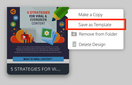
She could also create folders to organize her content and make things easy to find.

Use simple visuals to explain key concepts in your blog posts
Even if you don’t want to create an infographic, you can still use design elements to create informative visuals.
To summarize a key concept, Carrie often includes a short single-visual graphic that illustrates it. The graphics break up the text and reinforces the information.
Carrie would use visuals like this simple visual in a blog post about subletting your office space:

Using a simple area chart template, the visual illustrates the opportunity for profiting from a subletter.
Add humor to your blog posts with visuals
Carrie also used some simple arrows and text to liven up a post about why businesses shouldn’t rent commercial loft space. It’s a way to introduce humor into boring topics, like in the below image, for example.

By using custom blog images, Carrie was able to demystify dry, sometimes complex information and create blog content that is actually fun to read.

You can see with every example, Carrie goes the extra step to differentiate Lease Ref’s approach to connecting, educating and actually helping its readers. But she does it in ways that are simple, low-effort and easy to repeat.
Now for the really fun stuff!
How you can create infographics for your blog like Lease Ref
Without design experience, Carrie was able to create professional designs that elevated Lease Ref’s blog content, but also its brand. How did she get started and what did her process look like?
Carrie first picked out infographic templates that only require small edits like changing the fonts, icons and colors. After some practice, she was even able to design her own infographics from scratch – using templates for design inspiration and ideas.
I’ll walk you through her design process that she shared, so you can try out the same thing when you get started!
What type of information will your infographic visualize?
There are three ways you can approach picking a topic for your infographic.
- Summarize the key points of your entire blog post. You can model the layout of your infographic after the format of the blog post and its sections.
- Pick a particularly important section of your blog post and visualize that.
- Make an infographic that offers some further, complementary information. For example, you could flesh out a section of your blog post even more in an infographic.
Let’s take another look at the infographic Carrie made for her blog post about office lease renewals:

The infographic summarizes the information in the blog post in shorter, simpler terms. Each header in the infographic matches the headers in the blog post.

Even without reading the entire blog post, readers will find its key insights summarized in the infographic. This improves their chances of leaving the blog with valuable information.
Pick the right infographic template for your information
The information you are visualizing will dictate which type of infographic template you use.
For example, if your infographic is going to present a process or a step by step guide, then process infographic templates will work best.
Or if your infographic is going to visualize data and statistics, Venngage’s statistical infographic templates with charts and graphs will work well.
Often enough, you may decide to use a particular template simply because you like the color scheme, title font, or the icons it has. But remember: you can always personalize those elements yourself.
For her lease renewal infographic, Carrie used an informational infographic template with designated sections and clear headers to visualize the key information in her blog post.
Customize your infographic template and make it beautiful
Once you’ve picked your template, customize the design elements to make it fit your brand. Venngage for Business includes features like My Brand Kit. It lets you upload your brand’s logos, fonts and color palette and apply them to any design you’re working on.
This could involve simply swapping out the text and changing a few icons, or it could involve recreating entire sections of the infographic.
Adjust the length of the infographic:
If a template has more sections than you require, you can select the extra sections and simply delete them.
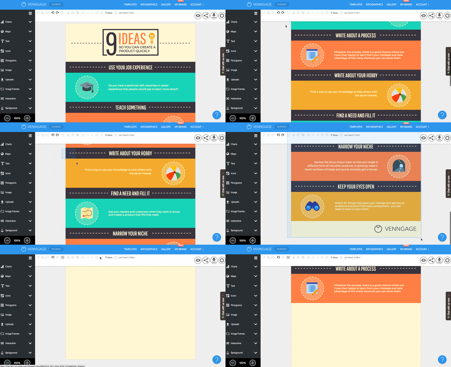
Then adjust the size of your page. Click on the settings tab and use the Magic Resize feature to fit everything into a standard page size.

Change the infographic template colors:
With My Brand Kit, you can do this with a click and your brand colors will be automatically applied. You can also create your own palette and apply it throughout your design.

Insert your information into the template:
Copy and paste your text into the text boxes on your template. Remember to summarize your blog information first.
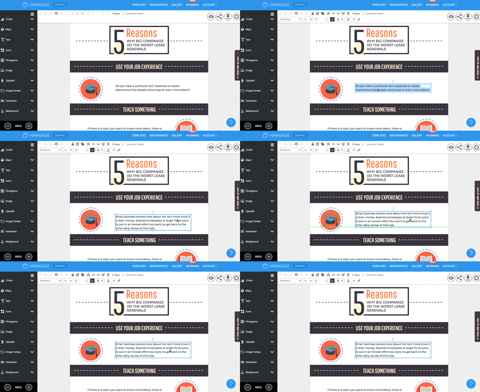
Change icons to fit your information:
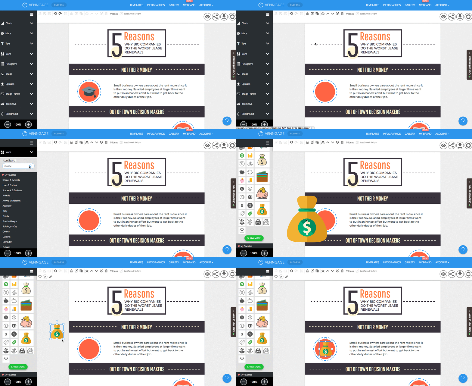
Search for icons that fit the style of your infographic design. Many icons can have their colors changed. Icon illustrations have preset colors, but with their detail and design, they can really enhance the look of your infographic.
You’re all set! Your infographic design is done, and your blog just got a whole lot more engaging. Try out Venngage for yourself to see just how easy it is.
Set your business apart from your competitors
When it comes to getting more traffic to your blog, pay attention to your audience and create original and engaging content that appeals to them.
Lease Ref knew that their audience would be bored by generic real estate content so they decided to spice things up. Their blog is a source of helpful information and some pretty entertaining infographics.
Now you know the basics of how to write a good blog post by using infographics and other visuals. If you want even more actionable blogging and design tips, check out these resources to help you get started.
Increase blog traffic with this proven method

The Anatomy of a Perfect Blog Post


