


A good infographic does more than just look nice—it simplifies complex information, tells a clear story and guides the viewer’s eye with purpose. Whether you’re explaining a process, summarizing research, or communicating a business strategy, effective infographics are built with intention and structure.
In my 10+ years as an information designer, I’ve seen how well-crafted visuals can cut through noise, align teams and captivate audiences. So what separates a decent infographic from a great one?
Let’s break it down.
New to design? No problem. You can start creating professional-looking infographics right away with Venngage’s Infographic Maker or browse our ready-to-use infographic templates.
What makes a good infographic?
A good infographic communicates information, often information that is complex in some way. As communication devices, great infographics should, above all, be useful to an audience.
Great infographics help the audience interpret information and frame it, or put it into context, often through storytelling.

This interpretation is important because it’s what helps us comprehend what might be complex.
Information included in an infographic might include research, data of some kind, descriptions of connected parts, in-depth details, or even emotionally difficult topics. Communicating this information, especially if it includes multiple elements like these, can be challenging.
Here is an example of an infographic with different kinds of data and information:

Can you imagine just reading a list of stats instead, or worse having to decipher a spreadsheet? This is why infographics can be game changers. By using visuals, they help convey ideas in ways that are accessible, coherent, memorable, and compelling.
Infographics can include visuals such as diagrams, data visualizations, photos, icons, illustrations, and more. Great infographics use these visuals deliberately to support key ideas and help the audience understand them fully.
If you are new to making infographics, check out this video about how to make one in five steps.
9 Essential elements of the perfect infographic
After designing hundreds of infographics, I’ve found that the best ones—whether for a pitch deck, a blog post, or internal reporting—share a few common elements. Nail these, and you’re well on your way to creating visuals that actually work.
1. Clear, readable fonts
Choose fonts that are easy to read, even at a glance. Stick with no more than two font styles—one for headings and one for body text. Decorative fonts can be fun, but legibility always comes first.
2. A strong title and headings
Your title is your first impression. It should tell people exactly what the infographic is about and spark interest. Headings throughout the graphic should guide the viewer through the story.
3. A brief, useful introduction
This is where you set the scene. Explain what the infographic is about and why it matters in one or two short sentences. No fluff, just context.
4. Concise body copy
Use short sentences, bullet points, and plain language. Every word should earn its spot. If it doesn’t move the story forward, cut it.
5. Reliable information and data
Source your facts from credible places and double-check your numbers. Trust is everything. If your data is off, your whole message falls apart.
6. A cohesive color scheme
Colors can highlight key info and make the design pop, but don’t overdo it. Stick to a palette that matches your brand or topic and use contrast to create visual hierarchy.
7. Supportive visual aids
Icons, illustrations, charts and diagrams should reinforce your message, not distract from it. Think of visuals as a translation of your data, not just decoration.
8. A clear conclusion or takeaway
End with a key insight, recommendation or next step. Don’t leave your viewer hanging—wrap things up with clarity.
9. An understanding of the audience
Before you design anything, ask: Who is this for? What do they care about? A great infographic speaks directly to the viewer’s needs, pain points and goals.
7 Tips to make a good infographic
How exactly does one go about making good infographics? Here’s seven tips to help you get started.
1. Common infographic design mistakes to avoid
Making a great infographic starts with, well, not making a bad one. There are a handful of errors you should definitely avoid:
- Misleading with false information or data distortions
- Overloading your infographic with visual distractions or clutter
- Neglecting to value and include all types of people
- Refusing to correct these mistakes (we all make them)
If you can avoid these blunders, you are well on your way to making a good infographic.
2. Make it useful to your target audience
Perhaps your infographic is for educating clients, or perhaps it is for training employees. What’s important is knowing who it is for and keeping them in mind as you create it.
Consider what they can take away from reading it and how this information will be useful to them. Make sure it’s easy for them to read by eliminating jargon and using words they will understand.
Here’s an example of an infographic created for a fairly general audience:

What makes this a good infographic is that it is incredibly actionable. Anyone reading this can use it to understand why, if, and when they should consider getting a flu shot, as well as other ways to prevent and prepare for a flu infection. This is something a middle schooler could understand.
3. Use storytelling to convey key messages
There’s knowing what you want them to know, and then there’s helping them get there. Data storytelling is a great technique for guiding your audience through information. Infographics are great storytelling mediums; good infographics tell stories that people remember and recall over time.
The following infographic uses storytelling effectively. Importantly, it introduces the audience to information at the start in a very short summary about why the topic matters to them and what the infographic will cover.
The following section walks the audience through some insights from science, and then takes them through several strategies one by one (click image to view full version). The tips make this information actionable too.

Note that the visuals included support the storytelling, especially the illustrations of people demonstrating the behaviors referenced.
Good infographics aren’t merely fun to look at, they use visuals to support the audience in getting the message.
4. Choose a layout or template that fits the information
The last example was easy to walk through because the layout was designed to help with this navigation. Some information is not as easy to structure as an ordered list, sequenced process or timeline is.
Sometimes you can create a side-by-side comparison, but other times you have a bunch of statistics you are not entirely sure how to weave it all together.
The process of selecting a template can help you consider different ways you might organize the information into a coherent whole. Venngage has a variety of templates to choose from, including some for facts and figures, some with a geographic focus, and some with steps in a journey.
This next example includes a diverse set of information, including quantitative data and categorical descriptions. The information is lumped into themes that might be useful for the audience to better understand. It may not be a linear story, but the layout helps make it easier to read.

5. Do your research
Infographics are unique because they are informational. Good infographics use information from (and cite) trustworthy sources, and put this information into appropriate context for the audience.
To do this well, it is likely that you will need to learn more about sources of information and ask yourself:
- Is this source trustworthy? Is the data verifiable?
- Can I share this data? Are there privacy concerns or other harms to be aware of?
- Is this data or information appropriate for the story and message?
- Does it reveal something that makes me uncomfortable? How will I make sure unconscious biases are not affecting my interpretation of it?
It’s worth noting that you may also need to research your audience to find out what they care about, what their current knowledge level is, and what information would be most useful to them. If you collect data of any kind, pay attention to methodology, and if you share this data with others explain your methodology to them. The citations at the bottom of the last example above are an example of this.
This is an example of an infographic that surely required a lot of in-depth research. It also contains a lot of technical language, so it may not be appropriate for all audiences.

Here is another example of a infographic about a complex topic. The audience is school-age children, so it is much more accessible, but there is still a lot of depth.
Good infographics balance being information rich and approachable.

6. Use visuals that aid comprehension
Understanding the information and data yourself will prepare you to make choices about what visuals are most appropriate to use, and to label those visuals in ways that help others.
Here are some general rules of thumb for choosing a type of visual — but remember to keep in mind the usefulness for your audience.
- Bar charts are the best for helping people use data to make comparisons (note, people have a harder time comparing area or volume, so pie charts, donut charts, and bubble charts are potentially problematic).
- Maps are ideal if you have place-based information.
- Time can be visualized in timelines, horizontal line graphs, or flow charts.
- Diagrams like mind maps and Venn diagrams are great for explaining themes.
- Photos of human faces are great for eliciting emotions, and photos can also be great for showing change over time or referencing specific people.
Good infographics don’t merely use the “right” type of visual, they use it in the right place and in the right way.
Visual elements should reinforce the key messages and be as concise and straightforward as possible.
You don’t want your audience to scratch their heads, you want them to have an “aha.”
Here’s an example of an infographic that could have been presented in a much more complicated way, but its simplicity helps you get the idea very quickly. You will see that what helps a lot is all of the carefully placed annotations or labels–at the left, on top and to the right of the lines.

Thoughtful use of color is essential too. Color can help:
- Highlight more important information, such as the use of red in the “9 ways” infographic above.
- Group items together for clarity, such as in the “5 freelancers infographic above.
- Put items in order, such as in the “COVID-19” infographic above.
Good infographics are indeed colorful, but the color is used not merely to attract attention but to intentionally focus it.
7. Make it memorable
It’s most important to make a point that’s useful and to make it stick, so don’t be afraid to use some creativity.
But, don’t take so much creative leeway that you are misleading or distracting your audience. This ruins credibility and you don’t want them remembering you are untrustworthy.
Here are two more examples of good infographics. Both of these are especially memorable because the designer thought outside the box when it came to presenting the information.


Be sure to share it!
Okay, this isn’t a tip for making a good infographic, but this is a tip for those who do. Whether your infographic good or great, it won’t be useful to others until you share it. Sharing it can be useful to you too, which I’ll explain in the next section.
How do I know if my infographic is good?
It’s easy to get attached to a design you’ve spent hours crafting, but how do you really know if it’s working?
Here’s the checklist I use (and recommend to every designer I’ve mentored) to evaluate whether an infographic is ready to share, publish, or present. Think of it as your last line of defense before hitting “send.”
- Is the main takeaway clear within 5 seconds?
First impressions matter—can someone glance at your infographic and immediately understand the point? - Is it useful?
Does it solve a problem, answer a question or offer insight your audience actually needs? - Is it accurate?
Are your facts correct, sources reliable and visuals faithful to the data? - Is it meaningful?
Does the content resonate with your audience? Is it relevant to their goals, challenges or interests? - Does the design support the data?
Every visual choice should enhance understanding, not distract from it. - Is it optimized for mobile viewing?
Most people view content on their phones, make sure your infographic is readable and scroll-friendly. - Have you used consistent fonts and spacing?
Clean, cohesive formatting builds trust and keeps attention focused on the message. - Can it be shared easily on social platforms?
Consider size, format and clarity. An infographic that looks great in a presentation may not work on Instagram. - Can you measure the results?
Track shares, downloads, link clicks or even time spent on page. If no one’s engaging with it, revisit the design or distribution strategy.
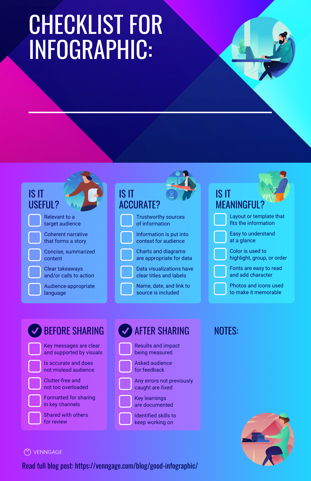
If you can confidently answer “yes” to all five, you’re in great shape.
Pro tip: I often send my infographics to a teammate who hasn’t seen the project. If they “get it” right away and can sum up the key point in one sentence, that’s usually a good sign. This will also help you identify what elements you can change and what skills you can work to improve over time. Y
For more tips on how to make a good infographic, check out this infographic design guide.
FAQs on how to make a good infographic
Where can I make a good infographic?
There are a number of design software options to consider. In my recent roundup on canva alternatives, I explain that some are much harder to learn, while others are too basic for creating infographics.
Venngage is in the sweet spot of easy and powerful. We offer numerous templates for business needs, features for branding and collaboration and lots of support, all to help you create good infographics.

What content or data makes for a good infographic?
Most content is appropriate, from concepts and processes to statistics and timelines. What makes a good infographic is less about the right type of content and more about the right amount and flow of content. The tips and examples above should help you get a good idea of what works well. If you need help with summarizing the information you’d like to share, check out this blog article on summarization.
What is a good infographic width?
The answer to this depends entirely upon where and how you want to use your infographic. Will you print it onto an 18″x24″ poster or include it on a webpage? If you want to include it in an email newsletter or post it on social media, bear in mind that it should be legible on mobile devices (640 by 320 pixels is a good rule of thumb in this case). Don’t forget that larger images take more time to load. Since infographics often take center stage online, I recommend you test out what works best fairly early in your creation process.
What are good infographic fonts?
Great question! Appropriate fonts (or typefaces, as we designers refer to them) will not only help your audience be able to easily read the infographic, they can actually make the information appear to be more credible.
Focus on making sure the primary or body font is super easy to read (see chart below for some ideas) and then select a more stylized font for headings that pairs well with it. Read this blog for a deeper dive.


