Oftentimes, diagrams are used for visualizing and explaining complex topics, patterns and systems to others. But they are often also useful for helping us explore and better understand these things ourselves.
Fishbone diagrams (or cause and effect diagrams) are specifically used to help us solve complex problems.
Let’s say your team is looking to better understand why a certain product is not as successful as you’d like it to be. By creating a fishbone diagram, you can investigate the causes of certain outcomes, thereby identify how to improve them moving forward:
Let’s go through what a fishbone diagram is, when you should and should not use it, how to create a fishbone diagram and how to conduct fishbone analysis. You can then create your own fishbone diagram using Venngage’s Diagram Maker—no design experience required.
Table of contents:
- What is a fishbone diagram?
- When to use a fishbone diagram
- When not to use a fishbone diagram
- How businesses can use fishbone diagrams
- How to create and use a fishbone diagram
What is a fishbone diagram?
Fishbone diagrams are also known as Ishikawa diagrams, named after Professor Kaoru Ishikawa who was a pioneer in the field of quality management and who created this unique visualization.
Although they were initially used for quality improvement, today fishbone diagrams can be helpful for all kinds of problem-solving. For example, this one lists different factors that can lead to a healthy lifestyle.
When to use a fishbone diagram
Here’s what fishbone diagrams are best used for.
Addressing complex problems
As you can see, the fishbone diagram example above allows a viewer to see several factors at once, making it a great diagram for sharing a lot of complex information.
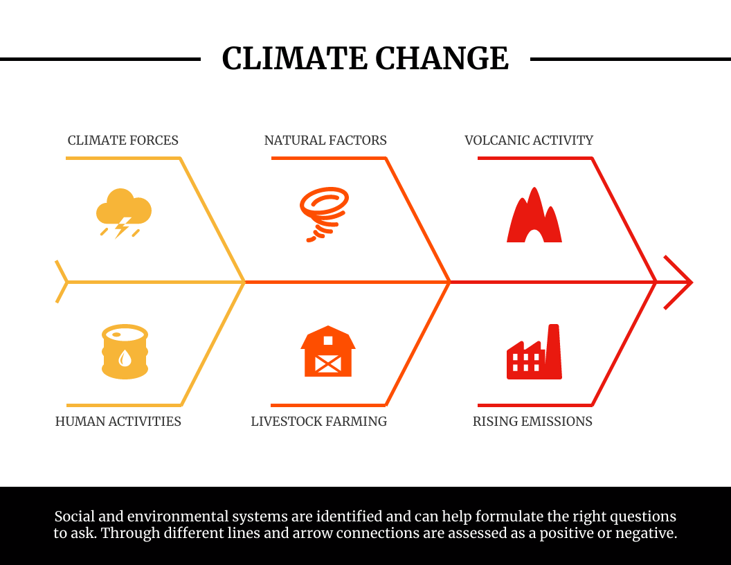
The most important thing about these diagrams is that they help teams recognize the reasons behind specific outcomes, or in other words—the root causes that lead to effects. They are ideal for addressing complex problems that have multiple causes, such as climate change:
Facilitating reflective analysis
Fishbone diagrams are useful for reflective analysis.
If teams are primarily focused on KPIs, these diagrams can provide context that is otherwise missing, helping folks better understand what’s causing numbers to rise or fall.
Teams can identify where mistakes are being made, revenue is being lost, as well as what activities are leading to the best results.
Planning for desired outcomes
Fishbone diagrams are also helpful for future planning. By referencing a fishbone diagram, teams can better identify the best methods for reaching desired outcomes and plan actions accordingly.
You can customize this fishbone diagram template to develop concrete plans for improving customer satisfaction:
When not to use a fishbone diagram
There are a few situations where you should use a different form of data visualization instead of fishbone diagrams.
When there’s one cause of multiple problems
While fishbone diagrams are ideal for scenarios in which there are multiple causes for a single problem, it’s not ideal for the reverse: when there is a common cause for several separate problems. If you are seeking to show this, a mind map might be a better fit.
When the order of causes and effects maters
If you want to show specific sequences of causes and effects, a flowchart is the better option:
Related: What is a Problem-Solving Flowchart & How to Make One
When you’re looking at correlation, not causation
It’s critical to also remember that correlation and causation are two entirely different things. The quintessential example of this is how ice cream sales and sunscreen sales both rise in summer, but one type of these sales is not leading to the other.
If you are wanting to describe correlation instead of causation, a scatterplot is a common visualization.
How businesses can use fishbone diagrams
Now that you know generally when to use and not to use these diagrams, let’s look at the two major ways businesses use fishbone diagrams to help them solve complex problems.
Analyze how conditions and motivations lead to actions and outcomes
Companies, employees, and customers face problems regularly. Declining leads, cash flow, productivity, satisfaction, retention—all of these problems have causes. Knowing these causes can make all the difference.
Here’s an example of a fishbone diagram that details the many factors that can contribute to missed deadlines:
It’s a big deal to be able to do this type of analysis. Not analyzing things like environments, people, and processes can lead to major unintended consequences.
For example:
- Poor training of employees can lead to inconsistencies in the workplace.
- Flawed KPIs can lead to disasters as dramatic as legal consequences, as Wells Fargo experienced.
- Artificial intelligence (AI) if implemented without human leadership can lead to errors, hazards, and institutionalized bias, as Bain consultancy describes.
- Outsourcing of labor overseas can reduce company loyalty and eliminate jobs domestically and eventually abroad, according to Investopedia.
Strategize based on how actions or inactions lead to positive or negative impacts
If you really want to change outcomes and impacts, analysis alone will be insufficient. Fishbone diagrams can also help companies plan improvements in policies, management, systems, etc.
This fishbone diagram example outlines some of the many factors that can lead to low productivity:
Once you’ve pinpointed the causes of problems, it’s much easier to take action to solve them.
How to create and use a fishbone diagram
1. Select the outcome or effect you want to investigate
What problem are you solving? What impacts or outcomes do you want to better understand? What do you want to improve?
Once you know this, you can select a Venngage fishbone diagram template and begin easily creating your diagram. Start by specifying as much as possible the key outcome on the right of the diagram, at the head.
2. Identify big categories of causes
Some of the more common categories are:
- Management
- Equipment
- Materials
- People
- Process
- Environment
- Methods
- Policies
- Systems
- Skills
- Measurement
You can use these categories if they make sense, or you may think of others that are more appropriate. It’s generally smart to use a total of four, six or eight categories.
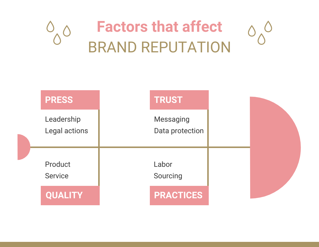
A simple fishbone diagram would just include only these categories, like in this example:
In your design, you can use colors to help people distinguish categories from one another.
3. Generate a comprehensive list of contributing factors
Depending on the topic, you may want to dive deeper. The main categories can inspire you to think more critically about multiple factors that may lie in each of them.
This deeper dive will likely require team dialogues and/or conversations with different employees, customers, and other stakeholders. There may be other research you want to do such as reading case studies, observing behaviors, and/or conducting competitor analysis.
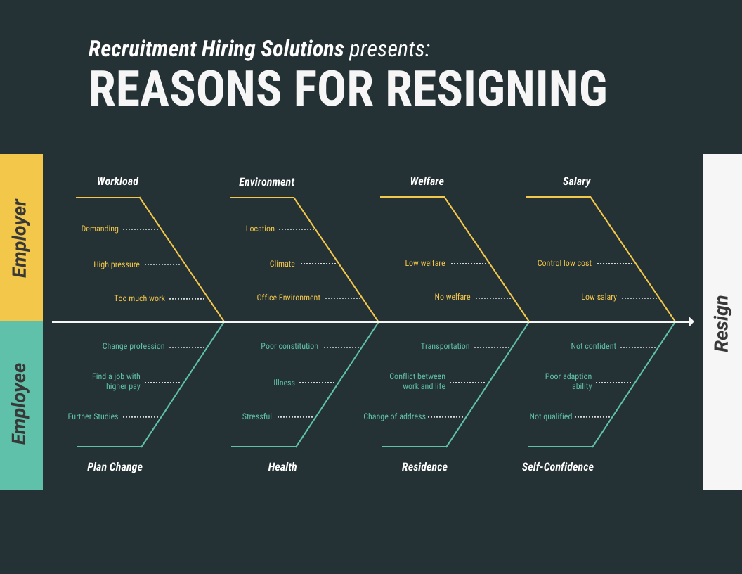
You can consider breaking the diagram into top and bottom halves, if that can add additional meaning, like in this example:
The diagram should adapt to your growing list. Add all the branches that are relevant to the right off the main stem extending from the head on the left. Use short phrases that describe the cause precisely and succinctly.
4. Analyze and reflect
Chances are that as you generated the categories and lists of causes, you began to consider all the things that are contributing to the outcome you selected. Even if you haven’t developed a completely exhaustive list, you are now ready to pause, take a step back, and think things through in a different way.
To pivot from thinking about the problem to thinking about the solution takes a shift in mindset. Being able to see everything at once in a fishbone diagram can facilitate this. It can help you expand your thinking and witness more fully the immense possibilities for change.
Visuals can also elicit emotions, and that’s important too. You may need to feel your sadness or anger about missed opportunities and other losses, and you will definitely be buoyed by feelings of curiosity and excitement about what you may be able to change.
Fishbone diagrams are powerful tools for reflection, but make no mistake, it’s the reflection that gets you really ready to change things.
5. Plan and take action
The journey to the root has prepared you to solve the problem at hand. Depending on how many categories and causes you’ve unearthed, and the support and resources you have, you can begin to prioritize which causes you will address first, and what you will work to shift over the long term. You might set new goals, and possibly new measures, accordingly.
The diagram you’ve created can be shared to help educate and motivate stakeholders to take action. You can add your brand colors and design details like icons using Venngage so it’s not only useful but visually engaging as well.
Summary: Use a fishbone diagram for root cause analysis, reflective analysis, future planning and more
Fishbone diagrams are not just attractive visuals for impressing others. They are visual tools that help us do some of the most valuable work there is: solving complex problems.
They can spur us to investigate and name what we can change. And because they are visual, we can continue to reference them as we make these changes, so we can stay on track.
Start creating a fishbone diagram today using Venngage’s drag-and-drop editor and easy-to-edit templates. No design experience required.


