


For me, a creative poster isn’t just about looking good, it’s about checking the boxes of these smart poster design tips that I’m about to share.
I pay close attention to visual hierarchy so the important stuff stands out, play with typography in posters to set the mood, and pull layout inspiration from designs I admire. Honestly, browsing event poster examples always sparks new ideas.
Personally, when designing posters, I focus a lot on visual hierarchy so the important details pop, experimenting with typography in posters to set the right vibe and grabbing layout inspiration from designs I admire.
Checking out event poster examples always sparks new ideas for me. And when I don’t feel like starting from scratch, poster templates are my go-to shortcut. In this guide, I’ll walk you through 50+ creative poster ideas to help you design something that really sticks.
9 poster-design tips to keep in mind
Before we start, here are some poster design tips you need to be aware of:
- Use a color overlay for a more understated poster.
- Keep consistent margin widths throughout your design.
- Incorporate your product directly into your creative poster ideas.
- Use directional cues like icons and illustrations to guide the viewer’s eye to important information.
- Design two complementary posters that work together visually.
- Group important information to help it stand out.
- Use accent colors to add interest in minimalist designs.
- Add hand-drawn illustrations to give your poster a personal touch.
- Choose an extra bold color palette for a striking visual effect.
What makes a poster creative?
A creative poster grabs attention and keeps it. It’s not just about bold colors, it’s about balance. The best designs highlight the key message, use type that feels intentional, and keep the layout polished without looking cluttered.
The posters that stay with me always mix clarity with a bit of personality. In the end, a creative poster tells a story at a glance and leaves people curious to learn more.
Sometimes to convey the most powerful message through poster you need to create a the tunnel vision of the story you are trying to convey. With Venngage AI, you can explore intelligent vision board creation to design posters that inspire change and focus. Much like the design assistants in Canva, the ai driven vision board creator allows you to go from a simple prompt to a high-resolution vision board that can inspire your next best brand poster.
Here are 52 poster ideas to inspire your next poster design.
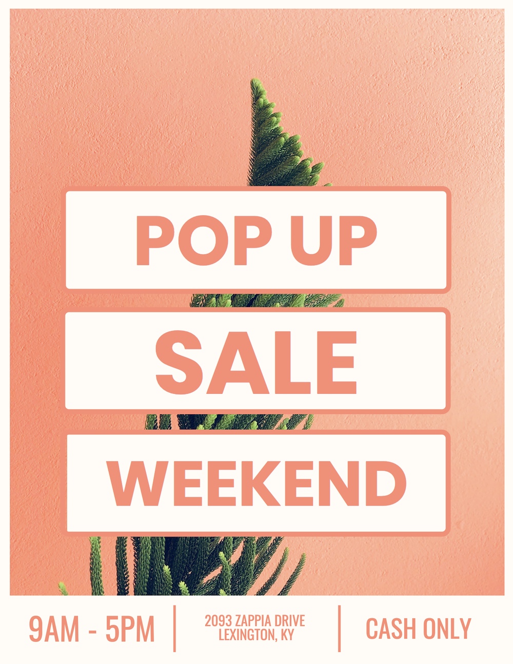
1. Mix bold complementary colors with a simple layout
This pop-up sale poster grabs attention with a bold orange background while keeping the off-white text easy to read. The green succulent in the center adds a modern, stylish detail that softens the look.
Personally, I can see local boutiques, coffee shops or small lifestyle brands using a design like this to promote flash sales or seasonal events—it’s clear, trendy and noticeable from across the street.
Pro Tip: Pair bold shades like orange and teal or pink and green. Keep your design minimal so the colors do the heavy lifting.
Related: How to Apply the Right Layout To Your Poster
2. Use an eye-catching poster background image
Your poster background instantly sets the tone for your design. The right image can guide the viewer’s eye, divide content naturally and add personality without overwhelming the message—perfect for parties, events or seasonal promotions.
Pro Tip: Skip generic stock photos. Choose an image that connects with your theme and leaves space for text. High-contrast areas are great for headlines.
In this pool party poster example, a vibrant poolside photo frames the text beautifully. The water background creates natural sections, while bold colors and a modern font make the party details easy to spot.

3. Create motivational posters with color overlays
Poster idea: Simple motivational poster

The best motivational posters are simple and clear. A breathtaking image combined with a bold message often does the trick. However, when your image is too busy or colorful, it can make the text disappear. You can solve this by applying a color overlay to mute the image slightly, as shown in this motivational poster example.
The overlay creates contrast, ensuring that the text stands out and the overall design remains visually appealing. Try this for your next poster making project—it’s a quick way to create professional-looking results.
4. Use leading lines to direct attention
I’ve found that a color overlay is one of the easiest ways to make text stand out without losing the impact of a strong background image. It softens the photo just enough to keep the message clear, which works especially well for motivational posters, office décor or even awareness campaigns.
Pro Tip: I usually go with a semi-transparent dark overlay when I want light text to pop, or a lighter overlay if I’m using bold typography. It’s quick, flexible, and keeps the design professional.
In this hiring poster example, the busy image is muted with a subtle overlay, letting the bold motivational quote take center stage. The final design feels clean, inspiring, and ready to grab attention.

5. Make your poster pop with a two-toned title
A two-toned title is a simple but powerful way to grab attention. By pairing two contrasting colors that work with your background, you can create a bold effect that instantly highlights your headline, perfect for events, sales or community announcements.
Pro Tip: I like using one dark color and one bright accent for contrast. Keep the rest of the text minimal so the title does the heavy lifting.
In this garage sale poster, the bold two-toned header pulls focus immediately, making it nearly impossible to miss. It’s also a great starting design for local events, nonprofits and small businesses that want their message noticed at a glance.

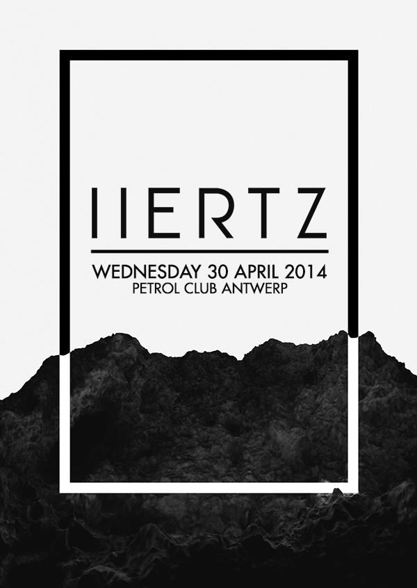
6. Choose a poster theme that reflects the subject
The quickest way to confuse an audience is with a design that doesn’t match the topic. A strong theme instantly sets the right mood, whether futuristic, playful or professional and makes the poster feel more credible.
Pro Tip: I always start by asking, “What’s the vibe of this event or message?” Then I pick fonts, colors, and imagery that reinforce that feeling. Consistency makes the design more memorable.
In this sci-fi poster, the design draws inspiration from Europa, a moon of Jupiter. Dark tones and a sleek, futuristic font capture the mood perfectly, while a playful design would have felt completely out of place.
It’s the perfect design for event organizers, student clubs and creatives who want their posters to feel instantly “on-theme.”

7. Use split layouts for “Before and after” effects
I love split layouts because they make transformation easy to see at a glance. Showing two contrasting states side by side—like “before” and “after”—instantly drives the message home. It’s a strong approach for campaigns, promotions, or any design built around change.
Pro Tip: Use bold contrasts between the two halves—different colors, tones or imagery—so the difference feels unmistakable.
In this organ donation poster, one half reflects life before, while the other reveals the hope that comes after. The simple divide makes the impact both emotional and clear.

8. Creatively incorporate product shots into your poster
Product images often risk looking too “salesy,” but with the right approach, they can blend seamlessly into a poster design. When placed thoughtfully, they feel natural and even elevate the overall look.
Pro Tip: Experiment with scale and placement. A product can serve as the background, a focal point, or even a subtle design element. The key is making it feel part of the composition rather than added on top.
In this product poster, a three-dimensional product image is woven into the flat design. It doesn’t feel forced—instead, it enhances the poster’s visual appeal. This approach works particularly well for artists and designers building websites for selling digital art, where product visuals need to feel integrated rather than overly promotional.

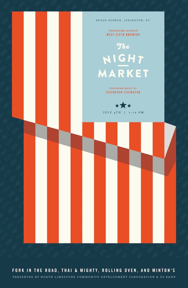
9. Combine multiple design influences for unique posters
Blending design influences can make your poster stand out. By pulling inspiration from the theme of your event and the context around it, you create something more memorable and relevant.
Pro Tip: Start with two strong sources of inspiration—like the event type and the date—and find a way to merge them visually. This adds depth without clutter.
In this night market poster, the designer combines the American flag with a vintage market stall. The result captures both the Fourth of July spirit and the market atmosphere in one cohesive design, perfect for festivals, cultural events and community gatherings.
10. Create multiple versions of your creative poster
Not everyone responds to the same design. Offering multiple poster versions lets you reach different audiences without diluting your message. It’s a practical way to boost engagement and appeal.
Pro Tip: Keep the core content consistent, but vary elements like color schemes, imagery or typography. This creates fresh options while maintaining brand recognition.
In this example, the designer created four versions of a futuristic event poster, each with unique colors and styles. This simple tweak broadens its appeal without extra effort.

11. Always use high-quality images in your poster
Blurry or pixelated visuals can make even the best design look unprofessional. High-quality images, on the other hand, instantly build trust and give your poster a polished feel, whether it’s printed or shared online.
Pro Tip: Stick with images at 300 dpi for print and at least 1080px wide for digital. Crisp, on-theme visuals elevate your brand and boost engagement.
In this yoga poster, the sharp, serene image matches the theme perfectly and looks clean on both screen and paper.
This template is a great starting point for fitness studios, wellness brands or anyone looking to project a polished, professional image.

12. Use icons to create a unique poster design
If you’d rather skip photos, icons are a versatile alternative. They add personality, communicate your message clearly, and can be customized to fit your theme.
Pro Tip: Choose a consistent icon style and color palette so the design feels cohesive. Mixing too many styles can look messy.
In this retail sale poster, clothing icons form a playful collage that conveys variety without letting one product dominate. It’s balanced clear, and eye-catching. It’s perfect for retail shops, e-commerce brands, and businesses that want a flexible, modern look.

13. Upgrade a simple poster with bold shapes and patterns
Adding shapes and patterns is an easy way to transform a flat design into something lively. It’s a small detail that can make a big difference in capturing attention.
Pro Tip: Use geometric shapes or repeating patterns to frame images or highlight text. Just don’t overcrowd the layout and keep it clean.
In this school event poster, bright colors and striking patterns elevate a plain photo into something dynamic and memorable, a great approach for schools, youth programs or events aimed at a younger audience.

14. Organize your poster into blocks for clear structure
When your poster has a lot of information, structure is everything. Breaking it into blocks makes it easy for people to scan and quickly find what matters.
Pro Tip: Use clear dividers, background shades, or even typography changes to define each section. This avoids clutter while improving readability.
In this music festival poster, content is divided into neat blocks so details like lineup and schedule are easy to digest.

15. Create posters for day-of event signage
Event posters aren’t just for promotion, they can also guide attendees during the event. Clear signage improves the experience and reduces confusion.
Pro Tip: Keep these posters highly visible with bold colors, simple icons and large type. Attendees should understand the message in seconds.
This school event poster uses a colorful, friendly design to share rules and directions in a way that’s easy to follow. Preparing these types of posters ahead of time ensures a smoother experience for event-goers.
16. Add depth to your poster with transparent shapes
Transparent shapes are a subtle way to add dimension without overwhelming your poster design. They let the background peek through while still creating structure and focus.
Pro Tip: Use transparency to highlight text or separate sections. Lighter opacity works best when you want to keep the design airy and modern.
In this job expo poster, a transparent overlay softens the background and makes the content easier to read while adding visual depth. A smart option for career fairs, educational events or any professional gathering that needs a clean but dynamic look.

17. Make handwritten fonts the focal point of your poster
Handwritten fonts instantly add warmth and authenticity. They can make your poster feel more personal and approachable, which is perfect when you want to connect emotionally with your audience.
Pro Tip: Use handwritten fonts sparingly—often just for headlines or quotes—so they remain impactful without hurting readability.
In this example, a handwritten font frames an inspiring quote. The casual lettering creates a human touch that a rigid, modern font wouldn’t capture.

18. Let your background image guide the design
Your background shouldn’t be an afterthought, it can set the tone for the entire poster. When everything flows from the background, the design feels more cohesive and intentional.
Pro Tip: Pick background images with enough negative space for text. Then, match your font colors and layout to complement the image.
Great for recruitment campaigns, product launches or promotions where the image itself carries the story, this hiring poster has a background that drives both the structure and the color scheme, making the overall design feel seamless.

19. Elevate minimalist posters with accent colors
Minimalism doesn’t mean black and white only. Adding one or two accent colors gives energy to a simple layout without complicating it.
Pro Tip: Use accents sparingly by applying them to keywords, borders or small shapes so they direct focus without cluttering the design.
In this minimalist poster, bold pops of color brighten the clean lines, striking a balance between simplicity and vibrancy.
20. Experiment with landscape orientation for a fresh look
Most posters default to vertical layouts, so a horizontal (landscape) design immediately feels different. It gives more breathing room and a modern edge.
Pro Tip: Landscape posters work best in wide display areas – think bulletin boards, digital screens or above a stage. Adjust your text flow so it guides the eye left to right.
In this event poster example, the horizontal layout feels spacious and contemporary, helping it stand out from traditional vertical designs.

21. Focus on a single call-to-action (CTA)
Every poster needs a clear next step. Whether it’s visiting a website, following on social media or attending an event, a single, direct CTA avoids confusion and makes the message stick.
Pro Tip: Place your CTA in a bold, high-contrast area so it’s impossible to miss. Keep the wording short—just one action per poster.
In this event poster, the CTA points viewers to a website for more details. With no competing actions, the message feels sharp and easy to follow.

22. Add unconventional borders for a modern touch
Borders aren’t just for structure, they can also add personality. A sleek or unexpected border helps frame your content and makes the design look polished.
Pro Tip: Experiment with asymmetrical or broken-line borders for a contemporary feel. Just keep them subtle enough that they don’t compete with the content.
Perfect for professional events, gallery shows, or brands that want elegance without clutter, this minimalist black-and-white poster includes a thin border that neatly frames the details, giving it a clean, modern edge.
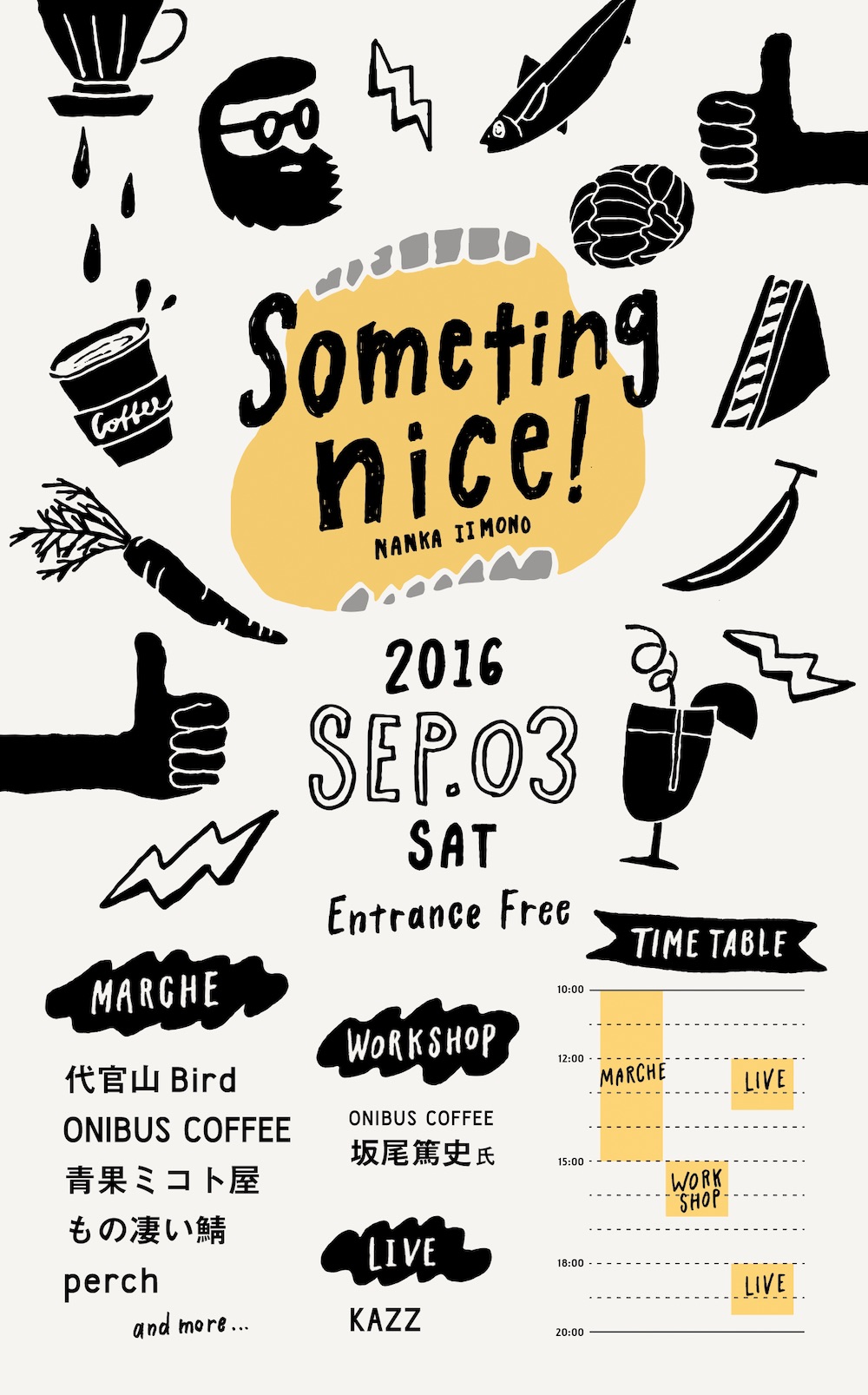
23. Use hand-drawn illustrations for a playful feel
Hand-drawn illustrations add charm and authenticity, making posters feel approachable and fun. They work especially well for casual or creative events. If your brand or event has a casual, creative tone, hand-drawn elements can help convey that feeling, making the design more relatable.
Pro Tip: Stick with one illustration style throughout your poster for consistency. Mix in playful fonts to match the energy.
In this event poster, the whimsical blue illustrations create a personalized vibe, perfect for a maker’s fair or community gathering.
24. Don’t overfill the canvas: use white space effectively
White space isn’t wasted space, it’s what makes designs feel organized and professional. It guides the viewer’s focus and gives your content breathing room.
Pro Tip: Leave at least 20–30% of the canvas empty. This ensures your main message isn’t buried in visual noise.
In this film festival poster, nearly half the canvas is left blank, which makes the title and imagery stand out with impact.

25. Use a simple background for easy customization
Flat, simple backgrounds keep attention on the content while giving you flexibility for future updates. They’re easy to rebrand or repurpose.
Pro Tip: Choose a neutral background and use brand kits or design tools to swap in colors, logos or themes. This way, one template can work for multiple events.
In this job fair poster, the yellow background highlights the text while leaving plenty of room for customization.
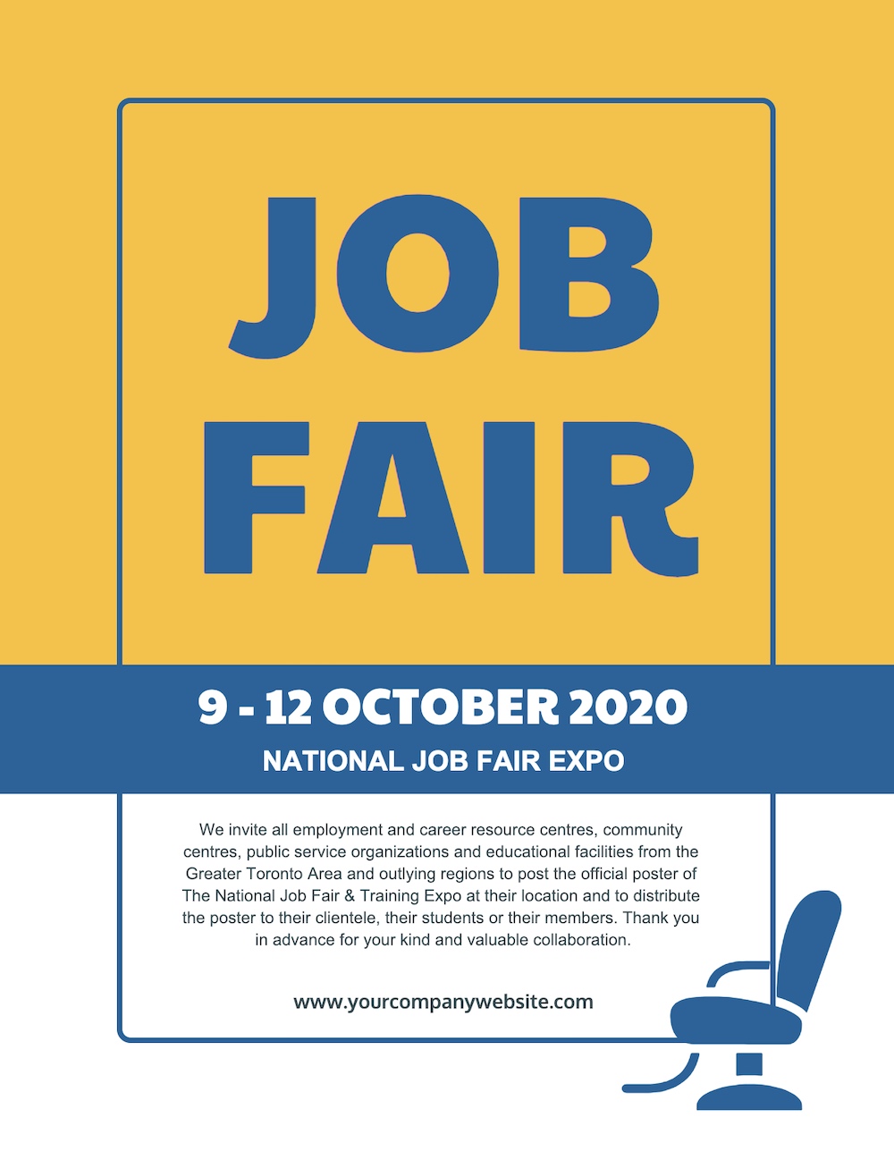
Perfect for businesses, schools or organizations that frequently create event posters. This example makes it versatile for future use, especially if you’re regularly producing posters for similar events.

Best of all, with a flat background, you can easily change the color scheme of your poster to fit different situations.
You can also easily reuse the poster template for future events this way.
Using Venngage’s My Brand Kit, all you have to do is click once to add your brand colors to the poster.
26. Enhance poster designs with gradient fills
Gradients add depth and dimension, turning simple shapes into bold design elements. They’re modern, eye-catching and flexible across styles.
Pro Tip: Apply gradients to shapes, text, or accents instead of the background for a more dynamic effect. Stick with 2–3 colors for balance.
Great for concerts, tech events, or any modern brand that wants a bold look, this event poster’s gradient-filled shapes create a sleek, futuristic vibe without overwhelming the layout.


27. Ensure your design matches the event theme
Your poster should reflect the mood of the event. A design that aligns with the theme feels more authentic and makes the message stick.
Pro Tip: Start with the event vibe—nostalgic, futuristic, elegant—and choose fonts, colors and imagery that reinforce it.
In this retro event poster, vintage tones, old-school fonts and even a CD icon transport viewers straight back to the 90s. Personally, I think this design is perfect for themed parties, cultural festivals or events where atmosphere matters as much as information.

28. Organize information using boxes and borders
When a poster is packed with details, clear structure is a must. Boxes and borders make complex layouts easy to navigate and prevent visual overload.
Pro Tip: Use consistent spacing between boxes and align content neatly inside them. This keeps the design clean and professional.
Great for conferences, schedules or posters with multiple speakers, this business poster uses distinct blocks to separate details, making it easy for viewers to find what they need at a glance.

29. Create custom icon stories for impact
Icons can do more than decorate, they can tell a story. By arranging them creatively, you can reinforce your message in a memorable way.
Pro Tip: Pick icons directly tied to your theme. Group them into shapes or patterns that add meaning to the design.
For example, in this conservation poster, pollution-related icons are used to form the shape of a dolphin, turning abstract data into a powerful visual. The design can also be an inspiration for nonprofits, social campaigns or any cause-driven poster where storytelling is key.

30. Maintain consistent margins for a professional look
Margins may feel like a small detail, but they’re what make posters look clean and intentional. Uneven spacing can make even great designs feel messy.
Pro Tip: Set margin guides in your design tool and stick to them. Consistency gives balance to both minimalist and content-heavy posters.
In this motivational poster, even with bold colors and varied fonts, consistent margins keep the layout polished.

31. Use icons as directional cues
Incorporating directional cues, like arrows or pointing icons, can help guide viewers to important information.
Pro Tip: Place arrows or pointing icons near CTAs or event details. They act as visual guides without adding clutter.
In this yellow music poster, arrow-shaped icons lead the eye straight to the event information in the center. These “directional cues” ensure the poster is easy to navigate, leading the reader directly to the core message.

32. Include a visual pun for added impact
A clever visual pun adds surprise and makes your poster instantly more memorable. It sparks an emotional response and often leaves viewers smiling.
Pro Tip: Keep the pun simple and easy to understand at a glance. If it takes too long to “get,” it loses impact.
In this minimalist movie poster, a witty visual pun makes the design playful while staying sleek. It’s a fun way to stand out in entertainment or casual event posters.

33. Blend your topic into your font choices
Fonts can carry meaning beyond words. By customizing typefaces with icons or shapes related to your theme, you make the text part of the story.
Pro Tip: Use icons sparingly, just enough to reinforce the theme without making the font hard to read.
In this music poster, the font itself is built with musical icons, instantly communicating the theme while keeping the design engaging.

34. Use a solid background shape or border to make text pop
When text competes with a busy background, it can disappear. Adding a solid shape behind it creates contrast, making important details impossible to miss.
Pro Tip: Use bold blocks sparingly for high-impact elements like titles, dates or CTAs. Too many can overwhelm the design.
In this example, strong black blocks highlight the event title, drawing the eye straight to the most important information.
35. Include clever design choices to stand out
Sometimes, a clever design is all you need to make your poster stand out. At first glance, this poster may look like a random collection of shoes, but if you step back, you’ll see that the shoes actually spell out a message.
Pro Tip: Think about how elements can form patterns or hidden shapes that reveal a deeper meaning.

36. Highlight an object everyone will recognize
Familiar objects create instant recognition and connection. Add a twist or hidden meaning, and the design becomes even more powerful.
Pro Tip: Choose symbols tied to your audience’s interests. A subtle redesign or hidden detail can make the object feel fresh.
In this Indiana Jones poster, the grail is instantly recognizable to even casual fans. But when you look closer, you notice that the grail is formed by the profiles of Indiana Jones and his father—a subtle and clever detail.

37. Include a simple and memorable tagline
A tagline can carry more weight than a paragraph of text. When it’s short, clear and memorable, it sticks with the audience long after they’ve seen the poster.
Pro Tip: Aim for brevity and punch. Bonus points if your tagline has a clever double meaning.
In this poster, one concise line delivers two interpretations at once—unique, modern and easy to recall.

38. Embrace negative space in your design
You don’t have to fill every inch of your canvas to create an engaging poster. In fact, embracing negative space allows your design to breathe and can make important elements pop.
Pro Tip: Surround key text or visuals with plenty of blank space. It directs the eye where you want it to go and avoids clutter.
In this minimalist poster, the blank space around the text draws the viewer’s eye to the focal point, making the message clearer and more impactful.

39. Keep important details in one spot
A beautiful poster fails if people can’t find the essentials. Grouping date, time and location in one clear section ensures your audience doesn’t miss the basics.
Pro Tip: Place all event details together and separate them with negative space or subtle dividers. It makes scanning quick and simple.
In this event poster, key details are neatly grouped, with space around them for clarity and easy readability.

40. Visualize your event schedule with a timeline
Timelines make complex schedules instantly easier to understand. They show when things happen and how events overlap, perfect for multi-session events.
Pro Tip: Use icons or color coding to separate activities on the timeline. This makes the flow of the event even clearer.
Instead of listing start and end times in a conventional way, this event schedule poster uses a timeline to visualize the event schedule. This method makes it easy for viewers to see how events overlap or occur throughout the day.
41. Tell a data-driven story with infographic poster
When you need to explain complex data, an infographic poster turns numbers into something visual and engaging.
Pro Tip: Mix charts, icons and short text blocks. Visual variety keeps the design interesting while making the data easier to digest.
In the example, the infographic effectively explains Credilogic’s growth over a decade. It uses a timeline to showcase the company’s origin, a growth graph for yearly progress, and a visual breakdown of their logo history.

42. Grab attention with contrasting font colors
To capture attention, simply highlight key words or phrases using a contrasting font color. This technique works especially well for action-driven terms like “Free,” “Act Now” or “50% Off.”
Pro Tip: Reserve contrasting colors for your most important terms—like dates, offers or CTAs—so they stand out without overwhelming the design.
In this illustrated party poster, the word “Drink” pops in bold contrast, instantly catching the eye and making the offer irresistible.

43. Use icons to tell a visual story
Your audience processes images faster than text, making icons or graphics a powerful tool for posters. Minimalist icons can quickly convey your message without overwhelming the viewer.
Pro Tip: Stick with clear, recognizable icons. Overly complex ones can confuse your audience instead of helping them.
In this winter jazz poster, minimalist snowflakes and music icons instantly tell the story without needing extra text. The design stays sleek and memorable.
Perfect for seasonal events, school programs, or community gatherings where quick recognition matters.

44. Enhance photos with bold duotones
Duotones transform ordinary photos into bold, eye-catching visuals. They add mood, vibrancy and cohesion—all while staying modern.
Pro Tip: Apply duotones to stock photos when you want them to match your color palette. It’s an easy way to unify your brand look.
In this documentary poster, a duotone effect turns a simple image into something powerful and cinematic.

45. Shift perspectives to create impact
Changing perspective can turn something familiar into something fresh. A new angle or flipped view immediately grabs attention.
Pro Tip: Experiment with cropping, inversion or rotation. Small shifts can make common images feel surprising and bold.
In this New York City poster, the flipped skyline paired with bold, obscured text makes an iconic subject feel brand-new, perfect for travel promotions, city events or posters that rely on reimagining familiar visuals.

46. Break down complex info using colors and shapes
When your poster is content-heavy, colors and shapes can act as natural organizers. They keep information easy to scan while adding energy to the layout.
Pro Tip: Use contrasting colors for different sections and rely on geometric shapes to guide the reader’s eye.
In this event poster, the designers used vibrant color blocks and geometric shapes to connect an event schedule, making it visually appealing and easy to follow. This method keeps the design clean while ensuring that readers can quickly grasp the information.
47. Present text in a unique layout
Typography can be more than words—it can be design. Arranging text in unconventional layouts makes your title stand out and become part of the visual.
Pro Tip: Break lines in unexpected places, but keep the font clean and bold so readability isn’t lost.
In this minimalist example, the designer breaks the event title across multiple lines, using random word breaks to create a visually interesting focal point.
While this design may take a moment to read, it leaves a lasting impression, ensuring that your message is memorable.

48. Upgrade stock photos with icons, filters, and borders
Stock photos don’t have to look generic. With a few creative tweaks, like icons, borders or filters, you can transform them into branded visuals that feel fresh.
Pro Tip: Add a flat shape or bold filter to help your text stand out against the photo.
In this pink party poster, a structured border and soft pink overlay make the text pop, turning a plain image into something eye-catching.

49. Elevate minimalist designs with vivid colors
Vivid color palettes are a major trend in modern design, embraced by brands like Apple, Spotify, and Google. You can incorporate bold, bright colors into your minimalist poster to create visual interest without sacrificing simplicity.
Pro Tip: Use gradients or bright accents sparingly, they should enhance simplicity, not overwhelm it.
In this futuristic Nike poster, a vibrant gradient draws the eye while preserving sleek minimalism. The result feels modern and powerful.

50. Make your text pop with layers and depths
Bold text has become a dominant design trend, especially in digital and social media. To take this trend further, try adding layers and depth to your typography, just like in this Nike poster example.
Pro Tip: Use shadowing or overlapping layers to add depth without sacrificing legibility.
By separating the bold text into multiple layers, the design below gains dimension and grabs attention in a way that stands out both in real life and on-screen. This technique ensures your poster leaves a strong visual impression.

51. Replace letters with icons for a creative twist
Swapping a letter with an icon adds personality without clutter. It’s simple, fun and instantly memorable.
Pro Tip: Choose icons with meaning that reinforce the message, otherwise, the effect can feel random.
In this minimalist “Go Vote” poster, the “O” becomes a voting icon, making the message clear and shareable. Two years after its release, the poster continues to circulate on social media—a testament to the power of creative simplicity.

52. Avoid dull backgrounds for your color filters
With countless free images, stock photos and patterns available, there’s no reason to use a boring background beneath your color filter. An interesting background can significantly enhance the appeal of your design.
Pro Tip: Look for stock images with interesting shapes or patterns, then layer your color filter to tie it all together.
In this minimalist poster, a vibrant flower pattern sits beneath the filter, creating contrast without overpowering the text. It’s the perfect design for creative campaigns, art shows or any poster that leans into colorful minimalism.

FAQs about poster design
What makes a poster design effective?
An effective poster communicates the main message quickly. Clear hierarchy, readable fonts and a balanced layout all help grab attention and guide the viewer’s eye.
How do I choose the right color scheme for my poster?
I usually start with 2–3 core colors that match the mood of the message. Online color palette tools make it easy to test combinations before committing.
What size should my poster be?
It depends on where it’s displayed. For events, 24×36 inches is common. For indoor displays or smaller spaces, 11×17 inches works well.
How can I make a simple poster look creative?
Even minimal designs stand out if you use bold typography, strong contrast or a striking focal image. Small design choices can make a big difference.
What tools can I use to design a poster?
Personally, I like using user-friendly tools like Venngage Canva or Adobe Express. They make it easy to customize templates and experiment with layouts.
And if you’re looking for a little more info about creating posters you should start here:


