Whether you’re a new grad or seasoned in your field, business cards are still used by everyone. So if you’re serious about your business and want to market yourself tangibly, a business card is an asset to have.
You don’t want to limit yourself to only having an online presence. You want to know that your name will be in someone’s jacket pocket for the next few weeks.
With 40+ business card templates, tips, and examples, you can create your own business card in no time. Let’s get started with these awesome business card designs!
Click to jump ahead:
- Why are business cards so important?
- 38 Business card examples for various professions
- What should be on a business card?
- How to design a business card
- How can I make my creative business card stand out?
- How much should I pay for business cards?
Why are business cards so important?
- They give a first impression of your business
- They give others options on how to contact you or your business
- They showcase your brand
- They offer your business more credibility
38 Business card examples for various professions
Whether you’re a graphic designer, lawyer, photographer, or real estate agent, below are 38 of the best business card examples to help inspire your design:
- Photography Business Card Examples
- Real Estate Business Card Examples
- Personal Business Card Examples
- Professional Business Card Examples
- Artist Business Card Examples
Photography business card examples
A great way to market yourself is by using your own photos in your business card. You are able to showcase your work without requiring people to go on your social media.
You can add splashes of color like pink to add personality. The icons on the front side are a reminder of the distinct theme of nature photography. You can use your business card as a mini portfolio to show off your work.
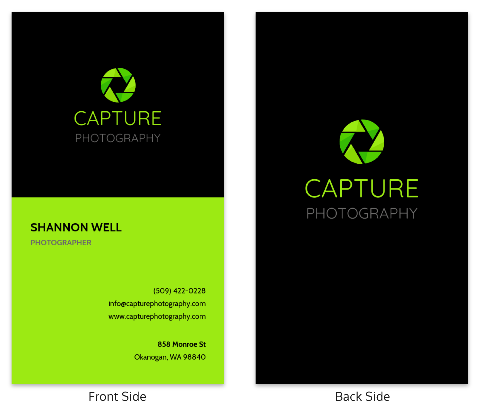
This creative business card is a great reflection of the brand’s personality. It portrays a sleek look that screams professionalism. The green is eye catching and the black brings boldness. Using your logo to match your card gives it a seamless look.
This minimal design photography card combines a simple look with stock photos for a fresh and clean finish. The pop of yellow highlights the purpose of the card along with the main point of contact.
You can choose neon colors to highlight the most important information on your business card.
Using a diagonal line in your photography business card design adds interest to your card. It’s simple in its tone but demanding in its appeal. The black and white background shades allow the simple gold logo to stand out.
If you want to appeal to a wide range of clients, using black and white to contrast is the right decision. The ambiguity of this simple design attracts curiosity, since it’s not too obvious what your business is promoting. A great marketing tactic!
Real estate business card examples
Not everyone is going to have the right photos on hand while creating their business card. So if you need to use a stock photo, make sure it is authentic, unique and high quality.
You don’t need to read any words to know what this business card is about. This vertical real estate business card idea is a fresh take on the traditional business card.
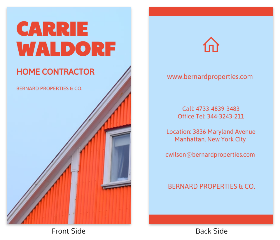
Using bold complementary colors will always leave an impact on whoever is looking at your business card. The use of orange contrasted against a gentle muted blue here helps it jump off the business card.
Your brand colors have a big impact on your innovative business card. Make sure you really reflect on your color choices and what they mean to your brand before choosing colors.
This real estate business card gives an inviting feel because of its familiarity. The white borders around the text allow for the information of the business card to be the focal point.
According to color theory, maroon gives a feel of confidence. Look behind the meaning of the color you select so that its purposeful and leaves an impact.
As a final note, having your photo on your business card ensures your clients will not forget your face.
Using black as the central color of your business card gives off a powerful vibe. It shows that you mean business.
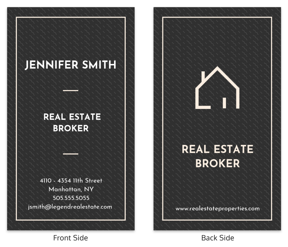
Using capital letters for your job title and name adds authority to your real estate business card. The minimalism of this design also allows for the white font and logo to capture your focus.
This business card design is clean and basic. It gets right to the point without any distractions. The use of gold allows for an accented trim that gives off the feel of sophistication and class.
If you want your business card to get right to the point, less is more here. Less ink is also generally cheaper for printing, your bank account will be happy!
Personal business card examples
A great way of self promotion is placing an illustration of yourself in the middle of your graphic business card. It adds some spice to your business card, it would be boring without it! Your personal business card ideas should reflect who you are as a person.
If you want to send the message that you’re playful to whoever receives your card, you’re on the right track. The addition of hues of purple and blue give a sense of ambition and creativity.
This business card screams flower power! This card brings you back to the 1960s but with a modern punch. The use of purple, bright blue, and black reminds me of a negative color effect you see in photography. As if there was a color reversal.
The slab of white space in the middle forces your attention to be concentrated on the important information. The elements here all work together to give a seamless but interesting feel to your business card.
This playful business card will grab anyone’s attention. The use of neon green and yellow allows for a bright and inviting page, it gives it a modern and trendy feel. The card gives off a very friendly vibe to anyone who gets ahold of it.
If you’re more outgoing and daring, this card is perfect for you. The addition of the illustration is a way of incorporating yourself without having a real picture of yourself, especially if you aren’t comfortable with it.
Using an abstract design with varieties of the color blue makes for an appealing personal business card. The use of blue gives this business card the feel of depth and stability, which is soothing for any potential client.
Be creative with your use of color blocking to add interest to your business card.
Minimalism has been a popular design option in the past couple of years. If you’re looking for a simple business card, without any distractions, this is for you.
Being this simple adds a refreshing feel to your personal business card. Knowing less is always more, it gives your business card a sense of mystery.

You don’t need to stick to just one color for your business card if you’re having trouble picking the perfect one. A part of your branding may be that you have a color palette with a variety of colors.
Instead of trying to fit every color into each business card, you can have a range in your business card pile. Your clients can pick whichever color appeals most to them. It’ll also give you an excuse to have more conversations with clients and industry professionals.
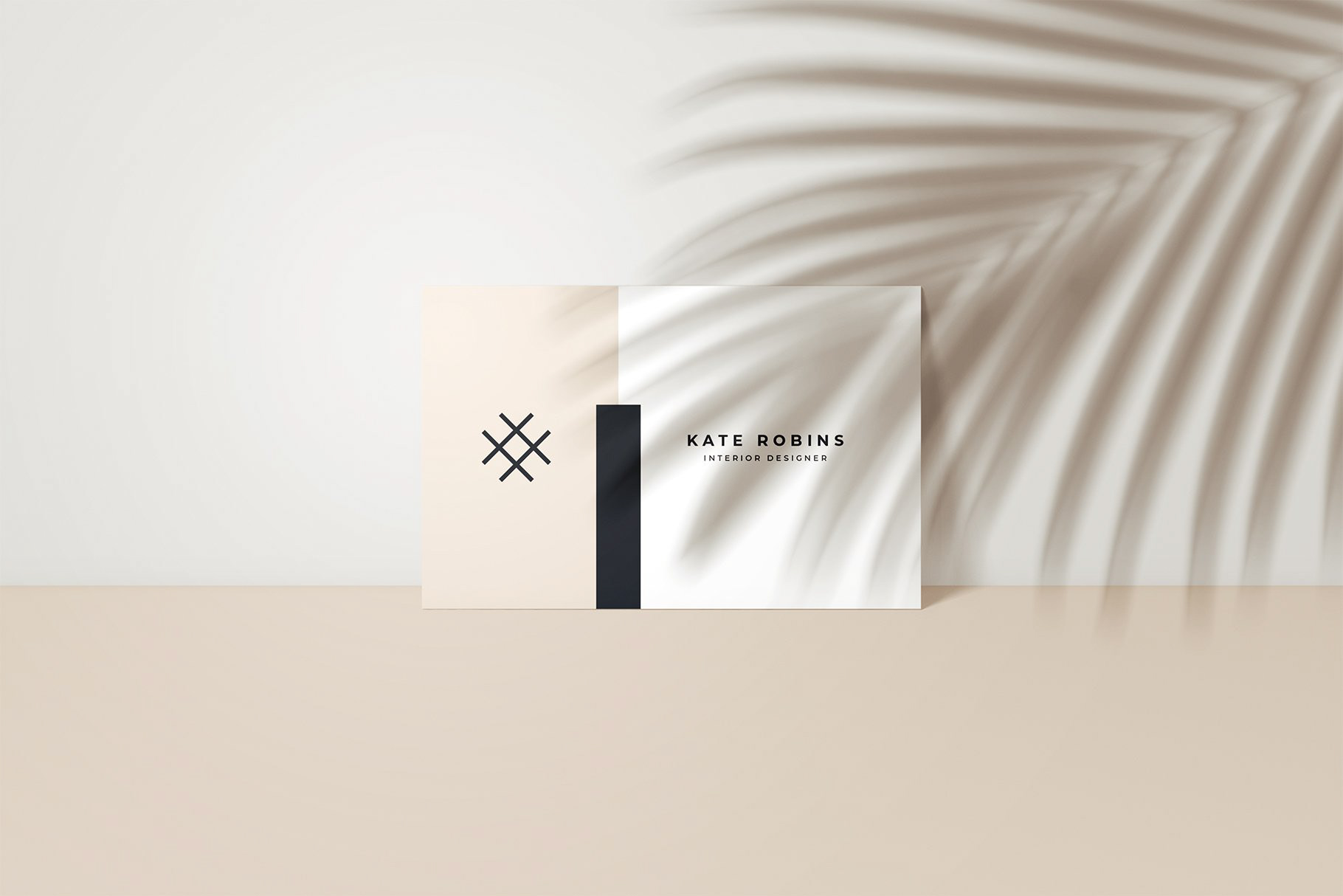
A neutral color palette on your business card will always feel modern and trendy. So will having a minimalist design with few words. All these elements come together beautifully. They leave your business card looking sleek and inviting.
This professional business card allows for an interactive visual experience. The use of icons in this business card template makes room for many illustrations.
Cute and informal but also with depth and meaning. The receivers of your card will take time to explore each icon and decipher the meanings. It reminds you of the Casper ad puzzles!

The power lies in your name with this business card example. This heavy bold font contrasts the graphic design and color of the background elegantly. Bold brand fonts have been very popular lately, according to our latest Graphic Design Trends blog post.
The use of this font creates a contemporary feel. Using similar styles of font allows for a strong and lasting impression for your business card.
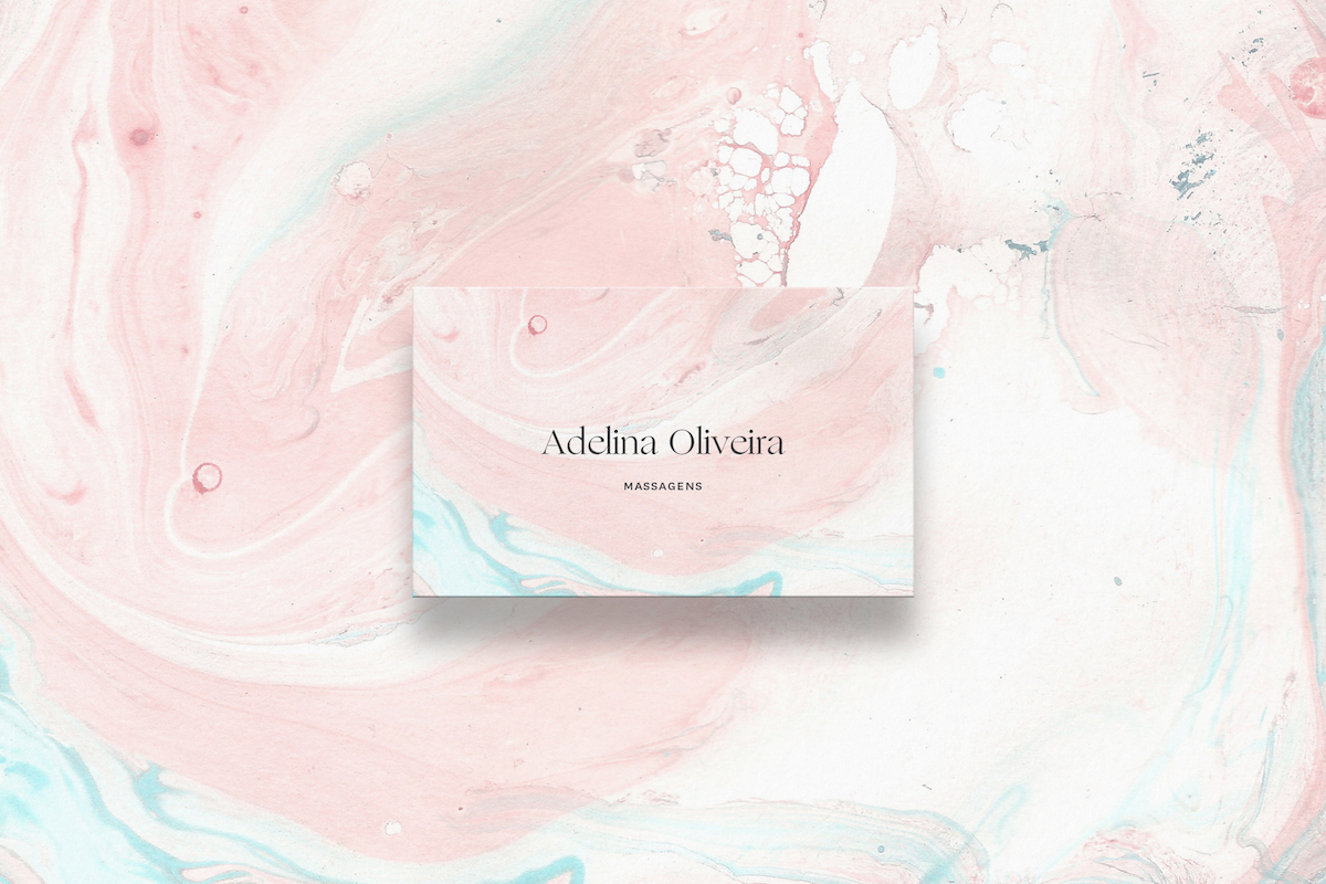
This muted pastel color business card is creative yet subtle enough to appeal to everyone. The light pastel color schemes allows the card to look creative but not too bold. If you have a business card design that is complex, try balancing it out by having a basic color on the backside of your business card.
If you need help choosing colors, take a look at this in-depth guide to pick color schemes.
Professional business card examples
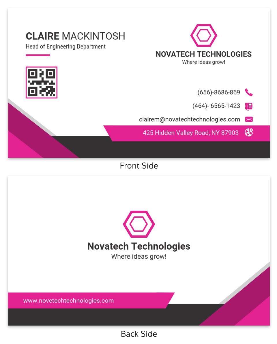
When it comes to professional business cards, first impressions matter most. That’s why having the right color combination is important to your overall design. Creating a bright side on the back of the card that contrasts the dark front side allows for a fun surprise.
The gold accents on the trim and logo also give the card a 3D pop. It guides the eyes of your potential clients to the information that matters most.
This muted blue professional business card uses white space to make its design jump off the card. The combination of blue, black, and white creates a great blend.
The spacing is also a great addition that centers your attention. This business card is all about spacing. Have some fun playing around with the spacing of your business card to come up with creative designs.
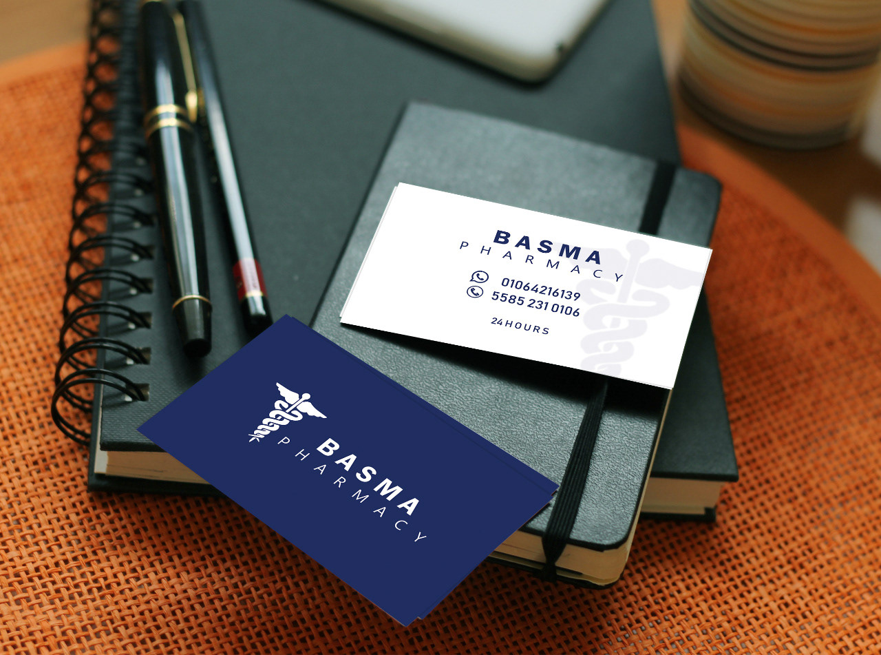
Using 2 color choices keeps your business card simple. If you want to add a little spice to your minimalist business card the flip the color placements on the other side. Add an accent color as well.
This business card example is to the point. There are no distractions. It has as little but enough information as possible.
Simplicity is beautiful. Getting to the point is what most clients want. This card has zero fluff and is very matter of fact in its design. It is fuss free and fast to use, requiring minimal effort.
Depending on your clientele, you will know if this professional business card design is right for you.
Who said you can’t have fun with your business card design? Depending on your personality and what you do, you can definitely have quirky illustrations for your design. This business card features animated fruits with lots of warm tones.
It puts a smile on your face and melts your heart. This style doesn’t need to just be limited to illustrators and designers. Anyone can have some fun with their business card.

Everything about the use of font in this business card is tasteful. It starts with the heavy bold font at the top to exaggerate the brand name. Underneath is a stylish cursive font to emphasize more detail.
At the bottom, you see a more basic font to give the important information needed. The designer grabbed your attention by playing with creative elegant fonts, then for the detail, they went with a general choice. Being intentional with your font choices helps you leave a lasting impression.
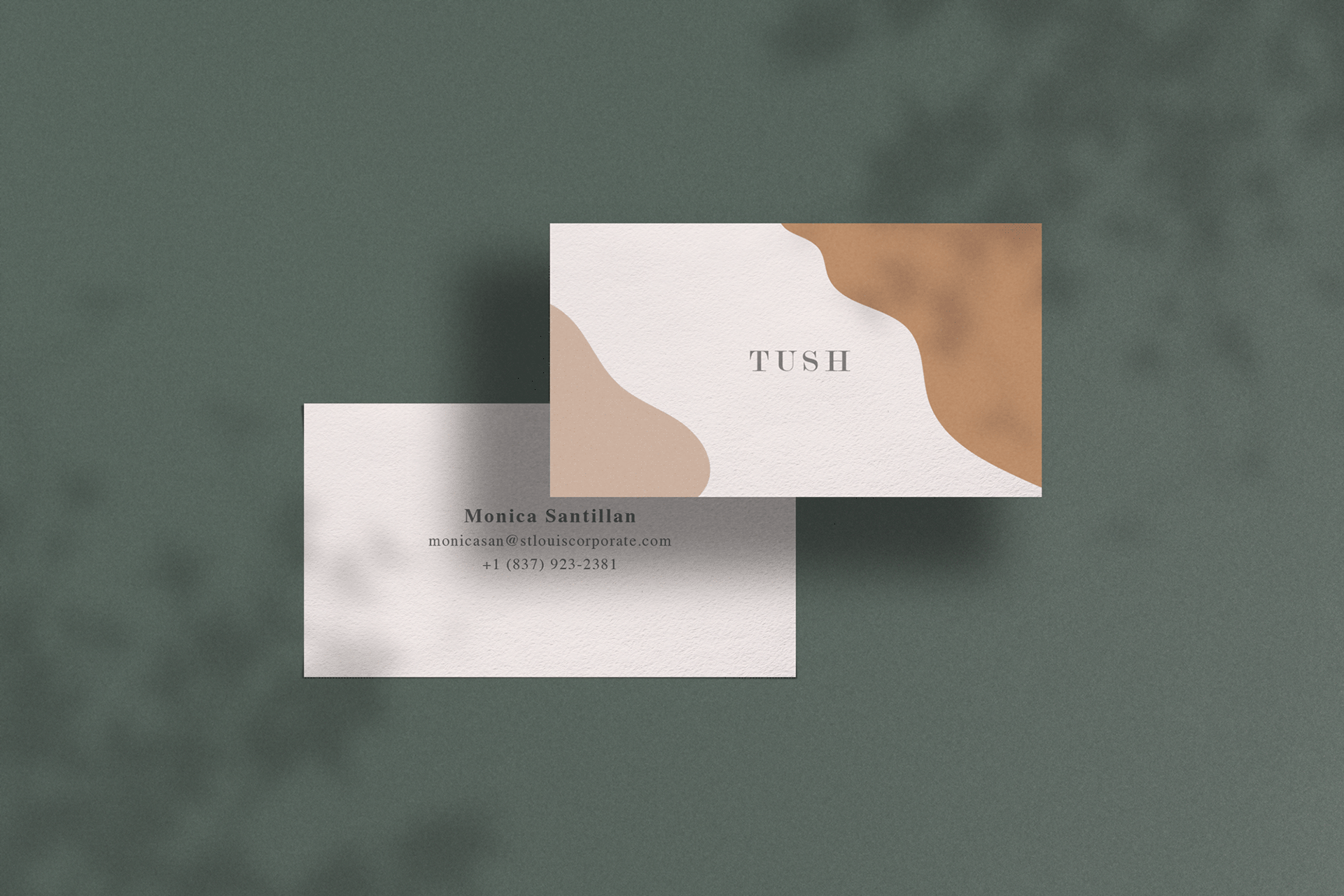
Use muted colors to give your business card an earthy natural feel. The darker tones on the corners of this business card direct your eyes to the center. This forces attention on the text in the middle.
Using flowy shapes and lines is a popular design trend this year.
Artist business card examples
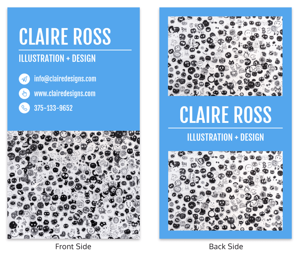
Nothing screams eye-catching quite like this very playful business card design. Although having a busy business card may seem distracting, placing a bright color centers the images so that your eye also focuses on the information.
The capitalized name in big font is a good choice as well in directing your client’s attention to who you are. Don’t be afraid to use content that jumps off the page!
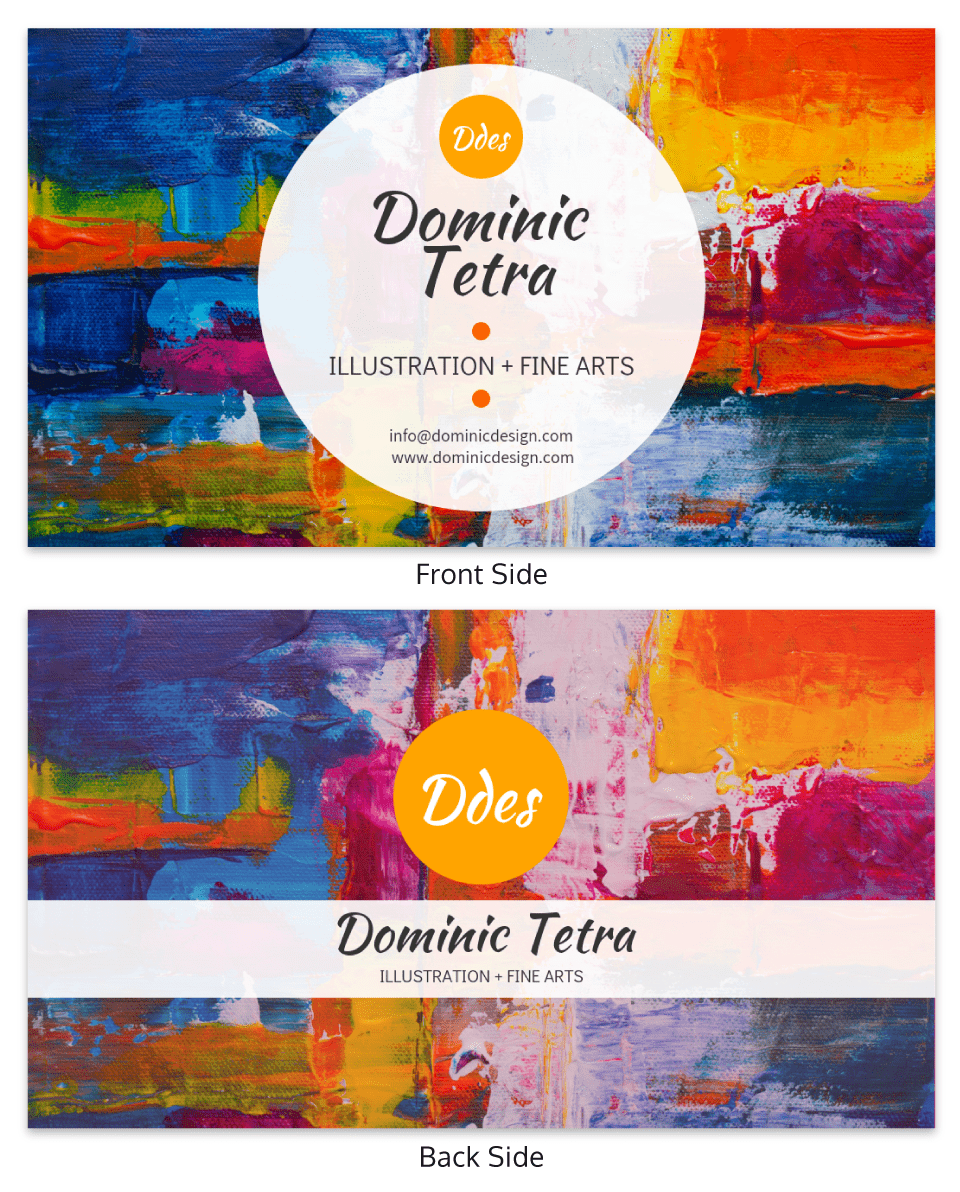
This impressionist-inspired business card is one of a kind. Since the background image is so colorful, the information on the card needs to be minimal. Think about what you want your clients to focus on. It differs for each person.
Here we see that the visual element is the focus. Have fun and be whimsical with your business card!
If you want to create a fun and vivid business card, this card is a great inspiration. Not only does it utilize icons to symbolize all the services provided, it also allows for lots of space to keep it from feeling overwhelming. Using yellow gives a burst of quirkiness and presents a great business card inspiration.
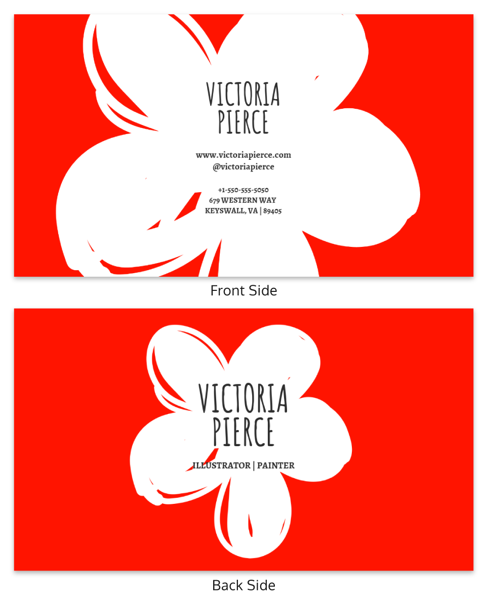
Vibrance is what is being displayed in this business card. The white flower against the bright red makes for such an exciting creative business card design. It screams drama. The handwritten font also personalizes this business card so that your clients feel your individuality.
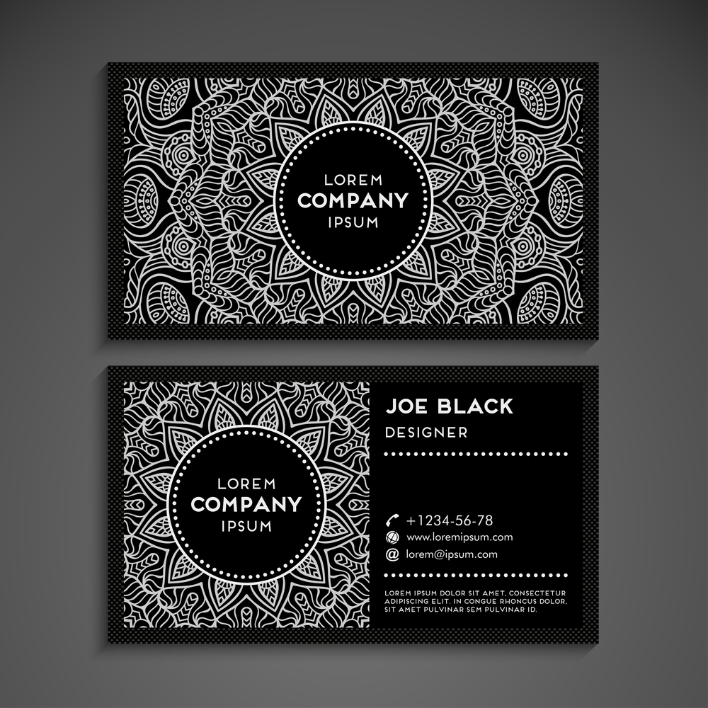
A business card design like this example is very hypnotizing. Symmetry in design is powerful and aesthetically pleasing.
The design centers around the middle of the business card. A smart way to balance your business card if you want it to look busy but not distracting.
This artistic business card makes you reluctant to throw it away. It captivates your client so that they are obliged to keep your card and contact you. That’s the influence that an artistic business card can have.
To keep the background from stealing all the attention on the business card, having a solid shape at the forefront helps. It allows your text to pop and not be lost.
The color scheme of this business card is pulled from the photo. This creates a monochromatic look. The red demands your attention and leaves a lasting impression.
The boldness of the card is captivating. Use bold colors to get a similar feel for your business card.
Replacing a photo of yourself with an icon is a good option if you’re not comfortable using a photo of yourself. It automatically draws attention to the information on your business card. The lines in the background add spice and interest to your business card as well.
Using a border around your text is another good tip to help direct your eye to the important information like this business card does.
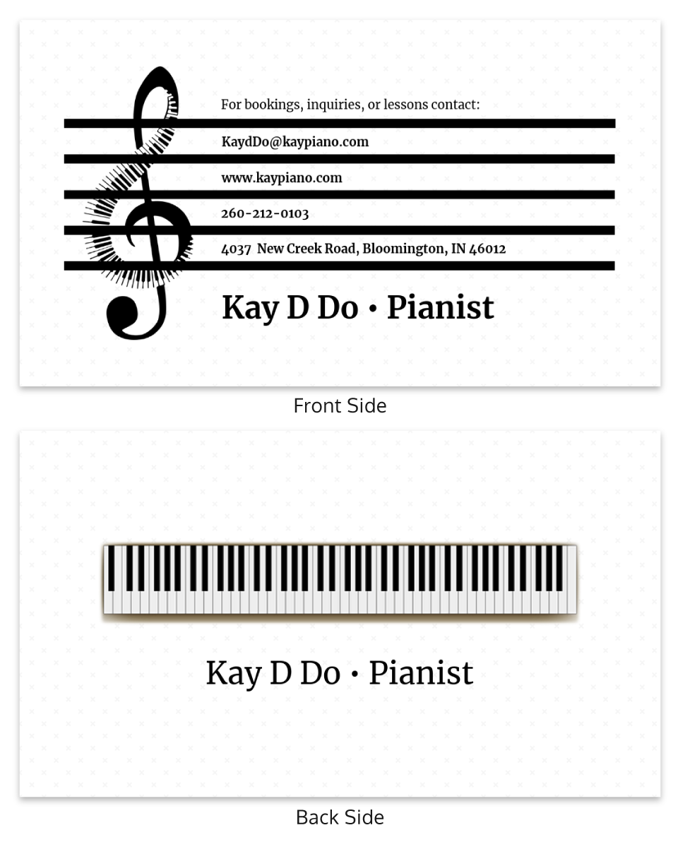
This business card does a great job reminding its potential customers of the service it offers. It uses a music sheet design to present the contact information on the front side of the card. On the backside is the actual piano.
Sometimes literally visualizing your business on your card will help attract new clients — it gets right to the point.
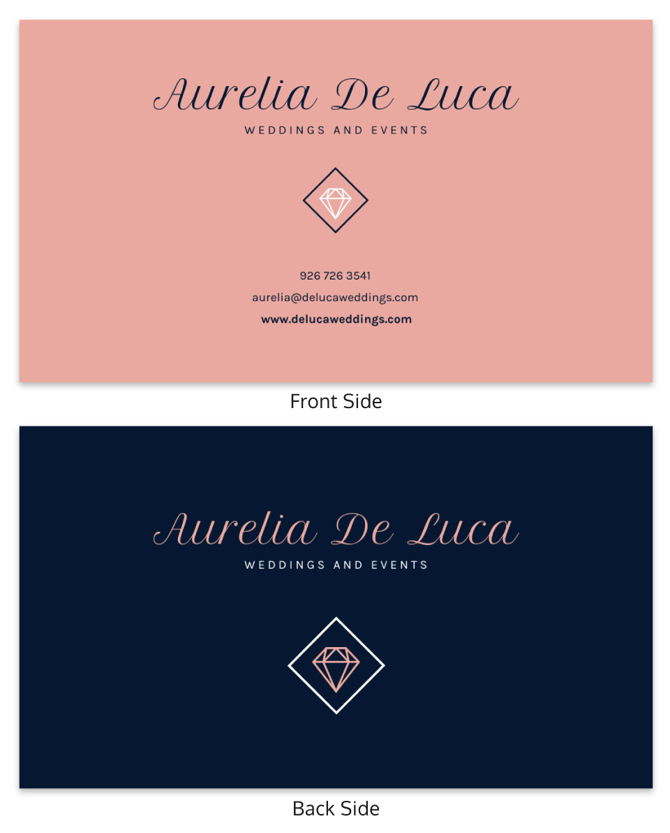
If you’re a wedding planner then having a chic wedding business card is essential. Using a cursive font gives your card a more attractive effect. The diamond logo complements the chic theme of the card along with the classic dark blue and pink contrasting on each side.
Depending on your business, pick a theme that matches what you do.
This business card takes it back to the beginning of business card history, with a modern twist.
The modern twist is that this business card uses a QR code to share information quickly. You can use a QR code generator to easily give a technological touch to a classic business card.
If you don’t want to quickly have a business card with minimal effort, this business card is the perfect choice.
We will end this post with his dreamy business card design that uses a great and interesting background image. The gradient color scheme also adds to the peaceful tone, giving you a great sense of calm.
If your business card has a bold background color, white font can really pop.
Also, since the background is busy, spacing your information is integral. Make sure you use the space on the card strategically.
What should be on a business card?
The most important part of a business card is the information on it. Make sure these points are included in your professional business card:
- Your name and the name of your business
- Your basic contact information: name, email, website, social media, and your digits (personal or business phone number)
- What you do, for example: artist, photographer, real estate agent, trainer, etc.
- Your personal logo/or company logo
How to design a business card
Step 1: Explore our collection of business card templates tailored for every industry, ensuring you’ll discover a design that matches your profession and style preferences.
Step 2: Choose your favorite business card template.
Step 3: Personalize your design using Venngage’s intuitive drag-and-drop editor, allowing you to create professional designs effortlessly, regardless of your design experience.
Step 4: Upgrade to a Business Plan to download your customized business card design in PDF format for high-quality printing.
How can I make my creative business card stand out?
Think about all the conferences and events you attend in a year. Now reflect on the amount of business cards you receive in them.
Making your business card personal to you and your branding is one of the best ways of making it stand out.
You can either keep it simple and to the point or be creative with it. It all depends on the main message you are trying to send out.
Brainstorm different color palettes that will compliment your business card. What do these colors mean to you? What emotion do you want to evoke?
Think about additional features you’d like to add to your business card. You can add icons and symbols, logos, or stock photos. Or unique fonts, colors, and illustrations.
The material itself can make a lasting impression. For example, custom metal business cards offer a premium feel with brushed and embossed textures that effectively highlight your brand and distinguish them from paper cards.
We’ve provided you with many creative business card designs with many business cards ideas.
How much should I pay for business cards?
If you design your business card yourself using a template, the costs are much cheaper.
Using an online template can cost around 0$-$100. You can customize your many different templates so that it fits your branding.
A batch of around 50 business cards can cost around $20. Not bad.
You shouldn’t need too many business cards so the costs can be quite low, with a big payback for your business.


