

TL;DR
- AI slop in design means low-effort, generic visuals created with AI and published without meaningful human editing. It looks polished at first but feels interchangeable.
- AI slop has inconsistent spacing, over-polished typography, cluttered visuals, and the same brushstroke banners and boxed layouts across unrelated designs.
- It can dilute your brand identity, hurt your reputation and make buyers question whether your product is as thoughtful as your marketing.
- To fix AI slop, use AI as a design partner. Treat every AI output as a first draft. Try tools like Venngage’s AI Design Generator to create and refine visuals. Also, develop better design taste so you can produce more professional work.
The internet is having two conversations about AI. People love how quickly it can turn an idea into a presentation, social post, or infographic. But they’re also getting tired of seeing the same AI aesthetic everywhere.
The problem starts when you publish the AI-generated design as it is. Without human input to shape the idea or make intentional design choices, the result can feel generic and interchangeable. That’s what people mean by AI slop in design: generic, low-effort work with little human editing or creative direction.
You don’t need to stop using AI, but rather get better at working with it. In this article, we’ll look at why AI-generated graphic designs often end up looking like slop and, more importantly, how you can make them feel intentional, distinctive and human.
What is AI slop in design and what does it look like?
AI slop design is low-effort, generic visual content created with AI and published with little or no human editing. It often looks polished at first glance but lacks originality, context or attention to detail.
A recent post by 404 Media asked readers to share AI-generated flyers they’d come across. The responses pointed out how recognizable these graphics had become. One person even commented that once you know what a ChatGPT flyer looks like, there’s no going back.
Let’s see some tell-tale signs and examples of sloppy, generic AI designs:
1. Typography that feels almost right
Typography can make AI-generated visuals feel off without you immediately knowing why. The text may be readable, but the tiny details like inconsistent kerning, baselines, minor changes in letter shapes and stroke weights can make the design look unpleasant.
A Reddit discussion about AI-generated typography described this feeling as an “uncanny valley” effect. Individually, these flaws are easy to overlook. But when several appear together, they create a subtle sense that something isn’t quite right.
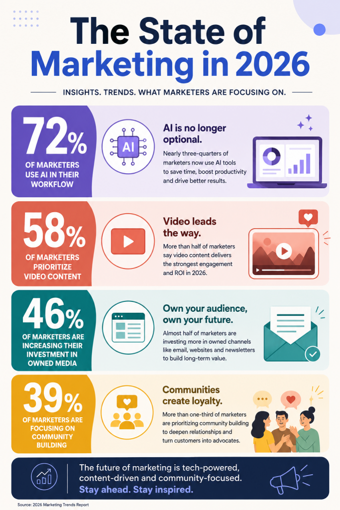
For example, I created this infographic using ChatGPT. It looks decent at first, but the typography feels off on closer inspection.
Here’s what seems wrong:
- The same percentage sign appears slightly different across the stats.
- Heading weights aren’t consistent across sections
- Some letter spacing feels uneven
- All-caps subtitle doesn’t have consistent spacing between characters.
- The headings are also disproportionately large and some text feels cramped, making the sections harder to scan.
2. Visually cluttered images
AI can sometimes overdo the details, cramming too much information into one design.
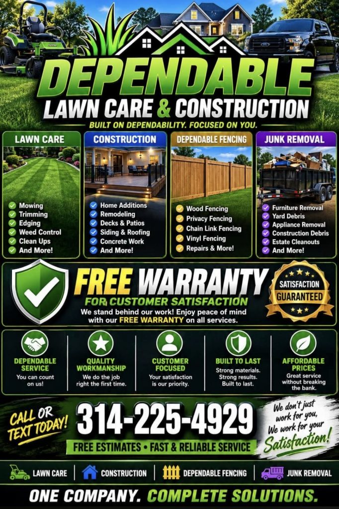
Look at this flyer, for example. It has photos, illustrations, icons, badges, checklists, multiple service categories, testimonials, guarantees and several calls to action. Each element competes for attention, making it hard to follow the text.
3. Designs with similar visual cues
A clear giveaway of AI slop is when the same visual elements keep showing up across unrelated designs. This could be oversized headlines, decorative strokes, similar icons, boxed information and big CTA banners can start appearing everywhere, regardless of what the design is actually for.
Take a look at these two AI-generated designs that look eerily similar. While one is a charity poster and the other is a retail sale flyer, both use brushstroke banners to highlight key text, circular icons to present supporting details and horizontal lines to divide sections and nearly-identical CTAs.

Ideally, a charity poster needs to make you care about the cause, while a retail flyer needs to make the product and offer stand out. But these designs feel interchangeable. You could swap the text and images between them and much of the layout would still work.
When the same visual choices keep showing up regardless of what the design is trying to communicate, that’s when it starts to look like AI slop.
4. It looks polished, but doesn’t communicate anything
I still remember the first time I saw Van Gogh’s The Starry Night or stumbled upon Peter Max’s psychedelic artwork in college. I couldn’t stop staring.
Memorable designs stay with you long after you’ve looked away. Sloppy AI designs, on the other hand, might look great at first glance, but still convey nothing.
Here’s an example of an AI poster with glossy visuals, vibrant colors and a futuristic composition. Everything looks polished, but we don’t know what this is actually trying to say.
It looks polished enough to catch your eye, but gives you nothing worth remembering.
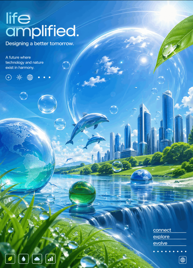
Sadly, low-quality AI visuals like this are everywhere. The problem has become so widespread that LinkedIn recently added a ‘Seems like AI slop’ button to report low-effort AI-generated content.
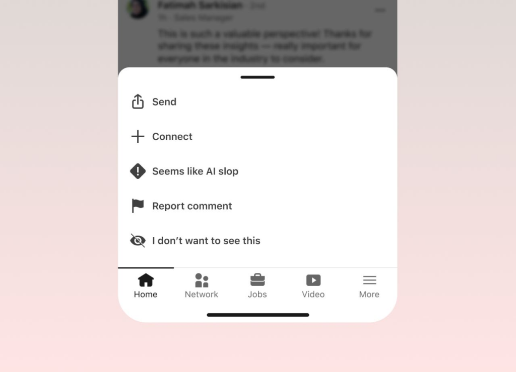
A sloppy AI-generated design is the visual equivalent of empty calories. You can consume plenty of it without feeling like you’ve seen anything worth remembering.
How AI slop hurts your brand?
Research shows that content perceived as AI-generated is seen as less authentic and less trustworthy than identical content labeled as human-made.
For brands publishing generic AI graphic designs, that distrust creates three specific problems.
Dilutes brand identity
Your marketing assets don’t just communicate a message. They also build recognition for your brand.
Generic AI output works against that when it starts looking like everything else in the feed. If you’re using the same layouts, decorative elements and visual treatments as everyone else, there’s less for people to associate with your brand.
Your audience may not consciously think, “I’ve seen this AI aesthetic before.” They just keep scrolling. The design looks familiar, but there’s nothing distinctive about it that makes them stop and remember your brand.
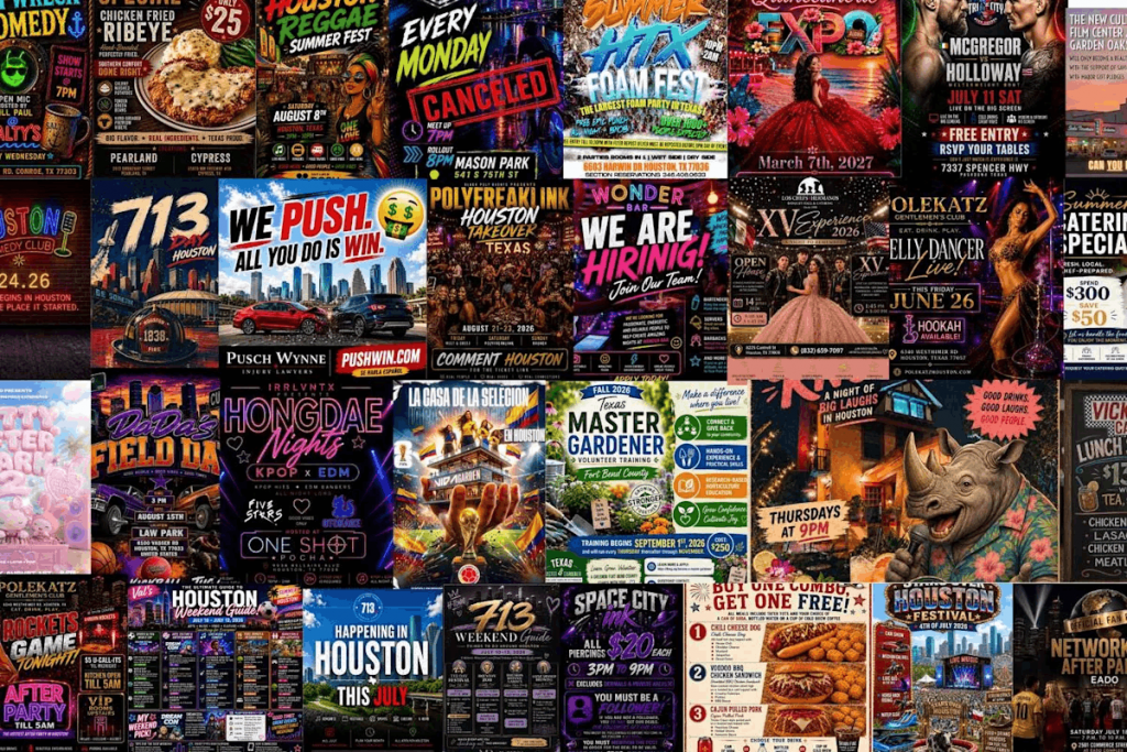
Lowers brand reputation
Every design you share online, whether it’s a promotional flyer, a process infographic or even a simple hiring post, speaks for your brand. When the designs look rushed, generic or poorly considered, they can make your brand seem less credible or trustworthy, impacting brand reputation in the long run.
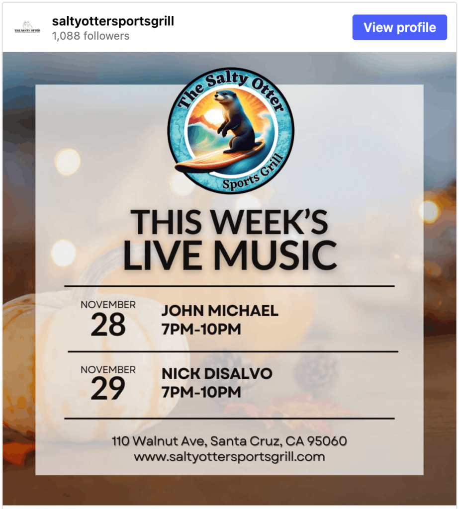
The Salty Otter, a café in downtown Santa Cruz, learned this the hard way. After revealing its AI-generated logo, the conversation quickly moved beyond the artwork. Customers questioned the brand’s creativity, values and commitment to supporting local artists.
Makes people question your content
In the last couple of years, buyers have seen multitudes of AI-generated content that doesn’t accurately represent reality.
In late 2025, some online sellers used AI-generated images to make inexpensive products look far more appealing than they actually were during the holiday shopping season.
By January 2026, disgruntled shoppers started donating, returning or reselling these “AI slop gifts” after feeling duped by the misleading ads.
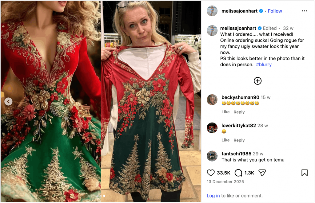
That’s the trust tax AI has created. If your flyer, social post or product image looks unmistakably AI-generated, people start wondering whether the product itself is just as disappointing.
The bottom Line
AI-generated graphic designs aren’t inherently bad. In fact, AI can be an excellent design partner for brainstorming ideas, generating first drafts, exploring different layouts and more. The key is knowing when to step in with human judgment.
How to create AI designs that don’t look like AI slop?
Most advice on AI design focuses on writing better prompts. That’s the wrong place to start. You need to follow a proper graphic design workflow.
1. Develop design taste before you develop better prompts
Better prompts won’t help much if you don’t know what good design looks like.
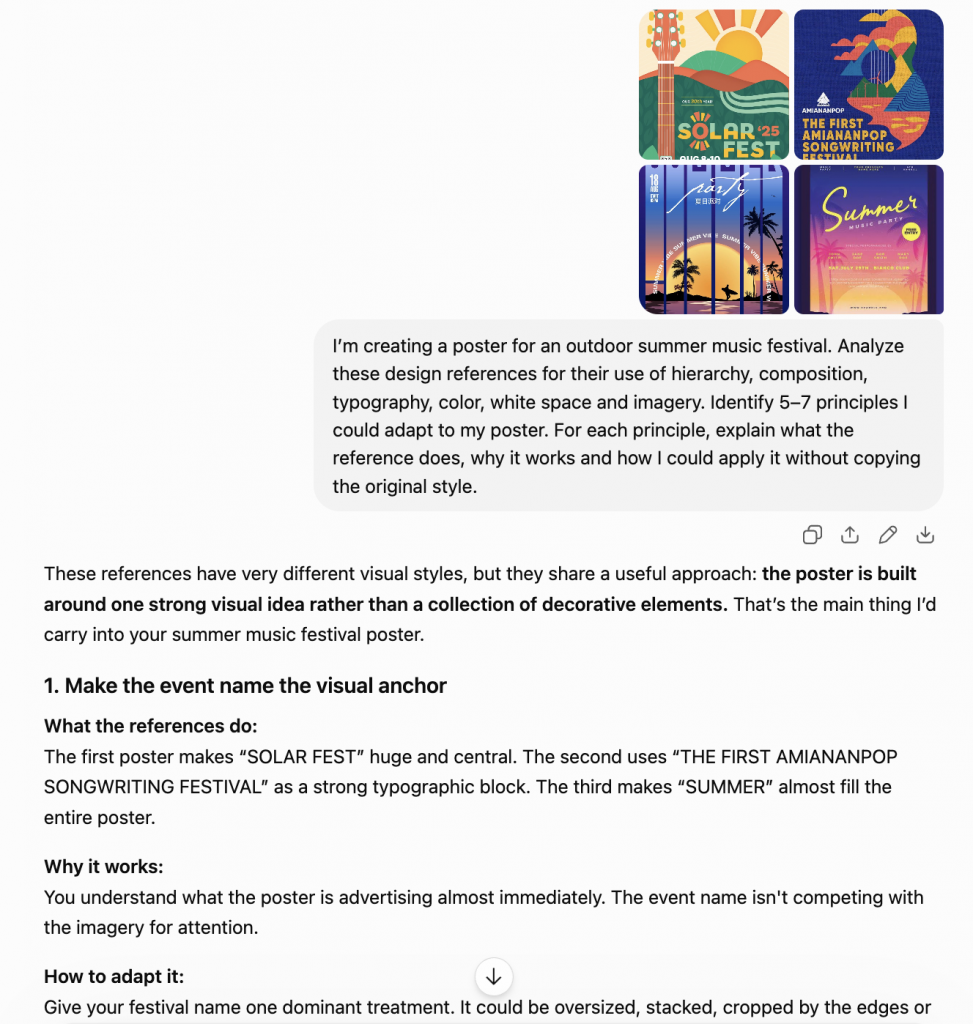
Before you start refining your prompts, spend time looking at work you genuinely think is good. And don’t limit your inspiration to your own industry. If every reference in your swipe file comes from SaaS companies, you’re likely to keep reproducing the same visual language as everyone else.
Instead, borrow ideas from places AI isn’t expecting, such as:
- Magazine covers
- Museum posters
- Food packaging
- Album artwork
Upload your design examples to ChatGPT or Claude and ask it to identify the design principles behind them and how you can apply them to your design.
Related: How to Create Infographics using ChatGPT
2. Use a dedicated AI graphic design tool
With general-purpose image generators, the typography, layout and decorative elements can all be baked into one image. If something feels off, you have limited control over the individual pieces, increasing the chances of AI slop in graphic design.
The best way to create professional-looking visuals is to use a dedicated AI design tool like Venngage AI Design Generator. It turns a prompt, campaign brief, PDF, Word document or spreadsheet into a professional-looking design that you can easily customize.
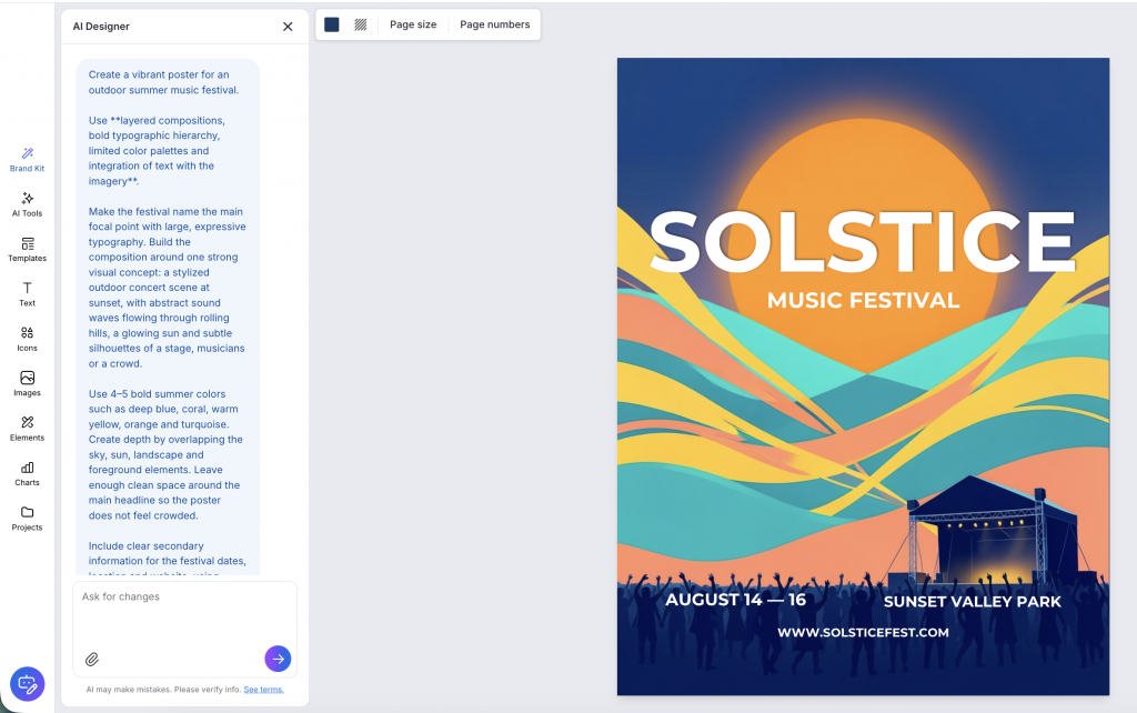
For example, instead of generating text as part of the image, Venngage AI uses actual typeface. You can try different fonts, adjust font weights, fix spacing and make sure your typography stays consistent throughout the design. This gives you more control over some of the small details that can make an AI-generated design feel off.
You also have more control over the visual elements. Venngage has a wide library of icons and graphics that you can add to your design instead of relying on the same generic AI decorations. You can also create custom icons based on your design topic and theme using the AI Icon Generator.

Here’s how you can avoid AI slop with Venngage AI:
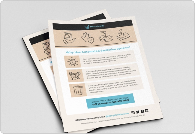
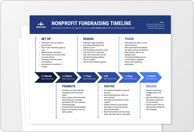
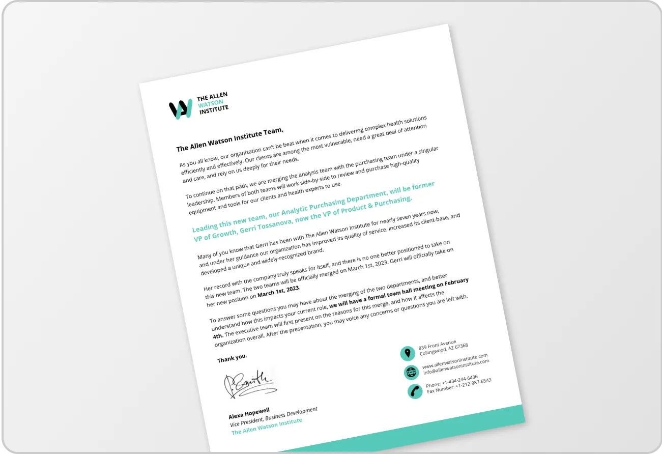
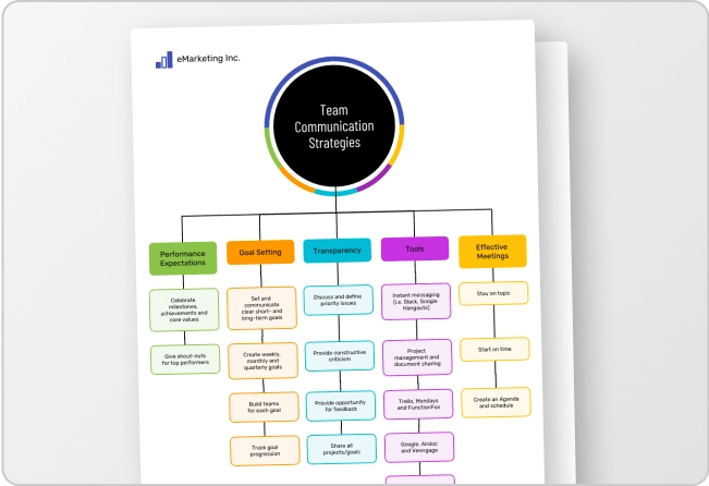
- Edit a template with AI: Venngage offers a vast library of design templates that you can customize with AI. Starting with a professionally designed layout helps you avoid the overused layouts, decorative elements and visual patterns often seen in AI-generated designs.
- Review your design: Unlike most editable AI design tools, Venngage AI can provide instant design feedback and help you rewrite copy, improve typography, adjust colors, rearrange layouts and fix readability issues. This helps customize the design easily.
- Ensure brand consistency: You can save your colors, fonts and logos in My Brand Kit so every design maintains brand consistency.
Venngage acts as your design partner. AI creates the first draft and helps you customize it while you offer creative directions.
3. Study your audience, not just your designs
You already know what AI slop looks like. The next step is finding out how your audience perceives it.
Start with your competitors, then spend time in Reddit communities, such as:
- r/isitAI
- r/isthisAI
- r/AIslop
- r/DesignAndAI
- r/GenerativeDesign
- r/DefendingAIArt
You’ll quickly notice the same complaints coming up again and again, which makes them a good reality check for your own work.
Keep a close tab on the comments in these subreddits, LinkedIn posts or other social media content. People won’t tell you your hierarchy is weak. They’ll say things like “Looks AI-generated,” “Feels generic” or “This looks like every other LinkedIn post.”
It’s the kind of feedback worth paying attention to.
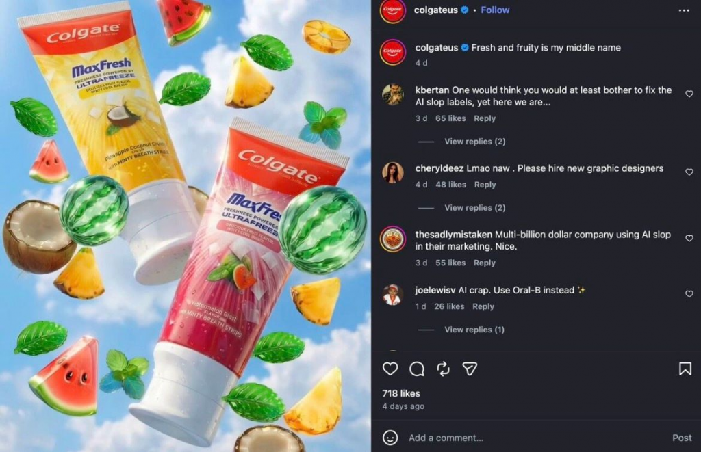
Some brands have started promoting their work as “made by humans” to avoid being perceived negatively. Study your audience long enough and they’ll tell you what not to create.
4. Know when to leave AI out of the room
You don’t have to boot AI out of your workflow. You just have to stop making it the default for every job.
The more your work shapes your brand or carries emotional weight, the less you should rely on AI alone. For instance, high-stakes design projects like logos, hero visuals, holiday creatives or cause-related messaging need more human touch and AI polishing.
Case in point: Coca-Cola’s 2024 AI-generated holiday ads, which drew criticism for replacing warmth with artificial polish.
The same goes for design-savvy audiences. Agencies, creatives and arts organizations have extra hate for AI shortcuts, as Oakland First Fridays learned when its AI-generated flyer became a PR disaster.
One last rule: the closer people look, the less forgiving they’ll be. A trade show banner, brochure or product package deserves far more scrutiny than a social post someone scrolls past in two seconds.
FAQs about AI-generated designs
Got more questions about AI-generated designs? Here are answers to some of the most common queries.
1. Why do AI designs look fake?
AI-generated designs often look fake because they reuse common visual patterns, generic layouts and overused styles. Small details like inconsistent typography, awkward illustrations and repetitive color palettes also make them easier for people to recognize.
2. Can people actually tell when a design was made with AI?
Yes. Most people can tell AI design patterns, especially repetitive typography, generic imagery and overused visual styles. Once a design feels generic or low effort, people often associate those qualities with the brand itself.
3. How do I make AI designs look professional?
Treat AI designs as your first draft, not your final design. Edit the typography, layout, colors and messaging, remove unnecessary elements and make sure every design reflects your brand instead of the AI tool that generated it.
4. Is it bad to use AI for graphic design?
No. AI is a useful design assistant when you use it to generate ideas or first drafts. Problems arise when brands publish AI-generated designs without editing or adapting them to their audience and brand identity.
5. When should I not use AI for design?
Avoid relying on AI alone for logos, brand identities, hero visuals, emotionally sensitive campaigns or print materials. These projects shape how people perceive your brand and usually need human creativity and careful design decisions.